Furnishing a small house can be challenging, especially managing not to make it look smaller than it is by making it stuffy.
As always, the expedients are there, in this case, 7 tricks that will make the house look bigger!
Let’s look at them together!
– HOMOGENEITY
In a small house, it is paramount to maintain harmony wherever possible, and one of the first things to do is to avoid contrasts as much as possible.
For this in a small house, it will be essential to try to have everything the same color walls, ceiling, doors, baseboards, floors…
The homogeneity of colors, and thus the lack of contrasts, will help make the room look larger.
Beware that this doesn’t necessarily mean having everything white or otherwise light; you could also decide to have everything dark!
The color changes, the contrasts precisely, create boundaries, and these visually shrink spaces.
Again to avoid boundaries, it would be good to have the same floor throughout the house; even if it were tone on tone, changing materials (or worse) patterns would still create some dividing line!
Likewise, use tiles as large as possible to limit the view of joints!
It is a good idea to maintain this homogeneity even with bigger furniture, curtains, and any rugs, thus keeping a tone-on-tone as much as possible.
You can play with colors, if you want, with smaller elements and decorations.
To brighten a bit of the tone on tone that might otherwise be “boring”, it will be enough to play with different materials and finishes!
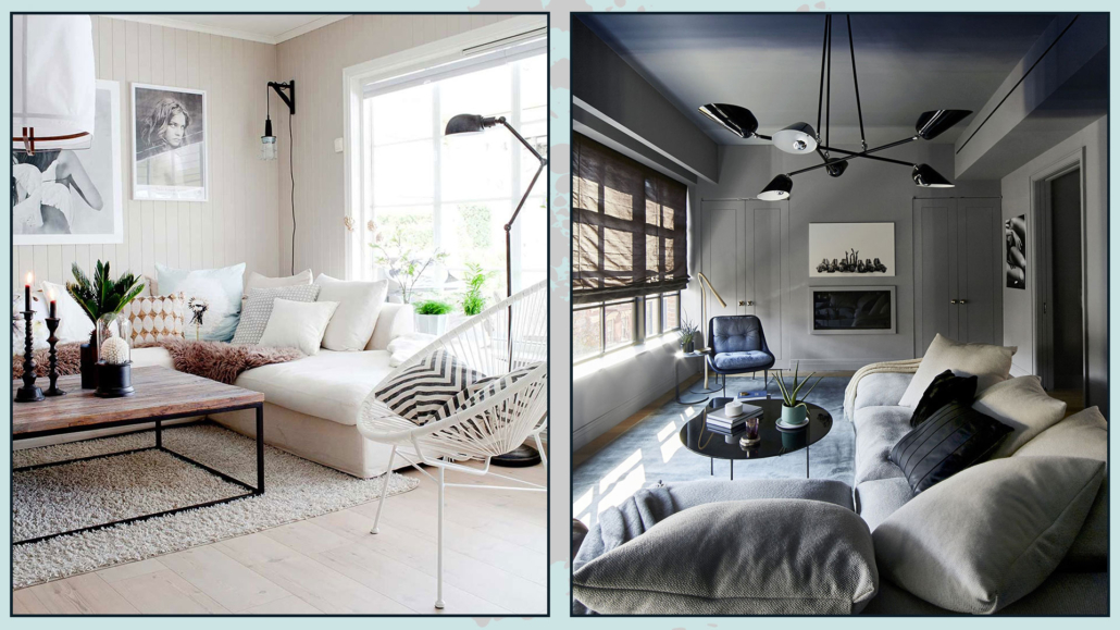
(credits: Tonje Isaksen; greenarchitectures.com)
– FURNISHINGS
It will be vital, in small rooms, to maximizing space as much as possible, and for this purpose, 2 types of furniture can help with this.
One is multi-functional furniture, that is, furniture that can have several functions in one, such as a bed or a storage sofa.
Or it could be a coffee table that transforms completely to become a dining table or partly to become, for example, a desk!
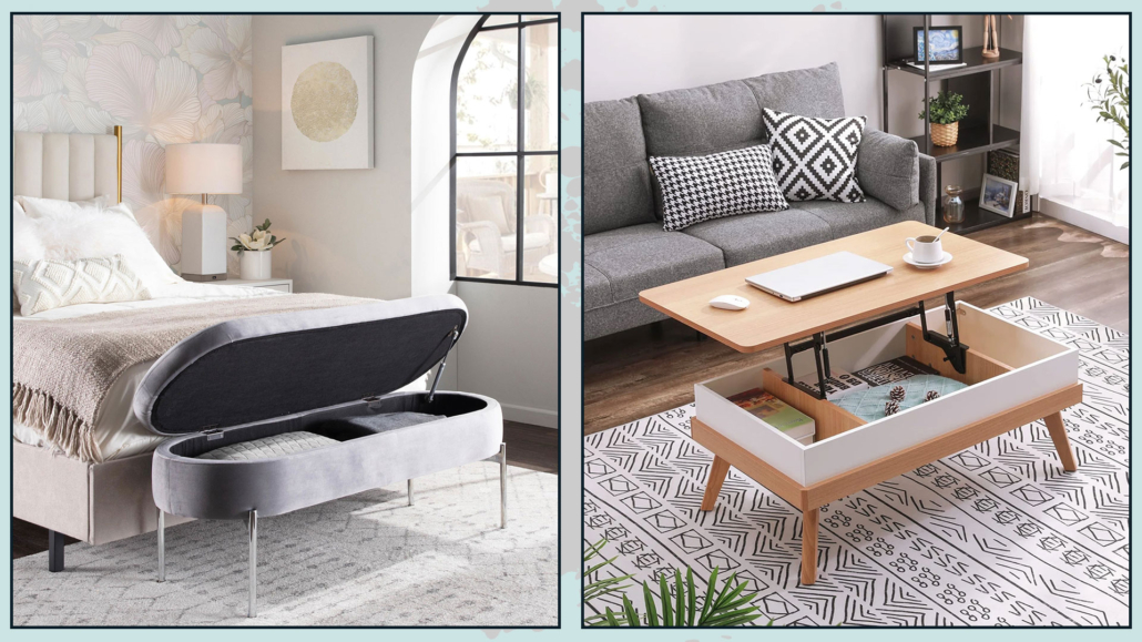
(credits: lumisource.com; Amazon)
The second type, quite helpful, is folding furniture such as might be a console table which, when opened, becomes a dining table!
That will give you more breathing room when the dining table is not needed!
Of course, there are also chairs, which you can place in a closet or, why not, even hang on the wall!
This type of furniture is increasingly needed and, therefore, has evolved over the years to become really beautiful as well, allowing you not to have to sacrifice design for functionality!
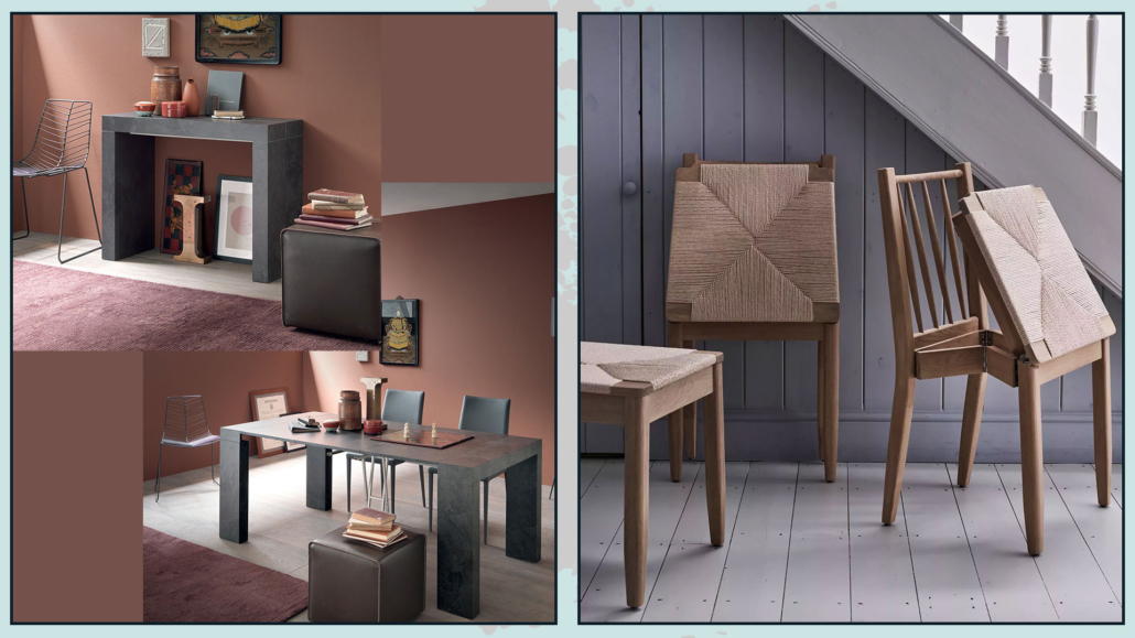
(credits: progettosedia.com; neptune.com)
Study your space well and what you need for your everyday life to choose the type of furniture that best suits your needs.
Another shrewdness will be to take elements that have feet and do not rest directly on the floor: this makes the eye perceive the space underneath, giving more breadth to the room.
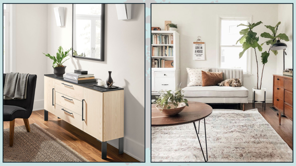
(credits: roomandboard.com; pinterest)
– EMPHASIZES THE HEIGHTS
Deceiving the mind is really very easy; it is always just a matter of perceptions!
Accentuating and emphasizing heights is a great way to make spaces seem visually larger!
A first way to do this is to use, where possible, full-height furniture, which, in addition to everything else, will give the possibility of more storage space!
If you are using drapery curtains, it will be imperative that you hang them as close to the ceiling as possible and that they skim the floor; let’s avoid optical barriers with curtains too short!
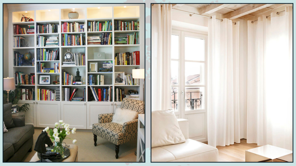
(credits: aewee.top; brandoconcept.com)
Replace floor and table lamps with wall ones you will illuminate properly while leaving the floor and various surfaces free!
Then if you get some particular lamps, maybe with arms you can even create some scenery!
Another way to emphasize heights is to use very tall plants!
The plants then will also give movement, create visual interest, and bring a touch of freshness!
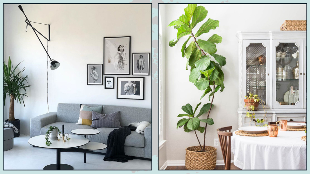
(credits: medium.com; maisondepax.com)
– FOCAL POINT
Speaking of visual interests: the focal point becomes almost essential in a small environment!
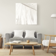
And the best way to do this is to use huge paintings that immediately attract the eye and attention!
I emphasize that it should be a single large painting rather than a wall gallery so as not only to create visual interest but also to avoid visually shrinking the environment!
Lots of paintings will, in fact, have many borders and create boundaries that we have already seen many times will make environments appear smaller!
Not only that, many paintings, although perfectly placed, also create a somewhat visual clutter that, again, optically shrinks the spaces!
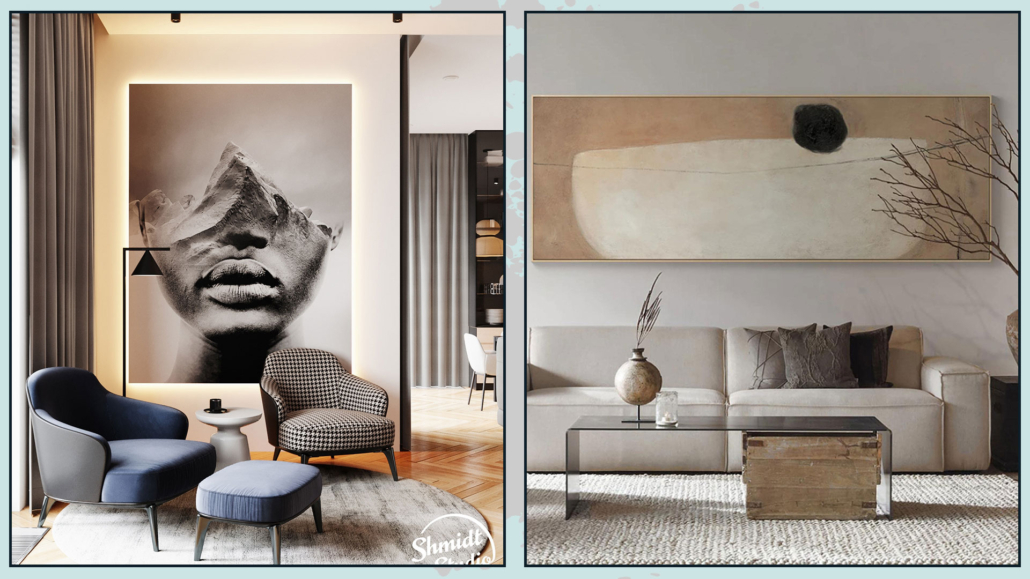
(credits: Behance; Amazon)
– DECLUTTERING
Picking up on the previous point, decluttering in small spaces is essential!
Lots of things, all misplaced, create visual confusion, and this, as already mentioned, will make the environments perceived as “crowded” and, therefore, smaller!
Withdraw everything you can and place in baskets or boxes what is in sight.
There are really so many solutions on the market to be able to keep everything tidy.
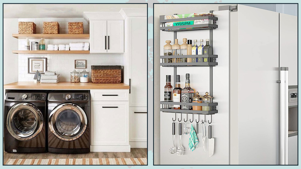
(credits: @crescentlivingco; amazon)
– DOUBLE THE LIGHT AND THE SPACES WITH THE MIRRORS
Mirrors are known to reflect, and this in small spaces is really a not inconsiderable help!
In fact, you will be able to double light and space!
You can think of mirroring an entire wall to give the optical illusion of extra space!
If the whole wall is too much for your taste, I still recommend using large mirrors to multiply as much light as possible!
In addition, large mirrors are also very scenic and can be that extra element of style that never hurts!
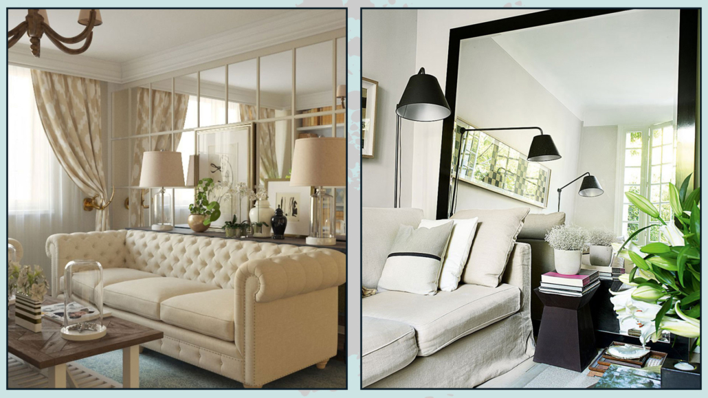
(credits: inmyroom.ru; Mark Luscombe-Whyte)
– SMALL SPACES, SMALL ELEMENTS?
Be careful not to fall into the common mistake of thinking: “because I have small spaces, I must have small furniture and elements!”
Everything too small will shrink spaces, in addition, to increasing the risk of overfilling and thus creating visual chaos that, again, will make the environment feel even smaller!
Always keeping proportions in mind, it is good to play with size by taking big and small elements.
Properly study what is essential and functional for you, get it comfortable and, therefore, maybe larger, and pair it with smaller pieces.
The interplay of sizes will help visually enlarge the spaces!
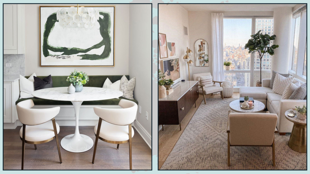
(credits: Stephen Sills; Margaret Boatner)
I hope this article was helpful and you love it; in case, let me know in the comments!
Feel free to share it with anyone you think might be interested, I will be honored, and it will help me get my name out there.
If you feel that your home, or some environment of it, does not reflect you enough, do not wait any longer and book your consultancy!
This post is also available in: Italian



Leave a Reply
Want to join the discussion?Feel free to contribute!