Today, I’d like to talk about the living room and discuss 6 common mistakes we could probably make, how to avoid them, and how to fix them to create a beautiful, inviting, and comfortable space.
The living room is where we go when we want to unwind, read a good book, watch TV, or enjoy the company of friends and family.
It’s crucial, therefore, that it’s inviting and comfortable so we can release the accumulated stress and relax!
Some mistakes can significantly impact our spaces, making them appear somewhat dull.
Let’s see what they are and how to fix them!
1 – FURNITURE ARRANGEMENT
As mentioned earlier, the space must be inviting and comfortable.
In other words, as soon as you step through the door of that room, you should feel like leaving all your worries behind!
To achieve this, the arrangement of the furniture is crucial.
You should arrange everything to support all the activities you want to do in that room: conversation, reading, watching TV…
As mentioned before, it’s paramount to identify the main activity and arrange everything else around it!
Pay attention to the distances!
To place everything against the walls, creating excessive distances between one element and another, is a most common mistake.
The elements shouldn’t appear isolated but feel like they belong together to make the space cohesive and inviting.
That’s why using a rug to tie the furniture and accessories together is paramount.
If the living room is large, create multiple areas, perhaps one for the TV and another for conversation.
If the space is small, try to arrange the elements uniformly and cohesively again to facilitate potential conversation, even if the primary function is watching TV!
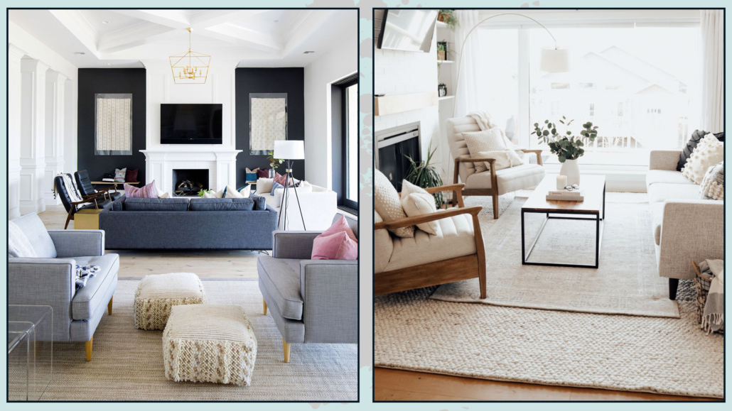
(credits: thisisnick.com; theblushhome.com)
2 – PAY ATTENTION TO SHAPES AND MATERIALS
The choice of sofas and seating will make a big difference, both in terms of shapes and materials!
You need to be mindful not only of the aesthetic aspect but also of comfort and materials that are easy to clean!
When it comes to comfort, be careful not to go overboard.
If the seats are so reclined that you’re almost lying down, it doesn’t favor conversation when you have guests over!
As for materials, they should be easy to clean to avoid having to use unattractive sofa covers.
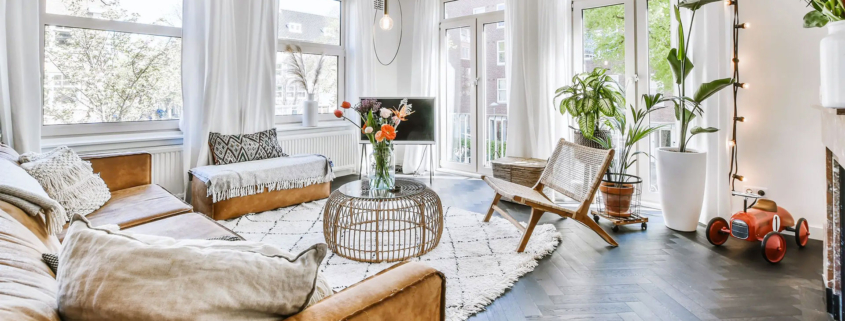
To make the living room even more inviting, remember to add some cushions, which not only serve as decor but can also be functional by providing additional back support if needed.
Also, put on a few blankets to make everything softer and cozier.
Of course, avoid using wool in the summer, but a colorful cotton or linen blanket has its charm even in the warmer months!
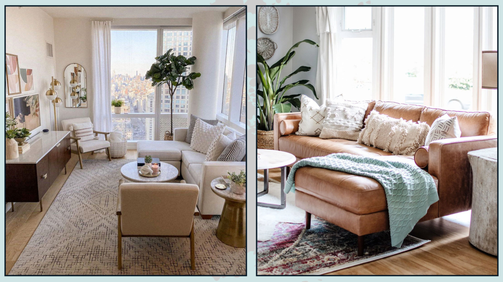
(credits: Margaret Boatner; whitepicketfarmhouse.com)
3 – PAY ATTENTION TO THE TV
In recent years, large televisions hung on the wall have become common.
It’s essential to pay close attention to the distances and the TV’s height to maintain proper comfort.
Depending on the distance between the sofa and the TV’s position, you can determine the appropriate size for it.
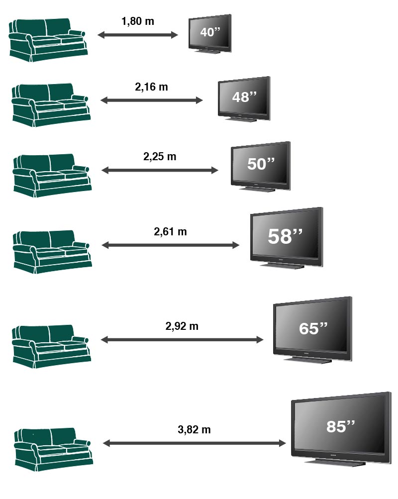
That is necessary to prevent eye strain, which is already prevalent caused by computer and mobile phone usage.
Another thing to keep in mind is the height at which the TV is hung, with its center ideally at eye level.
That helps prevent you from getting a crick in your neck every time you watch TV!
Television is an element that most of us have, and especially if it’s large, it could somewhat impact the living room’s design.
There are ways, if desired, to hide it or make it less impactful, which I’ve discussed here!
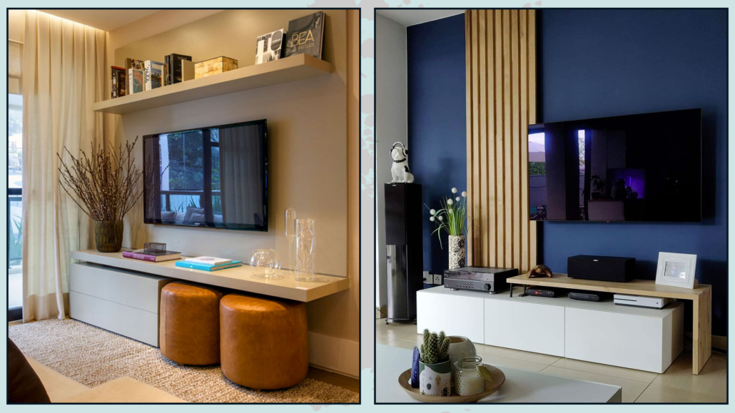
(credits: giseletaranto.com; @rcpa)
4 – COFFEE TABLES
Often, people have a central coffee table and sometimes a side table near the sofa, where you might place a table lamp.
Each seating area must have a surface nearby to set down a book, a glass, a plate, etc.
Coffee tables, especially the central one, are also the right place to create some compositions that can enhance the perception of space.
In smaller spaces, they could even be storage elements to help maintain order.
As for the coffee table, it doesn’t necessarily have to be one large piece; it could also be a composition of several tables of different sizes and heights.
That would allow you to move them quickly, as needed, and add some rhythm, which is always a good thing!
Coffee tables don’t have to be all of the same shape or material.
On the contrary, a bit of variation will make the space more attractive. Ensure, however, that the various tables have elements in common with other furniture or objects in the room.
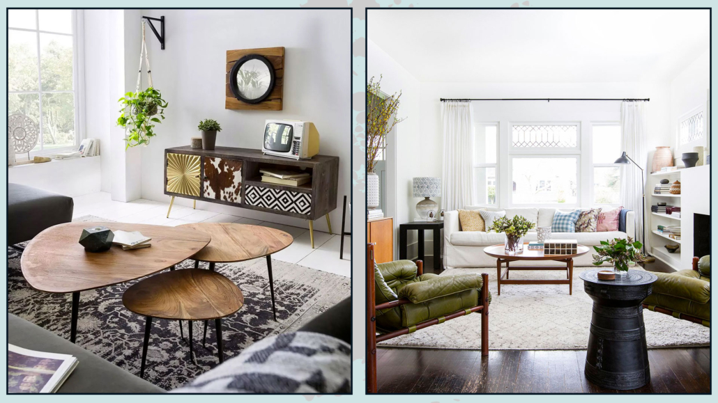
(credits: vemzu.sk; Rafael Soldi)
5 – LIGHTING
I touch on this point frequently because it’s genuinely crucial.
It is not enough to have a single overhead light source, even if adequate, for visual comfort.
One reason is that it could cast annoying shadows.
It’s paramount to have multiple light sources, perhaps with different color temperatures.
Using bulbs with a natural color temperature (around 4000° Kelvin) could be an excellent idea for general lighting.
For other lights, bulbs should be warm (around 2700° Kelvin).
That helps create a more relaxing and inviting atmosphere.
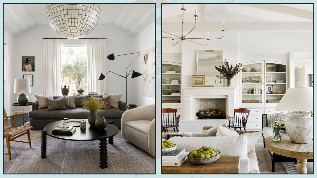
(credits: katiehodgesdesign.com; studio-mcgee.com)
6 – SCALE AND PROPORTIONS
Pay attention to the measurements of furniture and accessories.
Scale is the size of an element concerning the room, while proportion is the size of an item concerning another.
It’s paramount to play with the scale and proportions of various elements to create visual interest in the environment.
The environment would appear a bit flat if you placed everything on the same plane.
Balance and vary the heights, using plants, artwork, or perhaps a large floor mirror to assist you.
All of this creates movement and visual interest, precisely.
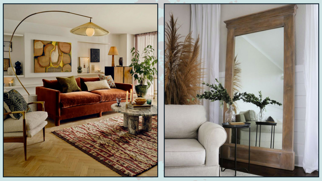
(credits: sohohome.com; sawdust2stitches.com)
PROPORTION
As for proportions, this mainly concerns the coffee table related to the sofa, the rug to the conversation area, and even the hung artwork!
A coffee table that’s too small compared to the sofa may appear as if it’s placed there somewhat by mistake.
The rule suggests that it should be 2/3 the size of the sofa, but as mentioned before, it doesn’t have to be a single table; it could be a composition of multiple tables!
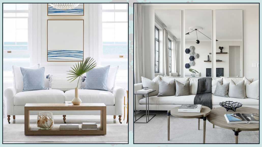
(credits: serenaandlily.com; imgnyc.com)
Regarding the rug, you’ve heard me say it multiple times: it should accommodate all the elements to bring them together in a unified area. If it’s smaller, it would create barriers and make the room look smaller.
The same applies to artwork and wall decorations.
If they are too small, they will get lost, while too large, they risk overwhelming the space.
As for wall decorations, pay attention to heights; the center of the picture or composition should be at eye level.
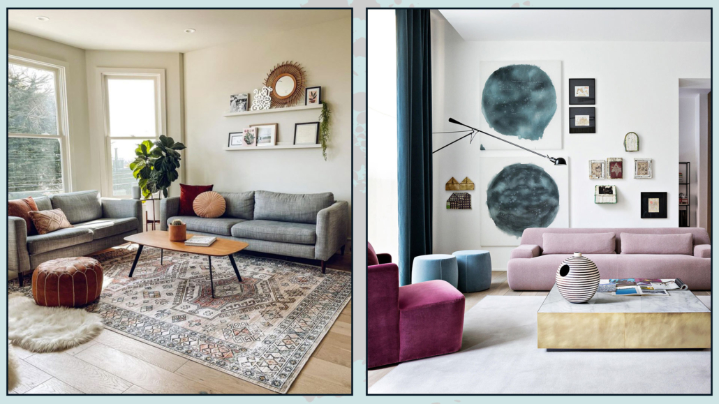
(credits: rugsusa.com; Meridiani living)
I hope this article has been helpful and enjoyable for you. If so, let me know in the comments!
Feel free to share it with anyone you think might be interested, I would be honored, and it will help me gain more exposure.
If you feel that your home, or any specific area of it, doesn’t reflect your personality enough, don’t wait any longer and book your consultancy!
This post is also available in: Italian






Leave a Reply
Want to join the discussion?Feel free to contribute!