When designing a kitchen, it’s easy to fall into some common mistakes that can make it less functional and, perhaps, even less enjoyable!
Today, I’ll share 11 mistakes I’ve often seen people make (and, let’s admit it, I made a few myself with my first kitchen!).
1 – BACKSPLASH
The backsplash and countertop are elements you’ll keep for a long time, so choose wisely!
First, focus on the material: it should be high-quality and easy to clean.
If you opt for tiles for your backsplash, ensure they are either large to minimize grout lines or designed to allow for very tight spacing, resulting in nearly invisible grout lines.
Grout lines can quickly become an insidious spot for accumulating grease and dirt!
You might use the same material for both the countertop and backsplash.
That creates a seamless, streamlined look for your kitchen and avoids the risk of mixing too many materials and colors.
If you prefer contrasting elements, pay close attention to how the colors and materials interact with each other, with your cabinets and flooring, to avoid a mismatched, chaotic appearance!
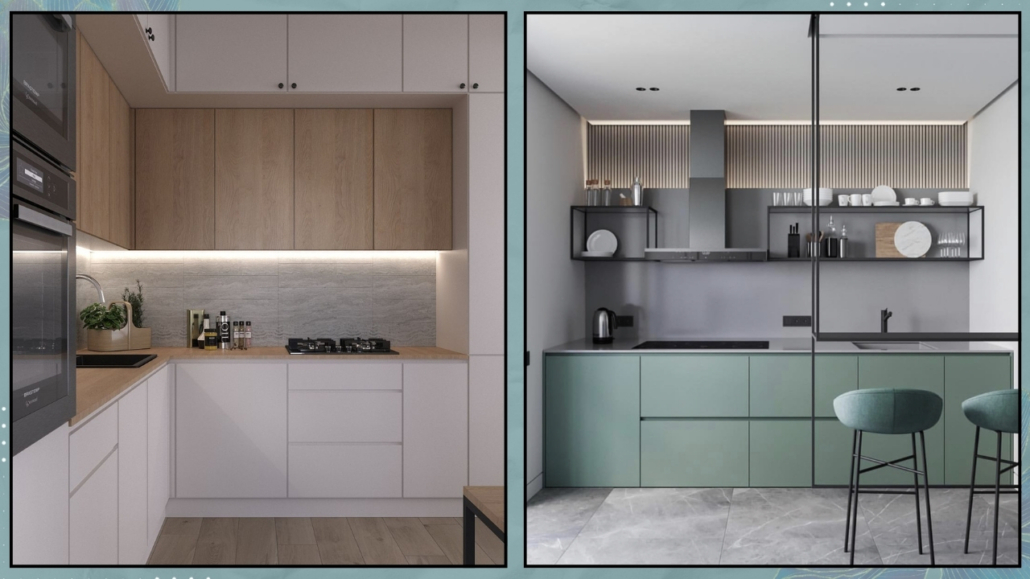
(credits: behance.net; chiefhouse.ru)
2 – LIGHTING
We say it often: lighting is always paramount, but even more so in the kitchen, where you use potentially dangerous tools like knives, good visibility is essential.
A single central ceiling light is definitely not enough.
Under-cabinet lighting is crucial to ensure everything is always well-lit.
If you have an island or peninsula, it’s ideal to include dedicated lighting for those areas, and don’t forget to add lighting above the dining table if there is one.
When it comes to lighting, selecting the right fixtures is just as important.
Choose decorative lamps that enhance your kitchen’s style!
Pay attention to proportions, too: if the light fixtures are too small, they might look out of place.
When in doubt, slightly larger fixtures are better, as they can become a focal point and add character to your kitchen.
Lastly, consider adding a stylish table lamp on the countertop: it will double as a decorative element while creating a warm, cozy atmosphere!
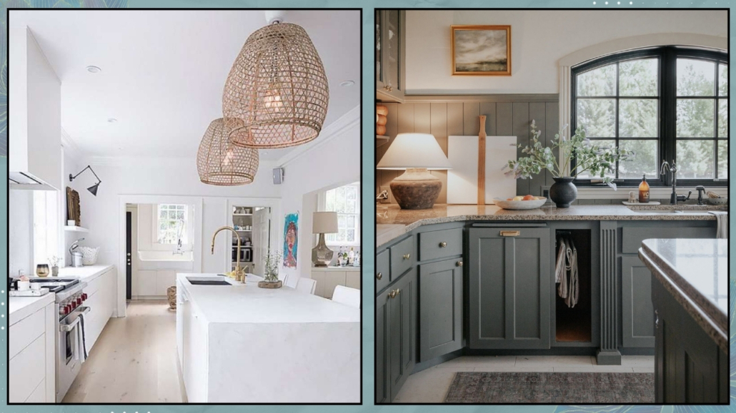
(credits: cutypaste.com; chrislovesjulia.com)
3 – ISLAND OR PENINSULA
Having a kitchen island or peninsula is a dream for many people.
However, it’s essential to get the dimensions right.
It’s not so uncommon to see oversized islands: you might even spot two in large spaces!
But while two islands are excessive, an island that’s too small doesn’t make sense either.
The minimum recommended size for an island is at least 60×120 cm (24×48 inches).
If there isn’t enough space for an island or even a peninsula, it’s better to go for mobile carts with wheels you can move as needed.
When designing an island or peninsula, pay attention to the distance from the rest of the kitchen to ensure smooth movement and allow drawers and cabinet doors to open easily.
In renovations, a common mistake is overlooking electrical outlets when designing an island not set up as a working area with a cooktop or sink.
It’s crucial to plan for outlets: you might need them for plugging in or charging a laptop, tablet, or phone.
Why not take it a step further? If the island is large enough, an outlet could be helpful for a decorative lamp.
Extra outlets are always a good idea!
(Here you can find some more tips for islands or peninsulas).
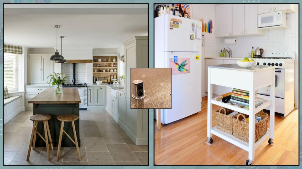
(credits: middleton-bespoke.co.uk; libertateapentrufemei.ro; apartmenttherapy.com)
4 – CLUTTERED COUNTERTOPS
Overloaded kitchen countertops are a common thing to see.
But do we really use everything we leave sitting out?
The ideal approach is to keep only the items you use regularly, like a coffee machine, a few decorative cutting boards, or a stylish olive oil dispenser.
You can also create intentional displays with things you love, such as a beautiful mug set or some cookbooks.
However, do this thoughtfully, with purpose and care!
Avoid leaving medications in plain sight.
While it’s true they might need to be taken daily, they’re not exactly appealing to look at.
It’s better to store them in a cabinet or a decorative box.
Another great idea is to extend a cabinet down to countertop level to hide appliances you don’t use daily or that aren’t as visually pleasing.
If you choose this option, install an outlet inside the cabinet.
This way, you can open the door and use the appliance without necessarily having to move it.
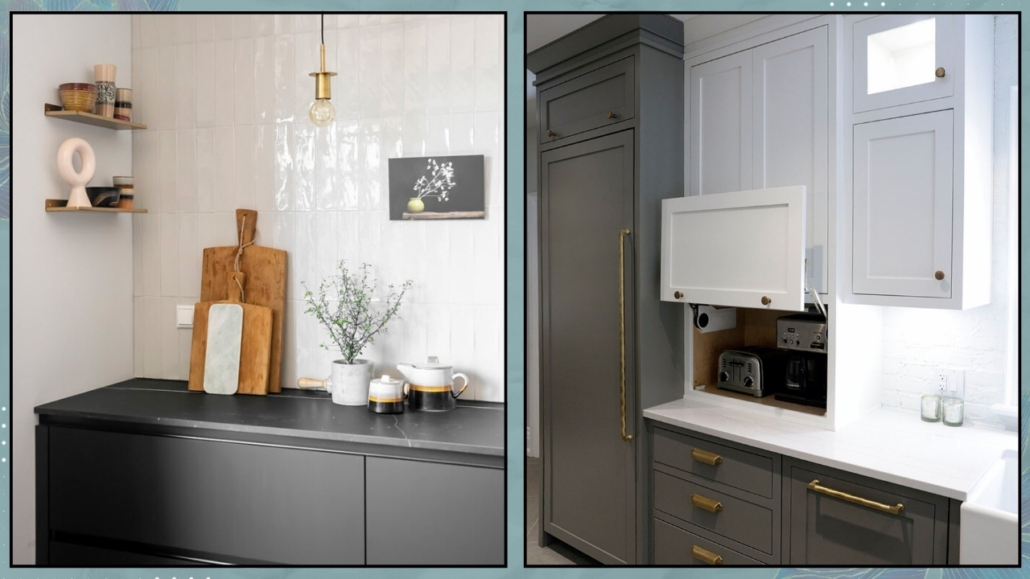
(credits: helladesignstudio.com; josephkitchens.com)
5 – SHELVES
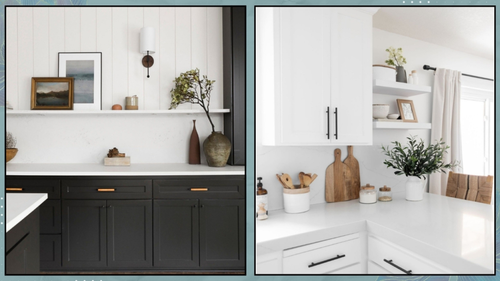
Open shelves showcasing dishes have been a popular trend for a while, but let’s admit they’re not the best choice, either visually or functionally.
In addition to collecting dust, the dishes on display will eventually accumulate grease unless you clean them almost daily.
Even if the dishes are beautiful and neatly arranged, the overall effect often creates visual clutter, which can be subconsciously unsettling.
That doesn’t mean to banish shelves completely.
On the contrary, having a few can add a sense of openness to your kitchen.
The key is to style them thoughtfully with few but pretty decorative items.
Use shelves sparingly and intentionally to avoid overwhelming the space!
(credits: urbanologydesigns.com; halfwaywholeistic.com)
6 – CABINETS AND DRAWERS
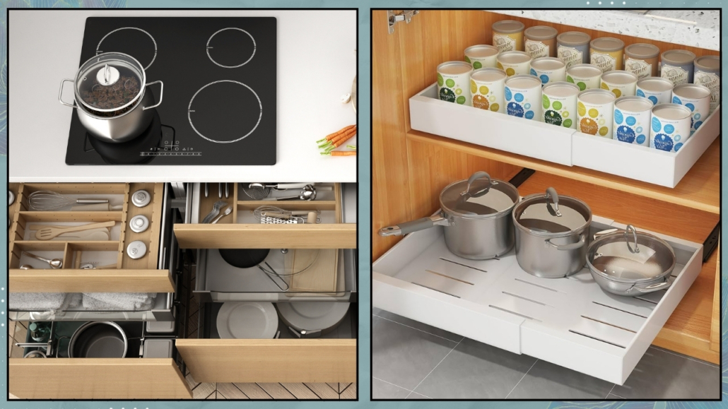
Base cabinets with doors are frequent in kitchens but are not the most functional.
Reaching for items stored in the back can be inconvenient and uncomfortable.
Deep drawers, on the other hand, are far more practical.
They allow you to see everything at a glance when opened.
It’s also essential to use organizational systems inside the drawers to prevent clutter and ensure easy access to all items.
If your kitchen primarily consists of cabinets, consider adding internal organization systems to make them more practical and functional.
When it comes to kitchen furniture, beyond the type of storage, good design is crucial, especially for corners!
Poor planning can lead to cabinet doors that don’t open fully, making it harder to access the items inside.
Proper planning ensures everything is accessible and easy to use.
(credits: Canva; amazon.it)
7 – HANDLES
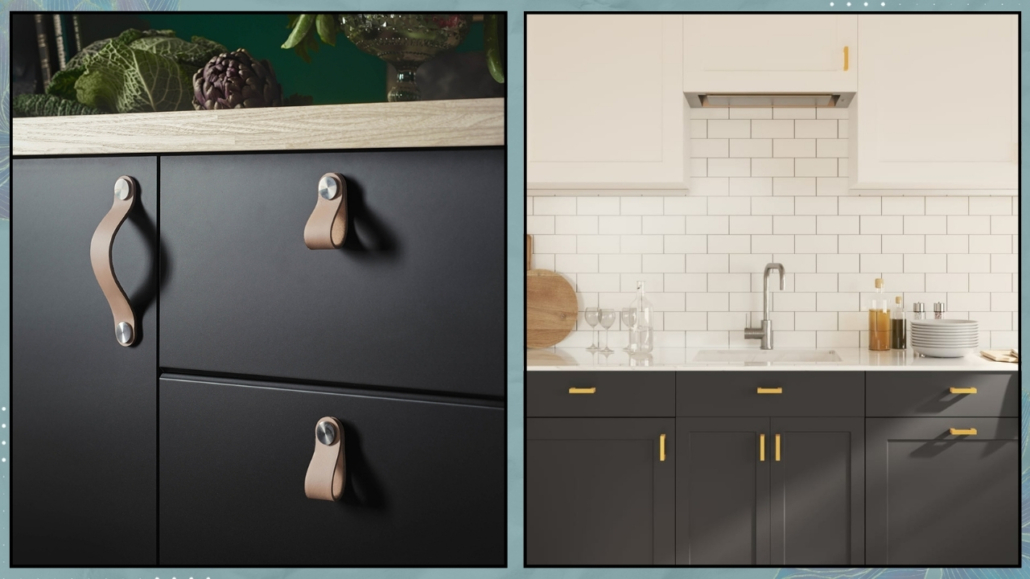
When choosing handles for your kitchen, the focus is often on aesthetics: shape, size, and color.
However, functionality, or rather, practicality, often gets overlooked!
Let me explain: some handles may look stunning, but they can be easy to snag on, becoming a nuisance or even a safety issue.
You’re constantly moving around, grabbing ingredients, preparing food, cooking, cleaning, etc., in the kitchen.
With more than one person in the space, the risk of snagging on handles increases.
If it happens frequently, it’s far from ideal.
So, choose handles that are beautiful but also practical for how you use your kitchen.
They should enhance your space, not get in your way!
(credits: Ikea; vidaxl.it)
8 – FAUCETS
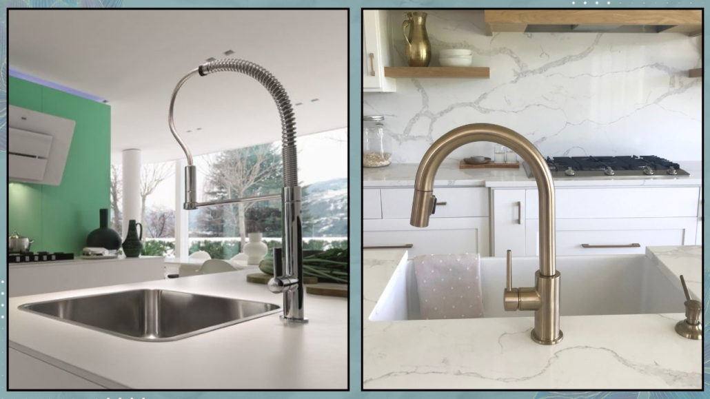
We often overlook the kitchen faucet, yet it’s a detail that can make a big difference in the overall design.
Of course, it needs to be functional, but choosing, for instance, one that matches the color of other metal accents in your kitchen, like handles or light fixtures, will add a distinctive touch to the space.
Don’t underestimate the importance of this element; these days, there’s an endless variety of options to suit any budget!
(credits: Franke; Canva)
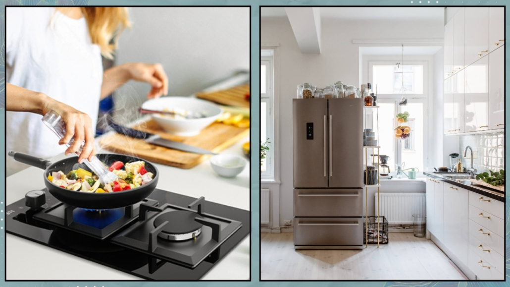
9 – APPLIANCES
People often focus on power, functionality, and aesthetics when talking about appliances.
While these are all important, we often overlook the dimensions!
Ideally, kitchen planning should start with the major appliances and choosing the right ones to meet your needs.
Here’s an example: if you live alone or as a couple, a cooktop with four burners, or even two, maybe enough!
But a cooktop with five or six burners is better for a family of four or five or if you frequently host guests.
The same logic applies to the dishwasher.
Instead of the standard 60 cm (24-inch) model, a 45 cm (18-inch) one could save valuable space.
And for the fridge, should you go for an American-style or a standard one?
Even with a standard 60 cm fridge, how large does the freezer need to be?
If you prioritize fresh food, a smaller freezer may be enough.
Also, consider the placement of your appliances.
The sink, cooktop, and fridge should be easily accessible, forming the famous “work triangle.”
Studies highlight the importance of this layout for a functional kitchen.
Lastly, think about whether your fridge should be built-in or freestanding.
There’s no right or wrong answer: it’s all about personal taste and aesthetics!
(credits: amazon.it; myscandinavianhome.com)
10 – MATERIALS AND COLORS
The kitchen is an investment that will stay in your home for years, so it’s essential to choose wisely!
First and foremost, focus on materials that are high quality, durable, and easy to clean.
There’s nothing worse than struggling to keep your kitchen clean or seeing it get damaged after only a short time.
That applies to the cabinetry but also to the countertop, backsplash, and even the flooring.
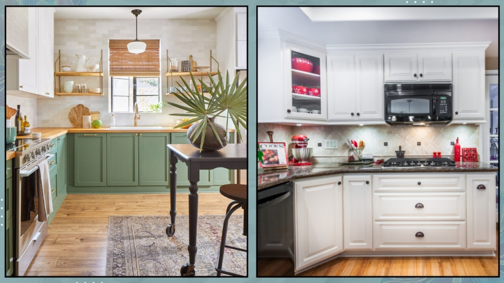
Two other aspects to consider when choosing materials are textures/patterns and colors: the overall combination must be harmonious, not a chaotic patchwork.
One should select flooring, cabinetry, countertops, and backsplashes in a way they communicate with each other.
A kitchen full of bright colors and various patterns might seem appealing initially, but the risk of getting quickly tired of it is high.
Given the investment involved, it’s simply not worth it.
If you love color, there’s no need to give it up!
You can incorporate it in the base cabinet doors; if you want, you can eventually repaint them later.
Or, use color in your decorations or even in small appliances like your coffee machine!
(credits: mrcabinetcare.com; Hector Sanchez)
11 – TRASH BINS ON DISPLAY
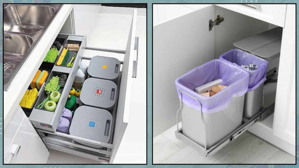
Having trash bins on display in the kitchen is far from ideal, especially with the increasing number of bins required for recycling, now five!
Thankfully, many solutions are available to integrate trash bins into your cabinetry, especially under the sink.
If it is impossible to fit all five bins, consider placing the less frequently used ones in another location, like a cabinet on the balcony.
Keeping the bins hidden makes for a cleaner, more organized kitchen.
(credits: peregoarredamenti.it; canva)
I hope you enjoyed this article about common kitchen design mistakes and found it helpful.
If so, don’t hesitate to share it with someone you think might be interested; I would be honored, and it will help me get known.
If you feel that your home, or any part of it, doesn’t reflect you enough, don’t wait any longer: fall in love with your place again and book your consultancy!
This post is also available in: Italian





Leave a Reply
Want to join the discussion?Feel free to contribute!