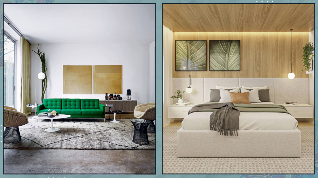
As the year comes to an end, the leading color brands reveal their predictions for the top trends for the coming year, so let’s dive in and explore each “2025 Color of the Year” proposal!

(Here you can find last year’s proposal)

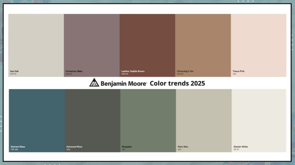
– BENJAMIN MOORE – CINNAMON SLATE

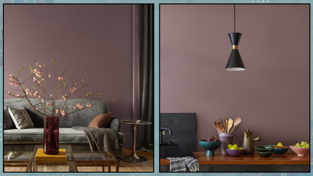
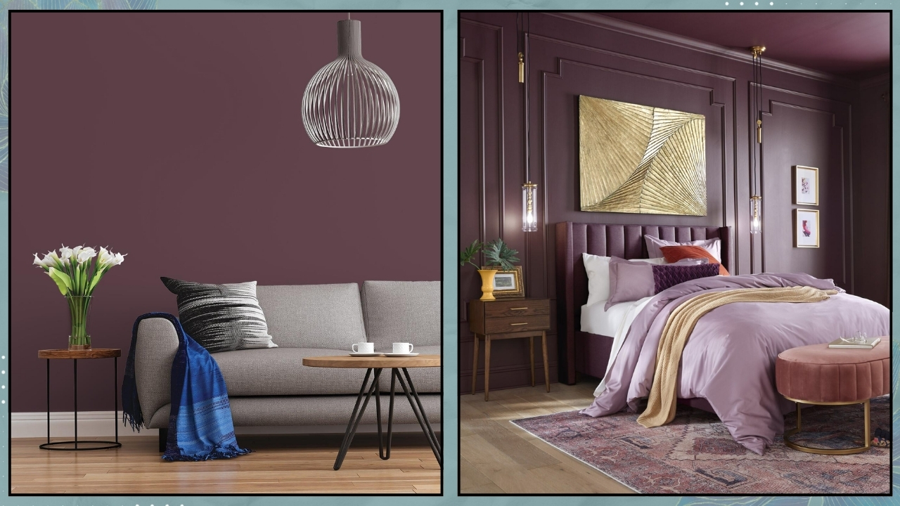
Once again, Benjamin Moore’s 2025 color of the year choice is an intriguing and delicate mix of colors: precisely between plum and brown.

It’s a rich, warm, inviting color that adds depth to any room!

In a press release, Andrea Magno, director of marketing and design for this brand said, “As the use of more saturated color in design has increased in recent years, we are seeing a growing interest in more nuanced colors, whose undertones add intricacy and dimension,” she said. “Cinnamon Slate is an inviting hue that offers enduring style and modern sensibility. Its depth and richness bring an air of approachability and sense of comfort throughout the home, making it a new favorite for years to come.”

Indeed, it’s a color that brings a sense of familiarity and is highly versatile, adapting to any style.

As always, Benjamin Moore also presents a color palette in which Cinnamon Slate naturally plays a central role, ranging from neutrals to more vibrant tones.

That truly allows for great personalization!

– SHERWIN WILLIAMS – CAPSULE

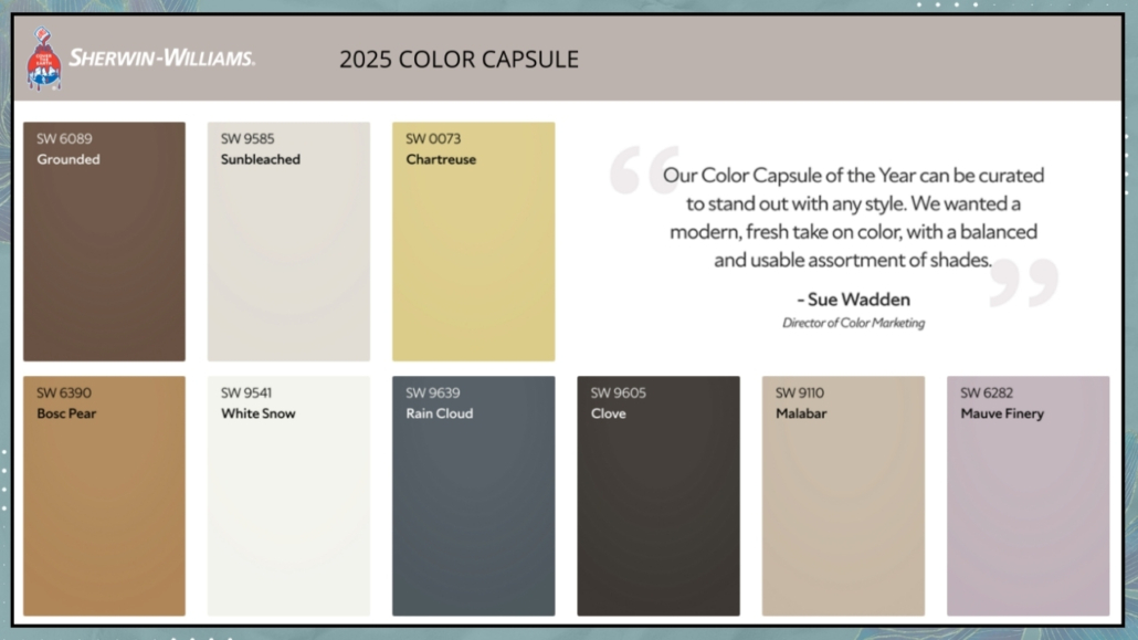
This year, Sherwin Williams is doing something different by not selecting a single color of the year but offering a stunning color palette: CAPSULE!

That expertly curated palette has the ability to create beauty and elevate any style!

It features rich, deep colors that alternate neutrals with a vibrant yellow-green and warm hues like brown.

The blue-gray and mauve add elegance and sophistication to the palette!

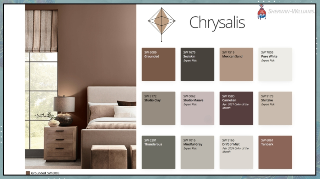
Sherwin Williams also introduces four additional palettes, known as Colormix Forecast, which explore the influences and emerging movements that the brand believes will shape tomorrow’s design.

– Chrysalis

“Capture the essence of peaceful, intentional living and transformative future thinking in a sanctuary of colors inspired by wood tones, sifting sands, and freshly turned earth.”

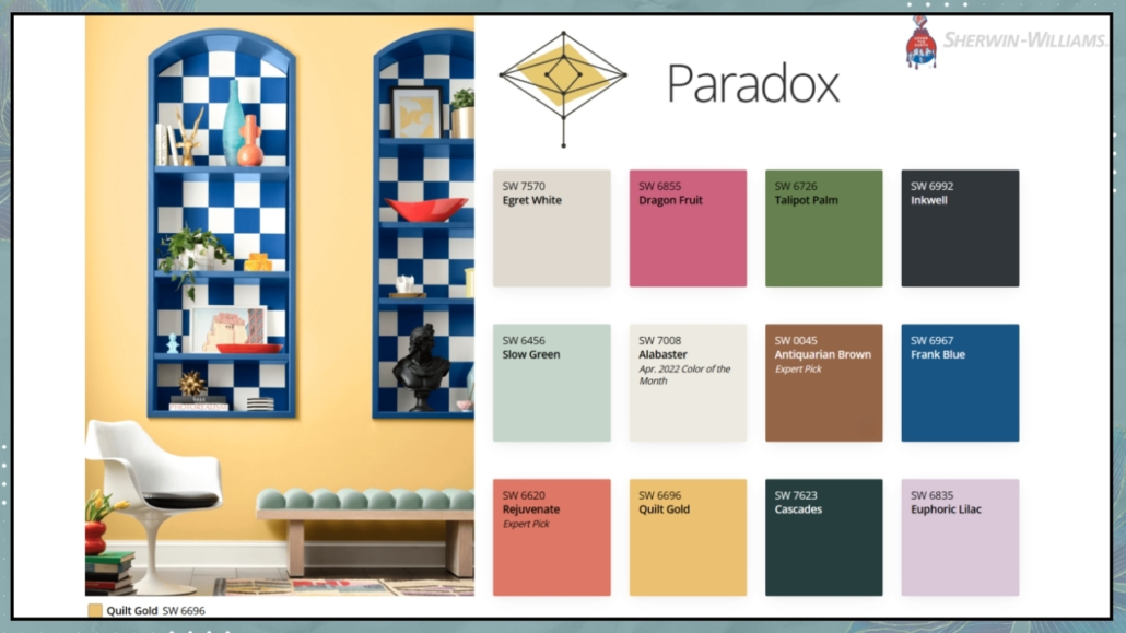
– Paradox

“Delve into the mystical blues, meditative midtones, and compelling chromas that connect us to the land, to creating things by hand, and to a richly personal epic narrative.”

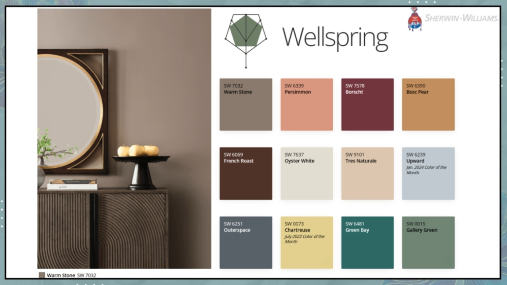
– Wellspring

“Embrace a mindset of openness and belonging with a collection of warm neutrals, sheltering deeps, and warm-hearted colors that nurture and nourish.”

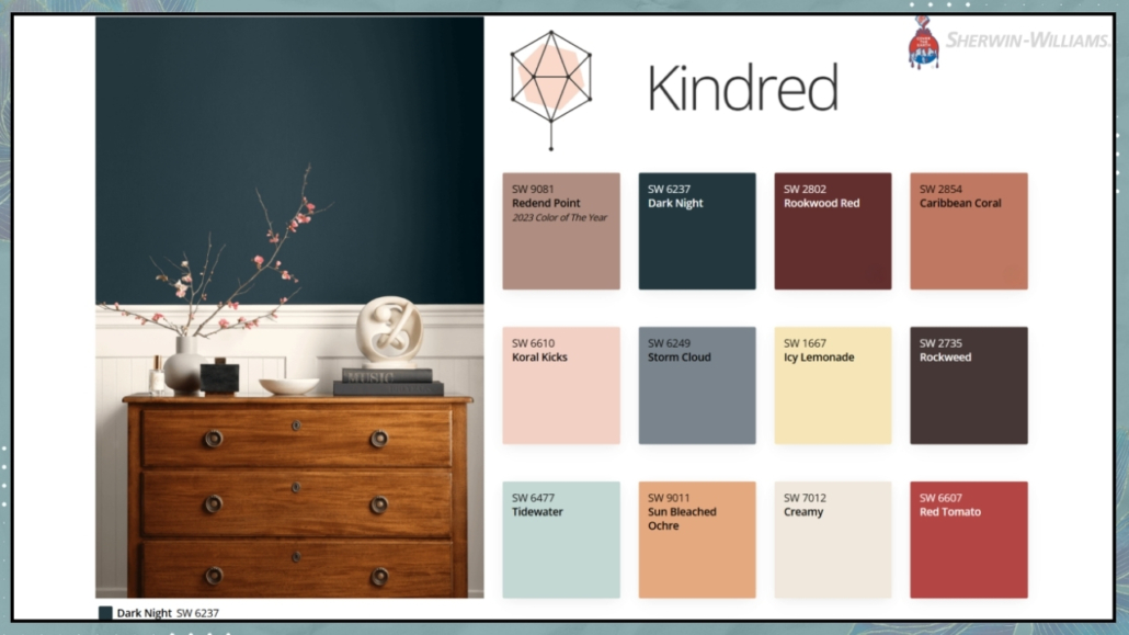
– Kindered

“Conquer the conventional with a palette of dopamine-drenched colors that defy expectations: electricbrights, grounding neutrals, and candy-coated accents.”

– PPG – PURPLE BASIL

This year, PPG, as his 2025 color of the year, introduces a shade of purple that is fresh, provocative, and relaxing all at once!

In some European markets, it’s also known as Amethyst Shadow or Acai Berry.

Purple Basil is an elegant and sophisticated color suited to any style.

Its well-balanced warm and cool undertones make it inviting and mysterious, never dull.

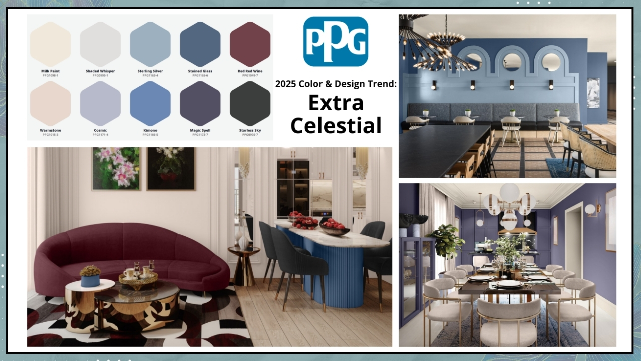
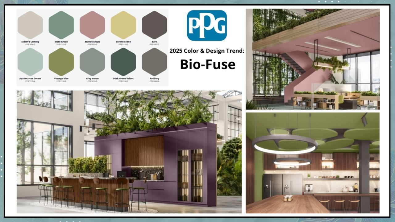
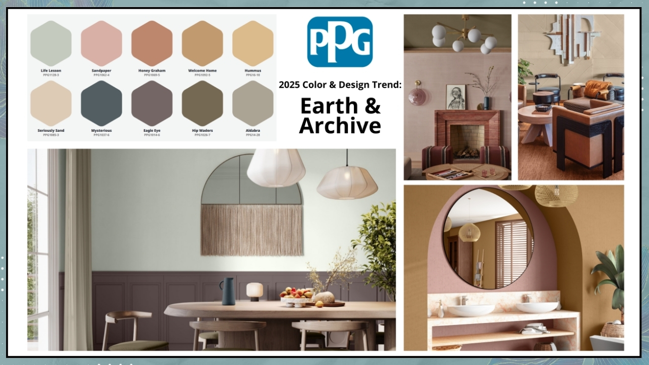
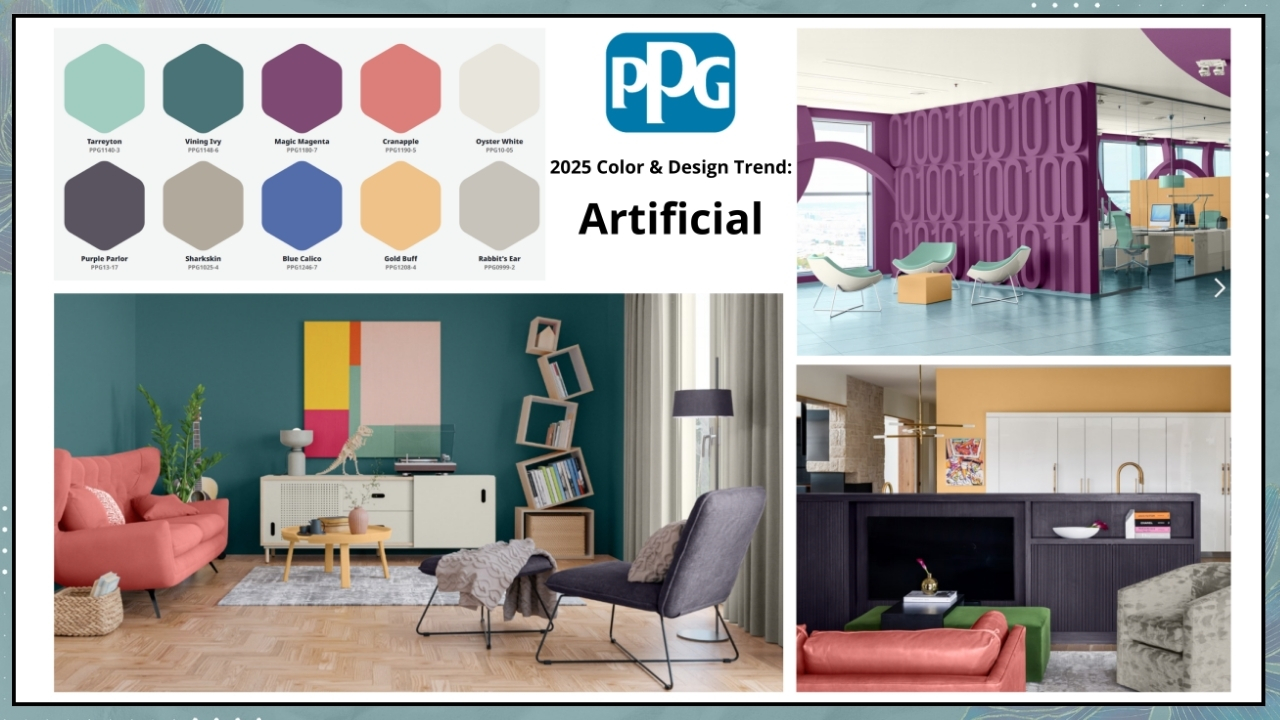
The blue and red tones within the color lend a certain kinetic energy, which forms the foundation of PPG’s four “Kinetic” palettes that pair beautifully with Purple Basil: Extra Celestial, Bio-Fuse, Artificial, and Earth & Archive.

“The theme of Kinetic color reflects the need for self-sufficiency in a fast-paced world.
It also highlights the interaction between nature and science driving innovation and the influence of new tools like artificial intelligence fostering boundless creativity,” said Vanessa Peterson, Global Color Styling Lead at PPG.

– Extra celestial

“Detached from cultural expectation or societal frameworks, consumers find greater wellness and renewable energy in living life on their own terms. Clear contrasts between dark and light hues, as well as a variety of blue and purple tones, reference the harmonies within our galactic sky.”

– Bio-fuse

“Consumers find comfort in ancient practices and future sciences. A growing desire for protection and safety drives purchasing and aesthetic directions. A hybrid of nature-based and laboratory colors, this palette is both calming and unusual.”

– Artificial

“Consumers look to play with designs and products that push boundaries, get noticed, and stand out while seeking sustainable solutions. The mix of bold, playful hues and neutrals hints at the balance between real and unreal worlds.”

– Earth & Archive

“Consumers return to the mindset that life is meant to be lived, enjoyed, appreciated, and valued. There is a great respect for quality and beauty. This warm and inviting palette is full of sunkissed tints and scorched earth hues.”

– BEHR – RUMORS

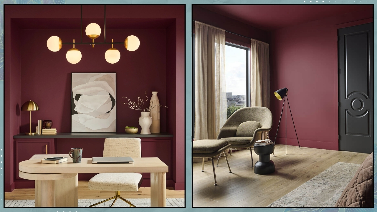
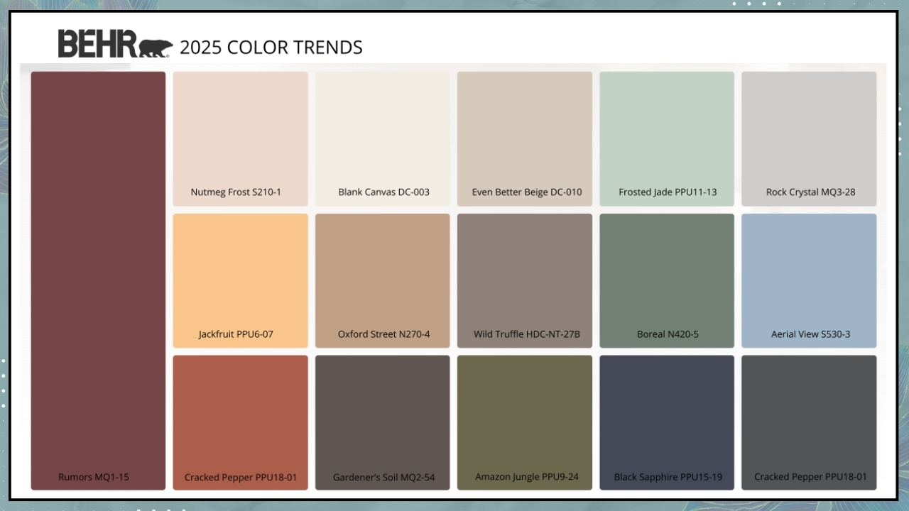
This year, Behr is making a bold choice with Rumors, a deep, dynamic crimson!

“It’s that perfect color that brings a balance of warmth and vitality to a space,” says Erika Woelfel, Vice President of Color and Creative Services at Behr.

The company turned to consumer opinions through an online survey to find inspiration for its color choice.

Most participants agreed that red on one’s mood has a positive impact, making them feel stronger and more confident!

When it came to Rumors specifically, respondents found it rich and enduring, glamorous and “luxurious.”

It’s a highly versatile color that complements any style, and you can also play with the finish, which can be shiny or matte!

Like every year, Behr also offers a curated color palette to pair with Rumors. Erika Woelfel recommends Cracked Pepper and Blank Canvas, the Colors of the Year for 2024 and 2023.

– SIKKENS – TRUE JOY

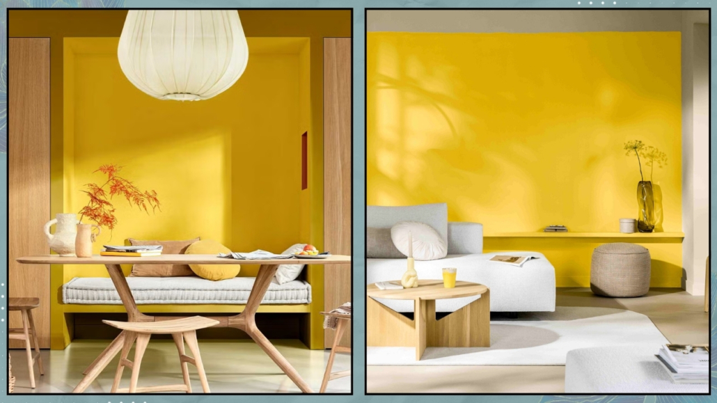
This year, Sikkens, as his 2025 color of the year introduces a decidedly positive and vibrant color that creates energizing spaces filled with optimism and pride.

It is a bold color, so it is better to use it in moderation!

Ideal for kids’ rooms, a study, or a kitchen where one can apply it more playfully, it also works well in social spaces—though sparingly, as it can become a bit “loud.”

So, consider it for an accent wall paired with various complementary elements!

Once again, Sikkens presents three color palettes to pair with True Joy.

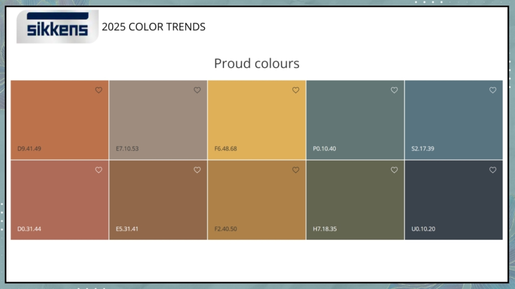
– Proud Colors

“Inspired by local cultures of the world, this palette aims to celebrate the heritage that makes each individual unique.”

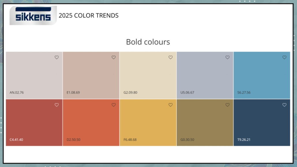
– Bold Colors

Vivid and contrasting colors for a dynamic palette.

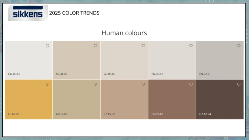
– Human Colors

Colors inspired by nature and the earth for a relaxing palette, with yellow adding a touch of brightness!

The proposals are rich and interesting! What’s your favorite?
Let me know in the comments!

I hope you enjoyed this article on 2025 colors of the year and found it helpful.

If so, don’t hesitate to share it with someone you think might be interested; I would be honored, and it will help me get known.

If you feel that your home, or any part of it, doesn’t reflect you enough, don’t wait any longer: fall in love with your place again and book your consultancy!

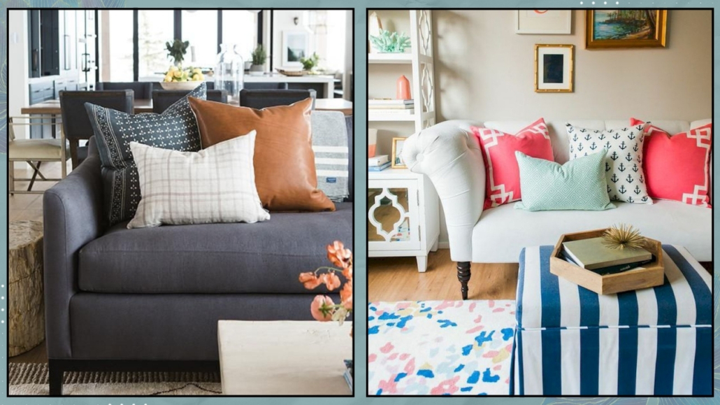
I’ll never get tired of saying it: in a world that’s increasingly fast-paced, busy, and, if I may say, often superficial, creating spaces of well-being at home is absolutely essential!

Shapes, colors, materials, lighting, furniture placement, and a connection to nature are the key elements for spaces that promote relaxation and well-being!

To achieve this, you must start with mindful design that truly considers who we are and what we want to experience at home.

– SHAPES

Furniture and decor with organic, soft shapes—what we might even call “curvy”—make spaces feel less formal and especially less rigid!

That somehow helps promote relaxation.

Of course, not everything needs to be curved, but it’s a good idea to “soften” the space with such elements.

From a feng shui perspective, it’s also important to limit, if not eliminate, sharp corners.

As mentioned before, not everything has to be curvy, especially if it’s not to your taste, but even furniture with rounded edges will make a big difference!

(credits: westwing.com; @vymir_design)

– COLORS

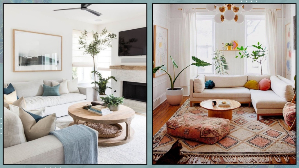
Neutral, natural colors like beige, blues, greens, and earthy tones are calming and relaxing. Using this type of palette at home helps promote well-being.

That doesn’t mean giving up on more vibrant or bold colors, but perhaps using them in smaller doses—think of the “60-30-10” rule, where they can be the famous 10%.

That will still help bring a bit of rhythm and energy to the space!

Alternatively, if you want to use them in larger doses, you could do so in more dynamic and active spaces, like the living room or the office.

That approach works well from a feng shui perspective because it helps balance Yin (passive, feminine, and calm) and Yang (active, masculine, and dynamic) energies, a fundamental principle in this discipline!

I suggest using the same colors throughout the house, obviously changing their saturation, to maintain a common thread between the rooms.

(credits: cocolapinedesign.com; Iba design Associates)

– MATERIALS

Using natural materials as much as possible is vital to creating spaces of well-being and health at home.

Wood and wicker, wool, velvet, cotton, and linen, not to mention stone, terracotta, and marble, are all natural and, therefore, healthy elements that promote well-being!

However, it’s also important to be mindful, whenever possible, of their sourcing and production processes.

That is something we often overlook and also applies to the paints we use on our walls: some may contain harmful substances!

We discussed this with Carla Spessato, a green lifestyle mentor, here!

The right choice of materials will create healthy spaces that contribute to our overall well-being while also helping to protect the environment.

(credits: Sebastian Erras; artdecorationcrafting.gr)

– LIGHT/ILLUMINATION

It is scientifically proven that light plays a fundamental role in our well-being.

Studies show that the incidence of depression is significantly higher in Nordic countries compared to other places.

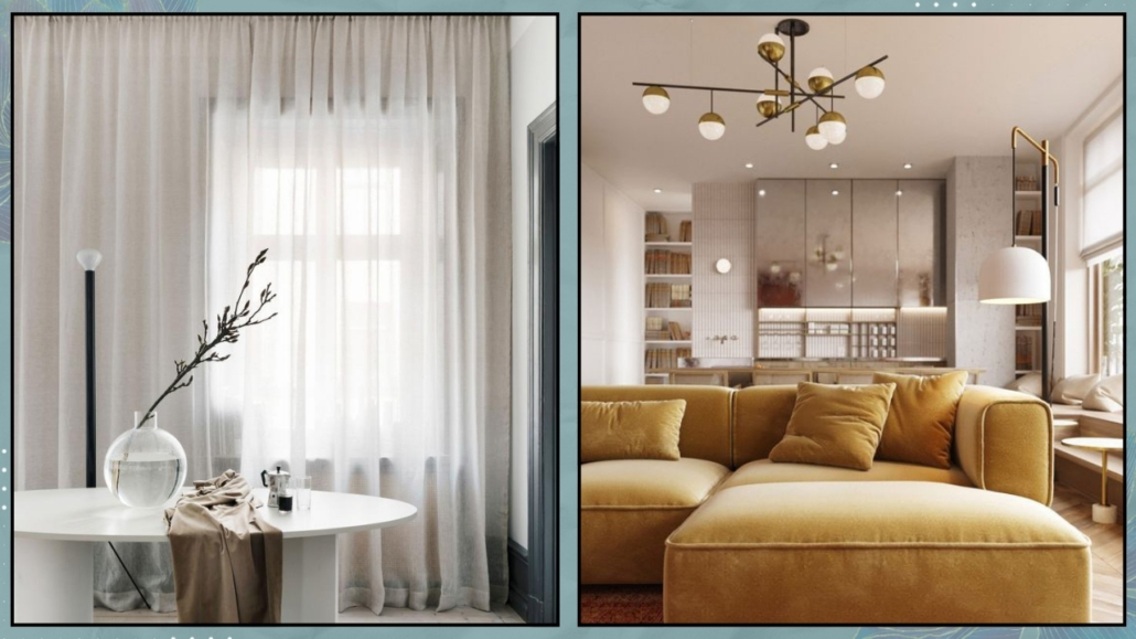
Therefore, maximizing natural light by keeping windows clean and using sheer curtains is paramount.

When the spaces are less bright, it becomes essential to use strategies like reflective colors, mirrors, and metals to expand light and increase brightness for less illuminated spaces.

Besides, it is also crucial to properly design artificial lighting using multiple light sources for visual comfort that promotes well-being!

Where possible, using dimmable lights would be ideal to adjust the atmosphere according to the moment’s needs.

(credits: Katke Zavese; Studio design HDm2)

– NATURE

Feeling close to nature is another fundamental element in creating well-being spaces at home.

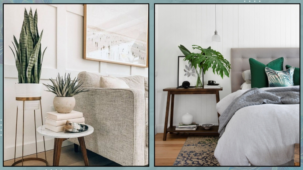
Having plants in various rooms is therefore essential!

Honestly, there’s no room – except perhaps for the storage room – that cannot have a plant, not even the bedroom!

Plants also have purifying qualities, which are very useful in our homes given, unfortunately, the pollution in our cities.

From a psychological perspective, caring for plants is also essential for relaxation (We discuss this in our guidebook with Dr. Francesca Basile and myself).

If you find it difficult, you can always use some succulents or place branches or leaves in vases, for instance, the Monstera leaf, which lasts a long time.

Finally, even if they lack purifying properties, you can also use artificial plants, as long as they are high quality and look realistic.

The mind won’t see the difference, so you’ll still benefit from the calming and relaxing properties!

(credits: Brianne Penney; westwing.it)

– FURNITURE PLACEMENT

For well-being spaces, the various rooms mustn’t be too cluttered with furniture and objects, as this can create an unconscious feeling of suffocation.

That doesn’t mean minimalism at all costs, especially if that’s not your style, but as much as choosing things that are functional and meaningful to you!

Additionally, everything must be positioned so that it’s accessible.

Passages and pathways should be free from obstructions and “fluid.”

That is fundamental also in feng shui because it allows fair energy to flow freely.

(credits: pure salt interiors; @reserve_home)

I hope you enjoyed this article and found it helpful.

If so, don’t hesitate to share it with someone you think might be interested; I would be honored, and it will help me get known.

If you feel that your home, or any part of it, doesn’t reflect you enough, don’t wait any longer: fall in love with your place again and book your consultancy!
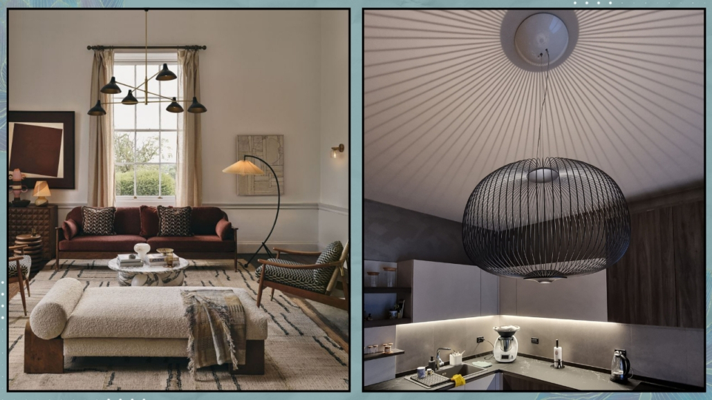
Personalizing your environment is essential because it makes it unique and ensures that the spaces are sincerely welcoming and familiar, making your home an authentic support for everyday life!

A home is not just a place to live but a reflection of our personality, memories, and experiences!

Today, I want to emphasize the importance of personalization and provide tips on how to create spaces that speak about you and tell your story, highlighting your unique personality!

Why is it important to personalize your home?

– Expresses Your Unique Personality

Personalization, clearly, allows you to express yourself.

Your chosen objects and details reflect your tastes, passions, and unique style.

A personalized home is an extension of yourself!

– Creates Emotional Connections

Personalized spaces with objects that have peculiar and significant meanings create emotional connections.

These objects evoke memories, stories, and important moments of your life, creating a bond with the spaces that will truly feel like yours!

– Makes Your Home Unique

In an era where people often follow design trends, personalizing your home makes it authentically unique, just like you!

Personal and distinctive elements set your home apart from any other!

– Increases Comfort and Well-Being

I often say this: a home that genuinely represents you makes you feel at ease and happy!

A home that exudes your personality enhances your comfort and well-being, authentically supporting you in your daily life!

Now, let’s look at various ways to personalize your spaces.

– Photos and Memories

That is one of the simplest and most immediate ways to personalize your spaces!

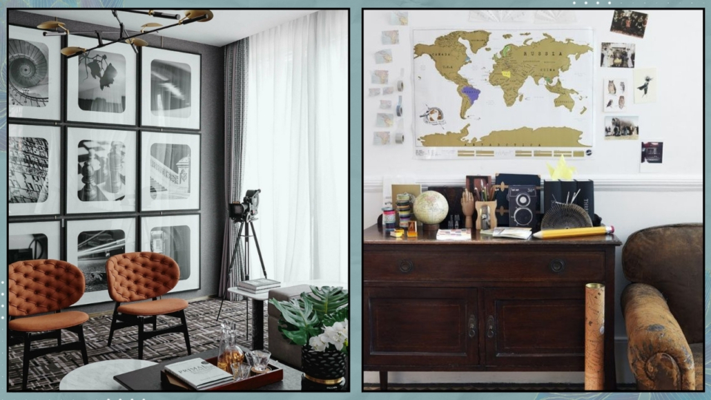
Create a photo gallery wall with images of family, friends, important places, and moments.

You can use frames of different sizes to add some variation.

You can also choose frames of different styles and colors to create something original; in this case, to avoid it becoming too “noisy,” I recommend using images with similar colors!

If you are a travel lover, you can also dedicate a specific corner where, in addition to photos, perhaps collected in an album, you can display maps and items gathered from your various trips!

(credits: Boxerjam; Petra Bindel)

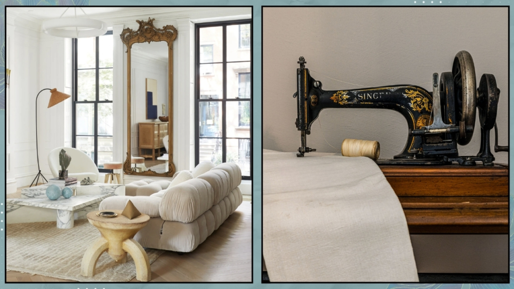
– Family Heirlooms

One way to make your home unique is to include furniture or items with a family history.

These kinds of objects add depth and history to your spaces.

Don’t worry if they don’t match your home’s style; bring them in and highlight them if you love them.

They will be the “unique piece,” perhaps the room’s focal point! The same goes for heirlooms such as clocks or kitchen utensils, even if they are a bit worn, that have been passed down from generation to generation!

(credits: Elizabeth Roberts Architecture; Aja della Mirusina)

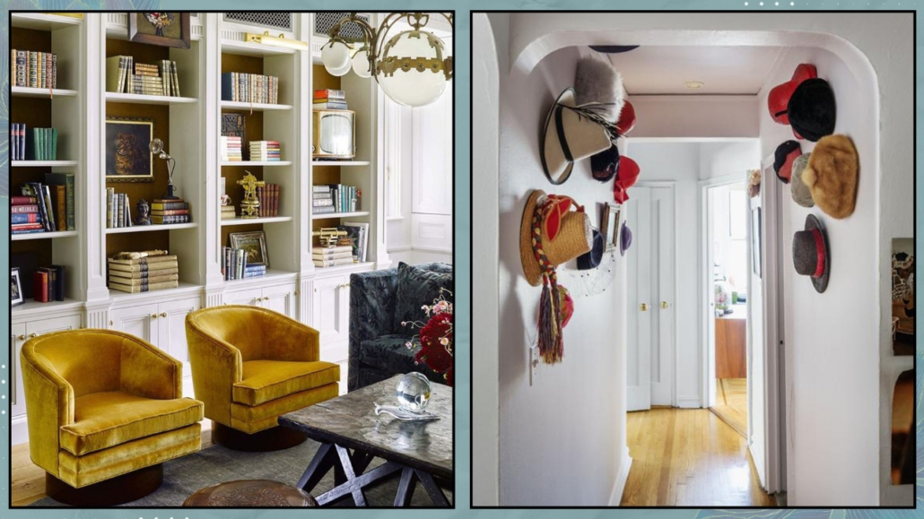
– Books and Collections

Display your favorite books on open shelves or bookcases.

You can organize them by color, size, or genre, creating a functional and aesthetic library!

You can also create areas with small arrangements of objects to highlight your books (I can discuss how to decorate bookshelves if you’re interested).

If you collect items, whatever they may be, show them off proudly and find a spot in your home to display them!

Collections tell a lot about who you are and your passions!

(credits: Elle.com; Living Corriere – Dean Kaufman)

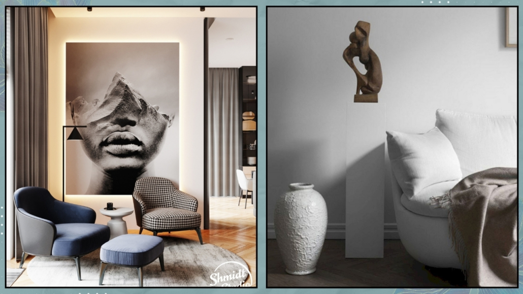
– Art and Decorations

If you love art, having some pieces like paintings, sculptures, or prints is a great way to personalize your home.

Choose pieces that inspire you and make you feel good!

If you like it, add some wall decorations as well, such as unique wallpaper, a tapestry, decorative mirrors, or even a mural – something that reflects your tastes and personality!

(credits: behance; futuristarchitecture.com)

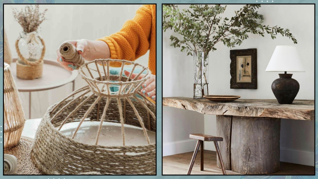
– DIY Items

If you have creative hobbies like painting, ceramics, or embroidery, you can use your creations as decorations!

There’s nothing more unique than this!

These items will add beauty while also telling a part of your story.

You might consider commissioning custom-made furniture or objects if you are not very handy.

A handmade table or a personalized painting can make a difference and become a standout piece in your home!

(credits: Shutterstock; @thomas.melhorn)

– Personalize Functional Spaces Too

The kitchen and bathroom are often treated as separate environments focused solely on functionality.

While functionality is crucial and should be the priority, personalization is also essential.

In the kitchen, for example, you can use paintings and decorations just like in the rest of the house.

You can create beautiful compositions on shelves if you have them or on the countertop (of course, without cluttering it entirely!).

For example, you can place a set of unique cups next to the coffee machine!

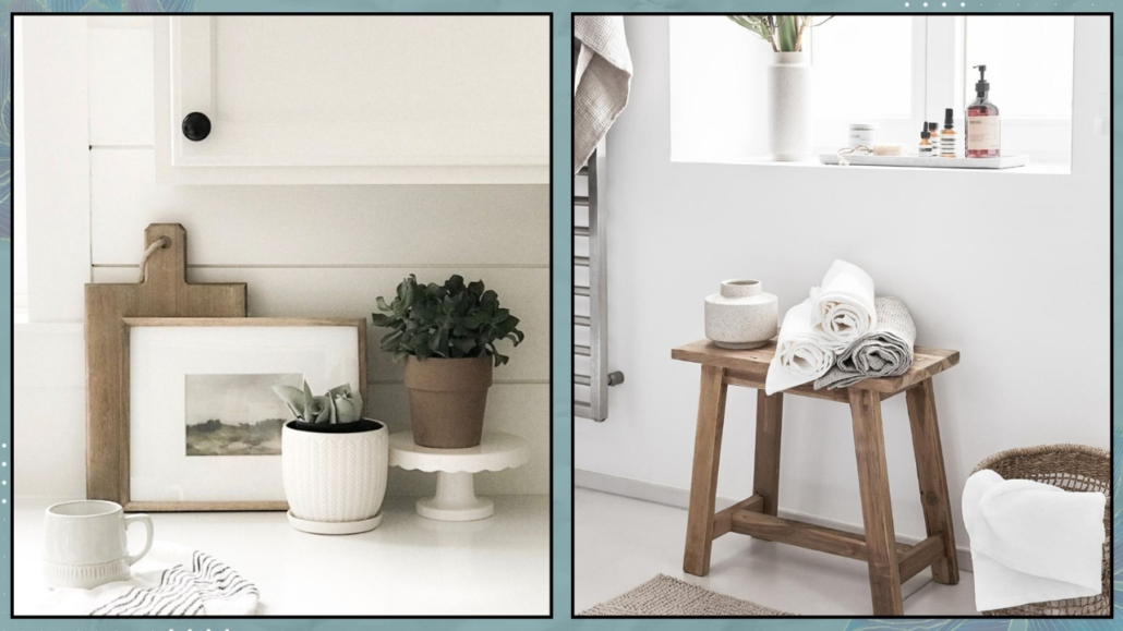
Also, use quality towels, maybe colorful, to give that extra touch.

In the bathroom, you can also use paintings if you like, as you do in other rooms!

The essential goal is to transform it into a small oasis using soft and coordinated towels and maybe a few scented candles to create some atmosphere!

For an extra touch, you might also think about using artisan soaps!

(credits: woodsandivory.com; westwingnow.it)

– Natural Elements

Plants bring color and a bit of life into the home.

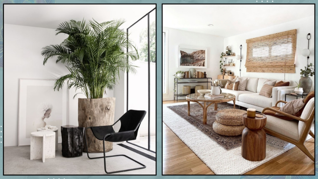
Choose plants that you like and that fit your lifestyle; you can even choose some that are particularly large and ornamental!

Don’t forget to use natural materials like wood, wicker, stone, and natural fabrics to create relaxing and cozy environments (as well as healthy ones!).

(credits: amdesigns.com; @indiebohonest)

Personalizing your spaces is truly important to create a home that isn’t just beautiful to look at but, more importantly, emotionally meaningful!

Every object and detail should tell a part of your story so that your home becomes a unique and special place for you.

Don’t be afraid to unleash your creativity and showcase who you are with purpose and awareness so that your home becomes the perfect reflection of yourself.

If you’re hesitant about how to proceed and need a hand, don’t hesitate to book your consultancy!

I hope this article has been helpful and enjoyable for you. If so, let me know in the comments!

Feel free to share it with anyone you think might be interested, I would be honored, and it will help me gain more exposure.

Today, I’m resuming the “design elements” series to talk about 10 beds you should know about!

Let’s take a look at them together!

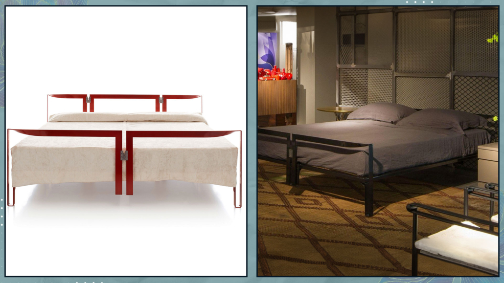
– VANESSA BED

Designed by Tobia Scarpa and his wife Afra Bianchin when they were still students at IUAV in Venice in 1959 for Gavina and later Cassina.

Vanessa features a colored metal frame with stainless steel connecting elements, playing with the curves of the iron sheet, giving the structure dynamism!

It is a visually light bed that can be matched with many styles.

(Credits: Cassina)

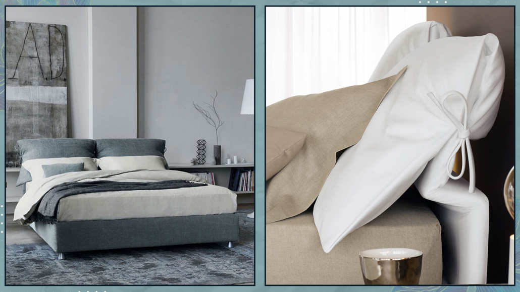
– NATHALIE BED

Designed by Vico Magistretti in 1978 for Flou.

Nathalie can be considered the progenitor of upholstered beds with a removable fabric headboard and unmistakable side bows.

The headboard can be adjustable and also exists in a storage version.

It is an elegant and comfortable bed that adapts to any style!

Nathalie received the Compasso d’Oro for lifetime achievement in 2020, a first in history.

Additionally, it is protected by European Design Law, which recognizes it as a work of art!

(Credits: Flou)

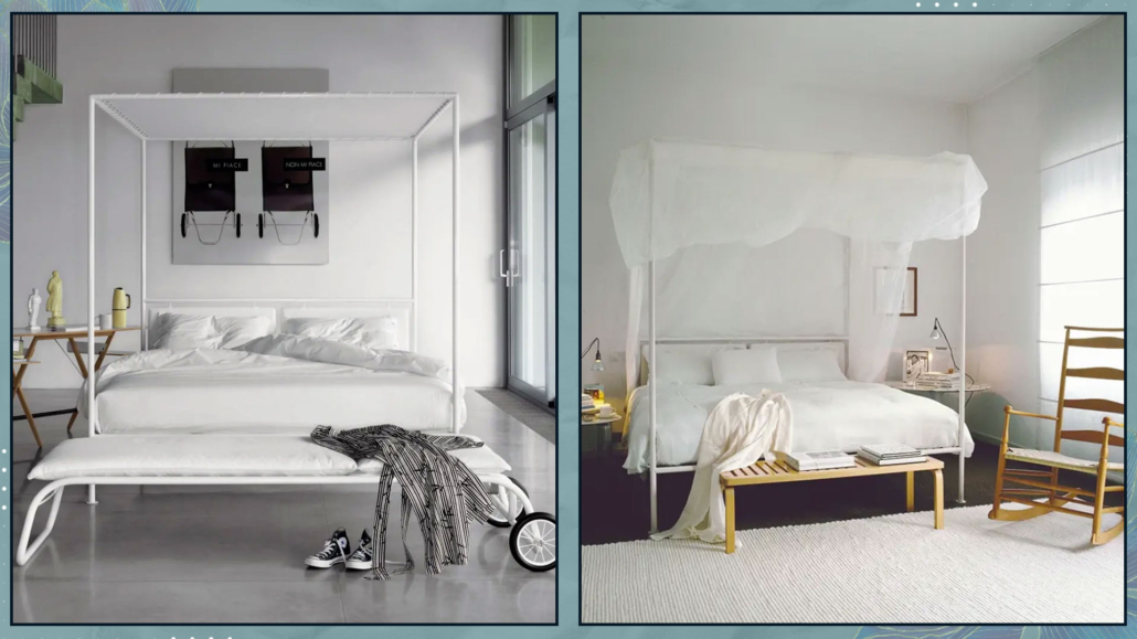
– ASSEMAN BED

Designed by Patrizia Cagliani in 1984 for De Padova.

It is a canopy bed with a simple, slim, and minimal structure made of powder-coated steel tubing in matte white or black, with adjustable feet.

The headboard is composed of upholstered plywood panels covered in polyester velvet.

You can choose between a white cotton canopy tied at the sides or a tulle mosquito net.

(Credits: De Padova)

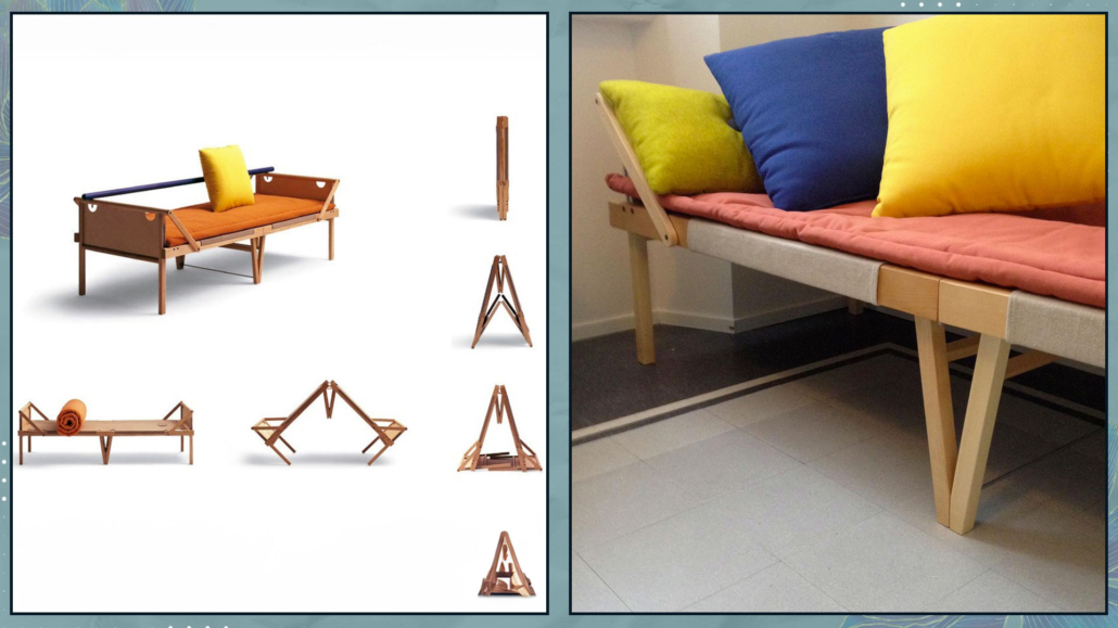
– OSPITE BED

Designed by Vico Magistretti in 1996 for Campeggi, this is a foldable sofa bed, perfect for those who love having guests but might not have much space!

Its design is refined, simple, discreet, yet robust and functional.

The frame is made of waxed maple wood with a blue bar, and the mattress is made of polyester padding in natural or orange cotton. In the latter case, it plays with the complementarity of orange and blue!

(Credits: Campeggi design)

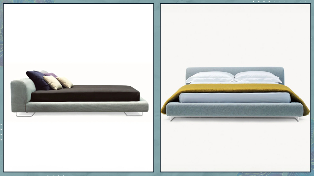
– LOWLAND BED

Designed by Patricia Urquiola, the Italian-Spanish designer, in 2000 for Moroso.

It is a low bed with curved and organic lines featuring an upholstered, removable headboard and bed frame.

Essential, comfortable, and practical, it has a flexible headboard that can also be used as a support space.

It can only accommodate mattresses with standard European measurements.

(Credits: Moroso)

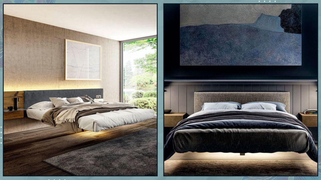
– FLUTTUA BED

Designed by Daniele Lago for his namesake company in 2004.

Thanks to its hidden structure, this bed appears to literally float in the air, giving the room a sense of lightness and spaciousness.

The platform rests on a height-adjustable central pivot and is fixed to the wall, ensuring solidity and sturdiness (it can support up to 140 kg).

These beds are customizable, allowing you to choose the headboard from wood, fabric, leather, or glass, along with an optional lighting kit for the platform that enhances the feeling of lightness and increases the bed’s spectacular appearance!

(Credits: Lago)

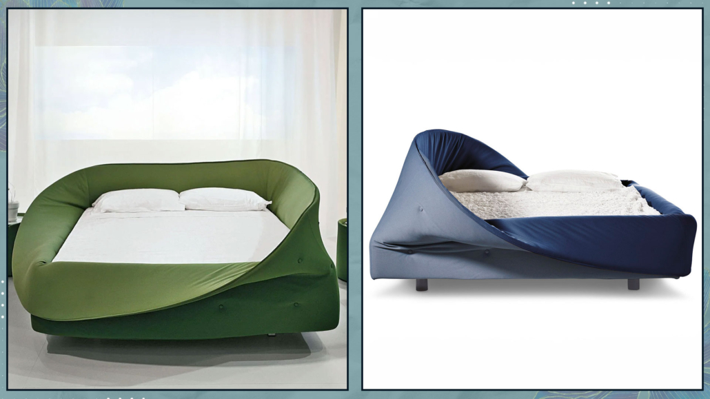
– COLLETTO BED

Designed by Slovenian designer Nusa Jelenec in 2009 for Lago.

This bed is a true nook, as you sleep enclosed by a soft barrier of plush foam surrounding the mattress.

This barrier, like the collar of a turtleneck, can be rolled up or down, fully or partially, allowing you to have a different bed each time you want!

(Credits: Lago)

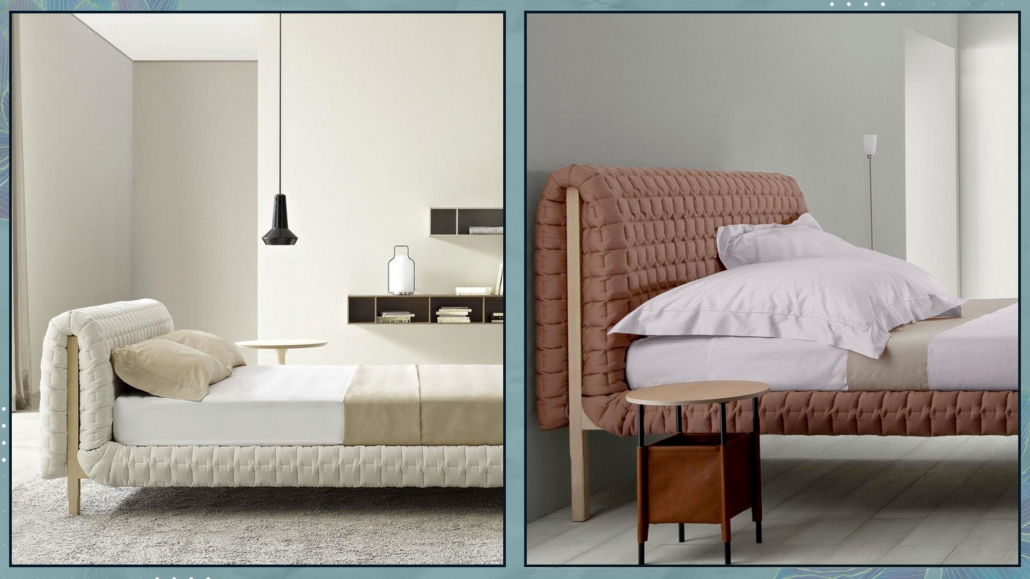
– RUCHÉ BED

Designed by French designer Inga Sempé in 2011 for Ligne Roset.

This bed features a solid wood frame with a headboard and bed frame upholstered with a quilt featuring interrupted square stitching, reminiscent of the design used the previous year for the namesake sofa.

It is available with either a low (85 cm) or high (110 cm) headboard.

(Credits: Ligne Roset)

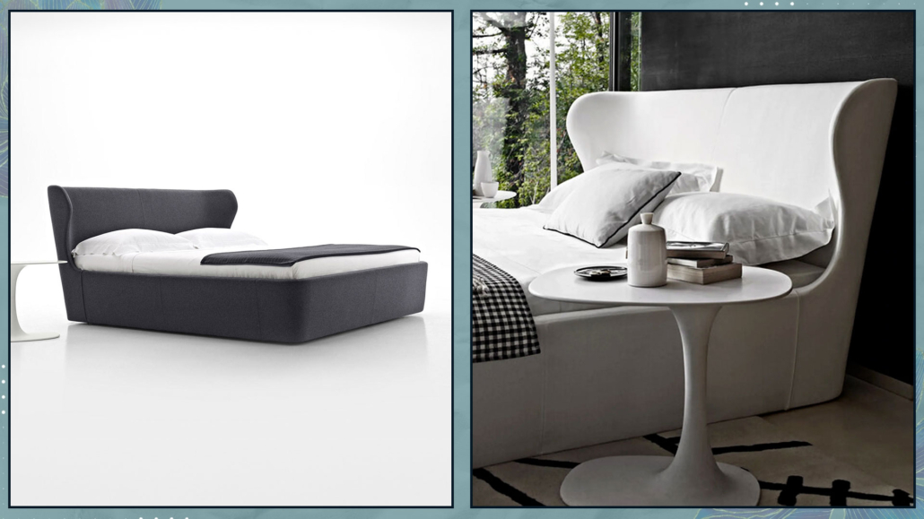
– PAPILIO BED

Designed by Japanese designer Naoto Fukasawa in 2013 for B&B.

This bed features a fluid and harmonious design, echoing the shape of the chairs of the same name, although the headboard is slightly less conical, yet still enveloping.

The mattress nearly aligns with the frame to emphasize the rigor of the ensemble.

It is available in fabric or leather upholstery options!

(Credits: B&B)

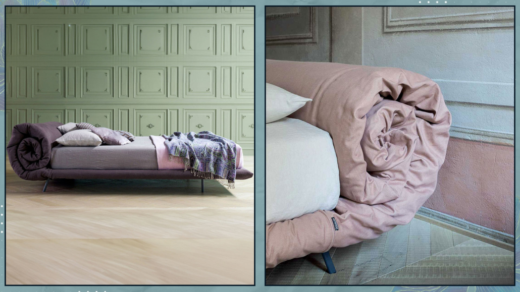
– BLANKET BED

Designed by Alessandro Busana in 2017 for Bonaldo.

This bed resembles a quilt that unfolds from the base of the bed to roll up then and define the headrest!

“Making a bed comfortable, even at a perceptual level, seemed to me an essential starting point. Hence the choice of the blanket for everything it represents in our imagination,” explains Busana.

The bed has a wooden and metal structure upholstered in padded fabric.

(Credits: Bonaldo)

I hope this article has been helpful and enjoyable for you. If so, let me know in the comments!

Feel free to share it with anyone you think might be interested, I would be honored, and it will help me gain more exposure.

If you feel that your home, or any specific area of it, doesn’t reflect your personality enough, don’t wait any longer and book your consultancy!
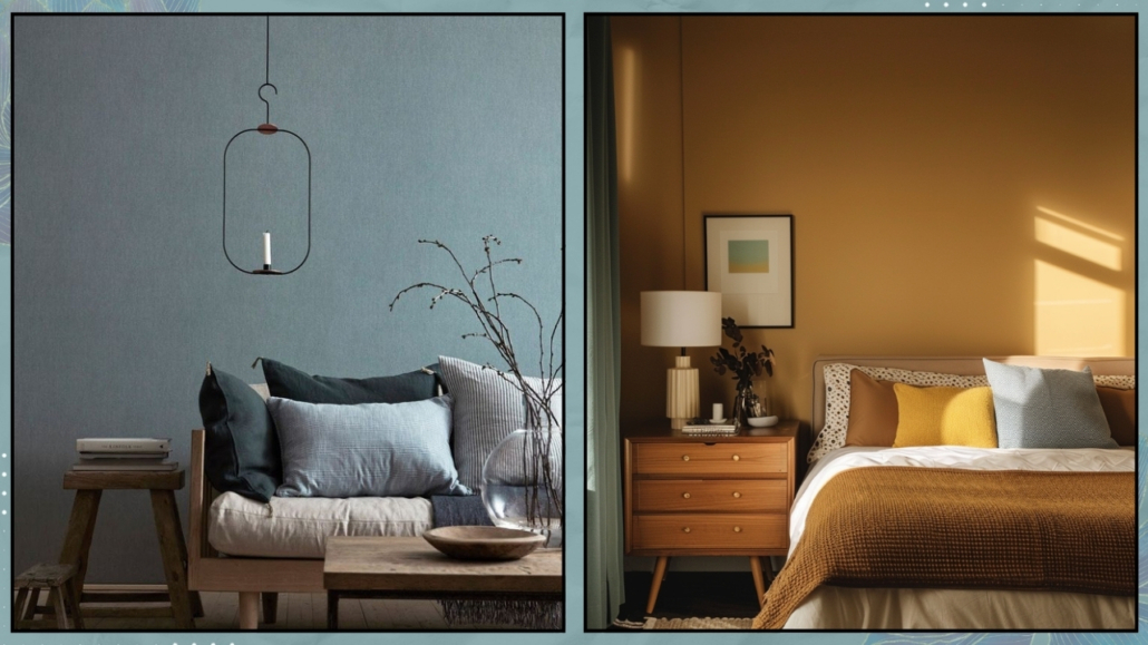
 

If you like here it is “the design elements series“!

According to feng shui, the entrance of a house is truly the most significant area of a home!

The reason is quite simple: the entrance is where energy enters, and we must ensure that it enters correctly and, above all, that only positive energy comes in.

The entrance is the transitional area that connects the interior and exterior, and it must be welcoming and “inviting” so that good energies, as well as the people and opportunities we desire, can enter.

Entrance is the house’s calling card aesthetically but also energetically!

The whole house and its inhabitants will likely be affected if the entrance is dark and cluttered.

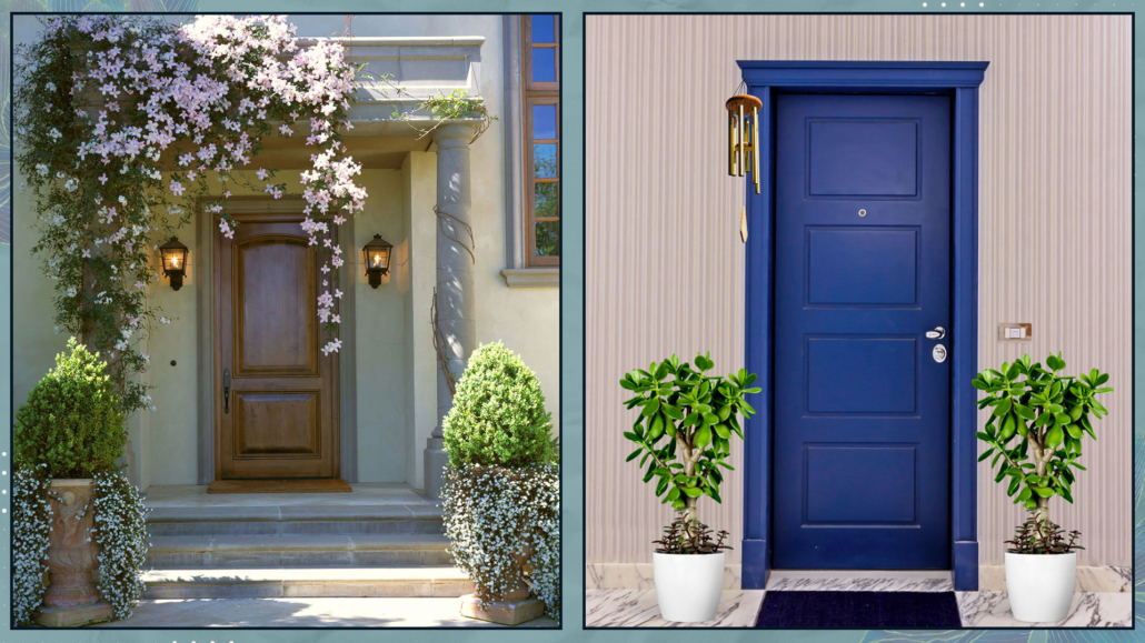
To have an inviting entrance for good energy, you must start from the outside, taking care of the front door, regardless of whether or not it is part of a condominium.

Often, in front of the door, we only have the classic doormat: according to feng shui, we should have something that can protect the entrance and, at the same time, bring good fortune!

Ideally, two objects should be on either side of the door, such as two plant pots.

If space is limited, you could place something above the door (like a wind chime or dreamcatcher).

(credits: Taylor Lombardo Architects; Vivere lo Stile)

Now, let’s step inside!

– LIGHTING

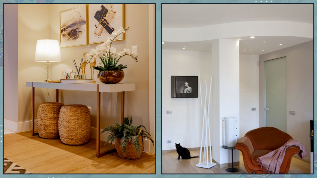
The entrance needs to be bright to be inviting.

Where it is not possible to take advantage of natural light, it is a good idea to investigate good artificial lighting using multiple light sources (perhaps a lamp on the console table).

If the entrance opens directly into the living room, consider the possibility of a small false ceiling where you could install recessed spotlights, ensuring good lighting.

(learn more about lighting here!)

(credits: Anderson Leite; fiorentini-casapesaro)

– ORDER AND CLEANLINESS

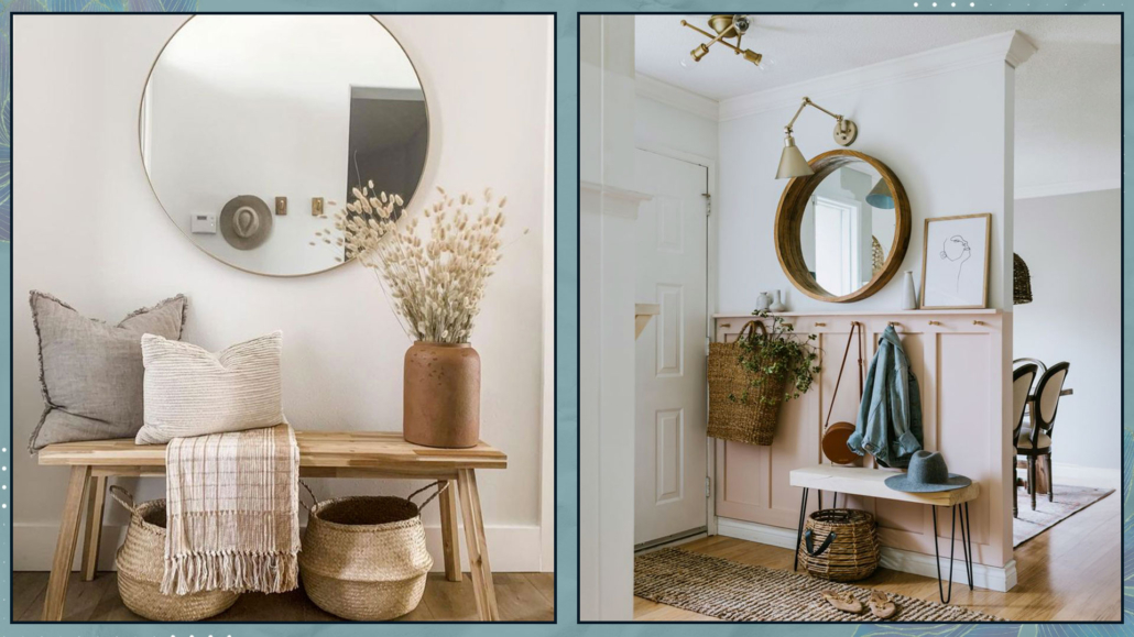
The entrance must be clean and tidy to welcome guests and energy, for the better!

Everything should be well-organized, even the tiniest entrance.

You need a surface to place your keys (even a simple shelf or a hanging drawer).

Something to hang jackets on and maybe a shoe cabinet!

Removing your shoes as soon as you enter would be ideal to avoid bringing dirt and negative energy into the rest of the house.

You might consider a small pouf and some neatly arranged slippers nearby, whenever that’s not possible.

That way, when you arrive, you can sit down to take off your shoes, put on the slippers, and store them where they belong!

(credits: shopltk.com; Jessica Sara Morris)

– PAY ATTENTION TO THE FLOW

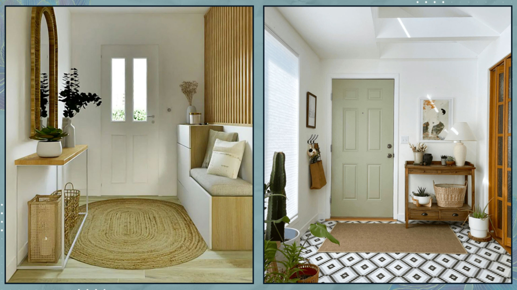
Energy must move freely and, once inside, distribute itself throughout the house.

Make sure there are no elements that can obstruct this movement!

Place a rug in the entrance to create a gathering area where the energy can slow down before flowing through the entire house.

(credits: rhinov.fr; indie.boho.nest)

– COLORS

We repeat it every time: colors have a psychological power, more or less unconscious, now scientifically recognized.

Feng Shui also acknowledges the energetic power of colors.

Each color is associated with one of the five elements (water, wood, fire, earth, and metal).

Each element corresponds to a specific energy:

Shades of green, the wood element, are associated with growth and financial well-being.

Reds, oranges, pinks, and purples, the fire element, are associated with fame and recognition.

Browns, beiges, and yellows, the earth element, are associated with stability and solidity.

Blues and blacks, the water element, are associated with travel, both physical and personal evolution.

Whites and grays, the metal elements, are associated with creativity and leadership.

It is vital to choose colors that enhance the energy you need.

(credits: tinnappelmetz.com; Michael Clifford design byMoksa Studio)

– MIRRORS

It is essential to have a mirror at the entrance to give yourself a final check before leaving and to allow guests to do the same when they enter.

However, be careful not to place the mirror directly facing the door, as it would reflect the energy back!

It’s better to place it on one of the adjacent walls so it will bounce the energy around but still keep it inside the house.

(credits: chrislovesjulia.com; c1studios.com)

– NATURAL ELEMENTS

It is paramount to have natural elements in the house, even for feng shui.

In the entrance, they enhance the connection between the outside and inside and infuse the space with vitality, invigorating the energy that enters the house.

Wooden furniture, baskets, and, of course, plants are a must at the entrance!

(credits: Jay Wilde; elmueble.com)

I hope this article about a feng shui entrance has been helpful and enjoyable for you. If so, let me know in the comments!

Feel free to share it with anyone you think might be interested, I would be honored, and it will help me gain more exposure.

If you feel that your home, or any specific area of it, doesn’t reflect your personality enough, don’t wait any longer and book your consultancy!
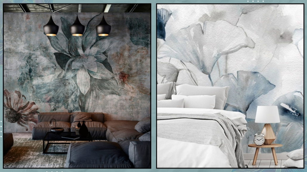
A small bedroom is one of the most challenging spaces to furnish because it contains the most cumbersome furniture, like the bed, which you can’t do without!

So, let’s see what to do when you have a small bedroom and want to make it functional and cozy!

– PRIORITIZE THE ESSENTIALS

If the bedroom is small, it’s best not to overcrowd it, as it might become stifling!

The bed and wardrobe are the essentials you can’t do without; everything else is extra!

For instance, you can have an integrated dresser in the wardrobe!

Consider the correct size of these elements, not just concerning the room’s size but what suits your needs as well.

Let me explain: if you’re single, there’s no point in getting a double bed; you could opt for a one-and-a-half size bed or, if you prefer, one of those single beds that, besides a headboard and footboard, also have a backrest.

With the proper pillows, these beds can transform into a sofa during the day, which can be helpful if the room also has other purposes, like a study!

The same goes for the length; if you’re not a basketball player, you can get a 1.90m bed instead of a 2.00m one.

In small spaces, even 10 cm can make a difference.

Arrange everything to have adequate space for moving around and comfortably accessing everything!

(credits: Elizabeth Roberts Architects; leroymerlin.it)

– UTILIZE VERTICAL SPACE

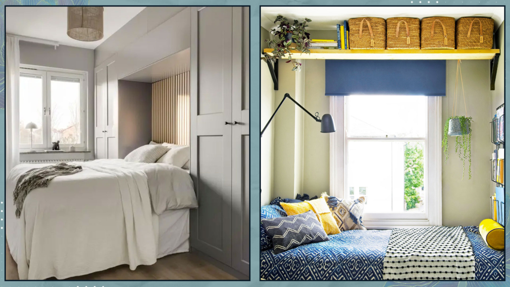
Especially for the wardrobe, utilize the height rather than the width.

Even if there is space for a medium-large wardrobe, look for a smaller but taller one.

The storage space will be the same, but the room will feel more open, potentially allowing space for another element.

You can also opt for a bridge wardrobe to use the entire bed wall and give the rest of the room more breathing space.

Consider placing shelves above the door as well to gain more storage space.

(credits: svenskfast.se; thatssogemma.com)

– PAY ATTENTION TO NIGHTSTANDS

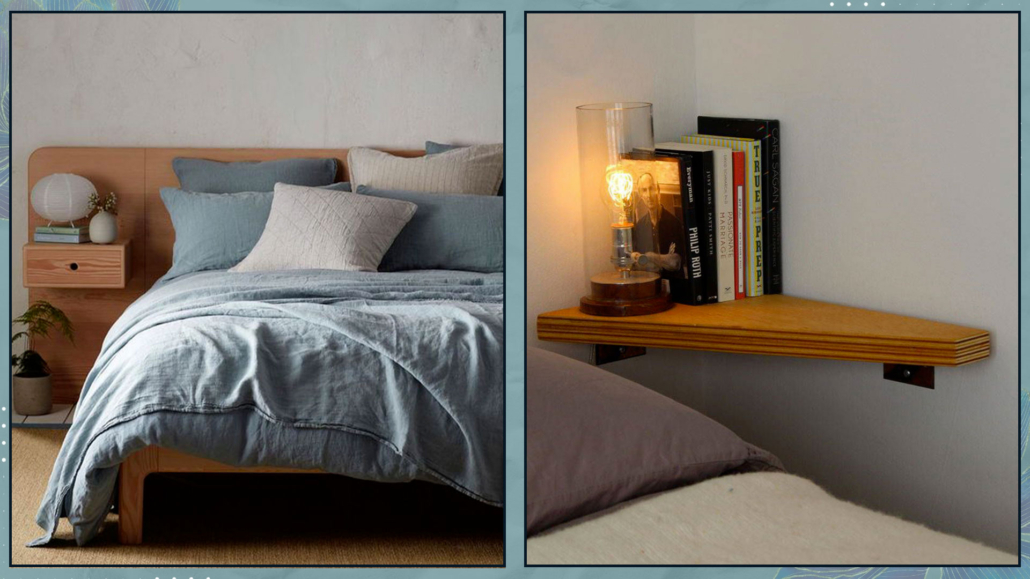
Classic nightstands might not fit in small spaces, but as mentioned before, that’s not a good reason to go without them!

It’s essential to have something to place, if only an alarm clock, a book, or a pack of tissues.

Anything can serve as a nightstand, like a chair, or a stool (as long as it matches the chosen style!)

If you prefer, you can opt for two small shelves, cubes, or tiny suspended drawers.

And if it indeed becomes difficult, you can place a large shelf above the bed!

Obviously, if you’re single, you can have just one nightstand, even if you have a double bed!

Aesthetically, you can also choose two different types of nightstands, but if you want a balanced relationship, according to Feng Shui, the nightstands should be identical!

(credits: Fabmood.com; mykidstime.com)

– SIMPLE, LINEAR, AND MULTIFUNCTIONAL FURNITURE

As we’ve seen when discussing tiny homes in total, choosing furniture with simple and minimalist lines is a good idea to avoid weighing down the room!

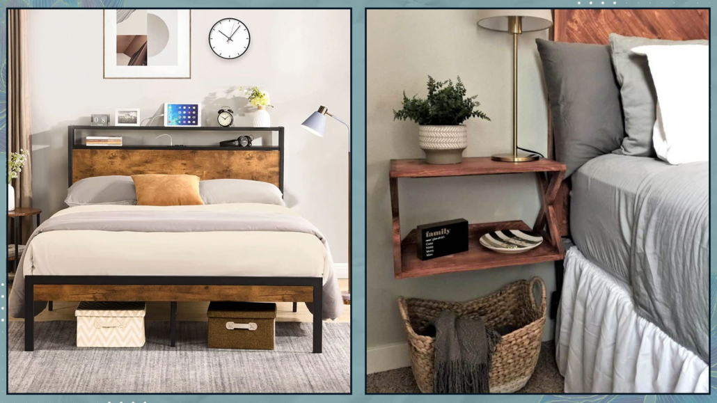
Ideally, all furniture should have legs to allow you to glimpse the space underneath and create the impression of a larger environment.

For example, having a shelf or a hanging drawer as a nightstand allows you to use the space underneath, perhaps with a basket that, besides being decorative, will give you additional storage space.

In a small bedroom, it might be convenient to have a storage bed or a bed with drawers.

However, this can weigh down the environment a bit (in addition to not being ideal from a Feng Shui perspective, as it doesn’t allow energy to flow freely).

Always keeping your needs in mind, consider the possibility of a bed with legs and then potentially placing boxes (perhaps on wheels) underneath.

The boxes will be more hidden under the bed, revealing some of the floor, which will visually enlarge the space.

That will also help with cleaning, as you can effortlessly move the boxes, allowing energy to flow better, so it is better also from a Feng Shui perspective!!

(credits: zevemomo.com; joyfulderivatives.com)

– COLORS

As you know, light colors reflect light best and help make the room airy and bright.

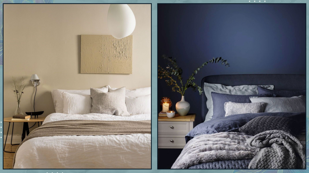
However, as we’ve said other times, dark colors can be an excellent option for the bedroom.

That is because dark colors provide depth and are enveloping, giving the sensation of a hug!

Additionally, the fact that they don’t reflect light can help promote sleep.

Whether choosing light or dark colors, you only have to be mindful of avoiding high contrasts that can create somewhat a boundary and visually shrink the space.

Another consideration when choosing colors is to avoid vivid colors, except in small doses of minor elements.

That is because they are stimulating and do not promote good sleep!

Great colors for the bedroom are greens, blues, and browns in all their shades, from the lightest, almost neutral tones to the darker ones!

(credits: cocolapinedesign.com; Jotun)

– MIRRORS

A mirror should never be missing in a bedroom, especially if it’s the room where you get dressed: it’s paramount to check your appearance before going out!

If the room is small, the mirror becomes essential to enlarge it and increase the light visually!

An excellent position for the mirror would be opposite the window, but this is not ideal from a Feng Shui perspective, as it reflects energy back, so it’s better if it’s at least angled.

Speaking of Feng Shui, it’s also vital that the mirror does not reflect the bed and the person sleeping in it.

That is because reflecting energy could cause insomnia or interfere with restful sleep.

If no position of the mirror doesn’t reflect the bed and you don’t want to give up the mirror, try covering it at night!

(credits: @obsessed4interiors; spazifluidi.it)

– LIGHTING

As you’ve heard me say many times, light is always fundamental!

If it’s true, as mentioned earlier, that you can use dark colors in the bedroom, even if it’s small because they are enveloping and reassuring, it’s also true that for it to be cozy, you must accurately light it!

Natural light is always the best and most preferable, so be careful not to cover windows or French doors with furniture or heavy curtains.

Use lightweight, very sheer curtains to make the most of the light.

If you love double curtains, which are helpful in the bedroom to prevent nighttime lights from disturbing sleep, ensure they only cover the wall and leave the windows completely free when they are open.

Then, plan the artificial lighting well.

You won’t be surprised when I tell you it’s crucial to have multiple light sources: a general light, preferably dimmable, and then other light points, for sure near the bed and perhaps near the wardrobe.

The light should be warm, soft, and diffused to promote relaxation!

For the light near the bed, if you only have small shelves, use wall lights to avoid “stealing” space. 

That is also a way to utilize heights, as I suggested in point two!

(credits: tlcinteriors.com.au; thathomebirdlife.com)

– ORDER

You expected this point, didn’t you?

Yes, order is vital in a small bedroom, primarily because clutter visually shrinks the room but also because it makes it far from inviting!

A room with fewer pieces of furniture (as I mentioned in the first point) and functional and intentionally chosen objects, kept well-organized, will undoubtedly be more welcoming and inviting!

Even from a Feng Shui perspective, clutter drains energy and thus disturbs sleep!

(credits: laredoute.com; heygraceann)

– DRESS THE BED

Whenever I discuss the bedroom, I emphasize the importance of dressing the bed.

You don’t need many things, as they could overwhelm the space!

But don’t forgo a few decorative pillows and perhaps a nice throw at the foot of the bed.

The bed will be super inviting, making the room, even the smallest one, truly elegant and cozy.

(credits: StyleRoom.se; apartmenttherapy.com)

– PLANTS AND SCENTS

Last but not least, to make the bedroom cozy are plants and scents!

No matter how small the room is, these two things should NEVER be missing!

For scents, a small aroma diffuser or those little bottles with sticks will be enough; You can place it on the nightstand without taking up too much space.

For plants, even only a leaf or some beautiful branches in a small vase will do, or you can utilize heights by hanging them or placing them on shelves!

(credits: bloglovin.com; amazon)

I hope this article has been helpful and enjoyable for you. If so, let me know in the comments!

Feel free to share it with anyone you think might be interested, I would be honored, and it will help me gain more exposure.

If you feel that your home, or any specific area of it, doesn’t reflect your personality enough, don’t wait any longer and book your consultancy!
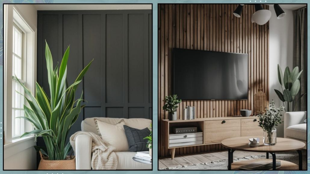
Should interior design rules always be followed to the letter to create harmonious environments that represent us?

I would dare say no!

While it’s true that general interior design rules can indeed provide an excellent starting point, it’s equally correct that they often need to be broken!

Only then can the home reflect us deeply and be supportive in our everyday lives.

Let’s look at some “rules” that we can, if not should, break!!!

1 – DO NOT MIX WOOD TONES

Avoiding mixing wood tones has been a must for quite some time, and even today, when it comes to wood, there are countless uncertainties.

Even those who love it often hesitate to use it because they fear creating a disharmonious environment.

And indeed, if one is not careful and uses wood tones “randomly,” the result may not be optimal!

At the same time, having only one essence first is almost impossible, even if you buy everything you need in the home, from materials to furniture, from a single place.

But, assuming you could, honestly, the environment might be a bit flat and monotonous.

Therefore, try not to mix more than three different wood tones but you can bring distinct types of wood into your home with due care.

If you want to know more, I recommend watching the video where I discuss this topic (if you prefer to read here is the article)!

(credits: Kindred Homestead; Milk magazine)

2 – DO NOT MIX DIFFERENT METALS

That is another myth that had been taught to me as well!

But just like with wood, sticking to only one metal risks leaving rooms without character!

In fact, it misses the opportunity to create some rhythm and movement.

Of course, one must avoid the opposite, which is an environment that’s a bit too noisy!

The magic word, as always, is balance: choose two or at most three metals and then mix them in a balanced manner.

If you want to learn more, I’ve dedicated an entire video to metals (here is the article if you prefer reading)!

(credits: interiors by Lindye Galloway Interiors and photography by Chad Mellon Photography; Studio Mcgee)

3 – BUYING EVERYTHING COORDINATED

There’s nothing wrong with buying everything coordinated (usually the bedroom and the living room), but in reality, it misses the opportunity to express oneself best!

Furniture stores often present various setups with coordinated elements, which, let’s admit, are also visually appealing, but they lack true personality!

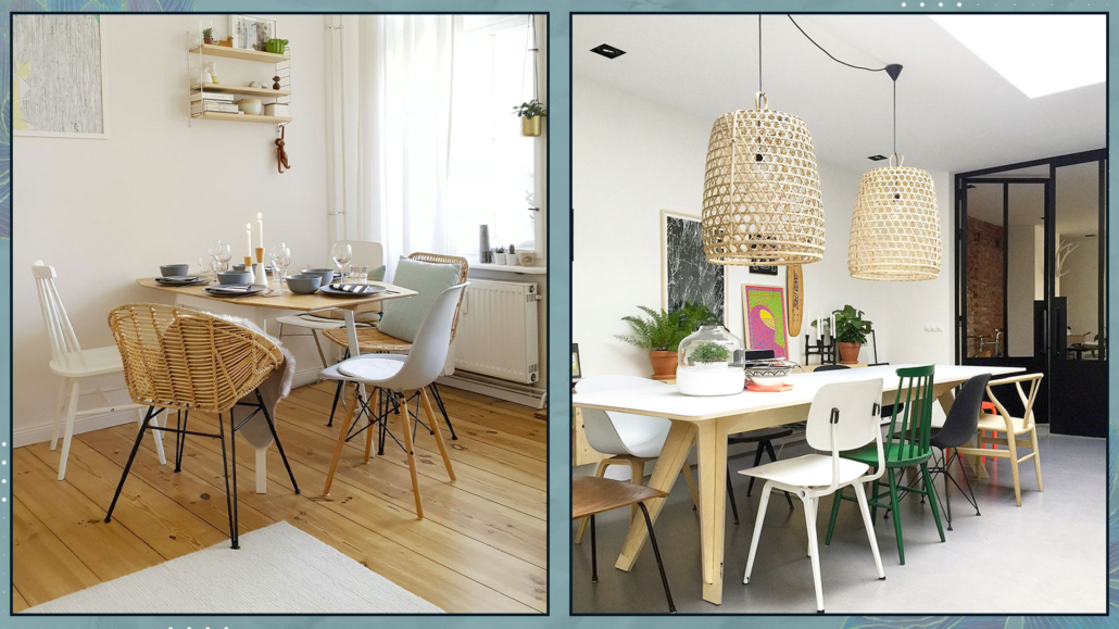
So don’t be afraid, for example, in the living room, to choose a table with chairs of different materials, and maybe even different from the console or any TV wall unit!

In the bedroom, wardrobe, bed, nightstands, and possibly a chest of drawers can all be different!

Of course, one shouldn’t choose them randomly; they should “speak” to each other, but they can have distinct shapes, colors, or materials!

Let’s focus on bedside tables for a moment.

In the past, I’ve mentioned that the two bedside tables don’t need to be identical and that you can use different bedside tables with the necessary attention for a harmonious space.

While this remains true aesthetically, it becomes a Feng Shui mistake if you desire an equal partnership as a couple!

So, if you believe in energies, like me, and how shapes, colors, and materials can influence us and want an equal relationship, opt for two identical bedside tables!

You can still choose not to coordinate them with the rest of the furniture!

(credits: bloglovin.com; ragusa.com)

4 – ALL CHAIRS THE SAME

In the previous point, I mentioned the possibility of choosing chairs not coordinated with the table.

But it’s also possible to choose chairs that are different from each other!

They can be the same chairs with different colors or even different in shapes and materials!

That adds some movement and character to the room!

Of course, one should consider the home’s overall style and what they want to convey, but it’s absolutely feasible!

A table with different chairs could become the focal point of the room!

(credits: @solebich; Showhome.nl)

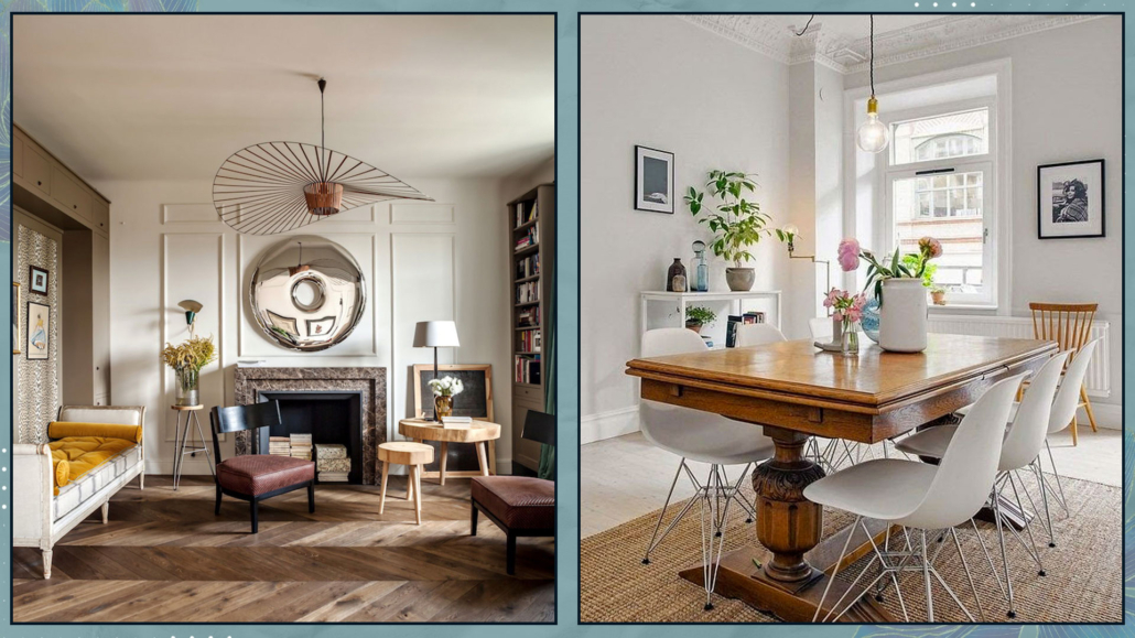
5 – MIXING OLD AND NEW

Why shouldn’t you incorporate modern elements into a predominantly classic environment?

Or vice versa, why not add something antique to a modern/contemporary space?

On the contrary, this mix can create atmospheres full of character!

For instance, modern lighting in a classically furnished room creates an attractive and unexpected contrast.

Similarly, placing an antique table or sideboard in a modern/contemporary setting adds a touch of elegance and “importance”!

(credits: living.corriere.it; Alvhem)

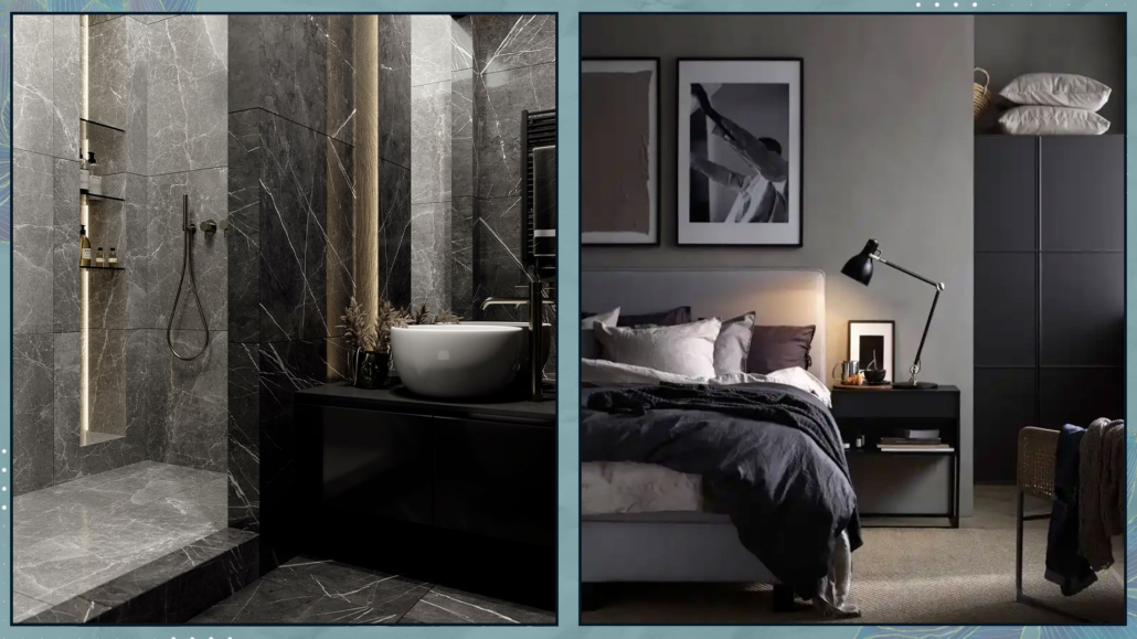
6 – USING LIGHT COLORS IN SMALL SPACES

Light colors certainly make a room feel airier and may appear hugger.

But, by now, we know that dark colors create a more intimate and cozy atmosphere!

Additionally, they add depth, so they won’t necessarily shrink the room if there’s uniformity among floors, walls, ceilings, and furnishings!

Especially in bathrooms and bedrooms, even if small, one can absolutely choose dark colors!

(credits: dezignark.com; ikea)

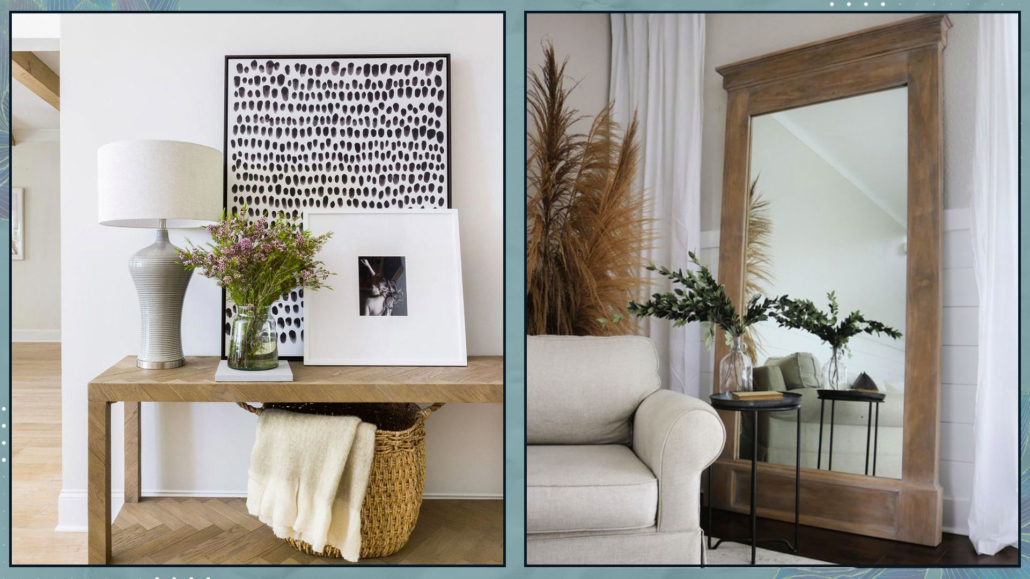
7 – HANG ON WALLS PAINTINGS AND MIRRORS

There’s a tendency to always hang mirrors and paintings on walls.

There’s nothing wrong with that, of course.

But why not lean some against the wall or on a console?

Especially when they’re of medium to large size, they can create an unusual arrangement that makes the space more original, less “rigid”!

(credits: Scout & Nimble; sawdust2stitches.com)

8 – EVERYTHING MUST BE SYMMETRICAL

While it’s true that symmetry is something that calms the mind and pleases the eye, it’s also true that too much symmetry can become annoying and even sterile!

While we’ve mentioned that, at least from a Feng Shui perspective, bedside tables should match, it doesn’t mean that decorations on the wall above the bed must be symmetrical!

It’s paramount to balance visual weights well, and while symmetry is undoubtedly one way to do that, it’s not the only way!

Different sizes and colors are other valid ways to balance everything effectively!

(credits: Knoll; glamorous-design.com)

As mentioned before, interior design’s rules are the starting point, but one needs to modify and review them to create a home that truly represents you.

A home tailored to you, where you can’t wait to return to find and be yourself, a home that supports you every day!

I hope this article has been helpful and enjoyable for you. If so, let me know in the comments!

Feel free to share it with anyone you think might be interested, I would be honored, and it will help me gain more exposure.

If you feel that your home, or any specific area of it, doesn’t reflect your personality enough, don’t wait any longer and book your consultancy!
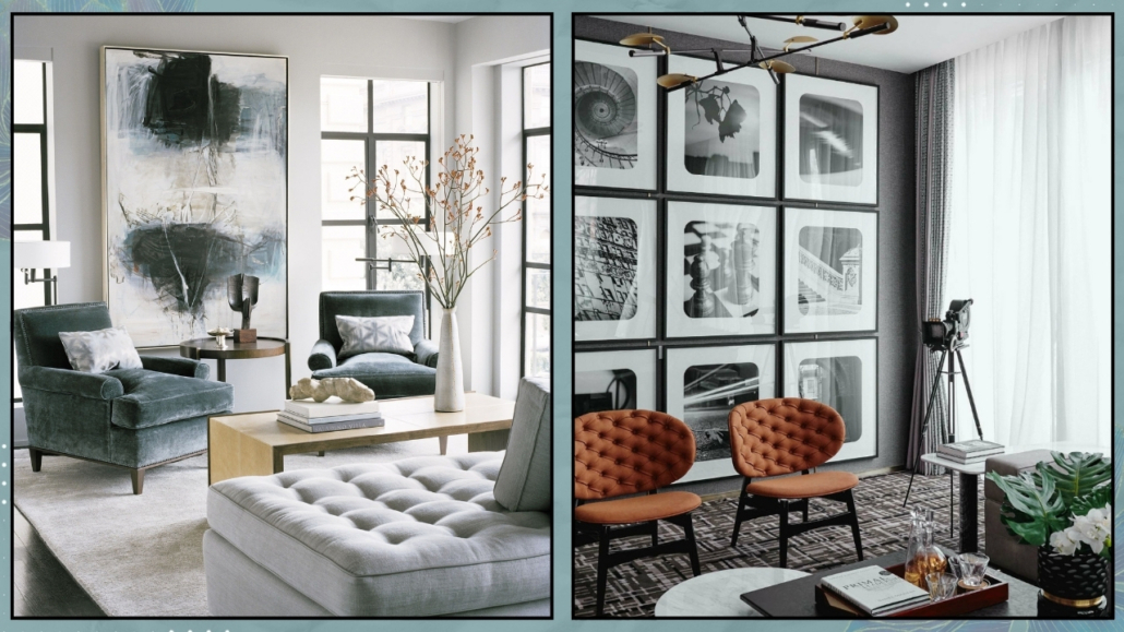
Do you have a small home and don’t know how to make it beautiful, cozy, and functional?

We’ve said it other times: a small home is definitely more challenging to furnish, but not impossible.

Nowadays, especially with new constructions, encountering this type of housing is very likely!

Let’s see what to do in the case of a small home!

1 – PAY ATTENTION TO FURNITURE SELECTION

When dealing with a small home, one might think they should opt for tinier furniture and accessories.

While maintaining a certain proportion is paramount, to have a few slightly larger pieces than many smaller ones is better.

First and foremost, smaller pieces might not be as comfortable or functional.

Also, too many pieces can create visual clutter, making the space feel even smaller.

From a Feng Shui perspective, it’s important not to overcrowd the space to allow energy to flow freely.

If the room is too full, the energy may become stagnant.

In addition to size, consider the type of furniture as well: it’s better to opt for pieces with simple, minimalist lines to avoid weighing down the space.

(credits: @elemorlovedecor_blog; @anabarcenasinteriorista)

As seen other times, it would also be ideal for furniture to have legs for being raised from the ground, creating the illusion of more space underneath and tricking the mind into perceiving greater spaciousness.

Additionally, like before, this allows for the flow of energy, making it an excellent choice from a Feng Shui perspective.

(credits: Ikea; theblushhome.com)

MULTIFUNCTIONAL AND TRANSFORMABLE FURNITURE

Very useful are also transformable or foldable furniture pieces, which you can open/enlarge or fold back depending on your needs!

There are many different types available on the market, and they can be quite aesthetically pleasing as well.

The same goes for multifunctional elements, such as storage ottomans/benches or chairs that you can use near the table or the sofa, depending on the occasion.

That allows for having fewer items that serve multiple functions!

(credits: lumisource.com; goodideatrade.com)

For making the right choice, good initial planning is crucial, where you understand how you use spaces, giving more importance to areas that you use most frequently.

For instance, if you don’t always have guests for lunch or dinner, a small extendable table in the dining area might suffice, providing more breathing space for the living room!

(credits: Amazon; Ikea)

2 – FOLLOW YOUR STYLE

When space is limited, it’s easy to feel intimidated, and when following advice (including the previous one) to opt for linear and essential furniture, there’s a risk of ending up with a result that doesn’t represent the home inhabitants.

If the house doesn’t reflect your style, it won’t be comfortable or functional, and you won’t feel at ease.

So, how do you express your style when having simple and linear furniture is essential?

Express your style through decorations!

“Less is more” is a must in small spaces, but “less” doesn’t mean lacking character!

Start with a minimal base, as mentioned before, for large furniture pieces, choosing items that can adapt to any style.

Then, express your personality with smaller accessories such as a unique chair, perhaps a designer piece, artwork, cushions, and so on.

By doing this, you’ll maintain airy spaces with character and personality – your own!

Moreover, this approach allows you to change things frequently without breaking the bank each time!

(credits: @reserve_home; flipboard.com)

3 – ORDER AND ORGANIZATION

We often talk about order for inviting and harmonious homes, but in small spaces, it’s vital to avoid visually constricting the area further!

Again, in this case, “less is more” is truly significant because it makes it easier to maintain a tidy home.

Having too many things scattered around isn’t ideal, even from a Feng Shui perspective, as it tends to stagnate energy rather than allow it to flow freely!

Tools for organizing drawers and closets can help maintain order.

There’s a wide variety available on the market, ranging in size and price to suit every need and budget!

Organizing drawers and closets effectively will allow for easy access to everything.

When items are practical to take out and put away, it’s much easier to maintain order!

Additionally, you can consider other storage elements such as benches, ottomans, or baskets, which not only serve a functional purpose but can also be decorative.

Among storage elements are still storage beds or beds with drawers, which are undoubtedly convenient but not recommended from a Feng Shui perspective due to the potential energy blockage.

If you want to utilize the space under the bed, it’s better to use boxes, perhaps with wheels, so you can move them around during cleaning and, thus, stir up the energy!

(credits: cherishedbliss.com; Etsy)

4 – MAXIMIZE BRIGHTNESS

In small spaces, it’s essential to have airy and bright environments.

Therefore, maximizing natural light is vital!

To achieve this, it’s important to keep windows and French doors clean and free from obstruction by plants, furniture, or curtains!

For privacy, use lightweight and filtering curtains.

If you prefer double curtains and want a thick and colorful one, use an extra-long rod so that, when it’s open, it doesn’t cover the window but only a part of the wall.

Pay attention to the color of the curtains, as they will tint the light filtering through and subsequently alter the perception of colors in the house!

(credits: Cille Grut; inredningshjalpen.com)

If your home isn’t so bright, help duplicate the light with mirrors, glossy elements, and metallic items!

However, avoid overdoing shiny or metallic elements to prevent the environment from feeling too cold!

Strategically position mirrors; practically, placing them in front of windows maximizes reflected light because they capture more.

However, from a Feng Shui perspective, this “sends back” the entering energy, so it’s better to position them laterally to invite energy to enter!

(credits: decoholic.org; Nordic design)

PAY ATTENTION TO COLORS TOO

Colors also play an important role in light reflection, and white is the ultimate reflective color.

From the live with color expert Claudia Piolatto (if you missed it, you can find it here), we understood that avoiding pure white is better because it can cause glare and tends to create somewhat sterile environments.

However, there are more than 150 shades of white, so you can absolutely find the most suitable one.

It’s not mandatory to totally eliminate colors!

For walls, choose light colors that aren’t too vivid and avoid strong contrasts (which visually shrink the space).

Feel free to use stronger colors in accessories and objects to add rhythm and character.

(credits: @anthology_creative_studio; article.com)

N.B. The bedroom could be an exception to light colors, and here’s why.

Dark colors create a cozy, intimate environment akin to a warm embrace, which is particularly important in the bedroom!

So, if you like them, feel free to use them!

Since the bedroom is primarily for resting and sleeping, prioritizing brightness at all costs can be overlooked.

However, I still advise maintaining consistency with the colors, perhaps opting for richer versions or toning them down with gray or black in the case of very vibrant colors.

That will maintain a sense of harmony throughout the space!

(credits: Pella Hedeby; Studio Enass)

I hope this article has been helpful and enjoyable for you. If so, let me know in the comments!

Feel free to share it with anyone you think might be interested, I would be honored, and it will help me gain more exposure.

If you feel that your home, or any specific area of it, doesn’t reflect your personality enough, don’t wait any longer and book your consultancy!
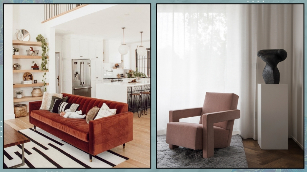
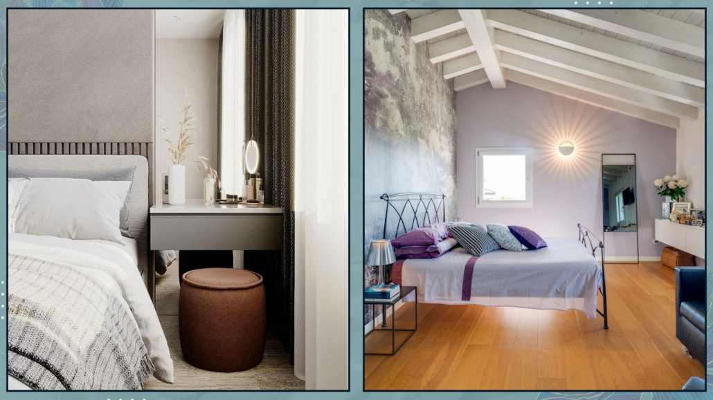
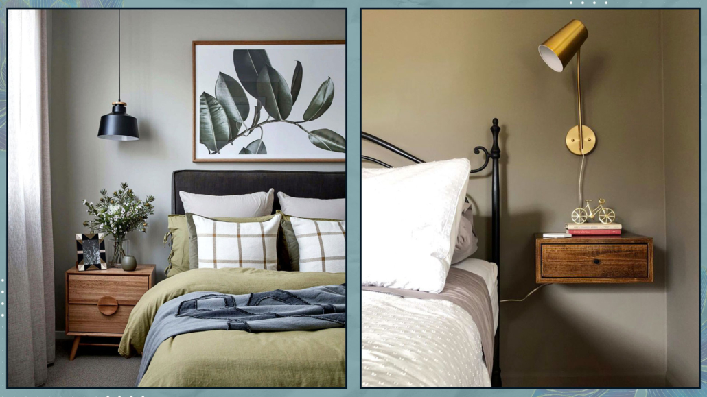
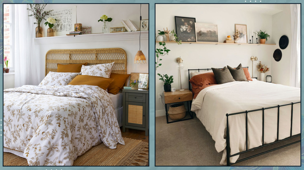
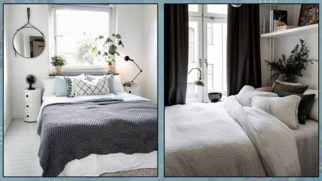
Colors, as we know, can influence our emotions, so it’s essential to consider how we want to feel in a given environment to choose the right ones.

That applies to the entire house, but especially to the bedroom because it’s where we most need to feel good and safe, thus promoting also good sleep!

So today, we’ll look at some suitable bedroom color combinations!

– DARK AND MOODY BEDROOM COLOR COMBINATIONS

Using dark colors is ideal if you love the idea of a cozy and enveloping bedroom.

Using deep blues with a warm undertone, rich browns, and charcoal grays gives a comforting sense of intimacy, like a hug and a sense of security!

Moreover, they are associated with the concept of sophistication and depth.

Dark shades also significantly enhance the cone of light from every light source, which is less visible with light colors!

That creates a beautiful contrast with the dark tones and intensifies the feeling of intimacy!

– BLACKS AND DARK GRAYS

Black or anthracite grays are quite beautiful but not so easy to use because they can result in a flat look.

If you opt for a monochromatic combination, it’s wise to use different finishes and textures to add some movement and play!

Wallpaper could be an example, but also in textiles like blankets and pillows; this, in addition to the movement mentioned earlier, also helps to soften everything!

I suggest painting the ceiling white anyway to maintain a minimum of openness in the room; everything completely dark could become overwhelming!

Another way to brighten the room could be to dress the bed with light textiles!

That will create some contrast and, as with textures, soften the environment a bit.

Everything doesn’t need to be solid color; conversely, introducing patterns, once again, creates some play and movement.

These patterns can be tone-on-tone, playing with various saturations, or you can introduce some other color to contrast and brighten things up.

(credits: Ikea; Lovisa Häger foto Jesper Florbrandt)

– BROWNS

Browns are another way to create cozy and moody environments.

They are definitely lighter compared to blacks and also more natural.

However, it’s still a dark color, so it’s good to balance it with lighter shades.

For a more enveloping environment, with browns (if they’re not overly dark), you can use the same color for walls, floors, and ceilings.

Also, in this case, remember to play with textures and patterns to create movement!

(credits: @ideabedroom; @rustandtrust)

– DEEP BLUES

In general, blues are calming tones, making them perfect for the bedroom.

Certainly less dramatic than black, one can use blue with more ease!

Blues are fantastic when paired with browns because they are the exact opposite in temperature.

Brown warms up blue, giving the rooms a relaxing sensation.

You can use brown as a color, but it’s even better as a material like wood.

Another great way to brighten blues is by using brass elements; the contrast is pleasant and elegant.

In the case of a monochromatic pairing, again, I recommend playing not only with various shades of blue but also with different textures and patterns.

That creates movement and adds character to the room.

(credits: Jotun; Studio Enass)

– RELAXING AND REASSURING COMBINATIONS

For a relaxing and reassuring bedroom, softer colors like powder blue, sage green, and other pastel shades are most suitable.

These colors are associated with nature, such as water, sky, or tree leaves, elements that reinforce the feeling of calmness and tranquility.

– LIGHT BLUES

As we saw earlier, blues are calming colors, and lighter ones are reassuring and relaxing as well.

This color is cold and quite luminous, which will visually enlarge the room and give a sense of freshness and space.

One can use it on ceilings as well as walls, and even in a monochromatic pairing, the result will be pleasant and inviting.

Being so light, it almost becomes a neutral color and serves as a perfect background if you want to use some darker blue accents.

As mentioned earlier, it’s a cold color, so it’s always good to warm it up with elements like wood and wicker.

Alternatively, you can add a bit of cheerfulness by incorporating some touches of orange, its complementary color.

That will add some dynamism and make it more contemporary.

As always, to add some movement and character, it’s also good to play with textures and patterns here as well.

(credits: Ikea; dudasenna_garden)

– GREENS

Greens are relaxing and rejuvenating colors and come in numerous shades, from pale green to richer olive green.

Sage green is the most commonly used because it’s less intense and imposing than olive green and deeper than pale green.

Although a monochromatic pairing, always playing with textures and patterns, is undoubtedly appealing, I recommend adding some browns either as colors or as elements like wood.

That combination is fabulous because it emphasizes the connection to nature!

(credits: @ideabedroom; posterstore)

– DUST PINK

Pink is a very delicate color, and if taken with a slight hint of brown, it’s perfect not only for a nursery but also for a master bedroom.

However, avoid candy pink or overly “sugary” shades, which are actually more challenging to pair and can become somewhat noisy!

Since it’s a very light color, it’s wise to have a few darker elements to add depth to the room.

If you don’t like dark colors, create contrast with whites to prevent the pink from becoming too flat.

(credits: @emilycapes1; stylebyemilyhenderson.com)

– LIGHT GRAYS

Light grays are the ultimate neutral colors for relaxing and reassuring bedrooms.

However, if you choose this color, you’ll need to pay close attention to its undertone, which could tend towards blue, green, or yellow.

The undertone drastically changes the perception of the environment.

Be careful to choose the one that best suits the existing finishes and furniture.

There is also a subcategory of gray called “greige,” a mix of gray and beige.

It’s a warm, enveloping color, very pleasant and subtle, with a contemporary and harmonious feel.

(credits: alvhem.com; Viktoria Askerow)

– WHITE BASES COMBINATIONS

We can’t talk about bedrooms without mentioning whites.

Whites are bright, timeless colors that complement every style and easily pair with any other color.

But, as explained here, it’s easy to say white because, besides pure white, there are at least another 150 shades, depending on its undertone!!!

Some people don’t like white because they think it can be flat and monotonous; however, it’s actually the perfect backdrop for any feeling you want to evoke.

Moreover, you only need to change details such as blankets, pillows, and a few decorative elements to have an ever-changing room.

Even a total white look can be fascinating if you create movement with different textures, finishes, and patterns, too!

(credits: lifeoncedarlane.com; thebrainandthebrawn.com)

– VIBRANT AND ENERGIZING COMBINATIONS

For an energizing bedroom, it’s good to use warm colors like red, peach, salmon pink, yellows, and oranges.

The advice with all these colors (especially red, yellow, and orange) is to avoid their most vibrant version because they would be too stimulating and disturb sleep.

Use these shades in less saturated versions by adding white for lighter colors, grays, or blacks for darker colors.

This way, you’ll retain their energizing properties while creating a more relaxed and tranquil atmosphere.

Use the brighter tones in small accent elements like pillows or some decorations!

(credits: clemaroundthecorner.com; @toc_estudiocreativo)

– HOW TO CHOOSE THE VARIOUS BEDROOM COLOR COMBINATIONS

The choice between these color combinations will depend on the feelings you want to experience in your bedroom.

Another element to consider in the choice is the existing finishes, such as the flooring, unless you decide to change it (that’s also a color to think about).

If you’re having difficulty making a choice, you could start with something you love, like the headboard of the bed, a particular painting, a rug, etc.

Additionally, consider how much natural light enters the room and its orientation.

As we’ve seen other times, a north-facing room receives colder light than one facing south!

I hope this article about bedroom color combinations has been helpful and enjoyable for you. If so, let me know in the comments!

Feel free to share it with anyone you think might be interested, I would be honored, and it will help me gain more exposure.

If you feel that your home, or any specific area of it, doesn’t reflect your personality enough, don’t wait any longer and book your consultancy!
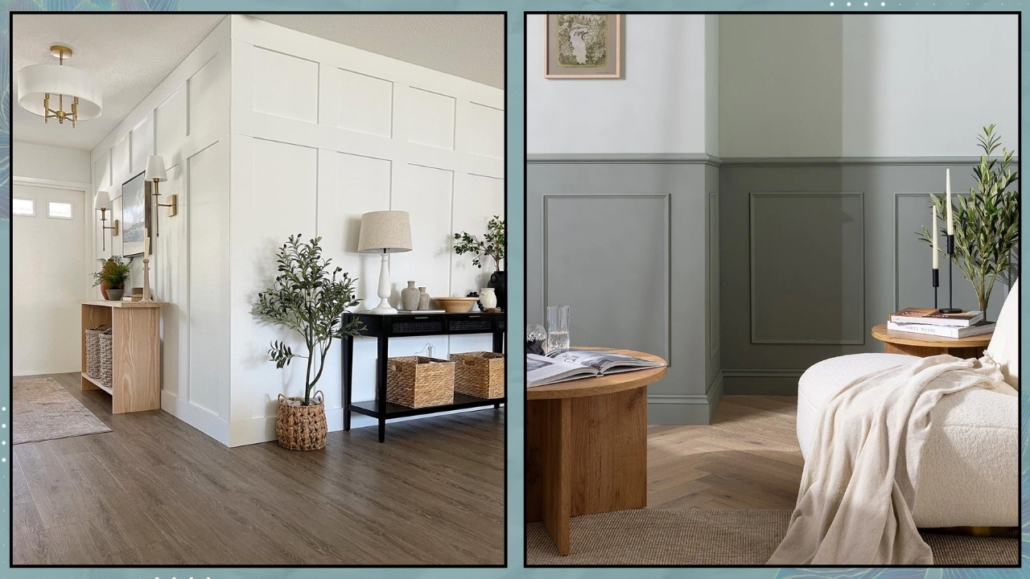
The home is not just a roof under which to eat and sleep but a LIVE place that supports us in every aspect, especially our psychophysical well-being.

The home should be that place where we feel good, where we let down our defenses, and where we rediscover and are ourselves!
To truly make it so, it’s paramount to pay attention to some details.

Let’s see them together.

– YOUR HOME SHOULD REFLECT YOU

An essential aspect of having a home that supports well-being is that it’s designed to represent you 100%.

Sometimes there’s a tendency to follow fashion trends, partly because they please the eye, partly to impress others, but this is a mistake!

Your home should exude your personality in every detail and be furnished with intention!

Each space should be designed to honestly support your lifestyle and personal way of being and living in the home.

Therefore, the choice of furniture, materials, and colors should be made based on your personality, as mentioned a moment ago.

They should please your eyes, of course, but also your body and soul, and they should speak of you!

Always start with a list of things that are important to you to create environments that are comfortable and harmonious for you.

(credits: luxesource.com; breyi.com)

– FUNCTIONALITY AND USABILITY

The same house and room can be furnished in many different ways, not only in style and colors but also in layouts!

It’s essential, first and foremost, that everything is arranged functionally for your way of living in the space.

As mentioned other times, consider the primary function for each room and then plan everything else around it.

An example I always give is the living room: is the primary function to entertain guests or watch TV?

You can see how the arrangements would differ!

Everything should be arranged functionally for you (you’re always at the center of everything!)

When functionally positioning things, it’s also vital to ensure that everything is easily accessible.

You should be able to move around the rooms and access everything without “jumping over obstacles” or moving things around.

This ease of access will make everything flow more smoothly, and you’ll enjoy every space totally.

Moreover, this fluidity will also make cleaning easier, making it, I won’t say enjoyable, but at least not stressful!

funzionalità e fruibilità casa che supporta benessere

(credits: Isabelle Dimang; optimaproperties.com)

– LIGHTING

Light is essential for psychophysical well-being.

It has been shown that in Nordic countries where the population experiences very few hours of daylight for many months of the year, the incidence of depression is higher.

Therefore, it’s paramount to have a bright home and to make the most of natural light first and foremost!

Sometimes, rooms tend to be dark, and in these cases, it’s vital to implement some strategies, such as using glossy materials (without overdoing them because they can make the environment feel cold) and, above all, mirrors.

Mirrors strategically placed, more or less in front of the window, can double the light in the room!

Another helpful trick is to use shiny metals in the lamp stems, chair and table legs, handles, and frames, for example!

Metals will also help reflect light.

It goes without saying that artificial light is essential as well.

Every room should have proper general lighting to see everything well.

However, as you know by now, this isn’t enough; it should be supplemented by other sources of light that can create atmosphere and be useful for activities (for example, a lamp near the couch, especially if you enjoy reading!).

luci-casa-che-supporta-benessere

(credits: studio mcgee; Studio-design-HDm2)

– MATERIALS

We’ve mentioned this other times: buying furniture and accessories made from natural materials is essential.

That is good for the environment, we know that, but it’s also good for us.

Warm materials like wood provide a pleasant sensation, even if unconscious because they connect us to nature.

The same goes for fabrics, such as cotton, linen, wool, or velvet, because they are free from synthetic substances and are much more pleasant to the touch (often also to the eye).

Natural materials are free from chemicals that are often harmful, so using them for furniture coverings, accessories, and fabrics means creating healthy environments.

materiali-naturali-casa-che-suporta-benessere

(credits: hoskelsa; @oh.eight.oh.nine)

– COLORS

Colors have an incredible psychological impact on us (I discuss it here), so they should be chosen carefully.

The calming colors of nature, such as sand, greens, and blues, are always an excellent choice for relaxing environments that connect us to nature.

It’s also a good idea to prefer warm tones or at least warm up cooler tones with the proper materials.

Neutral colors are very suitable for cozy and relaxing settings.

By neutral colors, I mean any color desaturated with white for a lighter tint or black for a darker color!

To have vibrant spaces, play with the tones and shades of colors from the palette, and dare with walls of intense colors.

If you love bright colors, use them to add character, maybe not in large quantities, but in accessories and decorations (the famous 10% of the 60-30-10 rule: I discuss it here).

(credits: habitatbyresene.co.nz; @rcpa)

– PLANTS

Undoubtedly, this point won’t surprise you; we’ve mentioned it many times!

Plants have a calming power because they mentally connect us to nature, which relaxes us.

This power is visual, so even though it’s better with authentic plants, it still applies to artificial ones.

Authentic plants have an added bonus, which is their ability to purify the air, and, of course, this is a great thing!

There isn’t a room in the house that can’t have plants, except maybe for a windowless bathroom or a storage room.

You can even put them in the bedroom!

Decorate with plants: get some tall ones that reach the ceiling, and get some small ones to put in your compositions on consoles, bookshelves, and tables.

You can even use just branches or decorative leaves; they have an elegant, minimal effect!

piante-casa-che-supporta-ilbenessere

(credits: harlowejames.com; Scout & Nimble)

– GET RID OF THE EXCESS

For those who aren’t minimalist at heart (like myself, I admit, I’m not), it’s easy to “accumulate” many things.

That impacts our homes and, therefore, us!

When you have a lot, it’s much harder to clean and keep everything well-organized, and things end up occupying important spaces (both in sight and drawers and closets).

It’s vital to get rid of what no longer serves a purpose, what no longer represents us, what no longer has meaning.

I know it’s not easy, but there’s a trick here too!

First of all, DON’T do everything at once; after a while, you might get tired and give up, rearranging everything as before.

Dedicate an hour a week, 10/15 minutes a day, whatever suits you best, and start with one room and one closet and then continue.

You don’t need to get rid of everything RIGHT AWAY; for the things you’re unsure about, only start by setting them aside!

HERE A TRICK!

Find a corner where you can keep a bit of temporary clutter and put everything there that you might not use anymore or doesn’t fit but, for various reasons, you find it hard to let go of.

Once you’ve tidied up the whole room, look at the result and savor how it makes you feel.

At that point, you can look at everything you’ve accumulated with different eyes and decide, with greater awareness, what to do with it.

Some things might find their way back to their place, which is fine, but it won’t be the same as before because you’ve made space!

Most of the things, however, will leave your home, I’m sure of it.

Of course, you don’t have to throw everything away; what’s in good condition can be given away or sold.

Believe me: this work will create space in your home, sure, but also in your mind!

(credits: Pins studio; lillytaylorinteriors)

I hope this article has been helpful and enjoyable for you. If so, let me know in the comments!

Feel free to share it with anyone you think might be interested, I would be honored, and it will help me gain more exposure.

If you feel that your home, or any specific area of it, doesn’t reflect your personality enough, don’t wait any longer and book your consultancy!