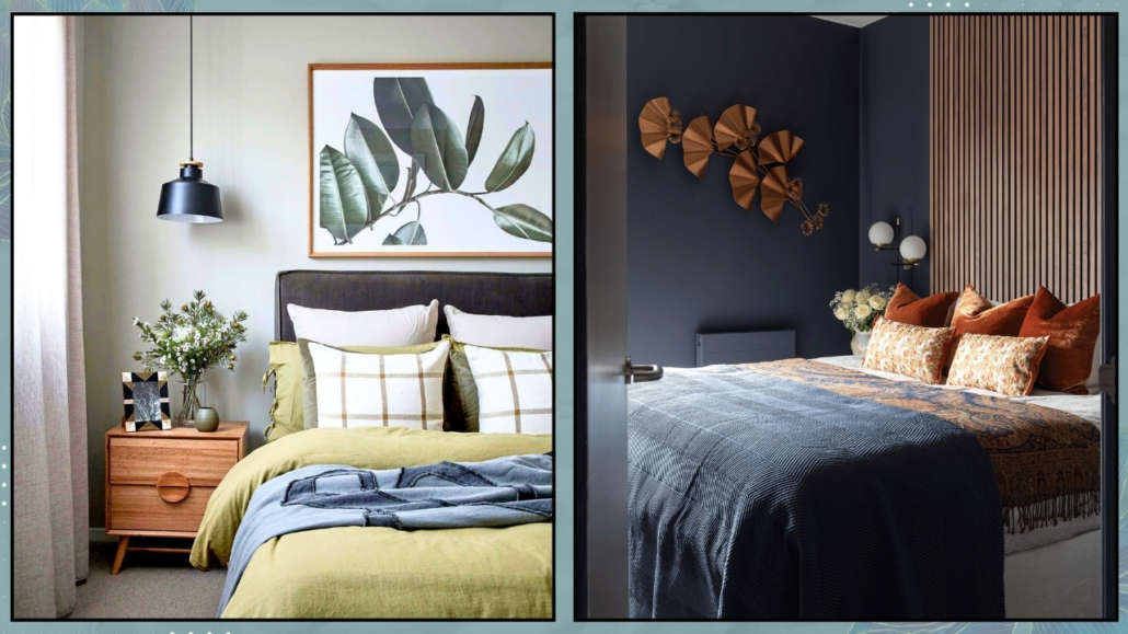
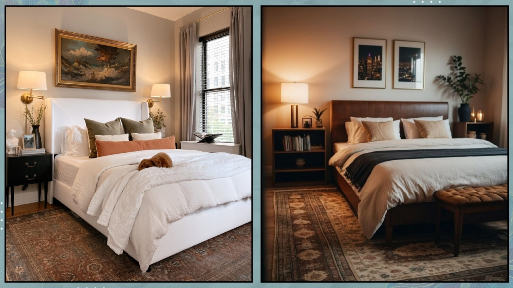
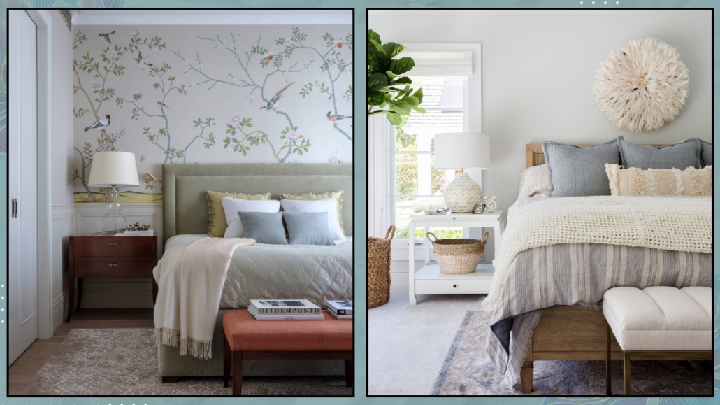
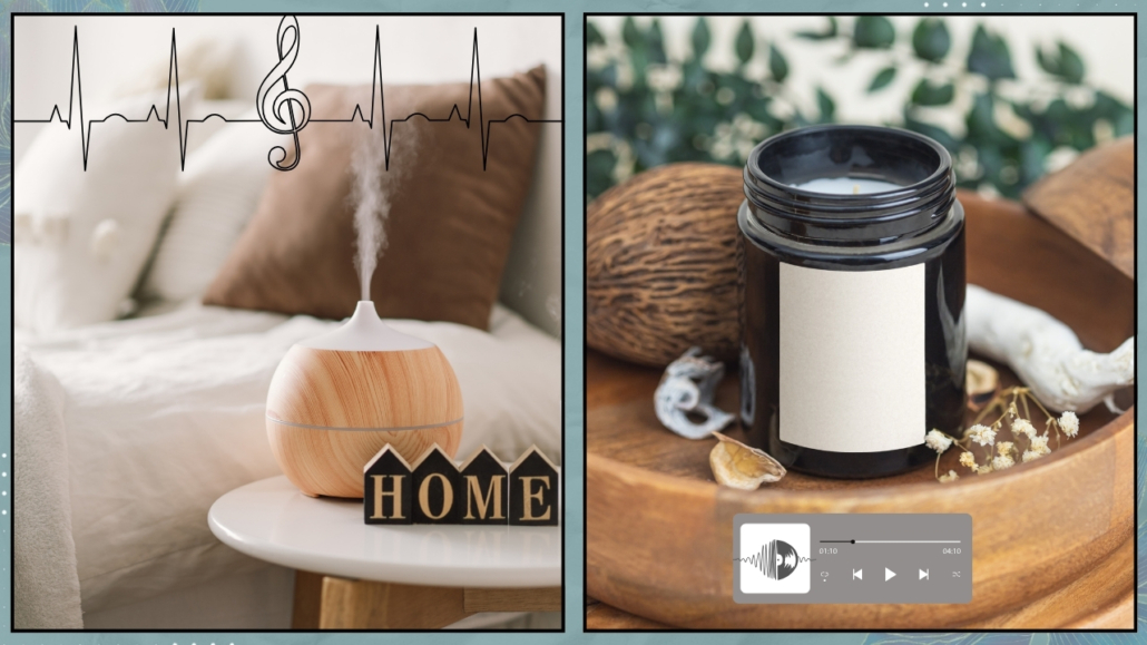
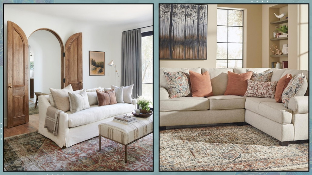
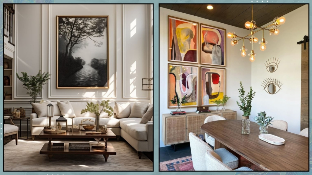
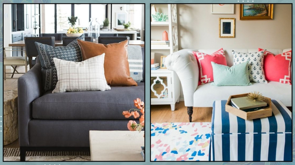
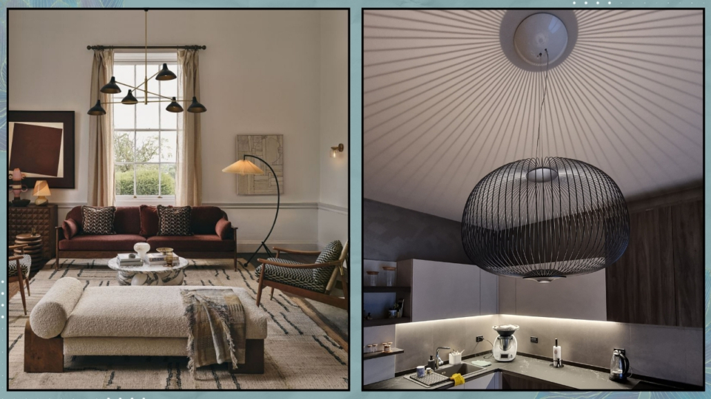
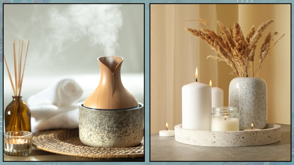
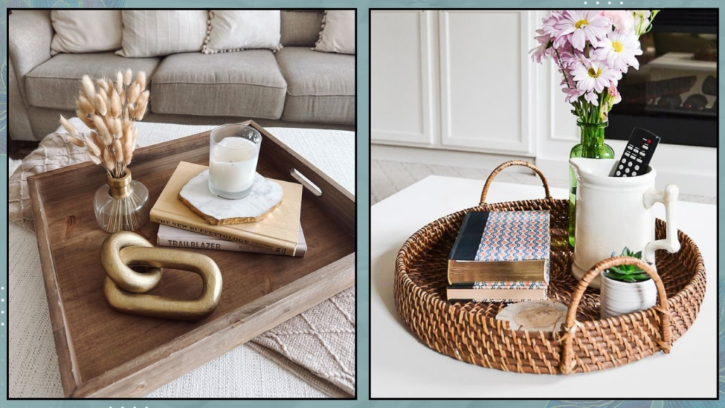
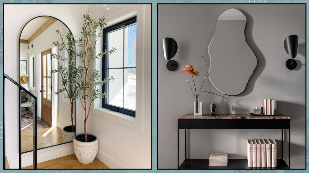
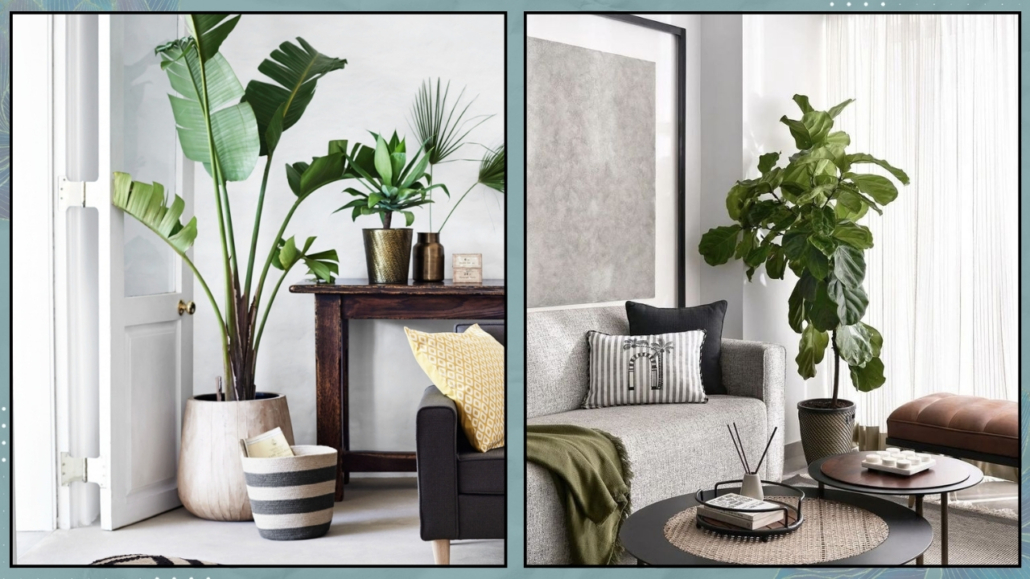
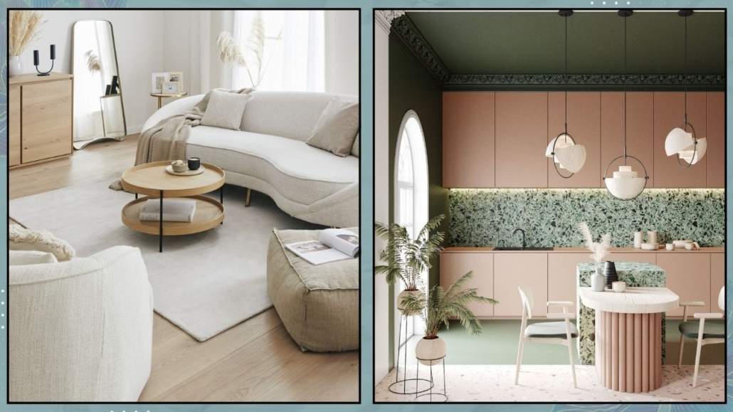
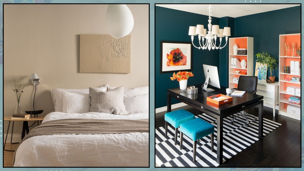
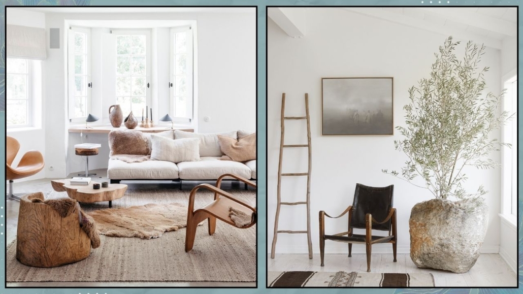
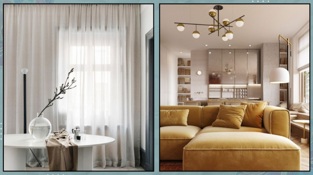
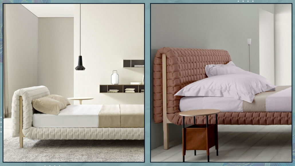
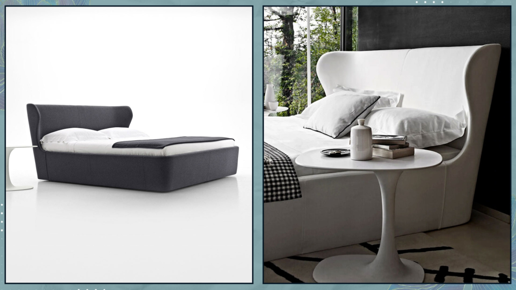
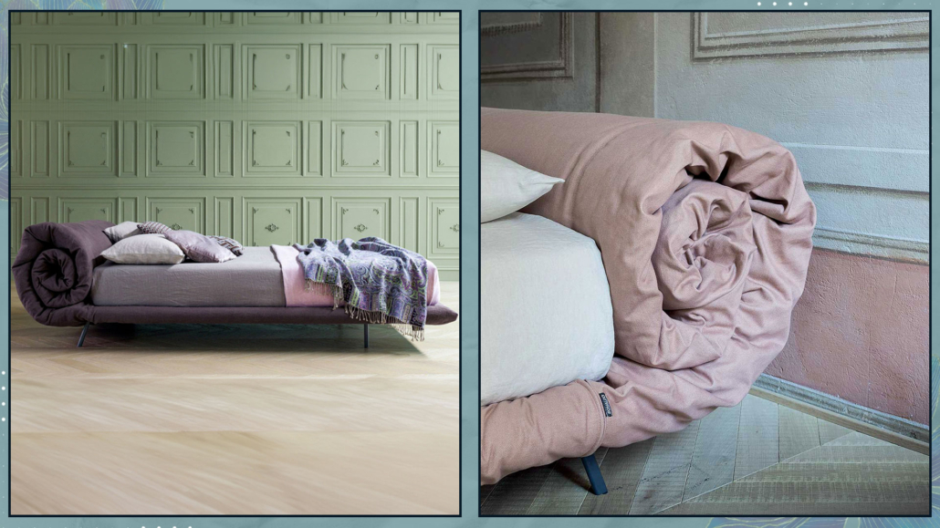
In several articles, I’ve emphasized the importance of maintaining a consistently tidy home for an organized, inviting, harmonious, and refined living space.
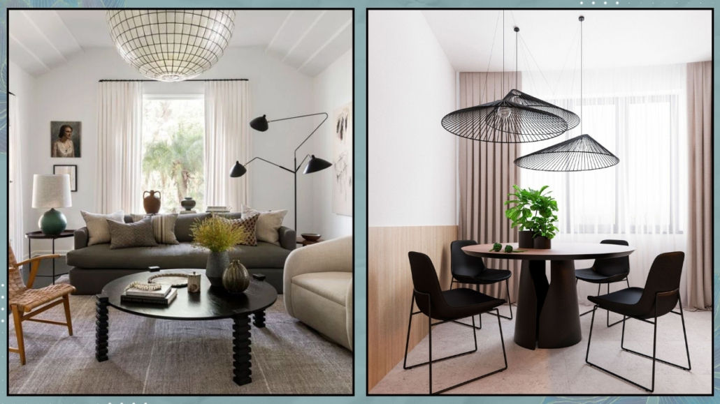
Avoiding visual clutter is crucial not only for aesthetic appeal but also for higger well-being, both mentally and physically.

A tidy home reduces stress, enhances focus, improves sleep, and even improves self-esteem.

Some small habits and actions can assist us in keeping our homes perpetually neat. Let’s explore them together.

1 – DECLUTTERING:

One of the reasons our homes (yes, I include myself!) are often in disarray is because we have TOO many things, and managing them all becomes overwhelming.

The more items we have, the easier it is for them to accumulate and create chaos, making us less motivated to tidy up: a vicious cycle!

Therefore, it’s essential to eliminate anything that is unnecessary and no longer serves a purpose.

I know it’s not easy, and, let’s admit it, often we don’t even know where to start, and it might take time, leading us to give up!

The trick is to do it in small doses: dedicate 10-15 minutes a day, or even per week if you prefer, and start with one room at a time, tackling drawers, closets, etc.

There might be items with sentimental value: set them aside, maybe create a box for them.

However, they must indeed hold meaning; otherwise, let them go.

Give away or sell the rest if it’s in good condition and usable, or merely throw it!

You’ll see that, as you gradually go through this process, your home will become increasingly tidy, and you might even enjoy it!

Once you finish, maintaining order will become easier.

You’ll also have made space for the new, but be cautious not to fill it up again.

Even when making new purchases, do it consciously: Do I really need it? Will I use it?

If it’s something decorative, ask yourself if it adds value, holds meaning, reflects who you are, or if it might eventually lose its charm.

(credits: El mueble; @oh.eight.oh.nine)

2 – ORGANIZATION:

Everything should have its designated place and be conveniently and functionally accessible.

If items don’t have a dedicated space, they end up lying around, creating clutter.

Therefore, it’s crucial that everything has a designated spot for storage.

Be mindful in choosing these spaces; they should make sense and, as mentioned earlier, be convenient and easily accessible.

Otherwise, items will end up scattered once again!

You can find a million ideas on how to organize your home with various types of containers: many of them beautiful, and I’ve suggested some myself.

The thing is, they’re not for everyone.

What works for some may be inconvenient and not very functional for others!

No matter how aesthetically pleasing things are, if they’re not practical, you may tire of using them and revert to the chaos from before.

The trick, as always, lies in thinking not in micro-categories but macro. Let me explain with a practical example:

In the kitchen, for instance, instead of having a jar for each type of pasta in the pantry, you could use a basket or a larger container to organize the bags/packages.

While there will still be a variety of colors from different containers, they will be “confined” in one space, making it neater and easier for you to access them, especially when unpacking groceries.

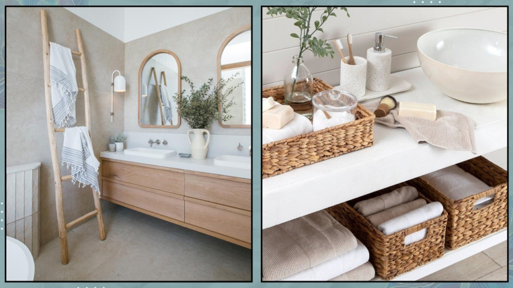
The same principle applies to bathroom drawers/cabinets.

Group items by categories: soaps, perfumes, cosmetics, razors, etc., and then place them in separate containers.

You’ll immediately notice a difference in terms of order while maintaining practicality.

A small tip: try to find and use containers that are visually consistent in terms of material for a cohesive look.

I’d suggest investing a bit more time, especially for containers holding items like shampoo, conditioner, and body wash, as they are quite visible.

(credits: Ikea)

3 – MAKING THE BED EVERY DAY

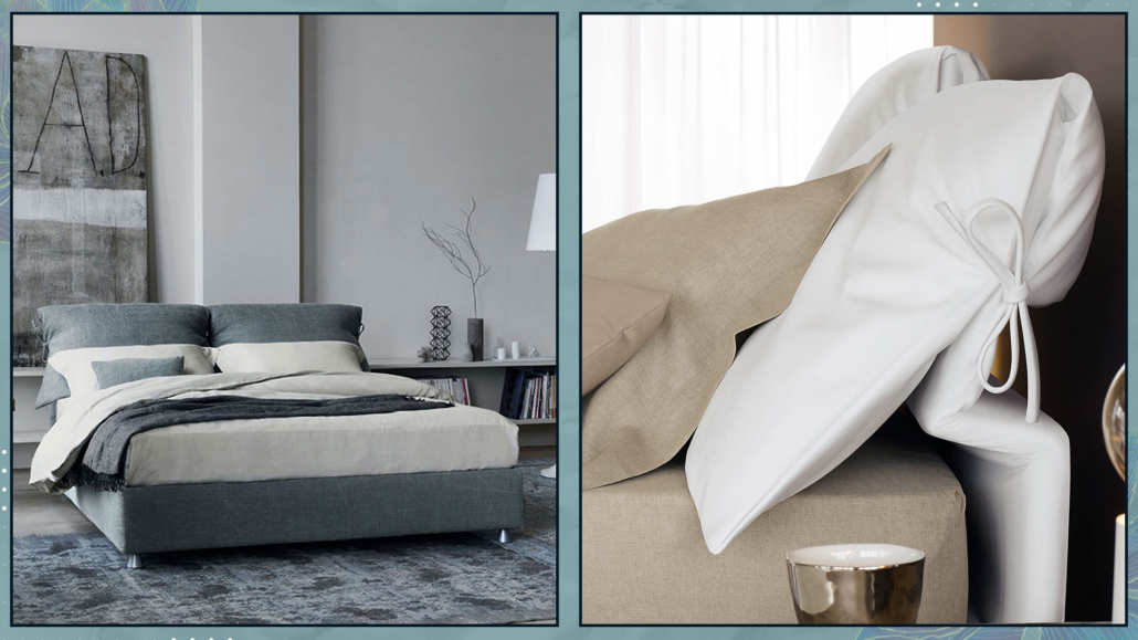
It might seem almost trivial, but making the bed every morning is genuinely vital for keeping the home consistently tidy!

Firstly, it serves a hygienic purpose: a well-made bed prevents dust and dirt from settling on the sheets.

Moreover, coming home after a long day of work and seeing your bed neatly arranged and ready to welcome you is actually a psychological boost.

On the other hand, seeing it in disarray may unconsciously bother you, perhaps triggering memories of chaotic or stressful situations you may have experienced during the day.

Invest a few minutes in this habit, remembering to adorn it with pillows and blankets: there doesn’t need to be a lot, just enough to make it immediately inviting and cozy!

(credits: @franzibower; lifeoncedarlane.com)

4 – ORGANIZE THE KITCHEN AND ALWAYS DO THE DISHES!

This suggestion might seem obvious, but I’ve often seen people leave dishes in the sink to wash them later or load the dishwasher afterward.

That tends to happen, especially during breakfast, when there’s a rush, and in the evening, when one is tired.

However, this has an impact on our minds and well-being because waking up in the morning or returning from the office to a chaotic kitchen is anything but relaxing and enjoyable.

Starting your day by dealing with the mess in the morning is not the best way to begin the day on a serene note!

And when it happens after a long day at work, when you might already be tired, it just adds stress!

Therefore, it’s a good habit to wash dishes immediately or, if you have one, load the dishwasher, leaving the kitchen organized and clean.

Plus, you’ll avoid lingering unpleasant odors!

(credits: exquisitelyunremarkable.com; studio-mcgee.com)

5 – TIDY UP THE COUCH WHEN YOU GET UP

This point is similar to the previous two, especially the bed one!

Coming home to a tidy couch with plump cushions and neatly arranged blankets (even those that may seem casually thrown have a specific arrangement) has a positive and calming impact on us.

Similar to the bed, the couch becomes inviting and welcoming.

It doesn’t take much time, even less than making the bed, but this small habit will always leave the living room organized, pleasant, and relaxing!

(credits: Alamy;theloomia.com)

6 – PAY ATTENTION TO TOWELS!

That is an often overlooked detail, but it’s paramount to be mindful of towels for two reasons.

Firstly, it is a good idea to change them regularly; it may seem trivial, but seeing crumpled dirty towels in the bathroom or kitchen is less than ideal.

Moreover, they inevitably develop odors that permeate the room.

The other thing to be cautious about is the color!

It’s a good idea, both for the kitchen and bathroom, to choose towels that align with the home color palette.

As always, this creates visual harmony, which is beneficial not only for the eyes but also for the mind.

Harmony has the power to calm and soothe, promoting relaxation!

(credits: eleanorrosehome.com; Jessica Windle)

7 – REMOVE YOUR SHOES AT THE ENTRANCE

It’s not always easy to have a shoe rack at the entrance, especially if it gives in a not-so-large open space.
Shoe racks are often placed in bedrooms or, ideally, in storage closets.

However, removing your shoes at the entrance, even if the shoe rack isn’t nearby, is paramount.

That is because, as you can imagine, we step on all sorts of things outside the house, and if we walk with our shoes inside, we inevitably bring these contaminants indoors!

We make an effort to keep everything in order, and then we risk having a dirty floor.

That is another factor that creates visual disorder and unconscious discomfort.

Leave a pair of well-kept slippers near the door, take off your shoes as soon as you enter, and put them away in the shoe rack.

Do the reverse when you need to leave.
It’s a small habit that you’ll quickly adapt to, and it will effectively help you maintain a consistently tidy home!

(credits: Future PLC; decoactual.com)

I hope this article has been helpful and enjoyable for you. If so, let me know in the comments!
Feel free to share it with anyone you think might be interested, I would be honored, and it will help me gain more exposure.

If you feel that your home, or any specific area of it, doesn’t reflect your personality enough, don’t wait any longer and book your consultancy!

Having a cozy, relaxing, and harmonious home has a positive impact not only visually but also emotionally!

The environment around us, including our interiors, significantly influences our psychophysical well-being; it’s scientifically proven!

It’s paramount, therefore, to be able to create settings that can support us, “nourish” us in everyday life and give us peace and serenity.

Let’s see today some ideas to bring harmony and well-being into our homes!

– ORDER

It’s not the first time I’ve said it, and even though it may seem obvious, I prefer to repeat it: a tidy home is decidedly more inviting and relaxing than a messy one.

And this is not only for potential guests but also for ourselves!

Chaos, even just having a room too cluttered, creates visual overstimulation that induces a sense of discomfort!

Imagine a well-kept lawn with beautiful trees and flowers, and now imagine the same lawn with tall grass, flowers scattered randomly, and maybe too many trees suffocating each other…

Where would you prefer to stay?

The same goes for the home!

I know it’s not always easy, but first of all, it’s essential to eliminate everything that is not used or no longer serves a purpose.

That will help free up space and allow for better organization of the remaining items.

Using baskets, decorative boxes, or storage furniture where you can put things away can be a valuable aid in keeping the house tidy.

Getting into the habit of tidying up before going to sleep is crucial: upon waking up, you won’t have the stress of having to organize, and the day will start in a more serene and calm manner.

You might also find that changing the position of furniture and objects to optimize the spaces could be a good idea!

So, don’t be afraid to move and rearrange things; you might discover that the new arrangement is more functional and aesthetically pleasing!

(credits: web; jambk)

– THE BEDROOM AS A “SANCTUARY” FOR CALM AND RELAXATION

As we’ve mentioned several times, the bedroom is the most relevant room in the house because it’s where we let go of all our defenses when we go to sleep.

It’s paramount, therefore, that it is inviting and relaxing.

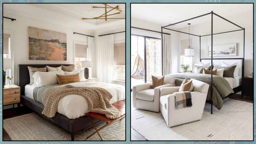
To achieve this, you can help yourself by dressing the bed in a cozy way, with blankets and pillows, so that it makes you feel like slipping in and letting yourself be embraced.

You can also use a soft carpet; here, a long pile might make sense, as the traffic is minimal, often barefoot or at most with slippers.

Use bedside lamps with warm lights to promote relaxation and sleep.

Avoid using cell phones and tablets because the blue light they emit disrupts sleep.

It would also be better to avoid having a television in the bedroom for the same reason.

If, by chance, you have your workspace in the bedroom, find a way to screen it so that you don’t see it when you’re in bed.

Otherwise, your thoughts will unconsciously go to work again, disturbing your sleep.

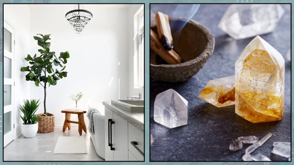
Some plants and relaxing scents like lavender, lemon balm, and chamomile help with relaxation!

(credits: sweethome.com; ingredientsldn.com)

– RELAXATION CORNERS

There are also other places to create relaxation corners!

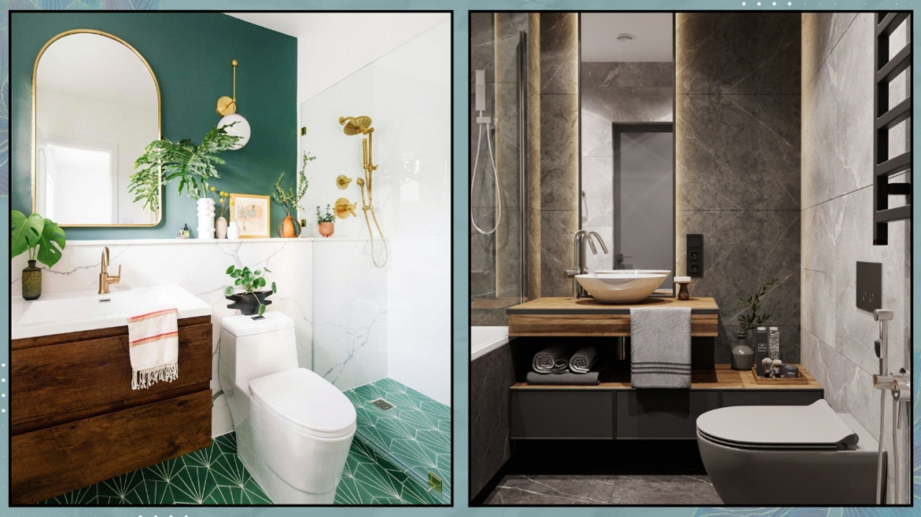
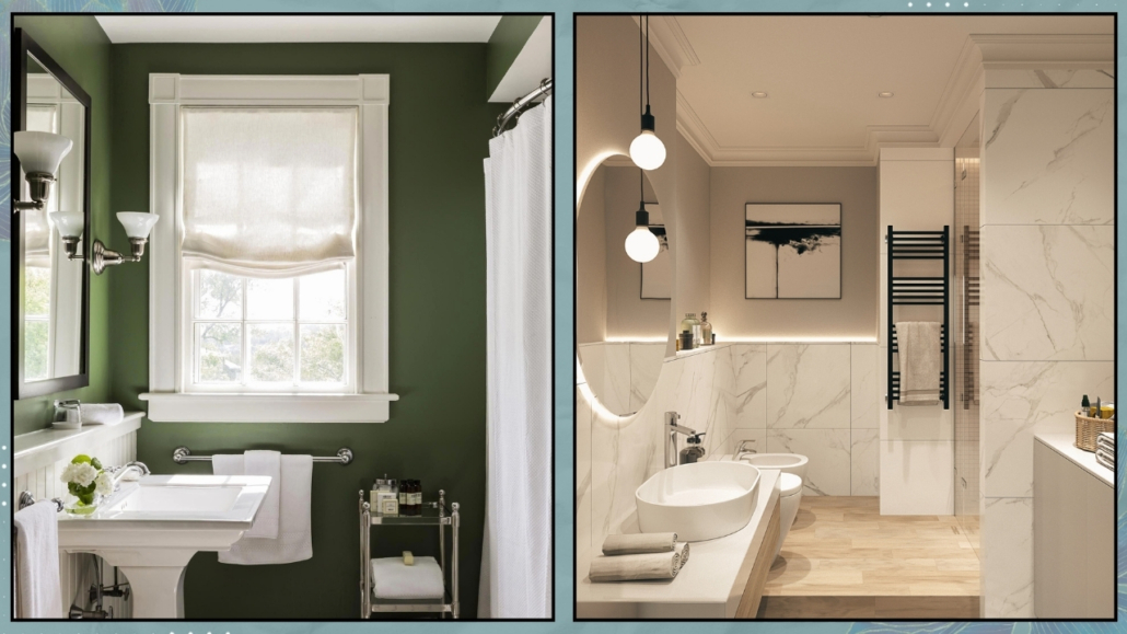
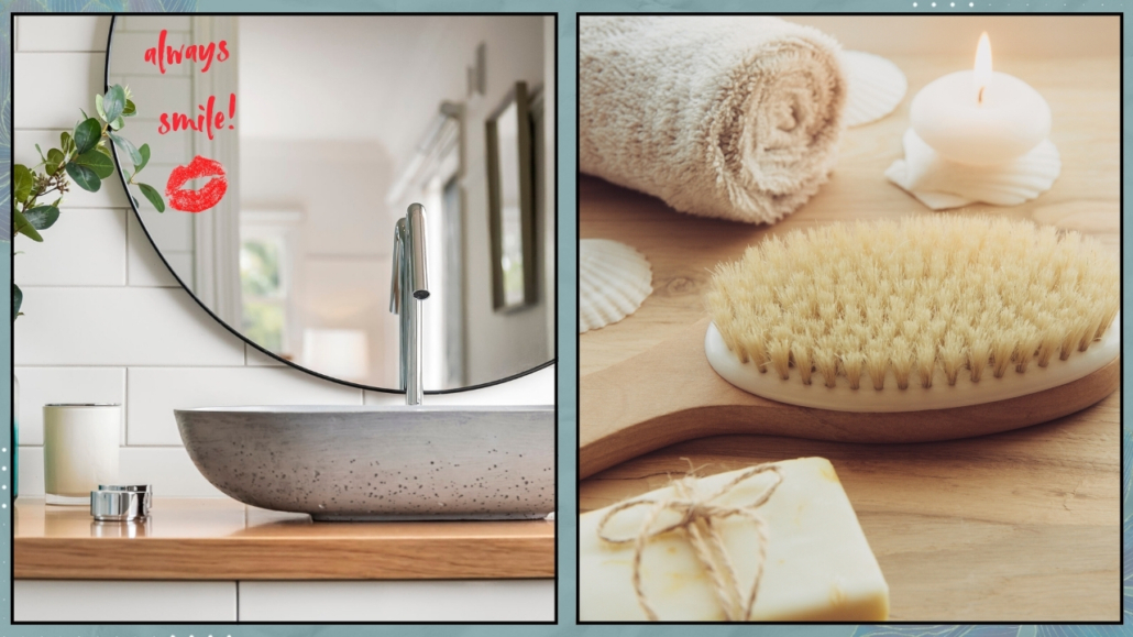
One of these is the bathroom; no matter how small it may be, it can become a small spa!

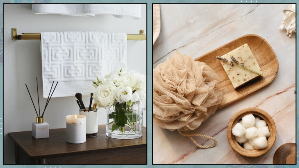
The first thing to do is to have soft towels, perhaps some candles and fresh fragrances, and, why not, a bit of music.

Use the bathroom to take a moment for yourself and regenerate!

Then, explore the rest of the house, maybe in the living room, and find a small spot (perhaps near the window) where you can create a relaxation corner.

It takes very little: a comfortable chair and a lamp (perhaps even a plant), and the trick is done!

That will be the place to retreat to for reading a book or listening to music!

Some plants and relaxing scents like lavender, lemon balm, and chamomile help with relaxation!

(credits: westwingnow.it; planete-deco.fr)

– BRING NATURE INDOORS

We know that we feel harmonious and peaceful when surrounded by nature.

So, there’s nothing better than bringing it indoors to evoke the same emotions.

First of all, make the most of natural light by letting it in as much as possible.

Use light-filtering curtains and, if necessary, mirrors to amplify it!

In addition to plants and flowers, another way to bring nature indoors is by using organic elements such as cotton, linen, and wool for fabrics and wood and wicker for furniture and accessories.

Also, opt for neutral and light colors and use a warm color temperature for artificial lights.

All of this creates a calm and relaxing mood.

(credits: Sebastian Erras; Eric Kuster)

– USE THE RIGHT COLORS

We mentioned it earlier; neutral and light colors help create a cozy and relaxing atmosphere!

When I talk about light neutrals, I don’t just mean white, gray, or cream, but also any desaturated colors (meaning white or gray has been added).

That allows for the use of colors and adds a particular play and visual interest.

Of course, this doesn’t mean giving up vibrant colors, but better to use them in small doses!

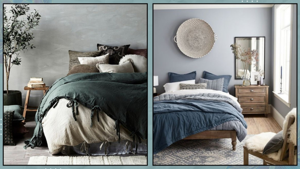
Blues and greens also have the calming and relaxing properties of neutral colors because they are colors we often see in nature.

So you can use them in more saturated tones, even on large surfaces like walls.

Remember, if you prefer cool blues or neutrals, warm them with warm colors or elements like wood!

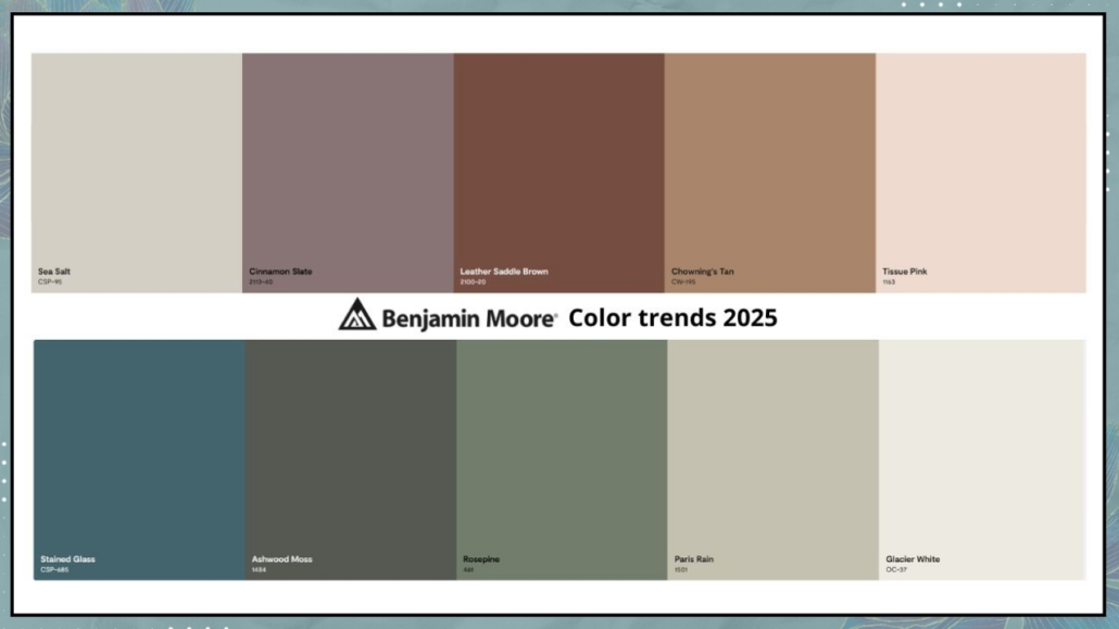
(credits: graziademonte.com; Benjamin Moore)

– NOT JUST THE SIGHT!

To bring harmony and well-being into your home, you need to experience it fully.

It’s not enough for the house to be visually pleasing; it must engage all five senses.

Having different textures and consistencies, smooth – rough, soft – solid, for example, creates rhythm and depth and also engages the sense of touch!

Textiles like pillows, curtains, and rugs “soften” the environment, not only visually but also acoustically; voices and sounds will resonate less and be more pleasant!

Finally, scents!

Smell is the most powerful of our five senses and is closely tied to memories and emotions!

Scents can influence our mood and concentration!

Keep your home always fragrant with the help of candles and essential oils (you can find other suggestions here).

Among the best scents for calming and relaxing environments are lavender, eucalyptus, and rosemary.

(credits: kc-designco.com; maisons du monde)

I hope this article has been helpful and enjoyable for you. If so, let me know in the comments!

Feel free to share it with anyone you think might be interested, I would be honored, and it will help me gain more exposure.

If you feel that your home, or any specific area of it, doesn’t reflect your personality enough, don’t wait any longer and book your consultancy!

Let’s start the new year by exploring together the 2024 home trends!

I want to remind you that these are suggestions and trends, and it’s not obligatory to follow everything, so only take what eventually resonates with you.

– FAREWELL TO PURE WHITE KITCHENS

For years, completely white kitchens have been in vogue, primarily to evoke a greater sense of cleanliness and also for their undeniable brightness!

Now, the trend is not to completely abandon white but to opt for a warmer shade, a more “buttery” white.

That alone will make the kitchen less cold and, allow me, aseptic!

The addition of wood elements, unique materials for lamps, distinctive handles, and the introduction of plants and wicker will make the environment decidedly welcoming!

This approach to designing kitchens will allow for a timeless kitchen that will never become tiresome and can potentially evolve over time with small changes like handles or other decorative elements!

(credits: virtuves.lv; jennymartindesign)

– GRAY, YES, BUT WITH A WARM UNDERTONE

Among the neutral colors used in interiors, gray is one of the favorites because it is a versatile color actually.

However, this year’s trend will be to use grays with a warm undertone to create inviting and cozy spaces.

If you’re wondering what an undertone is, I’ve discussed it here when I talked about neutrals!

Cool grays, compared to warm ones, create colder and duller environments.

That can have an impact on mood, giving a sense of depression.

It’s true, though, that cool grays provide a feeling of freshness, so they don’t need to be wholly avoided.

The trick, as always, is to balance them with warm elements, such as wood!

I would only suggest avoiding dark, cool grays; opt for lighter ones, as they can be “warmed up” more easily!

(credits: cocolapinedesign.com; H&M home)

– ENOUGH WITH CLASSIC MINIMALISM!

The two previous points lead us to bid farewell to classic minimalism with its austere forms and lines, pure white, and cool grays, ushering in a style that can be described as more livable and “sustainable”!

The trend is to embrace warm minimalism, Nordic style, or wabi-sabi.

They all share the foundation of “less is more,” but the aim is to make the spaces warmer and more inviting!

Moreover, there’s a focus on being more flexible, allowing individuals to bring their own personality and character into their homes!

It will always start with neutral colors and attention to functionality – typical of minimalism – but softened and made more welcoming.

(credits: rikreainteriors.it; ruemag.com)

– TERRACOTTA COLOR

Speaking of warm tones, a color that many believe is making a comeback is terracotta!

That applies both to tiles and as a general color scheme.

Indeed, it’s a warm and enveloping brown color that makes spaces decidedly inviting and relaxing.

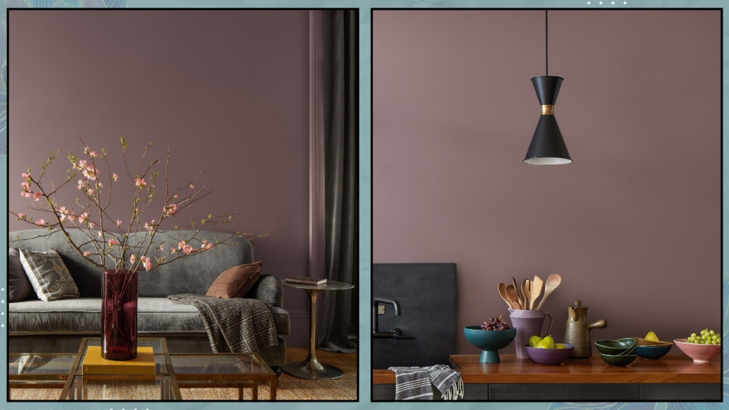
While it might not be among the colors of the year proposed by major brands, if you look at the color palettes they suggest to pair with their choices, you’ll notice many hues leaning towards brown!

Terracotta color can vary in saturation or tend towards red and pairs easily with many others, such as blue or green!

(credits: Living with Lolo; elmueble.com)

ZELLIGE-STYLE TILES

There has been a significant use of large tiles in recent years, even for wall coverings, to minimize the visibility of grout lines and create a more cohesive and uniform look.

Now, the focus has shifted towards zellige-style tiles, which are small, square, or rectangular tiles that appear handmade, as they are not “perfect.”

The edges are irregular, and there are variations in shade, even in solid-colored tiles.

They have a highly glossy glaze that reflects light beautifully.

And they are incredibly versatile.

Rectangular tiles, in particular, can be arranged in numerous patterns: vertical, horizontal, herringbone, and more.

Their irregularities are the distinctive features that make them special and create unique, timeless environments.

(credits: amyepeters; zweidesign)

– IRREGULAR-SHAPED RUGS

In recent years, organic shapes have become highly trendy (and continue to be), and this trend has extended to rugs as well.

You’ll find many rugs with unique shapes that serve as decorative accents in various spaces.

They are undoubtedly distinctive and, at times, playful, often used in expansive areas.

However, be cautious of nearby elements; the risk of creating chaotic environments is around the corner!

For consistent and harmonious spaces, other elements should have similar characteristics.

They pair well with furniture, especially sofas and armchairs, featuring organic shapes!

However, their irregular shape might make it challenging to arrange furniture uniformly.

For this reason, if you like these rugs, I’d suggest using them in small doses, perhaps in an entryway or to create a unique reading/relaxation nook.

(credits: tapis-studio.com;etsy.com)

– VINTAGE

With increased attention to sustainability, there’s also been a growing focus on the materials used in homes, leading to a rise in utilizing used and vintage furniture.

That trend we’ll see quite a bit in 2024, as it allows individuals to step away from the market of mass-produced industrial furniture and acquire unique and original pieces.

(credits: anthologycreatives.com; maisons du monde)

– BIO DESIGN

As mentioned earlier, there’s a greater emphasis on sustainability and nature.

We will witness increasingly sustainable homes with the use of natural materials, even in furniture and accessories.

That not only allows us to contribute positively to the environment but also to breathe “cleaner” air and let energy flow more freely in our spaces.

The growing desire for a connection with nature means we’re bringing more of it into our homes!

The inclusion of plants, water features, and fire elements, in addition to materials and curved shapes,  is an actual must.

And if you love a fireplace but don’t have one, I suggest looking at bioethanol fireplaces: they come in various sizes, from purely aesthetic to those capable of heating spaces!

(credits: Studio AG Arquitetura; planikauk.com)

What do you think?

Is there any trend you like and plan to incorporate into your home?

Let me know in the comments!

I hope this article has been helpful and enjoyable for you. If so, let me know in the comments!

Feel free to share it with anyone you think might be interested, I would be honored, and it will help me gain more exposure.

If you feel that your home, or any specific area of it, doesn’t reflect your personality enough, don’t wait any longer and book your consultancy!

Today, we return to the Design Elements column, discussing 5 historic and famous design chairs (you can find 10 more here!).

1 – THONET 214 CHAIR

Designed by Michael Thonet (an Austro-Hungarian cabinetmaker) for the eponymous company in 1859, it is an undisputed icon in furniture history.

Since its inception, this chair has remained the most successful and widely produced globally.

It is the first seat made from steam-bent wood, with a seat woven in straw.

It is known as the Bistro chair because it appeared in bars and restaurants in Vienna.

Due to being one of the first industrial products, the chair was sold at significantly lower prices than handmade chairs.

Comprising only six pieces of wood assembled with ten screws and two nuts, it has an essential and light appearance, featuring a classic design that also complements modern styles.

The renowned architect Le Corbusier described the chair as “the best design product in history for its ability to integrate technique and style.”

This chair is displayed as a work of art in many museums, such as the MoMA in New York and the Vitra Design Museum in Germany.

(credit: Thonet; @emmamelins)

2 – WASSILY CHAIR (formerly B3)

Designed by Marcel Breuer (Hungarian architect and designer, a prominent figure at Bauhaus) in 1925 and produced by his own company, Standard-Mobel Lengyel, in Berlin; then, the company was later absorbed by Thonet in 1929.

The chair gained recognition and mass production in the 1960s when Dino Gavina met Breuer and suggested reimagining the chair for his eponymous company (which was later bought by Knoll in 1968).

The name of the chair was also Gavina’s idea: Wassily, in honor of Wassily Kandinsky, a friend of Breuer and a great enthusiast of the chair.

It appears that Breuer drew inspiration from his Adler bicycle in using steel tubing to design and construct this chair.

That turned out to be a brilliant idea because steel tubing was readily available in large quantities, effectively initiating the production of steel tubular furniture.

Breuer employed the techniques of local plumbers to bring the chair to life.

The seat, backrest, and armrest are bands of eidengarn fabric: cotton treated with wax and paraffin, calendered by passing it between two rollers!

That is an innovation, a new material created in the furniture workshops of the Bauhaus, where Breuer served as the director.

Initially, the chair featured steel and black textiles, and later, to “soften” it, a version with cream-colored ones was introduced.

It is also available in red and other softer colors.

In 2019, for the centenary of the Bauhaus’s founding, a limited edition was crafted with black tubing: 500 units were produced, each bearing the Knoll seal, Breuer’s signature, and a unique serial number on the base.

(credits: Bauhaus; Knoll)

3 – CESCA CHAIR (Formerly B32)

Designed, like the previous one, by Marcel Lajos Breuer in 1928 and currently produced by Knoll, the Cesca chair draws inspiration from two historical seats: the MR10 by Van der Rohe and the Thonet 214.

It features a steel structure (similar to the Wassily) quite akin to Van der Rohe’s design, though more angular, while its seat and backrest are made of wood and Vienna straw, reminiscent of the Thonet 214.

Being a cantilever chair, it deviates from the traditional four-legged design, relying on a single tubular structure for support.

The combination of structural innovation and classic seat and backrest materials gives the chair a contemporary and versatile appeal, making it suitable for integration into various styles.

The carefully composed structure makes the frame visually lightweight yet remarkably durable and flexible.

It’s a very comfortable chair, available with or without armrests and with upholstered seats (and optionally backrests) for added comfort.

Interesting fact: given the resemblance to Mies Van Der Rohe’s chair, Breuer faced quite a few legal issues, to the extent that he couldn’t claim ownership of this chair and had to stop designing with tubular steel.

Despite everything, his name remained associated with the chair in various industry magazines.

In the 1960s, when the Gavina company acquired the design rights, Breuer was once again credited as the designer, and the chair’s name changed from B32 to Cesca after Breuer’s daughter, Francesca.

The Cesca chair remains one of the most imitated and best-selling chairs in the world.

(credits: tamsinjohnson.com)

4 – LOUIS GHOST CHAIR

Designed by Philippe Starck (French architect and designer) in 2002 for Kartell, the Louis Ghost Chair playfully nods to Louis XV-style armchairs and is crafted from polycarbonate.

Classic-baroque in style but modern in materials and production techniques, it took two years to perfect the injection molding process, ensuring the chair could be produced in a single mold without any joints or attachments.

This process, today, has been further refined, with a significant portion of the polycarbonate sourced from industrial waste from cellulose and paper production.

That reduces carbon dioxide emissions, resulting in a 60% reduction in environmental impact.

Due to its transparency, the chair is suitable for any setting and looks perfect even around an antique wooden table.

Undoubtedly one of Kartell’s best sellers, it holds the title of the world’s best-selling chair, despite not being the first transparent chair by the brand, which is the Marie.

In addition to the pure transparent version (crystal), you can also find the Louis Ghost Chair in other delicate colors, always maintaining its transparency, as well as in white or black.

You can also find original transformations, such as Teddie bear, Barbie-themed, with wings, illuminated, and more.

You can find it virtually everywhere, from restaurants to theaters, in numerous homes, and even on television.

Surprisingly, it has made appearances in religious ceremonies as well. In 2007, during an outdoor celebration with Pope Benedict XVI, we saw religious figures seated beside him on Louis Ghost chairs.

Even Queen Elizabeth II sat on a Louis Ghost Chair in 2018, sitting next to Anna Wintour while attending Richard Queen’s fashion show.

(credits: H2 Design and Build; Teresa Sapey)

5 – MASTERS CHAIR

Designed by Philippe Starck in 2010 and Eugeni Quitllet (Spanish designer) again for Kartell.

The Masters’ Chair features a distinctive backrest that, at first glance, appears to be an aesthetically pleasing weave.

However, it is, in fact, a tribute to three iconic chairs: the Series 7 by Arne Jacobsen, the Tulip Armchair by Eero Saarinen, and the Eiffel Chair by Charles Eames.

The profiles of the backrests of these chairs are overlaid and intertwined, creating a chair that, in itself, becomes an icon.

The chair is made from polypropylene, a material similar to expanded polystyrene, known for its high mechanical elasticity and durability.

It is lightweight, comfortable, stackable, and available in many colors, including metallic finishes.

These features make it highly versatile, and it earned the Good Design Award in 2010 from the Chicago Athenaeum Museum of Architecture and Design.

The Masters’ Chair also exists in a tall stool version suitable for kitchen islands, peninsulas, and bar counters.

(credits: Kartell; Lauren Nelson Design)

I hope this article has been helpful and enjoyable for you. If so, let me know in the comments!

Feel free to share it with anyone you think might be interested, I would be honored, and it will help me gain more exposure.

If you feel that your home, or any specific area of it, doesn’t reflect your personality enough, don’t wait any longer and book your consultancy!

Combining multiple styles at home is becoming increasingly common, but it’s not always easy.

A less-than-harmonious result is just around the corner if you’re not careful.

In the times of our grandparents, there wasn’t much choice, and homes were more or less furnished in the same style.

Nowadays, things are very different, and there are numerous possible home styles (here, I’m talking about the main ones!), making the choice not always straightforward.

And if selecting a single style is challenging when you’re alone, it becomes even more evident when sharing your home with your partner!

It’s unlikely that you both have the same tastes, yet the home should represent both.

The only way is to combine multiple styles but to achieve a harmonious and cohesive result, it’s essential to follow some precautions.

1 – IDENTIFY THE STYLES

The first thing to do is individually identify your own style and, from that, understand what you like the most, such as the color palette or typical shapes of that design.

Having clear ideas will make it easier to combine the styles.

Otherwise, the risk is buying things that, when put together, don’t work well and aren’t liked by either of you!

(credits: myshambar; meka)

2 – USE THE 80/20 RULE

The 80/20 rule suggests choosing a primary style, perhaps for hugger furniture and major decor elements, and a secondary one to complement it.

Having a dominant style allows you to create a cohesive and harmonious environment, while the secondary one adds a bit of rhythm and visual interest.

The key is to avoid competition between the two styles!

For example, you could have a predominantly modern/contemporary setting with some elements showcasing a classic taste, like a table or a sideboard!

(credits: Atelier HR; yoon-molduras)

3 – CREATE A FOCAL POINT

Use the secondary style as a focal point!

Sometimes, a single detail in a different style can transform an environment, giving it a unique character.

It can become the focal point, drawing the eye!

Imagine, in a predominantly modern/contemporary space, having a large mirror or a magnificent antique chandelier, etc.

Creating a focal point this way helps create emphasis, a fundamental interior design principle!

Look for elements that characterize the secondary style to create balanced and impressive spaces.

(credits: Elizabeth Roberts Architecture; weranda.pl)

4 – FURNISH NEUTRALLY AND DECORATE IN STYLE

You might also consider keeping the hugger furniture and accessories as neutral as possible.

Opt for linear, simple, and clean elements capable of adapting to almost any style.

Then, add character with decorations and slighter elements.

This approach is fantastic if either or both of you enjoy changing things up frequently!

Buying new furniture can be relatively expensive while changing decorations is more budget-friendly.

(credits: artfasad.com; Getty Images)

5 – USE COLOR

Color has the power to unify!

Having a consistent color palette will undoubtedly make it easier to combine two different styles and create a harmonious and cohesive environment.

Like the previous point, you might consider keeping walls more neutral (except for a possible focal point) and hugger furniture while using color in decorations and slighter elements.

Once again, it’s a way to facilitate changes without breaking the bank every time!

(credits: Orange I5; anthologycreatives.com)

6 – LOOK FOR COMMON GROUND

Search for as many common elements as possible between the styles!

In addition to color, it could be shapes, textures, or the use of metals or wood as well.

If you’re dealing with different metals or woods, pay attention to how you mix them—I suggest watching the videos where I discuss this (here metals and here wood)!

Common elements will serve as a guiding thread, tying together diverse elements cohesively and harmoniously.

(credits: Montse Morales; Zoco Home)

7 – START IN SMALL DOSES

Combining multiple styles throughout the house might be intimidating, and there could be a fear of an unpleasant result.

My advice is to start in small doses, creating small vignettes or compositions for the coffee table or console!

That will help you build confidence, see the results, and eventually adjust things without breaking the bank.

You’ll find it much easier if you’ve furnished it linearly and neutrally, as explained in point three.

You can always add more significant pieces once you understand what you both like!

(credits: covetnoir.com)

8 – BALANCE

Balance is always the key to having beautiful and harmonious spaces. Make sure that the styles are well distributed in the room and not concentrated in one single area.

Ensure the two styles blend together throughout to create a sense of rhythm.

Proper distribution will balance the different visual weights that inevitably come with the two styles, creating harmony and equilibrium.

(credits: Maisons du monde; the-designory)

ANOTHER TIP

Following the previous points will help you create environments that represent both of you!

However, it’s also fair for each of you to have a small corner all to themselves!

If you have a small study, that could be it, or a corner of the bedroom.

Alternatively, for example, if you have two bathrooms, each person could have their own, furnished and decorated ONLY with their style!

(credits: bhg.com; behomecasa)

I hope this article has been helpful and enjoyable for you. If so, let me know in the comments!

Feel free to share it with anyone you think might be interested, I would be honored, and it will help me gain more exposure.

If you feel that your home, or any specific area of it, doesn’t reflect your personality enough, don’t wait any longer and book your consultancy!

When it’s time for decorating your home, it’s easy to seek inspiration from magazines and the internet.

Often, we come across quite magnificent settings, but be careful about copying them because some solutions are indeed impractical!!! The home should be beautiful but, above all, functional!

Let’s look at some elements that may have the wow factor but can ultimately prove to be less convenient!

– WHITE SOFAS

White sofas are actually gorgeous to look at; for sure white is a timeless color that complements any style and palette.

Moreover, it certainly helps make the room feel more airy and bright.

The temptation, therefore, can be strong, but it’s genuinely not practical!

White gets dirty immediately, and you have to wash the covers very often, inevitably wearing them out!

Alternatively, you have to put unaesthetic sofa covers on them!

And on this matter, unfortunately, I speak from experience because my first sofas, I admit, were white!!

If you absolutely love white sofas, the advice is to buy ones with highly performant covers, like those water-repellent and stain-resistant.

Alternatively, an excellent compromise could be sofas in cream, gray, or ultra-light colors!

(Credits: Ikea; architonic.com)

– ARMLESS SOFAS

Armless sofas are very popular because they are linear and elegant, and without the bulk of armrests, they also appear more “lightweight”!

However, having arm support is much more comfortable and less rigid when sitting on the sofa!

If you don’t have an ottoman or a chaise lounge, you might still want to stretch your legs; if you have an armrest supporting your back, you can do it right on the sofa!

Even during a nap, having an armrest to rest the pillow on is undoubtedly more comfortable and “cocooning”!

In fact, the armrest somehow embraces you!

When buying a sofa, considering the investment, it’s essential to be clear about how you will use it because it’s actually a shame when sitting on it not to feel comfortable!

(Credits: 2modern.com; @la_muebleta)

– GLASS SURFACES

Glass greatly helps in brightening up a room; it’s relatively easy and quick to clean.

However, the downside is that it just takes a touch to get dirty, and dust is more noticeable on glass surfaces than on others!

So, especially if you’re not a fan of cleaning, carefully consider whether and what to get in glass.

If you love glass, you might consider getting frosted glass, which, being not transparent, will better camouflage dust and any traces!

The same goes for glossy black surfaces: they constantly need cleaning!

(Credits: bhdmdesign.com; leroymerlin.it)

– OPEN SHELVES AND NIGHTSTANDS

The concept of open shelves and nightstands has been popular for many years because it gives more breathing space to the rooms than closed furniture.

All the images featured in magazines or on Pinterest and Instagram are undoubtedly fabulous!

However, the reality is that most of the time, these setups are composed precisely for photographs.

In real life, things are not as they appear in the pictures!

Moreover, cleaning open bookshelves, shelves, and nightstands and removing everything each time is indeed impractical!

Does this mean having only closed furniture?

Obviously not, but there should be a few carefully chosen and decorated elements.

They should be well thought out and intentional, designed to showcase rather than “store.”

Let me explain further: there are books and objects worth displaying, creating unique compositions, and others that are not!

There’s also a practical aspect alongside the aesthetic one: everything that’s open and in plain view needs regular cleaning.

So, if you prefer to spend your time differently than constantly cleaning, think carefully about how much you want to keep open and on display!

(Credits: amazon.com; maisonblonde.com)

– VESSEL SINK

For a few years, the bathroom trend has included the vessel sink placed on a cabinet or shelf.

This type of sink can come in any size or shape, paired with a long or wall-mounted faucet.

Let’s admit it: there are some indeed lovely ones to look at, but they are not very practical!

In reality, the area where the sink rests on the cabinet or shelf will always be wet and dirty, requiring constant cleaning.

In the case of a faucet also resting on the cabinet, there might be difficulty in cleaning that area effectively!

If it’s a guest bathroom you don’t use very often, this inconvenience might not be so noticeable, but it will be evident in the case of the main bathroom!

It’s better to have a sponge nearby and clean after each use!

(Credits: Sceg Architetti; gaiamiacola.it)

– OPEN SHOWERS

Open showers are also an increasingly popular trend, with only one side glass wall covering half of the shower, leaving the rest open!

They are undoubtedly absolutely captivating, super minimal, visually perfect, especially in contemporary style, but decidedly impractical!

One reason is that no matter how careful you are, it’s inevitable to splash water everywhere!

It might work well if you have a huge shower with a glass wall that is actually long; otherwise, it can be very inconvenient!

However, another aspect may not be immediately apparent: since the shower is not enclosed, there won’t be a greenhouse effect, and therefore, there is a risk, especially in winter, of feeling cold!

(Credits: livcustomglass.com; galansobrini.es)

– SHAG RUGS

I’ve often talked about the importance of rugs in interior design: they bring textures and colors and can create defined areas by grouping elements together!

However, you must be careful about the type of rug you choose!

It’s easy to be drawn to shag rugs because they are visually appealing, but most importantly, they are super soft!

The problem is that they require continuous maintenance because they trap dirt much more and definitely become tangled and matted.

They should certainly be avoided in homes with pets, as their claws will easily damage the rug, and their fur will more readily get caught in the long fibers!

But in general, even high-quality shag rugs will wear out much more quickly than short-pile ones.

They might be suitable in low-traffic areas, but even then, given the vast range of other options, the advice is to avoid them!

(Credits: amon.com; @joanna.avento)

I hope this article has been helpful and enjoyable for you. If so, let me know in the comments!

Feel free to share it with anyone you think might be interested, I would be honored, and it will help me gain more exposure.

If you feel that your home, or any specific area of it, doesn’t reflect your personality enough, don’t wait any longer and book your consultancy!

The end of the year is approaching, and often, with the arrival of the new one, we have a desire for changes in the house: so here are 7 tips to renovate your home!

1 – MAKE ORDER

Well, I understand it might not be the most exciting piece of advice, but tidying up is truly the first step in renewing your home!

By order, I don’t just mean what’s visible to everyone, which you probably don’t need, but really getting to the bottom of things by rummaging through your closets and drawers!

I’m sure you’ll find many items you no longer use for various reasons; it’s time to let go of them!

Go room by room, start with the visible elements, and then look into all the furniture.

Anything that no longer represents you, that you no longer like, pull it out and set it aside.

There might be things you don’t use but have sentimental value; create a special box for those items and keep them all together.

For everything else, you can throw it away if it’s no longer usable or take it to a thrift store!

You’ll breathe new life into these items, making someone else happy and creating space and organization!

Getting rid of what you no longer need brings in “fresh” new energy to your home!

(credits: auroracustomfurniture.com; salvatoriofficial.com)

2 – REARRANGE FURNITURE AND ACCESSORIES

I’ve mentioned this several times before, but sometimes we don’t realize there are different ways to arrange furniture, and some might even be more functional!

Try making some changes; in the worst case, you can always replace everything as it was!

While this may not always be feasible for furniture, it’s undoubtedly doable for accessories and objects!

Empty your bookshelves, clear off coffee tables and consoles, and then try creating different compositions by mixing objects from various rooms.

Sometimes, even small changes can entirely change the look of a room!

Before doing this, I recommend taking a few photos of the current arrangements – you never know, it might be easier to put everything back as it was if you’re not satisfied with any of the new setups!

(credits: viverelostile)

3 – PAY ATTENTION TO THE ARTWORK

While getting things in order and rearranging furniture and accessories, also take a look at the artwork you’ve hung on your walls.

Do they still represent you? Do they fit well with any new furniture and accessory arrangements?

If you’ve made changes or additions over the years, is everything still harmonious?

It might be a good idea to consider changing some frames or, conversely, some prints.

Maybe having fewer pieces is better, or perhaps something is missing!

In short, try to look at it all with a critical eye, not just with your heart!

Moving and changing this decoration is undoubtedly an excellent way to renew your home!

(credits: floss.com; etsy.com)

4 – TEXTILES

I’ve talked about it in the context of decorating your home in autumn and spring: change your home textiles.

First and foremost, the covers of decorative sofa and bed pillows: it’s quick to do, generally not too expensive, and the replacements don’t take up much space in your closets or drawers!

In the bedroom, you could change the bedspread or at least the one or more decorative blankets you might have at the foot of the bed.

In addition to decorative pillows, you might consider changing the sofa covers and any decorative throws in the living room.

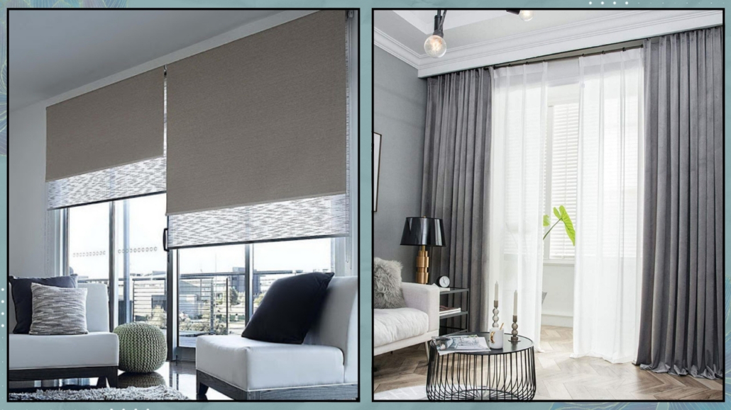
You could even think about changing the curtains, especially if you have double curtains and one of them is colorful!

Changing the colors, textures, and patterns of various textiles will completely transform the look of your home!

(credits: terracota.com; © Emery Bastable)

5 – PAINT THE WALLS

Giving your walls a fresh coat of paint is another way to renew your home!

It’s immediate and has a tremendous impact!

Of course, you don’t have to paint all the walls if you don’t want to; just one accent wall can suffice and become the focal point.

You can use the color-blocking technique to emphasize an area (if you don’t know what I’m talking about, you can find the video here).

(credits: Design Studio; @thuisbijmij)

If you already have colored walls, you might think about changing the color of one or more of them to create a subtle contrast.

Doing this is easy and not too costly, but it will make a significant difference.

What if you don’t like colors?

Well, you can change the white!!!

Yes, because, as I explained some time ago, it’s easy to say white!

In addition to pure white, there are at least 150 shades of white, and believe me, they can make a big difference in renewing your spaces!

(credits: arde.dk; kvarteretmakleri.se)

6 – SET THE ATMOSPHERE

Often, people focus on the aesthetics of a home, then its functionality, and pay a bit less attention to the atmosphere!

I believe that functionality and atmosphere should be the first two things to consider.

And how do you create the atmosphere?

– SCENTS

One thing that often isn’t given much thought is that scents have an incredible impact on us.

Let me give you a simple example: how do you feel when you walk into a bakery with the delightful scent of freshly baked bread or into a coffee shop with the aroma of excellent coffee?

Think about all the times, even in a hurry, you’ve been captivated by a scent emanating from a store or restaurant and closed your eyes to savor it.

On the contrary, I’m sure that if you’ve been somewhere, even if it’s a beautiful place, with unpleasant odors, you’ve thought twice about returning!

Scents we enjoy help us feel good and relax.

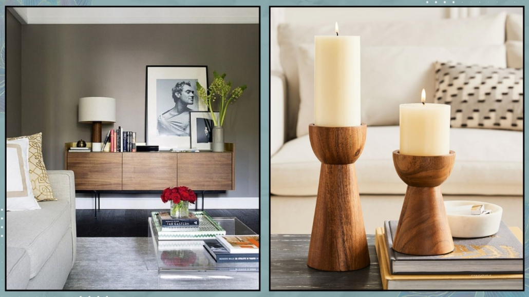
Use diffusers and candles around the house, and you’ll see the difference it makes!

(credits: charmeandmore.it; Maisons du monde)

– MUSIC

Music also has a tremendous power to make us feel good in an environment!

No matter what activity you’re engaged in, having some background music can undoubtedly be very helpful.

Create playlists to use according to the moment; it could be classical or calming music if you need to relax or focus, or it could be something a bit livelier if you need a boost of energy!

Use it even when you have guests; they’ll appreciate it!

(credits: evanto)

– LIGHTING

We’ve talked it many times before: light can drastically alter the perception of spaces!

Warm lighting creates a calm and relaxing atmosphere, while colder lighting is less inviting.

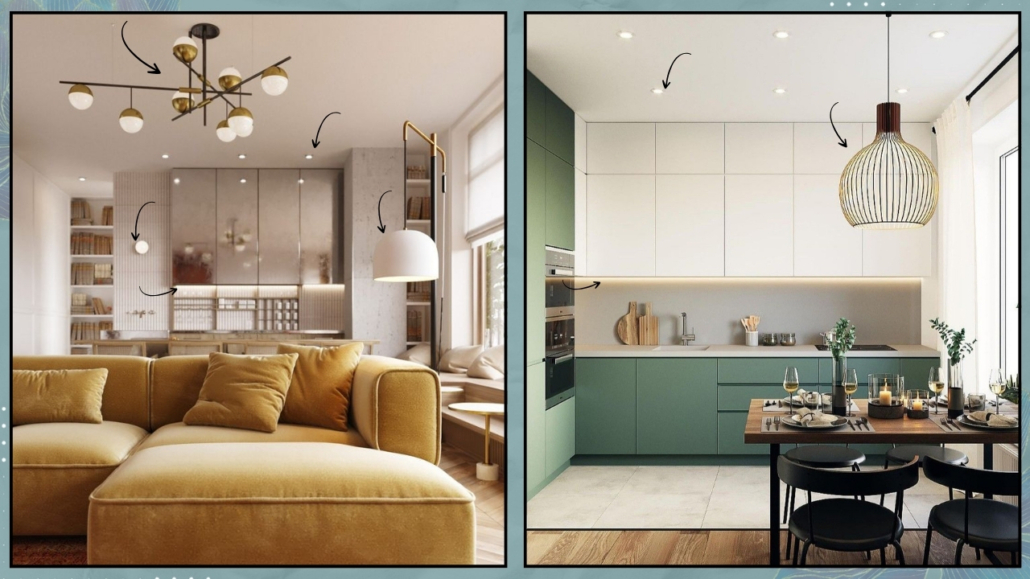
It’s ideal to have multiple light sources in every room!

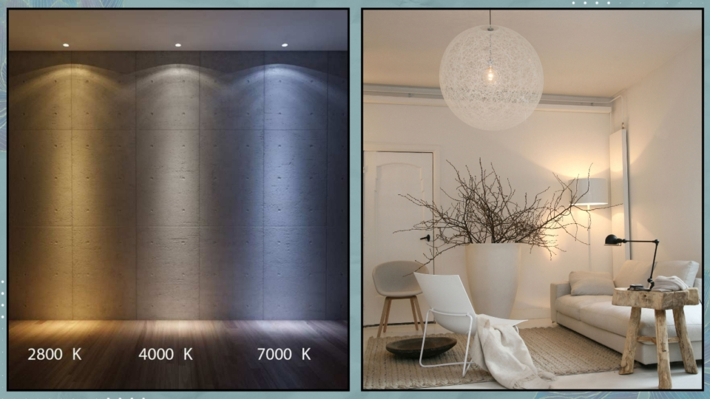
The general light can have a neutral, natural color temperature (around 4000K), while the others should all be warmer (more or less 3000K or lower).

A fantastic idea would be to have all dimmable lights, which means lights that you can adjust in terms of intensity and maybe even color temperature, allowing you to manage everything according to your needs!

(credits: lovisabarkman; porterdesigngrp.com)

These three elements are not set in stone (not even the lighting if you make it dimmable and can change the color temperature as desired), and this helps you change the atmosphere whenever you want!

7 – HANDLES

Another suggestion for renewing your home is to change the handles!

You can replace the ones on your doors, windows, and even the handles on various pieces of furniture.

Handles for furniture, in particular, are often available at affordable prices!

Handles are small but significant details that can make a huge difference and completely transform the look of your home!

(credits: cristincooper.com)

I hope this article has been helpful and enjoyable for you. If so, let me know in the comments!

Feel free to share it with anyone you think might be interested, I would be honored, and it will help me gain more exposure.

If you feel that your home, or any specific area of it, doesn’t reflect your personality enough, don’t wait any longer and book your consultancy!

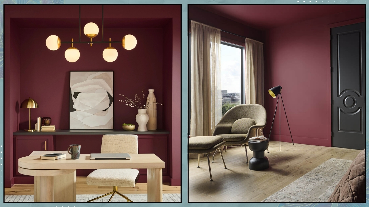
As every year, in the autumn, the major brands in the color industry make their suggestions for the color of the upcoming year; let’s see what the proposed for “The Color of the Year 2024” are!

– BENJAMIN MOORE – Blue Nova 825

This year, Benjamin Moore proposes a color that is actually a blend of blue and purple, an intense color described by the company as “inspired by the brilliance of a new star formed in space.”

Being part of the blue spectrum, it’s a soothing and, undoubtedly, very elegant color!

Andrea Magno, the Director of Marketing and Color Development, described the color as “a seductive mid-tone that balances depth and intrigue with classic charm and reassurance.”

It’s a color that can also be used on walls, but one should be mindful of the house’s orientation.

If the room faces north, it might be better to avoid using it on all walls, as it could become a bit gloomy and chilly.

Once again, Benjamin Moore offers a complete color palette to pair alongside Blue Nova 825.

This palette can be used in its entirety or selectively.

It’s a dynamic palette because it contains both warm and cool colors, light and dark!

– SHERWIN WILLIAMS – Upward

Sherwin Williams also opts for a shade of blue described as “airy and blissful.”

It’s a truly relaxing, bright, and energizing color!

Being very light and delicate, one can use it on all walls.

Upward is a color that pairs well with all styles and can even be used to give a fresh look to some furniture.

However, it’s a cold color, so it’s a good idea to warm it up somewhat with some warmer colors and perhaps some wood accents!

Here’s an interesting tidbit: Sherwin Williams collaborated with the French pastry chef Dominique Ansel for his vegan cronut filled with rice milk and glazed with dark chocolate, both made with butterfly pea flowers, a flower whose shade reflects Upward!

Sherwin Williams also offers a color palette you can pair (one or even all of them) with Upward.

These are colors that draw inspiration from the hues of nature, creating enveloping and relaxing environments.

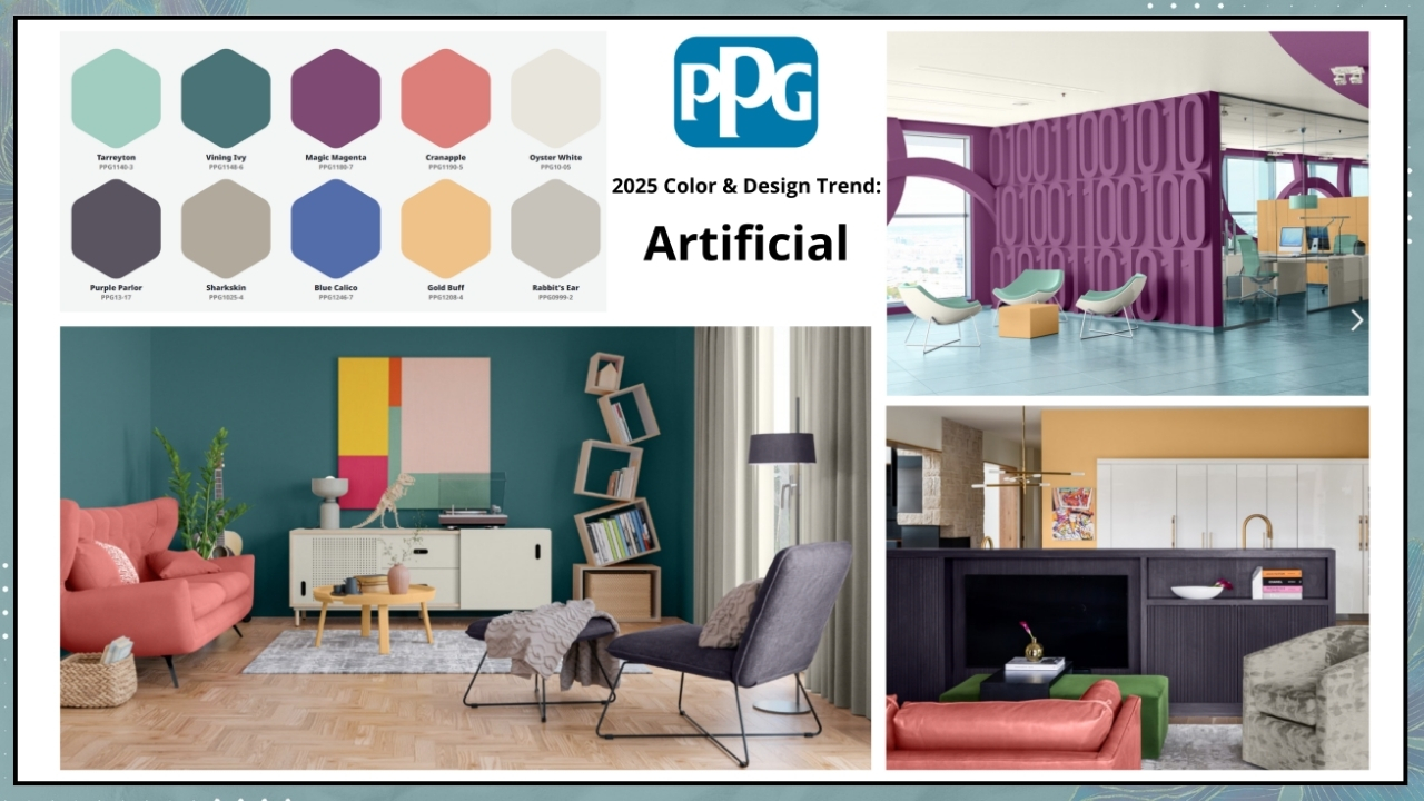
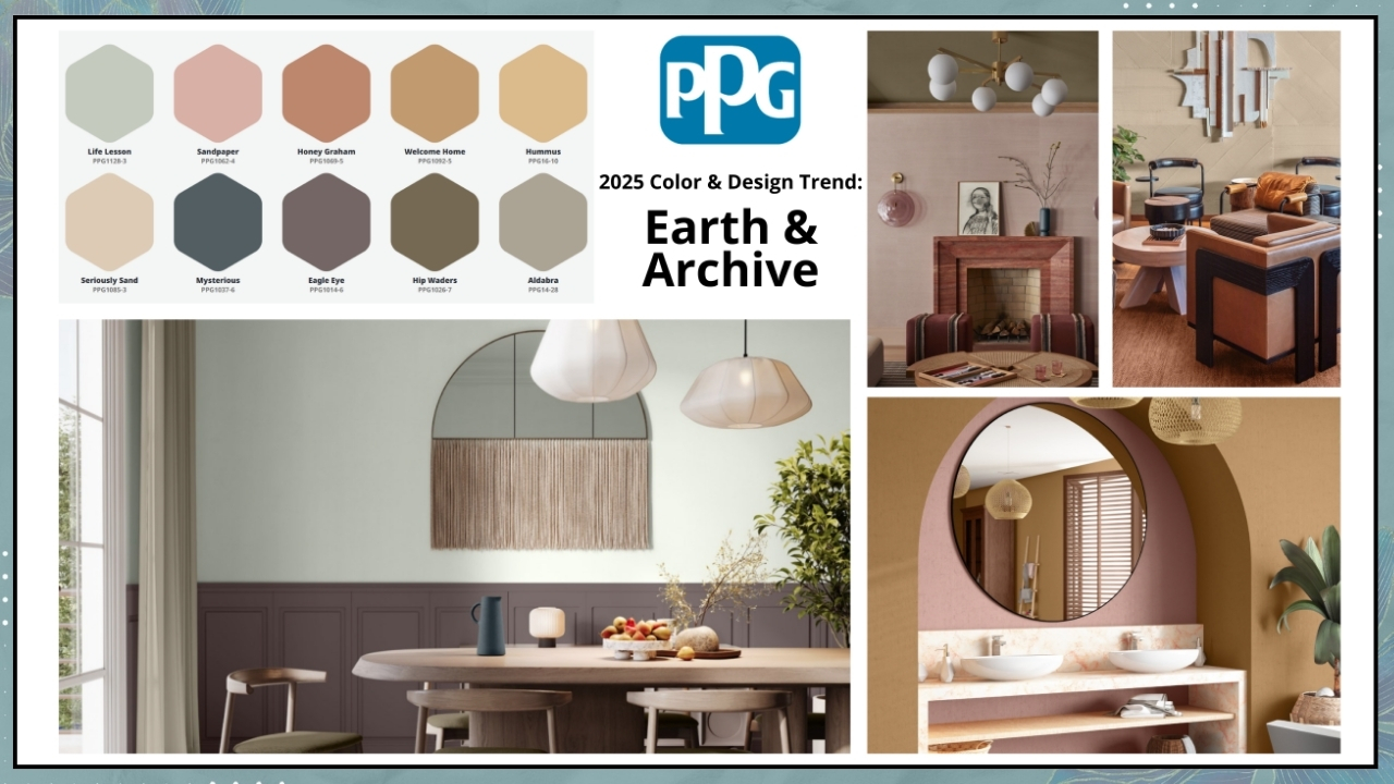
– PPG – Limitless

For 2024, PPG proposes a warm and enveloping neutral color that, as the name suggests, can be used without limits!

It’s a sunny and energizing shade that one can apply to all surfaces and complements various styles.

As is the tradition, PPG also offers three types of color palettes:

– Volume I

It consists of calming hues and tones paired with earthy shades and cooler tones; it aims to represent the exploration of the world and harmony!

– Volume II

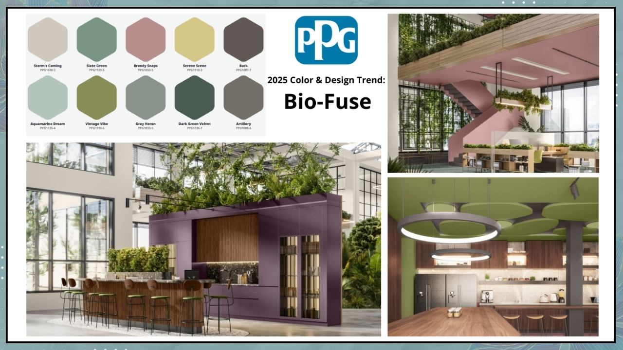
This palette consists of earthy and natural greens alongside warm, floral tones with some touches of vibrant blues and deep neutrals.

It symbolizes the transformation of the world with wonder and amazement!

– Volume III

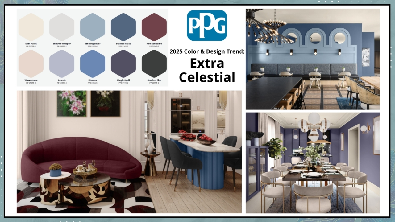
These colors draw inspiration from the Baroque and Renaissance periods, Art Deco, and Pop Art, remarkably combining them.

In some sense, it’s a palette that speaks to challenging and reinventing the world!

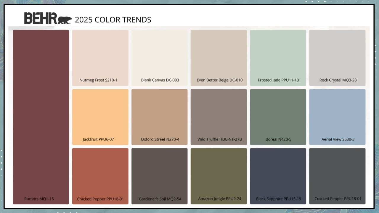
– BEHR – Cracked Pepper

This year, Behr presents the exact complementary of last year’s color by proposing a black!

However, it’s not a pure black that might feel a bit dark; instead, it’s a soft and enveloping charcoal black that actually adds an extra dimension to spaces.

It’s a timeless color that fits well with every style, “awakening the senses and exuding confidence”!

It’s a versatile color that one can use as a neutral in any room of the house.

Like the other brands, Behr also offers a color palette to combine with its Cracked Pepper.

In this palette, you’ll find whites, neutrals, and pastels, accompanied by some bolder and more energetic colors, all inspired by nature.

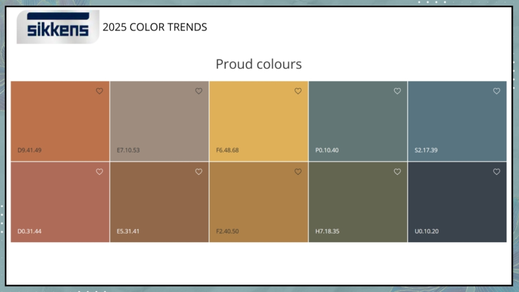
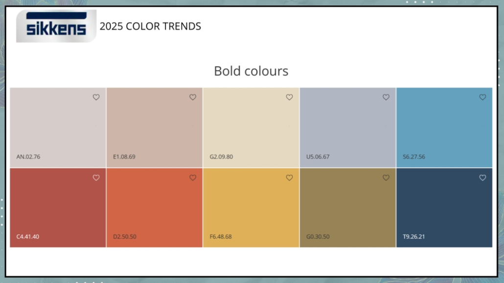
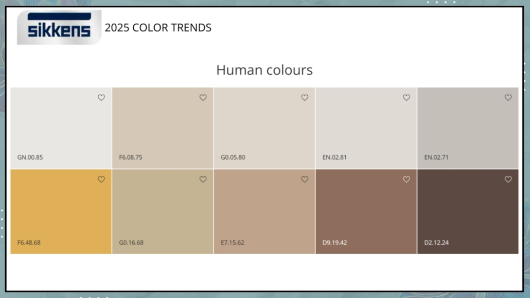
– SIKKENS – Sweet Embrace

Sikkens’ Color of the Year for 2024 is a very delicate and soothing hue “inspired by soft feathers and the subtle evening clouds.”

It’s a dusty pink with a subdued beige-gray undertone that creates intimate spaces and atmospheres that exude calm and stability.

This color is a neutral and can be used in every room of the house, complementing any style!

Similar to last year, Sikkens offers three color palettes to accompany Sweet Embrace:

– Warm Colors

These are natural earth tones to create environments that harmoniously connect with nature, establishing cozy and reassuring atmospheres.

– Calm Colors

There are various shades of green and blue; these colors help create relaxing environments, making them well-suited for studies and offices.

– Uplifting Colors

This palette is decidedly more vibrant, thanks to the yellow-leaning colors.

Shades of blue and violet serve to refresh the palette, making it youthful and dynamic!

What’s your favorite color?

Tell me in the comments!

I hope you found this article helpful and enjoyable. If you did, please let me know in the comments again!

Feel free to share it with anyone you think might be interested; I would be honored, and it will help me get noticed.

If you feel that your home or any part of it doesn’t reflect you enough, don’t wait any longer and book your consultancy!


Do you love colors? here is the color playlist on my YouTube channel!

Today, I’d like to talk about the living room and discuss 6 common mistakes we could probably make, how to avoid them, and how to fix them to create a beautiful, inviting, and comfortable space.

The living room is where we go when we want to unwind, read a good book, watch TV, or enjoy the company of friends and family.

It’s crucial, therefore, that it’s inviting and comfortable so we can release the accumulated stress and relax!

Some mistakes can significantly impact our spaces, making them appear somewhat dull.

Let’s see what they are and how to fix them!

1 – FURNITURE ARRANGEMENT

As mentioned earlier, the space must be inviting and comfortable.

In other words, as soon as you step through the door of that room, you should feel like leaving all your worries behind!

To achieve this, the arrangement of the furniture is crucial.

You should arrange everything to support all the activities you want to do in that room: conversation, reading, watching TV…

As mentioned before, it’s paramount to identify the main activity and arrange everything else around it!

Pay attention to the distances!

To place everything against the walls, creating excessive distances between one element and another, is a most common mistake.

The elements shouldn’t appear isolated but feel like they belong together to make the space cohesive and inviting.

That’s why using a rug to tie the furniture and accessories together is paramount.

If the living room is large, create multiple areas, perhaps one for the TV and another for conversation.

If the space is small, try to arrange the elements uniformly and cohesively again to facilitate potential conversation, even if the primary function is watching TV!

(credits: thisisnick.com; theblushhome.com)

2 – PAY ATTENTION TO SHAPES AND MATERIALS

The choice of sofas and seating will make a big difference, both in terms of shapes and materials!

You need to be mindful not only of the aesthetic aspect but also of comfort and materials that are easy to clean!

When it comes to comfort, be careful not to go overboard.

If the seats are so reclined that you’re almost lying down, it doesn’t favor conversation when you have guests over!

As for materials, they should be easy to clean to avoid having to use unattractive sofa covers.

To make the living room even more inviting, remember to add some cushions, which not only serve as decor but can also be functional by providing additional back support if needed.

Also, put on a few blankets to make everything softer and cozier.

Of course, avoid using wool in the summer, but a colorful cotton or linen blanket has its charm even in the warmer months!

(credits: Margaret Boatner; whitepicketfarmhouse.com)

3 – PAY ATTENTION TO THE TV

In recent years, large televisions hung on the wall have become common.

It’s essential to pay close attention to the distances and the TV’s height to maintain proper comfort.

Depending on the distance between the sofa and the TV’s position, you can determine the appropriate size for it.

That is necessary to prevent eye strain, which is already prevalent caused by computer and mobile phone usage.

Another thing to keep in mind is the height at which the TV is hung, with its center ideally at eye level.

That helps prevent you from getting a crick in your neck every time you watch TV!

Television is an element that most of us have, and especially if it’s large, it could somewhat impact the living room’s design.

There are ways, if desired, to hide it or make it less impactful, which I’ve discussed here!

(credits: giseletaranto.com; @rcpa)

4 – COFFEE TABLES

Often, people have a central coffee table and sometimes a side table near the sofa, where you might place a table lamp.

Each seating area must have a surface nearby to set down a book, a glass, a plate, etc.

Coffee tables, especially the central one, are also the right place to create some compositions that can enhance the perception of space.

In smaller spaces, they could even be storage elements to help maintain order.

As for the coffee table, it doesn’t necessarily have to be one large piece; it could also be a composition of several tables of different sizes and heights.

That would allow you to move them quickly, as needed, and add some rhythm, which is always a good thing!

Coffee tables don’t have to be all of the same shape or material.

On the contrary, a bit of variation will make the space more attractive. Ensure, however, that the various tables have elements in common with other furniture or objects in the room.

(credits: vemzu.sk; Rafael Soldi)

5 – LIGHTING

I touch on this point frequently because it’s genuinely crucial.

It is not enough to have a single overhead light source, even if adequate, for visual comfort.

One reason is that it could cast annoying shadows.

It’s paramount to have multiple light sources, perhaps with different color temperatures.

Using bulbs with a natural color temperature (around 4000° Kelvin) could be an excellent idea for general lighting.

For other lights, bulbs should be warm (around 2700° Kelvin).

That helps create a more relaxing and inviting atmosphere.

(credits: katiehodgesdesign.com; studio-mcgee.com)

6 – SCALE AND PROPORTIONS

Pay attention to the measurements of furniture and accessories.

Scale is the size of an element concerning the room, while proportion is the size of an item concerning another.

It’s paramount to play with the scale and proportions of various elements to create visual interest in the environment.

The environment would appear a bit flat if you placed everything on the same plane.

Balance and vary the heights, using plants, artwork, or perhaps a large floor mirror to assist you.

All of this creates movement and visual interest, precisely.

(credits: sohohome.com; sawdust2stitches.com)

PROPORTION

As for proportions, this mainly concerns the coffee table related to the sofa, the rug to the conversation area, and even the hung artwork!

A coffee table that’s too small compared to the sofa may appear as if it’s placed there somewhat by mistake.

The rule suggests that it should be 2/3 the size of the sofa, but as mentioned before, it doesn’t have to be a single table; it could be a composition of multiple tables!

(credits: serenaandlily.com; imgnyc.com)

Regarding the rug, you’ve heard me say it multiple times: it should accommodate all the elements to bring them together in a unified area. If it’s smaller, it would create barriers and make the room look smaller.

The same applies to artwork and wall decorations.

If they are too small, they will get lost, while too large, they risk overwhelming the space.

As for wall decorations, pay attention to heights; the center of the picture or composition should be at eye level.

(credits: rugsusa.com; Meridiani living)

I hope this article has been helpful and enjoyable for you. If so, let me know in the comments!

Feel free to share it with anyone you think might be interested, I would be honored, and it will help me gain more exposure.

If you feel that your home, or any specific area of it, doesn’t reflect your personality enough, don’t wait any longer and book your consultancy!

If you’re not a person who loves colorful walls in your home and prefers them white, then this article is for you because it’s easy to say white!

Often, white is thought to be the easiest choice: it’s a neutral and elegant color that goes with everything. In reality, it’s not as simple as it seems because there are at least 150 shades of white, and if you choose the wrong one, your walls can appear gray, yellowish, or bluish!

The shades of white depend on its undertone, which is the tiny hint of color present (I’m talking about undertones in terms of neutrals, and you can find more about it here), and as little as it is, it can completely change the perception of the environment!

So, how do you go about it? Let’s explore some tricks together to choose the most suitable white!

STUDY NATURAL AND ARTIFICIAL LIGHT

NATURAL LIGHT

Light greatly influences how white is perceived: depending on the room’s exposure and the amount of light that enters, the same white can have a different appearance!

Rooms facing north receive slightly cooler light with a hint of gray-blue, while those facing south receive warmer light with a touch of yellow.

Where the light is cold, it’s advisable to use a warm white to avoid making the room feel too “clinical” and off-putting.

When the light is warmer, you can choose based on the mood you want to create:

– With a warm white, you’ll have super inviting and cozy spaces, but they may appear slightly smaller visually.

– With a cold white, you’ll have cooler and more contemporary environments and rooms that visually seem a bit larger!

Exposures to the east and west are different as well and change throughout the day:

– to the east, you have warm light in the morning and cold light in the afternoon.

– to the west, the light is cold in the morning and warmer in the afternoon, eventually tending towards orange at sunset!

The amount of light that enters also helps you determine the best brightness of white, i.e., how much light it reflects.

In a room with limited natural light, it’s better to use a highly reflective white, while you have more flexibility in a well-lit room.

The reflectance level of white (and all colors, to be honest) is marked with the LRV code: the higher this value, the more it reflects light!

(credits: thelifestyledco.com; designperte.it)

ARTIFICIAL LIGHT

Naturally, the same considerations apply to artificial lighting, as they, too, will reflect on the shade, altering the perception of color.

If you have light bulbs at home with a warm color temperature (around 3000K or lower), your walls will tend to look slightly yellowish with cool whites but can turn orangish if with warm white.

In the case of natural light (around 4000K), white will behave like sunlight.

If, by any chance, you have cool lights (which are not recommended for home use), you’d end up with walls appearing gray-blue, creating an impersonal and somewhat unwelcoming atmosphere!

(credits: Vivere lo Stile)

THE COLORS OF FLOORING AND FURNISHINGS MATTER!

It’s crucial to consider the color of your furniture and flooring because they will have an impact on your walls.

The flooring, in particular, will significantly influence how white appears because it covers a large surface area!

Take into account doors and baseboards, especially if they are white and perhaps semi-glossy.

If you don’t want the semi-gloss effect on your walls, it’s better to opt for a different shade of white and create a subtle contrast.

Placing the same color but with different finishes close to each other isn’t the ideal choice!

(credits: arde.dk; Nicolas Schuybroek)

USE THE SAME WHITE EVERYWHERE

When painting the walls with colors, in most cases, the ceiling is painted white, often pure white.

However, when using white also for walls, even with a specific warm or cool undertone, the contrast might not be noticeable unless the white distinctly leans towards the color of its undertone.

Therefore, using different shades of white becomes unnecessary.

If you like the idea of having some contrast, you can achieve it by changing the sheen on the ceiling!

At the same time, you can opt to change the shade of white from one room to another, keeping in mind the points mentioned above for each room, all while aiming for some degree of consistency in every space.

(credits: staalmetstijl.be; kvarteretmakleri.se)

SOME PRACTICAL TIPS

As you can see, choosing the right white for your home’s walls isn’t as straightforward as it might seem. Here are some practical tips to help you select the best white for you:

– Get as many samples as possible: there’s nothing better than seeing how whites react with your own eyes and in your specific location.

Due to all the factors I mentioned earlier, a white that looks good on paper might not work well on your walls.

So, don’t hesitate to request multiple samples and try them out on various walls and in different rooms.

– Assess how they look in both natural and artificial light: Artificial lighting, in particular, is crucial because the lighting in your home is likely different from that in the store.

If you still have doubts about two or three different whites, you can paint a hugger section of the wall to get a better sense of their appearance, making your decision easier!

(credits: vintagerevivals.com; thegritandpolish.com)

I hope this article has been helpful and enjoyable for you. If so, let me know in the comments!

Feel free to share it with anyone you think might be interested, I would be honored, and it will help me gain more exposure.

If you feel that your home, or any specific area of it, doesn’t reflect your personality enough, don’t wait any longer and book your consultancy!