Today I would like to resume the design elements rubric by telling the story of extraordinary objects that have become everyday and sometimes taken a bit for granted!

These are objects that we know very well, some so simple that we feel like they have always existed, yet they are born of someone’s genius!

Here I told the story of 5 everyday objects: today, I offer you 6 more!

CLOTHESPIN

Is there anything simpler and more useful than the clothespin?

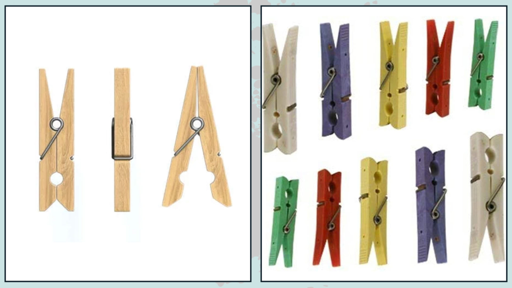
Two pieces of wood (complemented by plastic over the years) united by a steel spring!

The wooden clothespin we use today was invented by D.M. Smith of Springfield, Vermont, in 1853.

In 1944 Mario Maccaferri replaced wood with plastic to make the clothespin even more durable.

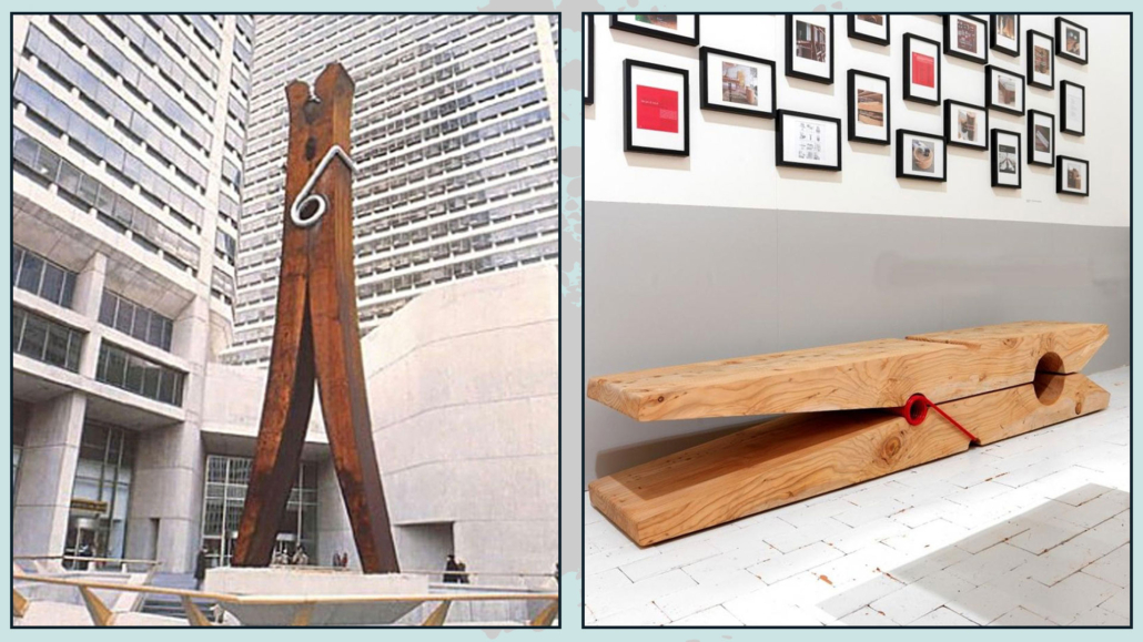
It then became a design classic in 1976 when artist Claes Oldenburg made a work of art named Clothespin: a giant clothespin 13.7 meters high!

This work is installed in Center Square Plaza in Philadelphia.

A curiosity: credit for this invention has often been given to the Shakers, a religious sect founded by Ann Lee in the US in 1772.

That is because they were the authors of many pieces of furniture that was an expression of their faith: utmost simplicity, essential details, and no decoration! The clothespin actually embodies all of this!

LE PARFAIT JAR

These pressure-top jars originated about 1825 by an unknown designer, mainly for storing food; today, they are also decorative items!

Filled not necessarily with food, they are, in fact, perfect to put in compositions to put on the countertops of our kitchens!

They are made of molded glass and have the ultimate sealing ability, with the characteristic orange rubber and iron hook!

A vacuum is created when the jar is heated inside, making the seal airtight!

They exist in various sizes from 50ml to 3 liters and have a large opening (7 to 10 cm) to make filling easier!

Despite numerous imitations, this jar is still present in our homes because it is functional and has a simple and inexpensive locking system.

It is now closely associated with high-quality handcrafted products!

STRAW

The straw is one of those items we pay little attention to, taking it almost for granted… only to appreciate it when it’s missing!

Over the years, the straw has really evolved a lot.

The origin of the straw is attributed to Marvin Stone, a manufacturer of paper filter cigarettes, in 1888.

Actually, straws already existed then that were made of ryegrass, a herbaceous plant.

Stone, however, fed up with straws breaking and especially leaving an unpleasant aroma, decided to produce his own straw.

At first, he wrapped some strips of the paper he used for filters to a pencil and, gluing them together, created the first paper straw.

The product was later improved by the introduction of paraffined paper that prevented the straw from impregnating, and this was the first straw patented in 1888 precisely.

Over the years, the straw has since become plastic, only to return now to paper due to pollution.

One of the significant improvements of this object was the addition of the flexible band introduced by Joseph B. Friedman in 1937.

This small addition has helped both young children, not yet accustomed to the glass, and bedridden convalescents.

Fun fact: the first batch of flexible straws was actually sold to a hospital in 1947.

ARMY KNIFE

The Swiss Army knife was created as a practical item for soldiers in 1891 by Karl Elsener.

Elsener then founded the Swiss Master Knifemakers Association to facilitate the production process.

The knife, however, was not as successful as hoped, and the association disbanded.

Elsener did not give up and tried to fix the problems that had not gotten it off the ground: that is, heaviness and limited functionality.

He succeeded in 1897 when he registered the new knife: the one we all know.

New functionality and good looks were well received by all, not just soldiers.

Elsener named his company after his mother’s name Victoria, then in 1921, he added the international name of stainless steel to the brand name, and it became Victorinox!

The use of the Swiss cross indicates an instrument of superior quality.

To meet every need, today, there are many variations of the original pocket knife on the market: it comes in a range of as many as 100 models!

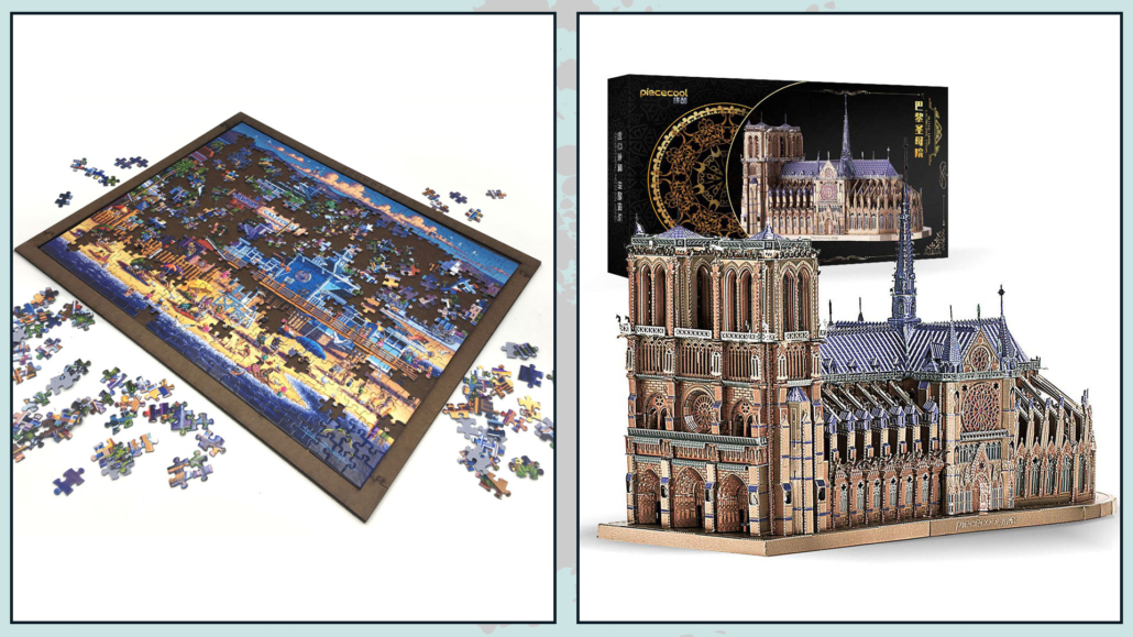
PUZZLE

Who has not done, in his life, at least one puzzle with more or fewer pieces?

Well, this fascinating and timeless game that appeals to all generations originated in 1766 for educational purposes!

The idea originated with John Spilsbury, an engraver and map maker in London, who one day decided to glue one of his maps onto a wooden board and cut out individual countries at their borders.

It was called Dissected Mapp and was used, for a long time, to teach geography in school.

Only in the twentieth century was it considered to create something for adults as well; they were extremely costly to produce, so they were sold in small quantities and only to wealthy customers.

These, however, used them as a means of entertainment at their parties, sparking and spreading a collective passion.

The pieces then became interlocking, and in 1908 the name puzzle was coined for this game, referring precisely to this new form.

In 1929, at the beginning of the Depression, puzzles became a national pastime loved by everyone regardless of social background.

That is for two reasons;

  • because it reproduces images that allow them, at least with the imagination, to escape from the dark moment they were experiencing;
  • the change of material from wood to cardboard, which makes the game much more affordable!

In 1932 they also arrived in the rest of the world, becoming the most beloved form of entertainment for young and old alike.

By 1990, puzzles had become so profitable that the Parker Brothers game company decided to focus its production on this game alone.

Over the years, 3d puzzles have also been born!

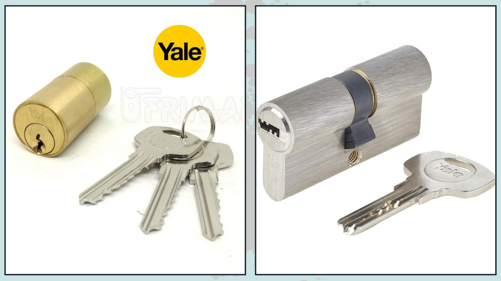
CYLINDER LOCK

Invented by Linus Yale Jr in 1861.

The son of a blacksmith, he invented a lock that was a device that matched keys composed of several parts that gave the possibility of using an infinite number of combinations that were difficult to copy.

Inside, it does not have any elements that could move, such as springs.

He also invented a mechanism called a “pin tumbler” or radial pawl: a mechanism that is not visible from the outside and, therefore, cannot be forced.

The lock came to be called “the infallible magic Yale lock.”

On the other hand, the second lock, is called “the infallible secure Yale lock” and is nothing more than an improved version of the first one.

Yale shows such confidence in its product that it promised $3,000 to those who succeeded in forcing it!

Shortly, these locks became so famous for their reliability, thanks in part to Yale’s entrepreneurial skills, that in 1856 they were also used for the U.S. Mint.

Yale thus becomes synonymous with lock!

In 1860 Yale also invented the first Monitor Bank lock, the first combination lock.

HERE THE CYLINDER LOCK WE ALL KNOW

Finally, in 1861 he reworked the pin tumbler mechanism and his own in cylinder locks.

He founded his company with Harry Towne in 1868 and died shortly later; his name, however, has been passed down as the most significant lock manufacturer.

In 1879 lock production was joined by padlock production.

I hope this article was helpful and you love it; in case, let me know in the comments!

Feel free to share it with anyone you think might be interested, I will be honored, and it will help me get my name out there.

If you feel that your home, or some environment of it, does not reflect you enough, do not wait any longer and book your consultancy!

Bringing some nature into the home becomes really important because it has a scientifically proven beneficial impact on our being: it brings a good mood and improves the quality of life by reducing stress!

Actually, it’s vital not only in homes but in architecture in general.

Have you ever heard of Biophilic design?

It is a particular way of designing homes, offices, in short, the various places where we live and work so that they are as connected to nature as possible.

The term Biophilic was introduced in 1964 by German psychoanalyst Erich Seligmann Fromm (1900-1980) and literally translated means love for all that is alive!

We also have an example of this way of designing here in Italy: the Vertical Forest in Milan, designed by Stefano Boeri.

However, since not all houses are yet designed and built with this philosophy, we need to start from the bottom, bringing nature into our homes ourselves!

Of course one of the first things to do is to use environmentally sustainable materials as much as possible, but this is only the basis!

Some elements help this reconnection to nature…

Let’s see what they are!

NATURAL LIGHT

Light is the primary and fundamental element for one’s well-being.

Many studies show that in Nordic countries where people are in the dark for many months, there is an increase in cases of depression!

That is why you need to let as much natural light into your home (and office) as possible!

There are ways to “light up” those darker rooms when this is not at hand: I’ve talked about it here!

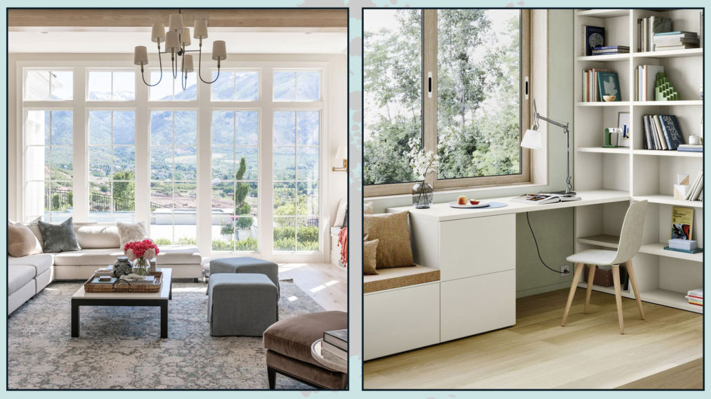
If you work from home, it will be relevant to place the workstation as close to the window as possible to take maximum advantage of natural light.

You may not know it, but in addition to feeling good, you will increase your productivity and creativity!

(credits: Rachel Parcell; nidi.it)

FRESH AIR

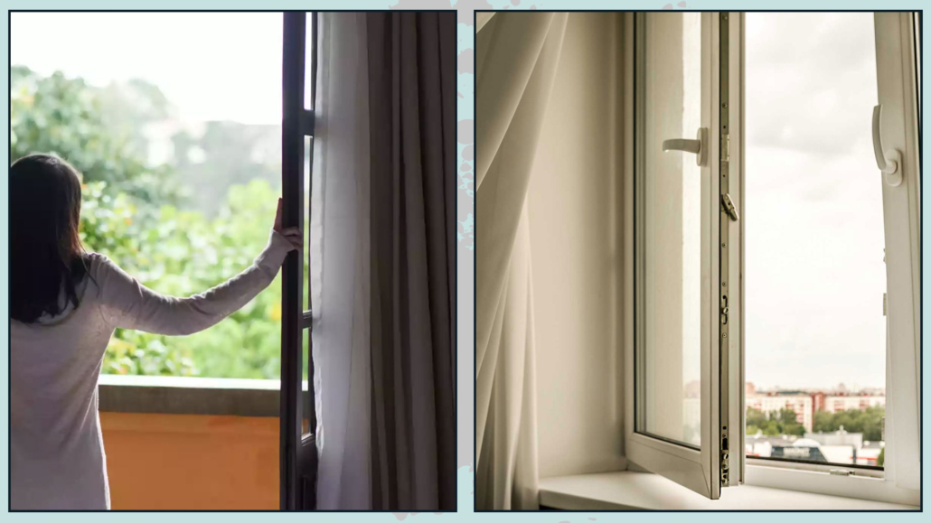
It is pretty evident how essential fresh air really is, think about how good you feel when you can breathe well when you are in the countryside, mountains, seaside or even just in the middle of the park!

In the average and small town, opening the windows will not only bring in some fresh air but will also allow you to hear sometimes the birds chirping!

Of course, in larger cities where the smog is so much, this is more complicated, but you can try to do it in the early morning hours when there is less traffic and maybe even get help from air purifiers.

(credits: evanto)

NATURAL TONES

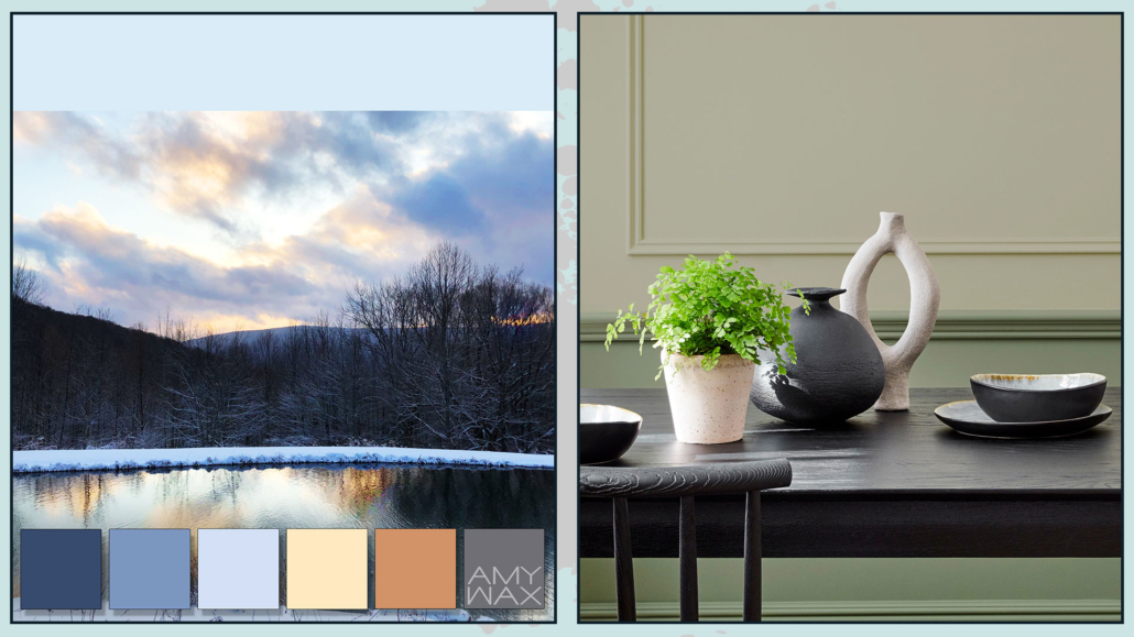
Colors also have their importance, and to feel closer to nature, creating palettes with nature’s own colors will be paramount!

The shades of greens, browns, beiges, blues and light blues, earthy reds and straw yellows…

All colors you see when precisely you are immersed in your favorite habitat!

One of the best ways to create a home color palette that you’re unlikely to tire of is to take colors from an image of your favorite landscape!

Does that sound like a strange idea?

Actually, if you try typing in the search engine or even in Pinterest, “color palettes”, you will see that many palettes are really taken from images!

There are many programs online that can extract colors from a photo by giving you codes that will allow you, again with online programs, to reach the color of your favorite brand!

(credits: amywax.com; Little Greene)

PLANTS

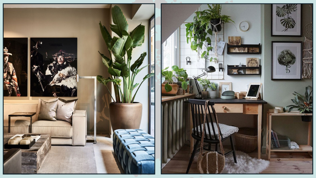
That is the fastest and easy way to bring nature into the home!
There is no room in the house where you cannot have plants, not even the bedroom, as Simona Borgia explained here!
Plants bring some life into the home, and many also have purifying properties!
They also bring in some moisture, which is very helpful, especially in winter when the air tends to dry out because of the heaters!

It is a great way to bring green into the home, a color that helps promotes calm and tranquility.

That is even for those who might not like green as a color!!!

Plants also bring rhythm and movement due to their shapes, and this brings some vitality to the environments!

Then giving necessary attention and care to the plants is another very relaxing factor indeed!

If, by chance, you are not exactly a green thumb, know that there are plants that are really easy to maintain!

(credits: Eric Kuster; naszedomowepielesze.pl)

NATURAL MATERIALS

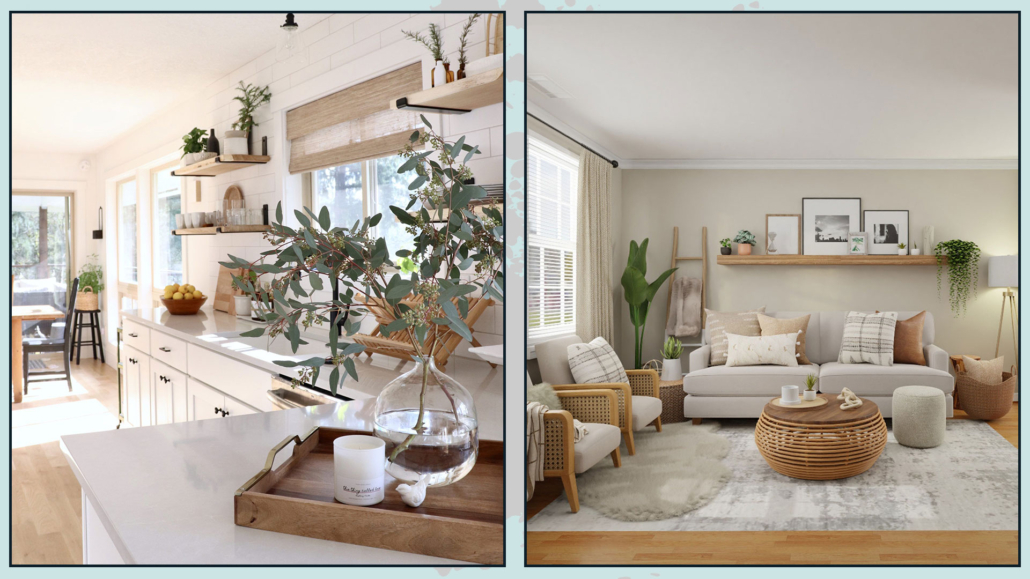
Also using natural elements such as furniture, textiles, and decorations as much as possible is another way to reconnect with nature.

Wood, marble, linen, rattan, and wicker are elements that will make a big difference in feeling connected to nature!

Wood, in addition to furniture, can be used in decorations: think of beautiful trays on which you can then create beautiful compositions!

A “slice” of the tree trunk might even be enough!

Adding beautiful wicker baskets will bring warmth and texture and precisely make you feel closer to nature!

Again, if the style allows, a rattan armchair could be that element that gives that extra touch to the room!

Don’t underestimate the beauty and properties of stones, too!

Stones are beautiful because of their uniqueness in shape, color, and texture; thus, they can be a valuable decorative element: think, for example, of a beautiful bowl with an array of stones that are all different.

I told you about stones because they also seem to have the ability to make us feel more grounded and more aligned with nature!

(credits: allisajacobs.com; spacejoy.com)

SENSORIAL ELEMENTS

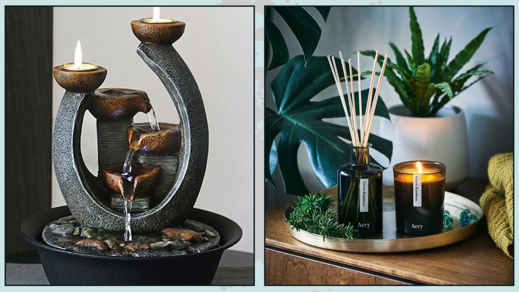
I’ve said it before, a home should be experienced with all the senses, and if we want to feel more connected to nature, we can’t help but try to recreate scents and sounds as well!

Bringing fragrances of nature into the home, such as might be a forest scent, helps lower stress!

In addition, sounds, such as the flow of water, also promote reconnecting with nature!

There are drinking fountains that can also be decorative.

If not, there are also many tracks that pick up the chirping of birds or the waves of the sea, for example, and it might be an idea to have them in the background!

(credits: ArtDigest; aeryliving.com)

I hope this article was helpful and you love it; in case, let me know in the comments!

Feel free to share it with anyone you think might be interested, I will be honored, and it will help me get my name out there.

If you feel that your home, or some environment of it, does not reflect you enough, do not wait any longer and book your consultancy!

Today I would like to emphasize again the importance of starting with the furniture project when you have to renovate your home!

I know it’s not the first time you’ve heard me say this, but it’s so paramount that it’s good to bring it up again every once in a while.

The furniture project should be done even when we “simply” have to furnish a home (especially if we are starting from scratch) to really make sure that we get a result that represents us fully.

Where well or poorly the furniture was already there, I can grant to skip this step ONLY if the renovation would involve redoing the bathrooms and, at most, the floor.

That is because we assume material choices will be made based on the style and color palette you already have!

Actually, even here, it would be better to do a minimum of planning to be sure that everything you have (or otherwise want to keep) will fit and can be put in a practical way!

THE FURNITURE PROJECT HELPS YOU TO HAVE A FUNCTIONAL HOME

In all other cases, however, it remains sure that it is really essential to start with the furniture project!

The reasons why I insist on this are many, although, in the end, the main reason is only one: that you can have the home of your dreams, a home that can truly represent you!

For this to happen, it is not enough to have a “beautiful” house; it must also be functional!

I open a small parenthesis, in case you have to buy furniture from scratch: when I talk about furniture design, I am talking about a preliminary design.

That is, having an idea of what elements you need to make a functional room with the addition of a moodboard and color palette.

So it’s not that you have to previously know that you’re going to have that specific credenza, for example, but that you would want a credenza well or poorly of that size, shape, and color.

The moodboard and color palette will help you choose materials.

Having specified this, let’s see in detail why to start with the furniture project, whether you already have the furniture or need to buy it!

BEING ABLE TO CORRECTLY DEFINE SPACES

That is especially if you decide to make structural changes by altering the size of rooms by tearing down and rebuilding some partitions.

By what criteria will you decide (excluding the minimum dimensions imposed by law, of course) the size of new rooms if you have no clear idea of the furniture you want to put there or how to arrange the existing one?

A few inches could make a massive difference in having a comfortable and functional environment from one that is not!

A furniture project will also be able to get you out of the box, if necessary, by perhaps creating unusual room arrangements that might, however, be more functional to your way of being!

STUDY THE ELECTRICAL (and more) SYSTEM CORRECTLY.

How many times have you heard me say that lighting is the most significant part of interior design?

How can you study an authentically functional system without knowing where you will place the furniture?

You will end up studying general lighting and then put sockets more or less everywhere for prudence!

But now imagine that you are lucky enough with a large living room, so large that when you place the furniture, you decide to put the conversation area in the middle, with no element leaning against the wall.

How will you be able to have good lighting in that area?

It will not be possible for you to have any floor or table lamp unless you have ugly, as dangerous, flying wires on the ground!

With a furnishing project done before, you could have had one or more sockets on the floor!

The matter of systems is obviously not limited to the electrical one, think for example, the kitchen:

if you have no idea how you want it, you could decide to leave the connections where they are…

And then maybe find it inconvenient to have, for example, the sink to the right of the burners rather than to the left!

Or you might think you have an island and maybe have the sink or burners on this island.

But how do you decide exactly where to put the connections if you haven’t designed the kitchen?

That applies whether you have to buy a new kitchen or reposition the old one because certainly, some changes will have to be made!

SAVE!

Does this point seem strange to you? Now I’ll explain why you can save time, and even money, by investing time in the furnishing project!

If everything is clear and defined, you’ll be able to choose the best construction company or artisans for the work you have to do. By giving them an accurate project, they will make you targeted estimates and not be dictated only by their experience based on similar works.

That will ensure that, excluding unforeseen events, prices will not change during the work!

Furthermore, there will be no waste of time, having clear everything there is to do!

Even, if you have to buy the furniture (all or in part), knowing what you want precisely, with a quick search, you will be able to choose the furniture store or shops that are right for you, and you will save a lot of time!

Do you see how investing in the furnishing project is an advantage?

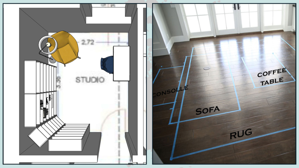
Don’t be afraid to play with the plan of the house, print several copies, draw to scale and cut out the furnishing accessories and study different solutions until you find the one that satisfies you the most!

If you have any doubts, or would you prefer help, do not hesitate to contact me!!

I hope this article was helpful and you love it; in case, let me know in the comments!

Feel free to share it with anyone you think might be interested.

I will be honored, and it will help me get my name out there.

If you feel that your home, or some environment of it, does not reflect you enough, do not wait any longer and book your consultancy!

Living in a dark room, or worse, a house, is not the best and is also not good for our psyche.

What to do when dealing with rooms with low light? Let’s look at some simple tricks to brighten them up!!!

1 – CLEAN THE WINDOWS GLASSES

I know it will seem like trivial advice, but dirty glass does not let light penetrate well and will therefore make the room darker.

If the room also had a balcony, you need to pay attention to any plants that could block the light!

(credits: elements.evanto.com)

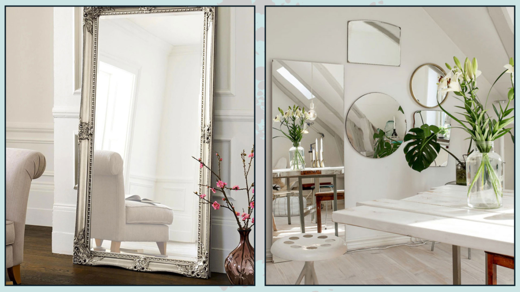
2 – DOUBLE THE LIGHT WITH MIRRORS

Strategically placing some mirrors will really make a big difference!

One of the places I recommend is in front of the window because it will double the light and give you the impression of having another window!

It could be one big mirror, but you can also decide to have more than one, perhaps of different sizes and shapes, to give some rhythm too!

(credits: shutterstock; Nodric design)

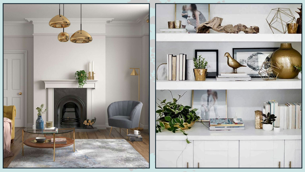
3 – ILLUMINATE WITH METALS

Another trick to make a room brighter is to use metals!

They can be the door handles, the structure of chairs, coffee tables, and lamps, or the frames of paintings and mirrors!

They are small touches that will help brighten up rooms, thanks to their ability to reflect light!

Of course, unless you have chosen a Glam style, don’t go overboard using these materials!

(credits: thecolourhub.ie; decoholic.org)

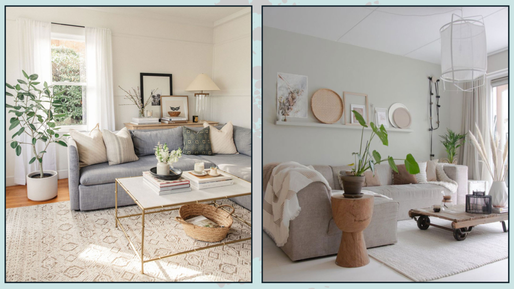
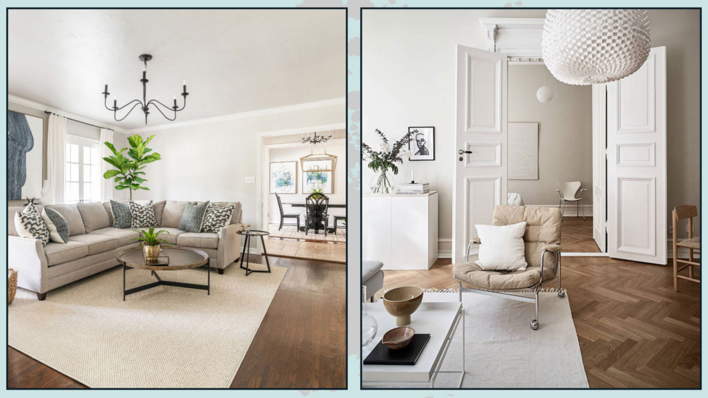
4 – USE LIGHT COLORS

Light colors reflect light very well and, therefore, will help a lot in making a room brighter.

Of course, the ultimate reflective color is white, which does not have to be pure white, but can be a warm or even cool white depending on the mood you want to give the house.

However, if you want to use colors, you know that you don’t have to give them up, and you have two options for doing so:

– Use your favorite color by adding a lot of white to make it neutral (and bright)

– Use pastel colors!

(credits: stylemepretty.com; noordenzoet.nl)

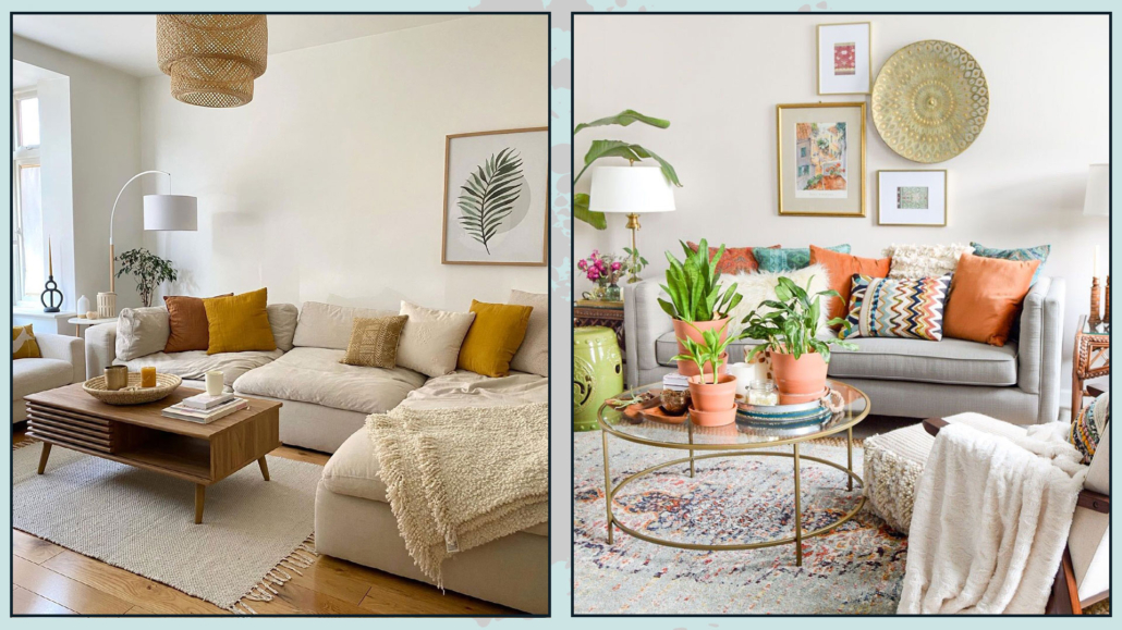
That should be done, not only for walls and ceilings but also possibly on larger pieces of furniture.

That doesn’t mean having a total white home if you don’t want it, not least because if not properly designed, having everything white, as well as for neutrals (I’ve talked about it here), could make the environment flat and boring!

So it’s great to add a few touches of color here and there with decorative items such as pictures, pillows, and other objects!

(credits: made.com; casawatkinsliving.com)

5 – ATTENTION TO THE FLOOR

The talk of light colors also extends to floor color…

A dark floor does not reflect light and makes the room darker.

If you have a dark floor and can’t or don’t want to change it, use light-colored rugs: it will be a quick and easy way to give it more brightness!

(credits: designdirections.com; cocolapinedesign)

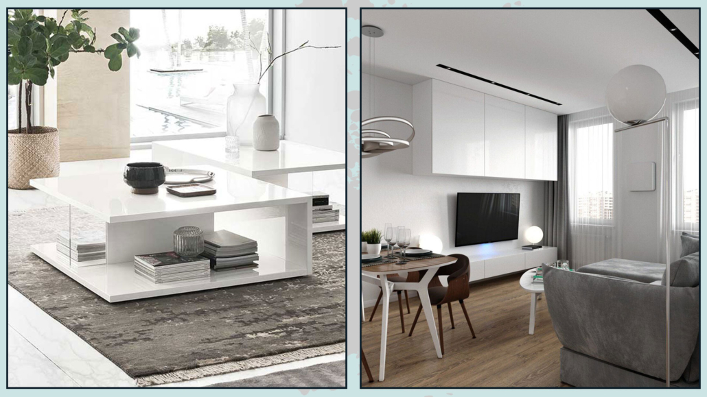
6 – PAY ATTENTION TO THE FINISHES

The finish you choose, whether on walls or furniture, will also make a difference!

Matte finishes absorb light, while glossy ones reflect it.

Obviously, it’s not the case to have all the shiny finishes that would make the room look a little, allow me the term, tacky!

Alternate these finishes, preferring perhaps semi-gloss finishes; this will also help give some rhythm and depth!

(credits: furnitureworld.co.uk; behance.net)

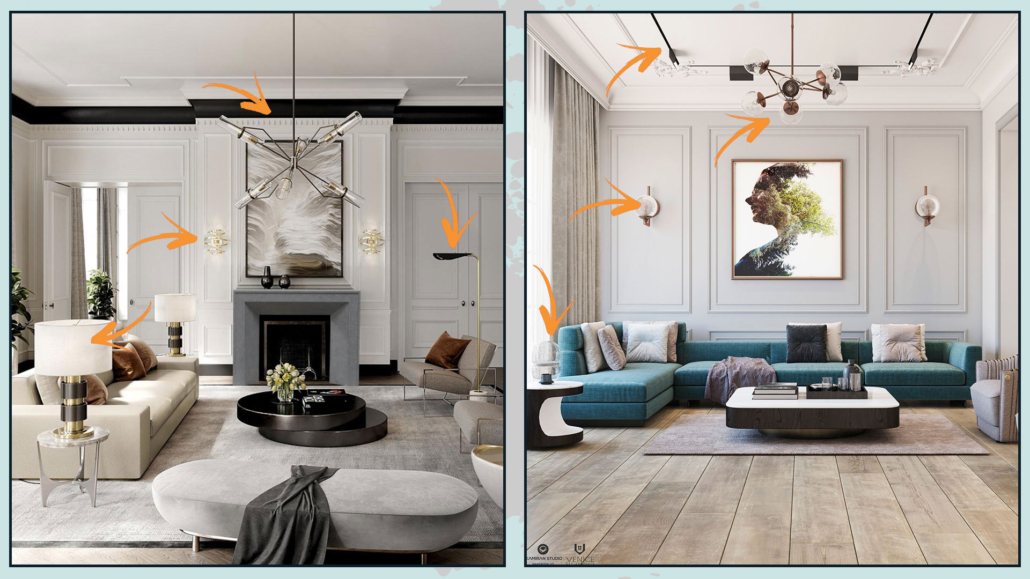
7 – LAYERS LIGHTING

It’s something you’ve heard me say countless times now, but in interior design, lighting is really the most vital part!

Then if the room tends to be dark, a good artificial light design will really make a difference.

Therefore, it is essential to have different light sources; the general one is not enough because it would also make the room very flat!

(credits: etsy.com; behance.net)

It will also be paramount to calculate the bulb wattage and color temperature well!

Too powerful and too cold a light will absolutely illuminate everything, but it will make the environment really inhospitable!

Then choose the appropriate lumens for the size of the room and choose as natural a light as possible (around 4000 ), at least for the general lighting.

For the other lights, also use warmer temperatures to create as well some atmosphere!

There are bulbs to which you can change the color temperature; that could be an option!

(If you want to know more about lighting I talk about it here)

(credits: lartedinnovare.it; viverelostile.com)

8 – PREFER LIGHTWEIGHT FURNITURE

A bit like what happens with small rooms, heavy furniture will make a room darker because it blocks light and creates strong shadows!

Better to use furniture with a more slender structure, perhaps raised so that some light can pass under them as well!

Using transparent furniture, always without overdoing it so as not to make the room too cold, will also help brighten the room.

(credits: maidenhome.com; joannacolomas.com)

9 – BE CAREFUL HOW YOU PLACE THE FURNITURE

In making a room brighter or not, the placement of furniture will make a big difference too.

For example, it is a good idea to place the lightest furniture, perhaps with the shiniest surfaces, near windows and light sources: their light shape will not block too much light, and their glossy finish will reflect light rays!

(credits: livingroomideas.eu; Sera Michael)

10 – USE LIGHT CURTAINS

Thick curtains block light, so unless you have privacy issues, use very light and bright curtains!

Do you love the idea of double curtains, especially to give color?

You don’t have to give them up, but avoid blackout shades, use a fabric that is filtering anyway and colors that are not too dark, but most importantly, keep them on the side, so they don’t cover the window!

(credits: kimdeyir.com; evgezmesi.com)

These are small tricks that will help make a room brighter without drastic renovations!

I hope this article on how to make a dark room brighter was helpful and you love it; in case, let me know in the comments!

Feel free to share it with anyone you think might be interested, I will be honored, and it will help me get my name out there.

If you feel that your home, or some environment of it, does not reflect you enough, do not wait any longer and book your consultancy!

Today I would like to talk about designing the perfect bedroom so that it is a super inviting, relaxing, and beautiful room!

The bedroom is the most intimate and personal room, and it is often the one we care for the least because “only I see it anyway”!

Actually, it should be the one we pay the most attention to because it is the one where we drop all our defenses when we go to sleep, so it is the one that should make us feel the best of all!

So let’s look at some suggestions to make the perfect bedroom for you!

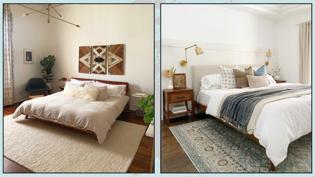
– USE THE RIGHT COLORS

Use soothing and cozy colors, colors that can make you feel good.

Recommended colors for the bedroom are shades of green, beige, and light blues, but really any color that you feel is yours will do!

The only caution will be not to use too vivid colors, except as an accent, but try to make it more neutral by adding white if you want light colors or black or gray if you want darker colors.

Doing this will allow you to have your favorite color, making it softer.

As you noticed, I mentioned not only light colors but also dark colors; this is because dark colors make the room more intimate, and therefore, it could really be a good idea for the bedroom!

(credits: lillytaylorinteriors; Pella Hedeby)

– CUSTOMIZE THE BED WALL

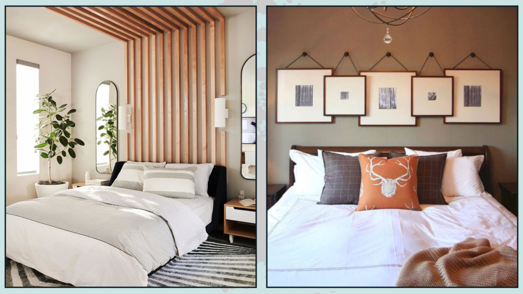
In most cases, the bed wall is the focal point of the room, so make it significant for you!

It could be a simple painting that has a special meaning or excites you, or a photo gallery or the display of particular objects; there is no rule: the important thing is that it draws you in and excites you!

Here are some ideas on how to decorate a bed wall.

(credits: bobbyberk.com; Bria Hammel Interiors)

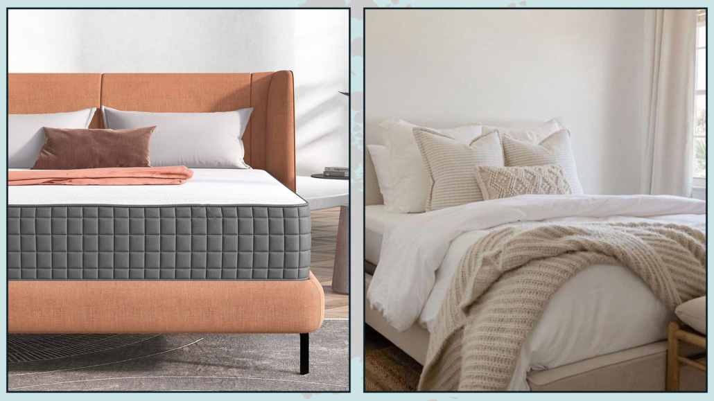
– CHOOSE THE RIGHT BED

By the right bed, I don’t mean so much the aesthetic part, which certainly has its importance, as much as the bed base and mattress so that you can have a good sleep!

These are two items, especially the mattress, that you really cannot go cheap on!

It is absolutely essential to get the right products that will allow you to get the best rest because only then will you be fresh and relaxed to face the coming day!

The bed frame is an extra, which will undoubtedly be important aesthetically but not functionally.

You might even decide to have only one particular headboard, maybe only designed on the wall on the wall!

(Here you can find some ideas for the bed headboard!)

(credits: amazingbargains.com; @CarleysWorld)

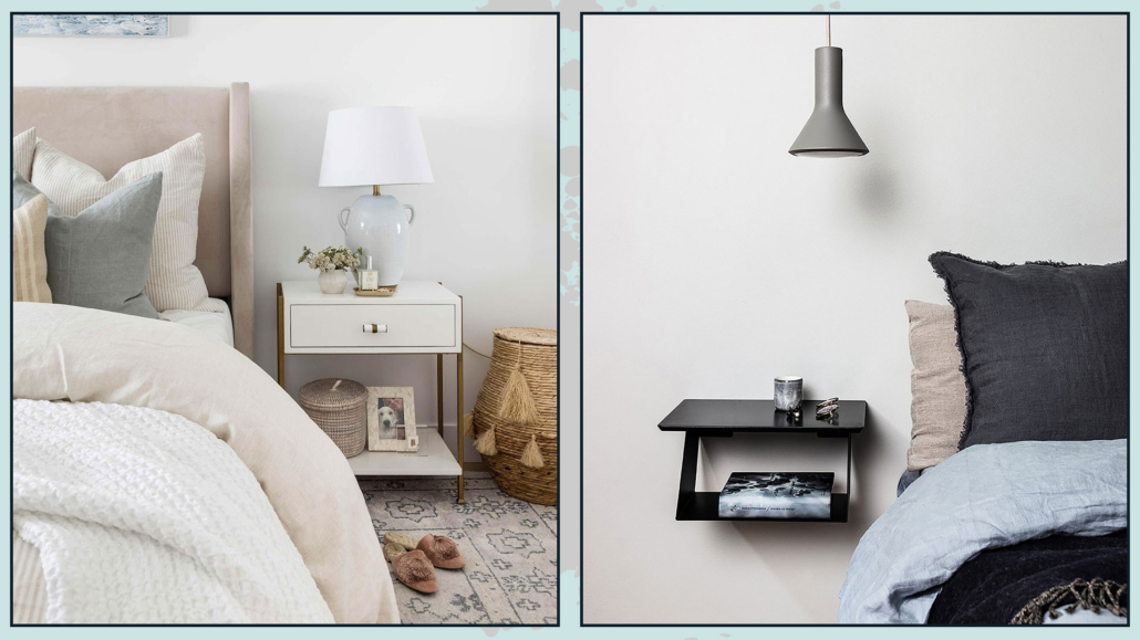
– I RECOMMEND THE NIGHTSTANDS!!!

No matter how small the bedroom is, it is really paramount to have something to serve as a countertop next to the bed!

That is for being able to rest the necessities, from an alarm clock to a book or even the phone (although that would be better not to have it near at night)!

If you don’t like classic nightstands, you can use a chair or place a super simple shelf, but it’s really mandatory to have something!

It will also be relevant to pay attention to the height of this tabletop for easy use, which should be at mattress height.

When this is not possible, it should be a little higher, but a maximum of 10cm!

(credits: shoppe.puresaltinteriors.com; royaldesign.se)

– DON’T PURSUE SYMMETRY AT ALL COSTS!

When choosing nightstands, you don’t have to feel compelled to buy them the same, perhaps coordinating with the bed and closet.

This choice is often made because symmetry is thought to be visually more beautiful in the bedroom!

Well, NO, it is not mandatory; an asymmetry, on the contrary, if well balanced, could make everything much more interesting!

Also, if there are two of you, you likely have different tastes and, above all, different needs, so one type of nightstand may suit one but not the other!

So don’t worry if there are two different nightstands in terms of shape: the important thing will be that they can perhaps have a commonality like color or material!

If then the two nightstands were also very different as visual weights, you could balance them with lamps, pictures, or, why not, a plant!

(credits: stylebyemilyhenderson.com; modsy.com)

– ABATJOUR

While having multiple lighting points is always very important, in the bedroom even more so: it is essential to have a light near the bed.

It can be a table lamp to rest on the nightstand, a sconce light, or even (and we increasingly see more and more of these) pendant lights.

Some renovation work obviously needs to be done for the latter, but they have a spectacular effect that is truly amazing!

Wall lamps might be more functional where the bedside table top is cramped to avoid “stealing” practicable space for something else!

Another crucial thing in designing the perfect bedroom is the color temperature of the bulbs!

In the bedroom, it is preferable to use warm lights because they remind our brain of the color of the sunset, and this puts us in a position to relax and then sleep better.

(credits: behance.net; target.com)

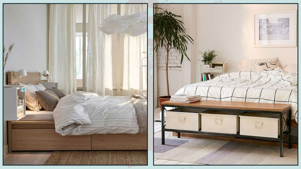
– THINK ABOUT CONTAINING

It may sound silly to you because you definitely have a closet, but it’s essential that the bedroom is really uncluttered!

That is because the disorder creates unconscious discomfort that can also disrupt sleep.

So think about having more storage elements: in addition to the possible dresser, it can be the bed with a box or drawers, but it can also be boxes to put under the bed.

It could be a bench at the foot of the bed or even a simple ottoman.

(credits: Ikea; urbanoutfitters.com)

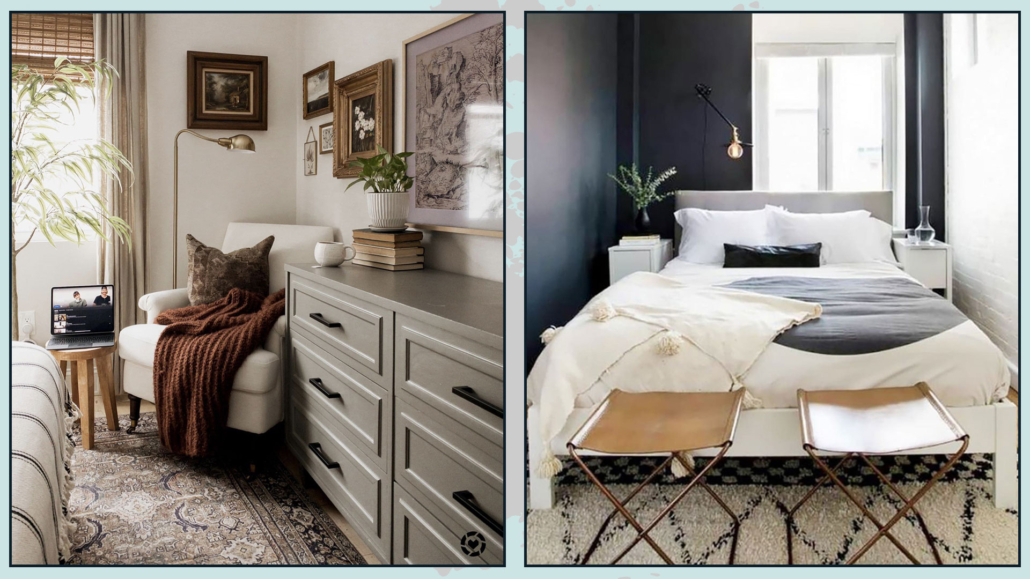
– ADD A SITTING

The bed should only be used for sleeping, so here, to make the room functional, it is relevant to add extra seating.

That can be useful for sitting down when you need to put on socks or shoes or to lay down a dress without precisely touching the bed!

Moreover, as seen in the previous point, the seat could be a container, thus also becoming a multifunctional element!

Not only that, it brings shapes and textures, and this gives some rhythm and movement to the room.

(credits: Pretty-Honeydew;  Homepolish)

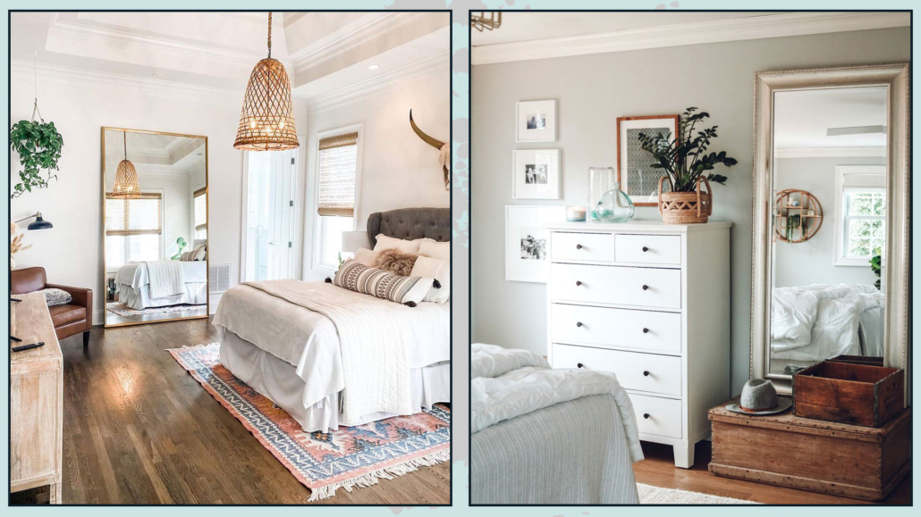
– USE THE RUG

The rug, as always, is a controversial element: if you think about it for the living room, it is much more difficult for this to happen in the bedroom!

And I’m not talking about the bedside rugs, which, let’s face it, are kind of sad!

I’m talking about a nice big rug to accommodate the bed, nightstands, and possible bench at the foot of the bed!

That will create an even more intimate sleeping area, but more importantly, it will be functional to avoid resting your feet on the cold floor!

And, again, it will contribute textures and colors, making the room more inviting!

(credits: Kristin DuFour; hartleyhomedesign.com)

– DON’T FORGET THE MIRROR.

The bedroom is the place, 99 out of 100, where you dress and get ready for the day, so it is paramount to have a mirror where you can check that you are in order!

Personally, I really love the mirror resting on the floor, but the important thing is that it is a long mirror in which you can see yourself entirely!

The mirror also doubles the light giving more breadth to the room!

(credits: ideasdonuts.com; nestingwithgrace.com)

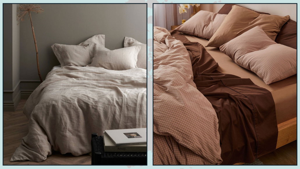
– CHOOSE THE SHEETS WELL

Like with the mattress and the bed base, it is important to feel “welcomed” by the bed sheets too!

As with room colors in general, I would advise against colors or patterns that are too strong because they excite and do not help sleep.

Choosing quality bedding that makes you feel a little snuggled and pampered will also be essential!

Therefore, choose good quality cotton or linen.

Of course, there are also satin and silk, and for them, allow me a very small digression: they are great for skin and hair care!

A satin or silk pillowcase will leave your facial skin brighter and the same for your hair by drastically avoiding knots, and for us curly-haired people, for example, it’s a boon!

Having closed this short aesthetic digression, having soft and snug sheets will surely help you sleep better!

(credits: ellos.se; sheetsociety.com)

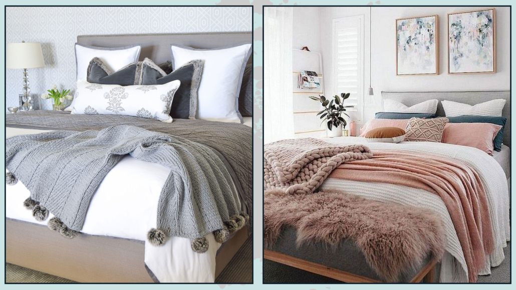
– DRESS THE BED

Don’t settle for putting a simple, albeit beautiful, bedspread on your bed: it would look a bit “incomplete”.

Add some decorative pillows and blankets to the bottom of the bed!

You might think it’s a bother to take everything off in the evening and put it back on in the morning, but this time will be amply rewarded!

Blankets and pillows will give that extra touch to your bed and the whole bedroom, especially if you choose different materials, textures, and colors, creating some contrast.

That will give some movement and character, but most importantly, it will make the bed and room even more inviting and cozy!

(credits: zdesignathome.com; messybits.com)

I hope this article was helpful and you love it; in case, let me know in the comments!

Feel free to share it with anyone you think might be interested, I will be honored, and it will help me get my name out there.

If you feel that your home, or some environment of it, does not reflect you enough, do not wait any longer and book your consultancy!

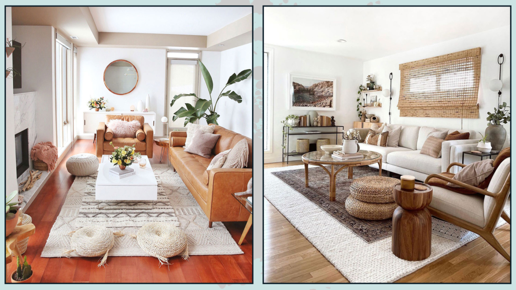
Designing the living room seems like a piece of cake, but in reality, it hides little pitfalls that can create settings that seem to lack something!

Today I would like to talk about the big little mistakes often made when designing a living room!

– ATTENTION TO THE DISTANCES BETWEEN THE VARIOUS ELEMENTS

That is a mistake that happens especially when the room is large enough: there is a tendency to arrange the various elements against the walls, even if they are far apart, to fill the space.

The furniture seems scattered here and there, creating dispersion; the room will really look a bit sad and without personality this way!

A living room should be cozy and inviting, encouraging conversation and activities around a central point.

This central point can be the television, the coffee table, or if you are lucky, the fireplace.

However, if you are too far from this central point, or if the various elements are not arranged to emphasize it, the space will look a bit “coarse”!

So try to arrange the main elements to make them somehow linked to each other, perhaps by the rug!

If the space is really that big, you might think about creating different zones, such as a music or reading corner or an even more intimate conversation area…

(credits: @amberinteriors; thisisnick.com)

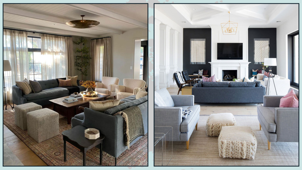
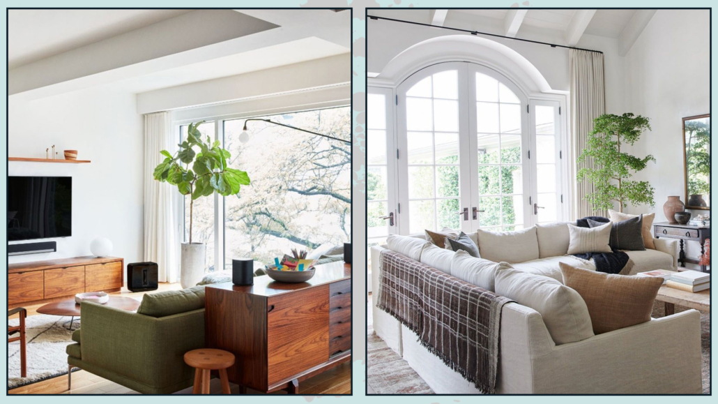
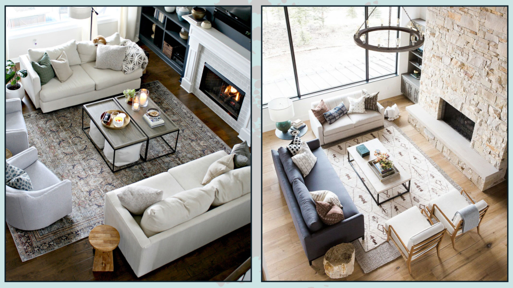
So divide the living room into several areas and remember not to be afraid to put the sofa “in the middle of the room”, leaving some passage behind; on the contrary, this is a pretty way to visually expand the space!

If you are lucky enough to have precisely that much space to go around the sofa and armchairs, I recommend decorating the backs!

There are many ways to do this: behind the sofa could be a console table or a beautiful blanket to add warmth and texture!

These small details will make your living room more complete and sophisticated!

(credits: midcentury585.com; shoppe.amberinteriordesign.com)

– PAY ATTENTION TO THE SIZE OF THE COFFEE TABLE

The coffee table is the element that somehow, along with the rug, links all the others in creating the conversation area.

It is, as well as decorative, a very functional item because it allows you to put down your things, such as your phone, or trays with food and drinks if you have guests!

The mistake that is often made is to get a coffee table that is too small; this definitely ruins the living room furniture design!

Not only does it somehow shrink the space visually as well!

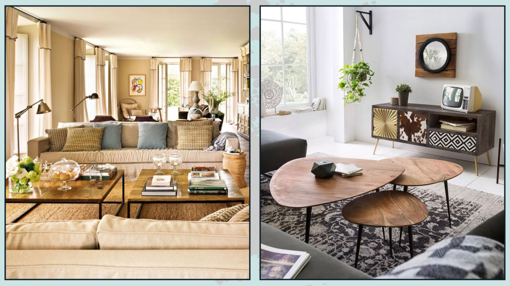
The coffee table should be proportionate to the other elements and should be about two-thirds of the sofa.

A large table, however, could be expensive, but more importantly, it could be inconvenient if you wanted to, for whatever reason, move it…

So here is a simple but effective idea: buy 2 side tables!

It can be two identical coffee tables to place side by side, or you can take a set of 2 or 3 coffee tables of the same shape but different sizes and heights!

That will make it much easier for you to maneuver them, even if it’s just for cleaning, and it will give some rhythm to the conversation area!

(credits: Isabel López-Quesada; vemzu.sk)

– PAY ATTENTION TO THE POSITION OF THE RUG

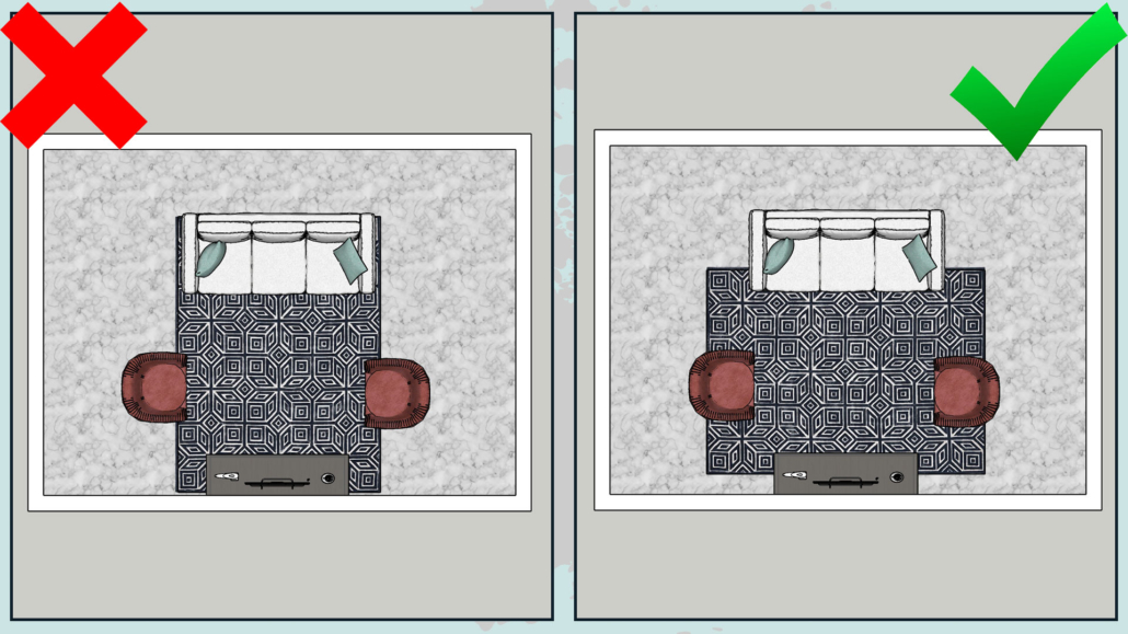
If I tell you that when getting a rug for the living room, it is paramount that it be large enough to fit under at least the front feet of the various elements to create a cozy conversation area, I am not telling you anything new.

However, there is another aspect to take into consideration, namely orientation!

The rug, which is most often rectangular, should follow the space’s shape.

If you turn it in the opposite direction, you will create a kind of barrier and visually shrink the space!

The rug should really be large and cover the floor abundantly and tie together the main elements such as the sofa, armchairs, and coffee tables!

It is, therefore, paramount first to consider the layout of the room, take a rug that follows this shape and arrange the various elements to create something functional and harmonious.

(credits: justinecelina.com; @indiebohonest)

– THINK ABOUT STORAGE!

Another mistake in living room design is not thinking enough about the elements to contain!

For functional and comfortable rooms, it is really essential to have storage elements to arrange everything that is not purely decorative.

For this reason, it is better to have closed elements to make the environment more linear and clean.

If the space is small, you can think of a storage coffee table or, directly, a storage sofa.

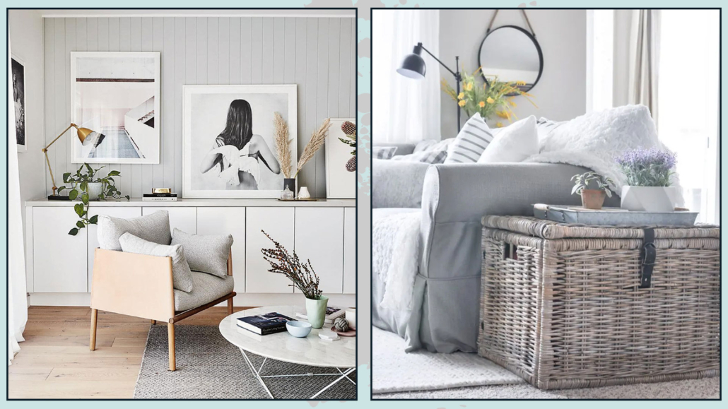
Of course, you can add baskets, which will also, as we have seen other times, give a warm touch to the living room!

(credits: homestolove.com.au; cherishedbliss.com)

– DO YOU HAVE TWO SOFAS? BE CAREFUL HOW YOU POSITION THEM!

You may have two identical sofas, perhaps a three and a two-seater, and when you have these two items, it is actually common to see them placed angularly, perhaps with a small table or lamp in the corner.

Now, this is not a literal mistake, and sometimes you can’t really do otherwise; but it does make the living room a little monotonous and unbalanced.

When you have two identical sofas, it would be much better to put them facing each other and possibly add seating on the sides; it would make the living room look more sophisticated!

On the other hand, if you are forced to put the sofas perpendicularly, think about the possibility of taking a single corner sofa, it would make everything a bit more harmonious!

Or choose two sofas that are different because the play of different colors and shapes will break the monotony and look like a design choice!

(credits: thriftydecorchick.com;studio-mcgee.com)

– BEWARE OF VISUAL WEIGHTS!

Another thing to pay attention to, when designing a living room, that is not always done is correctly balancing the furniture’s visual weights!

What do I mean by that? I’ll tell you right now!

There are huger and visually heavier pieces of furniture than others: for example, a sideboard and a sofa versus a seat and a lamp…

That is also true when it comes to heights!

It is a mistake to put “heavy” furniture grouped together on one side and the others on the other.

Instead, it is paramount to balance and alternate weights and heights for an environment that is truly harmonious and inviting!

So, if, for example, you have a large piece of furniture on one side, it is essential to balance it on the other, perhaps with the sofa and a lamp or a beautiful tall plant.

To balance, also color theory can help: colors like red and yellow have very powerful visual weights, and small doses of that color can help balance a somewhat massive element on the other side!

(credits: lemamobili.com; sohohome.com)

– ATTENTION TO LIGHTING

By now, you’ve heard me say it many times: the light is what makes the difference in a good design project!

It is s always important to have multiple lighting points, but it becomes even more so in the living room to create the right atmosphere!

Even if it were a beautiful chandelier, general ceiling lighting is absolutely not enough!

When designing a living room, it is also good to consider floor and table lamps.

That is to provide depth and create some atmosphere making the space inviting and comfortable, as well as functional!

In fact, you can turn on the light(s) you need depending on the activity at hand!

Earlier I talked about decorating the back of a sofa when it would be away from the walls, and I talked about console tables… there it might be a great place to put a beautiful lamp.

Of course, you have to be careful about the wires: you should not see them, so if you have to renovate, you might even think about putting an outlet on the floor!

(This is one of the reasons I am so insistent that it is paramount to do a detailed project, including the furniture, when remodeling your house).

(credits: katiehodgesdesign.com; Soho Home)

I hope this article about the mistakes one can do designing a living room was helpful and you love it; in case, let me know in the comments!

Feel free to share it with anyone you think might be interested, I will be honored, and it will help me get my name out there.

If you feel that your home, or some environment of it, does not reflect you enough, do not wait any longer and book your consultancy!

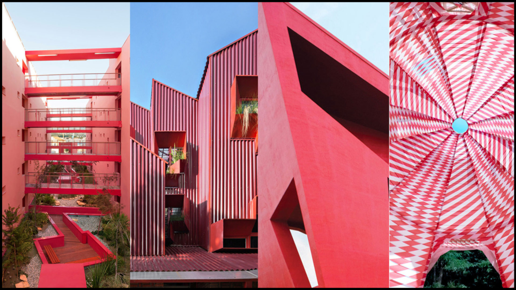
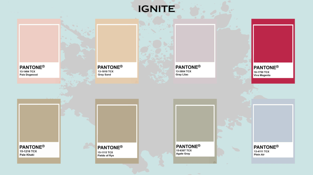
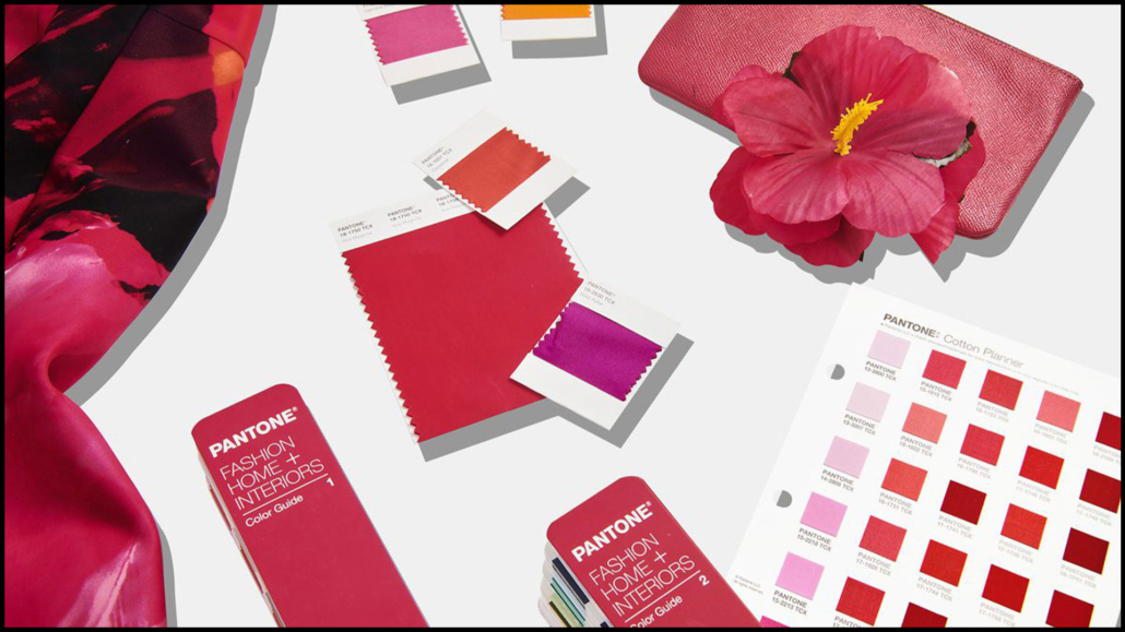
And, also this year, the Pantone color of the year 2023, Viva Magenta, has arrived!

(credits Pantone)

“In this age of technology, we look to draw inspiration from nature and what is real. PANTONE 18-1750 Viva Magenta descends from the red family, and is inspired by the red of cochineal, one of the most precious dyes belonging to the natural dye family as well as one of the strongest and brightest the world has known.”

These are the words of Leatrice Eiseman, executive director, of Pantone Color Institute, who also adds

“Rooted in the primordial, Viva Magenta reconnects us to original matter. Invoking the forces of nature, Viva Magenta galvanizes our spirit, helping us to build our inner strength.”

Once again, Pantone comes up with a color that can “help” us get through the tough times, including pandemic, war, and rising prices; Viva Magenta, in fact, is definitely vibrant, exuberant, and inspiring, but also sophisticated!

(credits Pantone)

Can we bring Pantone color 2023 into our homes?

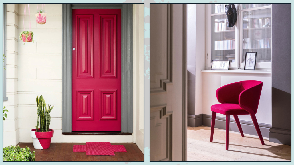
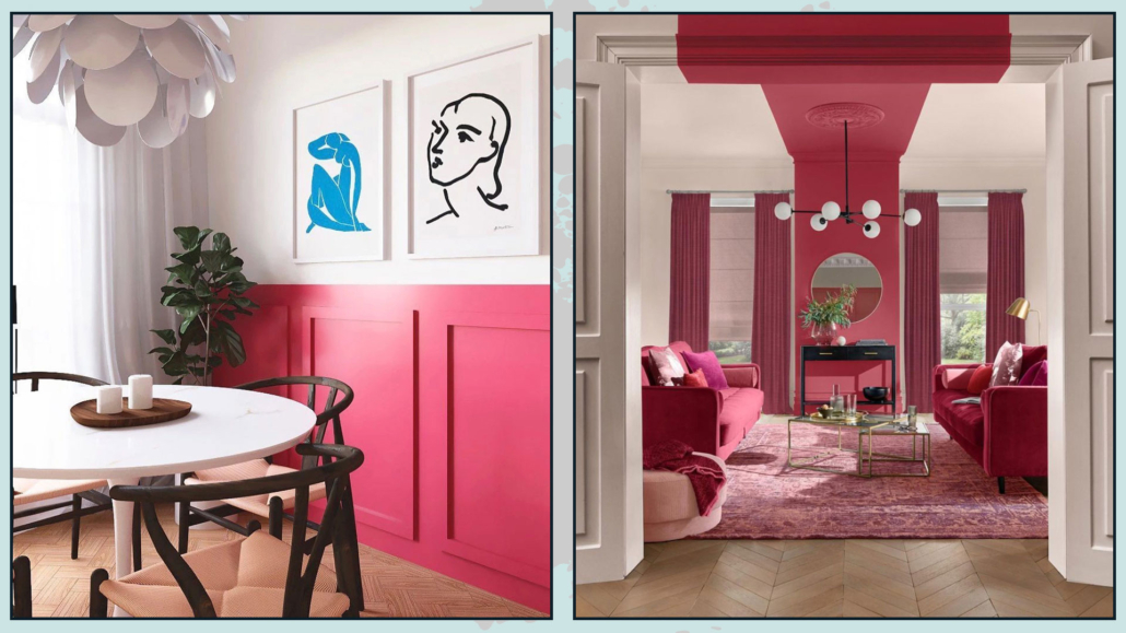
Of course yes, because this color will bring vibrancy to our environments!

This color is perfect for kitchens because it is a red that is not too “aggressive” and creates an energetic atmosphere perfect for this environment.

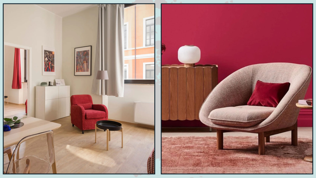
Also, it is great when used as an accent color even with large-scale furnishings such as a sofa, but honestly, you can also venture to use it on the walls, making it the focal point of the room.

(credits Pantone)

I would avoid coloring all walls with this color because, as they point out at the Pantone Color Institute, this color “packs a lot of drama even in small doses.”

Definitely to be used with caution in the bedroom: although the hint of blue certainly tones down the exciting component, it is still part of the red family!

(credits Pantone)

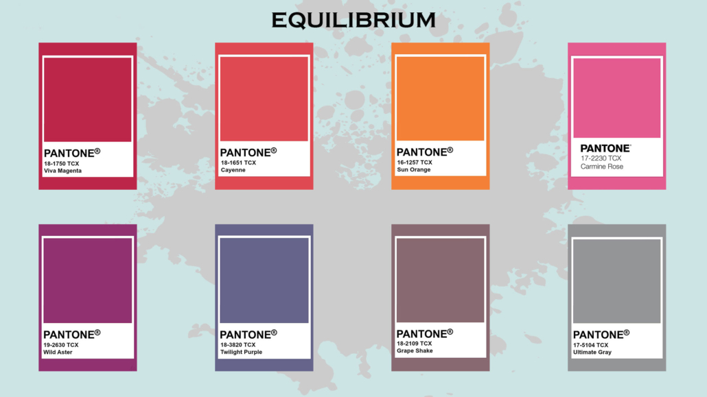
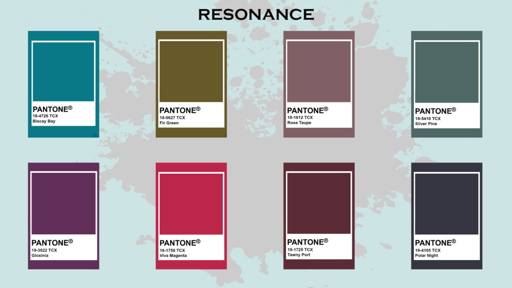
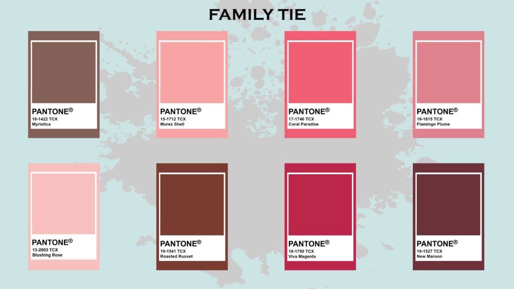
It’s a color you can pair with so many shades, both cool and warm, and Pantone is helping us again this year by offering 4 beautiful palettes to make the best use of Viva Magenta (at home, but of course not only!!!)

– EQUILIBRIUM

It is composed of warm and important colors in which Ultimate Gray and Grape Shape help calm this very vibrant palette down a bit.

My advice, if you want to use this palette in your home, is to use Ultimate Gray or Grape Shape as a base, Twilight Purple or Wilde Aster as a secondary color, and the others as accents.

– RESONANCE

This color palette puts warm shades with cool ones together, but all are pretty dark.

In this elegant color combination, Viva Magenta gives a vibrant note!

Again, I recommend using these colors sparingly and calming them down with a bit of white so as not to make it too heavy!

– FAMILY TIES

As the name suggests, this palette groups together colors of similar shades.

It is a combination of mainly pinkish colors with touches of browns that blend with Viva Magenta in a striking and lively tone on tone.

The colors are relatively light but still a bit bright, so they should be used carefully so as not to overdo it: don’t risk creating a house…wedding favors!

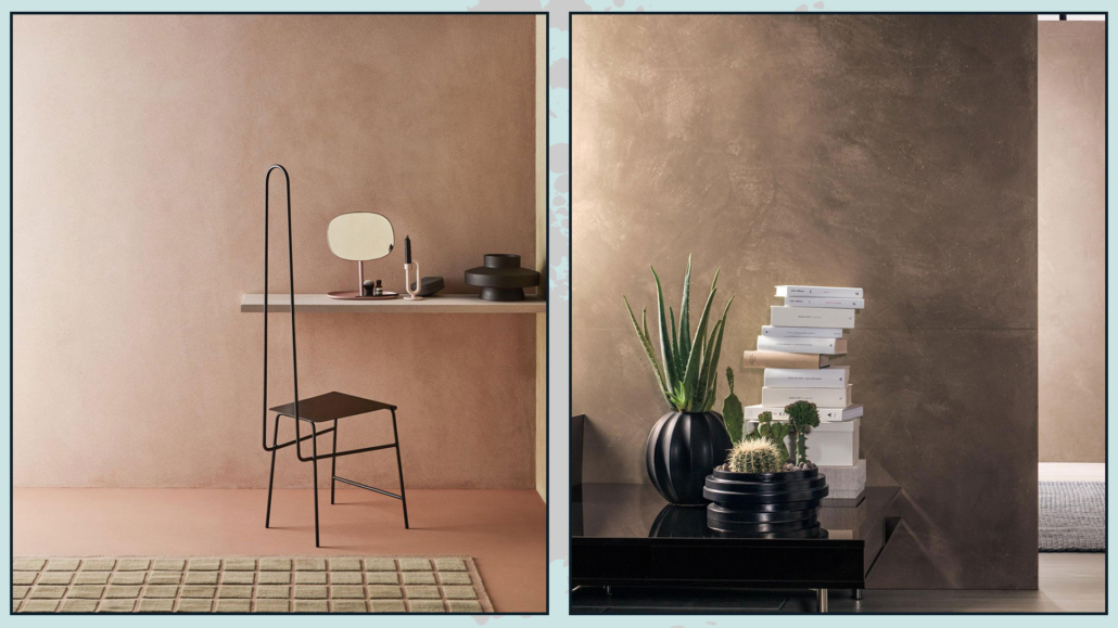
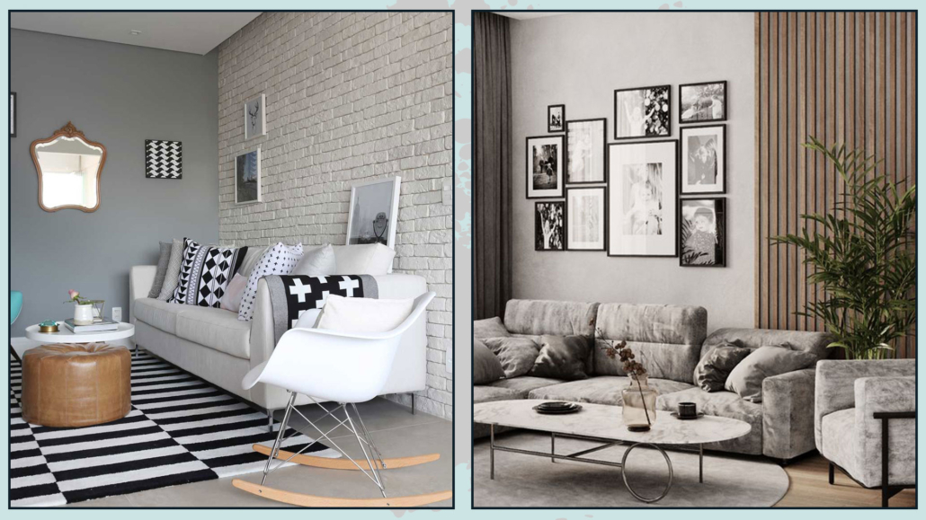
– IGNITE

It is a very bright pastel color scheme where Viva magenta stands out and brightens up the other shades.

Compared to the other palettes, it is a color palette therefore you can use it more lightly because of these somewhat neutral tones!

What do you think about this Pantone color 2023? If you like it, will you wear it or bring it into the house as well? In case how? Let me know in the comments!!!

(credits Pantone)

I hope this article was helpful and you love it; in case, let me know in the comments!

Feel free to share it with anyone you think might be interested, I will be honored, and it will help me get my name out there.

If you feel that your home, or some environment of it, does not reflect you enough, do not wait any longer and book your consultancy!

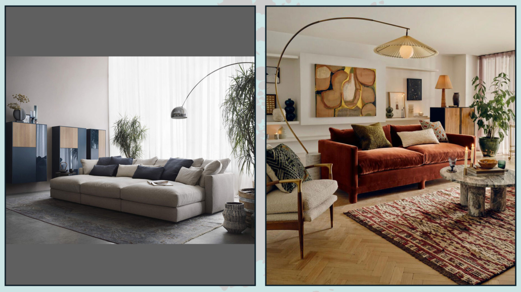
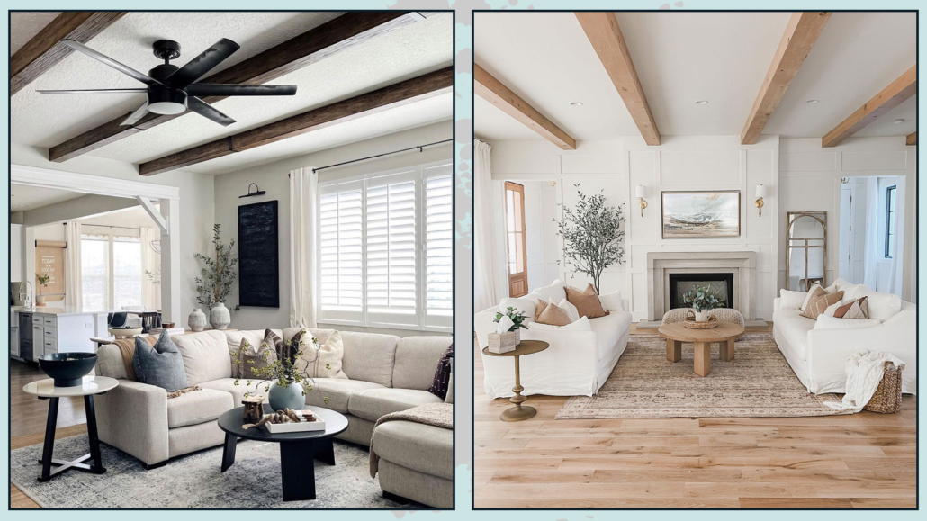
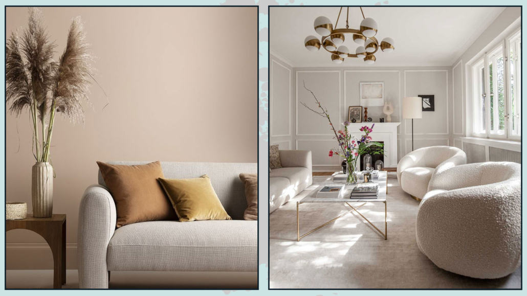
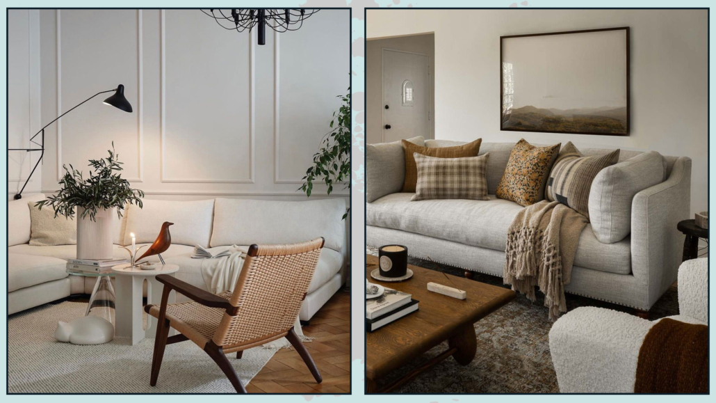
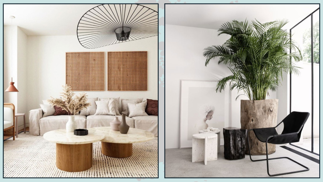
Neutral colors, mainly warm neutrals, are popular in interior design because they make rooms cozy, inviting, and relaxing.

However, one must know how to use them to avoid making them flat and boring, that will lead to somewhat impersonal rooms.

Choosing a neutral-colored palette often stems from the fear of making a mistake or overdoing the colors.

But even the misuse of neutrals may not give the desired result and, most of all, may not fully represent one’s personality!

If you want to learn more about how to choose neutrals for the home, I talk about it here!

One nice thing about neutrals is that they are the perfect base for virtually any style and are very versatile for color matching.

So let’s see how to make the use of neutrals attractive and dynamic!

– GIVE VALUE TO WALLS (AND CEILINGS)

Walls and ceilings seem to be the easy part: I choose the color, I paint, and that’s it!

Instead, there are many ways, many finishes, and techniques regarding painting, which used with neutrals can really make a difference by making the color more vibrant.

In a simplified way, here are three techniques that enhance warm neutrals.

– there is lime wash which is made of lime and other minerals, is naturally based, and is given with a brush.

Glaze effects are created that give depth and dimension to the color.

– there is Venetian plaster formed from marble powders with lime putty.

It has a thick consistency, so it’s given with a trowel, which makes the surface perfectly smooth.

– there is roman clay, a thick paint made from chalk and other natural ingredients; it is given with a trowel.

It creates a finish similar to Venetian plaster and looks like natural stone.

(credits: cose di casa; stelianadesign.ro)

In addition to wall paintings, you can also think about using stones, bricks, or wooden laths to give the room a little more dimensionality!

It is not mandatory, as always, to use these elements on all walls; on the contrary, but they can be helpful to enhance an architectural detail or create an original focal point.

(credits: marianaorsi.com.br; behance.net)

For more rustic styles, wood can also be used in the ceiling by putting beautiful beams!

This will help to give some rhythm to the environment!

(credits: greybirchdesigns; shopltk.com)

– PLAY WITH SHADES AND TEXTURES

To make your rooms appealing, it’s a great idea to use different neutrals, so add some warm neutrals to a room with mainly cool neutrals and vice versa.

And especially to play with the different saturations and shades of the various neutrals.

This thing is actually always helpful to give depth and movement to rooms, but it becomes all the more so when you choose a monochromatic or precisely neutral-color palette!

With the same principle, it is also good to play with different textures by mixing smoother finishes (both in fabrics and objects) with rougher ones.

(credits: haymespaint.com.au; editionnoire.com)

– COMBINE DIFFERENT STYLES AND PATTERNS

Neutral colors are a great tie-in for different furniture and accessories.

Putting different styles together is another great way to liven up the neutral color palette.

You will be able to create a play of shapes giving, over all, personality!

The same goes for patterns: mixing different ones will help make your spaces dynamic and contemporary.

In mixing patterns, I would say to avoid too strong color contrasts: better a tone on tone.

(credits: tthese_beautiful_thingss; shoppe.amberinteriordesign.com)

– USE LARGE DECORATIVE ITEMS

We’ve said neutral colors are calming and relaxing, so create something unexpected using large paintings or mirrors!

It will obviously be the focal point of the room.

Use particular patterns and, above all, some contrast to the wall to make it stand out.

However, this doesn’t only apply to paintings but, if you wish, also to decorative objects: think, for example, of a man-high vase with branches in it!

Or even a large plant that almost reaches the ceiling!

These are all things that help give rhythm and vibrancy to environments!

(credits:@anthology_creative_studio; amdesigns.com)

Pay also attention when choosing decorative items in general, choosing original pieces that can attract the eye by guiding it from one corner of the room to another.

Think of elements that are a bit out of the ordinary by creating distinctive and eye-catching compositions!

Sometimes, for this purpose, street markets are really a gold mine!

(credits: H&M Home; @hoskelsa)

I hope this article was helpful and you love it; in case, let me know in the comments!

Feel free to share it with anyone you think might be interested, I will be honored, and it will help me get my name out there.

If you feel that your home, or some environment of it, does not reflect you enough, do not wait any longer and book your consultancy!

Today I would like to address the kitchen topic by seeing together the trends for 2023!

The kitchen is the beating heart of the home, the room we experience most, not only for cooking and eating!

So it must be carefully chosen and studied.

Let’s see what the coming year brings!

– GREEN COLOR

Let’s face it, most of our kitchens are white, black, gray, or more or less light wood color.

Although it obviously exists, the colorful kitchen is more difficult to see.

With this intense desire to reconnect with nature, which has been increasingly felt in recent years, here are changing colors in furniture too.

In particular, the kitchen is green painted!

Last year, green, in its various shades, was the color of the year for virtually every brand.

We can say that green is considered a neutral color; this is why it will be seen much more often, especially in kitchen cabinets, whatever the style.

Green is a welcoming and calming color that, we can say, brings some life to the kitchen.

Are you about to buy or change the kitchen, but getting it all green scares you a little? Don’t you want to get sick of it after some time? Well you can think about taking this color in small doses:

– you can get only the low cabinets in green and the wall cabinets in white or light wood color;

– if you are lucky and you have the island or the peninsula, you could consider it as the highlight and only do the one green;

– you can use it in the splash guard or by painting the walls, although here I would be careful because green is a color that does not help digestion, so don’t paint all ones!

– you can use it in some items such as chairs or stools, some small appliances that you leave exposed, or pots and plants, or simply in towels and potholders!

(credits: @homedesigner_passion; @mcgregorhomes)

(credits: middleton-bespoke.co.uk; @obsessed4interiors)

– ROUNDED ISLANDS AND PENINSULAS

Soft, curvy shapes are a trend of recent years that will also enter the kitchen and will be seen mostly with islands and peninsulas but also in end units!

The rounder lines make the environment less rigid and impersonal, making the kitchen even more inviting and welcoming!

Curved shapes can also be introduced with chairs, which will also be more comfortable because they are enveloping, or with lighting and decorative objects!

(credits: @the_stables_; @vymir_design)

– LEAVE THE COUNTERTOP AS FREE AS POSSIBLE

The kitchen is no longer just a place to prepare meals and eat, so the important thing was to have the necessities that were functional for that purpose.

Now the kitchen is one of those rooms that are also carefully studied in terms of aesthetics.

It is a shame, therefore, to have a beautiful kitchen, however on the countertop of which chaos reigns, and let’s face it, it often happens: the coffee maker, the kneading machine, the knife set, the paper roll…

The trend for 2023 is to try to hide these small appliances, leaving out only what can also be decorative.

That is why you can bring the wall cabinets up to the countertop, inside which you can put all those things that you maybe regularly use (so it would be inconvenient to withdraw to the cabinets), but that can create chaos!

It will be enough to open the door, and voilà they are ready to use, but when they are not needed with the door closed, everything will be neater.

That will make the kitchen more elegant and sophisticated!

By the way, it is also much more hygienic because they will have less dust and also less grease if they are close to the fires.

On the countertop, you will leave only a few items that can be decorative and really give a plus!

(credits: josephkitchens.com; leacraftkitchens.com)

– FEWER SHELVES

For the same reason, i.e., visual chaos, but especially hygiene, the shelves will decrease a lot!

You will definitely avoid shelves instead of wall cabinets to put dishes because precisely it is not very hygienic.

However, it is not mandatory to make the shelves disappear entirely; the important thing is to be able to decorate them simply and elegantly!

To do this, you can take a cue on how to decorate bookcases (you can find it here): the rules are always the same!

(credits: halfwaywholeistic.com; quefalamaria.com)

– LIGHTING

The lighting will also change a little bit.

We can say that we usually have a general light, often placed in the center of the room, and then perhaps the under-cabinet light.

Those with an island or peninsula could also have direct lights on the top, either as pendants or as a lowering with recessed spotlights.

Light will become a bit of a protagonist; that is also because well-designed lighting can change the face of a room, even the kitchen!

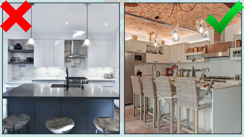
Once again, for those fortunate enough to have an island and peninsula, it will be easy to see pendant lights positioned only on one side: an asymmetry that will create visual interest.

But even for those who do not have an island and peninsula, it will be great to have multiple types of lighting, not only general lighting but also task lighting, on the table for better visual comfort when eating.

Under-cabinet lighting will also be designed even better in order to be able to see what you are doing when you are cooking, and if the cabinets are not there, you can use pretty wall lamps!

(credits: @nestmas-StudioRemi; Miton-Loto-Italian-Designer)

(credits: fireclaytile.com; @obsessed4interiors)

– PAINTINGS

It often happens that in the kitchen, as decorations, you put pictures that take up the topic of food or drink, or (and I admit I have them too) chalkboards with magnets; it is much more unlikely to see a beautiful painting or a gallery of photos.

Even in the kitchen we can and should bring some art!

Decorating the kitchen as you do other rooms will give your kitchen personality!

You can do it on the walls, but also on the countertop if you have the space; if it is true that we said to hide small appliances, it is not the same for decorative items.

As always, it should not be overdone, and it should be studied, but it will make a big difference indeed!

(credits: Sara Beltran; artofit.org)

– ANIMAL CORNER

I don’t know if this will really become a trend or not, but when I saw this solution, I fell in love with it.

Creating a small corner with dog or cat bowls, with a faucet to fill the bowl with water, is just brilliant!

That is super functional, especially when you have a large dog; carrying the full bowl around is not the best, but size aside, there is always the risk of spilling some of the water on the floor!

(credits: daveandjennymarrs.com; kingdomhome.com)

I hope this article was helpful and you love it; in case, let me know in the comments!

Feel free to share it with anyone you think might be interested, I will be honored, and it will help me get my name out there.

If you feel that your home, or some environment of it, does not reflect you enough, do not wait any longer and book your consultancy!

Some time ago, I had talked about 10 iconic lamps to know, but as you can imagine of famous designer lamps (here you can fine the Italian video), there are many more!

So today I’d like to introduce you to 7 more.

1 – FALKLAND LAMP

Designed by Bruno Munari in 1964 for the firm Danese Milano, produced by Artemide.

Also known as a stocking lamp, it was born as a hanging lamp; it takes shape from the tension of an elastic mesh tube and the weight of 7 differently shaped cylinders.

It has a single bulb with an aluminum reflector.

Munari took a cue from Japanese paper lamps to create this lamp, improving it, of course!

Unlike paper ones, the elastic mesh is less easily ruined, does not yellow, and most importantly, is washable!

Little curiosity the stretchy mesh is a real tights! In fact, Munari himself shared that one day he went to a sock factory to see if they could make him a lamp; these replied that they did not make lamps, and he said: “you will see that you will make them!”

This lamp now exists in three different sizes hanging 165, 85, and 53 cm high.

And it also exists as a floor lamp with a height of 195cm.

It is on exhibit at MoMa New York in the Architecture and Design department.

(credits: Artemide)

2 – BAT LAMP

Designed by Italian architect Gae Aulenti in 1965 and produced by Martinelli luce.

It is a height adjustable lamp and exists as both a table lamp and a floor lamp.

The diffuser, made of methacrylate, was obtained by molding techniques that were truly innovative at the time.

Also, the conical base spreads upward by widening into the ribs of the diffuser, just like the unfolding of bat wings.

And the telescope is in steel, and the base and knob are painted metal, now available in 7 colors.

With this lamp, Gae Aulenti returns to natural and organic shapes with a somewhat Liberty soul, moving away from the rigid and rational forms of the period.

(credits: Martinelli luce)

3 – BOURGIE LAMP

It is a relatively new lamp designed in 2004 by Ferruccio Laviani for Kartell.

It is a lamp with baroque shapes, but made of a decidedly modern material, polycarbonate.

This classic-modern mix makes this lamp appeal to people of even distant generations!

It exists in three versions that change according to the height of the shade, making this lamp very versatile and suitable both as a floor lamp and a table lamp.

Perhaps the best known version is the clear one, but you can now find it in different colors!

Fun fact: The idea of creating this lamp came to his creator while listening to a song!

This song is “Bourgie, bourgie” (after which the lamp takes its name) by Gladys Knight & the Pips, famous in the 1970s.

The song poked fun at the bourgeoisie of the time, described as sulky, ambitious, and contemptuous!

So here, Laviani decided to ironically reinterpret classic and formal shapes which have been untouchable until then.

(credits: Kartel)

4 – CABOCHE

Designed by Patrizia Urquola and Eliana Gerotto in 2005 for the Foscarini brand.

The two designers take their inspiration from a Bakelite bracelet from the 1930s, creating a series of lamps consisting of spheres made of plastic material, the polymethylmethacrylate, blown glass, chrome-plated metal, and aluminum.

Even the name of the lamps harkens back to jewelry making; caboche, in fact, is a technical term for one of the cuts (the most well-known one) for diamonds and precious stones.

It exists in multiple models: as a pendant, table, and floor lamp, and as a wall sconce.

All these models are available in different sizes and two versions: transparent and golden yellow.

The pendant lamp is suitable as both an ambient and punctual light: in fact, it emits direct light both upward and downward, but at the same time projects it diffusely through a white frosted glass; its spheres then create a magical mosaic on the walls!

(credits: Foscarini)

5 – TOLOMEO

Designed by Michele de Lucchi and Giancarlo Fassina in 1986 for the Artemide brand.

The two designers want to innovate the classic pantograph table lamp by comparing themselves with two other icons of the period: the Anglepoise lamp and the Nasca Loris lamp (from the latter, Pixar takes inspiration for its logo).

They changed how the lamp can be balanced and stopped in the desired position by replacing steel springs with steel cables and joints that keep them in tension; they also used aluminum for the structure.

These two fundamental changes make the lamp very light, eliminating the need for additional types of treatment, thus reducing production costs as well!

Tolomeo desk lamp won the Compasso d’oro ADI award in 1989 and is the best-selling lamp ever: an icon of simple and elegant hi-tech furniture.

Little trivia: In an interview conducted on the occasion of the 30th anniversary of the project, De Lucchi tells a curious anecdote: “Tolomeo, at that time, was not yet called that because the name was decided the night before it was presented at the Salone del Mobile. Ernesto (Gismondi, ed.) used to make a list of names every year, and Tolomeo seemed to us to be the most suitable character to represent the lamp because he was an astronomer, and a mathematician, in short, he was the one who best fits the idea of a scientific mindset.”

In its 30 years of life, Tolomeo also became a floor lamp, wall lamp, and pendant lamp, managing to adapt to new technologies, such as the switch to LED, while maintaining its essence!

(credits: Artemide)

6 – FORTUNY

Designed by Mariano Fortuny y Madrazo in 1907 now produced by Pallucco.

The idea starts from the need for indirect and diffuse light in a scenic environment.

Mariano Fortuny studied lighting in depth, above all stage lighting, where he understood that the correct use of fabrics could create soft, diffuse light.

The rays of light are not projected directly onto the subject but reflect off the umbrella, returning a softer beam of light.

His knowledge then in photography led him to use the three-foot structure as a support for the umbelliform lampshade.

The lampshade is adjustable, which allows you to use the light according to your needs.

This lamp exists in three versions: Century, Moda, and Ornaments, each with different characteristics in terms of color and dimensional aspects.

(credits: Pallucco)

7 – TETATET

Created by Davide Groppi in 2013 for the brand of the same name.

It is a portable and rechargeable LED lamp that is small and discreet, with a magnetic base.

It comes after Groppi’s experience in the restaurant business, fulfilling the desire to see the light as one of the ingredients used in the kitchen.

Its small size allows you to put one at each table.

The designer considers it his best project, which is probably a shared thought since it received the XXIV ADI Compasso d’Oro Honorable Mention in 2016.

Little trivia: it is used for the mise en place of many starred restaurants, above all Carlo Cracco’s in Milan!

(credits: Davide Groppi)

I hope this article was helpful and you love it; in case, let me know in the comments!

Feel free to share it with anyone you think might be interested, I will be honored, and it will help me get my name out there.

If you feel that your home, or some environment of it, does not reflect you enough, do not wait any longer and book your consultancy!