And here it is, the Pantone Color of the Year 2024: Peach Fuzz (13-1023).
The Pantone Color Institute celebrates its 25th anniversary with a delicate and soft peach color this year.
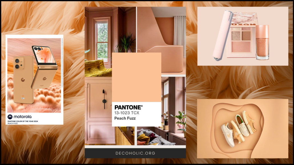
“A velvety and gentle peach whose all-encompassing spirit enriches the mind, body, and heart”
is how the company describes this delicate and simultaneously fresh color.
It’s a color we can define as neutral and calming but full of positivity, definitely very different from last year’s vibrant Viva Magenta!
The Viva Magenta, in fact, was a cochineal red, intense, and meant to galvanize the spirit and build inner strength.
This color is enveloping, delicate, and radiant, aiming to help strengthen empathy and compassion in a indeed tumultuous period.
“PANTONE 13-1023 Peach Fuzz brings belonging, inspires recalibration, and an opportunity for nurturing, conjuring up an air of calm, offering us a space to be, feel, and heal and to flourish from whether spending time with others or taking the time to enjoy a moment by ourselves”
Those are Leatrice Eiseman’s words, Executive Director of the Pantone Color Institute.
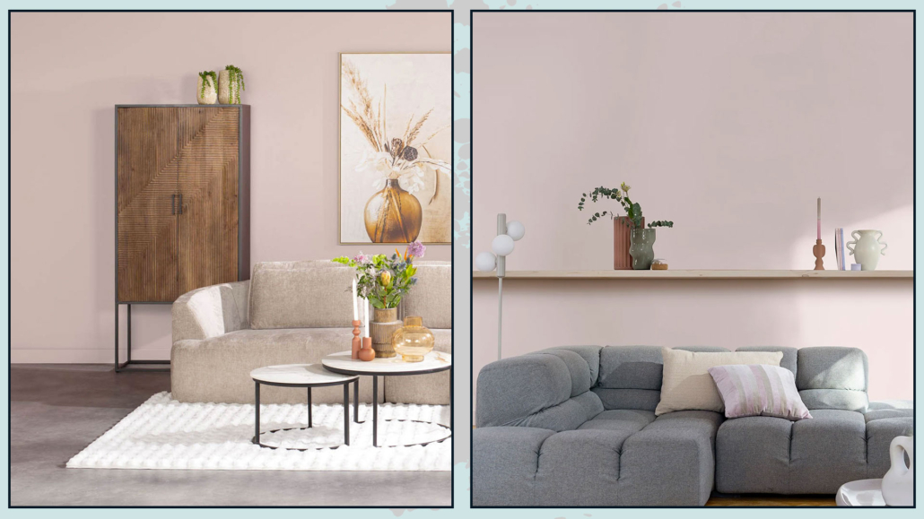
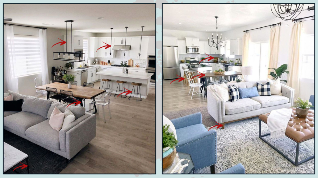
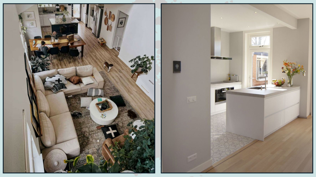
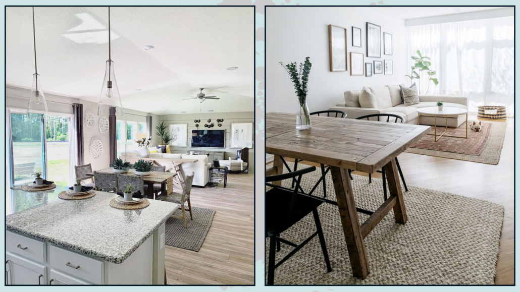
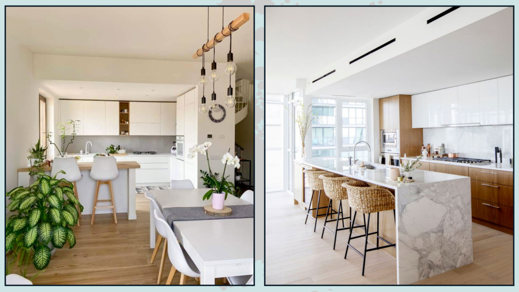
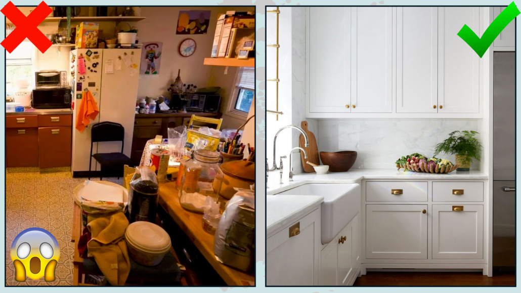
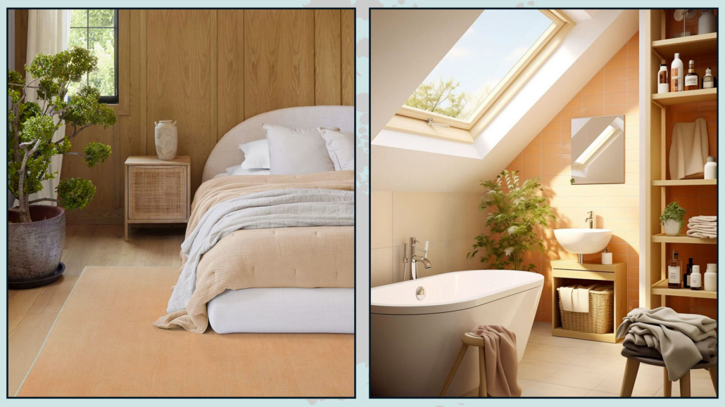
How to use this color in your home?
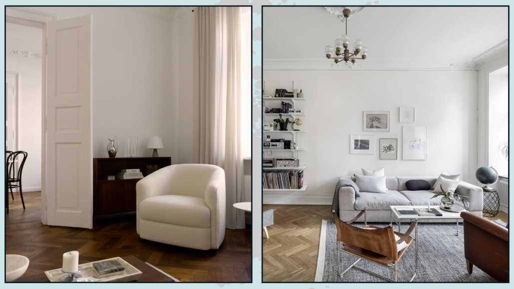
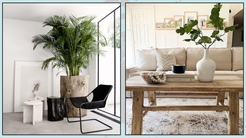
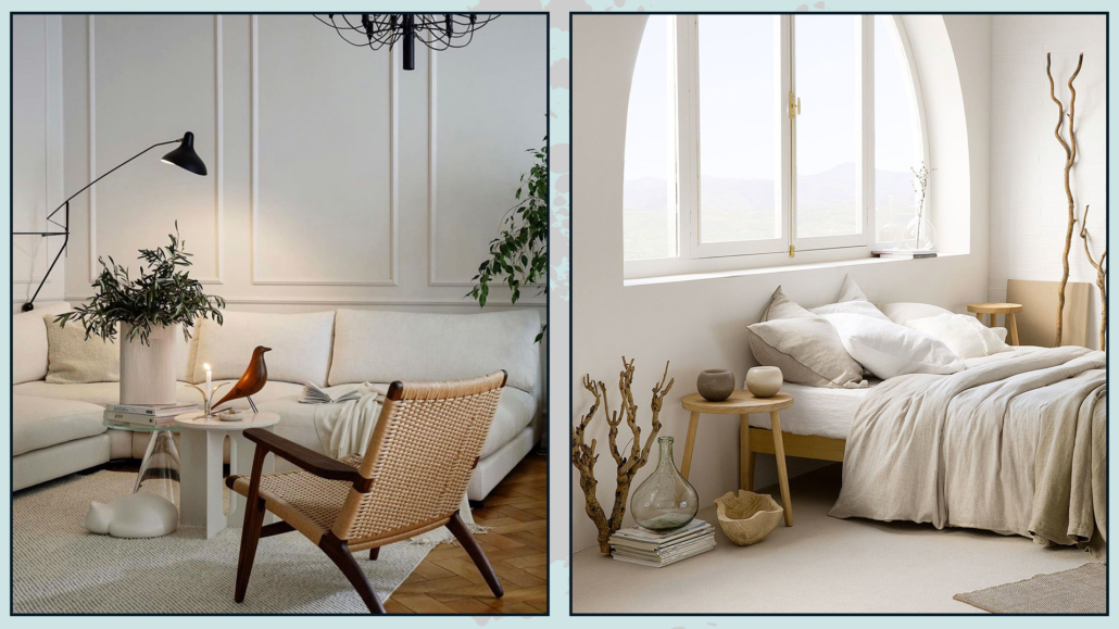
As mentioned earlier, it’s a delicate color that allows you to incorporate it into any home, whatever the style!
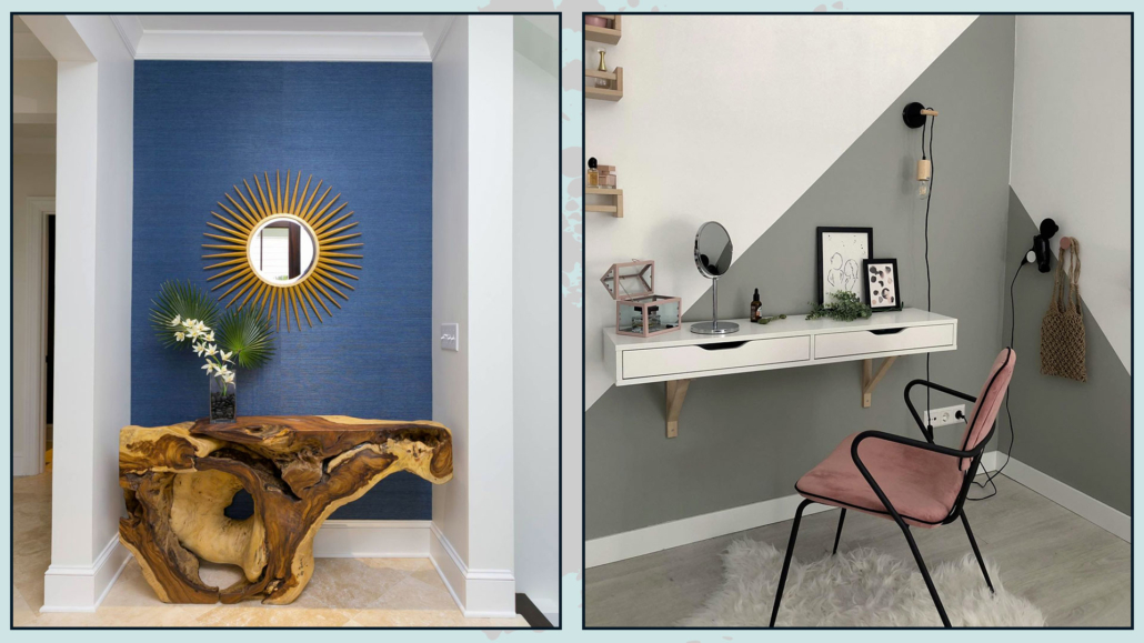
You can confidently use it on the walls, keeping in mind that, being a warm color, it may visually shrink the space a bit.
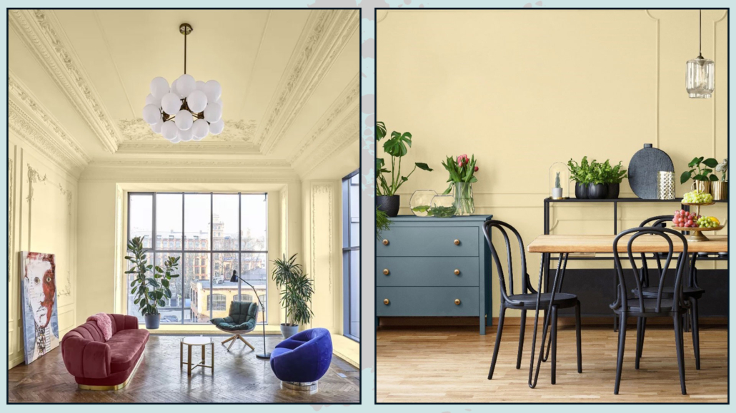
You can use it indiscriminately in all rooms, creating warm and inviting environments!
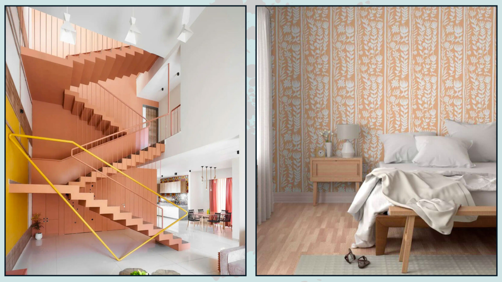
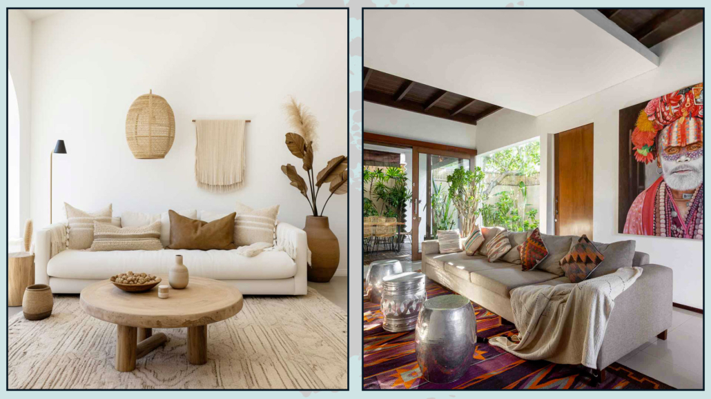
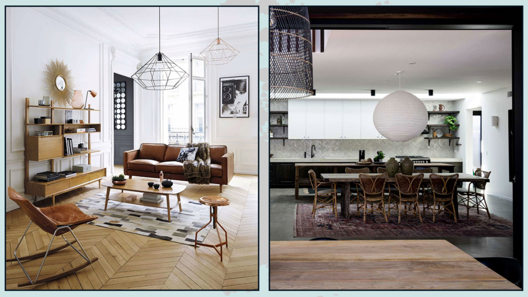
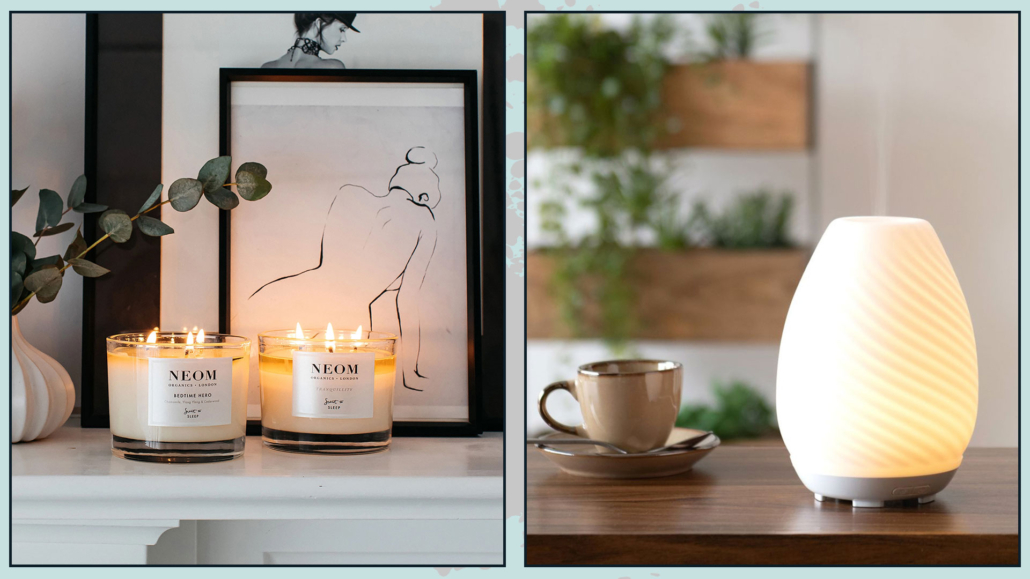
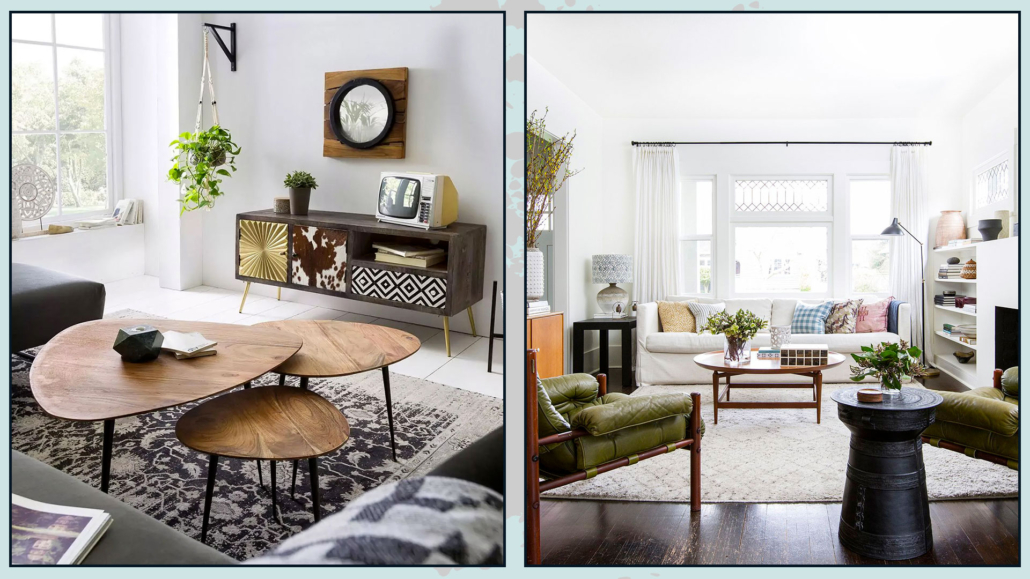
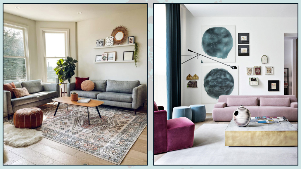
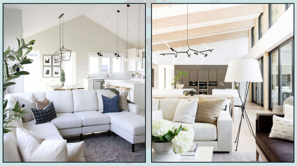
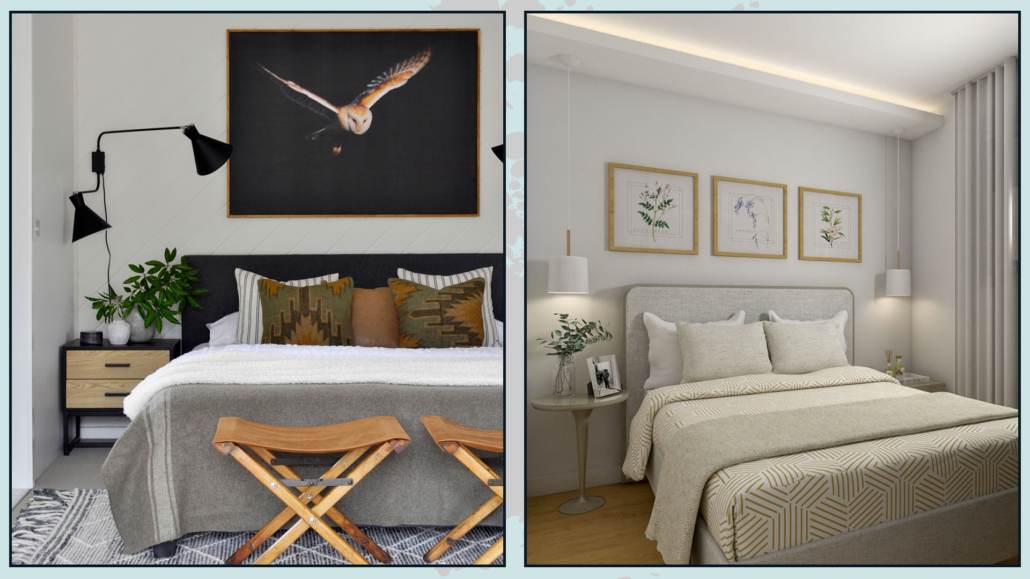
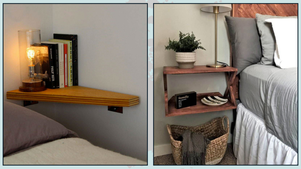
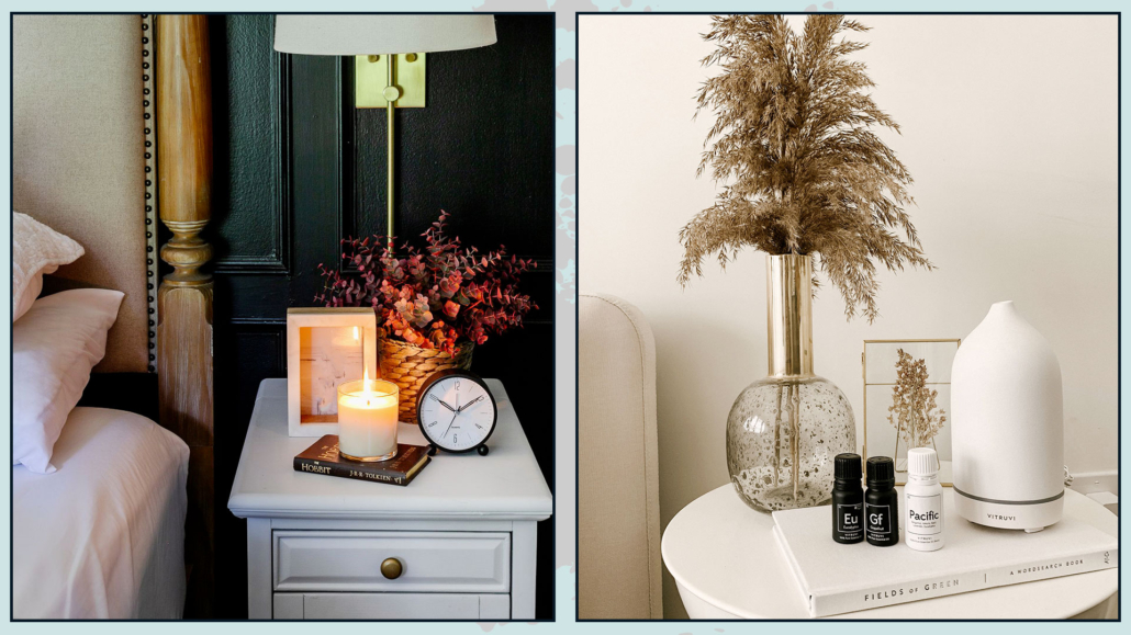
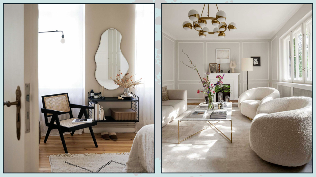
(credits: Manoj Patel Design Studio; Spoonflower)
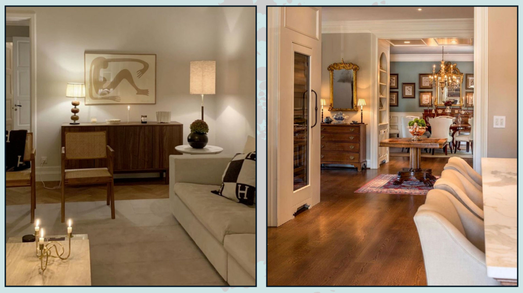
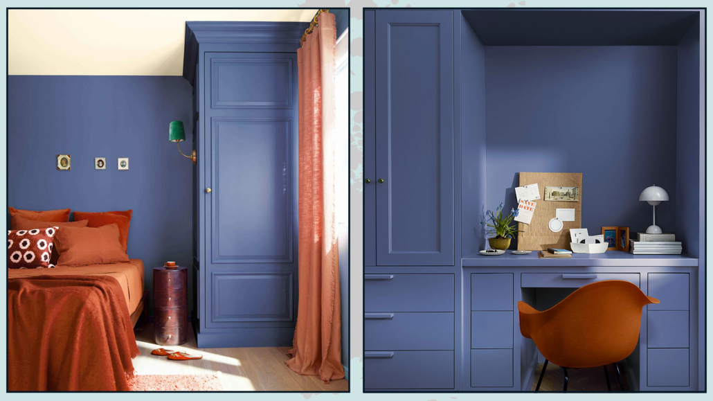
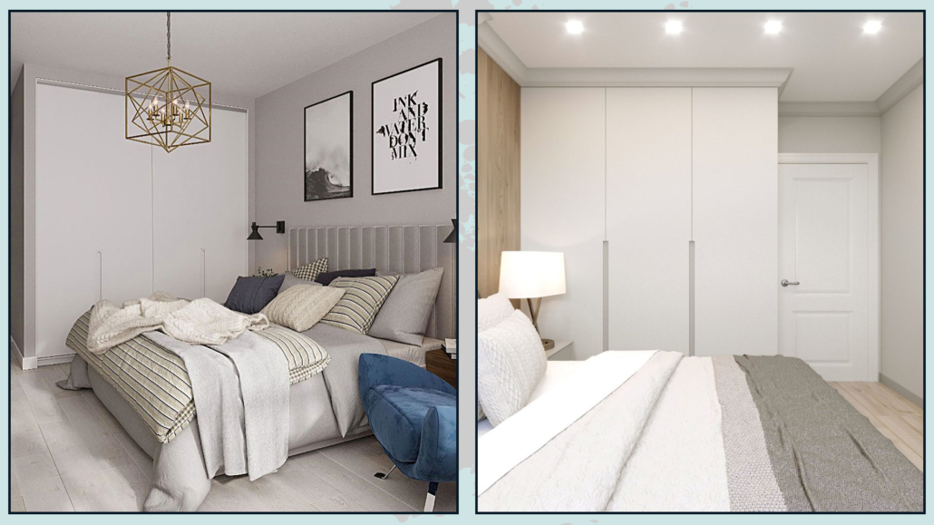
(credits: Stacy Zarin Goldberg; the nordroom)
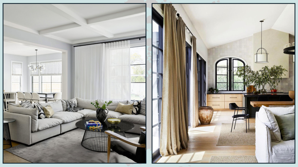
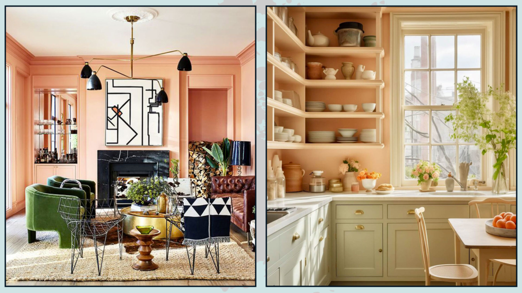
Regarding the walls, you can also use this color with wallpaper.
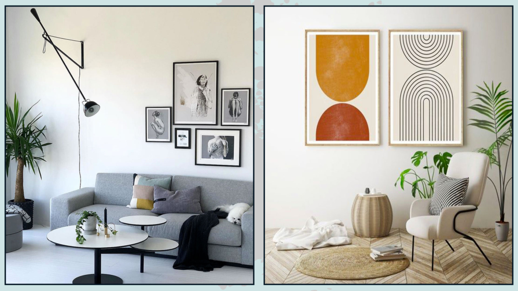
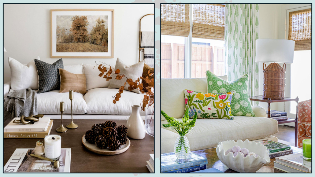
It works well in not overly large furnishings, such as a pouf, an armchair, a bench, or chairs.
You can incorporate paintings and objects with this color without any problem.
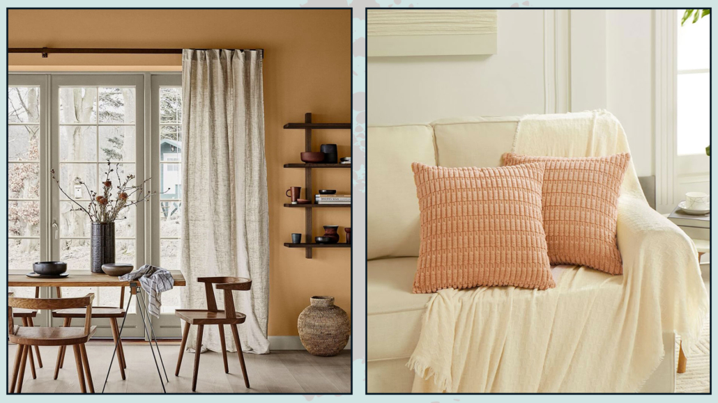
Of course, fabrics like blankets, pillows, and rugs can feature this color!
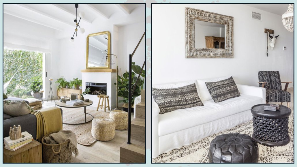
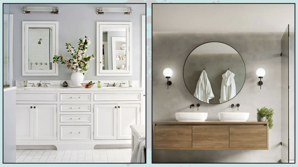
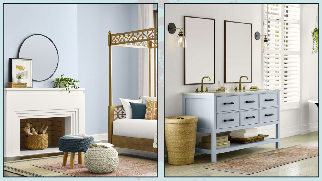
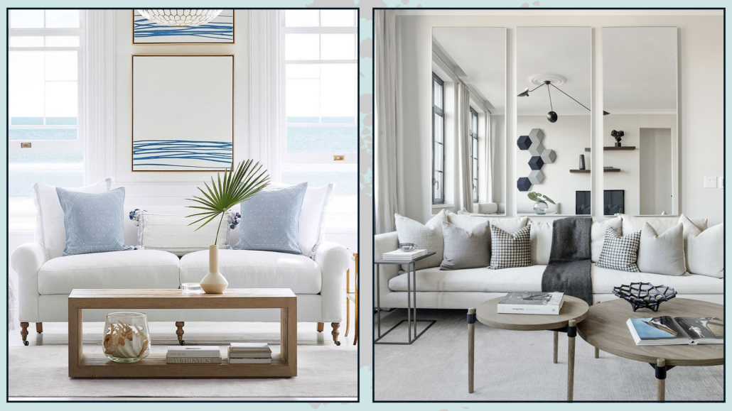
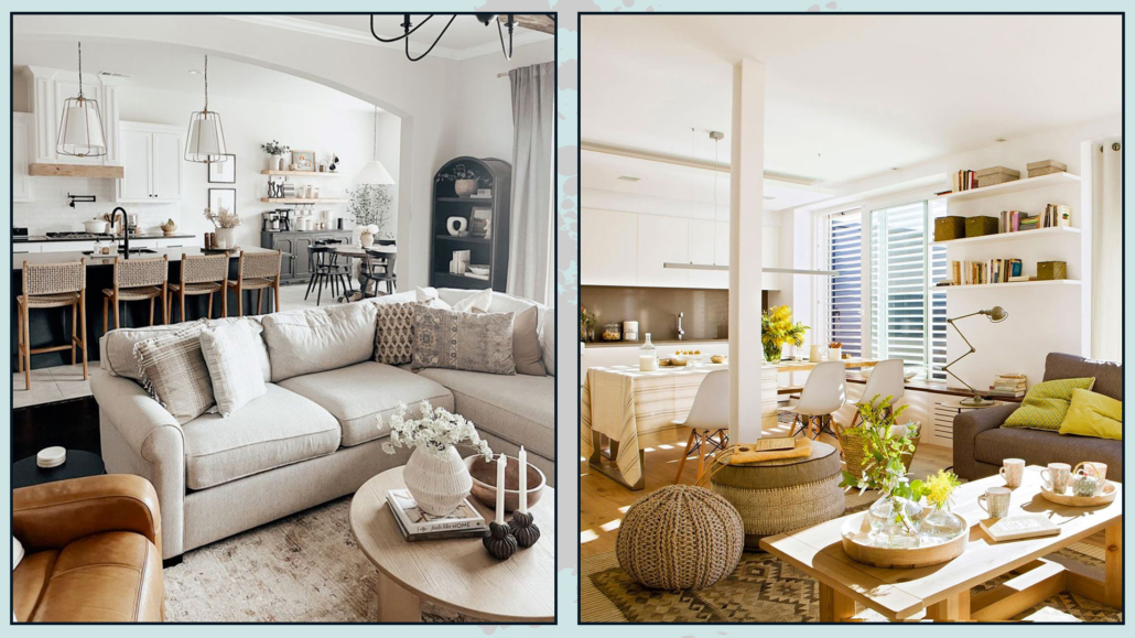
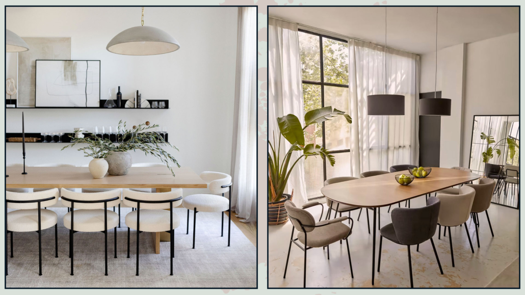
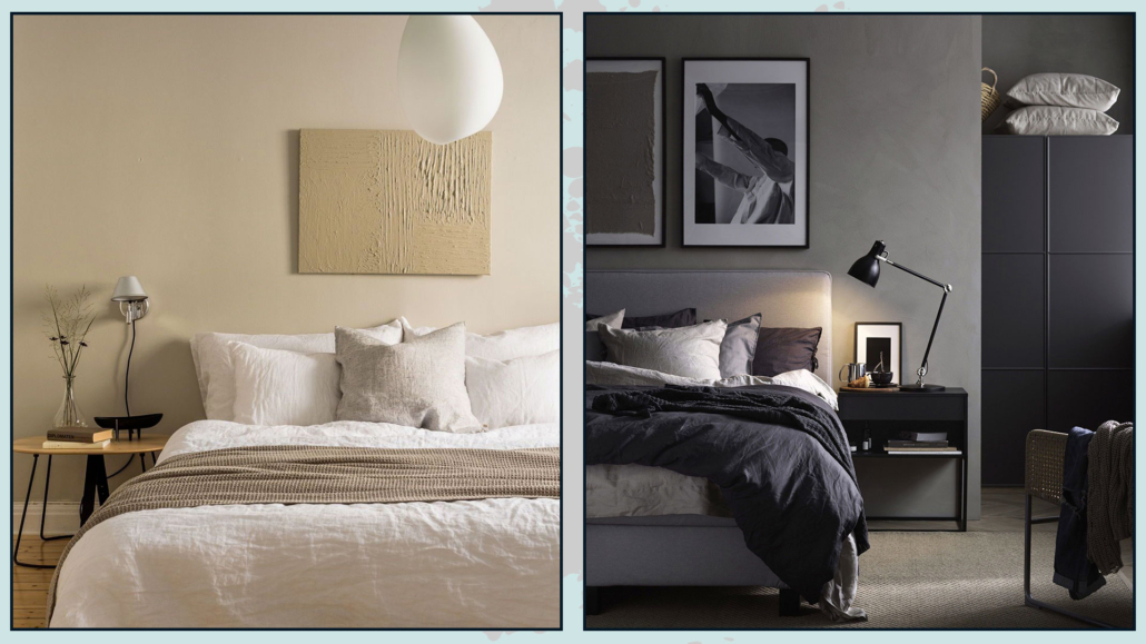
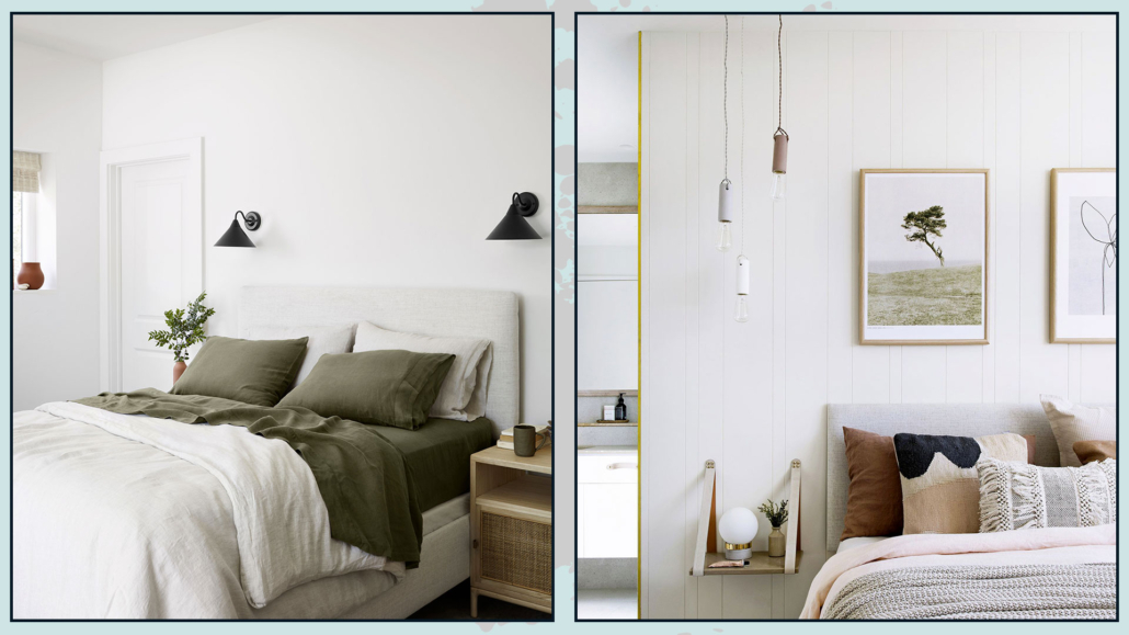
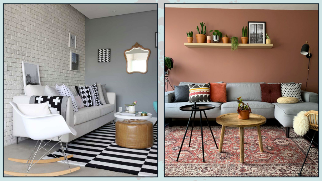
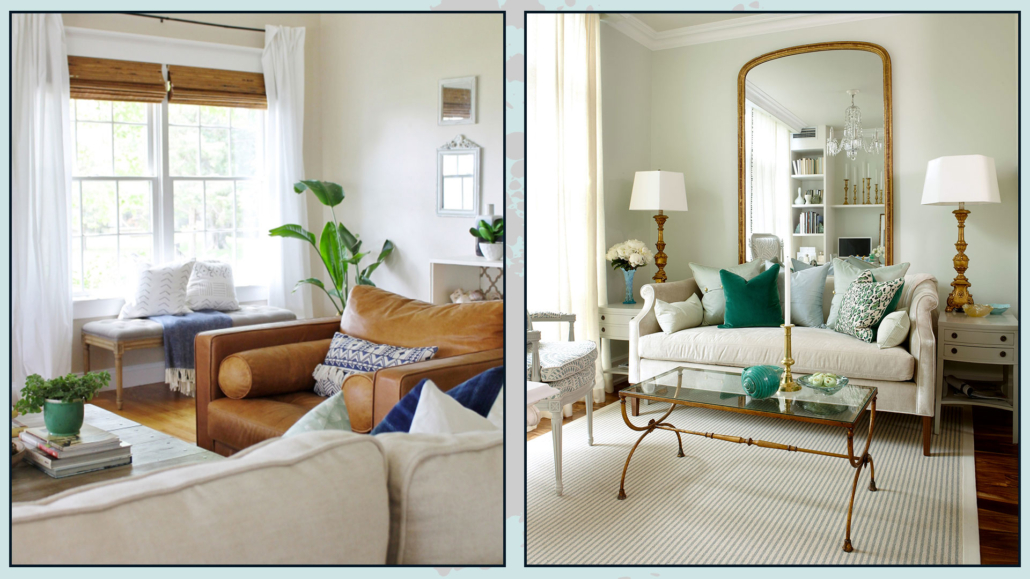
(credits: Jotun; Fanci home)
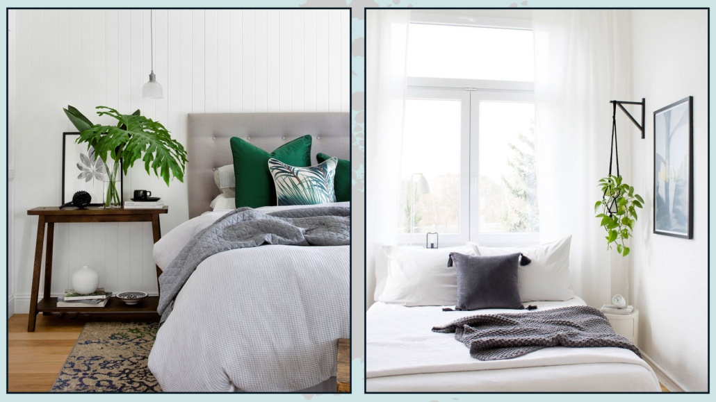
(credits: ruggable; the nordroom)
If you’re looking for wallpaper, fabrics, or rugs in this color, you can check out Spoonflower or Ruggable, brands that Pantone has collaborated with for his color of the year 2024!
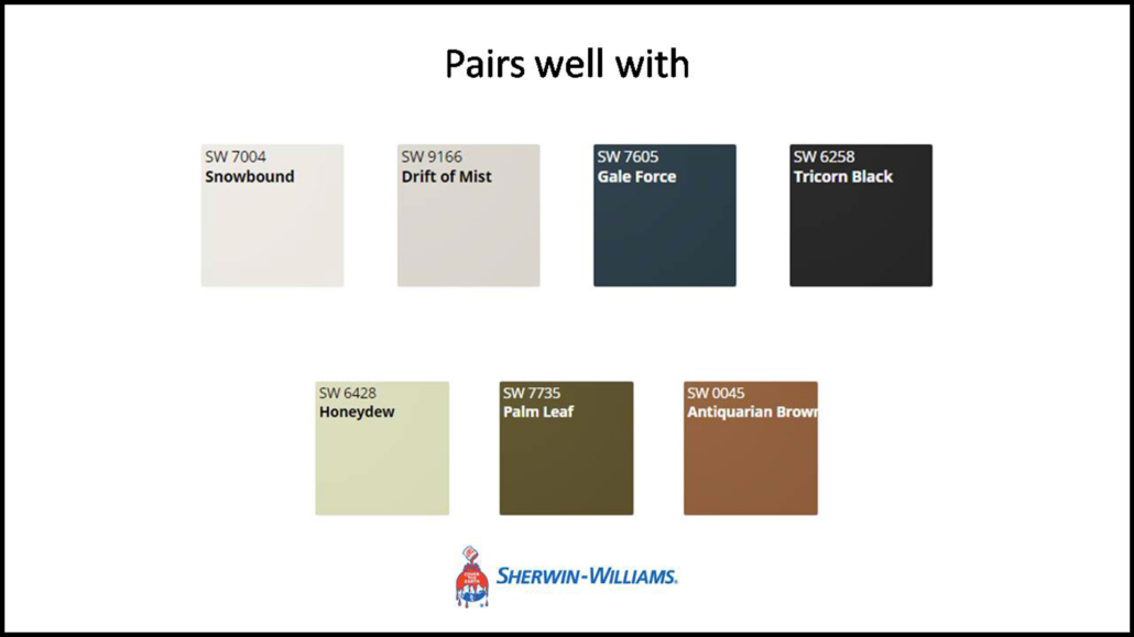
Peach Fuzz is a color that easily complements many colors, both warm and cool tones, and pairs well with wood!
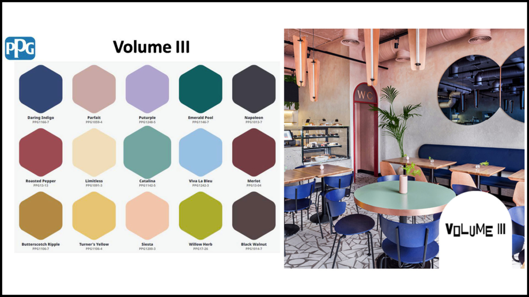
Pantone offers us 5 color palettes that are not the easiest to use:
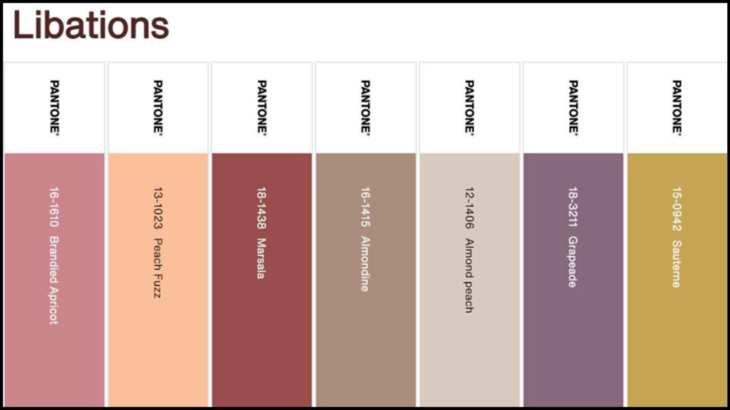
– LIBATIONS
Consisting of a sophisticated mix with a sophisticated and elegant mood.
The colors create subtle and refined contrasts.
It’s a palette that blends well with various styles.
(credits: Pantone)
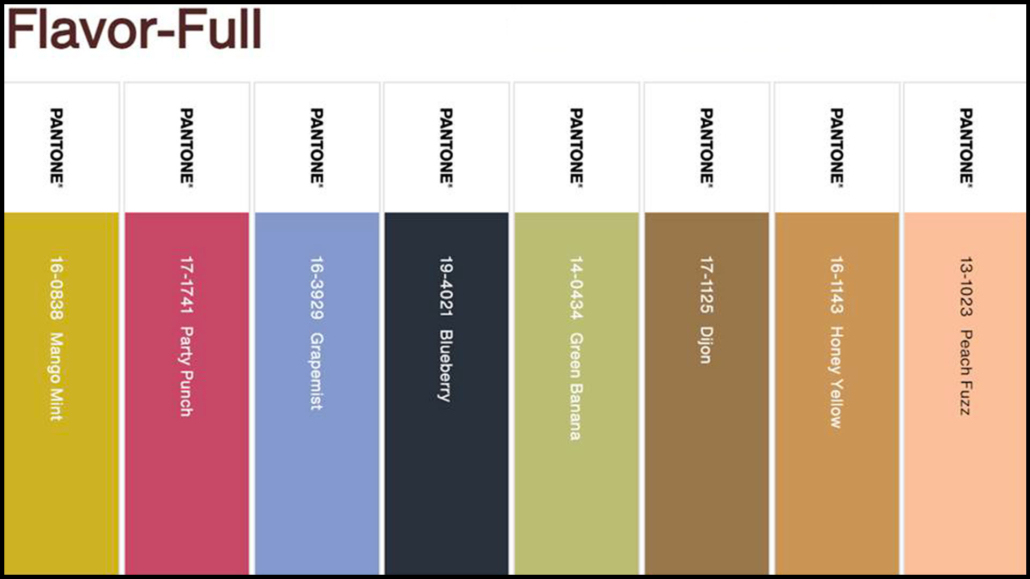
– FLAVOR FULL
It’s an engaging palette but not the easiest to combine because there’s a risk of creating “harlequin” environments.
Especially the first two colors (Mango Mint and Party Punch), it’s preferable to use them in small doses as accent colors!
(credits: Pantone)
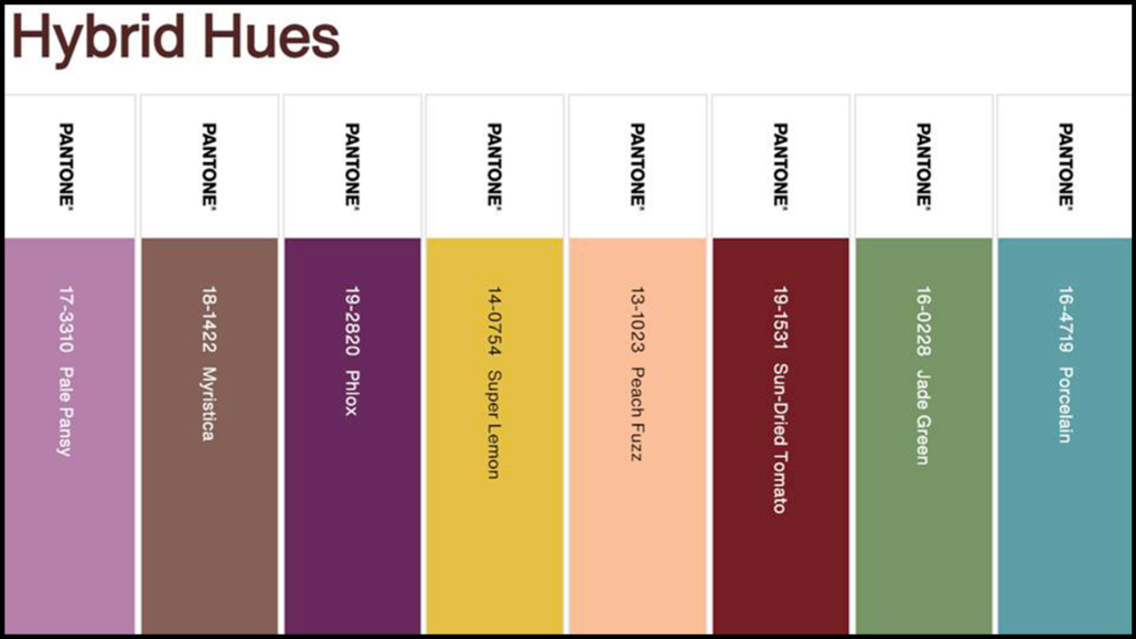
– HYBRID HUES
It’s a true dichotomy of various colors that can indeed be harmoniously combined, although appearing quite discordant.
They are intense colors, mostly dark, so be careful not to weigh down the environment!
(credits: Pantone)
– PEACH PLETHORA
It is a monochromatic palette that embraces various peach tones, from the lightest and delicate to the most saturated and vibrant.
This palette, as well, is not the easiest to use because there’s a risk of a decidedly Barbie effect!
If you love this palette, use the softer colors as a base (principally Pristine, Honey Peach, and Peach Puree) and incorporate the more saturated ones in small doses, in decor items, and, perhaps, in a few cushions.
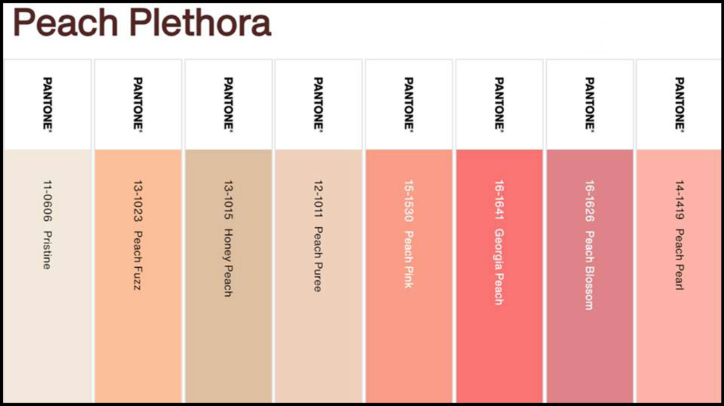
(credits: Pantone)
– PAIRINGS
This palette is composed of decidedly vibrant colors.
Excluding Peach Fuzz and Little Boy Blue, with which you can be a bit bolder, I would use the other colors sparingly.
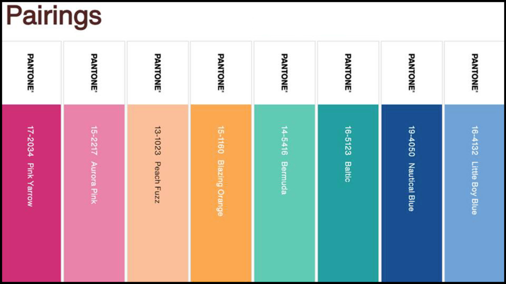
(credits: Pantone)
Do you like this Pantone color of the year 2024? Will you use it? Let me know in the comments!
(credits: Pantone)
I hope this article has been helpful and enjoyable for you. If so, let me know in the comments!
Feel free to share it with anyone you think might be interested, I would be honored, and it will help me gain more exposure.
If you feel that your home, or any specific area of it, doesn’t reflect your personality enough, don’t wait any longer and book your consultancy!