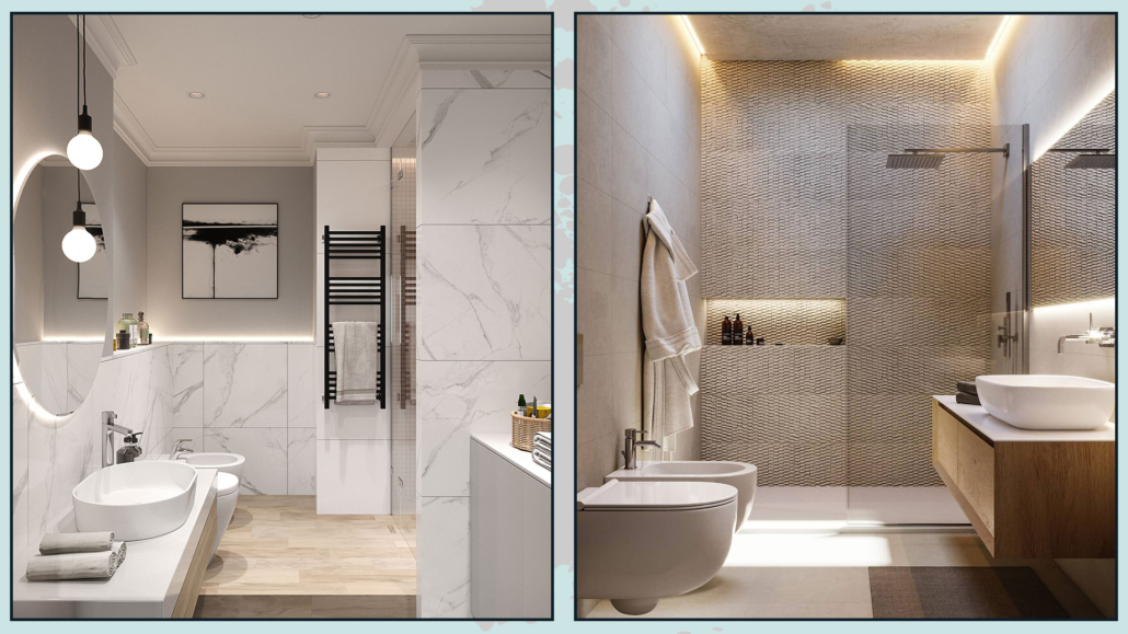
White or light gray kitchen and bathroom have been a trend for many years since they looked bright and clean!
The flip side, however, is that these environments can be a bit cold and impersonal!
If you have a white kitchen or bathroom that feels a little sterile but don’t want to or can make massive changes know that there are little tricks to warming up these rooms!
In this case, three tips will help you warm up and give personality, and I recommend you follow them all for a good result!
1 – ADD NATURAL ELEMENTS
Adding natural elements is a quick and easy way to warm up rooms!
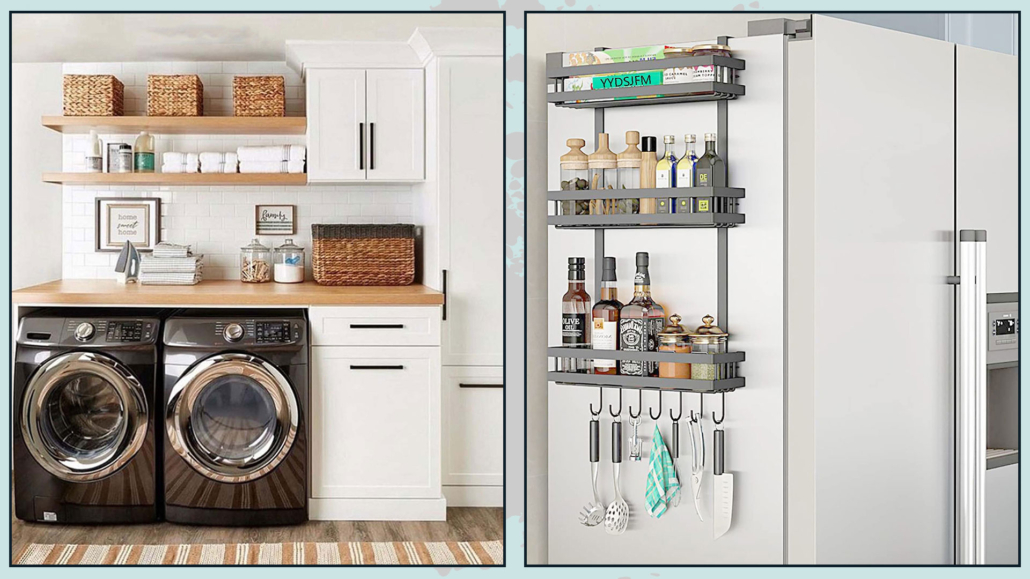
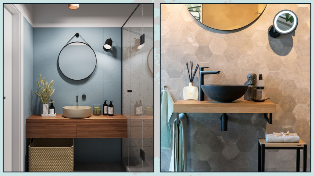
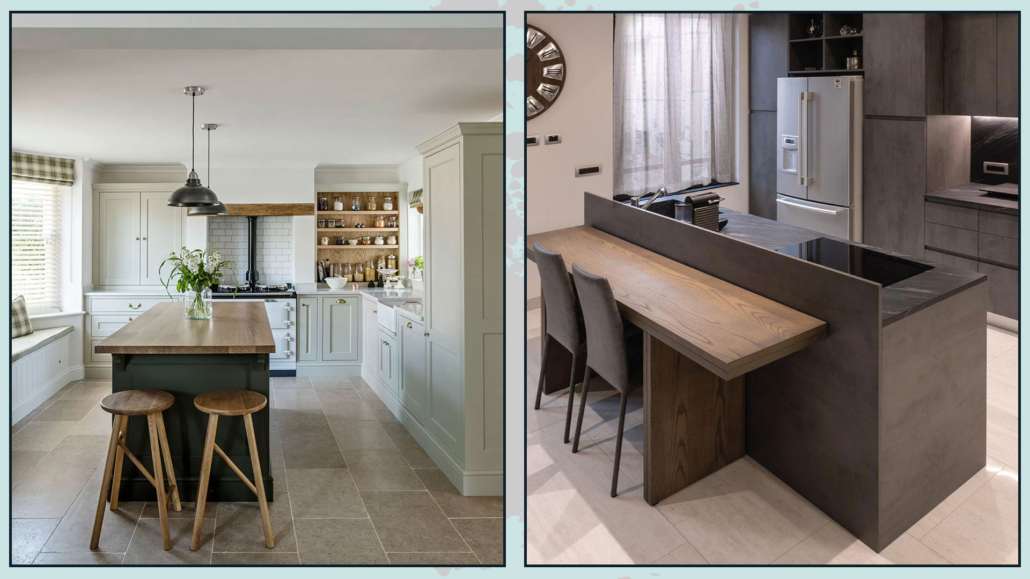
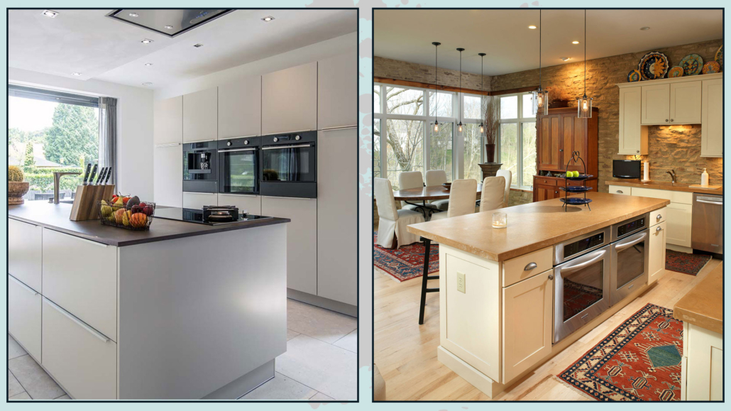
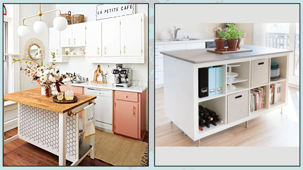
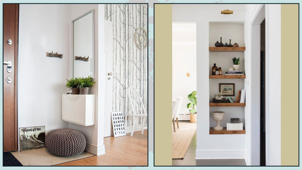
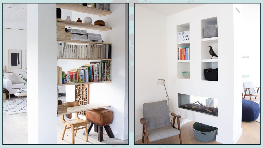
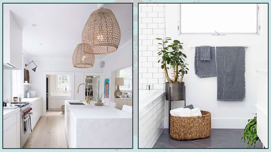
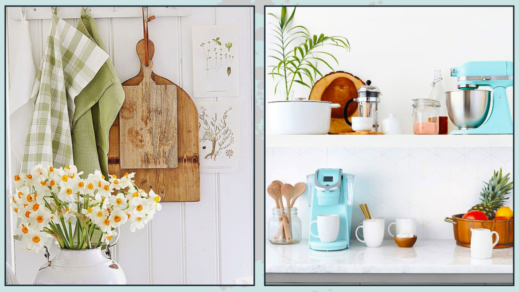
WOOD
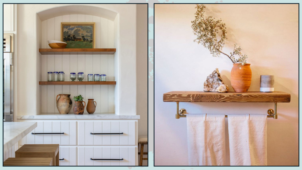
You can use wood by putting some shelves either in the kitchen or bathroom on which you can then put some decorative composition.
In the kitchen, you can bring wood with nice cutting boards, utensils, trays, and bowls!
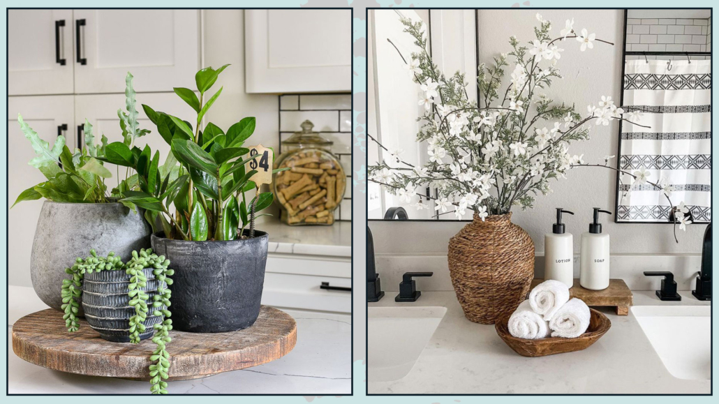
In the bathroom, you can add it with a stool, or some accessories, maybe a ladder to put towels on!
Always for the bathroom, you could also think about bamboo or teak liquid soap dispensers!
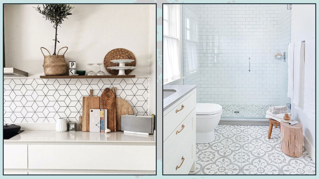
(credits: byshnordic.com; styleathome.com)
WICKER
Another natural element that helps with warmth is wicker, and you can use it with baskets, which are always helpful for storage and keeping everything tidy.
Also, depending on the style, you could use it as a chandelier shade or a plant pot cover!
In the kitchen, it could be placemats to put on the table!
(credits: cutypaste.com; 100layercake.com)
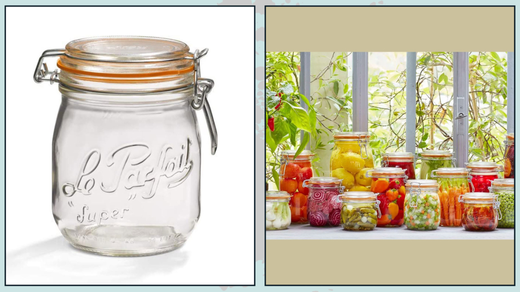
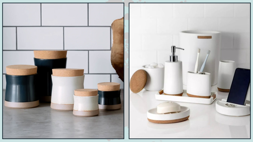
CORK
Cork is another excellent element for warming up rooms!
It could be the underpots or jar caps you may have exposed!
You could also think about having a glass bowl or vase filled with corks: it would be decorative and would precisely warm up the environment a bit!
(credits: Kinto; Target)
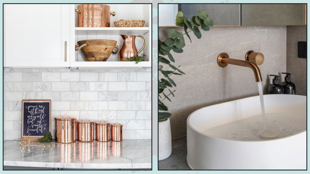
COPPER
Our grandmothers had many copper shapes hanging on the walls now, I’m not saying to do the same thing, especially with super modern kitchens, but a few copper items would surely help warm the room!
You can use them first as faucets or cabinet handles, or you could use them as plant pots or a couple of items on the countertop!
(credits: maisondepax.com; abiinteriors.com.au)
TERRACOTTA
If copper could be hard to insert, surely it will be easier with terracotta!
There are beautiful decorative vases or even terracotta pans that can be left on display!
(credits: intimatelivinginteriors.com;Sara & Rich Combs)
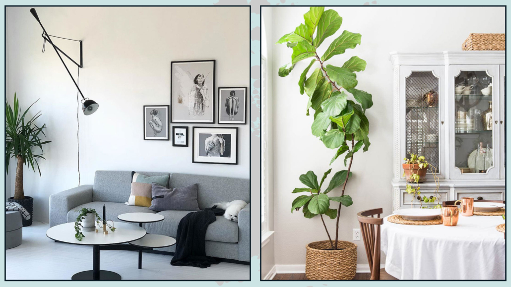
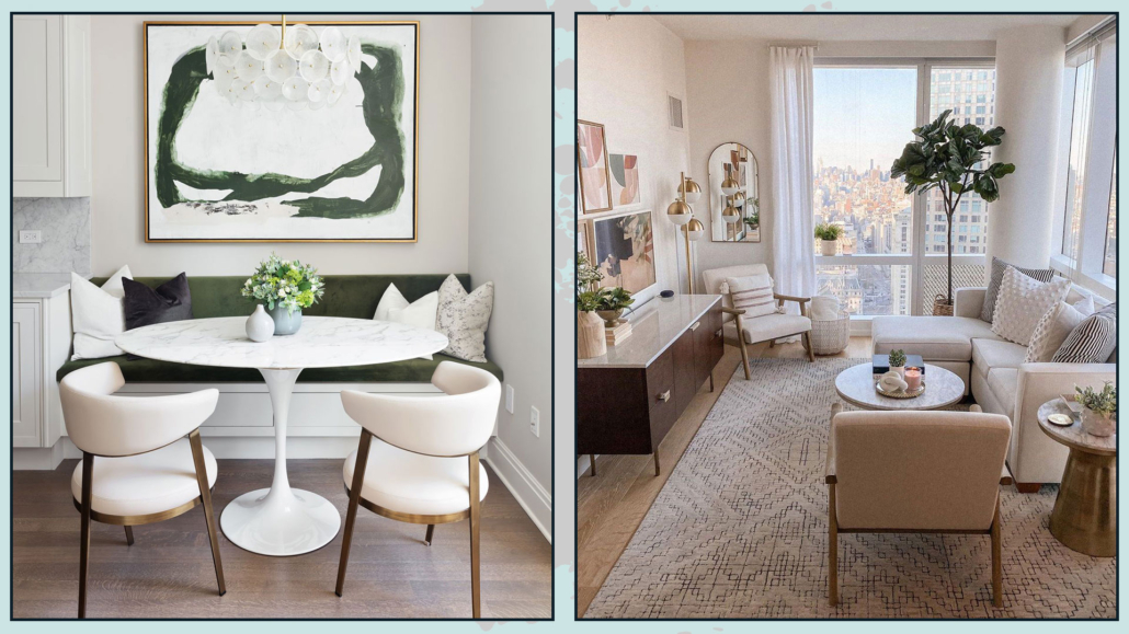
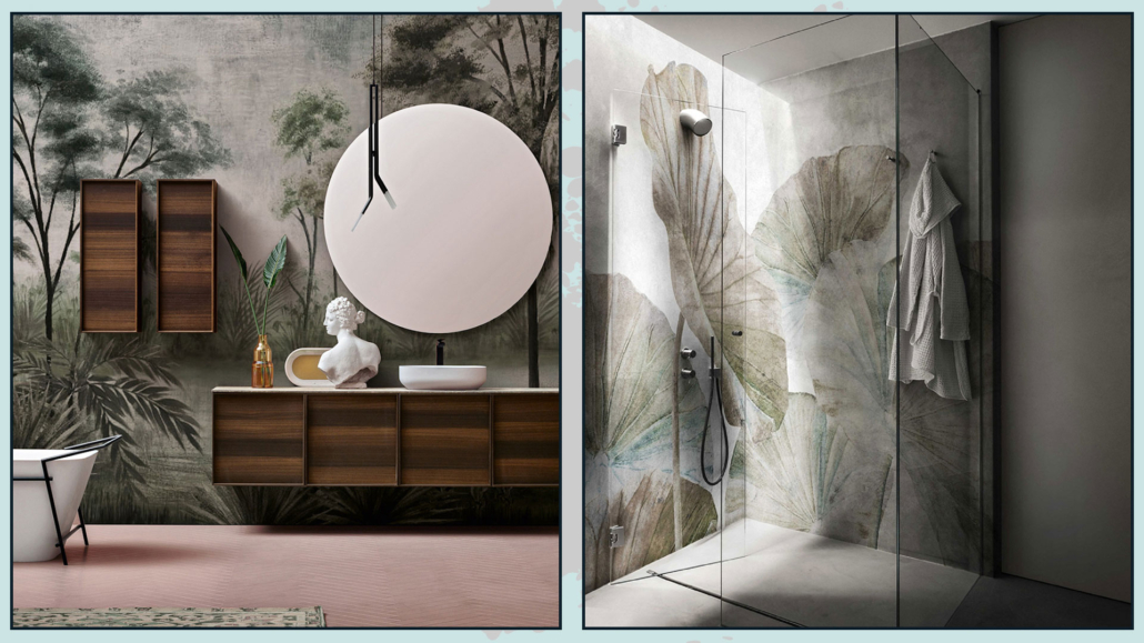
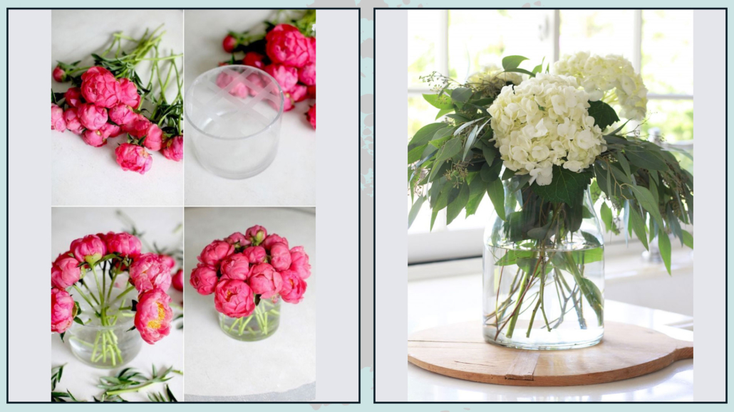
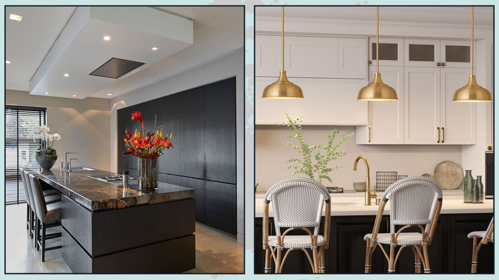
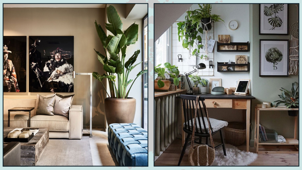
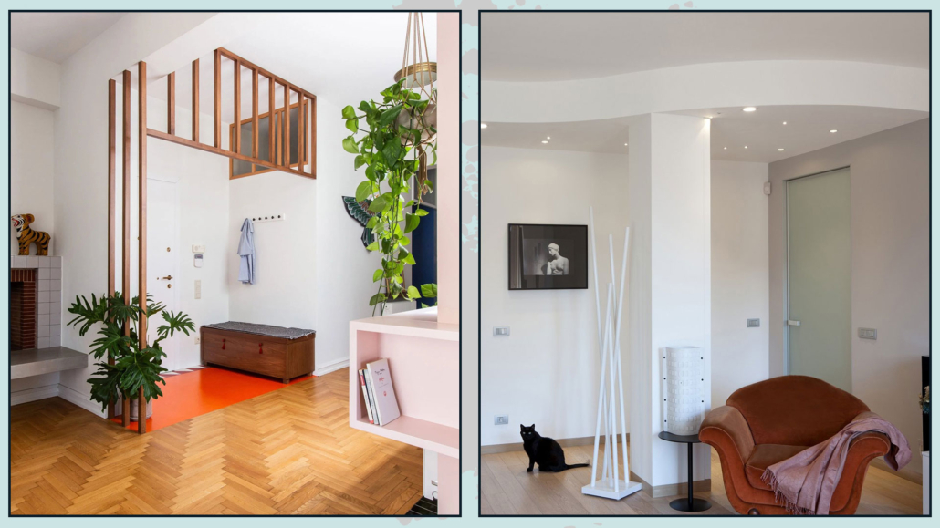
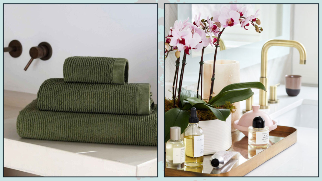
2 – PLANTS AND FLOWERS
I bet you were expecting it!
Well, yes, plants and flowers are a fabulous way to warm up a room, thus even a white kitchen and bathroom!
The call to nature beyond all will bring a bit of color and texture, creating some movement!
If space de allows, don’t be afraid, whether in the bathroom or kitchen, to put a large potted plant!
It will immediately make the environment more lively and cozy, as well as elegant!
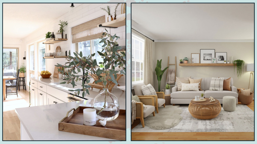
If this is not possible, even small touches of nature will be enough!
In the kitchen, of course, you can think of small vases with tastes on the countertop or some pots with branches or leaves!
No need to have a jungle or expensive bouquets of fresh flowers; very little is needed!
What if you are a black thumb?
You can create some arrangements with fake flowers! Real is better, of course, but nowadays, as I’ve said other times, there are artificial flowers that look real!
Plus, if you mix them with live branches or put a little water inside in the case of a glass vase, you’ll be able to make them look even more realistic!
As always, one should not overdo it, but it could be a good compromise!
(credits: littlehouseoffour.com; GeorgiaRaeOwen)
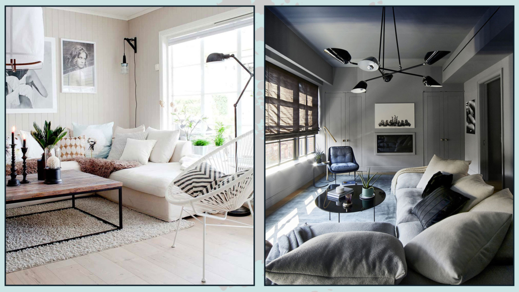
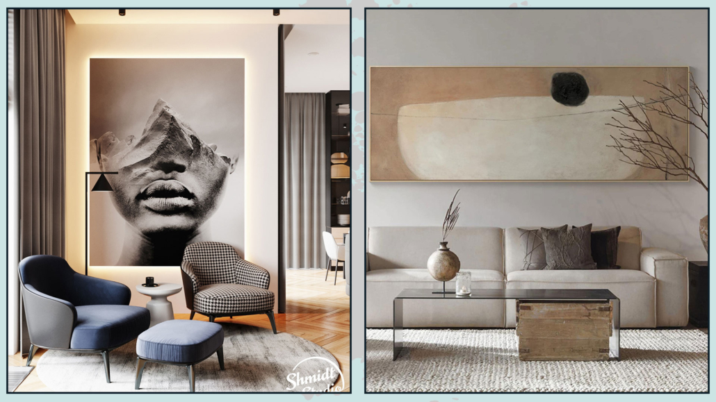
3 – ADD TOUCHES OF COLOR
White kitchen and bathroom can be seen as two blank canvases where to express one’s personality!
With white, ANY color looks good!
Warm colors will make the environment pleasant and more inviting, while blues and greens will add a touch of freshness and energy!
Of course, if you already have a color palette used in the rest of the house, bring that into the kitchen and bathroom!
BATHROOM
The quickest and fastest way to add color to the bathroom will be by using colorful rugs and towels!
But you can also do it using colorful toothbrush holders and dispensers!
You could also have a small tray with a few items, like a perfume bottle, colored!
(credits: Archiv firmy; House & Home)
KITCHEN
The fastest way to add color also for the kitchen is to use colorful textiles, such as rugs, towels, potholders, and the possible apron.
You could also put a pretty runner on the table with a lovely centerpiece!
On the countertop, if you have exposed appliances, you could get them colored or put a series of colored cups on a tray, for example!
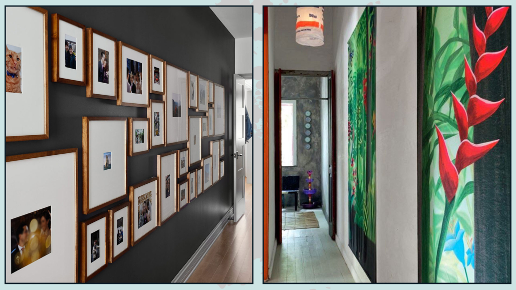
Of course, in both cases, decorating the walls with pictures or photos will be another great way to bring a splash of color!
As always, you don’t have to overdo it: just a few well-distributed touches in the room can make a difference!
(credits: vibekedesign.blogspot.com; mydomaine.com)
If well-designed, these decorations can be changed regularly (with each change of season, for example) to have an ever-changing kitchen and bathroom!
I hope this article was helpful and you love it; in case, let me know in the comments!
Feel free to share it with anyone you think might be interested, I will be honored, and it will help me get my name out there.
If you feel that your home, or some environment of it, does not reflect you enough, do not wait any longer and book your consultancy!