Do you want to change the face of your bathroom, making it more “luxurious” and sophisticated, without having to renovate it?
This article then is for you: today, I will give you 10 tips to change the face of the bathroom quickly and effectively!
LET’S START WITH THE SMALL DETAILS
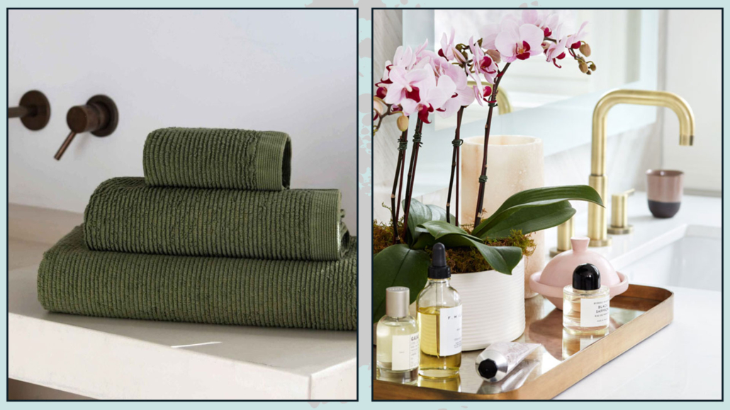
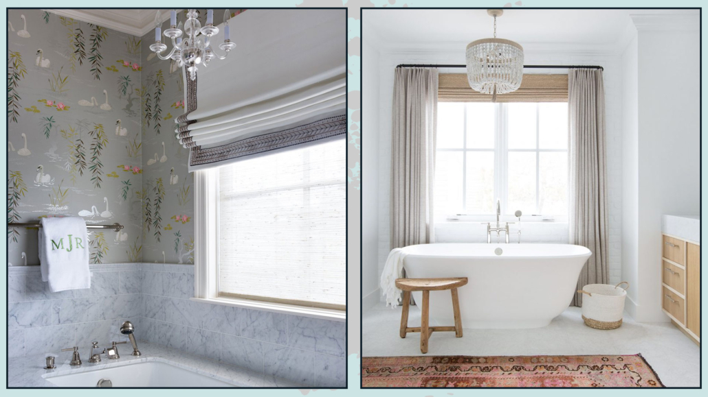
1 – TEXTILES
The most immediate thing to do is to check all the textiles in the bathroom, from the towels to the rug to the tub curtain, if any!
These details are indeed quite crucial because textiles bring texture, movement, and depth!
Check out the ones you currently have: are they in good order or a little old and creased?
In case they are a bit old, it might be worth changing them!
The choices for both rugs and towels are literally endless!
You can choose actually simple, minimalist rugs for a contemporary, fresh, linear look, but you could also opt for rugs with more textured patterns to give it some extra movement!
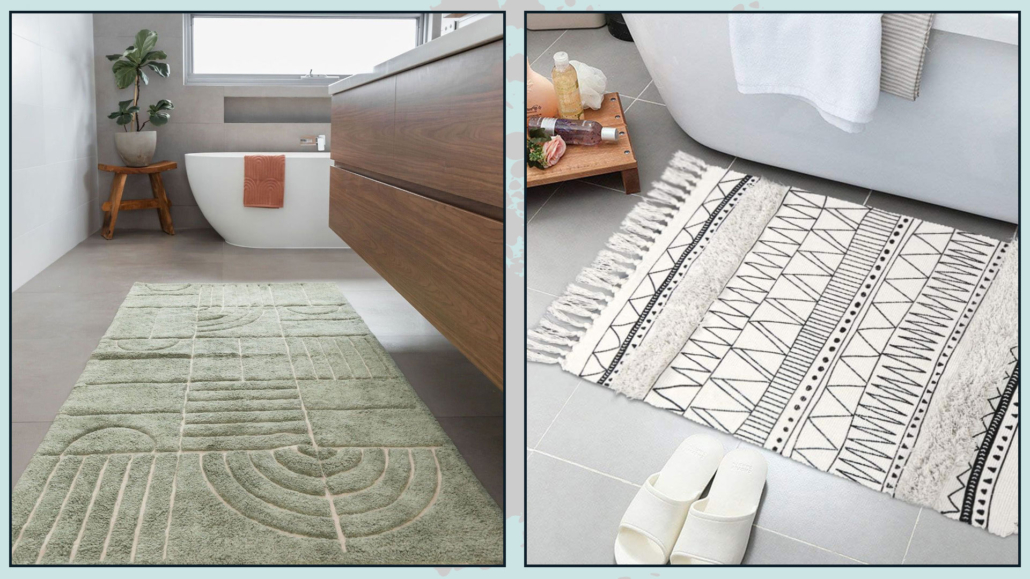
(credits: ohhappyhome.com.au; amazon)
Even for towels, there’s an embarrassment of choices!
Always opt for towels that make your color palette stand out, and tie in well with the rest.
When in doubt, get them white: they go with any color and style, are durable, easy to clean, and always very elegant and timeless!
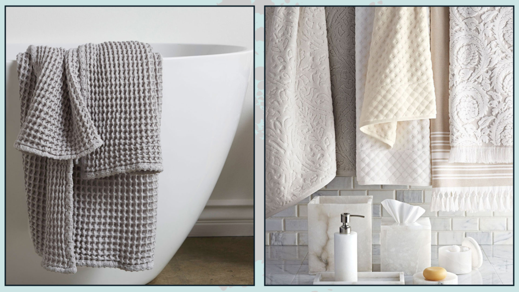
(credits: parachutehome.com; Neiman Marcus)
If you have a bathtub and curtain instead of glass, don’t settle for classic plastic curtains!
These will not add any value to your bathroom.
Even for these items, there are now many options: choose something a little more sophisticated that goes well with the rug and towels!
Whether it’s in a solid color or with some pattern, the tub curtain is also a great way to give that special touch to the bathroom!
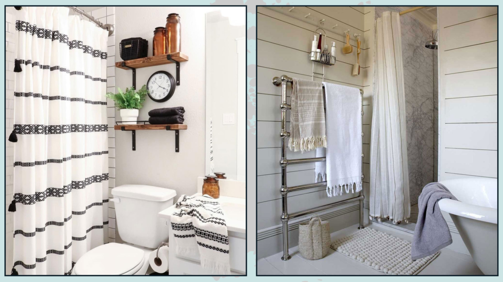
(credits: @txsizedhome’s; Claudia Dulak)
2 – CURTAINS
Curtains are part of textiles, but I prefer to dedicate a space just for them!
Even if bathroom window glasses are not transparent, having curtains in the bathroom is indeed advisable!
First of all, they are yet another way to bring texture, movement, and style, plus they help filter light making it “softer” and more relaxing.
In this environment, glass curtains are perhaps the best, also because they are the most practical!
They can be roller, packet, or even panels arranged at the bottom with a magnet!
The choice will obviously depend on the style of the bathroom!
If the bathroom is large and classically styled, you could also think about putting up drapery curtains if you like; they would make the bathroom look even more sophisticated!
It will be paramount here to choose a moisture-resistant material that is easy to wash!
Also, opt for light-colored curtains to maximize the entry of natural light, even if filtered!
(credits: marypattondesign.com; amberinteriordesign.com)
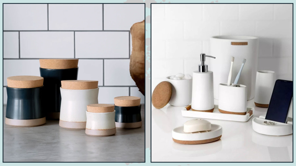
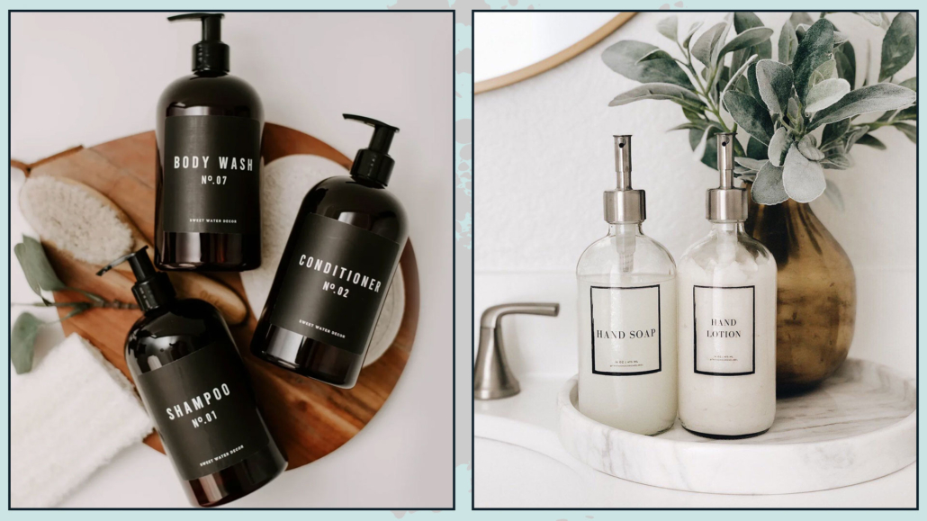
3 – USE EQUAL DISPENSERS
We also saw this in the 7 tricks for decorating your home like a Pro: prevent the visual chaos of a thousand bottles of various products!
Shampoo, conditioner, shower or soap foam, liquid soap, etc… all have small bottles of different shapes and, moreover, different colors!
The colors are often super vivid and will hardly have anything to do with your color palette!
Choose matching dispensers, putting the appropriate label on them so you know what it is, and transfer the various products inside!
Chances are you already have a pretty dispenser on the sink for liquid soap; why not do it for the shower as well?
Some even have brackets that can be glued to the wall, and it is very convenient to use!
That is a decidedly inexpensive trick that will immediately make a huge difference, however, instantly enhancing your bathroom and making it look more stylish!
(credits: etsy)
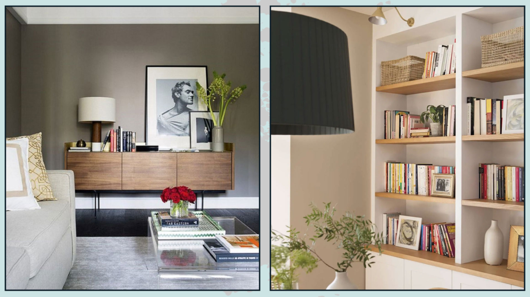
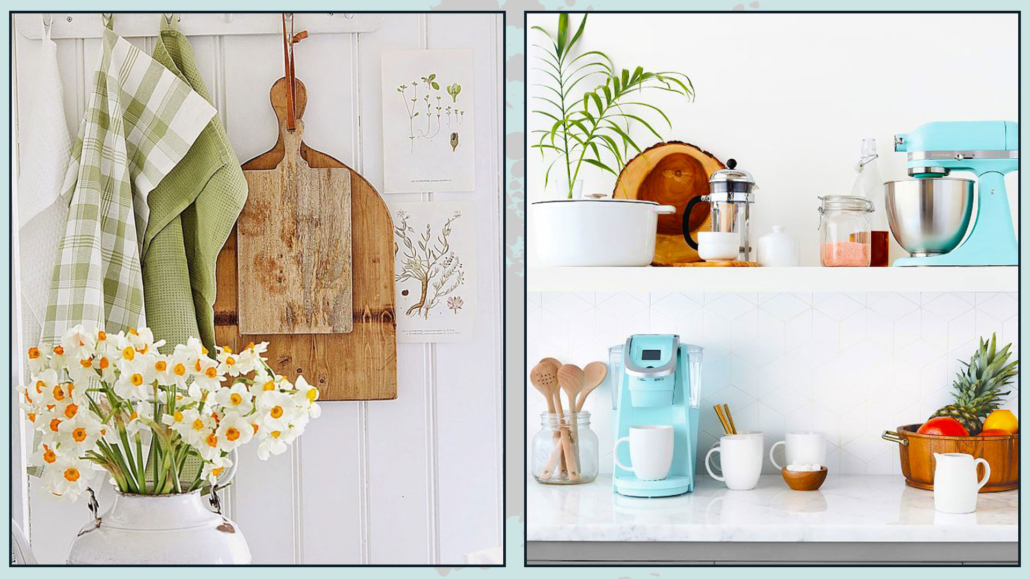
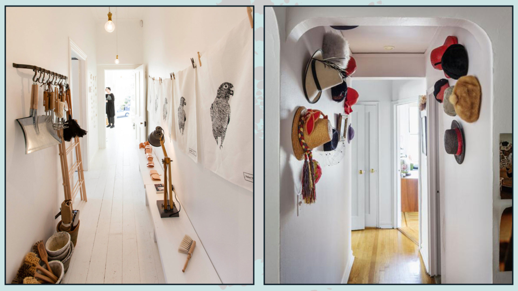
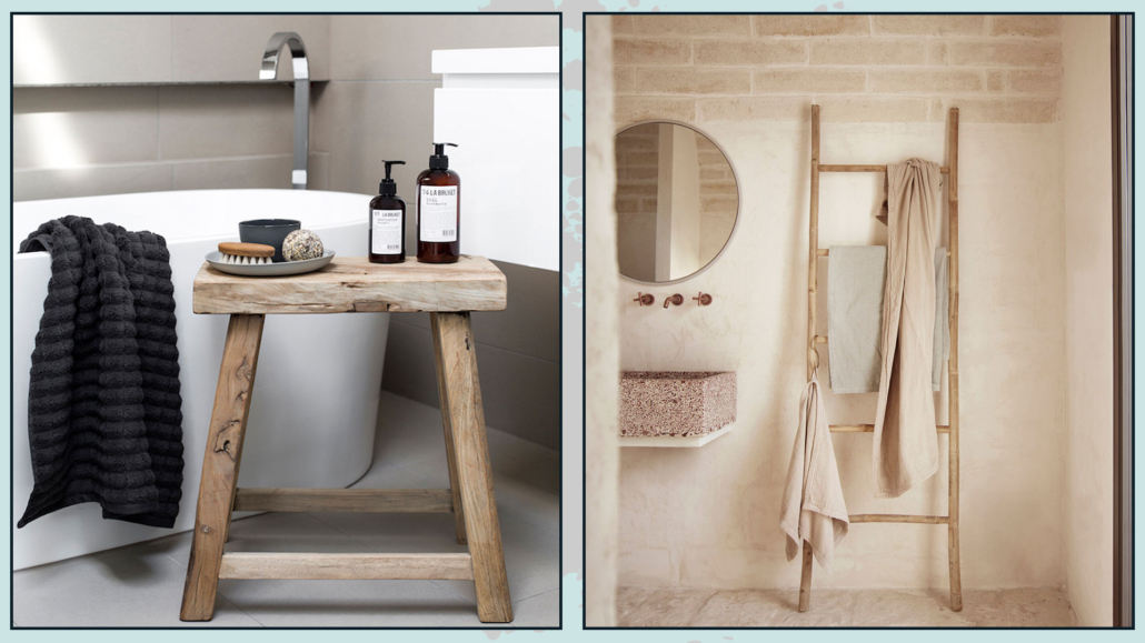
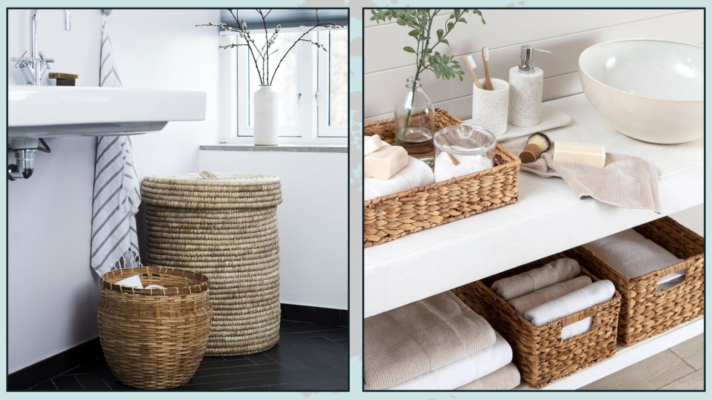
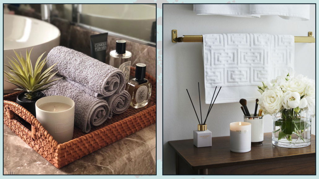
4 – ADD WOOD AND BASKETS
Wooden items and wicker baskets are stunning elements to give the bathroom that touch of warmth and elegance!
Think, for example, of a stool near the bathtub or shower to rest the essentials.
It might also be helpful for you to sit while you take care of yourself!
It is a little item that will really bring, however, a lot to the bathroom!
You could also think of putting a wooden ladder as a towel rack; or use accessories, such as toothbrush holders and dispensers!
Wood is a natural element that elevates any environment!
(credits: NeutralInstinct-Amanda Tiernan; designhunter.co.uk)
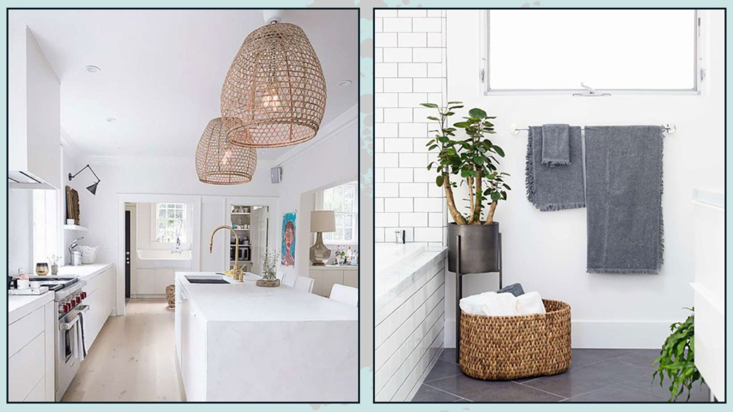
In addition to bringing texture and warmth, wicker baskets will be highly helpful for always keeping everything neat.
Tidiness is very important for a “luxurious” and sophisticated bathroom!
You can find baskets in all shapes and sizes; you can use them to put extra towels in case of guests or toilet paper rolls…
By doing so, even if they remain in sight, everything will be more studied and researched!
They can also be great pot covers for any plants!
(credits: musingsonmomentum.com; Amazon)
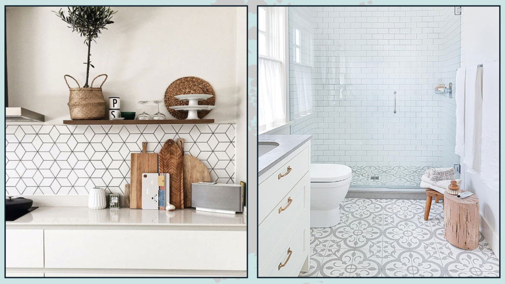
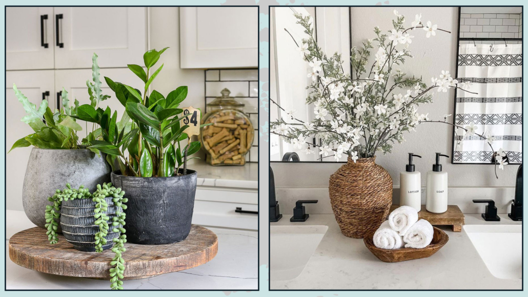
5 – FLOWERS AND PLANTS
You are not surprised by this point, are you?
Unless it is a blind room, there is no place in the house where you should not have plants and flowers!
They can be small compositions on the sink cabinet only to give that extra touch, especially if the bathroom is small!
They can also be pots of pothos hanging or leaning on a shelf or cabinet, but if space allows, they can also be large potted plants on the ground!
The plants must be moisture-loving such as pothos, precisely, or orchids (there are others: you can ask any florist).
Plants and flowers, as we have said many times now, make us feel close to nature, which helps relaxation.
They also bring life and elegance to the bathroom.
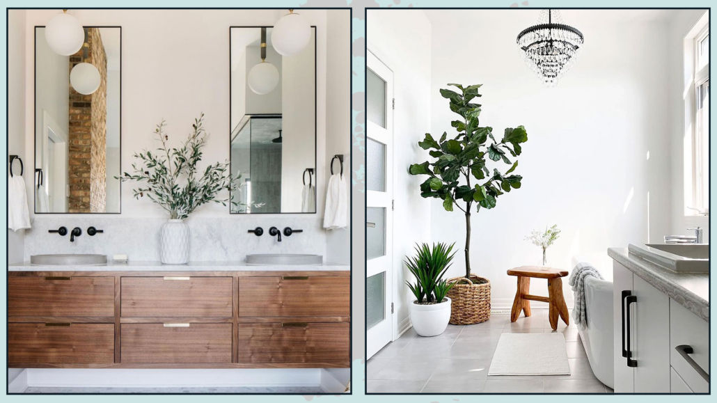
(credits: luxesource.com; @mylittlesho_kingston)
6 – ADD CANDLES AND SCENTS
Candles and scents help to make the environment more pleasant and cozy.
Candles also give a slightly romantic touch, and when lit, they help to relax as well.
Fragrances such as lavender and eucalyptus will help the feeling of relaxation even more!
You can add scents besides candles with potpourri or diffusers to have a pleasantly scented bath at all times!
(credits: wallsandthingsofficial; residencemagazine.se)
LET’S CONTINUE WITH SOME WORK!
The tricks shown so far to make the bathroom “luxurious” and sophisticated are truly simple and immediate and do not require any form of labor!
Now let’s look at others that may be a little more challenging but which, for the most part, you can still do on your own.
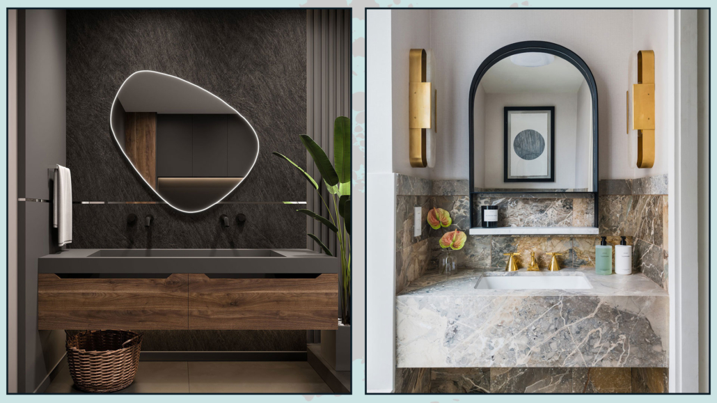
7 – CHOOSE A PARTICULAR MIRROR
The sink area is the focal point of the bathroom 90 out of 100; make it unique with a special mirror.
The mirror is a must-have item in the bathroom.
Get it big, maybe with a particular frame or shape; it doesn’t have to be square or rectangular!
You could get it backlit to also give some depth to that area!
Please, don’t settle for the classic mirror: of course, it has to be functional as well as attractive!
(credits: schattdecor.com; luxexpose.com)
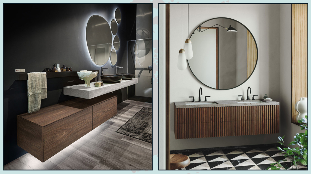
8 – LIGHTING
In addition to lighting properly with a general light, and task light at the mirror, think about using light and lamps to decorate and elevate your bathroom, making it more “luxurious” and sophisticated!
If you have hanging furniture, you can think about putting LED strips underneath them to give depth to the cabinet.
These lights, then, could be helpful if you get up at night: they will allow you to see without waking up!
We saw this earlier: always to create depth and some visual interest, you can use backlit mirrors.
Most importantly, use decorative lamps both on the ceiling and especially in the mirror area!
If you have a relatively simple mirror, you can take a more scenic lamp; conversely, choose more simple and linear lights if the mirror is highly elaborated!
You can also use pendants, even for the mirror, perhaps only on one side, to create a playful asymmetry.
Maybe put more than one at different heights, always to create some play and visual interest.
The only precaution will be to be careful about their heights: so as not to risk bumping your head against them.
(credits: deghishop.it;superficimilano.it)
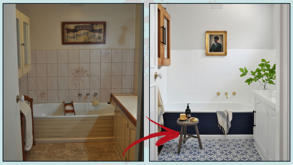
9 – CHANGE COLORS
An effective way to change the face of the bathroom is to repaint it!
Color, you know, has a strong visual impact, and the same environment with different colors can definitely give different feelings.
You can also find suitable colors for tiles, maybe you should call a specialist for that if you don’t have manual expertise, but it can be done!
(credits: thepaintedhive.net)
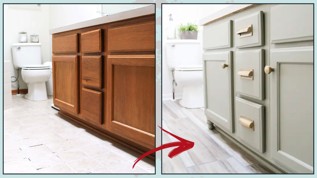
Color changing can be done for furniture too!
Perhaps the bathroom vanity is a bit old and worn out. By painting it, you will give it a new lease of life and certainly enhance the perception of your bathroom, making it more sophisticated!
(credits: midwestlifeandstyle.com)
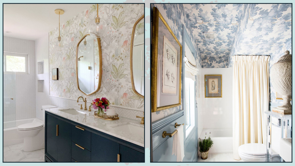
You could also consider using wallpaper, perhaps in the area around the vanity, to create a striking focal point.
Alternatively, if you have high ceilings, you could use wallpaper on the ceiling for something actually unique!
Again, when it comes to installing wallpaper, it is advisable to hire a professional to ensure the best result.
(credits: Kristin Laing;brittanyambridge.com)
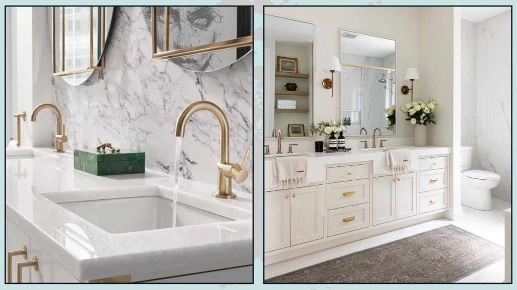
10 – CHANGE FAUCETS AND HANDLES
Faucets and handles are details that can have a significant impact on the perception of the environment.
Changing the handles on the cabinets will give them a whole new look, elevating their appearance!
If you’ve painted the cabinet, changing the handle becomes almost essential!
You can find a variety of handles in terms of shape, color, and material. Choose the one that best suits the new style and color palette.
The same goes for faucets, we have almost all standard ones, but there is really everything on the market!
So look for something more distinctive that can help, along with the rest, to make the bathroom more “luxurious” and sophisticated!
(credits: romanbathcentre.com; maisonblonde.com)
I hope this article was helpful and you love it; in case, let me know in the comments!
Feel free to share it with anyone you think might be interested, I will be honored, and it will help me get my name out there.
If you feel that your home, or some environment of it, does not reflect you enough, do not wait any longer and book your consultancy!