Posts

A couple of weeks ago, we saw how to combine different woods in the home (you can find it here); today, I’d like to share with you how matching various metals too!

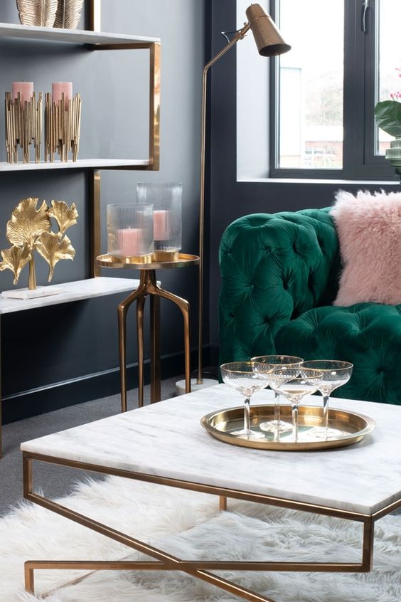
Metals have the ability to bring light, depth, and character to rooms while also bringing that touch of luxury!

In the home, metal parts are often in the details:

– cabinet and closet handles;

– door and window handles;

– faucets;

– legs of chairs/tables and coffee tables;

– chandeliers;

– household items

it often happens, for this reason, that we are not careful in matching them and end up perhaps with many different metals in the same room.

Fortunately, let’s face it, most of the time, since they are small details, it does not immediately fall to the eye if there is some “confusion” in these elements and if they do not always go well together.

Yet details, we have said a thousand times, can make a difference and, if well thought out, can elevate the perception of environments.

If the “clutter” doesn’t immediately fall to the eye, the correct pairing will!

There are really many different metals: gold, silver, bronze, brass, copper, corten, steel, etc.
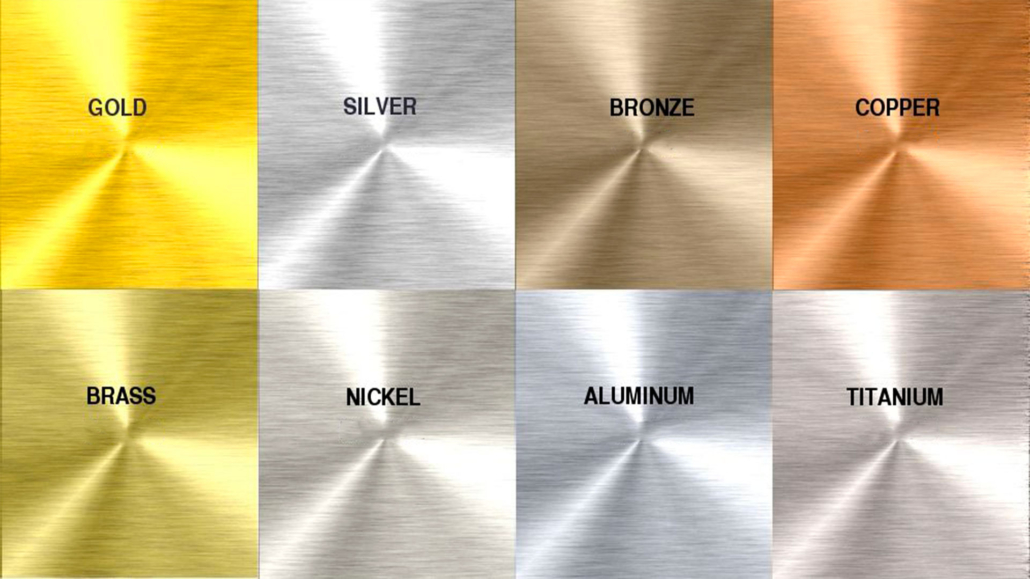
varietà di metalli

They can also have different finishes: they can, for example, be shiny, matte, satin, or brushed.

Each of these metals has its own specific color, and steel can also be colored; you can find it mainly in white and black.

In short, you can understand that the combinations can be really many and that putting them all in the same room can become a bit “too much”!

At the same time introducing only one metal in the house could be “boring”!!!

So let’s see the best ways to combine different metals to give character to your rooms!

1) CHOOSE THE STYLE YOU WANT TO GIVE TO YOUR ENVIRONMENTS.

As seen before, metals are many and also have many different finishes.

Each of them goes better with a particular style: steel, for example, is not the best in the rustic style; it’s better in a modern or contemporary style.

2) COMBINE A MAXIMUM OF 3 DIFFERENT METALS!

If a room is small, perhaps it is better to combine a maximum of 2 different metals, while you can go up to 3 in larger rooms.

In the case of mixing 2 metals, you can do it in two ways:

– balance the two metals by giving them equal importance, so put the same amount.

– choose one primary metal and put the second one only as an accent metal.
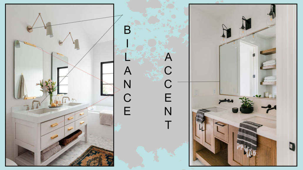
(Credit: Studio Mcgee; beckiowens.com)

In the case of matching three, you cannot give equal importance to everything, so you have to choose the metal you want to be “dominant.”

Then choose a second metal that complements the dominant metal in a less overbearing way and, finally, a third metal that is the extra “touch,” the accent color that draws the eye!
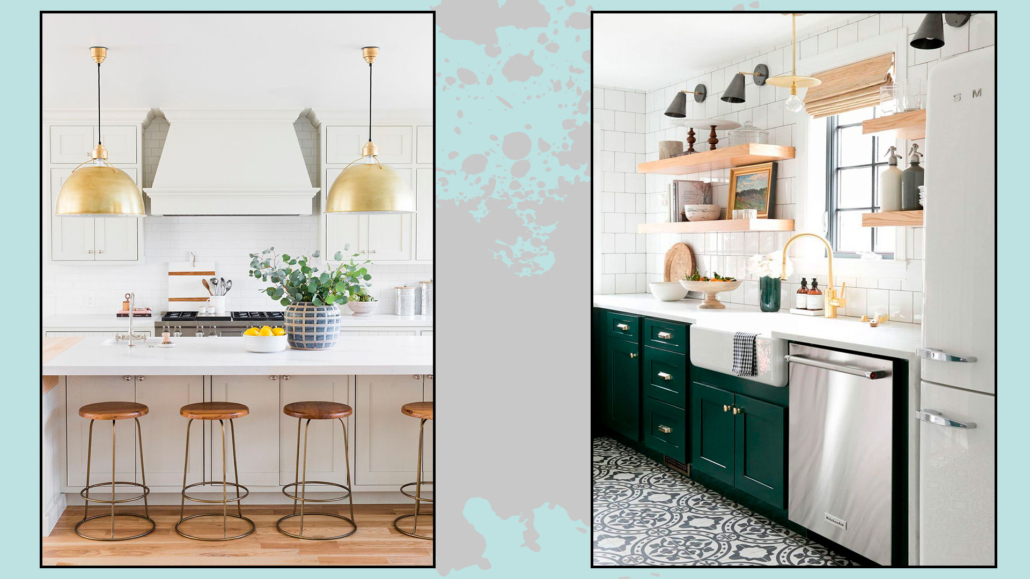
mix a tre metalli: uno principale e gli altri in dosi minori

(Credit Studio Mcgee)

The choice of the dominant metal should be made in accordance or contrasting color with the rest of the environment.

3) USE CONTRASTING METALS

putting different metals that, however, have the same color, such as aluminum and steel, will not create contrast and will not make a real mix of metals be perceived.
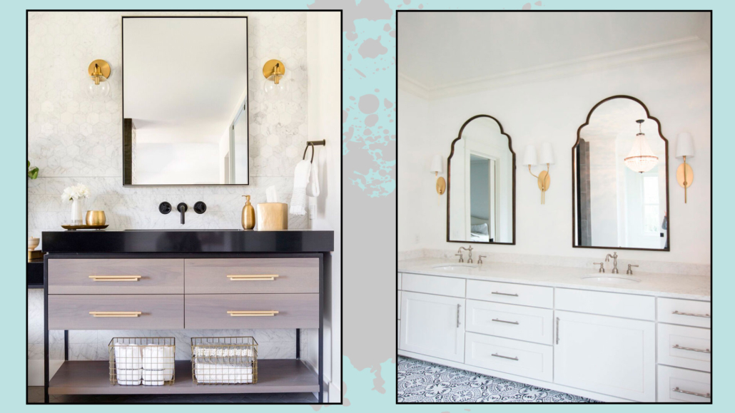
mettere metalli in contrasto per interesse visivo

(Credit @lindyegalloway; simplenaturedecorblog.com)

Choose metals with contrasting colors to create movement and visual interest.

Possibly use the same metal for all elements that have the same function.

For example, in one bathroom, use the same metal for all the faucets and another for all the towel and roll holders, and a third for the handles.

That creates harmony!

4) BALANCE THE DIFFERENT METALS

As with woods, avoid creating groups of the same metal separated by other metals; instead, try not to put elements of the same metal too close together.

For example, still in the bathroom, if you have a steel faucet, avoid putting the mirror of the same finish: put it instead in brass!
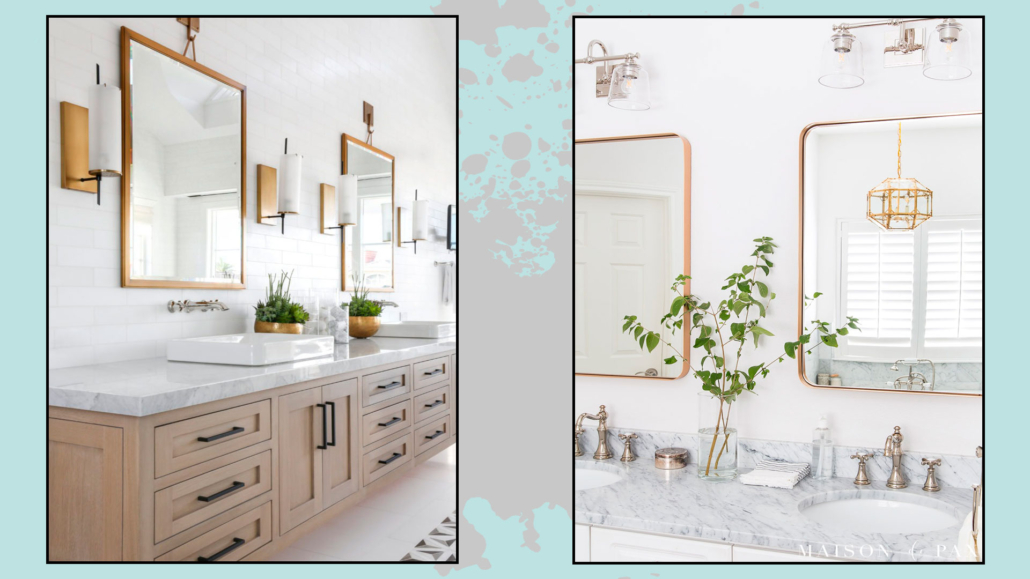
non mettere gli stessi metalli tutti vicini, evita assembramenti

(credit Lindye Galloway Interiors; maisondepax.com)

Also, repeat this choice several times, for example, in cabinet handles or lights.

5) CHOOSE THE RIGHT FINISH

We have seen it before, the same metal can have different finishes, and each metal will have a different impact depending on the finish you choose.

Choose the finish that best matches your style and personality!


I hope this article was helpful and you love it; in case, let me know in the comments!

Feel free to share it with anyone you think might be interested, I will be honored, and it will help me get my name out there.

If you feel that your home, or some environment of it, does not reflect you enough, do not wait any longer and book your consultancy!

The idea of having a luxurious home appeals to everyone, no doubt, but it is also a fact that you cannot always afford to spend large prices on furnishing.

However, some little tricks will allow you to have a home that looks more luxurious and perhaps designed by an expert!

Let’s look at them together:

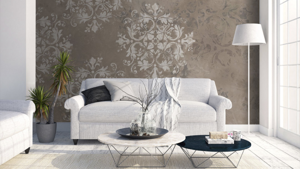
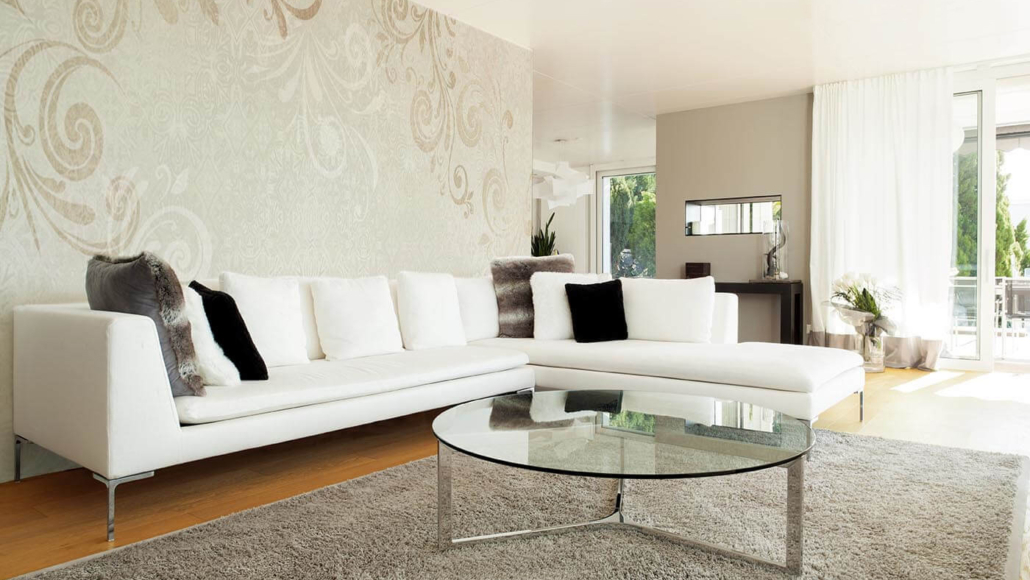
1 – WALLPAPER

No, don’t think about the wallpapers our grandparents had! There are all kinds and for all tastes on the market today!

(credit coverdesign.it)

Without necessarily opting for the super-colored ones (which should not be banned, we’d miss it), think of a neutral color, but one that carries different textures.

(credit demart.it)

It is not mandatory to cover all four walls: you can also do just an accent wall or a bookcase background.

The visual impact of the wallpaper is powerful and immediately gives the idea of something sophisticated and elegant.

2 – BOISERIE and MOLDING

We saw it in the 2021 trends, and again, it has nothing to do with what our grandparents had.

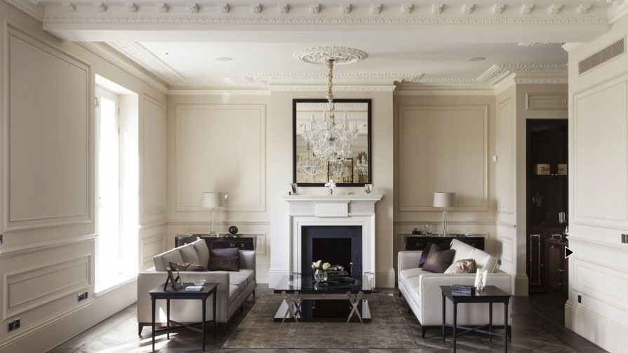
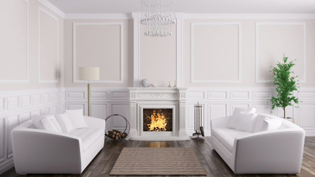
However, adding details like these means bringing in textures, but most importantly, that touch of elegance!

These elements create visual interest and immediately make the room look “richer.”

(credit it.decorexpro.com)

Again it is not mandatory to use it, as with wallpaper, on all four walls, but you could use it in only one that will become the room’s focal point!

Beware that this kind of decoration is suitable for classic style but also a modern and contemporary style!

3 – CHANDELIERS

Chandeliers are items that can enhance the aesthetics of a room if properly chosen and placed.

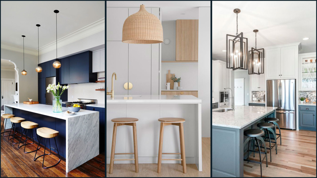
The chandelier usually makes the ambient light, but if properly placed above the table or on the island, it will indeed help create a focal point by emphasizing that specific area.

(credit Nicole Franzen; zephyrandstone.com.au; roeserhomes.com)

Depending on the chandelier you choose, you will undoubtedly add a touch of personality and style.

Always consider, when choosing, the colors, style, and materials you have chosen for the walls, furniture, and accessories!

Try to create cohesion with the other elements in the house!

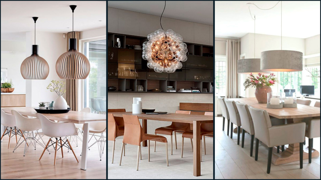
When the chandelier falls on a rectangular table, remember to get it lengthwise or put more than one so that you can suitably illuminate everything!

(credit Pinterest; Poliform; Pinterest)

4 – ACCENT SEATING

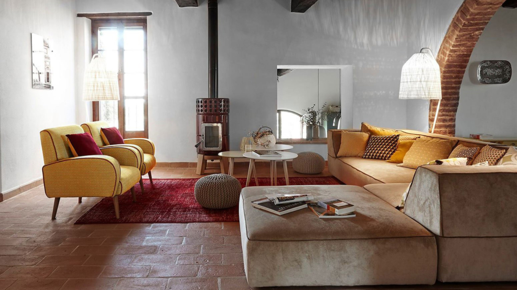
We often have the habit of buying sofas and armchairs in agreement; however, putting an armchair or seats with contrasting shapes, materials, and colors with the couch will give the room a different, more luxurious perception.

Doing this is also a great way to bring a touch of color and different textures to that room and, thus, effectively break the monotony and make it more interesting!

The room will look more elegant, sophisticated, and studied!

(credit villa Bellaria umbria Ph Kristian Septimius Krogh)

If the seating is totally different from the sofa, remember to “justify” it, perhaps by picking the color in the pillows, pictures, or other decorative objects.

That will make the environment harmonious!

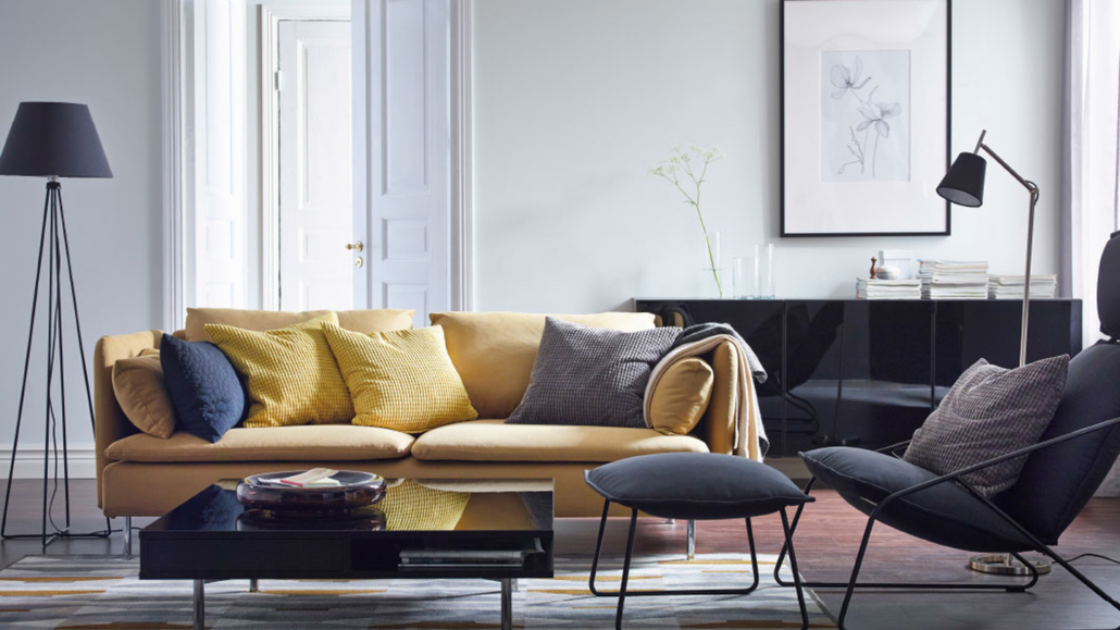
You can find many different seats on the market and at all prices; what they have in common, as mentioned before, is that they will give emphasis and character to any room!

(credit Ikea)

5 – PILLOWS

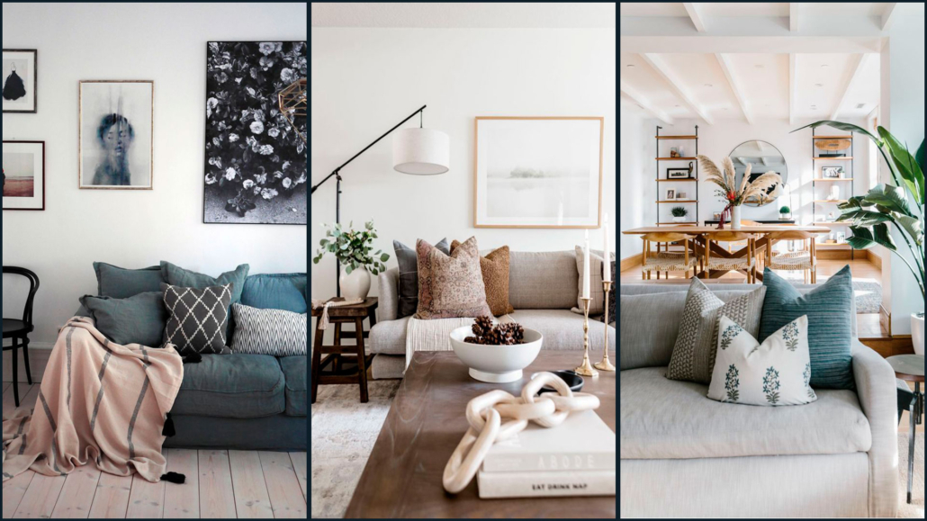
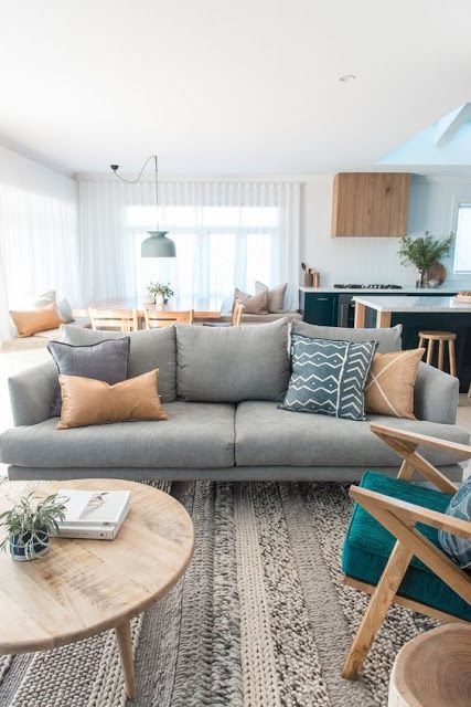
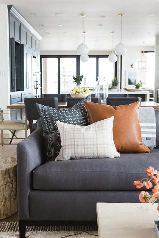
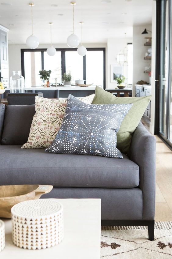
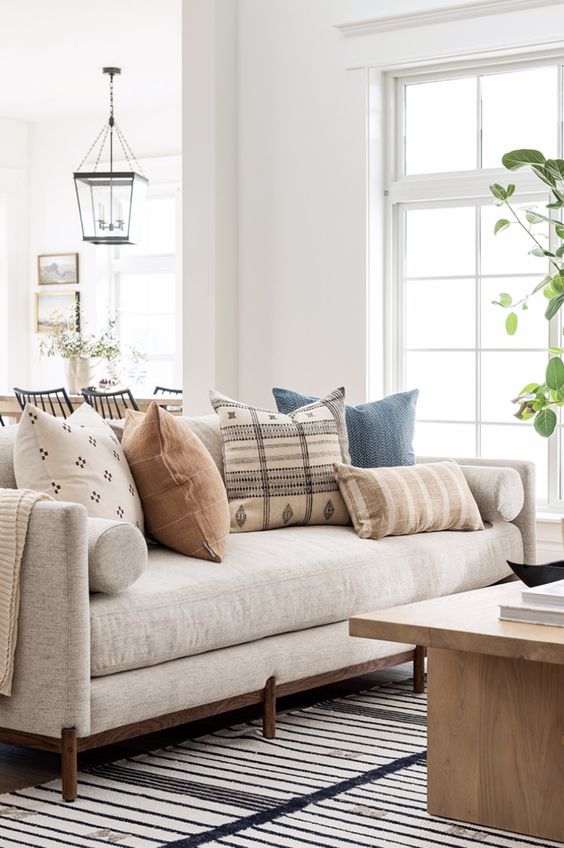
Pillows are another beautiful way to bring in textures and colors.

Putting a couple of pillows on the sofa that, as written a few lines ago, recall the different seat, or some color present in the decorations, will give a sense of harmony and keep everything well balanced.

(credit Pinterest; halfwaywholeistic.com; Pinterest)

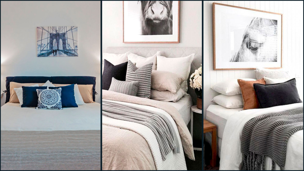
Putting pillows on the bed is also a good idea; you can place them in various ways, creating beautiful compositions.

That will give importance and elegance to the bed.

(credit Vivere lo stile; Brittany Niemer; Etsy)

Taking off and putting on pillows every day takes a little time, of course, but it is an investment that the final result will amply repay!

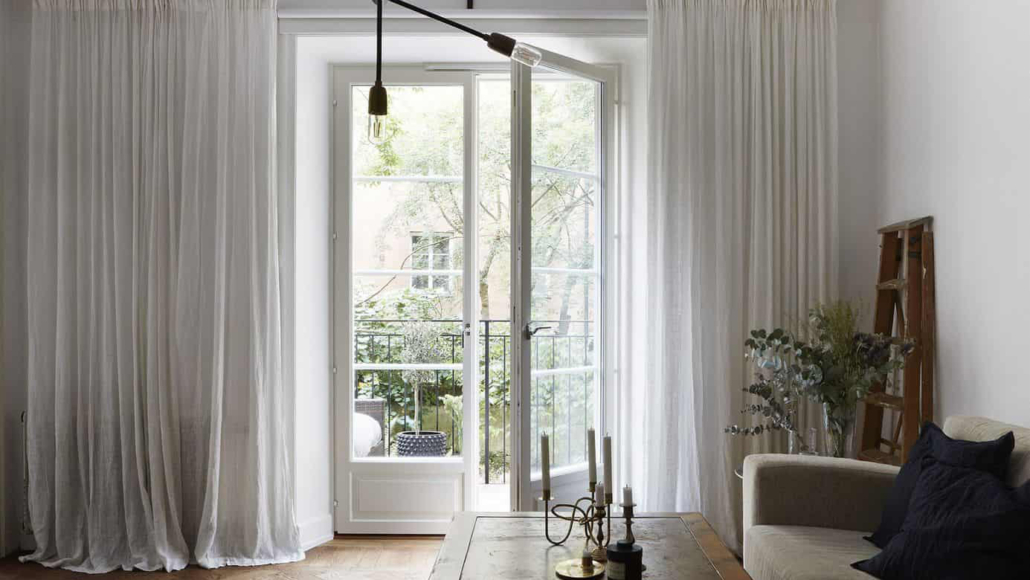
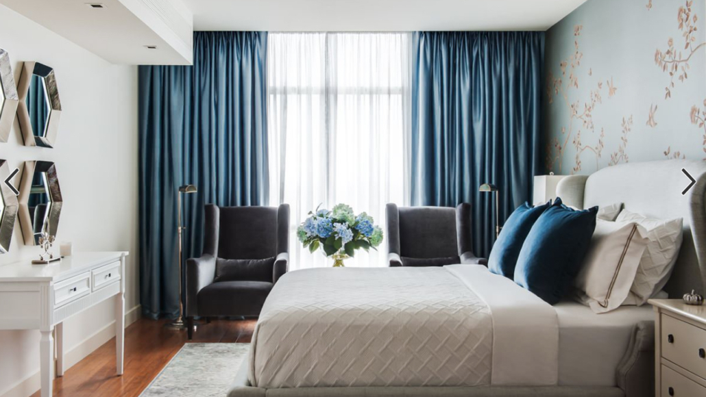
6 – CURTAINS

Curtains dress the home, bringing, too, textures and colors.

They bring warmth and elegance.

A pretty rod anchored high up, just below the ceiling, and soft, well-draped curtains that come to lean on the floor will make any room look decidedly more sumptuous.

(credit interiordesignexplained.com)

It is not mandatory to have highly pricey curtains: even at Ikea, you can find beautiful low-cost ones, but the dramatic effect they give is really unique.

(credit alexanderpollock.com.au)

If space allows, you can put drapery curtains also in the bathroom and kitchen, giving elegance and that extra touch to those two rooms as well!

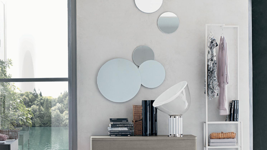
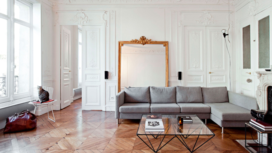
7 – MIRRORS

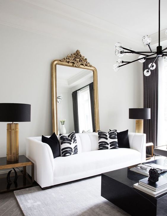
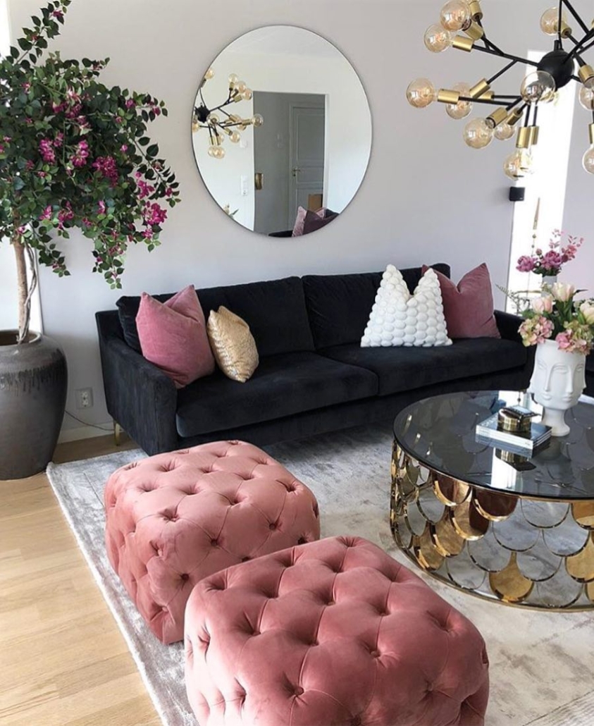
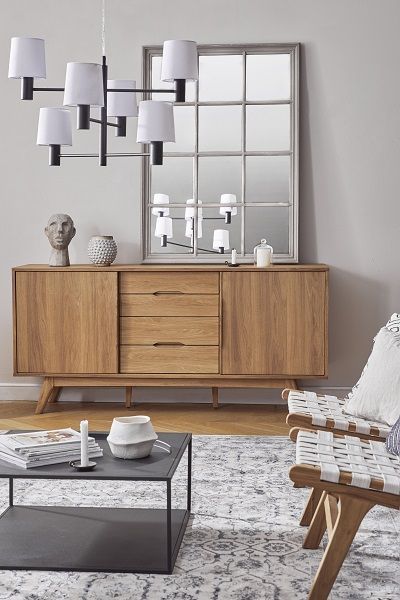
The mirror is functional for reflecting oneself, but it is also an object that stands out in any room.

Properly placed, it amplifies light and can even give the illusion of a larger space than it actually is!

(credit Tomasella.it)

Spaces seem to flow better because its ability to reflect creates a kind of continuity, but most importantly, it provides a focal point that draws attention and enhances the room.

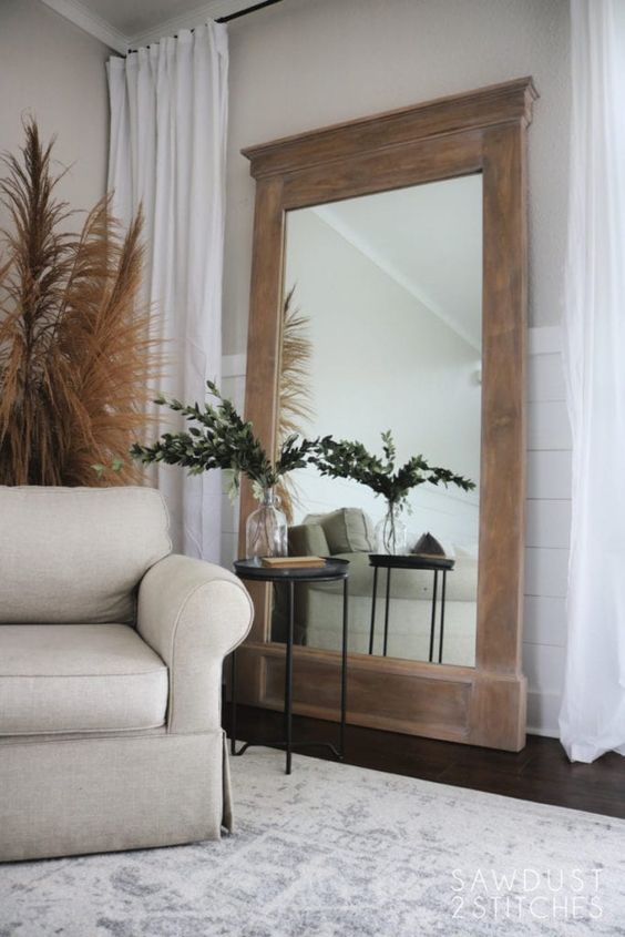
Mirrors resting on the floor, uniquely shaped mirrors will be able to give that extra touch of character and style!

(credit Living-corriere)

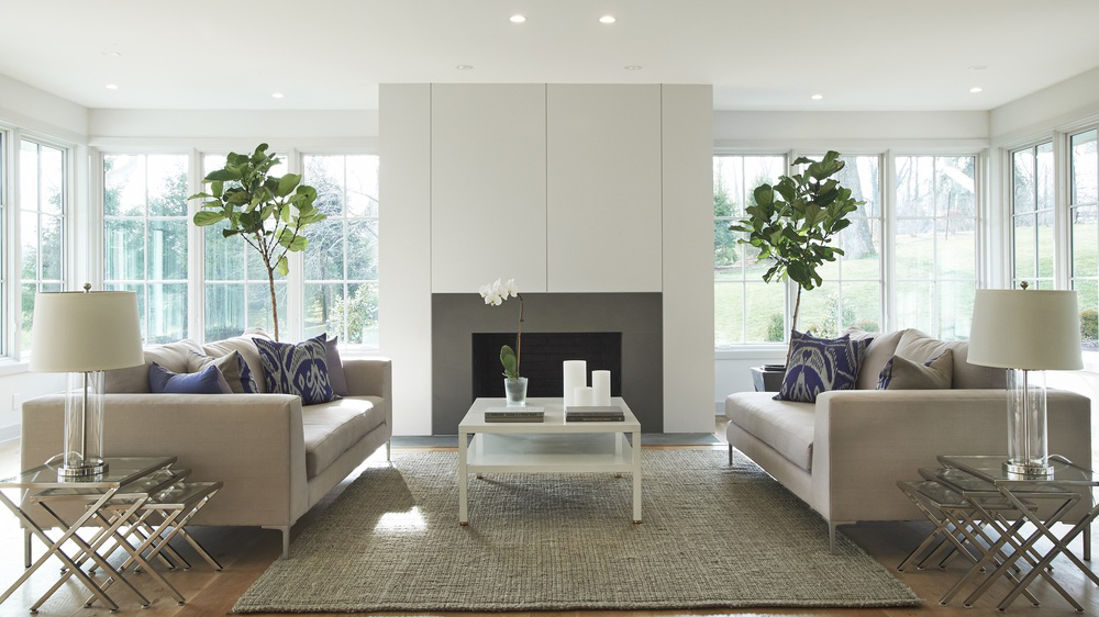
8) USE SYMMETRY

The human mind needs balance, and symmetry is a form of it.

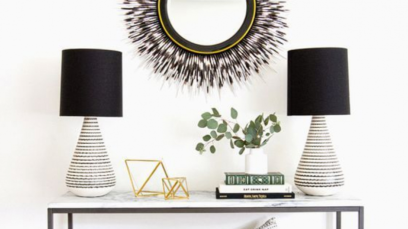
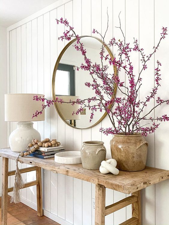
When you furnish and decorate, try to create symmetries; you don’t have to do it all the time: it might even be boring after a while, but for example, putting two equal table lamps at the ends of the console could be one way.

(credit sarahshermansamuel.com)

Using symmetry with objects or some furniture will immediately give the impression of something definitely researched.

(credit callastudio.com)

9 – ATTENTION TO DETAILS

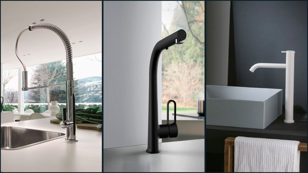
Details can change the face of rooms: so pay attention to finishes such as handles or faucets!

(credit Franke; Frattini; gaiainterni.com)

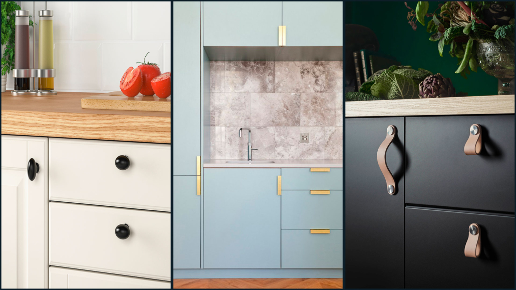
I have already spoken about this in a previous video, but the same kitchen, sink, or cabinet with different faucets and handles will give different impressions!

On the market, you find endless variations of materials and shapes, both as faucets and handles and at all prices, but these are details that can actually make a difference and make your home feel more luxurious!

(credit Ikea; Gucki; Ikea)

They are easily changeable elements that, correctly chosen, can give your home a touch of elegance and style.

10 – PLANTS AND FRESH FLOWERS

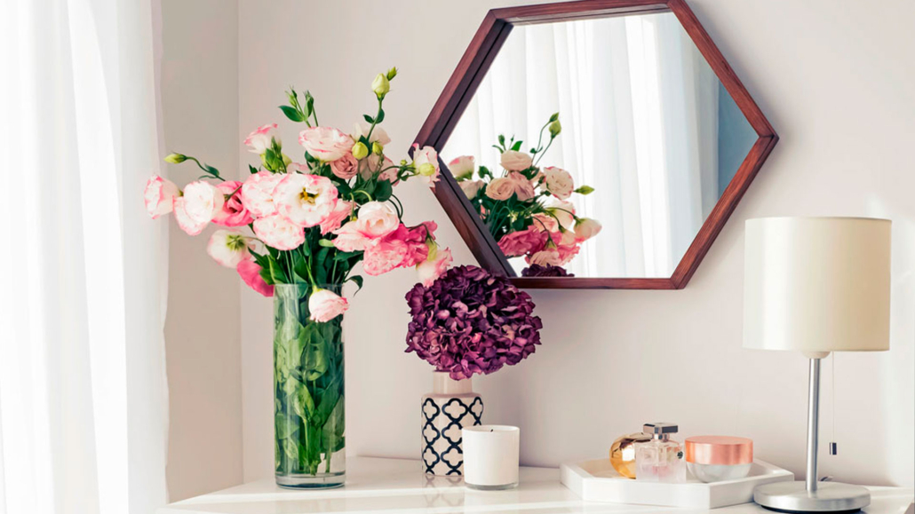
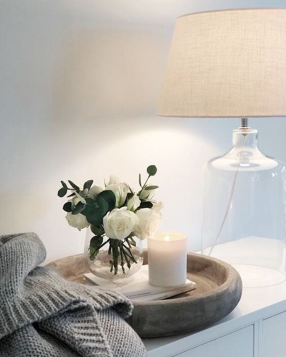
Plants bring color and textures into the home, and fresh flowers bring fragrance; all of these things elevate our perception of the ambiance.

Plants, as mentioned other times, bring us back to nature, allowing us to feel better; in particular, the scent of fresh flowers helps lower anxiety.

(credit @homepolish)

So plants and flowers have a dual function: they bring beauty, elegance, and well-being too!

Orchids, lavender, eucalyptus, and gardenia add a touch of elegance and a pleasant scent to any room!

If you don’t like cut flowers, you can also bring fragrance with candles and diffusers; those will also be very effective in enhancing environments.

Avoid fake plants and flowers except for the occasional small arrangement here and there!

Then if, like me, you’re not exactly a green thumb, know that there are very easy-to-care-for plants that are “big talkers,” as Simona Borgia, the urban gardener, says in this video!

One more note, it seems almost silly to say, but clutter is really the opposite of luxury!

So everything must be suitably stored and nothing out of place!

The clutter otherwise could ruin all the study and work done!


I hope this article was helpful and you love it; in case, let me know in the comments!

Feel free to share it with anyone you think might be interested, I will be honored, and it will help me get my name out there.

If you feel that your home, or some environment of it, does not reflect you enough, do not wait any longer and book your consultancy!
Today I would like to see how best to decorate the living room since it is one of the areas of the house we live in most and is where we receive guests.

The living room should represent us, and be inviting and comfortable.

To do this: there are at least 10 things you can’t miss to decorate your living room beyond the style, or mix of styles, you choose.

Let’s see them together in today’s video!

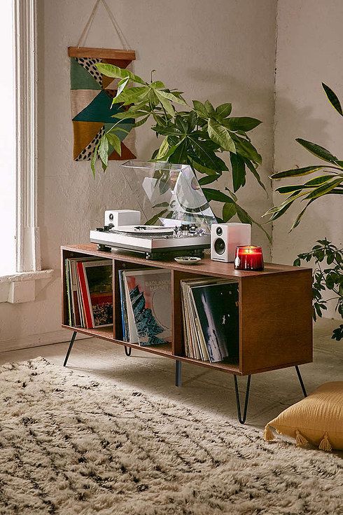
1) SOMETHING ALIVE

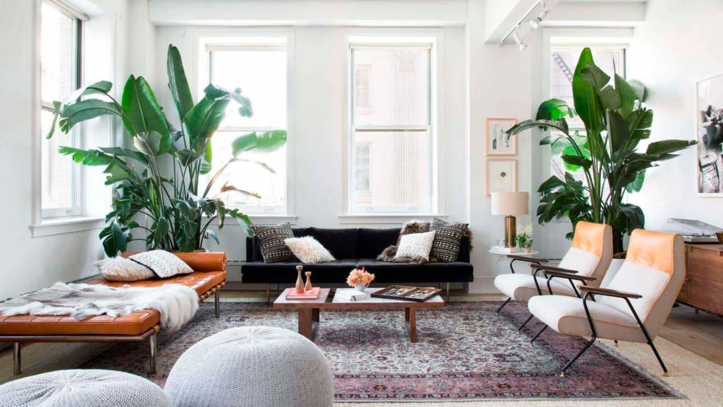
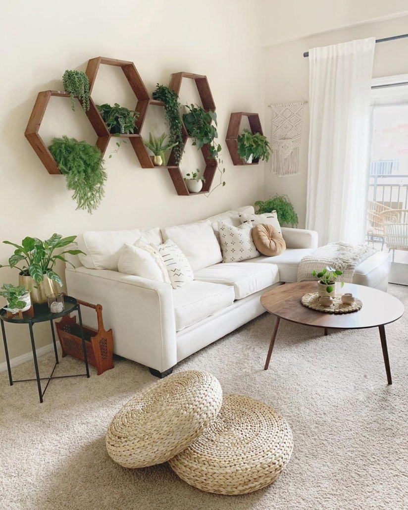
Every living room should have green plants.

Not only do they make the environment more inviting, luxurious, and cozy, but they are also highly beneficial in terms of health by absorbing harmful substances.

(If you are interested, here you can find my interview with Simona Borgia: aka Nina urban gardener)

Plants help give that warm touch to the room.

It also has a psychological function: it makes you feel more in touch with nature making you happier.

If you have a black thumb or think you do, you should know that there are many kinds of plants, and some are really easy to care for (again, in the video, Simona tells about this).

Plants with colorful flowers will also give a touch of color that doesn’t hurt.

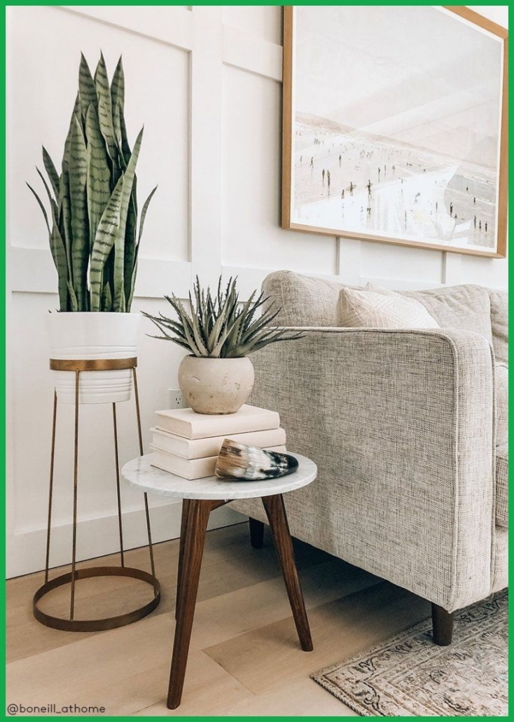
Also, depending on their size or the type of pot you choose, the plants can be actual decorations!


(Brianne Penney)                                                                            (decor.by.dp)


(thevintagerugshop.com)                                                                          (pure salt interiors)

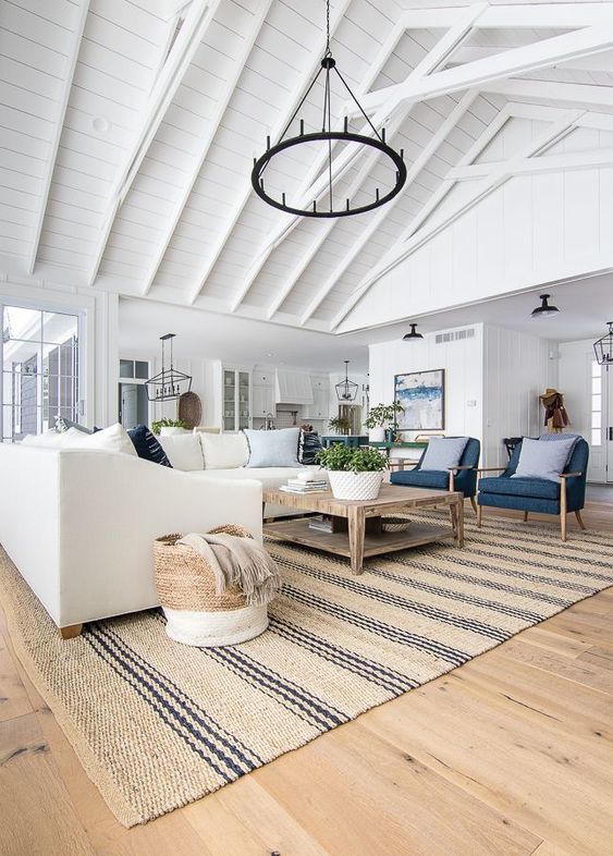
2) A COMFORTABLE RUG

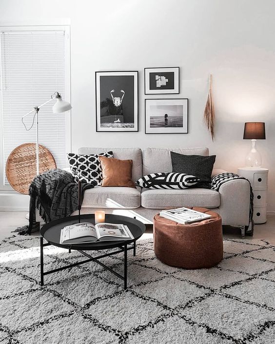
A soft rug with colors and patterns that match the style of the rest of the room will help warm the room.

Its softness underfoot will help you relax.

Good design is not only about aesthetics; but also about how you experience it and “taste” it with all your senses, including touch.

All to create cozy, intimate, and comfortable settings.

You should always feel welcomed and comfortable!

Pay attention to its size: it must accommodate the sofa and any armchairs or ottomans, creating a kind of environment within the environment; this will help create atmosphere.


(etsy.com)                                                                                         (mcgeeandco.com)


(mk.nordik)                                                                                              (thelilypadcottage.com)

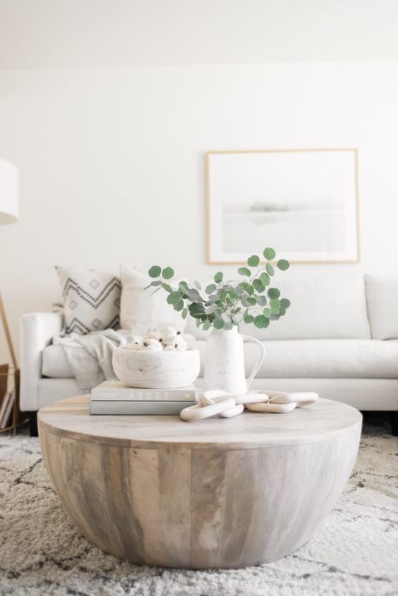
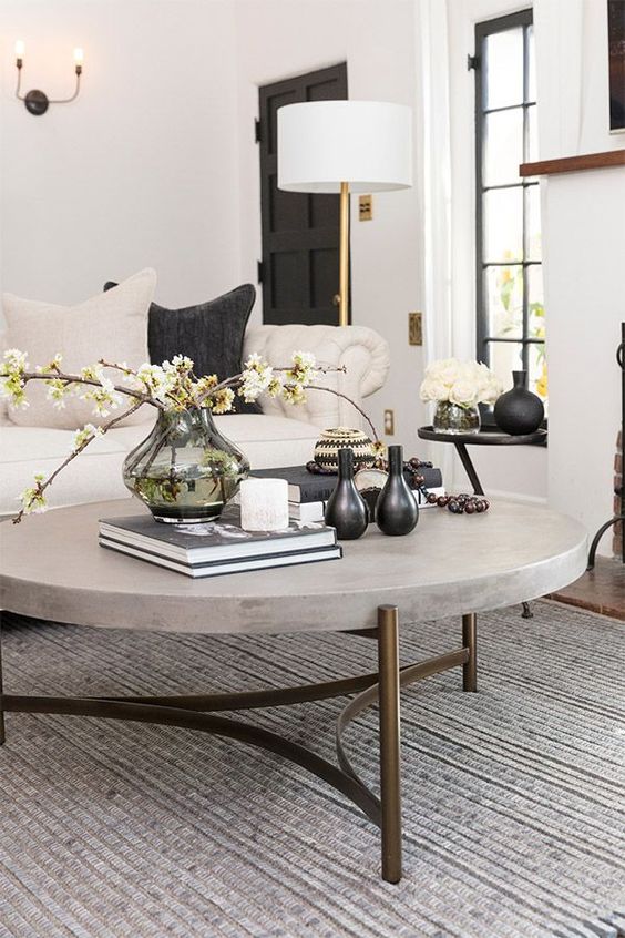
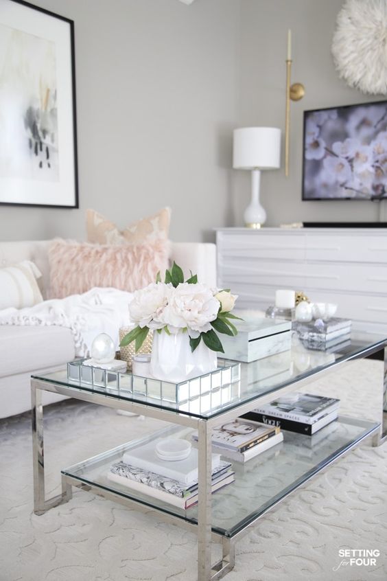
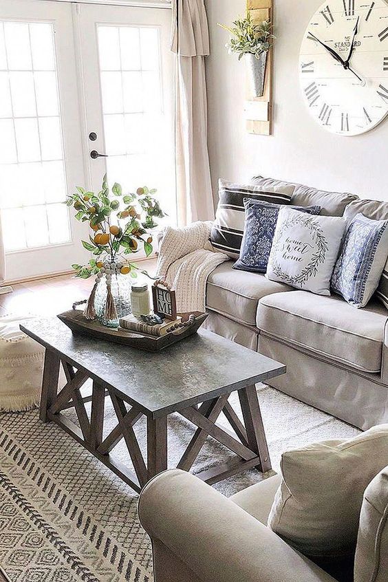
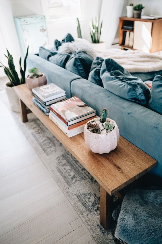
3) A COFFEE TABLE

With the right color, shape, and size, the coffee table will be the link between the various elements of the room and make it more complete.

If you then put together several coffee tables, different in color or shape, you will create original compositions that can give that extra touch to your living room!

It also will be really very functional, because you can place decorative objects on it, and/or trays with food for your guests.


(halfwaywholeistic.com)                                                                              (livingspaces.com)


(settingforfour.com)                                                                                    (wallmart.com)

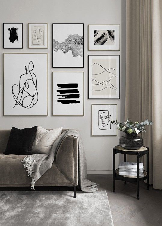
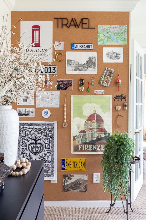
4) SOMETHING PERSONAL

It is necessary to put something personal so that you always feel represented and at ease.

Without these, the room may be beautiful, but definitely colder and less inviting!

It can be anything from your favorite books to photographs or paintings, a vacation memory in short, something that has deep meaning for you.

They will give an idea of your personality!
     

(desenio.com)                                                                                               (jessannkirby.com)


(justagirlblog.com)                                                                                     (urbanoutfitters.com)

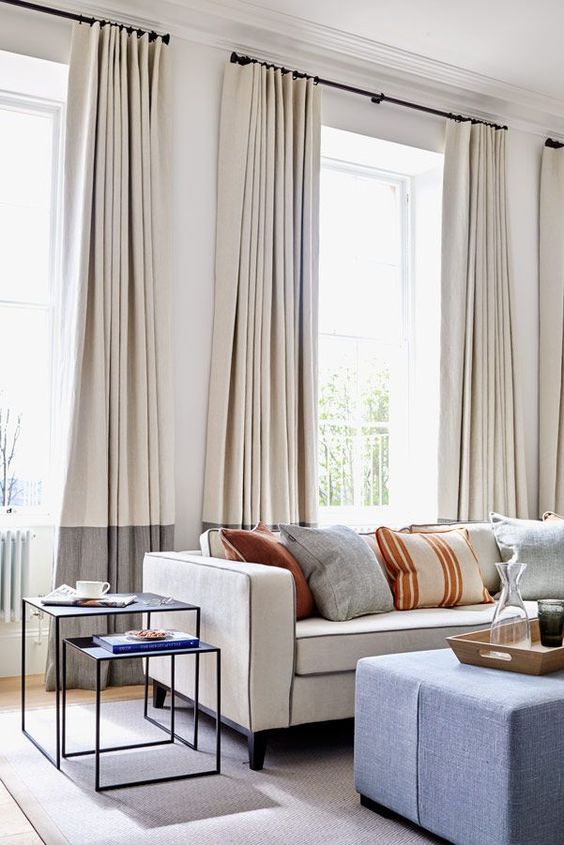
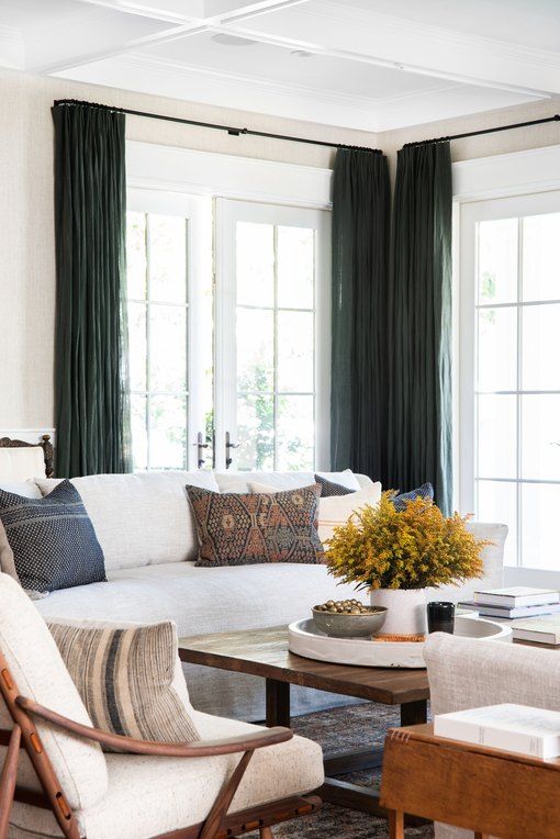
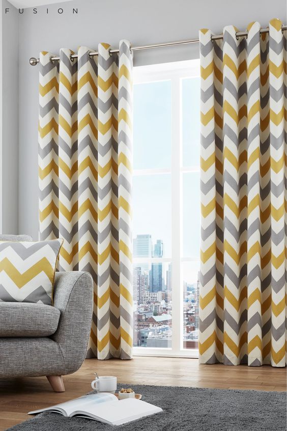
5) CURTAINS.

Curtains complete the room and give it character by introducing different colors and wanting patterns.

Remember to hang them high, just below the ceiling, to not suffocate the room, because otherwise, they will shrink it (this is one of the mistakes usually made decorating a home, here I tell about the others too!).


(amber interiors)                                                                                        (next.co.uk)


(pinimg.com)                                                                                       (pinterest.com)

6) PILLOWS.

Adding pillows to your sofa has a dual function:

comfort -> when you sit down, you may need extra support for your back, or maybe you want to take a nap, and it’s helpful to be able to use something soft and cozy!
decorate -> in fact, with pillows, you add textiles, patterns, and colors, giving a bit of liveliness and movement.

All without huge “commitments”: the pillows are indeed easily changed.

You may want to change the pillows slipcovers for each season, giving your living room a new look each time!


(house-nerd.com)                                                                                       (mcgeeandco.com)


(studio megee)                                                                                         (studio megee)

7) MIRRORS.

Mirrors add style and elegance to the living room.

Not only, if properly placed, they optically expand the space, but more importantly, brightness by reflecting light!

They can be placed anywhere, even on the floor, if very large!


(Lauren Miller; design Meg Cassidy creative)                                        (sawdust2stitches.com)


(Vanessa Valderrama)                                                                               (westingnow.it)

8) VASES.

Vases are versatile objects; they can be used alone or with a flower arrangement.

You can find them made of a variety of materials, such as glass, terracotta, or metal, and can also have very different shapes and sizes.

They add color and movement to the environment, or they can be perfect allies to create harmony and balance, which are basic concepts for decorating the home: I talk about them here!


(H&M home)                                                                                                   (Orsipanosinteriors.com)


(cooee.se)                                                                                           (sfgirlbybay.com )

Finally, although they may not seem essential, there are still 2 things that, if used to decorate the living room, will give it warmth and coziness:

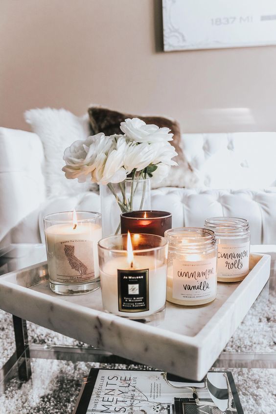
9) CANDLES.

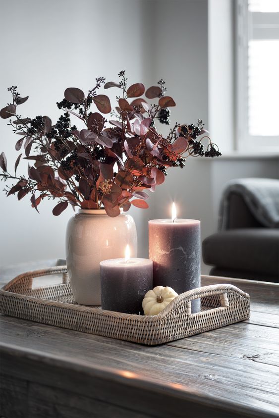
Candles help to warm the room and make it more intimate and inviting.

And since to experience it at its best, you have to live space with all your senses, using scented candles will help even more to make you feel comfortable and relaxed!


(blondieinthecity.com)                                                                 (hudsonhome.co.uk)


(hudsonhome.co.uk)                                                                              (my-furniture.com)

10) BLANKETS.

Adding blankets just placed right on the sofa, almost as if they were thrown, again helps warm the room.

They are perfect for adding color and a different texture to the sofa.

Like pillows, they are easily changeable depending on the season and, except in summer, can wrap and warm you up while watching a movie or reading a book!


(carollefortin.com)                                                                         (casafacile.it)


(house beautiful)                                                                                      (whitepicketfarmhouse.com)

Would you add something to decorate your living room?

Let me know in the comments!!!

For any doubt don’t hesitate to contact me!

Drywall, how to use it at home?

There are at least 7 possible ways to use this highly convenient and versatile material!

But first of all, what is drywall?

These are panels or boards composed of gypsum and cardboard sheets; they have a standard width of 120cm and a height ranging from 200 to 350cm.

Thickness varies according to use, although 13mm is the most common.

There are sheets with good acoustic and thermal insulation properties, or fireproof or even water-repellent.

The use of this material has several advantages:

– quick and easy processing due to the panels.

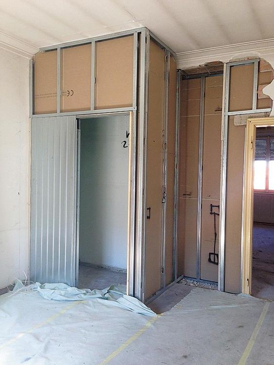
There is no need for mortar; the panels, which you can cut with a simple cutter, are screwed to a galvanized steel frame.

The joints would then be grouted, and the whole thing prepared to be painted like a regular wall.

Its ease of installation makes it practical for concealing systems, thus, avoiding making tracks in walls or “leveling” any imperfections or edges.

– cleaning.

The pieces are virtually ready to use: there is no use of bricks or mortar, raising thus very little dust, so once the work is done, ordinary cleaning will be enough.

– customization.

Due to the ease of workability, it is very suitable for custom fabrications: you can have curved shapes, put doors or add integrated lighting.

– ease of removal.

The ease of installation is also found in its eventual removal.

– costs.

Drywall work has a lower cost than the same work done, however, with wood or brick.

Of course, there are some disadvantages, but minimal:

– heavy impacts.

The slabs are resistant at the surface level and can withstand medium-slight impacts, but certainly not strong ones; the slab can be dented or ruined if you give it a hard blow!

– weights.

Paintings, shelves, or chandeliers may be too heavy: there are special hooks and dowels to put them.

For heavier loads, some dowels can be attached to the framing.

Well, now that we have seen what it is and what the advantages and disadvantages of drywall are, let’s also see how to use it in the home!

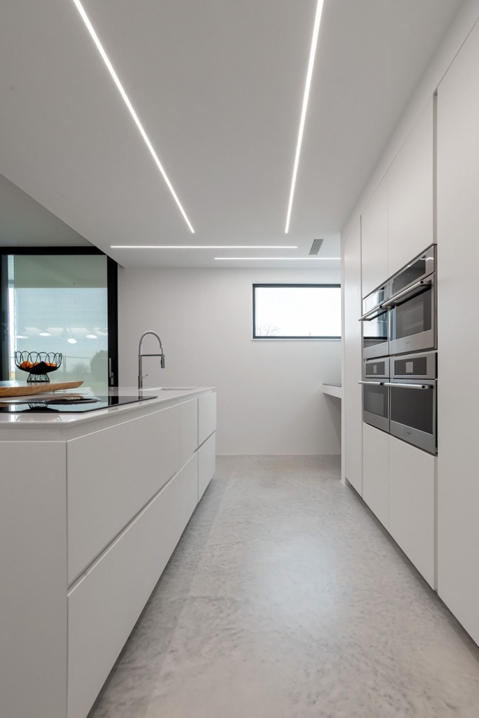
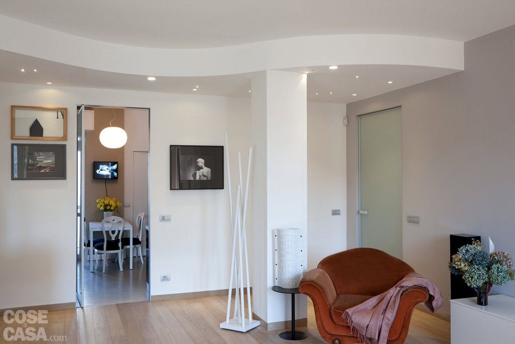
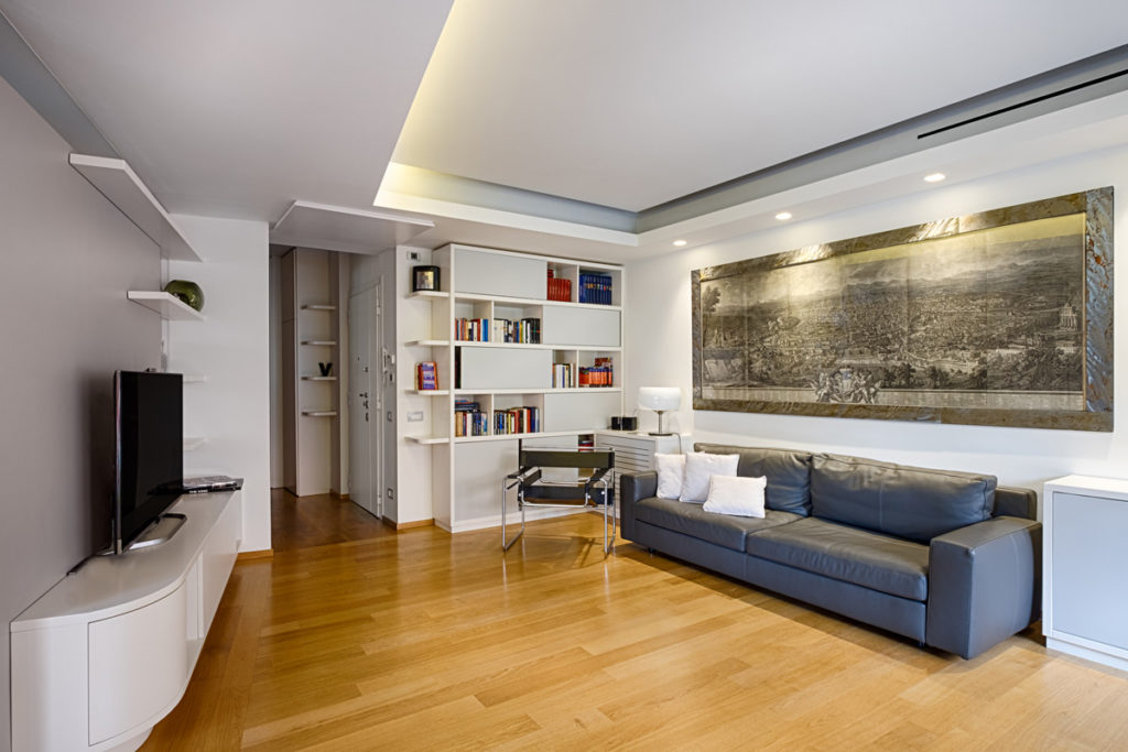
– One of the most common uses is as a FALSE CEILING.

A drywall ceiling will allow the use of recessed spotlights or LED strips.

Excellent use in transition areas or perhaps to optically divide two different functionalities in the same room, such as the open-space kitchen and living room or the entrance that gives directly onto the living room.

(credit inlet.it)

(credit cose di casa)

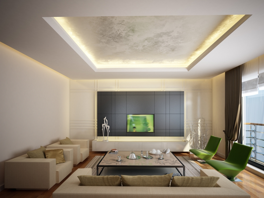
– Use of RIB.

It is always a ceiling use, only this time it is not fully covered, but only the perimeter part.

Perfect for creating ambient lighting

It could be a great idea to emphasize an impressive ceiling because LED strips can be put on it that light upward.

Depending on the width, it will also be possible to put spotlights pointing downward.

(credit officinemama.com)

(credit Tavan Dekor)

– WALL constructions.

It can replace bricks for wall construction to divide rooms.

That is convenient if you have to do this division when you already live in the house.

The ease of installation and cleanliness of the work makes this intervention really not invasive.

(credit cose di casa)

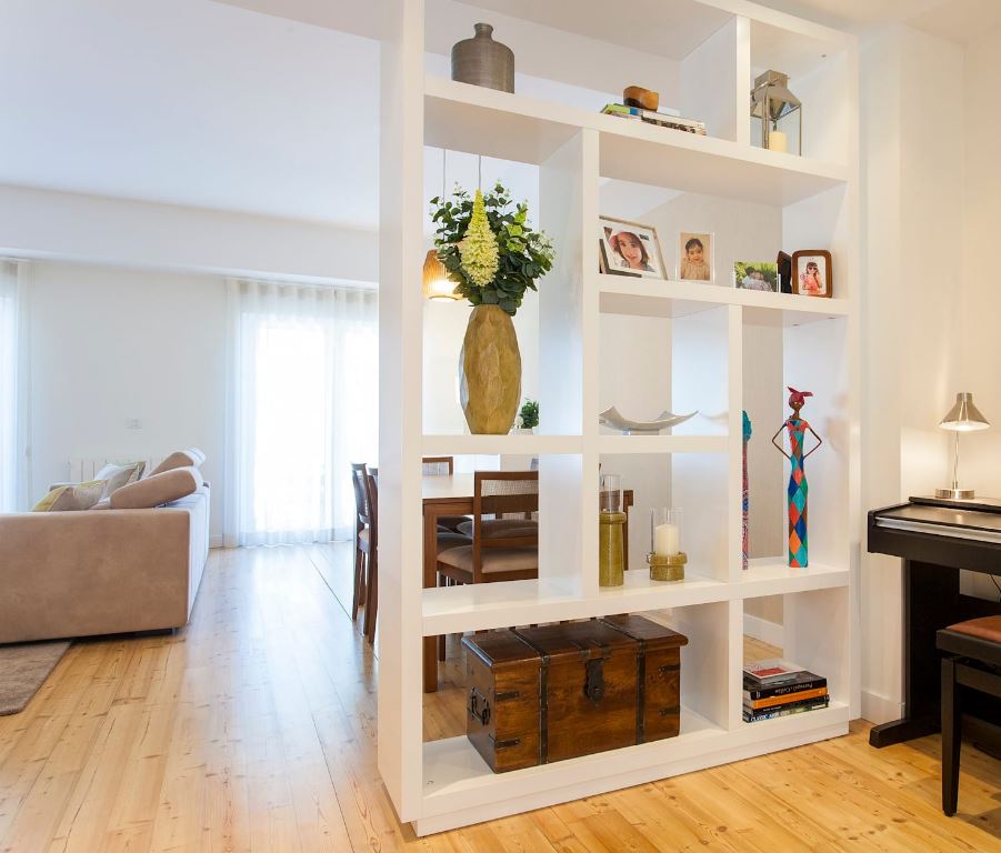
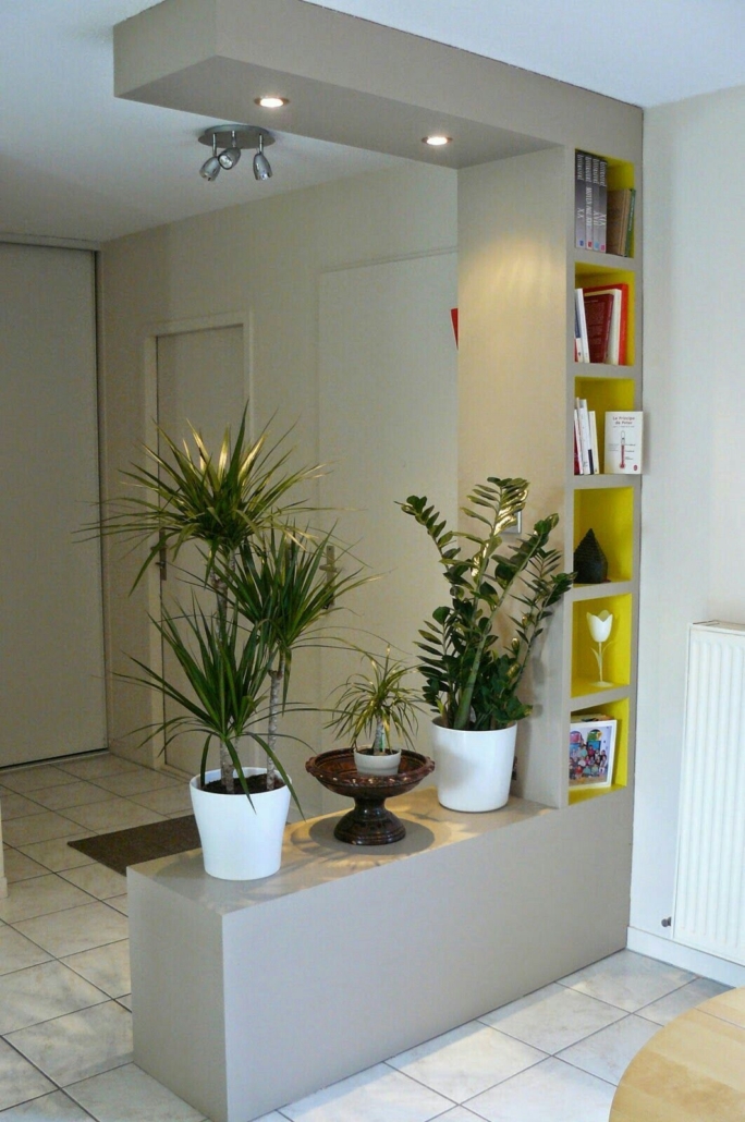
– Construction of DIVISIONS.

It is not always necessary to divide an entire wall; sometimes, a small wall or just a portion is enough, perhaps with an open opening to let light and look flow.

(credit homify.it)

(credit casaegiarfino.it)

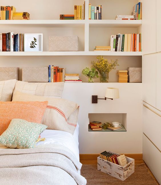
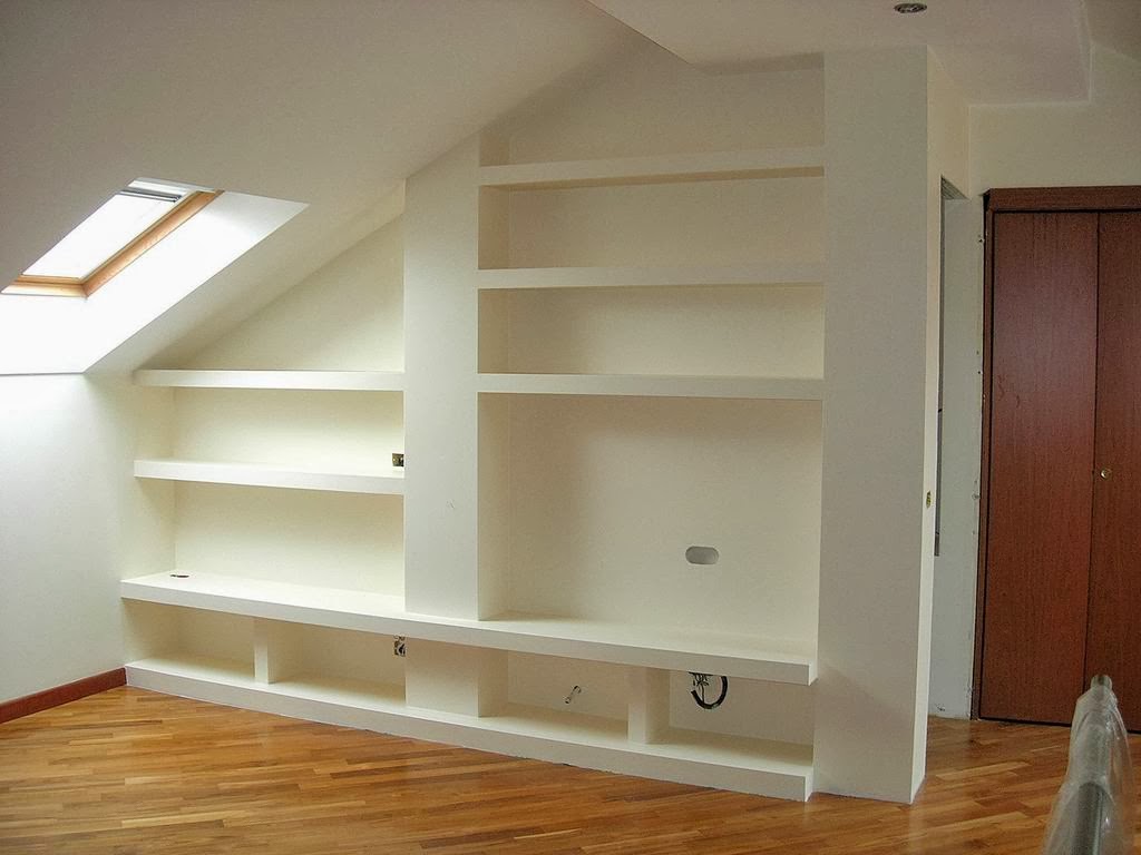
– CUSTOM furniture.

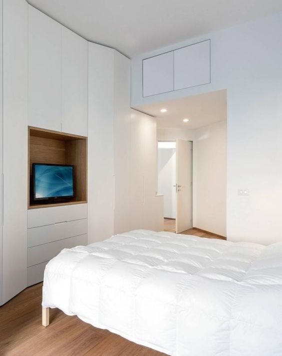
Its versatility allows the construction of cabinets, bookcases, wall units, and niches…

Really with a bit of imagination, you can do anything!

In the bedroom, for example, it can become an original wall with illuminated niches that will also serve as a support.

Or, if the room is large, you can create a walk-in closet.

Last week I was talking about mansards: drywall would become an incredible ally on that occasion!

Also great for taking advantage of an open understairs!

(credit El mueble)

(credit decor Style)

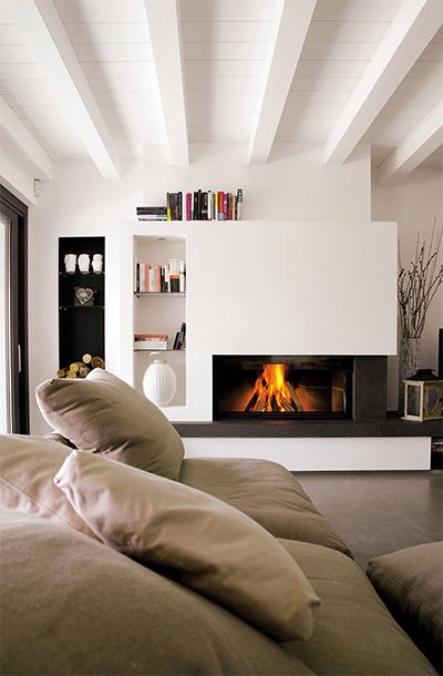
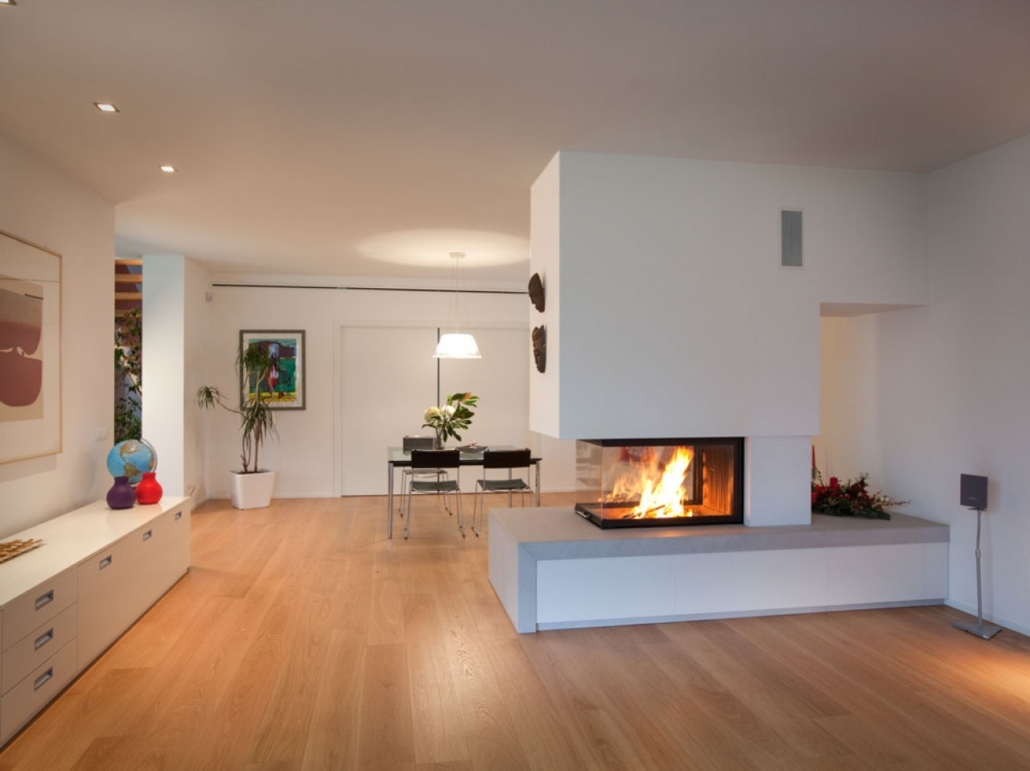
– fireplace COVERING.

If you have a fireplace in your home, lining it with drywall will give it a contemporary appeal.

If, on the other hand, you do not have it with drywall, it will be possible to put in a bioethanol one, that does not require a chimney, adding charm to the living room.

(credit artheco.it)

(credit michelincaminetti.it)

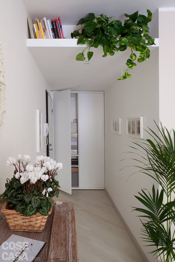
– creations of small MEZZANINE.

Especially in tiny houses, taking advantage of every inch is really vital.

Creating some small mezzanine in some areas where the ceiling is higher could be convenient for additional storage space!

(credit Cose di casa)

(credit Cose di casa)

Have you used it yet? Let me know how and where in the comments!

If you have any doubts just contact me!

How to furnish a mansard?

Living in a mansard has a certain charm because of its unusual shape, but for the same reason, decorating it is not so easy!
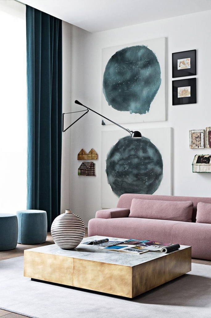
Today let’s see together some tips and tricks to make attic rooms comfortable!
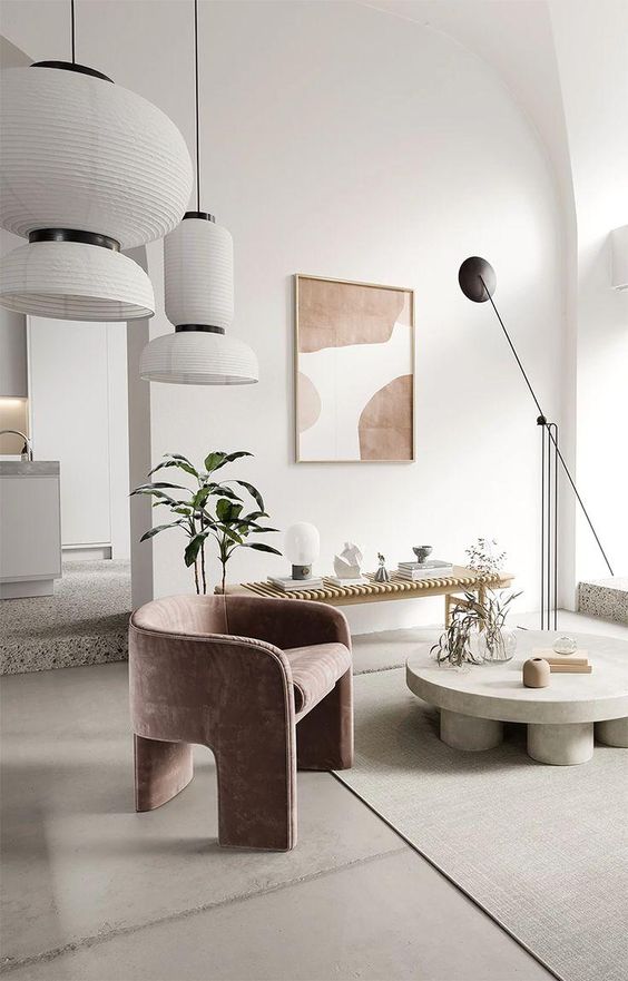
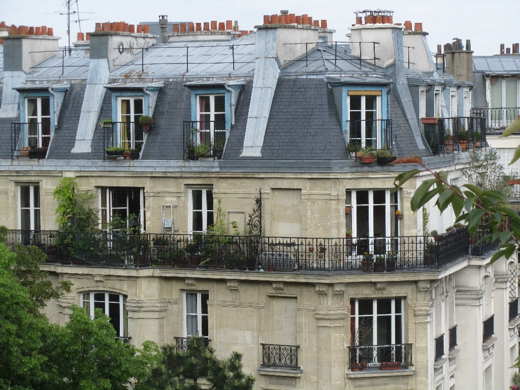
Before we get into today’s topic, let’s make a little history: the mansard and this term come from the French word “mansarde,” which in turn comes from the name of the architect François Mansart (1598-1666) who first designed this type of housing.

There are pros and cons to having a mansard room or apartment

Pros:

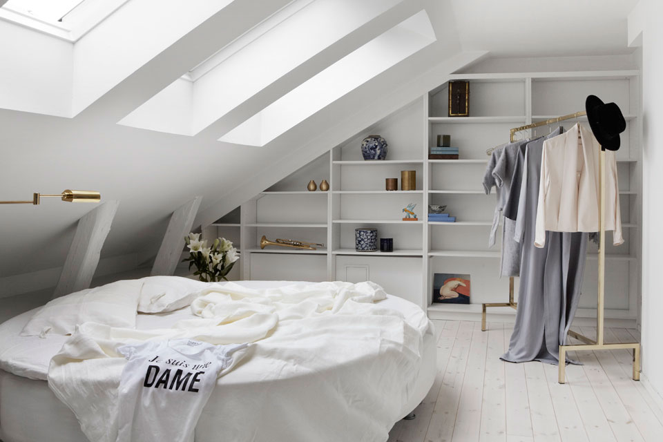
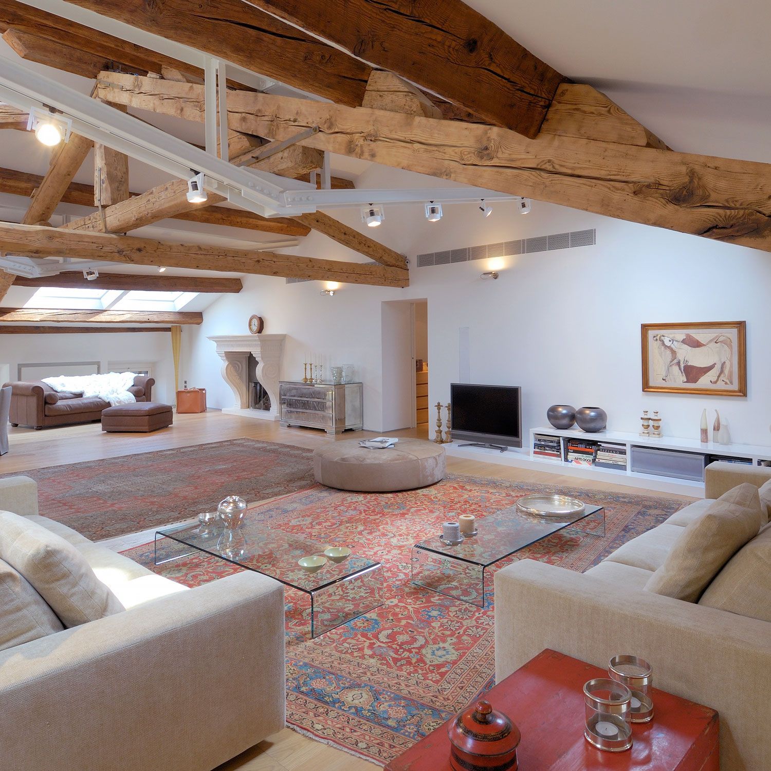
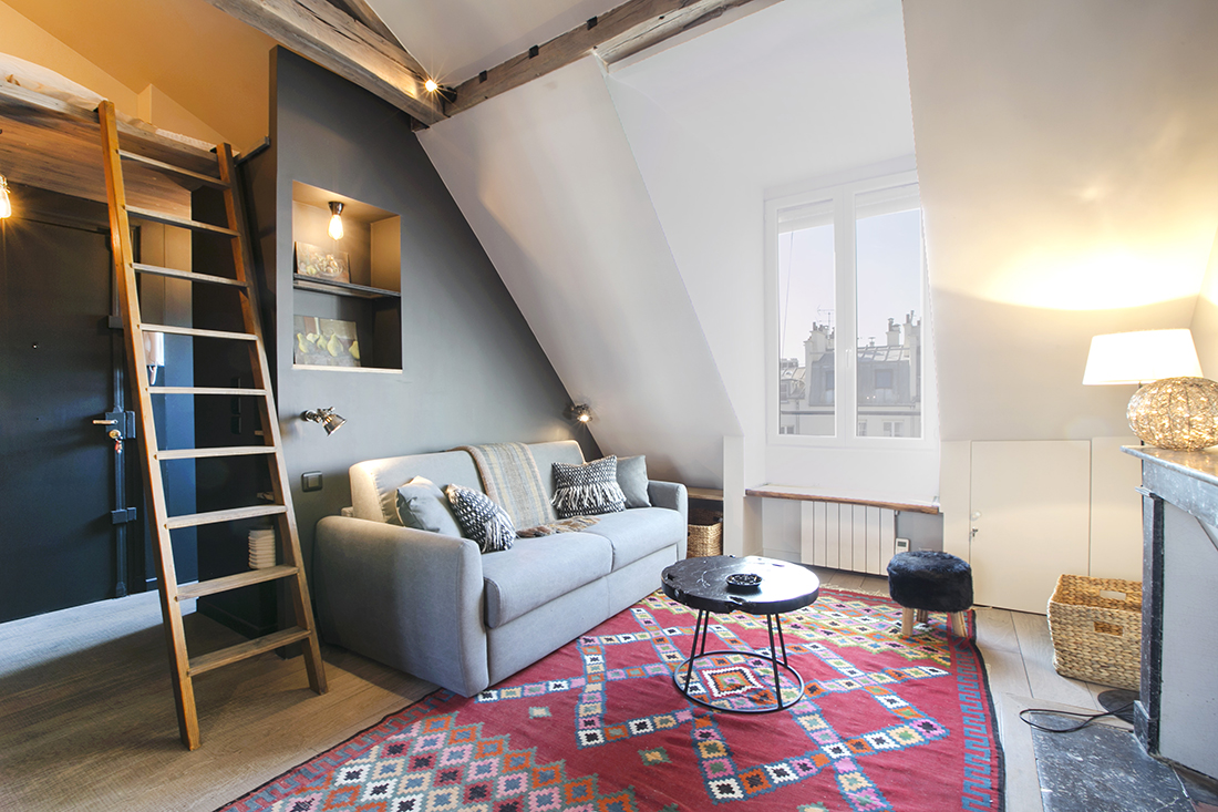
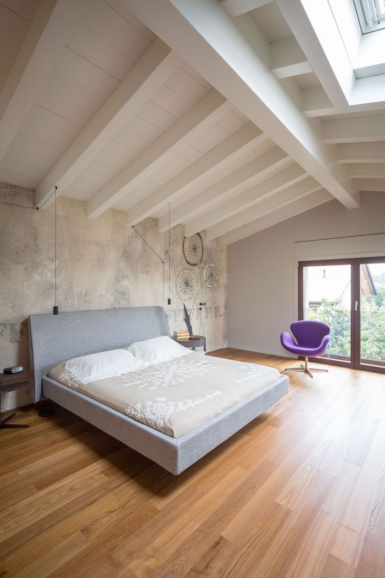
– it is an original and striking environment because of the sloping ceilings, often with exposed beams;

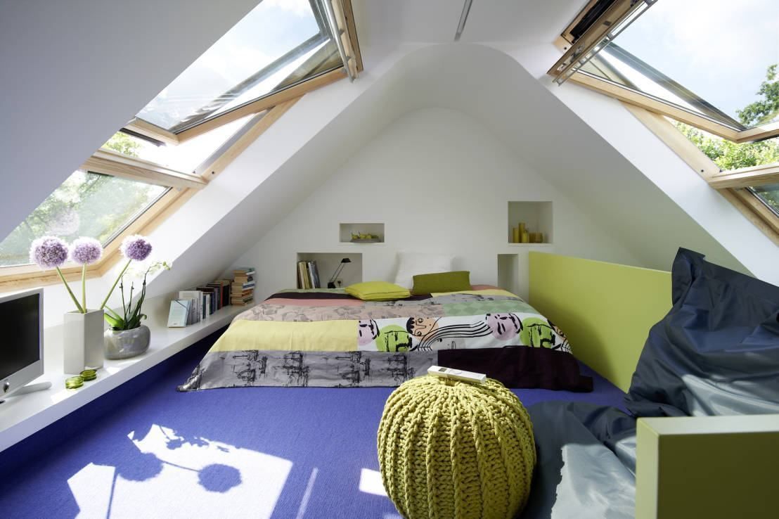
– thanks to the skylights, it tends to be a bright environment;

– with a bit of imagination, you will be able to find unusual settings not found in “normal” apartments.

Cons:

– it is not easy to find suitable furniture in stores;

– you have to be more careful about the climate and relative temperatures.

The roof is definitely exposed, and the risk is to have a room or house very hot in summer and very cold in winter;

– despite having a large floor plan, it might look small, having areas perhaps not walkable!

With good design, however, these cons can be, if not eliminated, at least curbed!

What makes particular a mansard is the difference in heights within it, which can be very different, making a furnishing project more or less difficult!


come arredare una mansarda

(credit fantasticfrank.se)

There are mansards that at their lowest point reach 2 meters and definitely make the task of furnishing it easier.

But there are also mansards that perhaps barely reach a meter in height and complicate things a little.

In this case, figuring out how to furnish the attic flat becomes more complicated but not impossible!

Speaking of heights, I make a very small digression: if you have an attic and would like to make it an apartment, you should know that there are very strict regulations to make that space habitable.

These regulations mainly concern heights (but not only), more precisely, the average height between the highest and the lowest point.

They vary from region to region, so I recommend contacting a technician who can give you the correct guidance!

Back to us, let’s look at some ideas that can help you better understand how to furnish a mansard!

1) CORRECTLY MATCH ROOMS TO HEIGHTS.

That is, put the rooms in the right place!

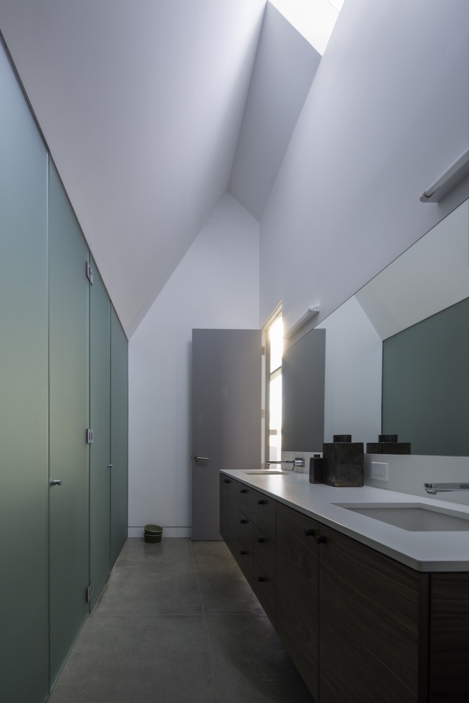
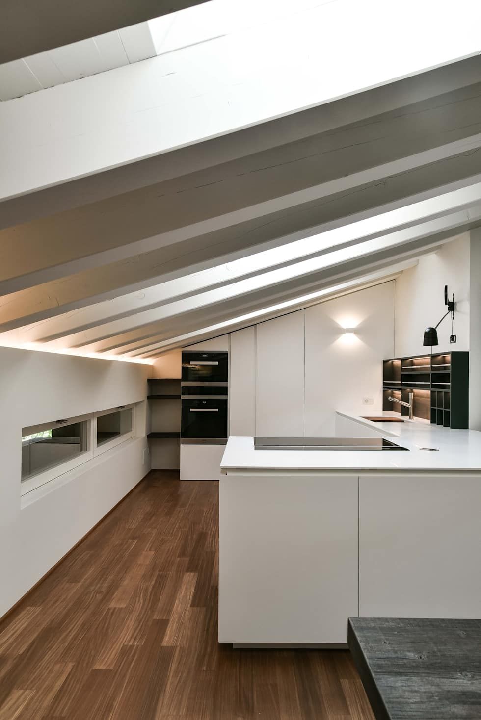
By this, I mean placing in the highest areas those rooms where you are often standing, like the kitchen or the bathroom.


(credit. architecturebeast.com)                                          (credit arch.Claude Petarlin)

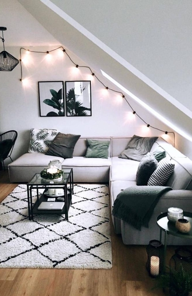
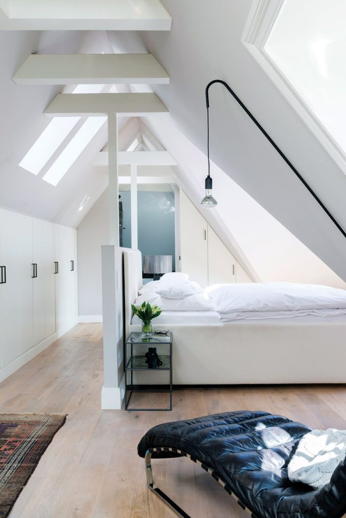
In the lower areas, on the other hand, you can put, for example, the living room (especially the sofa area) or the bedroom…


(credit Westwing)                                                                  (Christian Schaulin tramite Elle.com)

That may create an irregular floor plan, but, after all, this is another thing that gives charm to this type of housing!

2) USE CUSTOM-MADE FURNITURE

Here more than ever, making the best use of space is vital!

As we have seen among the cons of this type of housing, it will not be easy to find suitable furniture in traditional stores.

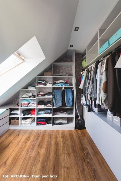
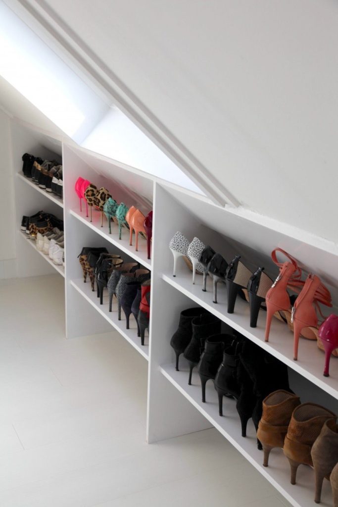
Therefore, it will be necessary to create custom-made furniture and carve out cabinets and storage in the lower areas that you could not otherwise exploit!


(credit Archon)                                                                          (credit vtwonen)

The cons turn into pros because you will have unique and original furniture designed not only for the conformity of the room but precisely for your needs!

3) ATTENTION TO LIGHT

These rooms should be very bright, as always natural light is preferred.

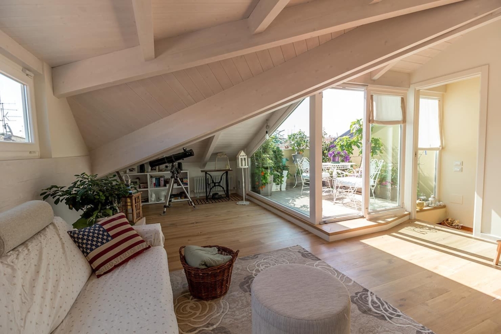
If it is a room, skylights will be okay, but if it is an entire apartment, it is good to have vertical windows and maybe, at least, a small veranda!


(credit Arch. Bartolucci)

That will allow a glimpse of the outside the risk, otherwise is to feel a bit stuffy!

As for artificial lighting, however, some tricks will improve living comfort:

– light from below and above, especially if you have a wooden roof!

– be careful with chandeliers except in the highest areas!

While passing under them without problems, the chandelier is still a bulky element that creates a visual “barrier” that will optically shrink spaces.

Electrified rails, adjustable spotlights, sconces, and LED strips will allow you to bring light where you want it with little clutter.

(credit menzoarchitetto.it)

(if you are interested I talk about lighting in general here)

4) ATTENTION TO COLORS!

If the mansard is very low-lying, the ideal is to use light and bright colors, at least as a base.

That will optically expand the spaces giving more breathing room.

If you want to use it, the color will be good in the furniture, accessories, and textiles.


(credit dodk.net)

On the other hand, if the mansard is high, you can dare a little more by coloring some walls too.

In this case, do it in the brightest parts of the house and avoid too dark colors.


(credit cristinavelani.com)

If you have a wooden ceiling and want to keep it that way, keep more neutral colors for the walls; so you don’t risk weighing the environment down.

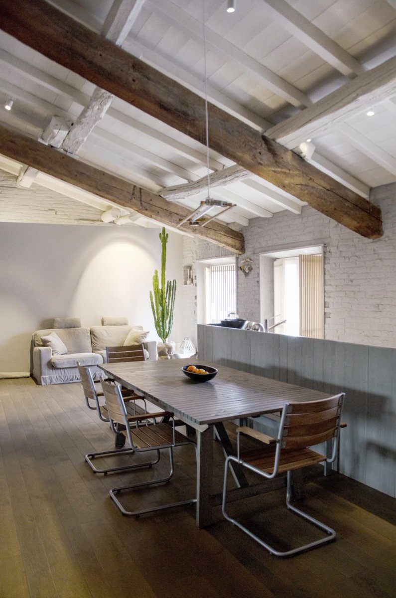
You can think of whitewashing the wooden ceiling to give it more breathing room, all or part of it; for example, if you have beams, you can decide to whitewash the battens between the beams while keeping them unchanged.


(credit Architettura & Urbanistica Sigurtà)                        (credit Living corriere)

These 4 tips are the basics that will help you better understand how to decorate your mansard, but if you have any doubts, don’t hesitate to write in the comments so I can better help you!

I hope the article on how to furnish a mansard was helpful and you loved it; in case, let me know in the comments!

If you need any help just contact me!

Home decor and furnishing are exciting, and today I’d like to give you some tips that can help you do it to the best for a home that represents you deeply!

Good design is not only about aesthetics; it is not enough to put beautiful things in a room for it to be lovely and comfortable.

More importantly, it is about how each element can communicate with the other.

So it is not just a matter of “beauty,” but it is a proper interaction between the elements of the same environment.

Some basic concepts are crucial to designing or transforming any environment, making it unique and wonderful.

Each thing must be connected to the other and give a sense of unity.

These concepts that will help you best decorate your home are 6: let’s see them together!

1) The first home decor basic concept is to create EMPHASIS.

Said like this may sound tricky, but it is not: it is about creating a focal point!

So it is having something outstanding that grabs attention.

If everything in the room has the same importance, everything will seem somewhat unconnected, monotonous, or boring.

There is a need for something that attracts, that somehow breaks the patterns.

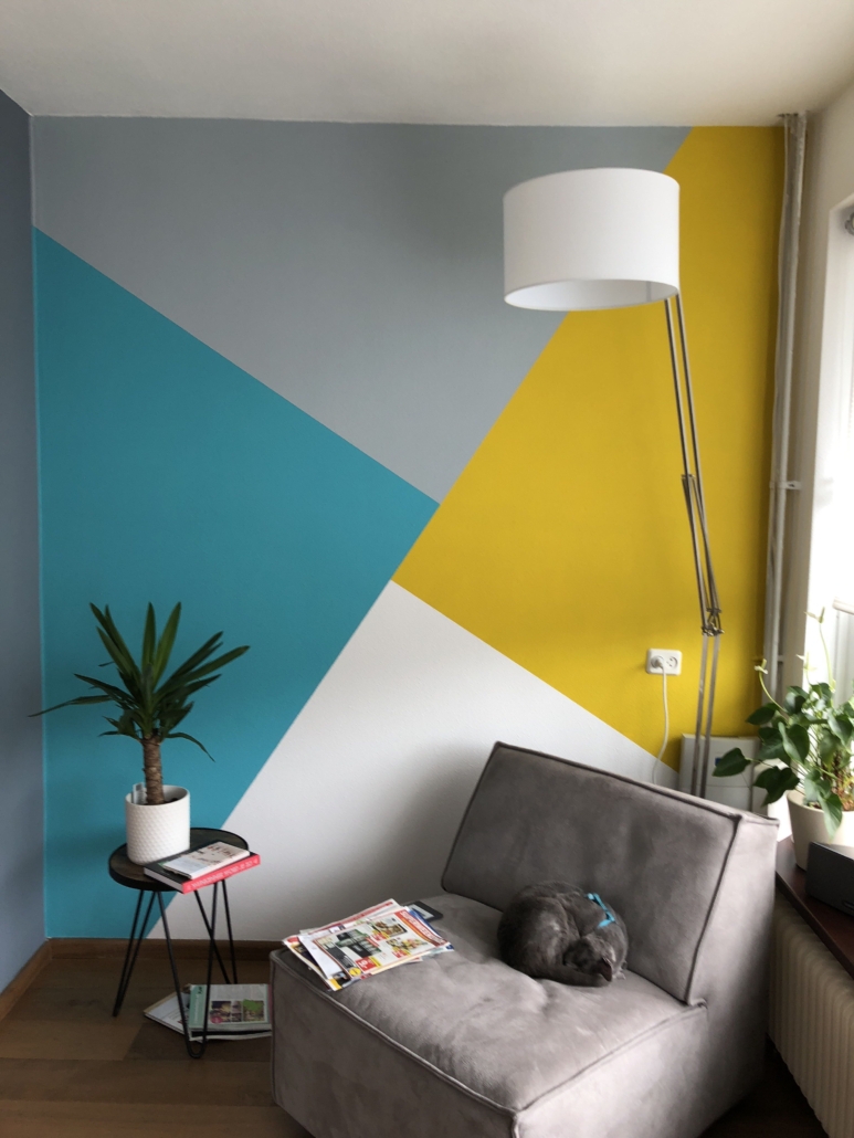
That can be a wall with a bold color, a painting or a particular object, etc.


(credit archimadestudio.com)                                                                        (credit etsy.com)

2) another concept is creating CONTRAST

In order to create movement, it is relevant to put elements close together that contrast with each other through color, shape, materials, or sizes.

It can be done in many ways, for example, by combining light and dark colors, huge elements with small ones, shiny and matte surfaces, and so on…

These contrasting plays enliven the environment by giving it character!

(credit ludexo.com)                                                                                (credit neptune.com)

3) RHYTHM is another essential concept.

In furniture, rhythm is achieved by creating repetitions and contrasts: it is like in the combination of musical notes, only this one is visual!

The repetitions create a flow that guides the eye through the surrounding space.

You can do it in various ways:
– a repeated architectural detail, object, or complement
– use the color of a painting in the patterning of a pillow and in some objects.

The latter will create rhythm precisely, but it will also help create balance and tie all the various elements together.


(credit shootfactory.co.uk)                                                                       (credit elledecor.com)

4) speaking of BALANCE, this is the fourth concept for a perfect interior project

Balance is the proper distribution of different visual weights.

Some colors, shapes, or sizes attract more than others and are said to have a greater visual weight.

To achieve a harmonious environment, it is paramount that these do not overpower what has less visual weight but that there is indeed a balance.

On paper, the perfect balance is symmetry, which is when dividing a room in half, the two parts are furnished in the same way; it is as if there is a mirror!


(credit Flanagan Lawrence source yellowtrace.com)

Why did I write “on paper”?

Because it is not mandatory that everything is symmetrical to achieve balance: on the contrary, asymmetry could make everything more dynamic!

A color with a high visual weight will balance well with a neutral colored element, but perhaps very large…


(credit Abramson architects)

Or, again, when elements are duplicated.


(credit Knoll)

5) SCALE and PROPORTIONS are basic home decor concepts when designing furniture!

SCALE takes into consideration the size of an object relative to the room in which it is placed:

Small rooms with furniture that is way too bulky will suffocate the space (and therefore you!); conversely small furniture and objects in large rooms will get lost!


(credit Meridiani living)                                                                                       (credit Bronxes Studio)

PROPORTION takes into consideration the size of one item in relation to another.

A rug that is too small next to a large sofa will look out of place!

You cannot think only about the size of the room and the main furniture, but you will have to think about the size of each element and the correlation between them.


(credit artheco.it)                                                                                              (credit artheco.it)

6) Finally, the last concept is HARMONY.

You can achieve harmony when all the elements in the environment communicate with each other, creating a unique and balanced whole.

One must have the impression that each piece nicely matches the other.

As always, this does not mean using only one style or color, but it is paramount that each piece seems to belong to the other in some way!

To do this, you need, as mentioned before, for the pieces to communicate with each other, picking up the material or color, for example!


(credit casavogue.globo.com)                                                                         (credit jessicabrigham.com)


These six home decor concepts go hand in hand, and if followed carefully, they will help you decorate your home by creating unique and spectacular environments where you will always feel at ease!

I hope this article was helpful and you love it; in case, let me know in the comments!

Feel free to share it with anyone you think might be interested, I will be honored, and it will help me get my name out there.

If you feel that your home, or some environment of it, does not reflect you enough, do not wait any longer and book your consultancy!