Posts

When designing a kitchen, it’s easy to fall into some common mistakes that can make it less functional and, perhaps, even less enjoyable!

Today, I’ll share 11 mistakes I’ve often seen people make (and, let’s admit it, I made a few myself with my first kitchen!).

1 – BACKSPLASH

The backsplash and countertop are elements you’ll keep for a long time, so choose wisely!

First, focus on the material: it should be high-quality and easy to clean.

If you opt for tiles for your backsplash, ensure they are either large to minimize grout lines or designed to allow for very tight spacing, resulting in nearly invisible grout lines.

Grout lines can quickly become an insidious spot for accumulating grease and dirt!

You might use the same material for both the countertop and backsplash.

That creates a seamless, streamlined look for your kitchen and avoids the risk of mixing too many materials and colors.

If you prefer contrasting elements, pay close attention to how the colors and materials interact with each other, with your cabinets and flooring, to avoid a mismatched, chaotic appearance!

(credits: behance.net; chiefhouse.ru)

2 – LIGHTING

We say it often: lighting is always paramount, but even more so in the kitchen, where you use potentially dangerous tools like knives, good visibility is essential.

A single central ceiling light is definitely not enough.

Under-cabinet lighting is crucial to ensure everything is always well-lit.

If you have an island or peninsula, it’s ideal to include dedicated lighting for those areas, and don’t forget to add lighting above the dining table if there is one.

When it comes to lighting, selecting the right fixtures is just as important.

Choose decorative lamps that enhance your kitchen’s style!

Pay attention to proportions, too: if the light fixtures are too small, they might look out of place.

When in doubt, slightly larger fixtures are better, as they can become a focal point and add character to your kitchen.

Lastly, consider adding a stylish table lamp on the countertop: it will double as a decorative element while creating a warm, cozy atmosphere!

(credits: cutypaste.com; chrislovesjulia.com)

3 – ISLAND OR PENINSULA

Having a kitchen island or peninsula is a dream for many people.

However, it’s essential to get the dimensions right.

It’s not so uncommon to see oversized islands: you might even spot two in large spaces!

But while two islands are excessive, an island that’s too small doesn’t make sense either.

The minimum recommended size for an island is at least 60×120 cm (24×48 inches).

If there isn’t enough space for an island or even a peninsula, it’s better to go for mobile carts with wheels you can move as needed.

When designing an island or peninsula, pay attention to the distance from the rest of the kitchen to ensure smooth movement and allow drawers and cabinet doors to open easily.

In renovations, a common mistake is overlooking electrical outlets when designing an island not set up as a working area with a cooktop or sink.

It’s crucial to plan for outlets: you might need them for plugging in or charging a laptop, tablet, or phone.

Why not take it a step further? If the island is large enough, an outlet could be helpful for a decorative lamp.

Extra outlets are always a good idea!

(Here you can find some more tips for islands or peninsulas).

(credits: middleton-bespoke.co.uk; libertateapentrufemei.ro; apartmenttherapy.com)

4 – CLUTTERED COUNTERTOPS

Overloaded kitchen countertops are a common thing to see.

But do we really use everything we leave sitting out?

The ideal approach is to keep only the items you use regularly, like a coffee machine, a few decorative cutting boards, or a stylish olive oil dispenser.

You can also create intentional displays with things you love, such as a beautiful mug set or some cookbooks.

However, do this thoughtfully, with purpose and care!

Avoid leaving medications in plain sight.

While it’s true they might need to be taken daily, they’re not exactly appealing to look at.

It’s better to store them in a cabinet or a decorative box.

Another great idea is to extend a cabinet down to countertop level to hide appliances you don’t use daily or that aren’t as visually pleasing.

If you choose this option, install an outlet inside the cabinet.

This way, you can open the door and use the appliance without necessarily having to move it.

(credits: helladesignstudio.com; josephkitchens.com)

5 – SHELVES

Open shelves showcasing dishes have been a popular trend for a while, but let’s admit they’re not the best choice, either visually or functionally.

In addition to collecting dust, the dishes on display will eventually accumulate grease unless you clean them almost daily.

Even if the dishes are beautiful and neatly arranged, the overall effect often creates visual clutter, which can be subconsciously unsettling.

That doesn’t mean to banish shelves completely.

On the contrary, having a few can add a sense of openness to your kitchen.

The key is to style them thoughtfully with few but pretty decorative items.

Use shelves sparingly and intentionally to avoid overwhelming the space!

(credits: urbanologydesigns.com; halfwaywholeistic.com)

6 – CABINETS AND DRAWERS

Base cabinets with doors are frequent in kitchens but are not the most functional.

Reaching for items stored in the back can be inconvenient and uncomfortable.

Deep drawers, on the other hand, are far more practical.

They allow you to see everything at a glance when opened.

It’s also essential to use organizational systems inside the drawers to prevent clutter and ensure easy access to all items.

If your kitchen primarily consists of cabinets, consider adding internal organization systems to make them more practical and functional.

When it comes to kitchen furniture, beyond the type of storage, good design is crucial, especially for corners!

Poor planning can lead to cabinet doors that don’t open fully, making it harder to access the items inside.

Proper planning ensures everything is accessible and easy to use.

(credits: Canva; amazon.it)

7 – HANDLES

When choosing handles for your kitchen, the focus is often on aesthetics: shape, size, and color.

However, functionality, or rather, practicality, often gets overlooked!

Let me explain: some handles may look stunning, but they can be easy to snag on, becoming a nuisance or even a safety issue.

You’re constantly moving around, grabbing ingredients, preparing food, cooking, cleaning, etc., in the kitchen.

With more than one person in the space, the risk of snagging on handles increases.

If it happens frequently, it’s far from ideal.

So, choose handles that are beautiful but also practical for how you use your kitchen.

They should enhance your space, not get in your way!

(credits: Ikea; vidaxl.it)

8 – FAUCETS

We often overlook the kitchen faucet, yet it’s a detail that can make a big difference in the overall design.

Of course, it needs to be functional, but choosing, for instance, one that matches the color of other metal accents in your kitchen, like handles or light fixtures, will add a distinctive touch to the space.

Don’t underestimate the importance of this element; these days, there’s an endless variety of options to suit any budget!

(credits: Franke; Canva)

9 – APPLIANCES

People often focus on power, functionality, and aesthetics when talking about appliances.

While these are all important, we often overlook the dimensions!

Ideally, kitchen planning should start with the major appliances and choosing the right ones to meet your needs.

Here’s an example: if you live alone or as a couple, a cooktop with four burners, or even two, maybe enough!

But a cooktop with five or six burners is better for a family of four or five or if you frequently host guests.

The same logic applies to the dishwasher.

Instead of the standard 60 cm (24-inch) model, a 45 cm (18-inch) one could save valuable space.

And for the fridge, should you go for an American-style or a standard one?

Even with a standard 60 cm fridge, how large does the freezer need to be?

If you prioritize fresh food, a smaller freezer may be enough.

Also, consider the placement of your appliances.

The sink, cooktop, and fridge should be easily accessible, forming the famous “work triangle.”

Studies highlight the importance of this layout for a functional kitchen.

Lastly, think about whether your fridge should be built-in or freestanding.

There’s no right or wrong answer: it’s all about personal taste and aesthetics!

(credits: amazon.it; myscandinavianhome.com)

10 – MATERIALS AND COLORS

The kitchen is an investment that will stay in your home for years, so it’s essential to choose wisely!

First and foremost, focus on materials that are high quality, durable, and easy to clean.

There’s nothing worse than struggling to keep your kitchen clean or seeing it get damaged after only a short time.

That applies to the cabinetry but also to the countertop, backsplash, and even the flooring.

Two other aspects to consider when choosing materials are textures/patterns and colors: the overall combination must be harmonious, not a chaotic patchwork.

One should select flooring, cabinetry, countertops, and backsplashes in a way they communicate with each other.

A kitchen full of bright colors and various patterns might seem appealing initially, but the risk of getting quickly tired of it is high.

Given the investment involved, it’s simply not worth it.

If you love color, there’s no need to give it up!

You can incorporate it in the base cabinet doors; if you want, you can eventually repaint them later.

Or, use color in your decorations or even in small appliances like your coffee machine!

(credits: mrcabinetcare.com; Hector Sanchez)

11 – TRASH BINS ON DISPLAY

Having trash bins on display in the kitchen is far from ideal, especially with the increasing number of bins required for recycling, now five!

Thankfully, many solutions are available to integrate trash bins into your cabinetry, especially under the sink.

If it is impossible to fit all five bins, consider placing the less frequently used ones in another location, like a cabinet on the balcony.

Keeping the bins hidden makes for a cleaner, more organized kitchen.

(credits: peregoarredamenti.it; canva)

I hope you enjoyed this article about common kitchen design mistakes and found it helpful.

If so, don’t hesitate to share it with someone you think might be interested; I would be honored, and it will help me get known.

If you feel that your home, or any part of it, doesn’t reflect you enough, don’t wait any longer: fall in love with your place again and book your consultancy!

As the year comes to an end, the leading color brands reveal their predictions for the top trends for the coming year, so let’s dive in and explore each “2025 Color of the Year” proposal!

(Here you can find last year’s proposal)

– BENJAMIN MOORE – CINNAMON SLATE

Once again, Benjamin Moore’s 2025 color of the year choice is an intriguing and delicate mix of colors: precisely between plum and brown.

It’s a rich, warm, inviting color that adds depth to any room!

In a press release, Andrea Magno, director of marketing and design for this brand said, “As the use of more saturated color in design has increased in recent years, we are seeing a growing interest in more nuanced colors, whose undertones add intricacy and dimension,” she said. “Cinnamon Slate is an inviting hue that offers enduring style and modern sensibility. Its depth and richness bring an air of approachability and sense of comfort throughout the home, making it a new favorite for years to come.”

Indeed, it’s a color that brings a sense of familiarity and is highly versatile, adapting to any style.

As always, Benjamin Moore also presents a color palette in which Cinnamon Slate naturally plays a central role, ranging from neutrals to more vibrant tones.

That truly allows for great personalization!

– SHERWIN WILLIAMS – CAPSULE

This year, Sherwin Williams is doing something different by not selecting a single color of the year but offering a stunning color palette: CAPSULE!

That expertly curated palette has the ability to create beauty and elevate any style!

It features rich, deep colors that alternate neutrals with a vibrant yellow-green and warm hues like brown.

The blue-gray and mauve add elegance and sophistication to the palette!

Sherwin Williams also introduces four additional palettes, known as Colormix Forecast, which explore the influences and emerging movements that the brand believes will shape tomorrow’s design.

– Chrysalis

“Capture the essence of peaceful, intentional living and transformative future thinking in a sanctuary of colors inspired by wood tones, sifting sands, and freshly turned earth.”

– Paradox

“Delve into the mystical blues, meditative midtones, and compelling chromas that connect us to the land, to creating things by hand, and to a richly personal epic narrative.”

– Wellspring

“Embrace a mindset of openness and belonging with a collection of warm neutrals, sheltering deeps, and warm-hearted colors that nurture and nourish.”

– Kindered

“Conquer the conventional with a palette of dopamine-drenched colors that defy expectations: electricbrights, grounding neutrals, and candy-coated accents.”

– PPG – PURPLE BASIL

This year, PPG, as his 2025 color of the year, introduces a shade of purple that is fresh, provocative, and relaxing all at once!

In some European markets, it’s also known as Amethyst Shadow or Acai Berry.

Purple Basil is an elegant and sophisticated color suited to any style.

Its well-balanced warm and cool undertones make it inviting and mysterious, never dull.

The blue and red tones within the color lend a certain kinetic energy, which forms the foundation of PPG’s four “Kinetic” palettes that pair beautifully with Purple Basil: Extra Celestial, Bio-Fuse, Artificial, and Earth & Archive.

“The theme of Kinetic color reflects the need for self-sufficiency in a fast-paced world.
It also highlights the interaction between nature and science driving innovation and the influence of new tools like artificial intelligence fostering boundless creativity,” said Vanessa Peterson, Global Color Styling Lead at PPG.

– Extra celestial

“Detached from cultural expectation or societal frameworks, consumers find greater wellness and renewable energy in living life on their own terms. Clear contrasts between dark and light hues, as well as a variety of blue and purple tones, reference the harmonies within our galactic sky.”

– Bio-fuse

“Consumers find comfort in ancient practices and future sciences. A growing desire for protection and safety drives purchasing and aesthetic directions. A hybrid of nature-based and laboratory colors, this palette is both calming and unusual.”

– Artificial

“Consumers look to play with designs and products that push boundaries, get noticed, and stand out while seeking sustainable solutions. The mix of bold, playful hues and neutrals hints at the balance between real and unreal worlds.”

– Earth & Archive

“Consumers return to the mindset that life is meant to be lived, enjoyed, appreciated, and valued. There is a great respect for quality and beauty. This warm and inviting palette is full of sunkissed tints and scorched earth hues.”

– BEHR – RUMORS

This year, Behr is making a bold choice with Rumors, a deep, dynamic crimson!

“It’s that perfect color that brings a balance of warmth and vitality to a space,” says Erika Woelfel, Vice President of Color and Creative Services at Behr.

The company turned to consumer opinions through an online survey to find inspiration for its color choice.

Most participants agreed that red on one’s mood has a positive impact, making them feel stronger and more confident!

When it came to Rumors specifically, respondents found it rich and enduring, glamorous and “luxurious.”

It’s a highly versatile color that complements any style, and you can also play with the finish, which can be shiny or matte!

Like every year, Behr also offers a curated color palette to pair with Rumors. Erika Woelfel recommends Cracked Pepper and Blank Canvas, the Colors of the Year for 2024 and 2023.

– SIKKENS – TRUE JOY

This year, Sikkens, as his 2025 color of the year introduces a decidedly positive and vibrant color that creates energizing spaces filled with optimism and pride.

It is a bold color, so it is better to use it in moderation!

Ideal for kids’ rooms, a study, or a kitchen where one can apply it more playfully, it also works well in social spaces—though sparingly, as it can become a bit “loud.”

So, consider it for an accent wall paired with various complementary elements!

Once again, Sikkens presents three color palettes to pair with True Joy.

– Proud Colors

“Inspired by local cultures of the world, this palette aims to celebrate the heritage that makes each individual unique.”

– Bold Colors

Vivid and contrasting colors for a dynamic palette.

– Human Colors

Colors inspired by nature and the earth for a relaxing palette, with yellow adding a touch of brightness!

The proposals are rich and interesting! What’s your favorite?
Let me know in the comments!

I hope you enjoyed this article on 2025 colors of the year and found it helpful.

If so, don’t hesitate to share it with someone you think might be interested; I would be honored, and it will help me get known.

If you feel that your home, or any part of it, doesn’t reflect you enough, don’t wait any longer: fall in love with your place again and book your consultancy!

When you walk into your living room and look at the wall behind the sofa, does it feel dull and you would like to find a way for decorating this wall effectively and give it some character?

You’re in the right place!

In today’s article, I’ll give you eight ideas for decorating the wall behind the sofa and giving it character!

1 – COLOR

Colors are the quickest way to give a wall some character, but be careful: it may not be as simple as it seems!

The chosen color should be consistent with the other colors in your home to maintain harmony.

You can go for a contrasting color, or if you like to stick with the same color, you can play around with its saturation!

Here is a tip: get some samples before painting the wall any color. Choosing from a swatch or even at the paint store is not easy; the result will likely be different!

So, get some small cans of paint and try them on the wall, or ask for medium-sized painted pieces of cardboard and place them against the wall.

Then, observe how they interact with both natural and artificial light, as well as how they complement your furniture.

Once you have chosen the color, remember you do not have to paint the entire wall if you don’t want to!

You could paint just a band that reaches a little above the sofa or use color-blocking techniques, such as framing the couch!

You can also get creative and use geometric shapes; just be careful not to overdo it.

Again, a good idea is to try a virtual mock-up first, even using something as simple as Canva!

(credits: Enorm d’ Acheteromme; etsy.com)

2 – TEXTURED WALLS

You might want to create a textured wall using exposed bricks (which you can paint any color), wood panels, or raised tiles!

Adding tactile and visual texture to the wall creates a strong impact that can indeed give the space character!

Even here, you don’t have to cover the entire wall—you can create a certain rhythm by leaving some areas untouched.

(credits: marianaorsi.com.br; canva)

3 – WOOD MOLDING

Wood molding is making a big comeback, and for good reason!

Don’t think it’s just for traditional living rooms, as it actually pairs wonderfully with more modern styles, adding a touch of elegance.
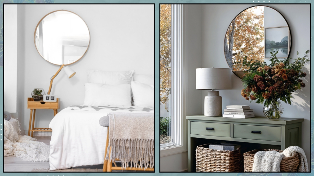
Once again, you don’t have to cover the entire wall; you could only add a section slightly higher than the sofa!

(credits: leroymerlin.fr; canva)

4 – WALLPAPER

Wallpaper, in recent years, has been a growing trend and could be an excellent option for the wall behind the sofa.

Nowadays, the selection of wallpaper is practically endless, so it’s easy to feel overwhelmed!

Start by studying your home’s style and color palette for an initial shortlist.

Be mindful of choosing patterns that are proportionate to the space—avoid designs that are too small and might get lost or too large and overpowering!

I’ve dedicated an article to selecting wallpaper, which you can find here (and here in Italian video format!).

(credits: tecnografica.net; uwals.it)

5 – ART OR MIRRORS

A classic way to decorate the wall behind the sofa is by using paintings, prints, or photographs!

For a good result, in this case, it’s paramount to pay attention to the size.

If you opt for a single piece, it should be huge, at least 2/3 the sofa width, and hung 6 to 10 inches (15 to 25 cm) above the backrest; otherwise, it may look randomly placed.

You could also go for a large piece to create a bold statement!

If you’re hanging multiple pieces, be mindful of the spacing between them so they always look like part of a cohesive arrangement.

Create harmony by using matching frames or, if you prefer different ones, keep consistent the artwork colors.

Remember to choose subjects that reflect your personality and are unique: avoid mass-produced prints!

The same principles apply if you decide to use mirrors!

(credits: cocolapinedesign.com; posterstore.it)

6 – SHELVES OR NICHES

Shelves are another great way to decorate the wall behind the sofa because you can style them however you like!

You can display artwork and photos, place books, candles, vases, plants, etc.

The best part is that you can move these items around whenever you want, making the wall decoration behind the sofa definitely dynamic!

You could also add LED strips under the shelves to create ambiance and add more depth to the wall!

If space allows, you could also create a small ledge behind the sofa to display your décor and maybe even a lamp.

(credits: idoitmyself.be; thebeautyrevival.com)

7 – PLANT WALL

Have you ever thought about a plant wall?

It consists of stabilized moss panels that require no water or maintenance!

A blessing for those who don’t exactly have a green thumb!

Again, it’s not mandatory to do the whole wall; you could do just a portion or even create a large artwork using the moss.

You can get creative with it, even decorating mirrors or creating lettering!

(credits: bynaturedesign.ca; gettyimages)

8 – SHOWCASE YOUR PASSIONS

I have said it many times: there’s nothing more personal and impactful than decorating with your passions.

And the wall behind the sofa is no exception.

You can display your record collection, hats, or whatever you are passionate about!

Let your imagination and creativity run wild!

The only tip I offer is to start arranging everything on the floor to be sure you like how it looks.

Then, as I often suggest for artwork, cut out paper templates of your items and put them on the wall with paper tape for an extra visual check. If everything feels right, go ahead and hang it all!

(credits: canva; amazon.com.br)

With attention, you can combine ideas, like wood molding and color, color and artwork or shelves, and so on!

Be careful, however, not to overdo it, or you might risk a less-than-pleasing result!

I hope you enjoyed this article for decorating the wall behind the sofa and found it helpful.

If so, don’t hesitate to share it with someone you think might be interested; I would be honored, and it will help me get known.

If you feel that your home, or any part of it, doesn’t reflect you enough, don’t wait any longer: fall in love with your place again and book your consultancy!

I’ll never get tired of saying it: in a world that’s increasingly fast-paced, busy, and, if I may say, often superficial, creating spaces of well-being at home is absolutely essential!

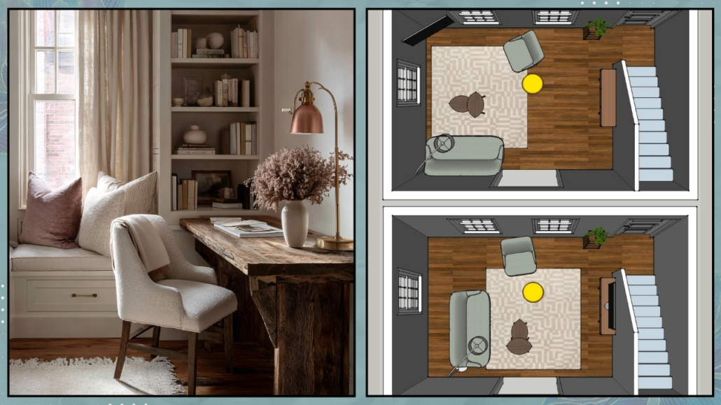
Shapes, colors, materials, lighting, furniture placement, and a connection to nature are the key elements for spaces that promote relaxation and well-being!

To achieve this, you must start with mindful design that truly considers who we are and what we want to experience at home.

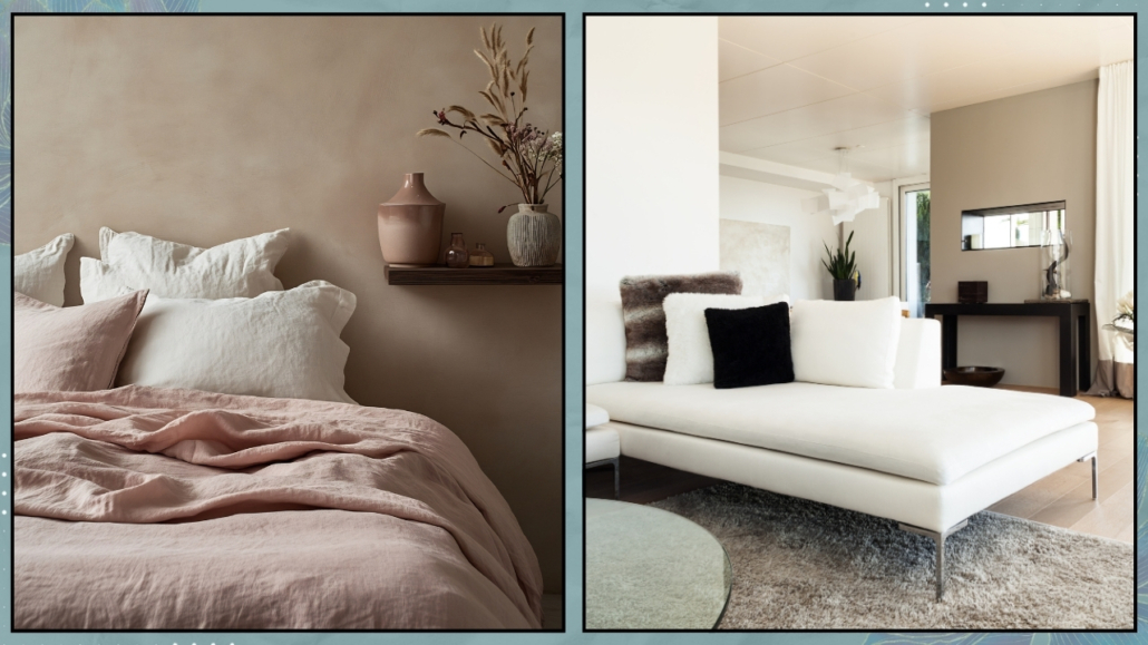
– SHAPES

Furniture and decor with organic, soft shapes—what we might even call “curvy”—make spaces feel less formal and especially less rigid!

That somehow helps promote relaxation.

Of course, not everything needs to be curved, but it’s a good idea to “soften” the space with such elements.

From a feng shui perspective, it’s also important to limit, if not eliminate, sharp corners.

As mentioned before, not everything has to be curvy, especially if it’s not to your taste, but even furniture with rounded edges will make a big difference!

(credits: westwing.com; @vymir_design)

– COLORS

Neutral, natural colors like beige, blues, greens, and earthy tones are calming and relaxing. Using this type of palette at home helps promote well-being.

That doesn’t mean giving up on more vibrant or bold colors, but perhaps using them in smaller doses—think of the “60-30-10” rule, where they can be the famous 10%.

That will still help bring a bit of rhythm and energy to the space!

Alternatively, if you want to use them in larger doses, you could do so in more dynamic and active spaces, like the living room or the office.
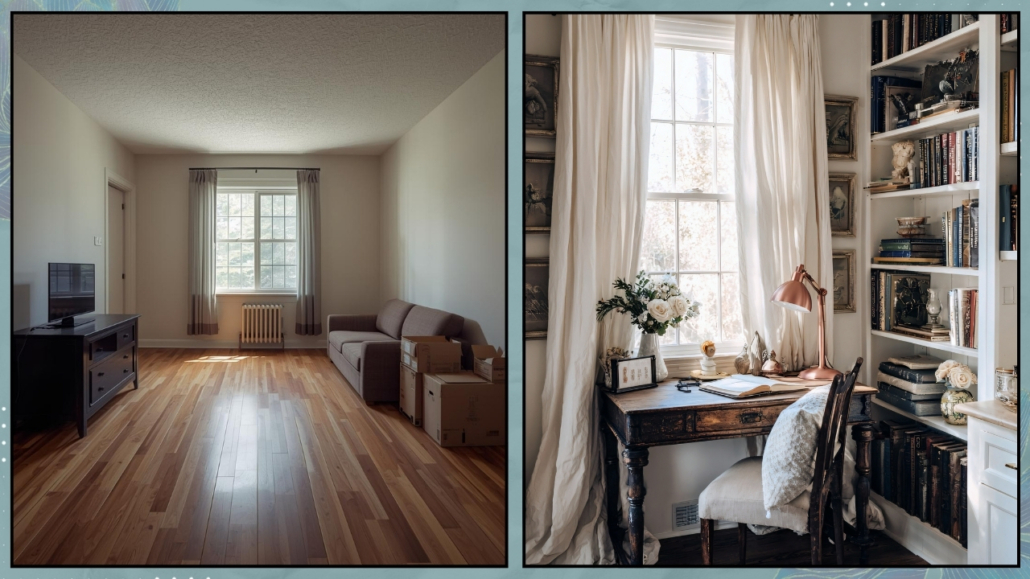
That approach works well from a feng shui perspective because it helps balance Yin (passive, feminine, and calm) and Yang (active, masculine, and dynamic) energies, a fundamental principle in this discipline!

I suggest using the same colors throughout the house, obviously changing their saturation, to maintain a common thread between the rooms.

(credits: cocolapinedesign.com; Iba design Associates)

– MATERIALS

Using natural materials as much as possible is vital to creating spaces of well-being and health at home.
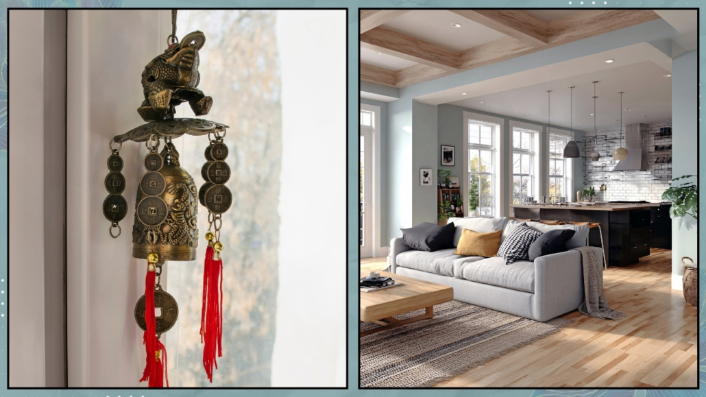
Wood and wicker, wool, velvet, cotton, and linen, not to mention stone, terracotta, and marble, are all natural and, therefore, healthy elements that promote well-being!

However, it’s also important to be mindful, whenever possible, of their sourcing and production processes.
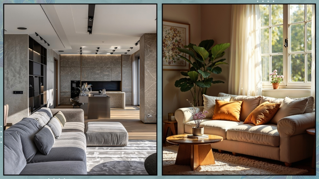
That is something we often overlook and also applies to the paints we use on our walls: some may contain harmful substances!

We discussed this with Carla Spessato, a green lifestyle mentor, here!

The right choice of materials will create healthy spaces that contribute to our overall well-being while also helping to protect the environment.

(credits: Sebastian Erras; artdecorationcrafting.gr)

– LIGHT/ILLUMINATION

It is scientifically proven that light plays a fundamental role in our well-being.

Studies show that the incidence of depression is significantly higher in Nordic countries compared to other places.

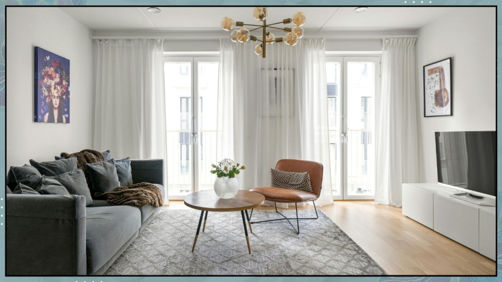
Therefore, maximizing natural light by keeping windows clean and using sheer curtains is paramount.

When the spaces are less bright, it becomes essential to use strategies like reflective colors, mirrors, and metals to expand light and increase brightness for less illuminated spaces.

Besides, it is also crucial to properly design artificial lighting using multiple light sources for visual comfort that promotes well-being!

Where possible, using dimmable lights would be ideal to adjust the atmosphere according to the moment’s needs.

(credits: Katke Zavese; Studio design HDm2)

– NATURE

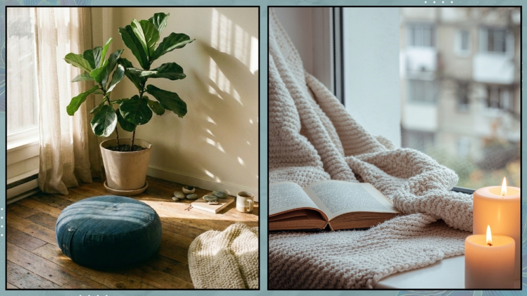
Feeling close to nature is another fundamental element in creating well-being spaces at home.

Having plants in various rooms is therefore essential!

Honestly, there’s no room – except perhaps for the storage room – that cannot have a plant, not even the bedroom!

Plants also have purifying qualities, which are very useful in our homes given, unfortunately, the pollution in our cities.

From a psychological perspective, caring for plants is also essential for relaxation (We discuss this in our guidebook with Dr. Francesca Basile and myself).

If you find it difficult, you can always use some succulents or place branches or leaves in vases, for instance, the Monstera leaf, which lasts a long time.

Finally, even if they lack purifying properties, you can also use artificial plants, as long as they are high quality and look realistic.

The mind won’t see the difference, so you’ll still benefit from the calming and relaxing properties!

(credits: Brianne Penney; westwing.it)

– FURNITURE PLACEMENT

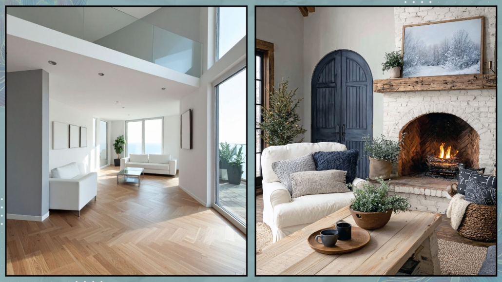
For well-being spaces, the various rooms mustn’t be too cluttered with furniture and objects, as this can create an unconscious feeling of suffocation.

That doesn’t mean minimalism at all costs, especially if that’s not your style, but as much as choosing things that are functional and meaningful to you!

Additionally, everything must be positioned so that it’s accessible.

Passages and pathways should be free from obstructions and “fluid.”

That is fundamental also in feng shui because it allows fair energy to flow freely.

(credits: pure salt interiors; @reserve_home)

I hope you enjoyed this article and found it helpful.

If so, don’t hesitate to share it with someone you think might be interested; I would be honored, and it will help me get known.

If you feel that your home, or any part of it, doesn’t reflect you enough, don’t wait any longer: fall in love with your place again and book your consultancy!

Creating a home you love and making you feel good in an increasingly hectic and fast-paced world is essential.

It would be miserable and exhausting, in fact, to come home after a long day and not feel happy in your own space.

I often say that to recharge yourself fully, you should feel comfortable and safe at home.

Today, I want to share some tips that will help you create a home you love and that make you feel good!

– PLAN

The first thing to do is to plan your home carefully: understand how you want to use and live in each room so that you can buy furniture and accessories that are functional for that specific space.

It is paramount to have precise measurements to ensure furniture is proportionate so the room won’t look too crowded or empty.

At that point, deciding what kind of atmosphere you want to create in the home is essential so you can choose the appropriate styles and colors.

Then, creating a mood board, first a general one and then one for each room, is necessary so you can see that everything works together harmoniously and that there is a cohesive theme throughout the home!

Plan even if you already have a home but are not completely satisfied with it: you’ll know what you want to fix or change, and this will bring you enthusiasm, even if you could or would not do everything all at once!

(credits: canva)

– DECLUTTERING AND SIMPLICITY

We live in an age of rampant consumerism, and in our homes, we often accumulate everything and anything (though, fortunately, this isn’t the case for everyone).

One of the biggest challenges is often letting go!

However, having too many things in your home leads to two main problems:

– It makes it harder to keep things organized, and cleaning the house becomes longer and burdensome.

– With so many, too many, things around, our minds also feel “full,” overcrowded!

That creates a more or less unconscious sense of unease.

So it’s vital to simplify, only keeping what is truly necessary or holds particular meaning/value (and not just in economic terms).

Periodically, you should take a look at your surroundings and see if there are things you no longer use, no longer like: in short, things that no longer serve a purpose, and “get rid of them” (whether by selling, donating, or throwing them away!).

Doing this will create a physical space in your home and a mental one as well, making life feel lighter!

(Psychologist Dr. Basile and I have dedicated an entire chapter of our guidebook to decluttering you can find it on Amazon.)

(credits: canva)

– ORGANIZE

It’s not enough to have only the essentials to keep your home in order; everything needs to have its own place and be easily accessible.

Otherwise, things are likely to be left lying around.

Arrange things in a way that works for you so you’ll always know where to find them.

Try to organize closets, drawers, and pantries as well—you’ll find plenty of ideas on how to do this.

There are also many storage solutions and gadgets available that can help.

Just be sure to choose ones that are functional for your lifestyle and how you use your home; otherwise, you might get tired of them quickly and revert to old habits.

An example I often give is that there is no need to have a jar for every type of food in the pantry if you don’t have the time or patience to transfer everything each time.

It’s enough to have containers, perhaps baskets, where to store bags by category.

Organizing shouldn’t complicate your life – quite the opposite!

To have everything neatly arranged, orderly, and accessible calms the mind and brings a sense of peace, even if you’re not always aware of it!

(credits: ikea; Hgtv)

– SHOWCASE WHAT YOU LOVE AND MAKES YOU FEEL GOOD

It’s vital to display the things you love, as these items make you feel good and give you that sense of home!

If you’re a book lover, don’t just fill your bookshelf—create compositions with your favorite books.

For instance, you can place two or three on the coffee table, maybe along with a candle and another object (remembering to mix different shapes, materials, and sizes to create movement and rhythm!).

If you love to travel, you can create a space with the places you’ve visited mementos.

Or, you might want to create a beautiful photo gallery.

Feel free, if you have children, to put some of their drawings on the fridge. While it might not look like a “magazine home,” it brings joy, and that’s the only thing that matters most.

If you’re particular about keeping things tidy, you can always create an album with all their artwork and keep it proudly on display!

By showcasing what you love, everywhere you look in your home, you’ll find something that brings you joy!

(credits: canva)

– BRING NATURE INTO YOUR HOME

I know, I always say this, but it’s because it’s a significant point: nature relaxes us!

Try to incorporate natural elements into your furniture, textiles, and accessories.

Wooden furniture, natural fabrics, terracotta vases, and wicker baskets all help create a calming atmosphere.

And of course, don’t forget the plants!

Authentic plants are incredibly beneficial, as they purify the air, among other things.

But it’s also taking care of them—watering, repotting when necessary, and removing any dry leaves or flowers—that helps our minds relax.

While authentic plants are best, we’ve learned that if you don’t have a green thumb, it’s better to have a well-made artificial plant than a sickly real one!

Sick or dying plants, as you can imagine, can be depressing, so again, it’s better to have a quality fake plant than to be throwing out constantly real ones!

(credits: canva)

– BE GRATEFUL

This point might sound strange, but we are bombarded with images every day, and trends change incredibly fast.

It’s so easy to be attracted to these images and trends, and comparing our homes to them is a snap!

At that point, the desire to change everything can kick in, and dissatisfaction can take hold!

That’s why it’s paramount to look around you and be grateful for your home, what you have inside it, and what might have cost sacrifice to obtain—this will quickly restore balance.

It’s also good to remember that trends come and go, and the images we see are often carefully staged sets created just for the photoshoot.

This point inevitably ties back to the first one: if you’ve planned your home well, taking the time to understand your real needs and focusing on what makes you feel good, gratitude will come naturally!

(credits: canva)

I hope this article about creating a home you love and making you feel good has been helpful and enjoyable for you. If so, let me know in the comments!

Feel free to share it with anyone you think might be interested, I would be honored, and it will help me gain more exposure.

If you feel that your home, or any specific area of it, doesn’t reflect your personality enough, don’t wait any longer and book your consultancy!

Personalizing your environment is essential because it makes it unique and ensures that the spaces are sincerely welcoming and familiar, making your home an authentic support for everyday life!

A home is not just a place to live but a reflection of our personality, memories, and experiences!

Today, I want to emphasize the importance of personalization and provide tips on how to create spaces that speak about you and tell your story, highlighting your unique personality!

Why is it important to personalize your home?

– Expresses Your Unique Personality

Personalization, clearly, allows you to express yourself.

Your chosen objects and details reflect your tastes, passions, and unique style.

A personalized home is an extension of yourself!

– Creates Emotional Connections

Personalized spaces with objects that have peculiar and significant meanings create emotional connections.

These objects evoke memories, stories, and important moments of your life, creating a bond with the spaces that will truly feel like yours!

– Makes Your Home Unique

In an era where people often follow design trends, personalizing your home makes it authentically unique, just like you!

Personal and distinctive elements set your home apart from any other!

– Increases Comfort and Well-Being

I often say this: a home that genuinely represents you makes you feel at ease and happy!

A home that exudes your personality enhances your comfort and well-being, authentically supporting you in your daily life!

Now, let’s look at various ways to personalize your spaces.

– Photos and Memories

That is one of the simplest and most immediate ways to personalize your spaces!

Create a photo gallery wall with images of family, friends, important places, and moments.

You can use frames of different sizes to add some variation.

You can also choose frames of different styles and colors to create something original; in this case, to avoid it becoming too “noisy,” I recommend using images with similar colors!

If you are a travel lover, you can also dedicate a specific corner where, in addition to photos, perhaps collected in an album, you can display maps and items gathered from your various trips!

(credits: Boxerjam; Petra Bindel)

– Family Heirlooms

One way to make your home unique is to include furniture or items with a family history.

These kinds of objects add depth and history to your spaces.

Don’t worry if they don’t match your home’s style; bring them in and highlight them if you love them.

They will be the “unique piece,” perhaps the room’s focal point! The same goes for heirlooms such as clocks or kitchen utensils, even if they are a bit worn, that have been passed down from generation to generation!

(credits: Elizabeth Roberts Architecture; Aja della Mirusina)

– Books and Collections

Display your favorite books on open shelves or bookcases.

You can organize them by color, size, or genre, creating a functional and aesthetic library!

You can also create areas with small arrangements of objects to highlight your books (I can discuss how to decorate bookshelves if you’re interested).

If you collect items, whatever they may be, show them off proudly and find a spot in your home to display them!

Collections tell a lot about who you are and your passions!

(credits: Elle.com; Living Corriere – Dean Kaufman)

– Art and Decorations

If you love art, having some pieces like paintings, sculptures, or prints is a great way to personalize your home.

Choose pieces that inspire you and make you feel good!

If you like it, add some wall decorations as well, such as unique wallpaper, a tapestry, decorative mirrors, or even a mural – something that reflects your tastes and personality!

(credits: behance; futuristarchitecture.com)

– DIY Items

If you have creative hobbies like painting, ceramics, or embroidery, you can use your creations as decorations!

There’s nothing more unique than this!

These items will add beauty while also telling a part of your story.

You might consider commissioning custom-made furniture or objects if you are not very handy.

A handmade table or a personalized painting can make a difference and become a standout piece in your home!

(credits: Shutterstock; @thomas.melhorn)

– Personalize Functional Spaces Too

The kitchen and bathroom are often treated as separate environments focused solely on functionality.

While functionality is crucial and should be the priority, personalization is also essential.

In the kitchen, for example, you can use paintings and decorations just like in the rest of the house.

You can create beautiful compositions on shelves if you have them or on the countertop (of course, without cluttering it entirely!).

For example, you can place a set of unique cups next to the coffee machine!

Also, use quality towels, maybe colorful, to give that extra touch.

In the bathroom, you can also use paintings if you like, as you do in other rooms!

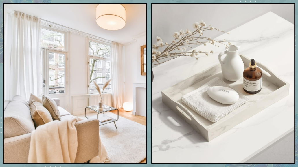
The essential goal is to transform it into a small oasis using soft and coordinated towels and maybe a few scented candles to create some atmosphere!

For an extra touch, you might also think about using artisan soaps!

(credits: woodsandivory.com; westwingnow.it)

– Natural Elements

Plants bring color and a bit of life into the home.

Choose plants that you like and that fit your lifestyle; you can even choose some that are particularly large and ornamental!

Don’t forget to use natural materials like wood, wicker, stone, and natural fabrics to create relaxing and cozy environments (as well as healthy ones!).

(credits: amdesigns.com; @indiebohonest)

Personalizing your spaces is truly important to create a home that isn’t just beautiful to look at but, more importantly, emotionally meaningful!

Every object and detail should tell a part of your story so that your home becomes a unique and special place for you.

Don’t be afraid to unleash your creativity and showcase who you are with purpose and awareness so that your home becomes the perfect reflection of yourself.

If you’re hesitant about how to proceed and need a hand, don’t hesitate to book your consultancy!

I hope this article has been helpful and enjoyable for you. If so, let me know in the comments!

Feel free to share it with anyone you think might be interested, I would be honored, and it will help me gain more exposure.

Today, I’m resuming the “design elements” series to talk about 10 beds you should know about!

Let’s take a look at them together!

– VANESSA BED

Designed by Tobia Scarpa and his wife Afra Bianchin when they were still students at IUAV in Venice in 1959 for Gavina and later Cassina.

Vanessa features a colored metal frame with stainless steel connecting elements, playing with the curves of the iron sheet, giving the structure dynamism!

It is a visually light bed that can be matched with many styles.

(Credits: Cassina)

– NATHALIE BED

Designed by Vico Magistretti in 1978 for Flou.

Nathalie can be considered the progenitor of upholstered beds with a removable fabric headboard and unmistakable side bows.

The headboard can be adjustable and also exists in a storage version.

It is an elegant and comfortable bed that adapts to any style!

Nathalie received the Compasso d’Oro for lifetime achievement in 2020, a first in history.

Additionally, it is protected by European Design Law, which recognizes it as a work of art!

(Credits: Flou)

– ASSEMAN BED

Designed by Patrizia Cagliani in 1984 for De Padova.

It is a canopy bed with a simple, slim, and minimal structure made of powder-coated steel tubing in matte white or black, with adjustable feet.

The headboard is composed of upholstered plywood panels covered in polyester velvet.

You can choose between a white cotton canopy tied at the sides or a tulle mosquito net.

(Credits: De Padova)

– OSPITE BED

Designed by Vico Magistretti in 1996 for Campeggi, this is a foldable sofa bed, perfect for those who love having guests but might not have much space!

Its design is refined, simple, discreet, yet robust and functional.

The frame is made of waxed maple wood with a blue bar, and the mattress is made of polyester padding in natural or orange cotton. In the latter case, it plays with the complementarity of orange and blue!

(Credits: Campeggi design)

– LOWLAND BED

Designed by Patricia Urquiola, the Italian-Spanish designer, in 2000 for Moroso.

It is a low bed with curved and organic lines featuring an upholstered, removable headboard and bed frame.

Essential, comfortable, and practical, it has a flexible headboard that can also be used as a support space.

It can only accommodate mattresses with standard European measurements.

(Credits: Moroso)

– FLUTTUA BED

Designed by Daniele Lago for his namesake company in 2004.

Thanks to its hidden structure, this bed appears to literally float in the air, giving the room a sense of lightness and spaciousness.

The platform rests on a height-adjustable central pivot and is fixed to the wall, ensuring solidity and sturdiness (it can support up to 140 kg).

These beds are customizable, allowing you to choose the headboard from wood, fabric, leather, or glass, along with an optional lighting kit for the platform that enhances the feeling of lightness and increases the bed’s spectacular appearance!

(Credits: Lago)

– COLLETTO BED

Designed by Slovenian designer Nusa Jelenec in 2009 for Lago.

This bed is a true nook, as you sleep enclosed by a soft barrier of plush foam surrounding the mattress.

This barrier, like the collar of a turtleneck, can be rolled up or down, fully or partially, allowing you to have a different bed each time you want!

(Credits: Lago)

– RUCHÉ BED

Designed by French designer Inga Sempé in 2011 for Ligne Roset.

This bed features a solid wood frame with a headboard and bed frame upholstered with a quilt featuring interrupted square stitching, reminiscent of the design used the previous year for the namesake sofa.

It is available with either a low (85 cm) or high (110 cm) headboard.

(Credits: Ligne Roset)

– PAPILIO BED

Designed by Japanese designer Naoto Fukasawa in 2013 for B&B.

This bed features a fluid and harmonious design, echoing the shape of the chairs of the same name, although the headboard is slightly less conical, yet still enveloping.

The mattress nearly aligns with the frame to emphasize the rigor of the ensemble.

It is available in fabric or leather upholstery options!

(Credits: B&B)

– BLANKET BED

Designed by Alessandro Busana in 2017 for Bonaldo.

This bed resembles a quilt that unfolds from the base of the bed to roll up then and define the headrest!

“Making a bed comfortable, even at a perceptual level, seemed to me an essential starting point. Hence the choice of the blanket for everything it represents in our imagination,” explains Busana.

The bed has a wooden and metal structure upholstered in padded fabric.

(Credits: Bonaldo)

I hope this article has been helpful and enjoyable for you. If so, let me know in the comments!

Feel free to share it with anyone you think might be interested, I would be honored, and it will help me gain more exposure.

If you feel that your home, or any specific area of it, doesn’t reflect your personality enough, don’t wait any longer and book your consultancy!


If you like here it is “the design elements series“!

According to feng shui, the entrance of a house is truly the most significant area of a home!

The reason is quite simple: the entrance is where energy enters, and we must ensure that it enters correctly and, above all, that only positive energy comes in.

The entrance is the transitional area that connects the interior and exterior, and it must be welcoming and “inviting” so that good energies, as well as the people and opportunities we desire, can enter.

Entrance is the house’s calling card aesthetically but also energetically!

The whole house and its inhabitants will likely be affected if the entrance is dark and cluttered.

To have an inviting entrance for good energy, you must start from the outside, taking care of the front door, regardless of whether or not it is part of a condominium.

Often, in front of the door, we only have the classic doormat: according to feng shui, we should have something that can protect the entrance and, at the same time, bring good fortune!

Ideally, two objects should be on either side of the door, such as two plant pots.

If space is limited, you could place something above the door (like a wind chime or dreamcatcher).

(credits: Taylor Lombardo Architects; Vivere lo Stile)

Now, let’s step inside!

– LIGHTING

The entrance needs to be bright to be inviting.

Where it is not possible to take advantage of natural light, it is a good idea to investigate good artificial lighting using multiple light sources (perhaps a lamp on the console table).

If the entrance opens directly into the living room, consider the possibility of a small false ceiling where you could install recessed spotlights, ensuring good lighting.

(learn more about lighting here!)

(credits: Anderson Leite; fiorentini-casapesaro)

– ORDER AND CLEANLINESS

The entrance must be clean and tidy to welcome guests and energy, for the better!

Everything should be well-organized, even the tiniest entrance.

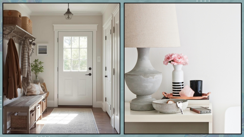
You need a surface to place your keys (even a simple shelf or a hanging drawer).

Something to hang jackets on and maybe a shoe cabinet!

Removing your shoes as soon as you enter would be ideal to avoid bringing dirt and negative energy into the rest of the house.

You might consider a small pouf and some neatly arranged slippers nearby, whenever that’s not possible.

That way, when you arrive, you can sit down to take off your shoes, put on the slippers, and store them where they belong!

(credits: shopltk.com; Jessica Sara Morris)

– PAY ATTENTION TO THE FLOW

Energy must move freely and, once inside, distribute itself throughout the house.

Make sure there are no elements that can obstruct this movement!

Place a rug in the entrance to create a gathering area where the energy can slow down before flowing through the entire house.

(credits: rhinov.fr; indie.boho.nest)

– COLORS

We repeat it every time: colors have a psychological power, more or less unconscious, now scientifically recognized.

Feng Shui also acknowledges the energetic power of colors.

Each color is associated with one of the five elements (water, wood, fire, earth, and metal).

Each element corresponds to a specific energy:

Shades of green, the wood element, are associated with growth and financial well-being.

Reds, oranges, pinks, and purples, the fire element, are associated with fame and recognition.

Browns, beiges, and yellows, the earth element, are associated with stability and solidity.

Blues and blacks, the water element, are associated with travel, both physical and personal evolution.

Whites and grays, the metal elements, are associated with creativity and leadership.

It is vital to choose colors that enhance the energy you need.

(credits: tinnappelmetz.com; Michael Clifford design byMoksa Studio)

– MIRRORS

It is essential to have a mirror at the entrance to give yourself a final check before leaving and to allow guests to do the same when they enter.

However, be careful not to place the mirror directly facing the door, as it would reflect the energy back!

It’s better to place it on one of the adjacent walls so it will bounce the energy around but still keep it inside the house.

(credits: chrislovesjulia.com; c1studios.com)

– NATURAL ELEMENTS

It is paramount to have natural elements in the house, even for feng shui.

In the entrance, they enhance the connection between the outside and inside and infuse the space with vitality, invigorating the energy that enters the house.

Wooden furniture, baskets, and, of course, plants are a must at the entrance!

(credits: Jay Wilde; elmueble.com)

I hope this article about a feng shui entrance has been helpful and enjoyable for you. If so, let me know in the comments!

Feel free to share it with anyone you think might be interested, I would be honored, and it will help me gain more exposure.

If you feel that your home, or any specific area of it, doesn’t reflect your personality enough, don’t wait any longer and book your consultancy!

Should interior design rules always be followed to the letter to create harmonious environments that represent us?

I would dare say no!

While it’s true that general interior design rules can indeed provide an excellent starting point, it’s equally correct that they often need to be broken!

Only then can the home reflect us deeply and be supportive in our everyday lives.

Let’s look at some “rules” that we can, if not should, break!!!

1 – DO NOT MIX WOOD TONES

Avoiding mixing wood tones has been a must for quite some time, and even today, when it comes to wood, there are countless uncertainties.

Even those who love it often hesitate to use it because they fear creating a disharmonious environment.

And indeed, if one is not careful and uses wood tones “randomly,” the result may not be optimal!

At the same time, having only one essence first is almost impossible, even if you buy everything you need in the home, from materials to furniture, from a single place.

But, assuming you could, honestly, the environment might be a bit flat and monotonous.

Therefore, try not to mix more than three different wood tones but you can bring distinct types of wood into your home with due care.

If you want to know more, I recommend watching the video where I discuss this topic (if you prefer to read here is the article)!

(credits: Kindred Homestead; Milk magazine)

2 – DO NOT MIX DIFFERENT METALS

That is another myth that had been taught to me as well!

But just like with wood, sticking to only one metal risks leaving rooms without character!

In fact, it misses the opportunity to create some rhythm and movement.

Of course, one must avoid the opposite, which is an environment that’s a bit too noisy!

The magic word, as always, is balance: choose two or at most three metals and then mix them in a balanced manner.

If you want to learn more, I’ve dedicated an entire video to metals (here is the article if you prefer reading)!

(credits: interiors by Lindye Galloway Interiors and photography by Chad Mellon Photography; Studio Mcgee)

3 – BUYING EVERYTHING COORDINATED

There’s nothing wrong with buying everything coordinated (usually the bedroom and the living room), but in reality, it misses the opportunity to express oneself best!

Furniture stores often present various setups with coordinated elements, which, let’s admit, are also visually appealing, but they lack true personality!

So don’t be afraid, for example, in the living room, to choose a table with chairs of different materials, and maybe even different from the console or any TV wall unit!

In the bedroom, wardrobe, bed, nightstands, and possibly a chest of drawers can all be different!

Of course, one shouldn’t choose them randomly; they should “speak” to each other, but they can have distinct shapes, colors, or materials!

Let’s focus on bedside tables for a moment.

In the past, I’ve mentioned that the two bedside tables don’t need to be identical and that you can use different bedside tables with the necessary attention for a harmonious space.

While this remains true aesthetically, it becomes a Feng Shui mistake if you desire an equal partnership as a couple!

So, if you believe in energies, like me, and how shapes, colors, and materials can influence us and want an equal relationship, opt for two identical bedside tables!

You can still choose not to coordinate them with the rest of the furniture!

(credits: bloglovin.com; ragusa.com)

4 – ALL CHAIRS THE SAME

In the previous point, I mentioned the possibility of choosing chairs not coordinated with the table.

But it’s also possible to choose chairs that are different from each other!

They can be the same chairs with different colors or even different in shapes and materials!

That adds some movement and character to the room!

Of course, one should consider the home’s overall style and what they want to convey, but it’s absolutely feasible!

A table with different chairs could become the focal point of the room!

(credits: @solebich; Showhome.nl)

5 – MIXING OLD AND NEW

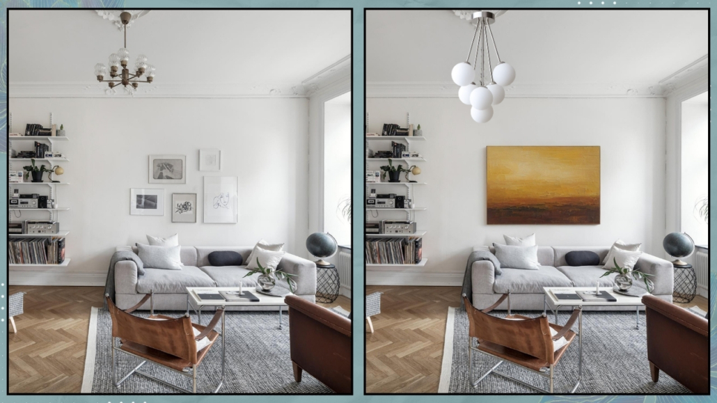
Why shouldn’t you incorporate modern elements into a predominantly classic environment?

Or vice versa, why not add something antique to a modern/contemporary space?

On the contrary, this mix can create atmospheres full of character!

For instance, modern lighting in a classically furnished room creates an attractive and unexpected contrast.

Similarly, placing an antique table or sideboard in a modern/contemporary setting adds a touch of elegance and “importance”!

(credits: living.corriere.it; Alvhem)

6 – USING LIGHT COLORS IN SMALL SPACES

Light colors certainly make a room feel airier and may appear hugger.

But, by now, we know that dark colors create a more intimate and cozy atmosphere!

Additionally, they add depth, so they won’t necessarily shrink the room if there’s uniformity among floors, walls, ceilings, and furnishings!

Especially in bathrooms and bedrooms, even if small, one can absolutely choose dark colors!

(credits: dezignark.com; ikea)

7 – HANG ON WALLS PAINTINGS AND MIRRORS

There’s a tendency to always hang mirrors and paintings on walls.

There’s nothing wrong with that, of course.

But why not lean some against the wall or on a console?

Especially when they’re of medium to large size, they can create an unusual arrangement that makes the space more original, less “rigid”!

(credits: Scout & Nimble; sawdust2stitches.com)

8 – EVERYTHING MUST BE SYMMETRICAL

While it’s true that symmetry is something that calms the mind and pleases the eye, it’s also true that too much symmetry can become annoying and even sterile!

While we’ve mentioned that, at least from a Feng Shui perspective, bedside tables should match, it doesn’t mean that decorations on the wall above the bed must be symmetrical!

It’s paramount to balance visual weights well, and while symmetry is undoubtedly one way to do that, it’s not the only way!

Different sizes and colors are other valid ways to balance everything effectively!

(credits: Knoll; glamorous-design.com)

As mentioned before, interior design’s rules are the starting point, but one needs to modify and review them to create a home that truly represents you.

A home tailored to you, where you can’t wait to return to find and be yourself, a home that supports you every day!

I hope this article has been helpful and enjoyable for you. If so, let me know in the comments!

Feel free to share it with anyone you think might be interested, I would be honored, and it will help me gain more exposure.

If you feel that your home, or any specific area of it, doesn’t reflect your personality enough, don’t wait any longer and book your consultancy!

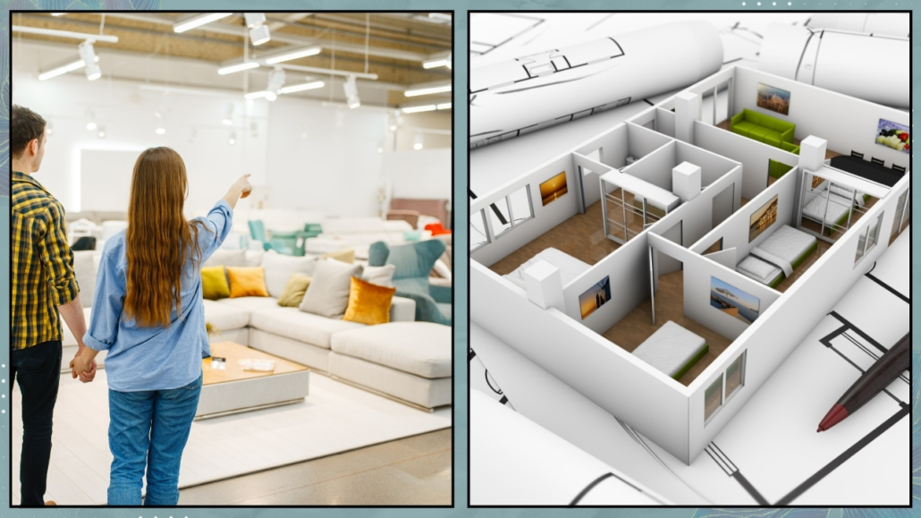
Furnishing a home without a design is one of the biggest mistakes you can make when setting up a home.

That is because the result may not be what you desired, aesthetically and, more importantly, functionally!

And this could cost you dearly, financially, but mainly in terms of well-being!

Let’s go through together the most common mistakes made when not planning.

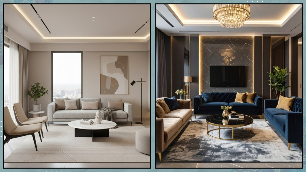
– LACKING A BIG PICTURE VISION

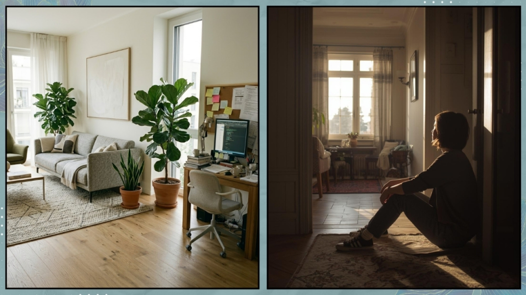
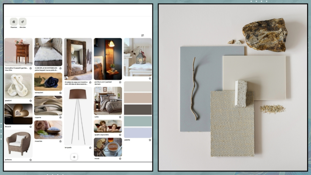
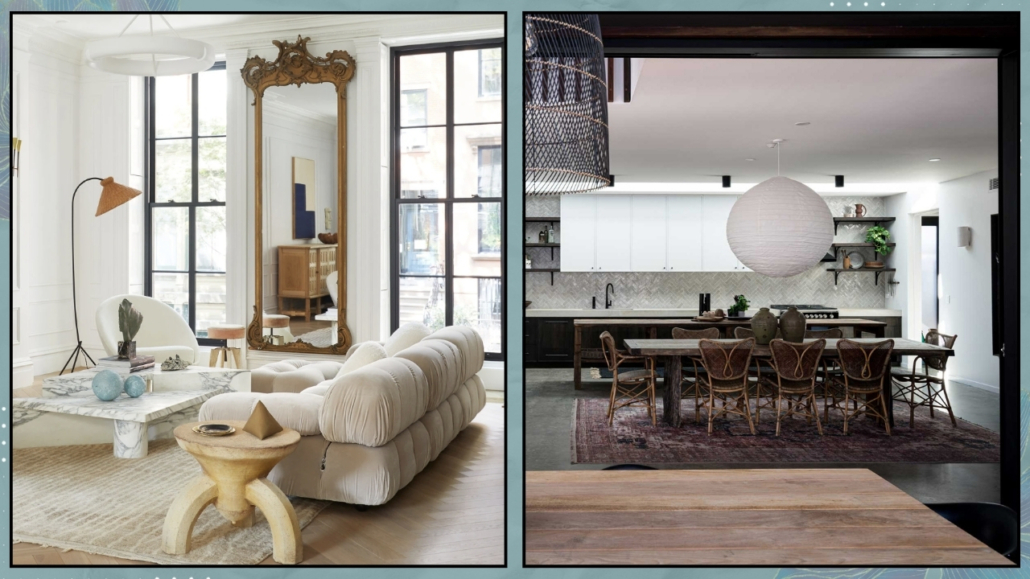
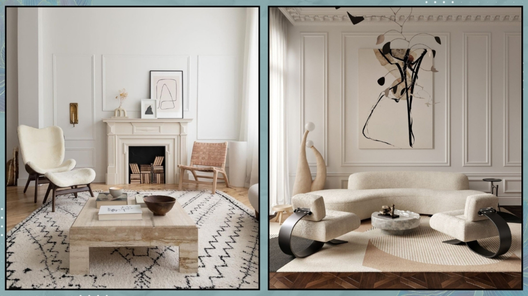
By “big picture vision,” I don’t mean knowing precisely which elements you want to have, but rather the mood you want to create in the house.

It’s essential to start gathering some images that inspire you about environments!

You can create a folder on Pinterest or your computer.

Once you’ve collected them, use programs like PowerPoint or Canva to see them all together and see what you like or don’t.

What do the various images have in common? It could be the color palette or the style.

If the feelings you experience when looking at those images are what you want to feel in your home, then you’ve found your general idea and can delve deeper into the details!

The big-picture vision is also helpful for the future.

In fact, for a thousand reasons, you might decide not to buy everything at once, but with this big-picture vision, you’ll always stay focused on the “goal”!

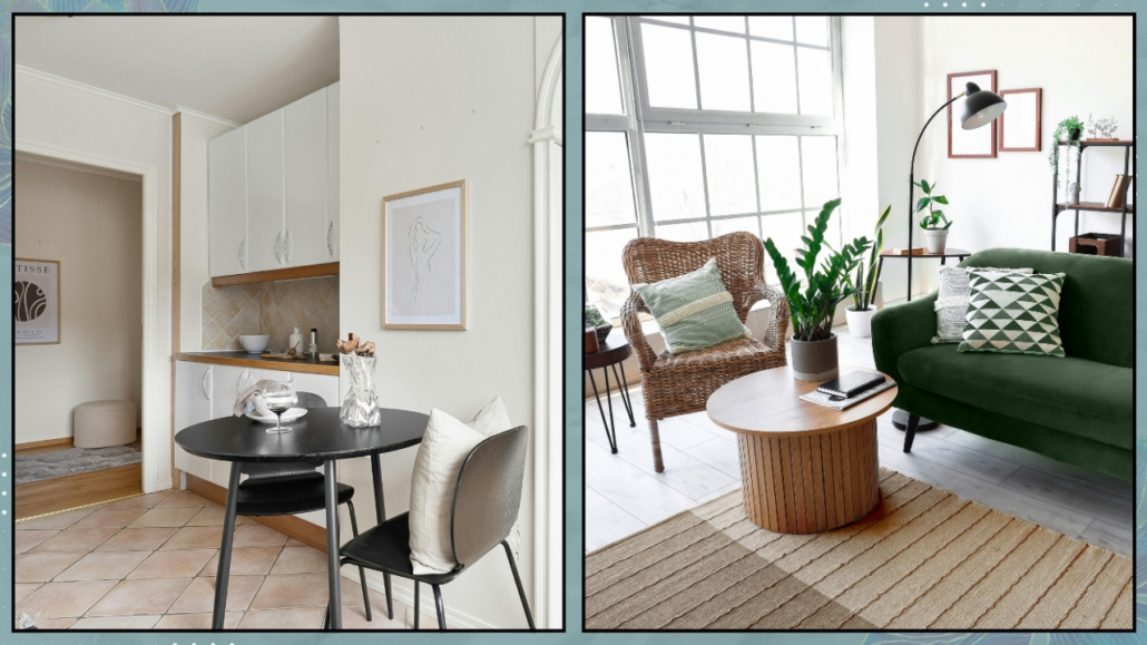
Starting from this perspective, as you find the items you would like to purchase, you will create a specific mood board, placing those items close together to see whether or not they meet the initial vision.

(credits: viverelostile; Knoll)

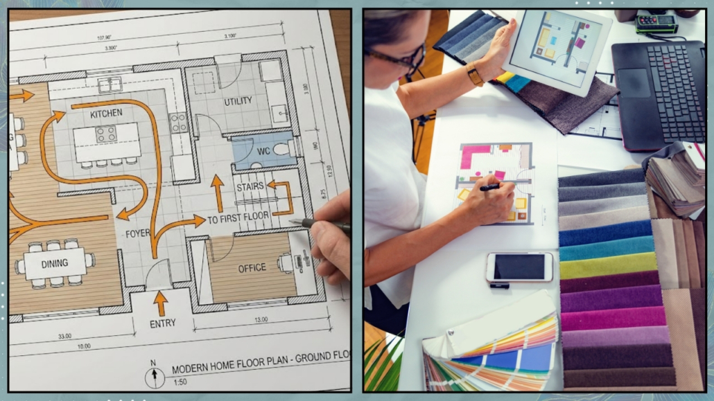
– NOT TAKING MEASUREMENTS.

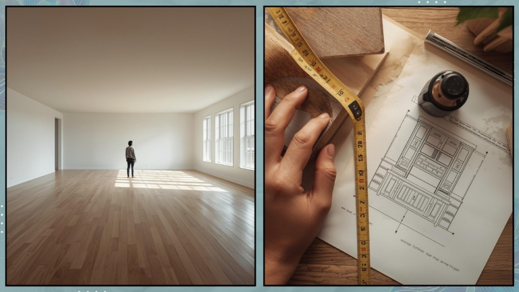
I’m sure you’ll take the room’s main measurements, like the length, width, and height.

And you’ll also measure the encumbrances of doors and windows or any architectural elements. However, what is not always considered is how to relate the elements to each other afterward. Let me explain better: it happens that if a three-meter sofa fits on paper, one might not think about how well it will work once other furniture is added!

I say this from personal experience: in my first home, I bought two sofas, one three-seater and one two-seater.

On paper, I could have placed them in an L-shape, but in reality, the space became cramped and poorly usable.

I resolved it by placing them facing each other, but if I had taken better measurements, maybe instead of one of the sofas, I could have gotten armchairs!

It might have even cost me less, but more importantly, I would have created the conversation area as I wanted and wouldn’t have been forced to put the TV in the corner!

The space would have felt lighter and definitely more usable.

It’s also paramount to see where the outlets are to avoid covering any of them!

There are other vital measurements to consider as well, which I’ve discussed here.

How can you ensure buying proportionate elements and maintaining good use of space?

Obviously, there are design programs like SketchUp or Homestyler, but it could become lengthy and complicated if you’re not skilled with them.

As mentioned other times, the best, simplest, and cheapest way is to draw the dimensions with paper tape!

You’ll immediately see if you can move comfortably between the various elements!

(credits: optimaproperties.com; thesunnysideupblog.com)

– MAKING IMPULSIVE PURCHASES

It happens to see a piece of furniture or an accessory in a store, fall in love with it, and, on impulse, buy it.

Then, you bring it home only to discover that it doesn’t fit with the rest or doesn’t fit because it’s too big.

That can happen if you skip the two previous points!

But once you’ve bought it, what do you do? You can’t always return things!

When you see something you like, look at your mood board and see if it fits well with the rest.

If something doesn’t quite match, ask yourself what it is: the shape or the color?

Then look if there’s something similar that actually makes sense with the rest.

After doing this, don’t forget to check the measurements: think about where you’d like to place it and see not just if it fits but if it risks suffocating the space or, conversely, getting “lost”!

(credits: camillestyles.com; leclairdecor.com)

– BUYING IN HASTE

The urge to have everything immediately is a bad advisor.

You risk buying something because it’s “necessary,” like a sofa, but in the end, it’s not the right one for a thousand reasons.

Don’t buy something just because you need it without being absolutely convinced and without checking, as mentioned earlier, that it aligns with your vision!

Once you’ve made the purchase, especially if it’s significant, you won’t change things immediately, and you’ll end up with a home that doesn’t fully represent you.

I know you can’t wait to have the house of your dreams, but take your time to make conscious purchases that are functional and represent you.

Only then will the house truly support you!

(credits: at_lucys_house; westwing.fr)

– BUYING EVERYTHING BEFORE LIVING IN THE HOUSE

That ties back to the previous point of wanting to have everything immediately!

Apart from the risk, as mentioned earlier, of buying things that don’t fully represent you, it could lead you to buy “unnecessary” or less functional items!

There’s nothing like living in the house to understand what you REALLY need absolutely!

While a bed and kitchen are essential, paradoxically, the rest can be acquired even after you’ve moved in!

It might sound extreme in the opposite sense now, but the reasoning should be: what can I absolutely not do without?

Start from there, looking for items that align with your mood board and the measurements of the house.

Then, enter the home, live in it, and furnish it by truly tailoring it to you!!

(credits: urbanoutfitters.com; obsessed4interiors)

I hope this article has been helpful and enjoyable for you. If so, let me know in the comments!

Feel free to share it with anyone you think might be interested, I would be honored, and it will help me gain more exposure.

If you feel that your home, or any specific area of it, doesn’t reflect your personality enough, don’t wait any longer and book your consultancy!