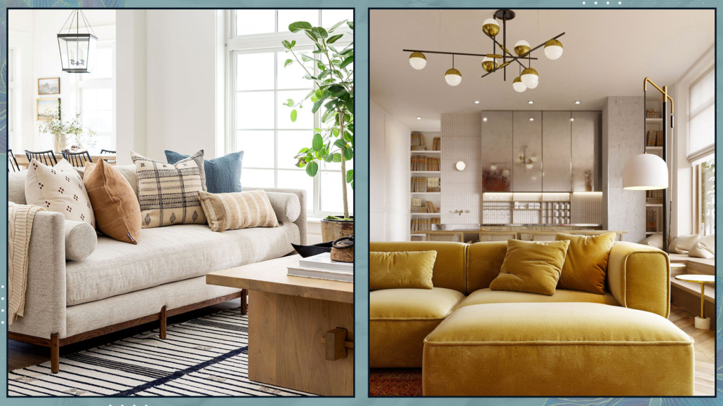
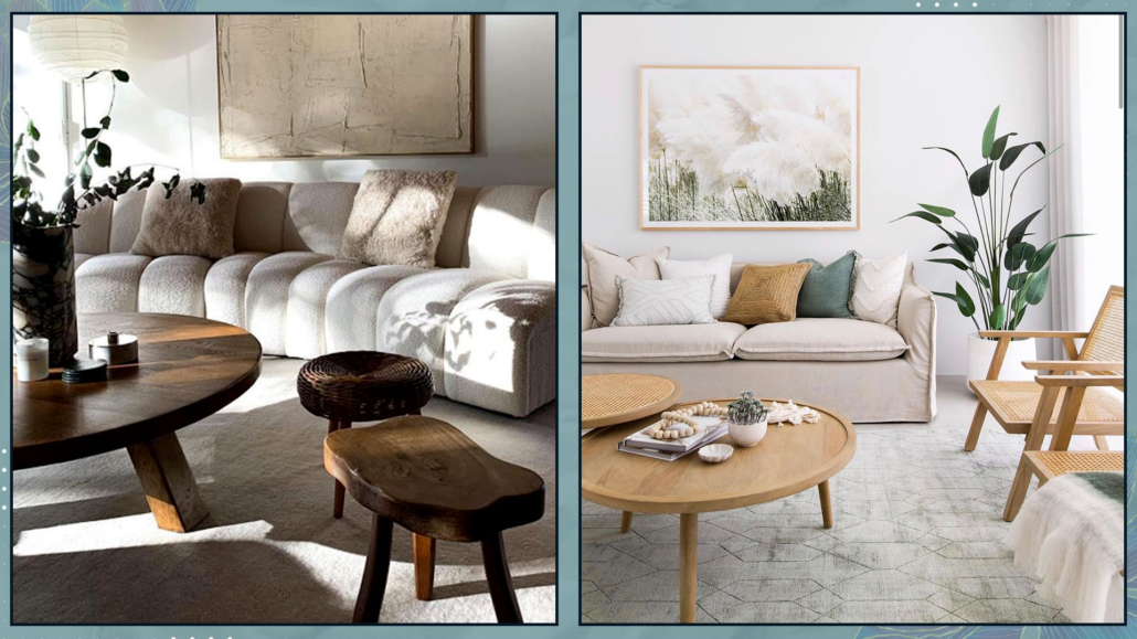
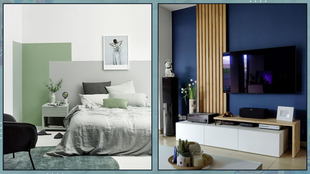
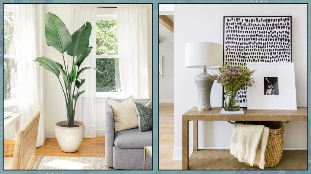
Posts

Lately, especially during the live sessions with Dr. Francesca Basile, I’ve been talking about change and the importance of improving our spaces so they can always support us!

However, often, when we want to make changes to our home, we don’t know where to start!

In fact, we’re so used to our spaces that we don’t know what needs to change!

We could say we’re accustomed and don’t notice things anymore because they’ve “always been that way,” and we’ve lived with them well (or almost)!!

But if you want to freshen up your home, you should look at your spaces with different eyes!

To do this, it’s helpful to enter each room as if it were the first time, with paper and pen, and ask yourself a series of questions!

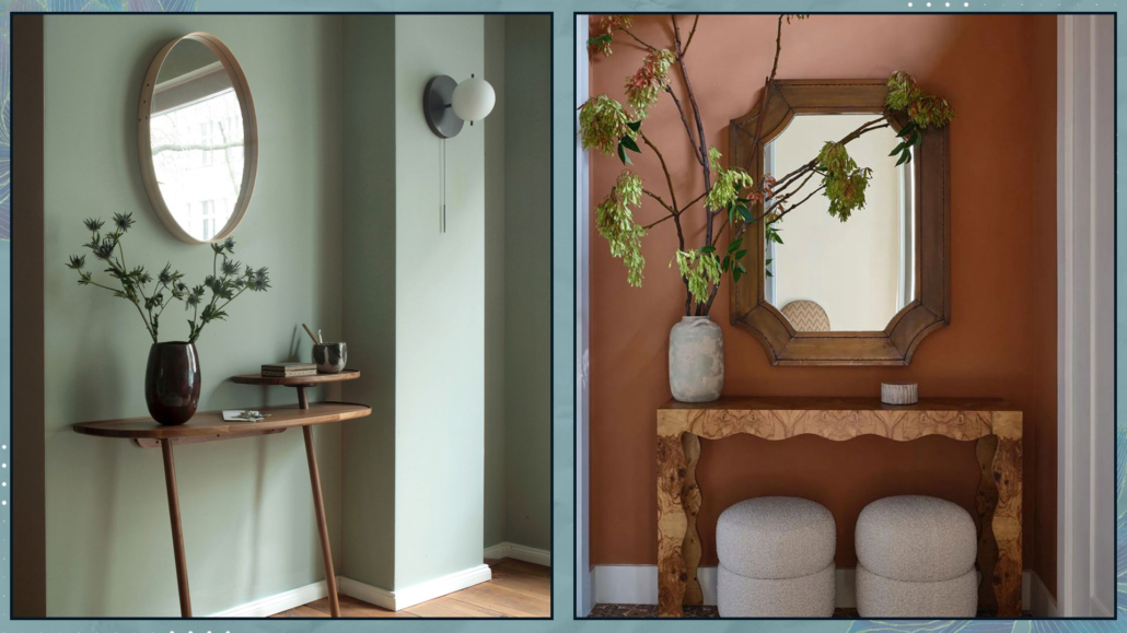
– WHAT’S THE FIRST THING I SEE WHEN I WALK IN?

Take note of what catches your eye at first; naturally, there’s no right or wrong answer!

It could be a painting, a console, a simple vase, or a photo frame!

Now ask yourself: “Is this what I want people to see first?”

While it’s correct that your home should represent you and please you, it’s equally true that if there’s something you don’t like, you might avoid or limit invitations because of it.

Moreover, if you don’t want it to be the first thing people see, actually, you don’t want it to be the first thing you see, either!

(credits: Scout & Nimble; etsy.com)

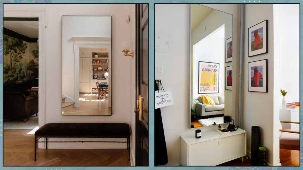
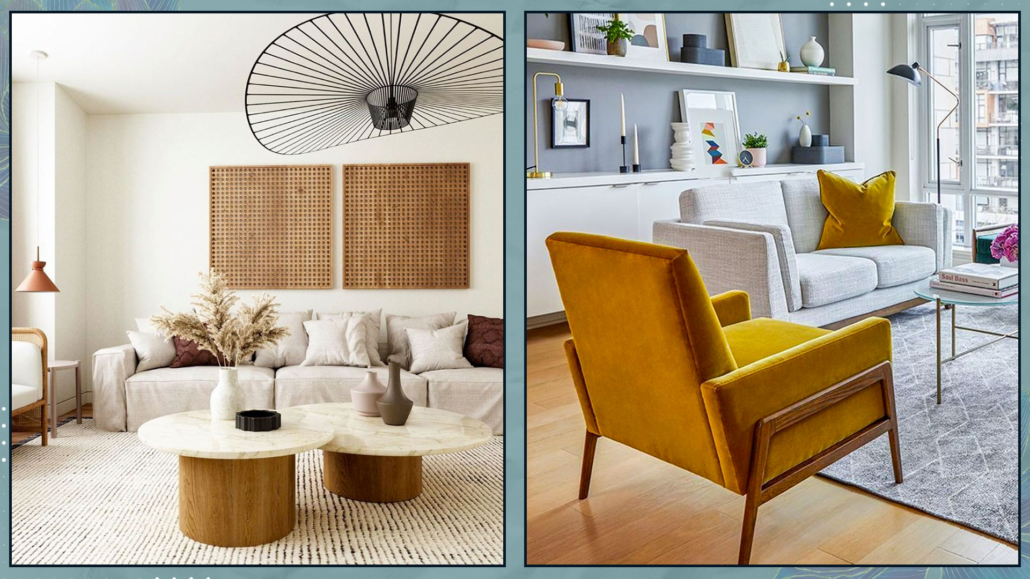
– IS THE ROOM AIRY AND BRIGHT OR DARK AND “DEPRESSING”?

No matter how small the room may be, it should give a sense of spaciousness and be as bright as possible!

Not all rooms have abundant natural light, but as mentioned other times, there are many tricks to “brighten it up.”

Primarily, use mirrors, then glossy surfaces and metals, which are elements that best reflect light!

(credits: puresaltinteriors.com; realestate.com.au)

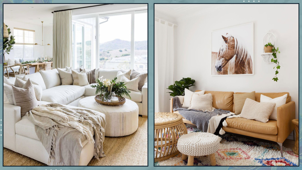
– IS IT A WELCOMING AND INVITING ENVIRONMENT OR COLD AND “REPELLENT”?

Take a critical look at your surroundings and answer honestly.

You should feel welcomed, embraced, and immediately at ease when you enter different rooms.

If this isn’t the case, try to think of those things that would make you feel better.

It could be changing colors, using textures and materials, or personalizing with some unique objects or decorations!

(credits: @indiebohonest; marianaorsi.com.br)

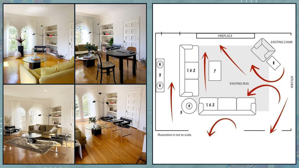
– DOES THE GAZE FLOW SMOOTHLY THROUGHOUT THE ROOM, OR IS SOMETHING BLOCKING IT?

It’s crucial that when entering a room, the gaze can flow freely throughout the space.

That creates an unconscious pleasure in the mind, promoting relaxation.

There may, indeed there should, be a focal point that draws more attention, but generally, the gaze should be able to move without any “obstacles.”

Therefore, it’s advisable to remove or rearrange anything that might somehow hinder this flow of vision!

(credits: Becky Shea Design; Rafael Soldi)

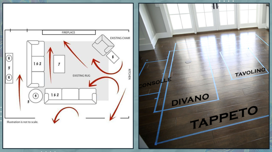
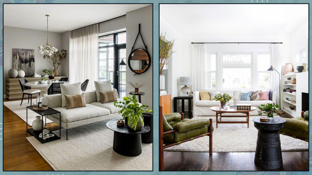
– ARE THERE VISUALLY HEAVIER AREAS?

Check that there are no areas where all the furniture is too clustered and others empty.

Having everything placed only on one side of the room creates an imbalance that leads to an unconscious discomfort in the mind.

It’s good to balance visual weights and play with heights for the same reason!

Moreover, this will also help with the previous point, as it will aid in the flow of the gaze!

(credits: johnlewis.com; ruggable.com)

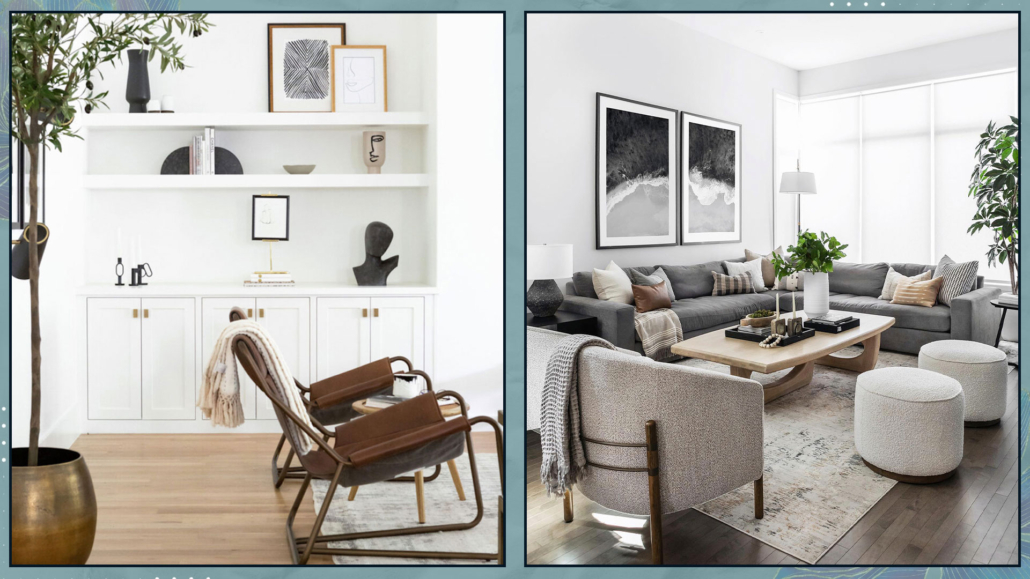
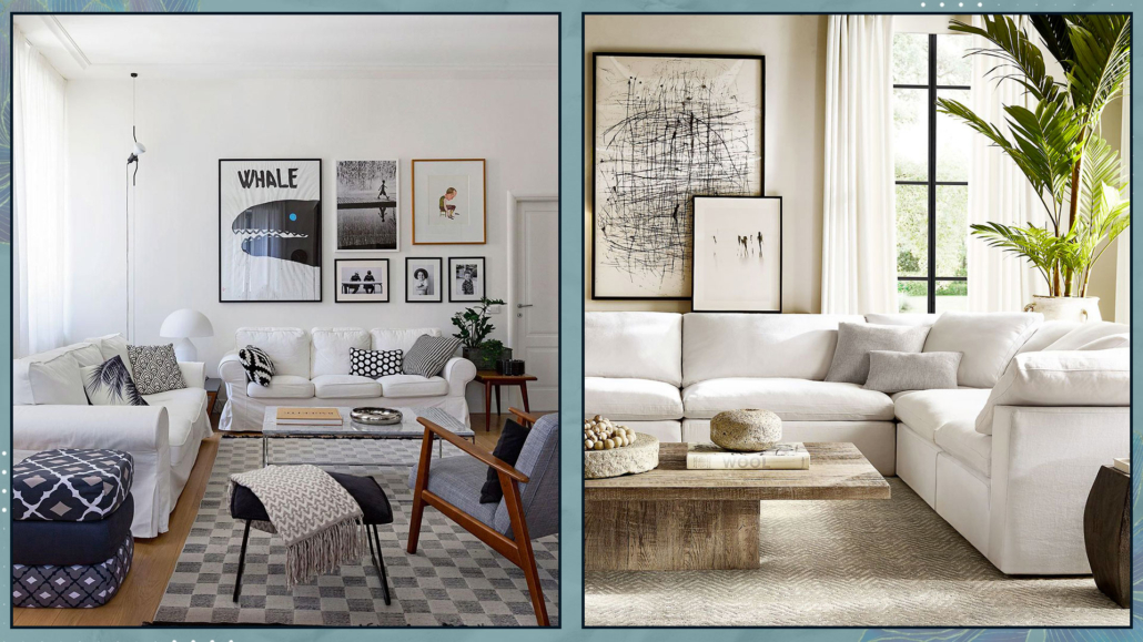
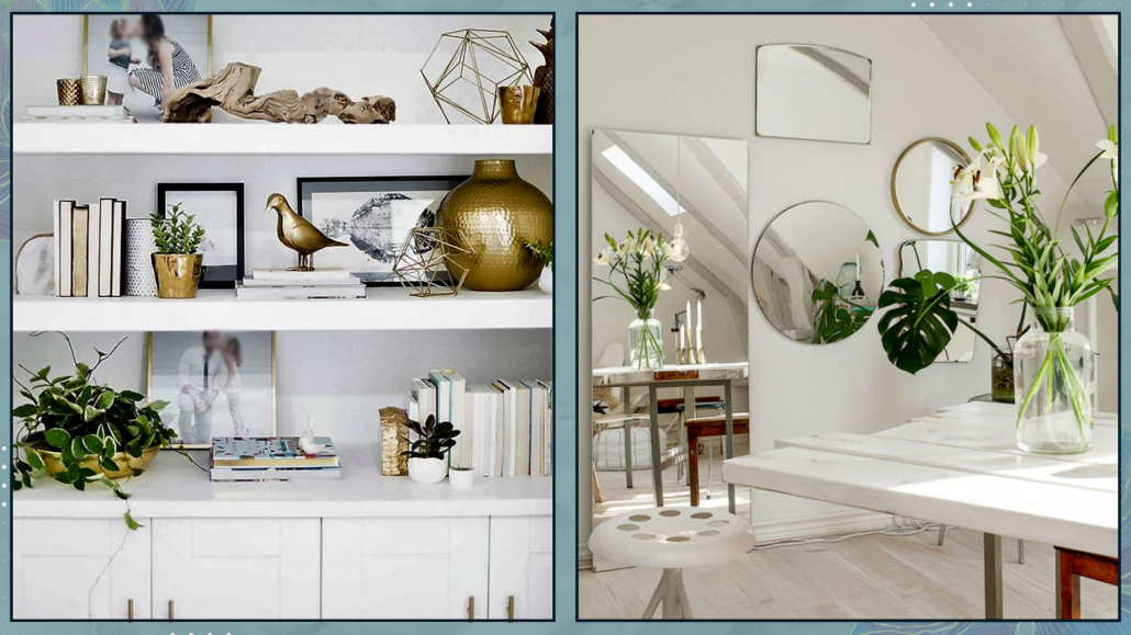
– WALL DECOR… IS IT TOO MUCH OR TOO LITTLE?

The walls are also crucial, and walls too crowded with photographs and paintings can feel suffocating!

While it’s true that empty spaces are necessary to provide breathing room, it’s equally accurate that completely empty walls can appear sad!

In addition to the number of decorations, be mindful of their sizes; everything should be proportionate: decorations that are too small will get lost, and those that are too large will dominate.

Choose elements that represent you, that hold meaning for you, and, of course, harmonize with the chosen style and colors!

(credits: cose di casa; rh.com)

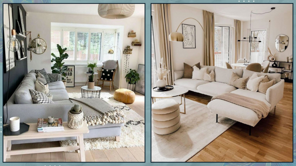
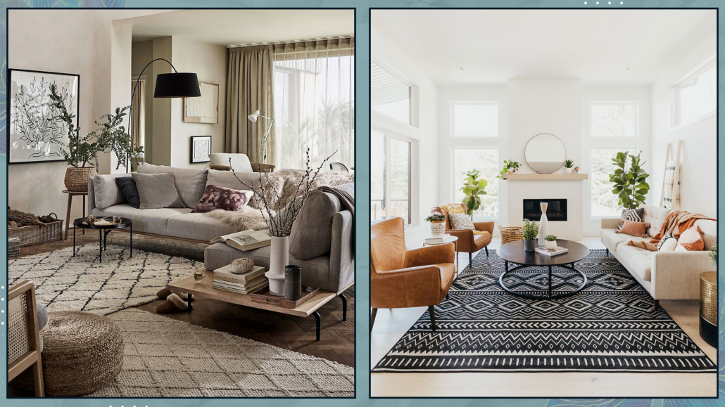
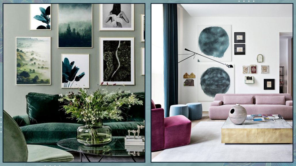
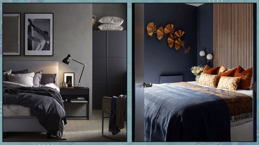
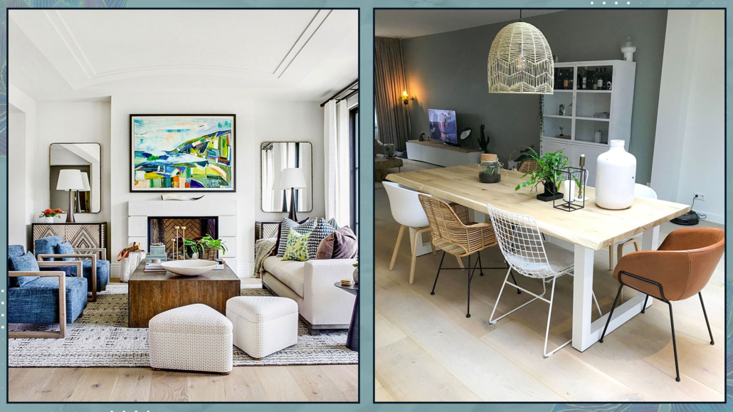
– ARE THE COLORS IN THE ROOM MONOTONOUS OR VARIED?

Speaking of colors, does your palette appear varied and harmonized or flat and monotonous?

Colors must create play and contrast to add movement and rhythm to the room.

Even if you choose a monochromatic palette, playing with the same color’s saturations, shades, tones, and nuances is paramount!

If you have more than one color, following some precautions is paramount, I discussed it here.

(credits: posterstore.co.uk; Meridiani living)

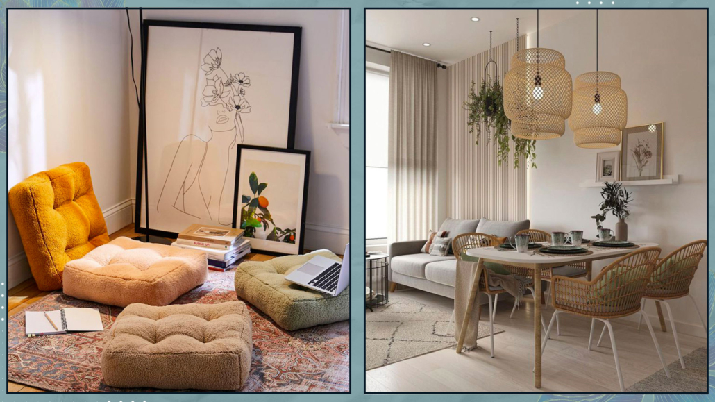
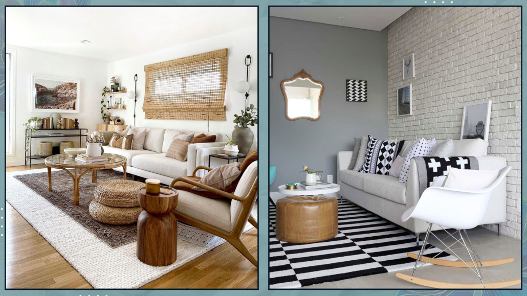
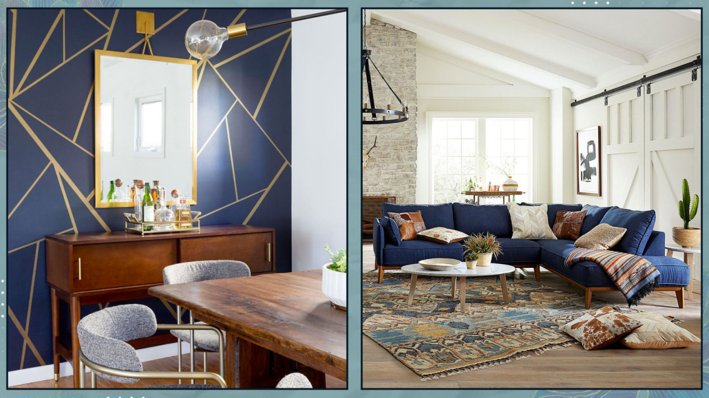
– ARE THERE ANY PATTERNS AND TEXTURES, OR DOES EVERYTHING SEEM A BIT FLAT?

In addition to playing with various color saturations, everything mustn’t be smooth and solid-colored, as the environment would appear somewhat flat.

You can use patterns or textures on walls, perhaps with wallpaper!

If that seems too much, use them on curtains, rugs, cushions, armchairs, and even sofas!

There are also some slight considerations regarding pattern combinations for a harmonious and pleasant result, which I discussed here!

(credits: Jenn Feldman; furniture jolene-113)

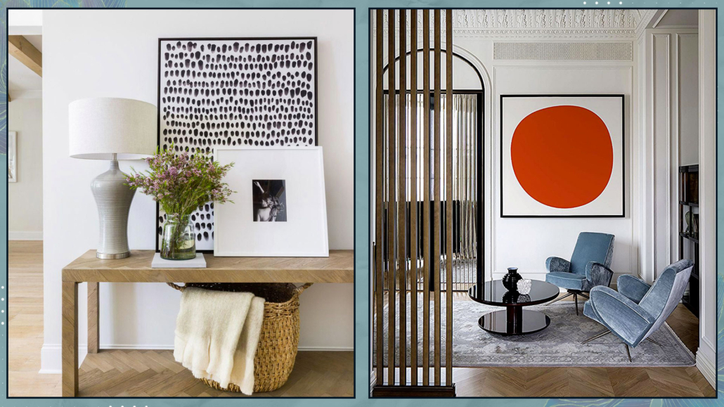
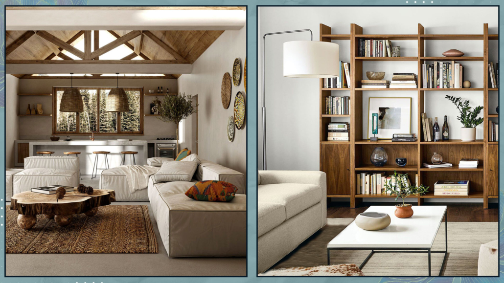
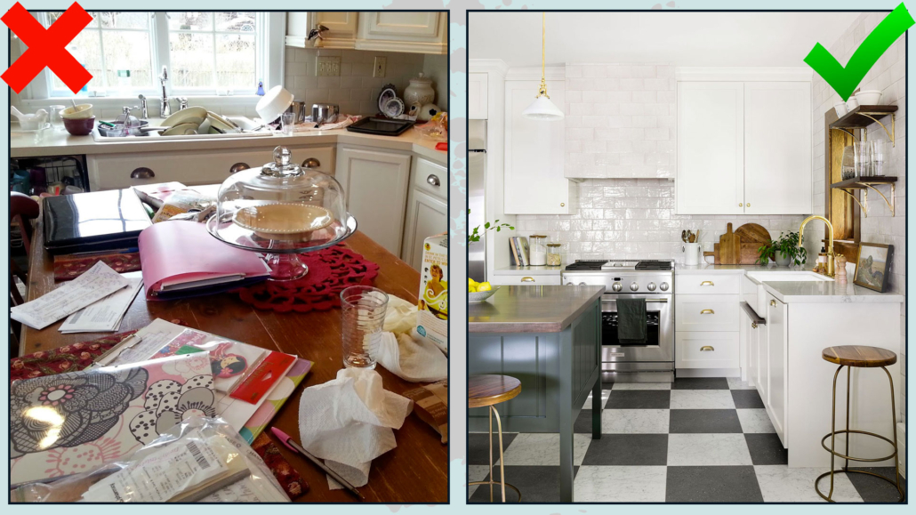
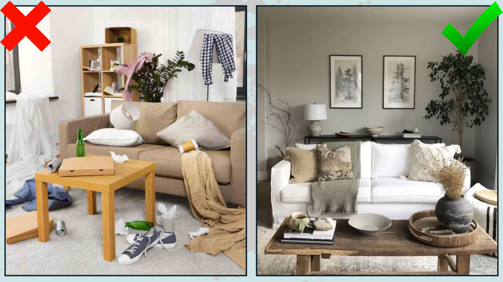
– IS THE ROOM NEAT OR A BIT CHAOTIC?

Clutter isn’t ideal for beautiful, harmonious, and relaxing spaces; we’ve said it other times.

Check to see if there are things around that would be better stored away; perhaps you need to add a few more storage elements.

They could be baskets that, moreover, will decorate, add textures, and “warmth” to the environment!

By clutter, I also mean the visual clutter of a room that may be too full of furniture or objects.

Evaluate critically if there’s too much and if you might feel a bit “overwhelmed”; if so, try to remove some!

(credits: yanaprydalna.com; kassavello.com)

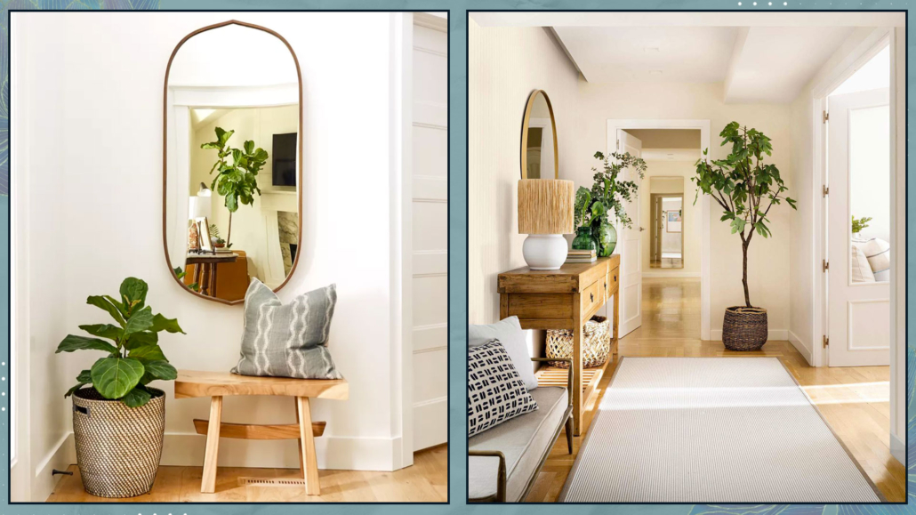
– ARE THERE PLANTS IN THE ROOM?

That is also an essential aspect of improving your spaces.

You might be tired of hearing it, but plants reconnect us to nature, making them essential elements for our homes.

You don’t need to have a jungle; sometimes, just a leaf or some branches will do, and there isn’t a room (excluding the utility room) that can’t have plants!

While real ones are preferable, if, like me, you’re not exactly blessed with a green thumb, know that it’s been proven that even artificial ones (as long as they look realistic) have the same effect on the mind!

And this holds even in terms of Feng Shui!

(credits: @oh.eight.oh.nine; afloral.com)

If you examine the various rooms of your home by asking yourself these questions, you’ll find that you’ll be able to identify areas where improvements may be needed to enhance the spaces!

I hope this article has been helpful and enjoyable for you. If so, let me know in the comments!

Feel free to share it with anyone you think might be interested, I would be honored, and it will help me gain more exposure.

If you feel that your home, or any specific area of it, doesn’t reflect your personality enough, don’t wait any longer and book your consultancy!

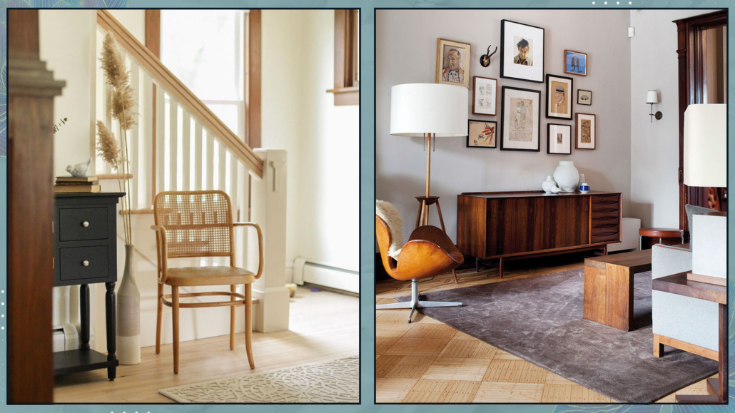
Do you have a small home and don’t know how to make it beautiful, cozy, and functional?

We’ve said it other times: a small home is definitely more challenging to furnish, but not impossible.

Nowadays, especially with new constructions, encountering this type of housing is very likely!

Let’s see what to do in the case of a small home!

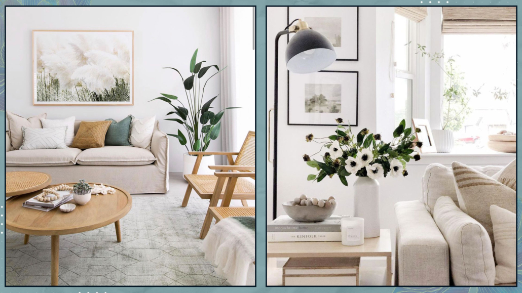
1 – PAY ATTENTION TO FURNITURE SELECTION

When dealing with a small home, one might think they should opt for tinier furniture and accessories.

While maintaining a certain proportion is paramount, to have a few slightly larger pieces than many smaller ones is better.

First and foremost, smaller pieces might not be as comfortable or functional.

Also, too many pieces can create visual clutter, making the space feel even smaller.

From a Feng Shui perspective, it’s important not to overcrowd the space to allow energy to flow freely.

If the room is too full, the energy may become stagnant.

In addition to size, consider the type of furniture as well: it’s better to opt for pieces with simple, minimalist lines to avoid weighing down the space.

(credits: @elemorlovedecor_blog; @anabarcenasinteriorista)

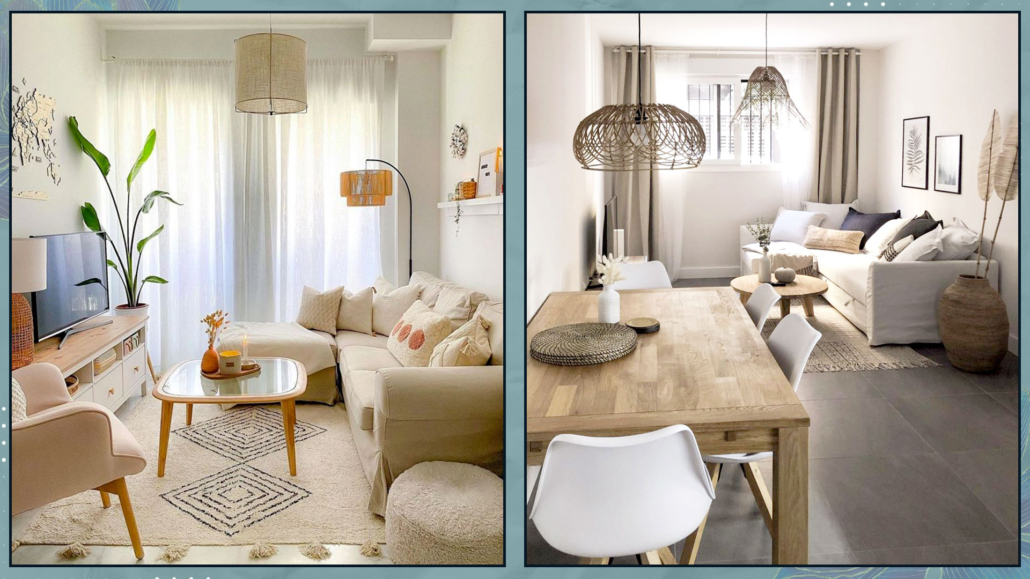
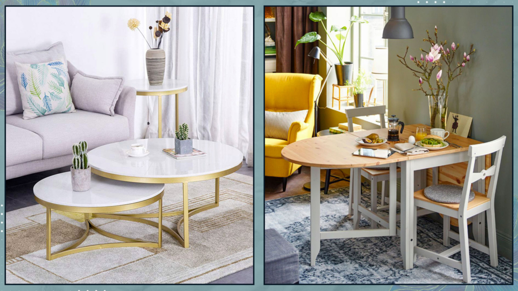
As seen other times, it would also be ideal for furniture to have legs for being raised from the ground, creating the illusion of more space underneath and tricking the mind into perceiving greater spaciousness.

Additionally, like before, this allows for the flow of energy, making it an excellent choice from a Feng Shui perspective.

(credits: Ikea; theblushhome.com)

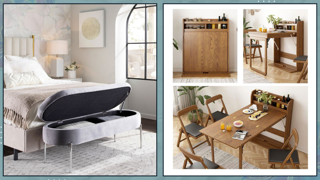
MULTIFUNCTIONAL AND TRANSFORMABLE FURNITURE

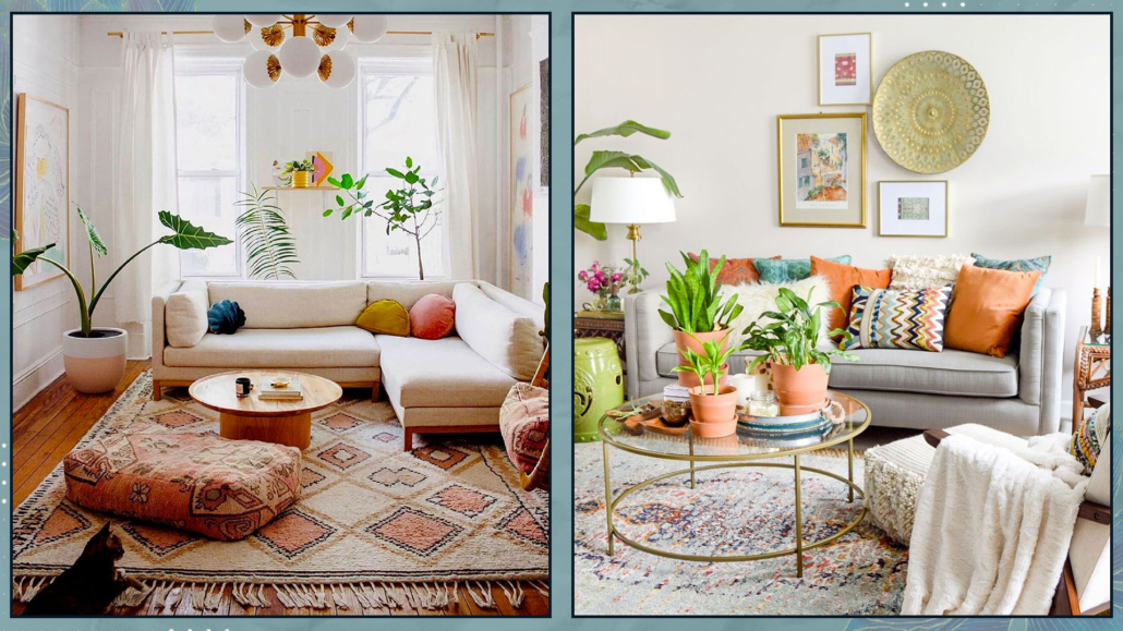
Very useful are also transformable or foldable furniture pieces, which you can open/enlarge or fold back depending on your needs!

There are many different types available on the market, and they can be quite aesthetically pleasing as well.

The same goes for multifunctional elements, such as storage ottomans/benches or chairs that you can use near the table or the sofa, depending on the occasion.

That allows for having fewer items that serve multiple functions!

(credits: lumisource.com; goodideatrade.com)

For making the right choice, good initial planning is crucial, where you understand how you use spaces, giving more importance to areas that you use most frequently.

For instance, if you don’t always have guests for lunch or dinner, a small extendable table in the dining area might suffice, providing more breathing space for the living room!

(credits: Amazon; Ikea)

2 – FOLLOW YOUR STYLE

When space is limited, it’s easy to feel intimidated, and when following advice (including the previous one) to opt for linear and essential furniture, there’s a risk of ending up with a result that doesn’t represent the home inhabitants.

If the house doesn’t reflect your style, it won’t be comfortable or functional, and you won’t feel at ease.

So, how do you express your style when having simple and linear furniture is essential?

Express your style through decorations!

“Less is more” is a must in small spaces, but “less” doesn’t mean lacking character!

Start with a minimal base, as mentioned before, for large furniture pieces, choosing items that can adapt to any style.

Then, express your personality with smaller accessories such as a unique chair, perhaps a designer piece, artwork, cushions, and so on.

By doing this, you’ll maintain airy spaces with character and personality – your own!

Moreover, this approach allows you to change things frequently without breaking the bank each time!

(credits: @reserve_home; flipboard.com)

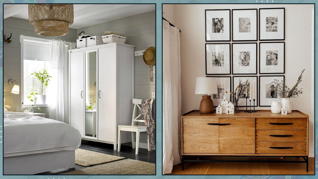
3 – ORDER AND ORGANIZATION

We often talk about order for inviting and harmonious homes, but in small spaces, it’s vital to avoid visually constricting the area further!

Again, in this case, “less is more” is truly significant because it makes it easier to maintain a tidy home.

Having too many things scattered around isn’t ideal, even from a Feng Shui perspective, as it tends to stagnate energy rather than allow it to flow freely!

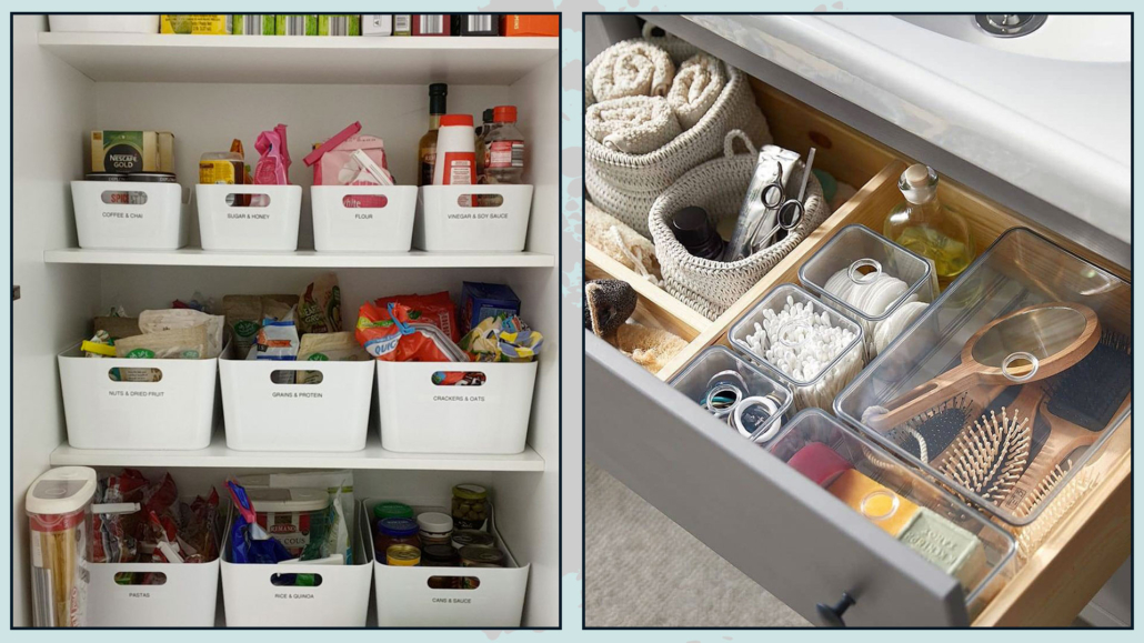
Tools for organizing drawers and closets can help maintain order.

There’s a wide variety available on the market, ranging in size and price to suit every need and budget!

Organizing drawers and closets effectively will allow for easy access to everything.

When items are practical to take out and put away, it’s much easier to maintain order!

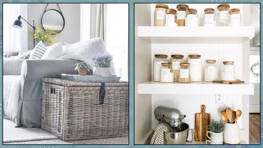
Additionally, you can consider other storage elements such as benches, ottomans, or baskets, which not only serve a functional purpose but can also be decorative.

Among storage elements are still storage beds or beds with drawers, which are undoubtedly convenient but not recommended from a Feng Shui perspective due to the potential energy blockage.

If you want to utilize the space under the bed, it’s better to use boxes, perhaps with wheels, so you can move them around during cleaning and, thus, stir up the energy!

(credits: cherishedbliss.com; Etsy)

4 – MAXIMIZE BRIGHTNESS

In small spaces, it’s essential to have airy and bright environments.

Therefore, maximizing natural light is vital!

To achieve this, it’s important to keep windows and French doors clean and free from obstruction by plants, furniture, or curtains!

For privacy, use lightweight and filtering curtains.

If you prefer double curtains and want a thick and colorful one, use an extra-long rod so that, when it’s open, it doesn’t cover the window but only a part of the wall.

Pay attention to the color of the curtains, as they will tint the light filtering through and subsequently alter the perception of colors in the house!

(credits: Cille Grut; inredningshjalpen.com)

If your home isn’t so bright, help duplicate the light with mirrors, glossy elements, and metallic items!

However, avoid overdoing shiny or metallic elements to prevent the environment from feeling too cold!

Strategically position mirrors; practically, placing them in front of windows maximizes reflected light because they capture more.

However, from a Feng Shui perspective, this “sends back” the entering energy, so it’s better to position them laterally to invite energy to enter!

(credits: decoholic.org; Nordic design)

PAY ATTENTION TO COLORS TOO

Colors also play an important role in light reflection, and white is the ultimate reflective color.

From the live with color expert Claudia Piolatto (if you missed it, you can find it here), we understood that avoiding pure white is better because it can cause glare and tends to create somewhat sterile environments.

However, there are more than 150 shades of white, so you can absolutely find the most suitable one.

It’s not mandatory to totally eliminate colors!

For walls, choose light colors that aren’t too vivid and avoid strong contrasts (which visually shrink the space).

Feel free to use stronger colors in accessories and objects to add rhythm and character.

(credits: @anthology_creative_studio; article.com)

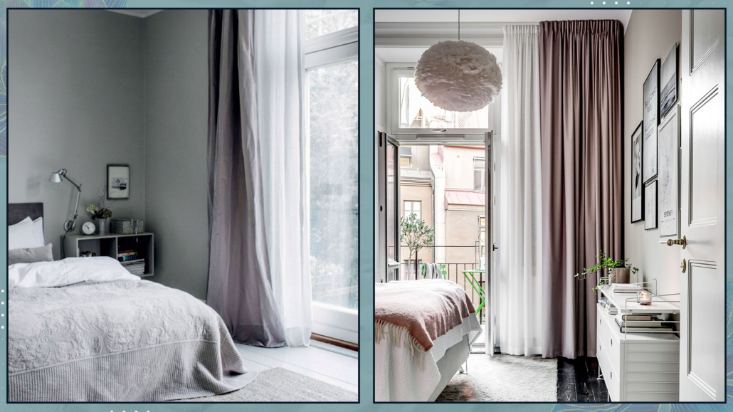
N.B. The bedroom could be an exception to light colors, and here’s why.

Dark colors create a cozy, intimate environment akin to a warm embrace, which is particularly important in the bedroom!

So, if you like them, feel free to use them!

Since the bedroom is primarily for resting and sleeping, prioritizing brightness at all costs can be overlooked.

However, I still advise maintaining consistency with the colors, perhaps opting for richer versions or toning them down with gray or black in the case of very vibrant colors.

That will maintain a sense of harmony throughout the space!

(credits: Pella Hedeby; Studio Enass)

I hope this article has been helpful and enjoyable for you. If so, let me know in the comments!

Feel free to share it with anyone you think might be interested, I would be honored, and it will help me gain more exposure.

If you feel that your home, or any specific area of it, doesn’t reflect your personality enough, don’t wait any longer and book your consultancy!
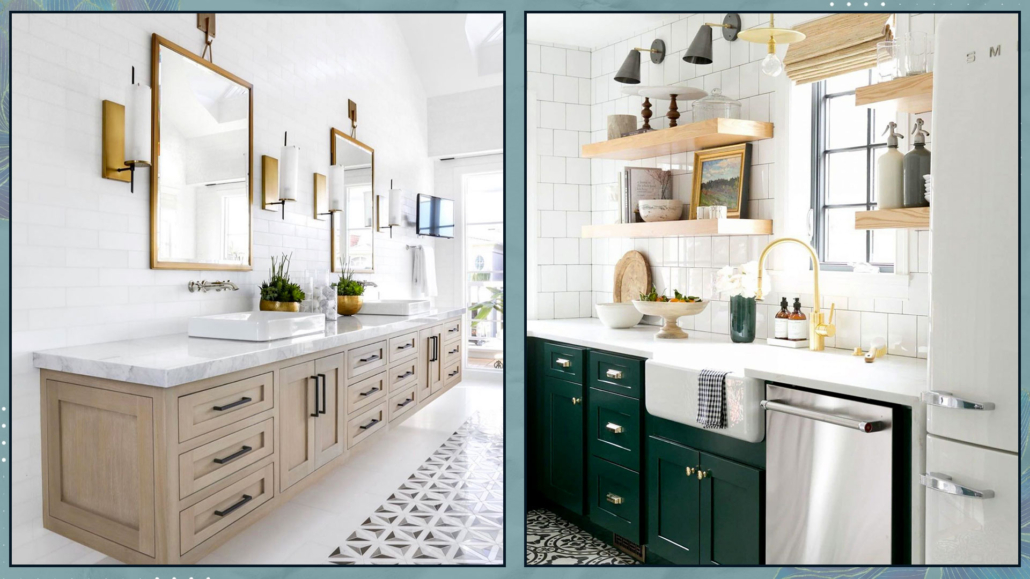
Colors, as we know, can influence our emotions, so it’s essential to consider how we want to feel in a given environment to choose the right ones.

That applies to the entire house, but especially to the bedroom because it’s where we most need to feel good and safe, thus promoting also good sleep!

So today, we’ll look at some suitable bedroom color combinations!

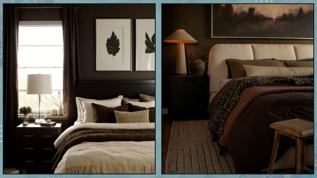
– DARK AND MOODY BEDROOM COLOR COMBINATIONS

Using dark colors is ideal if you love the idea of a cozy and enveloping bedroom.

Using deep blues with a warm undertone, rich browns, and charcoal grays gives a comforting sense of intimacy, like a hug and a sense of security!

Moreover, they are associated with the concept of sophistication and depth.

Dark shades also significantly enhance the cone of light from every light source, which is less visible with light colors!

That creates a beautiful contrast with the dark tones and intensifies the feeling of intimacy!

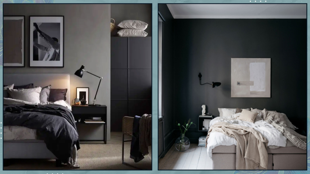
– BLACKS AND DARK GRAYS

Black or anthracite grays are quite beautiful but not so easy to use because they can result in a flat look.

If you opt for a monochromatic combination, it’s wise to use different finishes and textures to add some movement and play!

Wallpaper could be an example, but also in textiles like blankets and pillows; this, in addition to the movement mentioned earlier, also helps to soften everything!

I suggest painting the ceiling white anyway to maintain a minimum of openness in the room; everything completely dark could become overwhelming!

Another way to brighten the room could be to dress the bed with light textiles!

That will create some contrast and, as with textures, soften the environment a bit.

Everything doesn’t need to be solid color; conversely, introducing patterns, once again, creates some play and movement.

These patterns can be tone-on-tone, playing with various saturations, or you can introduce some other color to contrast and brighten things up.

(credits: Ikea; Lovisa Häger foto Jesper Florbrandt)

– BROWNS

Browns are another way to create cozy and moody environments.

They are definitely lighter compared to blacks and also more natural.

However, it’s still a dark color, so it’s good to balance it with lighter shades.

For a more enveloping environment, with browns (if they’re not overly dark), you can use the same color for walls, floors, and ceilings.

Also, in this case, remember to play with textures and patterns to create movement!

(credits: @ideabedroom; @rustandtrust)

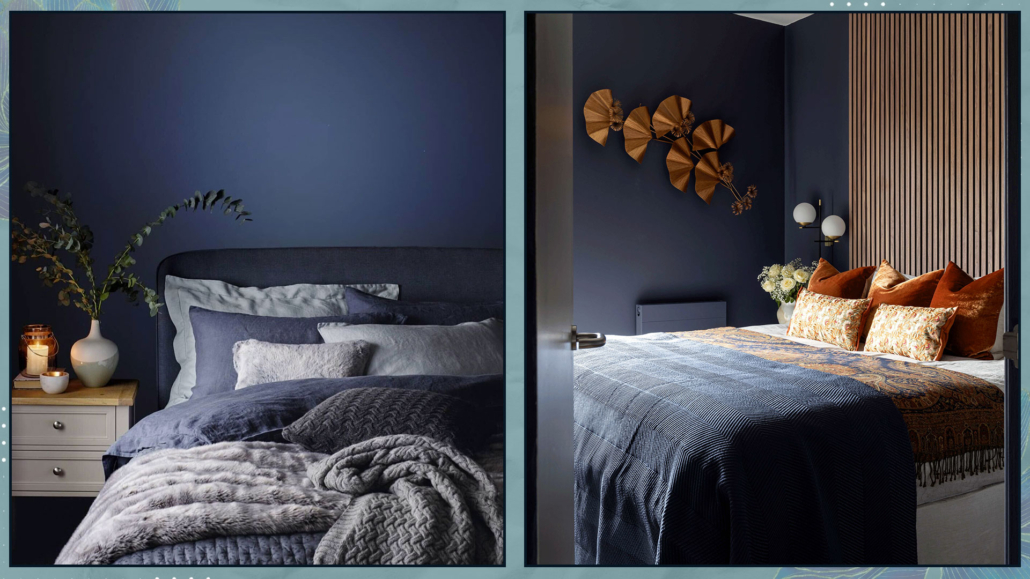
– DEEP BLUES

In general, blues are calming tones, making them perfect for the bedroom.

Certainly less dramatic than black, one can use blue with more ease!

Blues are fantastic when paired with browns because they are the exact opposite in temperature.

Brown warms up blue, giving the rooms a relaxing sensation.

You can use brown as a color, but it’s even better as a material like wood.

Another great way to brighten blues is by using brass elements; the contrast is pleasant and elegant.

In the case of a monochromatic pairing, again, I recommend playing not only with various shades of blue but also with different textures and patterns.

That creates movement and adds character to the room.

(credits: Jotun; Studio Enass)

– RELAXING AND REASSURING COMBINATIONS

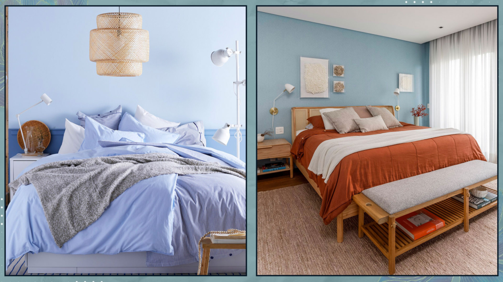
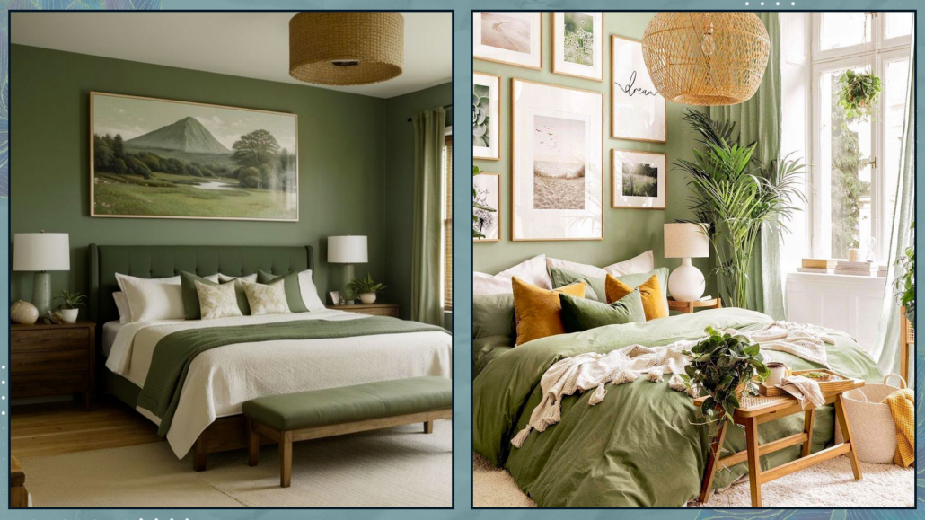
For a relaxing and reassuring bedroom, softer colors like powder blue, sage green, and other pastel shades are most suitable.

These colors are associated with nature, such as water, sky, or tree leaves, elements that reinforce the feeling of calmness and tranquility.

– LIGHT BLUES

As we saw earlier, blues are calming colors, and lighter ones are reassuring and relaxing as well.

This color is cold and quite luminous, which will visually enlarge the room and give a sense of freshness and space.

One can use it on ceilings as well as walls, and even in a monochromatic pairing, the result will be pleasant and inviting.

Being so light, it almost becomes a neutral color and serves as a perfect background if you want to use some darker blue accents.

As mentioned earlier, it’s a cold color, so it’s always good to warm it up with elements like wood and wicker.

Alternatively, you can add a bit of cheerfulness by incorporating some touches of orange, its complementary color.

That will add some dynamism and make it more contemporary.

As always, to add some movement and character, it’s also good to play with textures and patterns here as well.

(credits: Ikea; dudasenna_garden)

– GREENS

Greens are relaxing and rejuvenating colors and come in numerous shades, from pale green to richer olive green.

Sage green is the most commonly used because it’s less intense and imposing than olive green and deeper than pale green.

Although a monochromatic pairing, always playing with textures and patterns, is undoubtedly appealing, I recommend adding some browns either as colors or as elements like wood.

That combination is fabulous because it emphasizes the connection to nature!

(credits: @ideabedroom; posterstore)

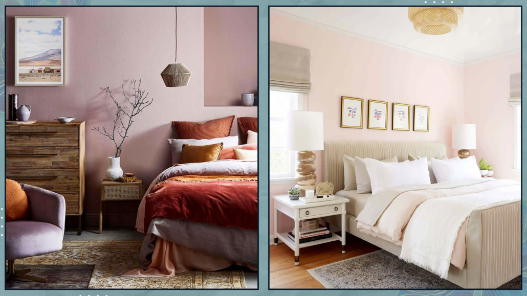
– DUST PINK

Pink is a very delicate color, and if taken with a slight hint of brown, it’s perfect not only for a nursery but also for a master bedroom.

However, avoid candy pink or overly “sugary” shades, which are actually more challenging to pair and can become somewhat noisy!

Since it’s a very light color, it’s wise to have a few darker elements to add depth to the room.

If you don’t like dark colors, create contrast with whites to prevent the pink from becoming too flat.

(credits: @emilycapes1; stylebyemilyhenderson.com)

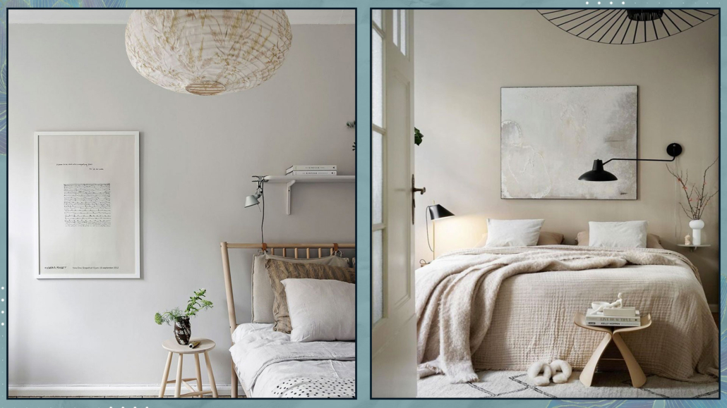
– LIGHT GRAYS

Light grays are the ultimate neutral colors for relaxing and reassuring bedrooms.

However, if you choose this color, you’ll need to pay close attention to its undertone, which could tend towards blue, green, or yellow.

The undertone drastically changes the perception of the environment.

Be careful to choose the one that best suits the existing finishes and furniture.

There is also a subcategory of gray called “greige,” a mix of gray and beige.

It’s a warm, enveloping color, very pleasant and subtle, with a contemporary and harmonious feel.

(credits: alvhem.com; Viktoria Askerow)

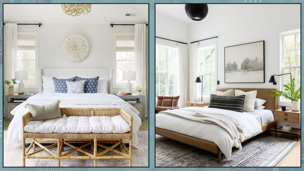
– WHITE BASES COMBINATIONS

We can’t talk about bedrooms without mentioning whites.

Whites are bright, timeless colors that complement every style and easily pair with any other color.

But, as explained here, it’s easy to say white because, besides pure white, there are at least another 150 shades, depending on its undertone!!!

Some people don’t like white because they think it can be flat and monotonous; however, it’s actually the perfect backdrop for any feeling you want to evoke.

Moreover, you only need to change details such as blankets, pillows, and a few decorative elements to have an ever-changing room.

Even a total white look can be fascinating if you create movement with different textures, finishes, and patterns, too!

(credits: lifeoncedarlane.com; thebrainandthebrawn.com)

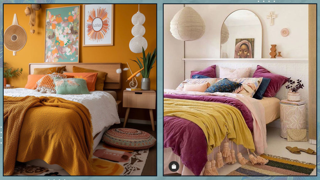
– VIBRANT AND ENERGIZING COMBINATIONS

For an energizing bedroom, it’s good to use warm colors like red, peach, salmon pink, yellows, and oranges.

The advice with all these colors (especially red, yellow, and orange) is to avoid their most vibrant version because they would be too stimulating and disturb sleep.

Use these shades in less saturated versions by adding white for lighter colors, grays, or blacks for darker colors.

This way, you’ll retain their energizing properties while creating a more relaxed and tranquil atmosphere.

Use the brighter tones in small accent elements like pillows or some decorations!

(credits: clemaroundthecorner.com; @toc_estudiocreativo)

– HOW TO CHOOSE THE VARIOUS BEDROOM COLOR COMBINATIONS

The choice between these color combinations will depend on the feelings you want to experience in your bedroom.

Another element to consider in the choice is the existing finishes, such as the flooring, unless you decide to change it (that’s also a color to think about).

If you’re having difficulty making a choice, you could start with something you love, like the headboard of the bed, a particular painting, a rug, etc.

Additionally, consider how much natural light enters the room and its orientation.

As we’ve seen other times, a north-facing room receives colder light than one facing south!

I hope this article about bedroom color combinations has been helpful and enjoyable for you. If so, let me know in the comments!

Feel free to share it with anyone you think might be interested, I would be honored, and it will help me gain more exposure.

If you feel that your home, or any specific area of it, doesn’t reflect your personality enough, don’t wait any longer and book your consultancy!
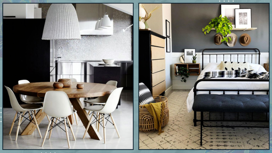
The home is not just a roof under which to eat and sleep but a LIVE place that supports us in every aspect, especially our psychophysical well-being.

The home should be that place where we feel good, where we let down our defenses, and where we rediscover and are ourselves!

To truly make it so, it’s paramount to pay attention to some details.

Let’s see them together.

– YOUR HOME SHOULD REFLECT YOU

An essential aspect of having a home that supports well-being is that it’s designed to represent you 100%.

Sometimes there’s a tendency to follow fashion trends, partly because they please the eye, partly to impress others, but this is a mistake!

Your home should exude your personality in every detail and be furnished with intention!

Each space should be designed to honestly support your lifestyle and personal way of being and living in the home.

Therefore, the choice of furniture, materials, and colors should be made based on your personality, as mentioned a moment ago.

They should please your eyes, of course, but also your body and soul, and they should speak of you!

Always start with a list of things that are important to you to create environments that are comfortable and harmonious for you.

(credits: luxesource.com; breyi.com)

– FUNCTIONALITY AND USABILITY

The same house and room can be furnished in many different ways, not only in style and colors but also in layouts!

It’s essential, first and foremost, that everything is arranged functionally for your way of living in the space.

As mentioned other times, consider the primary function for each room and then plan everything else around it.

An example I always give is the living room: is the primary function to entertain guests or watch TV?

You can see how the arrangements would differ!

Everything should be arranged functionally for you (you’re always at the center of everything!)

When functionally positioning things, it’s also vital to ensure that everything is easily accessible.

You should be able to move around the rooms and access everything without “jumping over obstacles” or moving things around.

This ease of access will make everything flow more smoothly, and you’ll enjoy every space totally.

Moreover, this fluidity will also make cleaning easier, making it, I won’t say enjoyable, but at least not stressful!

funzionalità e fruibilità casa che supporta benessere

(credits: Isabelle Dimang; optimaproperties.com)

– LIGHTING

Light is essential for psychophysical well-being.

It has been shown that in Nordic countries where the population experiences very few hours of daylight for many months of the year, the incidence of depression is higher.

Therefore, it’s paramount to have a bright home and to make the most of natural light first and foremost!

Sometimes, rooms tend to be dark, and in these cases, it’s vital to implement some strategies, such as using glossy materials (without overdoing them because they can make the environment feel cold) and, above all, mirrors.

Mirrors strategically placed, more or less in front of the window, can double the light in the room!

Another helpful trick is to use shiny metals in the lamp stems, chair and table legs, handles, and frames, for example!

Metals will also help reflect light.

It goes without saying that artificial light is essential as well.

Every room should have proper general lighting to see everything well.

However, as you know by now, this isn’t enough; it should be supplemented by other sources of light that can create atmosphere and be useful for activities (for example, a lamp near the couch, especially if you enjoy reading!).

luci-casa-che-supporta-benessere

(credits: studio mcgee; Studio-design-HDm2)

– MATERIALS

We’ve mentioned this other times: buying furniture and accessories made from natural materials is essential.

That is good for the environment, we know that, but it’s also good for us.

Warm materials like wood provide a pleasant sensation, even if unconscious because they connect us to nature.

The same goes for fabrics, such as cotton, linen, wool, or velvet, because they are free from synthetic substances and are much more pleasant to the touch (often also to the eye).

Natural materials are free from chemicals that are often harmful, so using them for furniture coverings, accessories, and fabrics means creating healthy environments.

materiali-naturali-casa-che-suporta-benessere

(credits: hoskelsa; @oh.eight.oh.nine)

– COLORS

Colors have an incredible psychological impact on us (I discuss it here), so they should be chosen carefully.

The calming colors of nature, such as sand, greens, and blues, are always an excellent choice for relaxing environments that connect us to nature.

It’s also a good idea to prefer warm tones or at least warm up cooler tones with the proper materials.

Neutral colors are very suitable for cozy and relaxing settings.

By neutral colors, I mean any color desaturated with white for a lighter tint or black for a darker color!

To have vibrant spaces, play with the tones and shades of colors from the palette, and dare with walls of intense colors.

If you love bright colors, use them to add character, maybe not in large quantities, but in accessories and decorations (the famous 10% of the 60-30-10 rule: I discuss it here).

(credits: habitatbyresene.co.nz; @rcpa)

– PLANTS

Undoubtedly, this point won’t surprise you; we’ve mentioned it many times!

Plants have a calming power because they mentally connect us to nature, which relaxes us.

This power is visual, so even though it’s better with authentic plants, it still applies to artificial ones.

Authentic plants have an added bonus, which is their ability to purify the air, and, of course, this is a great thing!

There isn’t a room in the house that can’t have plants, except maybe for a windowless bathroom or a storage room.

You can even put them in the bedroom!

Decorate with plants: get some tall ones that reach the ceiling, and get some small ones to put in your compositions on consoles, bookshelves, and tables.

You can even use just branches or decorative leaves; they have an elegant, minimal effect!

piante-casa-che-supporta-ilbenessere

(credits: harlowejames.com; Scout & Nimble)

– GET RID OF THE EXCESS

For those who aren’t minimalist at heart (like myself, I admit, I’m not), it’s easy to “accumulate” many things.

That impacts our homes and, therefore, us!

When you have a lot, it’s much harder to clean and keep everything well-organized, and things end up occupying important spaces (both in sight and drawers and closets).

It’s vital to get rid of what no longer serves a purpose, what no longer represents us, what no longer has meaning.

I know it’s not easy, but there’s a trick here too!

First of all, DON’T do everything at once; after a while, you might get tired and give up, rearranging everything as before.

Dedicate an hour a week, 10/15 minutes a day, whatever suits you best, and start with one room and one closet and then continue.

You don’t need to get rid of everything RIGHT AWAY; for the things you’re unsure about, only start by setting them aside!

HERE A TRICK!

Find a corner where you can keep a bit of temporary clutter and put everything there that you might not use anymore or doesn’t fit but, for various reasons, you find it hard to let go of.

Once you’ve tidied up the whole room, look at the result and savor how it makes you feel.

At that point, you can look at everything you’ve accumulated with different eyes and decide, with greater awareness, what to do with it.

Some things might find their way back to their place, which is fine, but it won’t be the same as before because you’ve made space!

Most of the things, however, will leave your home, I’m sure of it.

Of course, you don’t have to throw everything away; what’s in good condition can be given away or sold.

Believe me: this work will create space in your home, sure, but also in your mind!

(credits: Pins studio; lillytaylorinteriors)

I hope this article has been helpful and enjoyable for you. If so, let me know in the comments!

Feel free to share it with anyone you think might be interested, I would be honored, and it will help me gain more exposure.

If you feel that your home, or any specific area of it, doesn’t reflect your personality enough, don’t wait any longer and book your consultancy!
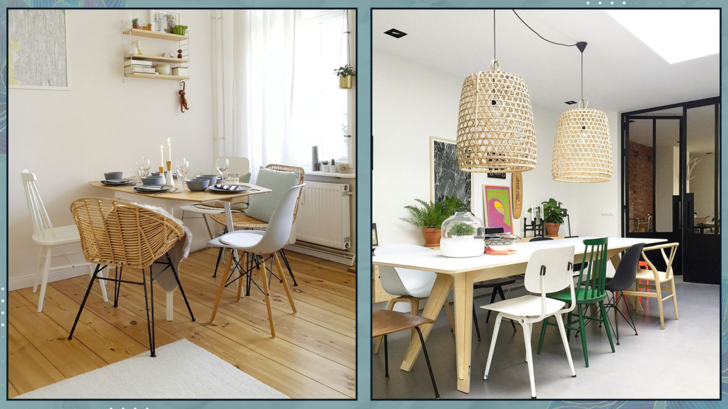
In several articles, I’ve emphasized the importance of maintaining a consistently tidy home for an organized, inviting, harmonious, and refined living space.

Avoiding visual clutter is crucial not only for aesthetic appeal but also for higger well-being, both mentally and physically.

A tidy home reduces stress, enhances focus, improves sleep, and even improves self-esteem.

Some small habits and actions can assist us in keeping our homes perpetually neat. Let’s explore them together.

1 – DECLUTTERING:

One of the reasons our homes (yes, I include myself!) are often in disarray is because we have TOO many things, and managing them all becomes overwhelming.

The more items we have, the easier it is for them to accumulate and create chaos, making us less motivated to tidy up: a vicious cycle!

Therefore, it’s essential to eliminate anything that is unnecessary and no longer serves a purpose.

I know it’s not easy, and, let’s admit it, often we don’t even know where to start, and it might take time, leading us to give up!

The trick is to do it in small doses: dedicate 10-15 minutes a day, or even per week if you prefer, and start with one room at a time, tackling drawers, closets, etc.

There might be items with sentimental value: set them aside, maybe create a box for them.

However, they must indeed hold meaning; otherwise, let them go.

Give away or sell the rest if it’s in good condition and usable, or merely throw it!

You’ll see that, as you gradually go through this process, your home will become increasingly tidy, and you might even enjoy it!

Once you finish, maintaining order will become easier.

You’ll also have made space for the new, but be cautious not to fill it up again.

Even when making new purchases, do it consciously: Do I really need it? Will I use it?

If it’s something decorative, ask yourself if it adds value, holds meaning, reflects who you are, or if it might eventually lose its charm.

(credits: El mueble; @oh.eight.oh.nine)

2 – ORGANIZATION:

Everything should have its designated place and be conveniently and functionally accessible.

If items don’t have a dedicated space, they end up lying around, creating clutter.

Therefore, it’s crucial that everything has a designated spot for storage.

Be mindful in choosing these spaces; they should make sense and, as mentioned earlier, be convenient and easily accessible.

Otherwise, items will end up scattered once again!

You can find a million ideas on how to organize your home with various types of containers: many of them beautiful, and I’ve suggested some myself.

The thing is, they’re not for everyone.

What works for some may be inconvenient and not very functional for others!

No matter how aesthetically pleasing things are, if they’re not practical, you may tire of using them and revert to the chaos from before.

The trick, as always, lies in thinking not in micro-categories but macro. Let me explain with a practical example:

In the kitchen, for instance, instead of having a jar for each type of pasta in the pantry, you could use a basket or a larger container to organize the bags/packages.

While there will still be a variety of colors from different containers, they will be “confined” in one space, making it neater and easier for you to access them, especially when unpacking groceries.

The same principle applies to bathroom drawers/cabinets.

Group items by categories: soaps, perfumes, cosmetics, razors, etc., and then place them in separate containers.

You’ll immediately notice a difference in terms of order while maintaining practicality.

A small tip: try to find and use containers that are visually consistent in terms of material for a cohesive look.

I’d suggest investing a bit more time, especially for containers holding items like shampoo, conditioner, and body wash, as they are quite visible.

(credits: Ikea)

3 – MAKING THE BED EVERY DAY

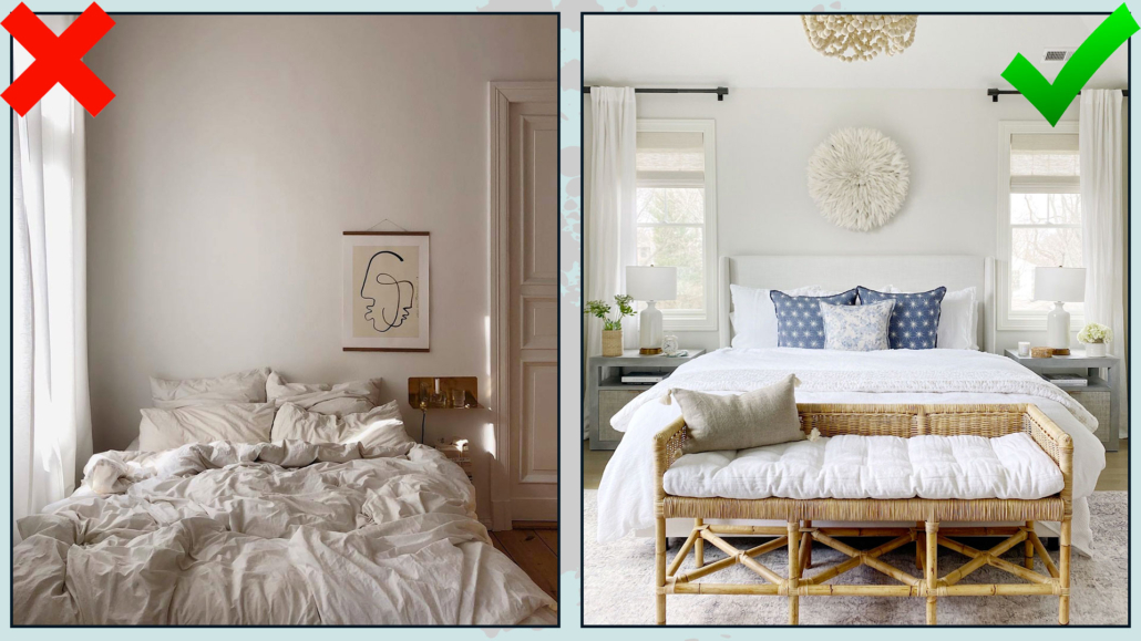
It might seem almost trivial, but making the bed every morning is genuinely vital for keeping the home consistently tidy!

Firstly, it serves a hygienic purpose: a well-made bed prevents dust and dirt from settling on the sheets.

Moreover, coming home after a long day of work and seeing your bed neatly arranged and ready to welcome you is actually a psychological boost.

On the other hand, seeing it in disarray may unconsciously bother you, perhaps triggering memories of chaotic or stressful situations you may have experienced during the day.

Invest a few minutes in this habit, remembering to adorn it with pillows and blankets: there doesn’t need to be a lot, just enough to make it immediately inviting and cozy!

(credits: @franzibower; lifeoncedarlane.com)

4 – ORGANIZE THE KITCHEN AND ALWAYS DO THE DISHES!

This suggestion might seem obvious, but I’ve often seen people leave dishes in the sink to wash them later or load the dishwasher afterward.

That tends to happen, especially during breakfast, when there’s a rush, and in the evening, when one is tired.

However, this has an impact on our minds and well-being because waking up in the morning or returning from the office to a chaotic kitchen is anything but relaxing and enjoyable.

Starting your day by dealing with the mess in the morning is not the best way to begin the day on a serene note!

And when it happens after a long day at work, when you might already be tired, it just adds stress!

Therefore, it’s a good habit to wash dishes immediately or, if you have one, load the dishwasher, leaving the kitchen organized and clean.

Plus, you’ll avoid lingering unpleasant odors!

(credits: exquisitelyunremarkable.com; studio-mcgee.com)

5 – TIDY UP THE COUCH WHEN YOU GET UP

This point is similar to the previous two, especially the bed one!

Coming home to a tidy couch with plump cushions and neatly arranged blankets (even those that may seem casually thrown have a specific arrangement) has a positive and calming impact on us.

Similar to the bed, the couch becomes inviting and welcoming.

It doesn’t take much time, even less than making the bed, but this small habit will always leave the living room organized, pleasant, and relaxing!

(credits: Alamy;theloomia.com)

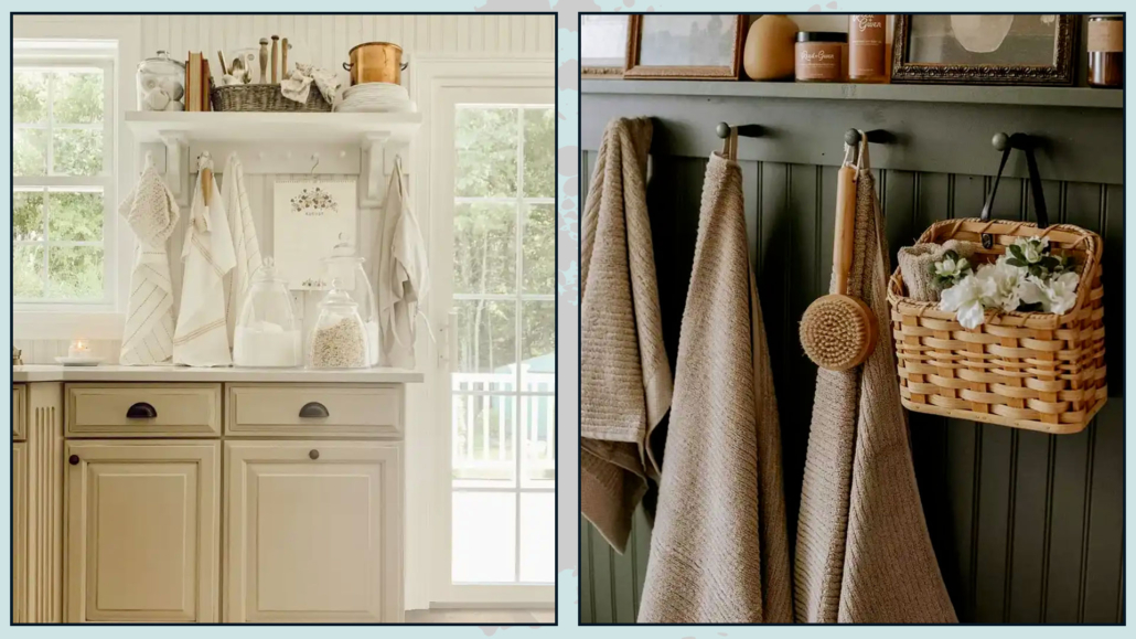
6 – PAY ATTENTION TO TOWELS!

That is an often overlooked detail, but it’s paramount to be mindful of towels for two reasons.

Firstly, it is a good idea to change them regularly; it may seem trivial, but seeing crumpled dirty towels in the bathroom or kitchen is less than ideal.

Moreover, they inevitably develop odors that permeate the room.

The other thing to be cautious about is the color!

It’s a good idea, both for the kitchen and bathroom, to choose towels that align with the home color palette.

As always, this creates visual harmony, which is beneficial not only for the eyes but also for the mind.

Harmony has the power to calm and soothe, promoting relaxation!

(credits: eleanorrosehome.com; Jessica Windle)

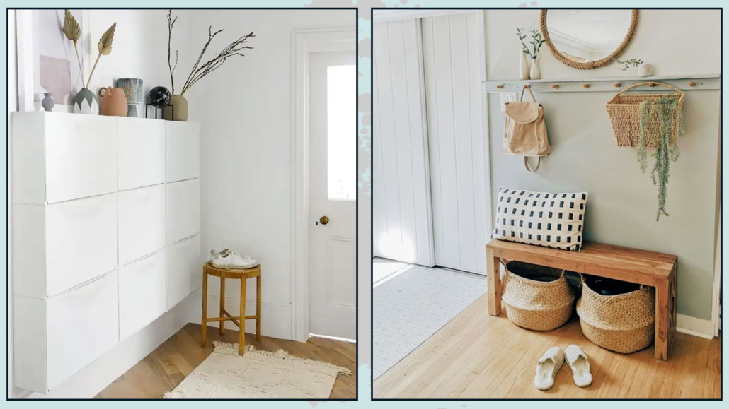
7 – REMOVE YOUR SHOES AT THE ENTRANCE

It’s not always easy to have a shoe rack at the entrance, especially if it gives in a not-so-large open space.

Shoe racks are often placed in bedrooms or, ideally, in storage closets.

However, removing your shoes at the entrance, even if the shoe rack isn’t nearby, is paramount.

That is because, as you can imagine, we step on all sorts of things outside the house, and if we walk with our shoes inside, we inevitably bring these contaminants indoors!

We make an effort to keep everything in order, and then we risk having a dirty floor.

That is another factor that creates visual disorder and unconscious discomfort.

Leave a pair of well-kept slippers near the door, take off your shoes as soon as you enter, and put them away in the shoe rack.

Do the reverse when you need to leave.

It’s a small habit that you’ll quickly adapt to, and it will effectively help you maintain a consistently tidy home!

(credits: Future PLC; decoactual.com)

I hope this article has been helpful and enjoyable for you. If so, let me know in the comments!

Feel free to share it with anyone you think might be interested, I would be honored, and it will help me gain more exposure.

If you feel that your home, or any specific area of it, doesn’t reflect your personality enough, don’t wait any longer and book your consultancy!
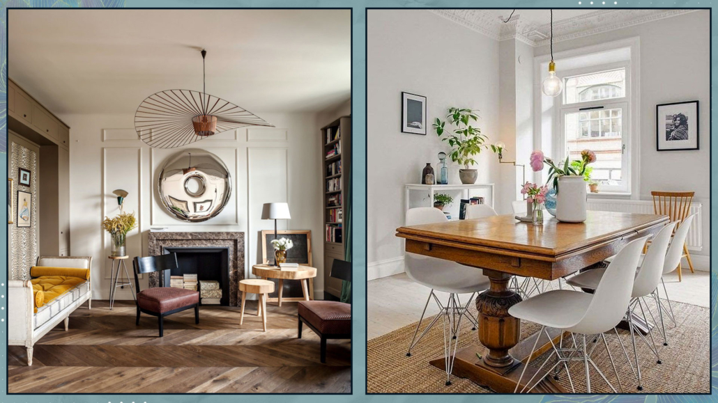
Let’s start the new year by exploring together the 2024 home trends!

I want to remind you that these are suggestions and trends, and it’s not obligatory to follow everything, so only take what eventually resonates with you.

– FAREWELL TO PURE WHITE KITCHENS

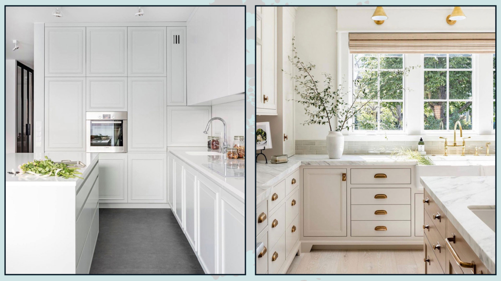
For years, completely white kitchens have been in vogue, primarily to evoke a greater sense of cleanliness and also for their undeniable brightness!

Now, the trend is not to completely abandon white but to opt for a warmer shade, a more “buttery” white.

That alone will make the kitchen less cold and, allow me, aseptic!

The addition of wood elements, unique materials for lamps, distinctive handles, and the introduction of plants and wicker will make the environment decidedly welcoming!

This approach to designing kitchens will allow for a timeless kitchen that will never become tiresome and can potentially evolve over time with small changes like handles or other decorative elements!

(credits: virtuves.lv; jennymartindesign)

– GRAY, YES, BUT WITH A WARM UNDERTONE

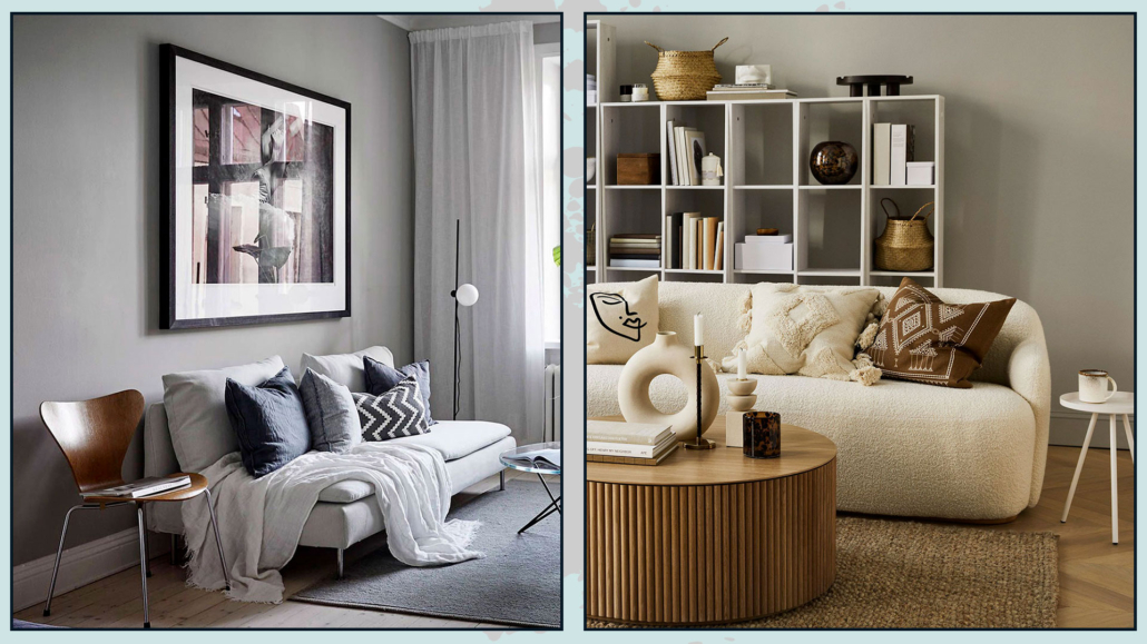
Among the neutral colors used in interiors, gray is one of the favorites because it is a versatile color actually.

However, this year’s trend will be to use grays with a warm undertone to create inviting and cozy spaces.

If you’re wondering what an undertone is, I’ve discussed it here when I talked about neutrals!

Cool grays, compared to warm ones, create colder and duller environments.

That can have an impact on mood, giving a sense of depression.

It’s true, though, that cool grays provide a feeling of freshness, so they don’t need to be wholly avoided.

The trick, as always, is to balance them with warm elements, such as wood!

I would only suggest avoiding dark, cool grays; opt for lighter ones, as they can be “warmed up” more easily!

(credits: cocolapinedesign.com; H&M home)

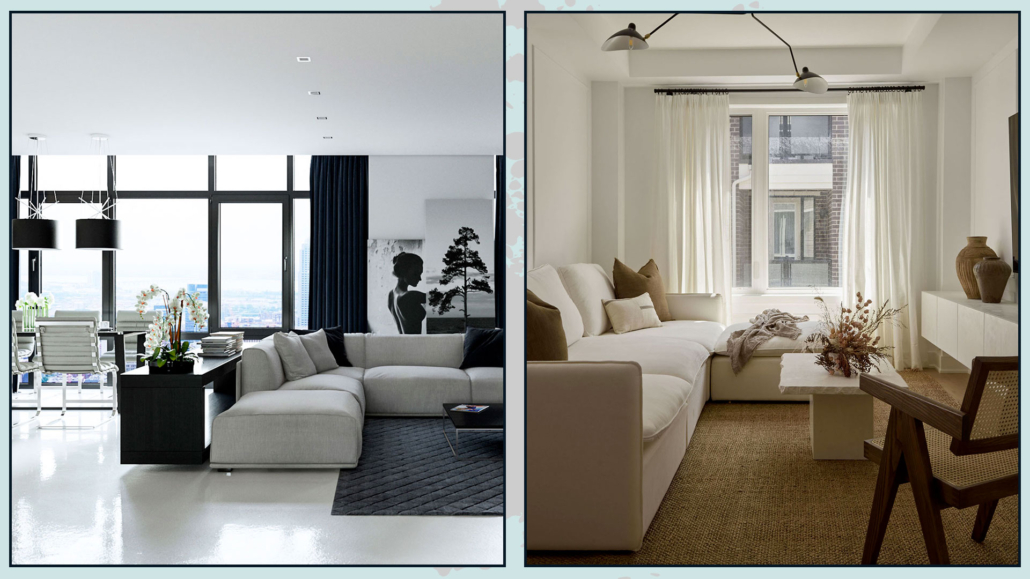
– ENOUGH WITH CLASSIC MINIMALISM!

The two previous points lead us to bid farewell to classic minimalism with its austere forms and lines, pure white, and cool grays, ushering in a style that can be described as more livable and “sustainable”!

The trend is to embrace warm minimalism, Nordic style, or wabi-sabi.

They all share the foundation of “less is more,” but the aim is to make the spaces warmer and more inviting!

Moreover, there’s a focus on being more flexible, allowing individuals to bring their own personality and character into their homes!

It will always start with neutral colors and attention to functionality – typical of minimalism – but softened and made more welcoming.

(credits: rikreainteriors.it; ruemag.com)

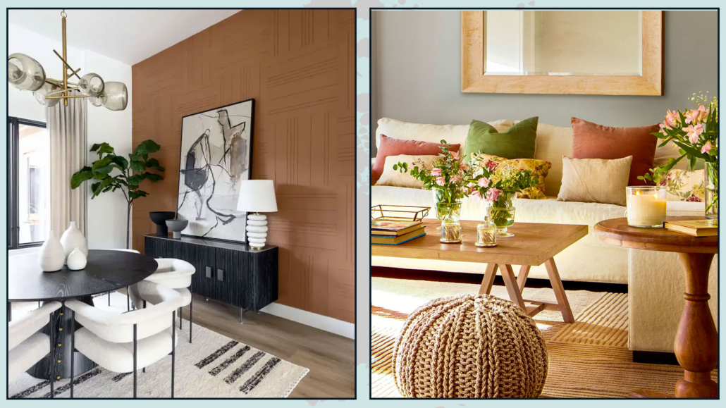
– TERRACOTTA COLOR

Speaking of warm tones, a color that many believe is making a comeback is terracotta!

That applies both to tiles and as a general color scheme.

Indeed, it’s a warm and enveloping brown color that makes spaces decidedly inviting and relaxing.

While it might not be among the colors of the year proposed by major brands, if you look at the color palettes they suggest to pair with their choices, you’ll notice many hues leaning towards brown!

Terracotta color can vary in saturation or tend towards red and pairs easily with many others, such as blue or green!

(credits: Living with Lolo; elmueble.com)

ZELLIGE-STYLE TILES

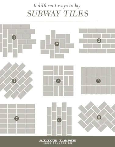
There has been a significant use of large tiles in recent years, even for wall coverings, to minimize the visibility of grout lines and create a more cohesive and uniform look.

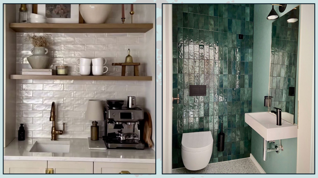
Now, the focus has shifted towards zellige-style tiles, which are small, square, or rectangular tiles that appear handmade, as they are not “perfect.”

The edges are irregular, and there are variations in shade, even in solid-colored tiles.

They have a highly glossy glaze that reflects light beautifully.

And they are incredibly versatile.

Rectangular tiles, in particular, can be arranged in numerous patterns: vertical, horizontal, herringbone, and more.

Their irregularities are the distinctive features that make them special and create unique, timeless environments.

(credits: amyepeters; zweidesign)

– IRREGULAR-SHAPED RUGS

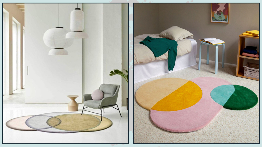
In recent years, organic shapes have become highly trendy (and continue to be), and this trend has extended to rugs as well.

You’ll find many rugs with unique shapes that serve as decorative accents in various spaces.

They are undoubtedly distinctive and, at times, playful, often used in expansive areas.

However, be cautious of nearby elements; the risk of creating chaotic environments is around the corner!

For consistent and harmonious spaces, other elements should have similar characteristics.

They pair well with furniture, especially sofas and armchairs, featuring organic shapes!

However, their irregular shape might make it challenging to arrange furniture uniformly.

For this reason, if you like these rugs, I’d suggest using them in small doses, perhaps in an entryway or to create a unique reading/relaxation nook.

(credits: tapis-studio.com;etsy.com)

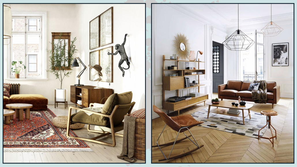
– VINTAGE

With increased attention to sustainability, there’s also been a growing focus on the materials used in homes, leading to a rise in utilizing used and vintage furniture.

That trend we’ll see quite a bit in 2024, as it allows individuals to step away from the market of mass-produced industrial furniture and acquire unique and original pieces.

(credits: anthologycreatives.com; maisons du monde)

– BIO DESIGN

As mentioned earlier, there’s a greater emphasis on sustainability and nature.

We will witness increasingly sustainable homes with the use of natural materials, even in furniture and accessories.

That not only allows us to contribute positively to the environment but also to breathe “cleaner” air and let energy flow more freely in our spaces.

The growing desire for a connection with nature means we’re bringing more of it into our homes!

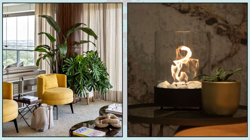
The inclusion of plants, water features, and fire elements, in addition to materials and curved shapes,  is an actual must.

And if you love a fireplace but don’t have one, I suggest looking at bioethanol fireplaces: they come in various sizes, from purely aesthetic to those capable of heating spaces!

(credits: Studio AG Arquitetura; planikauk.com)

What do you think?

Is there any trend you like and plan to incorporate into your home?

Let me know in the comments!

I hope this article has been helpful and enjoyable for you. If so, let me know in the comments!

Feel free to share it with anyone you think might be interested, I would be honored, and it will help me gain more exposure.

If you feel that your home, or any specific area of it, doesn’t reflect your personality enough, don’t wait any longer and book your consultancy!
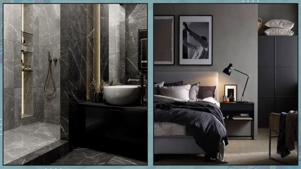
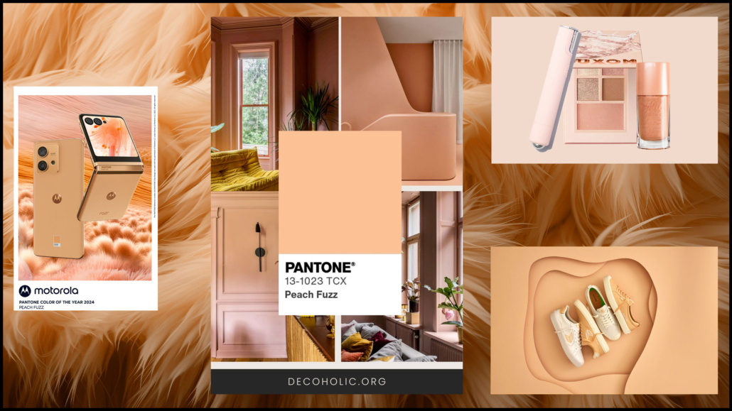
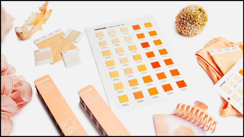
And here it is, the Pantone Color of the Year 2024: Peach Fuzz (13-1023).

The Pantone Color Institute celebrates its 25th anniversary with a delicate and soft peach color this year.

“A velvety and gentle peach whose all-encompassing spirit enriches the mind, body, and heart”

is how the company describes this delicate and simultaneously fresh color.

It’s a color we can define as neutral and calming but full of positivity, definitely very different from last year’s vibrant Viva Magenta!

The Viva Magenta, in fact, was a cochineal red, intense, and meant to galvanize the spirit and build inner strength.

This color is enveloping, delicate, and radiant, aiming to help strengthen empathy and compassion in a indeed tumultuous period.

“PANTONE 13-1023 Peach Fuzz brings belonging, inspires recalibration, and an opportunity for nurturing, conjuring up an air of calm, offering us a space to be, feel, and heal and to flourish from whether spending time with others or taking the time to enjoy a moment by ourselves”

Those are Leatrice Eiseman’s words, Executive Director of the Pantone Color Institute.

How to use this color in your home?

As mentioned earlier, it’s a delicate color that allows you to incorporate it into any home, whatever the style!

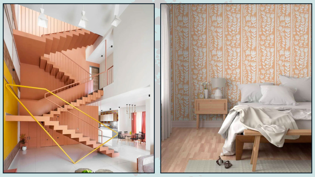
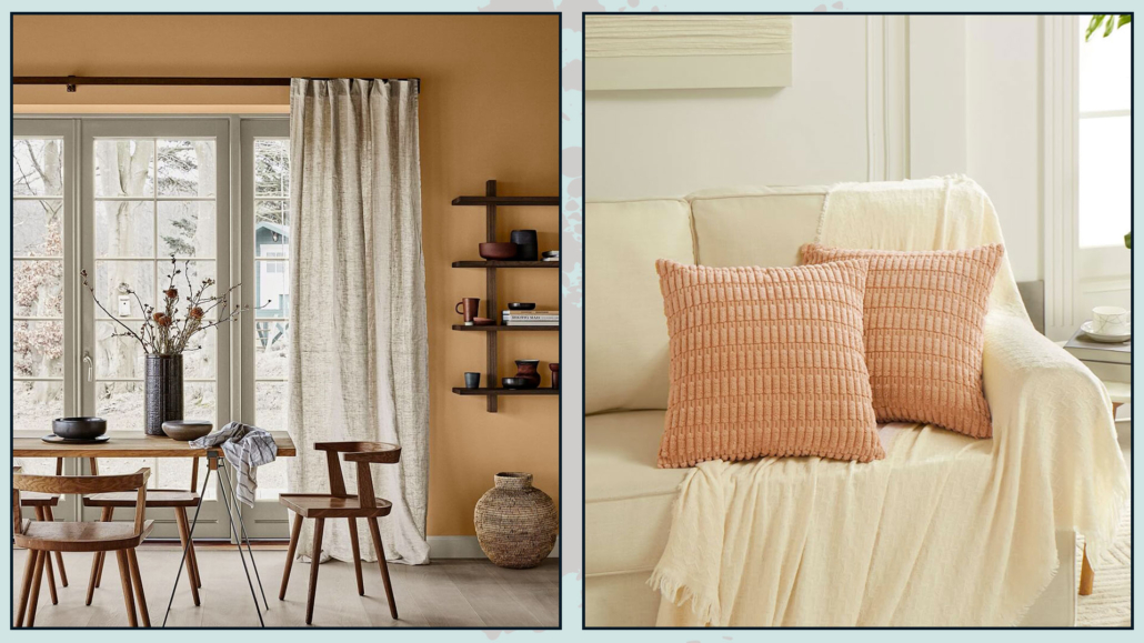
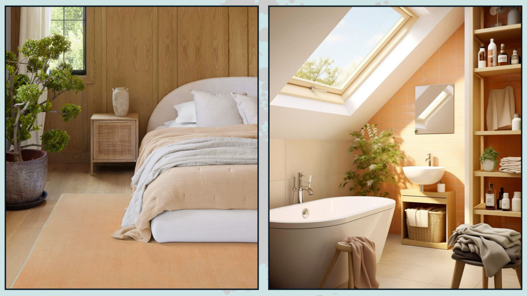
You can confidently use it on the walls, keeping in mind that, being a warm color, it may visually shrink the space a bit.

You can use it indiscriminately in all rooms, creating warm and inviting environments!

(credits: Manoj Patel Design Studio; Spoonflower)

(credits: Stacy Zarin Goldberg; the nordroom)

Regarding the walls, you can also use this color with wallpaper.

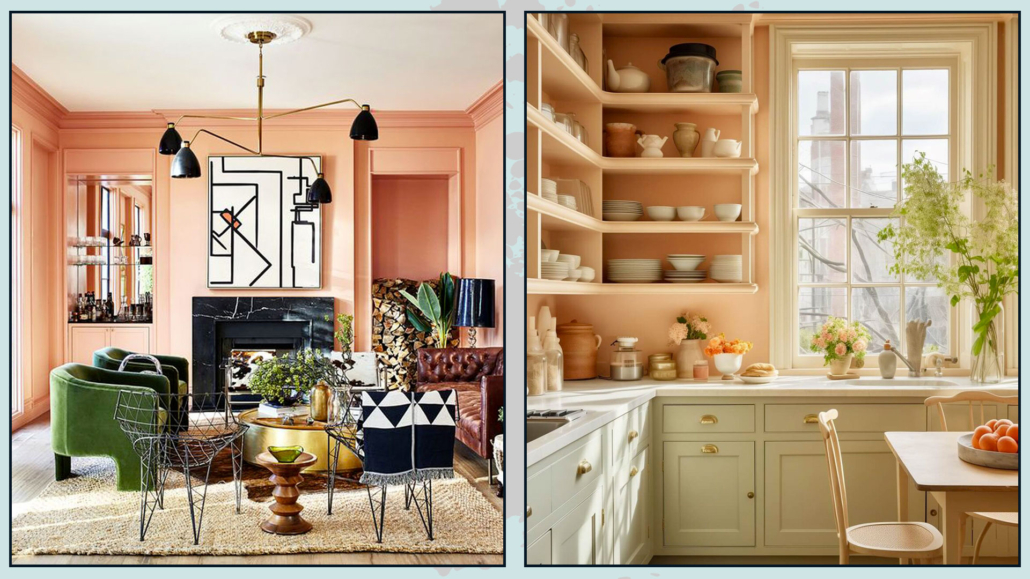
It works well in not overly large furnishings, such as a pouf, an armchair, a bench, or chairs.

You can incorporate paintings and objects with this color without any problem.

Of course, fabrics like blankets, pillows, and rugs can feature this color!

(credits: Jotun; Fanci home)

(credits: ruggable; the nordroom)

If you’re looking for wallpaper, fabrics, or rugs in this color, you can check out Spoonflower or Ruggable, brands that Pantone has collaborated with for his color of the year 2024!

Peach Fuzz is a color that easily complements many colors, both warm and cool tones, and pairs well with wood!

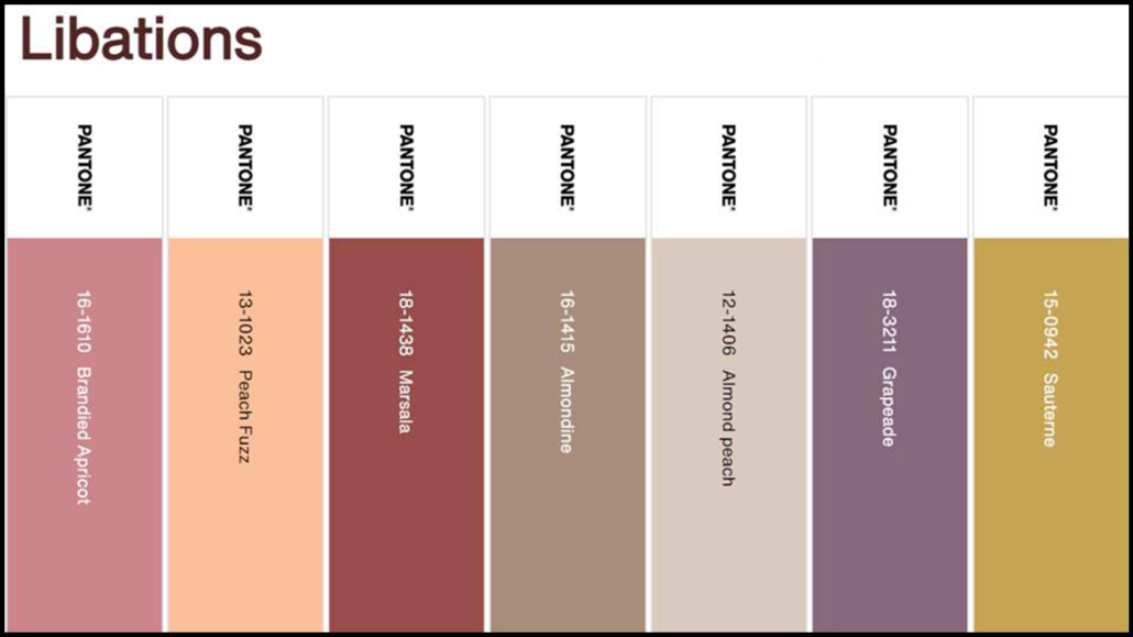
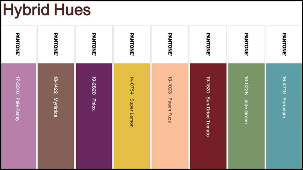
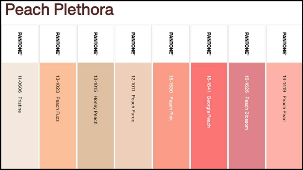
Pantone offers us 5 color palettes that are not the easiest to use:

– LIBATIONS

Consisting of a sophisticated mix with a sophisticated and elegant mood.

The colors create subtle and refined contrasts.

It’s a palette that blends well with various styles.

(credits: Pantone)

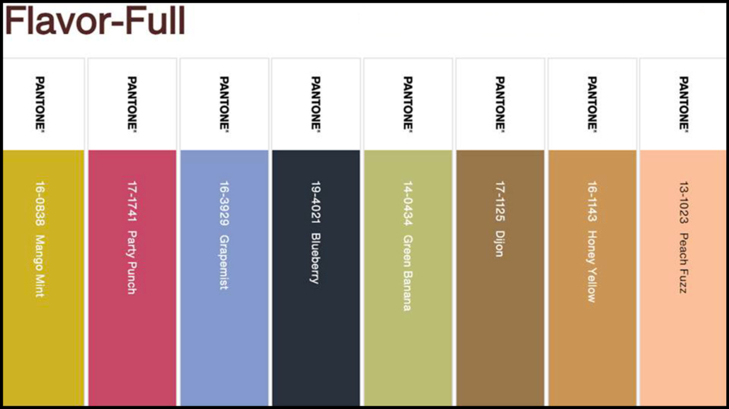
– FLAVOR FULL

It’s an engaging palette but not the easiest to combine because there’s a risk of creating “harlequin” environments.

Especially the first two colors (Mango Mint and Party Punch), it’s preferable to use them in small doses as accent colors!

(credits: Pantone)

– HYBRID HUES

It’s a true dichotomy of various colors that can indeed be harmoniously combined, although appearing quite discordant.

They are intense colors, mostly dark, so be careful not to weigh down the environment!

(credits: Pantone)

– PEACH PLETHORA

It is a monochromatic palette that embraces various peach tones, from the lightest and delicate to the most saturated and vibrant.

This palette, as well, is not the easiest to use because there’s a risk of a decidedly Barbie effect!

If you love this palette, use the softer colors as a base (principally Pristine, Honey Peach, and Peach Puree) and incorporate the more saturated ones in small doses, in decor items, and, perhaps, in a few cushions.

(credits: Pantone)

– PAIRINGS

This palette is composed of decidedly vibrant colors.

Excluding Peach Fuzz and Little Boy Blue, with which you can be a bit bolder, I would use the other colors sparingly.

(credits: Pantone)

Do you like this Pantone color of the year 2024? Will you use it? Let me know in the comments!

(credits: Pantone)

I hope this article has been helpful and enjoyable for you. If so, let me know in the comments!

Feel free to share it with anyone you think might be interested, I would be honored, and it will help me gain more exposure.

If you feel that your home, or any specific area of it, doesn’t reflect your personality enough, don’t wait any longer and book your consultancy!
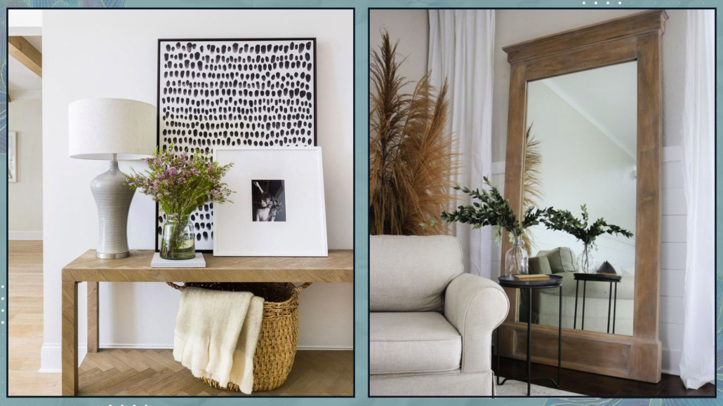
Today, we return to the Design Elements column, discussing 5 historic and famous design chairs (you can find 10 more here!).

1 – THONET 214 CHAIR

Designed by Michael Thonet (an Austro-Hungarian cabinetmaker) for the eponymous company in 1859, it is an undisputed icon in furniture history.

Since its inception, this chair has remained the most successful and widely produced globally.

It is the first seat made from steam-bent wood, with a seat woven in straw.

It is known as the Bistro chair because it appeared in bars and restaurants in Vienna.

Due to being one of the first industrial products, the chair was sold at significantly lower prices than handmade chairs.

Comprising only six pieces of wood assembled with ten screws and two nuts, it has an essential and light appearance, featuring a classic design that also complements modern styles.

The renowned architect Le Corbusier described the chair as “the best design product in history for its ability to integrate technique and style.”

This chair is displayed as a work of art in many museums, such as the MoMA in New York and the Vitra Design Museum in Germany.

(credit: Thonet; @emmamelins)

2 – WASSILY CHAIR (formerly B3)

Designed by Marcel Breuer (Hungarian architect and designer, a prominent figure at Bauhaus) in 1925 and produced by his own company, Standard-Mobel Lengyel, in Berlin; then, the company was later absorbed by Thonet in 1929.

The chair gained recognition and mass production in the 1960s when Dino Gavina met Breuer and suggested reimagining the chair for his eponymous company (which was later bought by Knoll in 1968).

The name of the chair was also Gavina’s idea: Wassily, in honor of Wassily Kandinsky, a friend of Breuer and a great enthusiast of the chair.

It appears that Breuer drew inspiration from his Adler bicycle in using steel tubing to design and construct this chair.

That turned out to be a brilliant idea because steel tubing was readily available in large quantities, effectively initiating the production of steel tubular furniture.

Breuer employed the techniques of local plumbers to bring the chair to life.

The seat, backrest, and armrest are bands of eidengarn fabric: cotton treated with wax and paraffin, calendered by passing it between two rollers!

That is an innovation, a new material created in the furniture workshops of the Bauhaus, where Breuer served as the director.

Initially, the chair featured steel and black textiles, and later, to “soften” it, a version with cream-colored ones was introduced.

It is also available in red and other softer colors.

In 2019, for the centenary of the Bauhaus’s founding, a limited edition was crafted with black tubing: 500 units were produced, each bearing the Knoll seal, Breuer’s signature, and a unique serial number on the base.

(credits: Bauhaus; Knoll)

3 – CESCA CHAIR (Formerly B32)

Designed, like the previous one, by Marcel Lajos Breuer in 1928 and currently produced by Knoll, the Cesca chair draws inspiration from two historical seats: the MR10 by Van der Rohe and the Thonet 214.

It features a steel structure (similar to the Wassily) quite akin to Van der Rohe’s design, though more angular, while its seat and backrest are made of wood and Vienna straw, reminiscent of the Thonet 214.

Being a cantilever chair, it deviates from the traditional four-legged design, relying on a single tubular structure for support.

The combination of structural innovation and classic seat and backrest materials gives the chair a contemporary and versatile appeal, making it suitable for integration into various styles.

The carefully composed structure makes the frame visually lightweight yet remarkably durable and flexible.

It’s a very comfortable chair, available with or without armrests and with upholstered seats (and optionally backrests) for added comfort.

Interesting fact: given the resemblance to Mies Van Der Rohe’s chair, Breuer faced quite a few legal issues, to the extent that he couldn’t claim ownership of this chair and had to stop designing with tubular steel.

Despite everything, his name remained associated with the chair in various industry magazines.

In the 1960s, when the Gavina company acquired the design rights, Breuer was once again credited as the designer, and the chair’s name changed from B32 to Cesca after Breuer’s daughter, Francesca.

The Cesca chair remains one of the most imitated and best-selling chairs in the world.

(credits: tamsinjohnson.com)

4 – LOUIS GHOST CHAIR

Designed by Philippe Starck (French architect and designer) in 2002 for Kartell, the Louis Ghost Chair playfully nods to Louis XV-style armchairs and is crafted from polycarbonate.

Classic-baroque in style but modern in materials and production techniques, it took two years to perfect the injection molding process, ensuring the chair could be produced in a single mold without any joints or attachments.

This process, today, has been further refined, with a significant portion of the polycarbonate sourced from industrial waste from cellulose and paper production.

That reduces carbon dioxide emissions, resulting in a 60% reduction in environmental impact.

Due to its transparency, the chair is suitable for any setting and looks perfect even around an antique wooden table.

Undoubtedly one of Kartell’s best sellers, it holds the title of the world’s best-selling chair, despite not being the first transparent chair by the brand, which is the Marie.

In addition to the pure transparent version (crystal), you can also find the Louis Ghost Chair in other delicate colors, always maintaining its transparency, as well as in white or black.

You can also find original transformations, such as Teddie bear, Barbie-themed, with wings, illuminated, and more.

You can find it virtually everywhere, from restaurants to theaters, in numerous homes, and even on television.

Surprisingly, it has made appearances in religious ceremonies as well. In 2007, during an outdoor celebration with Pope Benedict XVI, we saw religious figures seated beside him on Louis Ghost chairs.

Even Queen Elizabeth II sat on a Louis Ghost Chair in 2018, sitting next to Anna Wintour while attending Richard Queen’s fashion show.

(credits: H2 Design and Build; Teresa Sapey)

5 – MASTERS CHAIR

Designed by Philippe Starck in 2010 and Eugeni Quitllet (Spanish designer) again for Kartell.

The Masters’ Chair features a distinctive backrest that, at first glance, appears to be an aesthetically pleasing weave.

However, it is, in fact, a tribute to three iconic chairs: the Series 7 by Arne Jacobsen, the Tulip Armchair by Eero Saarinen, and the Eiffel Chair by Charles Eames.

The profiles of the backrests of these chairs are overlaid and intertwined, creating a chair that, in itself, becomes an icon.

The chair is made from polypropylene, a material similar to expanded polystyrene, known for its high mechanical elasticity and durability.

It is lightweight, comfortable, stackable, and available in many colors, including metallic finishes.

These features make it highly versatile, and it earned the Good Design Award in 2010 from the Chicago Athenaeum Museum of Architecture and Design.

The Masters’ Chair also exists in a tall stool version suitable for kitchen islands, peninsulas, and bar counters.

(credits: Kartell; Lauren Nelson Design)

I hope this article has been helpful and enjoyable for you. If so, let me know in the comments!

Feel free to share it with anyone you think might be interested, I would be honored, and it will help me gain more exposure.

If you feel that your home, or any specific area of it, doesn’t reflect your personality enough, don’t wait any longer and book your consultancy!
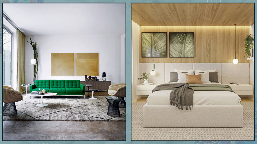
When it’s time for decorating your home, it’s easy to seek inspiration from magazines and the internet.

Often, we come across quite magnificent settings, but be careful about copying them because some solutions are indeed impractical!!! The home should be beautiful but, above all, functional!

Let’s look at some elements that may have the wow factor but can ultimately prove to be less convenient!

– WHITE SOFAS

White sofas are actually gorgeous to look at; for sure white is a timeless color that complements any style and palette.

Moreover, it certainly helps make the room feel more airy and bright.

The temptation, therefore, can be strong, but it’s genuinely not practical!

White gets dirty immediately, and you have to wash the covers very often, inevitably wearing them out!

Alternatively, you have to put unaesthetic sofa covers on them!

And on this matter, unfortunately, I speak from experience because my first sofas, I admit, were white!!

If you absolutely love white sofas, the advice is to buy ones with highly performant covers, like those water-repellent and stain-resistant.

Alternatively, an excellent compromise could be sofas in cream, gray, or ultra-light colors!

(Credits: Ikea; architonic.com)

– ARMLESS SOFAS

Armless sofas are very popular because they are linear and elegant, and without the bulk of armrests, they also appear more “lightweight”!

However, having arm support is much more comfortable and less rigid when sitting on the sofa!

If you don’t have an ottoman or a chaise lounge, you might still want to stretch your legs; if you have an armrest supporting your back, you can do it right on the sofa!

Even during a nap, having an armrest to rest the pillow on is undoubtedly more comfortable and “cocooning”!

In fact, the armrest somehow embraces you!

When buying a sofa, considering the investment, it’s essential to be clear about how you will use it because it’s actually a shame when sitting on it not to feel comfortable!

(Credits: 2modern.com; @la_muebleta)

– GLASS SURFACES

Glass greatly helps in brightening up a room; it’s relatively easy and quick to clean.

However, the downside is that it just takes a touch to get dirty, and dust is more noticeable on glass surfaces than on others!

So, especially if you’re not a fan of cleaning, carefully consider whether and what to get in glass.

If you love glass, you might consider getting frosted glass, which, being not transparent, will better camouflage dust and any traces!

The same goes for glossy black surfaces: they constantly need cleaning!

(Credits: bhdmdesign.com; leroymerlin.it)

– OPEN SHELVES AND NIGHTSTANDS

The concept of open shelves and nightstands has been popular for many years because it gives more breathing space to the rooms than closed furniture.

All the images featured in magazines or on Pinterest and Instagram are undoubtedly fabulous!

However, the reality is that most of the time, these setups are composed precisely for photographs.

In real life, things are not as they appear in the pictures!

Moreover, cleaning open bookshelves, shelves, and nightstands and removing everything each time is indeed impractical!

Does this mean having only closed furniture?

Obviously not, but there should be a few carefully chosen and decorated elements.

They should be well thought out and intentional, designed to showcase rather than “store.”

Let me explain further: there are books and objects worth displaying, creating unique compositions, and others that are not!

There’s also a practical aspect alongside the aesthetic one: everything that’s open and in plain view needs regular cleaning.

So, if you prefer to spend your time differently than constantly cleaning, think carefully about how much you want to keep open and on display!

(Credits: amazon.com; maisonblonde.com)

– VESSEL SINK

For a few years, the bathroom trend has included the vessel sink placed on a cabinet or shelf.

This type of sink can come in any size or shape, paired with a long or wall-mounted faucet.

Let’s admit it: there are some indeed lovely ones to look at, but they are not very practical!

In reality, the area where the sink rests on the cabinet or shelf will always be wet and dirty, requiring constant cleaning.

In the case of a faucet also resting on the cabinet, there might be difficulty in cleaning that area effectively!

If it’s a guest bathroom you don’t use very often, this inconvenience might not be so noticeable, but it will be evident in the case of the main bathroom!

It’s better to have a sponge nearby and clean after each use!

(Credits: Sceg Architetti; gaiamiacola.it)

– OPEN SHOWERS

Open showers are also an increasingly popular trend, with only one side glass wall covering half of the shower, leaving the rest open!

They are undoubtedly absolutely captivating, super minimal, visually perfect, especially in contemporary style, but decidedly impractical!

One reason is that no matter how careful you are, it’s inevitable to splash water everywhere!

It might work well if you have a huge shower with a glass wall that is actually long; otherwise, it can be very inconvenient!

However, another aspect may not be immediately apparent: since the shower is not enclosed, there won’t be a greenhouse effect, and therefore, there is a risk, especially in winter, of feeling cold!

(Credits: livcustomglass.com; galansobrini.es)

– SHAG RUGS

I’ve often talked about the importance of rugs in interior design: they bring textures and colors and can create defined areas by grouping elements together!

However, you must be careful about the type of rug you choose!

It’s easy to be drawn to shag rugs because they are visually appealing, but most importantly, they are super soft!

The problem is that they require continuous maintenance because they trap dirt much more and definitely become tangled and matted.

They should certainly be avoided in homes with pets, as their claws will easily damage the rug, and their fur will more readily get caught in the long fibers!

But in general, even high-quality shag rugs will wear out much more quickly than short-pile ones.

They might be suitable in low-traffic areas, but even then, given the vast range of other options, the advice is to avoid them!

(Credits: amon.com; @joanna.avento)

I hope this article has been helpful and enjoyable for you. If so, let me know in the comments!

Feel free to share it with anyone you think might be interested, I would be honored, and it will help me gain more exposure.

If you feel that your home, or any specific area of it, doesn’t reflect your personality enough, don’t wait any longer and book your consultancy!
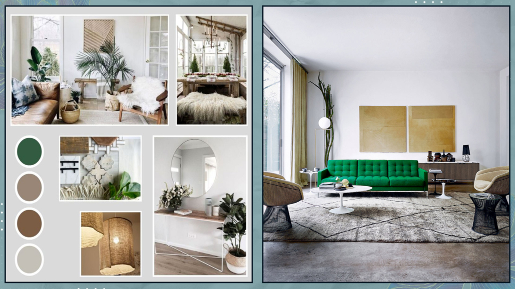
The end of the year is approaching, and often, with the arrival of the new one, we have a desire for changes in the house: so here are 7 tips to renovate your home!

1 – MAKE ORDER

Well, I understand it might not be the most exciting piece of advice, but tidying up is truly the first step in renewing your home!

By order, I don’t just mean what’s visible to everyone, which you probably don’t need, but really getting to the bottom of things by rummaging through your closets and drawers!

I’m sure you’ll find many items you no longer use for various reasons; it’s time to let go of them!

Go room by room, start with the visible elements, and then look into all the furniture.

Anything that no longer represents you, that you no longer like, pull it out and set it aside.

There might be things you don’t use but have sentimental value; create a special box for those items and keep them all together.

For everything else, you can throw it away if it’s no longer usable or take it to a thrift store!

You’ll breathe new life into these items, making someone else happy and creating space and organization!

Getting rid of what you no longer need brings in “fresh” new energy to your home!

(credits: auroracustomfurniture.com; salvatoriofficial.com)

2 – REARRANGE FURNITURE AND ACCESSORIES

I’ve mentioned this several times before, but sometimes we don’t realize there are different ways to arrange furniture, and some might even be more functional!

Try making some changes; in the worst case, you can always replace everything as it was!

While this may not always be feasible for furniture, it’s undoubtedly doable for accessories and objects!

Empty your bookshelves, clear off coffee tables and consoles, and then try creating different compositions by mixing objects from various rooms.

Sometimes, even small changes can entirely change the look of a room!

Before doing this, I recommend taking a few photos of the current arrangements – you never know, it might be easier to put everything back as it was if you’re not satisfied with any of the new setups!

(credits: viverelostile)

3 – PAY ATTENTION TO THE ARTWORK

While getting things in order and rearranging furniture and accessories, also take a look at the artwork you’ve hung on your walls.

Do they still represent you? Do they fit well with any new furniture and accessory arrangements?

If you’ve made changes or additions over the years, is everything still harmonious?

It might be a good idea to consider changing some frames or, conversely, some prints.

Maybe having fewer pieces is better, or perhaps something is missing!

In short, try to look at it all with a critical eye, not just with your heart!

Moving and changing this decoration is undoubtedly an excellent way to renew your home!

(credits: floss.com; etsy.com)

4 – TEXTILES

I’ve talked about it in the context of decorating your home in autumn and spring: change your home textiles.

First and foremost, the covers of decorative sofa and bed pillows: it’s quick to do, generally not too expensive, and the replacements don’t take up much space in your closets or drawers!

In the bedroom, you could change the bedspread or at least the one or more decorative blankets you might have at the foot of the bed.

In addition to decorative pillows, you might consider changing the sofa covers and any decorative throws in the living room.

You could even think about changing the curtains, especially if you have double curtains and one of them is colorful!

Changing the colors, textures, and patterns of various textiles will completely transform the look of your home!

(credits: terracota.com; © Emery Bastable)

5 – PAINT THE WALLS

Giving your walls a fresh coat of paint is another way to renew your home!

It’s immediate and has a tremendous impact!

Of course, you don’t have to paint all the walls if you don’t want to; just one accent wall can suffice and become the focal point.

You can use the color-blocking technique to emphasize an area (if you don’t know what I’m talking about, you can find the video here).

(credits: Design Studio; @thuisbijmij)

If you already have colored walls, you might think about changing the color of one or more of them to create a subtle contrast.

Doing this is easy and not too costly, but it will make a significant difference.

What if you don’t like colors?

Well, you can change the white!!!

Yes, because, as I explained some time ago, it’s easy to say white!

In addition to pure white, there are at least 150 shades of white, and believe me, they can make a big difference in renewing your spaces!

(credits: arde.dk; kvarteretmakleri.se)

6 – SET THE ATMOSPHERE

Often, people focus on the aesthetics of a home, then its functionality, and pay a bit less attention to the atmosphere!

I believe that functionality and atmosphere should be the first two things to consider.

And how do you create the atmosphere?

– SCENTS

One thing that often isn’t given much thought is that scents have an incredible impact on us.

Let me give you a simple example: how do you feel when you walk into a bakery with the delightful scent of freshly baked bread or into a coffee shop with the aroma of excellent coffee?

Think about all the times, even in a hurry, you’ve been captivated by a scent emanating from a store or restaurant and closed your eyes to savor it.

On the contrary, I’m sure that if you’ve been somewhere, even if it’s a beautiful place, with unpleasant odors, you’ve thought twice about returning!

Scents we enjoy help us feel good and relax.

Use diffusers and candles around the house, and you’ll see the difference it makes!

(credits: charmeandmore.it; Maisons du monde)

– MUSIC

Music also has a tremendous power to make us feel good in an environment!

No matter what activity you’re engaged in, having some background music can undoubtedly be very helpful.

Create playlists to use according to the moment; it could be classical or calming music if you need to relax or focus, or it could be something a bit livelier if you need a boost of energy!
Use it even when you have guests; they’ll appreciate it!
(credits: evanto)

– LIGHTING

We’ve talked it many times before: light can drastically alter the perception of spaces!

Warm lighting creates a calm and relaxing atmosphere, while colder lighting is less inviting.

It’s ideal to have multiple light sources in every room!

The general light can have a neutral, natural color temperature (around 4000K), while the others should all be warmer (more or less 3000K or lower).

A fantastic idea would be to have all dimmable lights, which means lights that you can adjust in terms of intensity and maybe even color temperature, allowing you to manage everything according to your needs!

(credits: lovisabarkman; porterdesigngrp.com)

These three elements are not set in stone (not even the lighting if you make it dimmable and can change the color temperature as desired), and this helps you change the atmosphere whenever you want!

7 – HANDLES

Another suggestion for renewing your home is to change the handles!

You can replace the ones on your doors, windows, and even the handles on various pieces of furniture.

Handles for furniture, in particular, are often available at affordable prices!

Handles are small but significant details that can make a huge difference and completely transform the look of your home!

(credits: cristincooper.com)

I hope this article has been helpful and enjoyable for you. If so, let me know in the comments!

Feel free to share it with anyone you think might be interested, I would be honored, and it will help me gain more exposure.

If you feel that your home, or any specific area of it, doesn’t reflect your personality enough, don’t wait any longer and book your consultancy!