Posts

Decorating home differently for each season is a way to give new life to our homes while giving them new energy too!

You don’t need big things because then we know we have to retire them at the following season change: just small touches that can make a difference, though!

Spring is approaching, so here are some tips for decorating your home for this beautiful period!

One of the first things to do is to take advantage of the famous spring cleaning, not only to do deep cleaning but also to get rid of anything that is no longer needed.

Good decluttering will help give rooms a fresher, lighter feel!

TYPICAL ELEMENTS

Spring kicks off the beautiful season, longer days, and the awakening of nature!

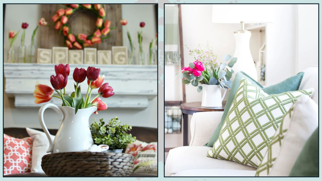
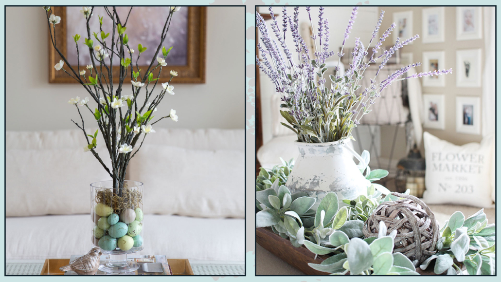
Plants, flowers, pastel and light colors, and fresh aromas are among the most typical elements to use in decorating your home and bringing a little spring into the home.

It is a proper time to take care of your plants, change the pots of those that need it, remove any yellowed leaves, and clean and polish them!

For flowers, I understand that it is not always feasible to have fresh ones everywhere, and I know I always say it is better to avoid fake plants and flowers, but let’s be objective: sometimes, it remains the best solution.

Always without exaggeration, of course, but nowadays, there are fake flowers that look real!

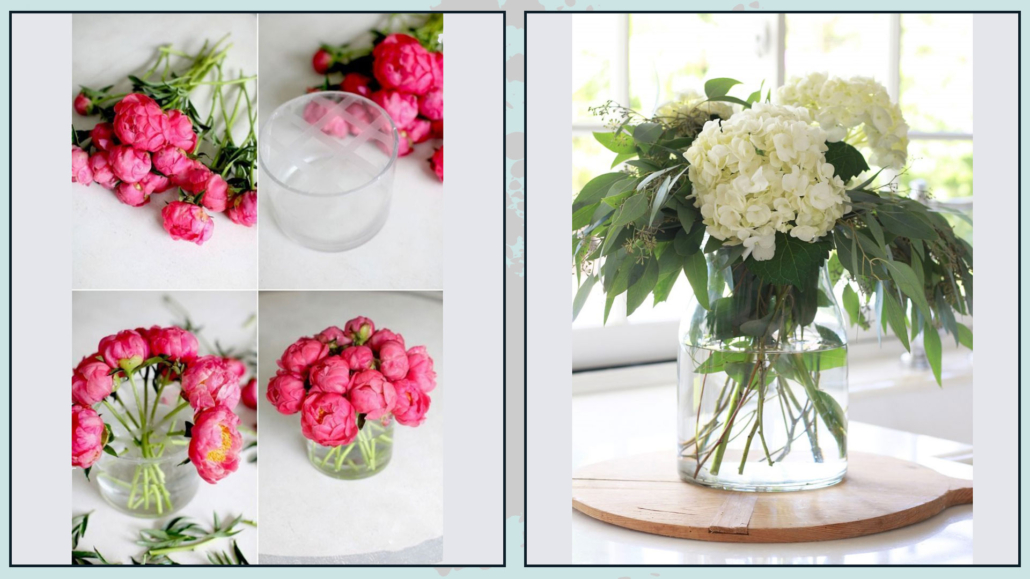
Then 2 tricks can help and not make people perceive that they are using artificial flowers:

– if using in a glass jar, put some water inside;

– add some authentic branches.

Berry branches, rather than that of eucalyptus or butcher’s broom, last for weeks and will give that touch of authenticity to the artificial flower arrangement!

In addition, pots can be created with small arrangements of moss.

Let’s now see, room by room, how to bring in a little spring!

(credits: awonderfulthought.com; onsuttonplace.com)

(credits: designthusiasm.com; thriftyandchic.com)

LIVINGROOM

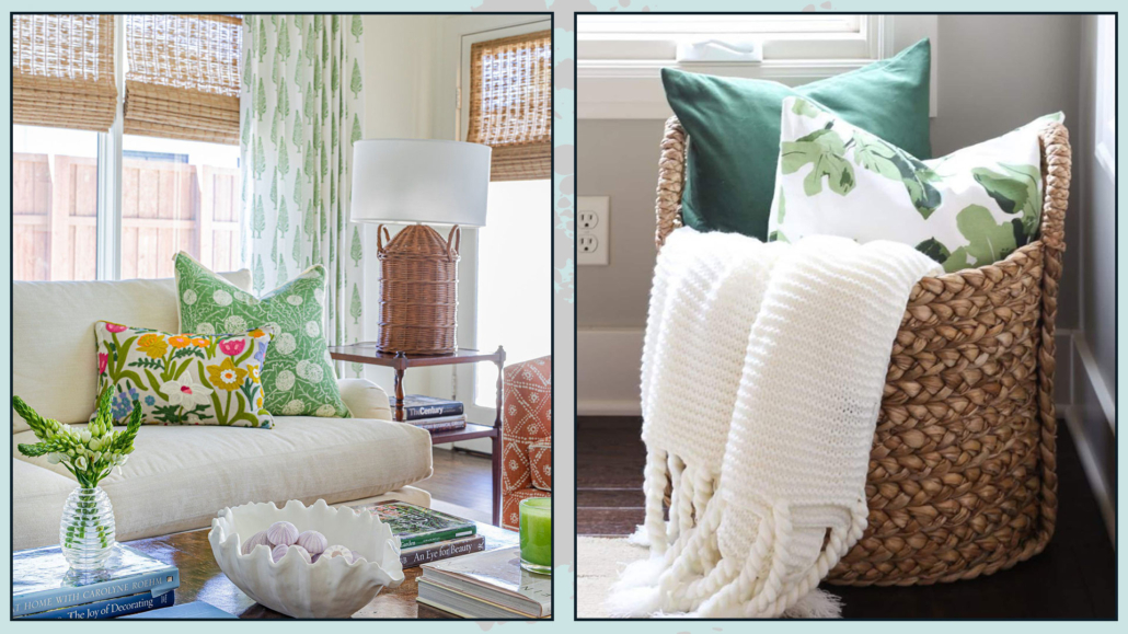
After taking care of the plants that are there, a quick and effective way to decorate is to change the covers of the pillows you have on the sofa.

Use colors in cheerful spring hues with some floral patterns, and use cotton, linen, and silk fabrics!

If you like to have the blanket on the couch, you can have it just as long as it is not wool but cotton and in spring colors, even vivid if you like to give some movement.

Change the decorations on the coffee table, putting a lovely vase of flowers and colorful and scented candles.

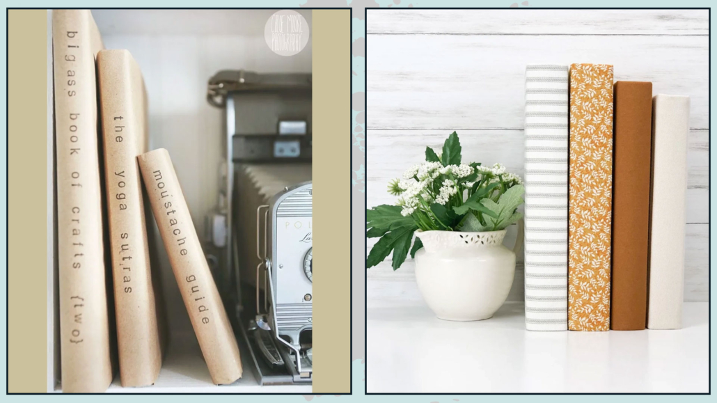
If you have dark-colored covers books on your coffee table, you might consider replacing them with books with lighter-colored covers.

If you have frames with prints, as I had suggested for fall decorations, you can think about changing them by putting ones with typically spring themes and colors.

These are all things that are not bulky yet change the face of an environment.

Wicker baskets are always “the welcome ones” and a great way to decorate and pick up anything that doesn’t need to be on view!

If you have double curtains, it’s a good idea, unless it’s neutral, to also change the non-filtering one to more spring colors.

A lovely centerpiece with a nice glass vase and flowers will be ideal for the dining table too!

(credits: ©EmeryBastable; lifeonvirginiastreet.com)

KITCHEN

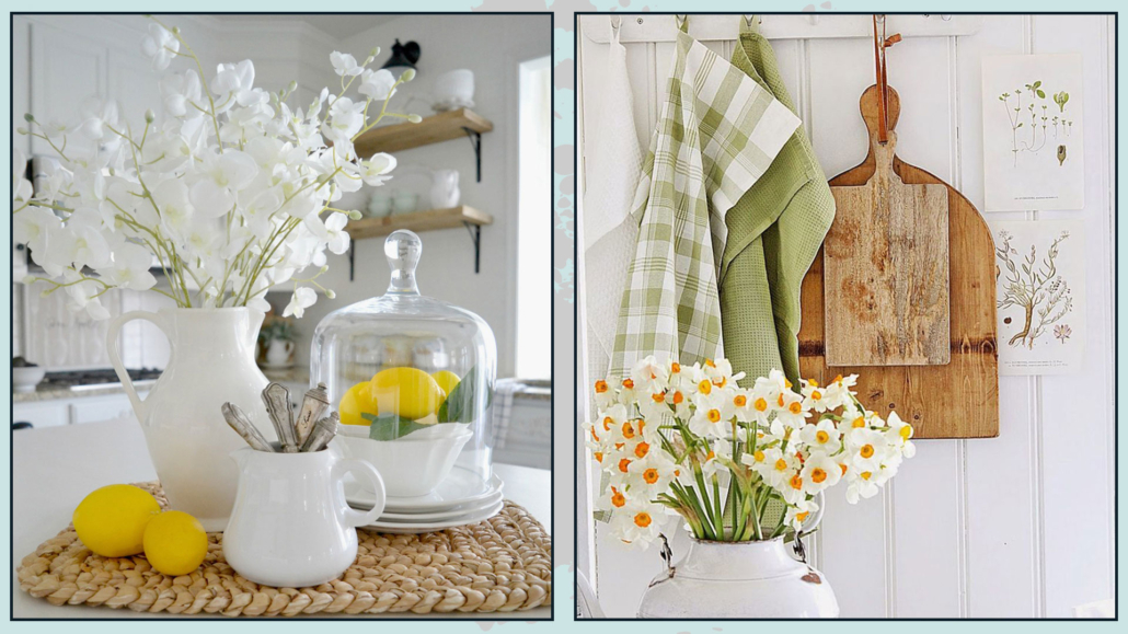
The best way to bring spring into the kitchen is to have jars with aromatic herbs and maybe lavender!

The scents these give off immediately bring you back to this fresh season!

You can also accompany these with lemons to give them some color and fragrance!

If you have pretty colored mugs, you can take them out and place them on a tray on the countertop.

You can hang some garland, maybe DIY, on the walls: you can find many tutorials on the internet!

And, of course, change textiles, such as gloves, potholders, and aprons, but also any cushions on chairs and rugs!

(credits: adventuresindecorating1.blogspot.com; vibekedesign.blogspot.com)

BEDROOM

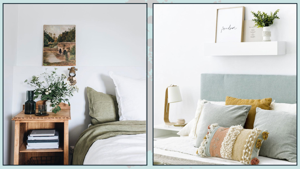
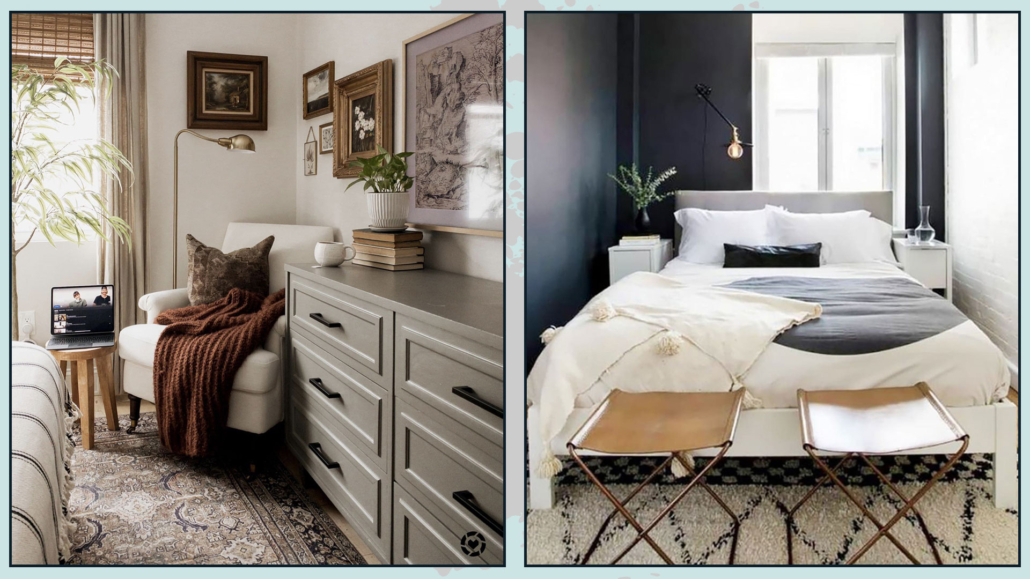
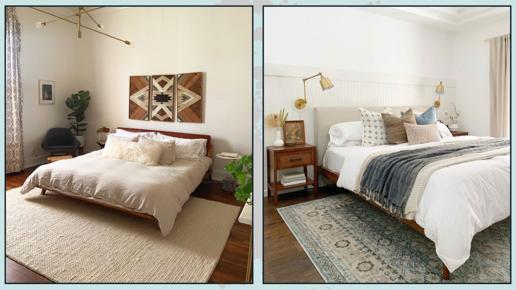
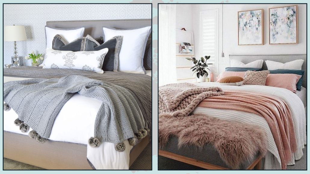
Here too, as you can imagine, the easiest and most effective way is to change textiles!

You can decide on a bedspread in cheerful colors, perhaps with floral patterns (always being careful not to overdo it).

Or you can keep a more neutral bedspread and add the splash of color with pillows and a blanket at the foot of the bed!

Similar to the living room, you might think about changing the non-filtering ones if you have double curtains.

On the dresser, a beautiful arrangement with flowers in a lovely glass vase and a few colorful, scented candles.

You can as well put small flower arrangements on the nightstands or place a faux tulip on it.

Again, if you have paintings with prints, replace them with more spring-like images.

(credits: @abbie_melle; kenayhome.com)

START THINKING ABOUT THE OUTDOORS AS WELL

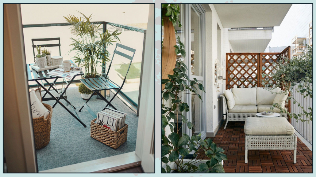
However small your balcony may be, take advantage of the outdoor spaces as well and start fixing them up!

There can be no shortage of plants there, possibly with flowers to give some color too, but also think about a small seat or just some cushions on the ground!

Make the interior and exterior connected to enlarge and give more breathing space!

If you want more ideas on how to decorate a balcony, I talk about it here (7 ways to make a balcony pleasant and functional) and here (How to decorate your balcony, even if it is small and narrow!)!

(credits: gordmans.com; blackhaus.com)

I hope this article about decorating your home in spring was helpful and you love it; in case, let me know in the comments!

Feel free to share it with anyone you think might be interested, I will be honored, and it will help me get my name out there.

And if you need advice for your home, do not hesitate to contact me!

Curtains, I always say, are really essential when furnishing and decorating a house!

This is because they dress the windows and bring warmth, textures, and wanting colors to the room.

Today I would like to look at some common mistakes you make when putting up curtains and also how to do it in special situations such as when there are radiators, you have an arched window, or the window is very close to a wall!

LET’S START WITH THE COMMON MISTAKES!

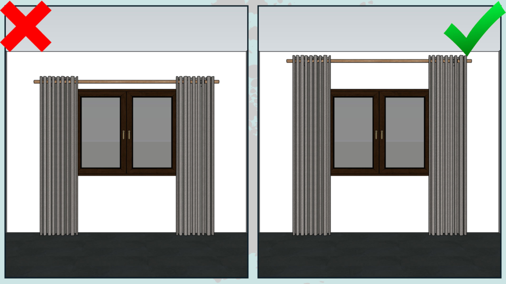
– HANG AT THE RIGHT HEIGHT

That is a mistake people often make: which is to hang curtains just above the window!

Putting the curtains at that level will not emphasize the heights by visually shrinking the room!

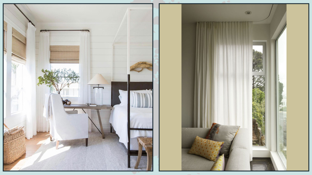
The curtain should be hung as close to the ceiling as possible; to give an idea about two-thirds of the space between the window and roof.

If the ceiling were really very high, the curtains should be hung at least 15-20 cm above the window!

– PAY ATTENTION TO THE LENGTH OF THE ROD

Another mistake that is often made is to buy a rod the same size as the window or just slightly longer.

That, as with the previous point, somewhat shrinks the window, but mostly it is nonfunctional.

The curtains, when open, obstruct the passage of light because they overlap the windows!

You need to calculate at least 10-15 cm on each side so that the open curtain barely covers the window profile.


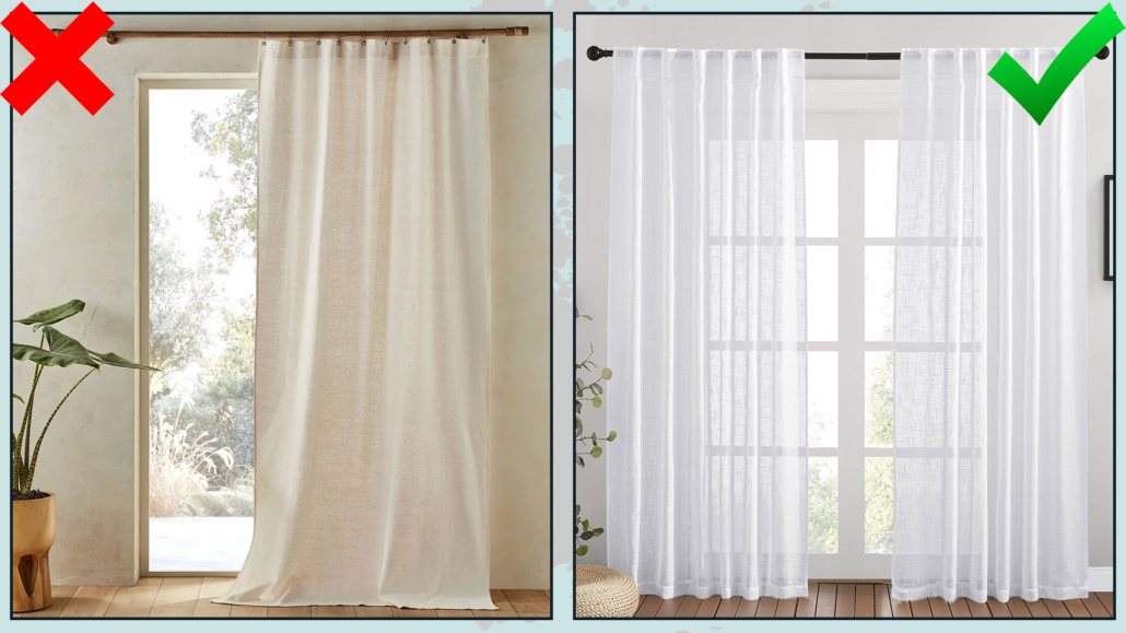
– CHOOSE THE RIGHT WIDTH PANEL!

Curtains should always be soft both when open and closed.

Choosing a too narrow panel will result in the curtain appearing drawn when the curtains are closed.

Conversely, if the panel is too wide, it will be heavy both when the curtains are closed and especially when they are open!

In either case, the curtains will look randomly placed and unstudied!

(credit: la redoute; amazon)

– TAKE GOOD MEASUREMENTS IN LENGTH!

Another very common mistake is to have curtains that are too short!

Doing this will visually shrink the room, and as with the previous point, the curtains will look as if they were placed without a proper study.

Depending on the style and especially how much they are opened and closed and the footfall in that area, three lengths can be studied:

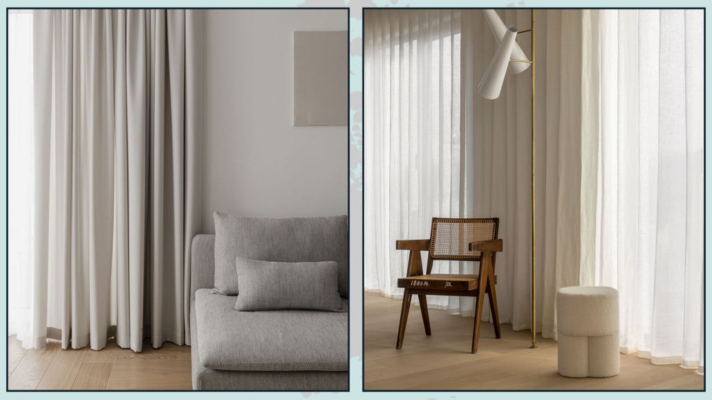
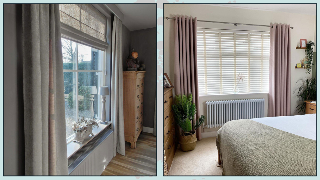
– the curtain that skims the floor: this is ideal when curtains often open, in high footfall areas, and for an elegant yet casual look;
If you really don’t like the idea of it skimming the floor, you can make it slightly shorter, but no more than a couple of inches.

(credits: Pion studio; villedesign.be)

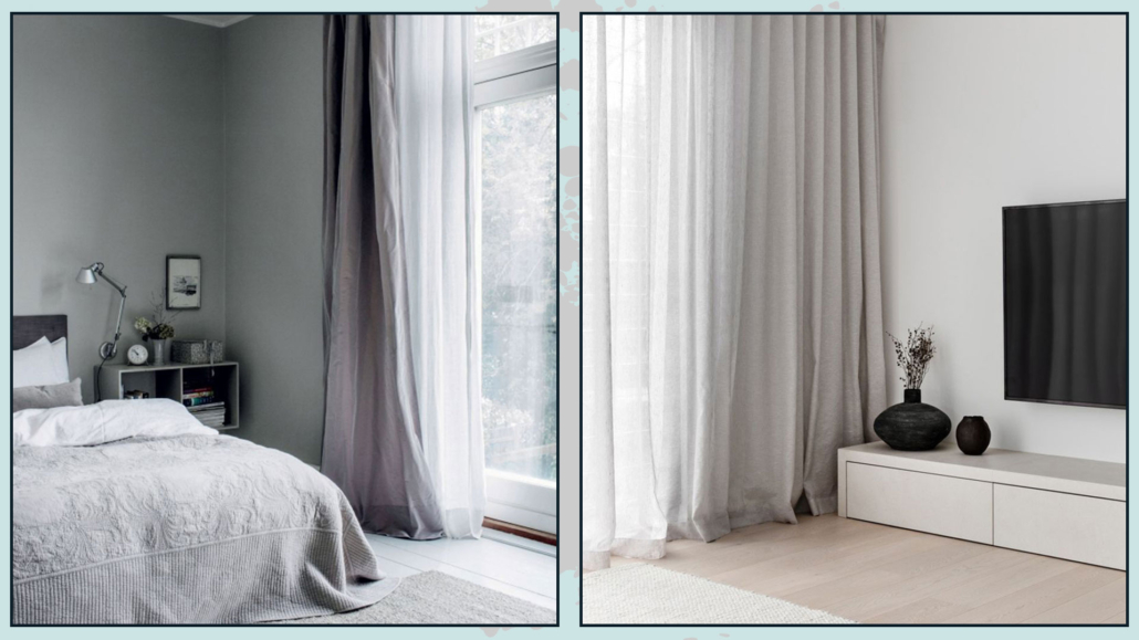
– make the curtain rest slightly: this means adding 1-2 cm to the curtain relative to the floor so that it caresses it.
It is ideal for giving an extra dynamic touch!

(credits: Cille Grut; Kate Lawrence Interiors)

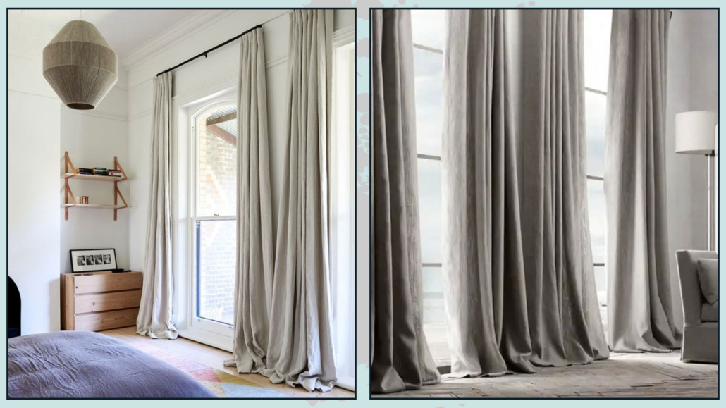
– create a slight puff on the floor: to do this, you need to add 4-6 cm to the fabric relative to the floor.
That will give a touch of formality to the room.

Be careful not to overdo the puffing, first of all, because there is then the risk of stumbling in, but it will turn out anything but elegant!

(credits: thedesignfiles.net;borgonovo1930.com)

HOW TO DO IN PARTICULAR SITUATIONS?

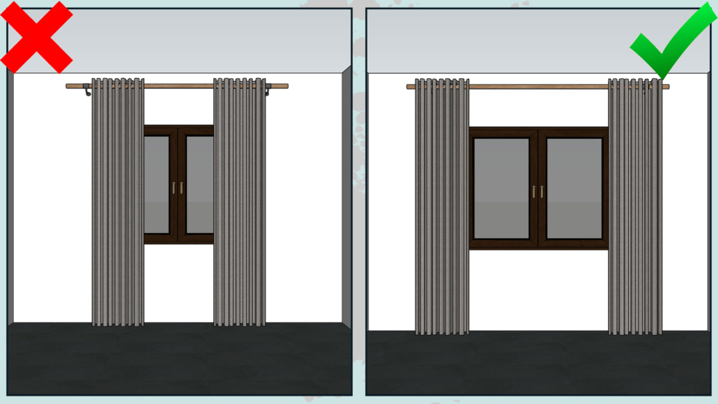
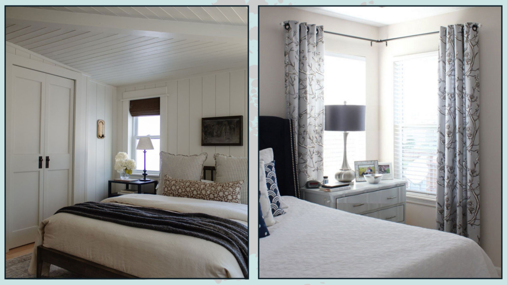
– WINDOWS NEAR THE WALL – ANGLE WINDOWS

You might happen to have windows near the wall that do not allow you to have that extra 10-15 cm for the rod: how to do it?

In this case, it might be advisable to decide to change the type of curtain, choosing packet or roller blinds, not necessarily glass blinds!

If you have two windows in a corner with not enough wall portion between them, it is best to avoid having 2 panels for each window; when open, they would overlap the window, not letting light through well!

If this is the case and you would still like to use drapery, the solution is there: use two different types of curtains!

That is, a roller or package to the window and then use an angle rod and use only one panel per window!

This simple trick will make the windows look like one, even if angular!

(credits: nadinestay.com; thehomesihavemade.com)

If, on the other hand, there is a good portion of the wall, possibly equal for the two windows, then double drapery panels will do!

I still recommend using two separate rods to emphasize each window.

If the corner window is a unique window indeed, I would recommend not using rods but ceiling tracks for a simpler and cleaner effect.

(credits: Marie Flanigan Interiors; Houzz.com)

– RADIATORS

Perhaps in the new generation houses not, but in most other homes, the radiators are put under the windows.

That presumably is so as not to steal valuable space from other walls.

Positioned this way, however, makes it more complicated to use curtains because if they cover it, obviously they block the passage of heat somewhat.

Again, it might be worthwhile to use two different types of curtains, that is use roller or packet curtains and drapery!

When the heaters are on, you will keep the drapery curtains open to let the heat in, but you will not have to give up privacy because you can pull down the other curtains!

Doing so will not block the heat but will not give up the elegance and fullness that drapery curtains give!

(credits: @Huisno26; Greenbank Interiors)

– ARCHED WINDOWS

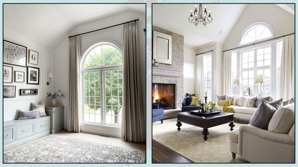
When you have arched windows, the ideal is to treat them like regular windows and then put the rod over the arch as close to the ceiling as possible!

You can put the rod below the arch only in case the window, and consequently the ceiling, is a really high one.

The risk, if not, is to suffocate it by making the environment visually smaller.

(credits: makingprettyspaces.com; Jane Lockhart Design)

I hope this article was helpful and you love it; in case, let me know in the comments!

Feel free to share it with anyone you think might be interested, I will be honored, and it will help me get my name out there.

If you feel that your home, or some environment of it, does not reflect you enough, do not wait any longer and book your consultancy!

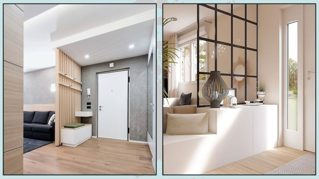
It is increasingly easy nowadays to find houses where you enter DIRECTLY into the living area and therefore it’s important creating an entrance area where, in fact, there is none!

Let’s look together at some ideas for doing this; it goes without saying that a lot will depend on the configuration of the room!

– USE FURNITURE

I’ve talked about this in other videos: we tend to place furniture against the wall, often missing out on incredible opportunities!

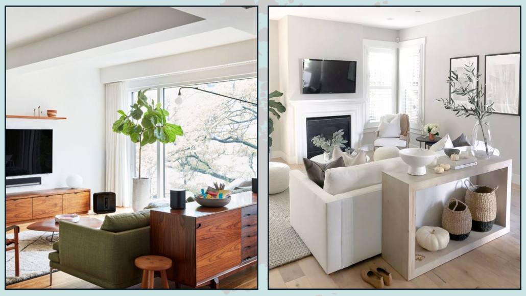
You may find that positioning the sofa differently so that it has its back, facing front or side, to the front door creates a more intimate conversation area.

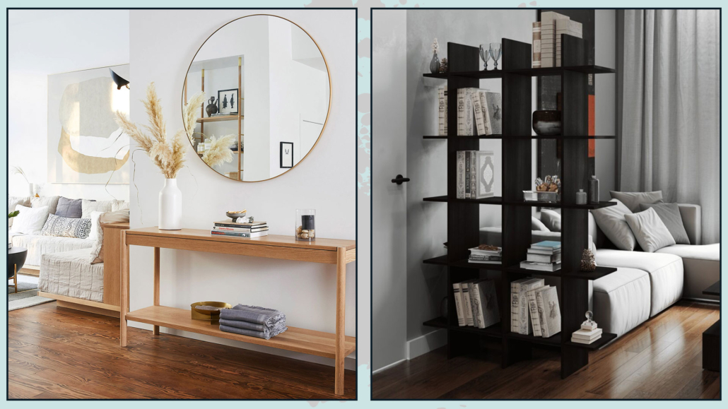
The sofa at that point would act as a divider between the entrance and the living room, and behind it, you could place a console table that would serve as a countertop for the entrance!

(credits: midcentury585.com; girlmeetsgold)

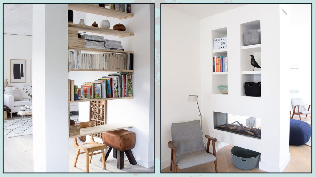
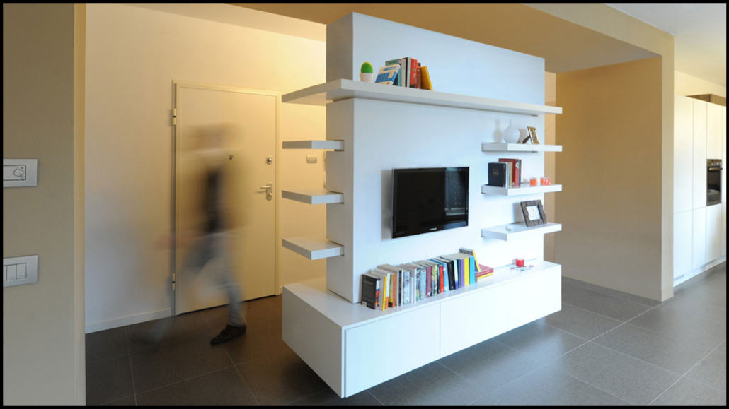
If the living room is developed right in front of the door, you could put a piece of furniture, maybe double-sided, right in front of the door, leaving the passage to the sides, obviously!

That will be functional for both rooms, demarcate the areas and screen the living room a bit!!!

(credits: graziani-dicembrino)

When the living room should develop sideways, you can take advantage of the front or side wall for a console table and mirror, and perhaps, on the other side, an open bookcase, acting as a “broadside”!

You could choose it low so that it doesn’t block the eye at all, and to have an extra tabletop, but you could also decide to get a full-height one to screen a bit more.

(credits: studioblitz.com; amiel.club)

– VERTICAL DIVIDERS

Still looking at separating the entrance a bit from the rest of the living room, it might be a good idea to use proper dividers.

It could be a small wall, perhaps drywall, at full height to act as a shim, and that is functional for the entrance, so with shelves or, if the depth allows, even with doors, to serve as a closet for coats and bags.

(credits: homebook.pl; redesignhome.co)

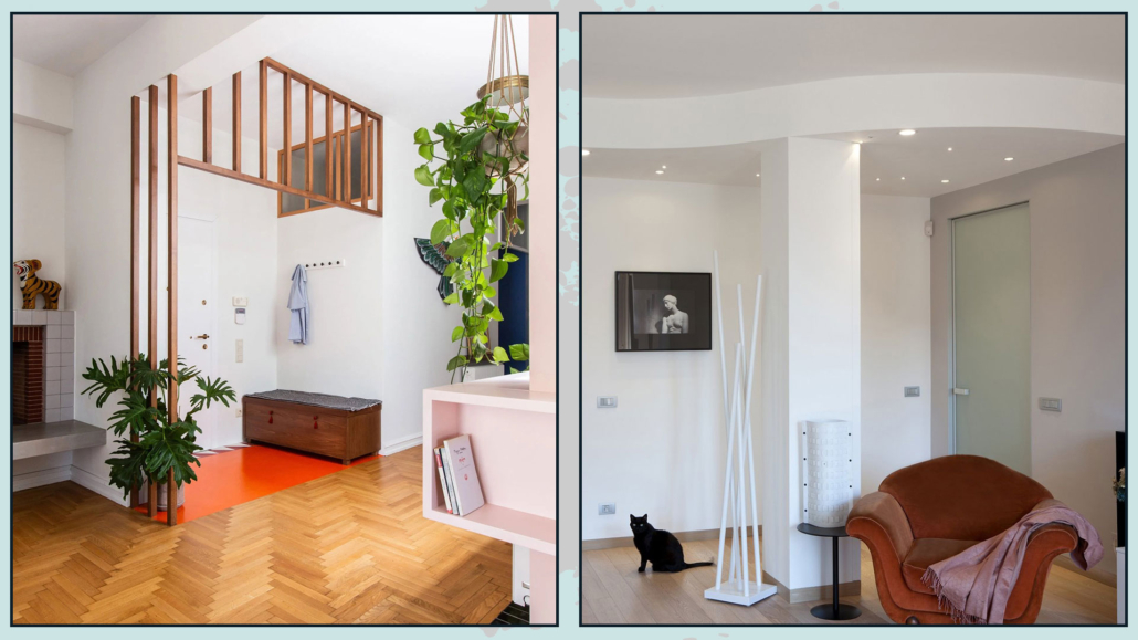
If you want something less invasive, you can think of small walls made of wooden slats or glass so that as much light as possible can pass through.

The latter perhaps surmounting a small wall at half height.

In all cases, you could put a small bench or console leaning against these dividers that will be very useful as well as decorative.

(credits: lemayr-thomas.com; teste.com.ar)

Do you have a pillar nearby? Why not take advantage of it?

Depending on the distance to the wall, you can put shelves or a cabinet or close it with sheetrock creating a niche!

If you want more ideas on how to hide or at least disguise a pillar, I’ve talked about it here.

(credits: Heimai; femkeido.nl)

– USE COLOR AND MATERIAL CHANGE

Another good way to create an entryway when it gives directly into the living room is to have different flooring and/or make a small suspended ceiling, perhaps with spotlights.

The latter is also very functional for proper lighting of that area.

The change of material creates a barrier that unconsciously demarcates spaces.

(credits:living corriere; cose di casa)

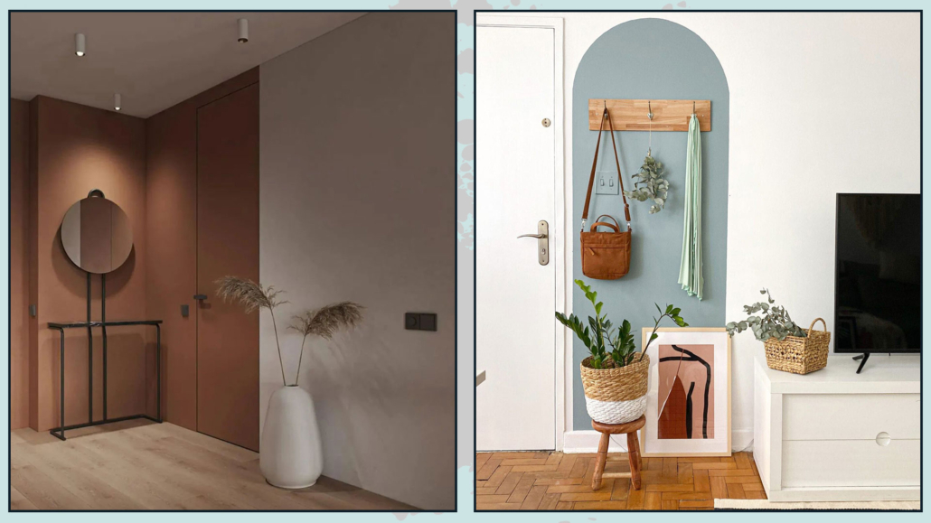
You may also decide to use the color-blocking technique and paint the wall or the piece of it that serves as the entrance differently from the rest.

All you need on that wall is a small shelf and a mirror, and you’re done!

(credits: behance.net; @meu.alugado)

START FROM THE BASE AND PLAY WITH THE FLOOR PLAN!

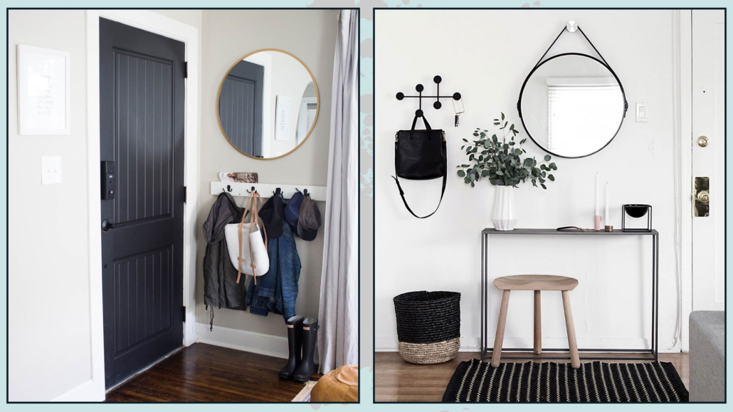
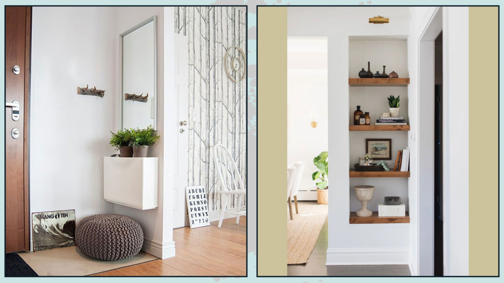
The essentials for an entryway are a countertop so you can “empty your pockets” when you return, a mirror, and a couple of hooks for coats and bags.

That is the basis from which to start and for which a small portion of the wall is really all that is needed.

From there, depending on the size and shape of the room, you can add a closet or a bench to embellish and make the entrance even more functional!

(I talk in detail about entrance here!)

(credits: rooneyclothing.com; homeyohmy.com)

As always, what will make the difference is good design!

It is essential to evaluate the spaces and how to arrange the furniture so that all areas are functional.

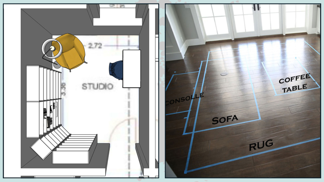
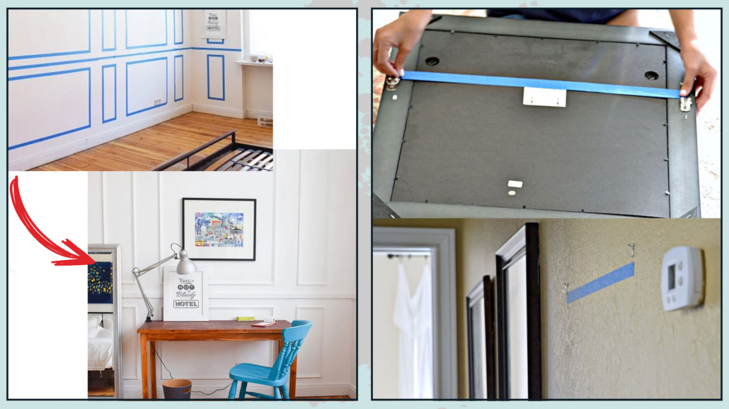
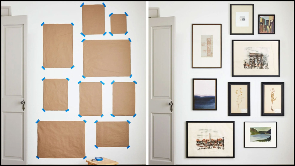
As I always say thus, it is paramount to play with the floor plan by drawing furniture to scale or to use paper tape and drawing pieces of furniture on the floor!

Visualizing remains one of the best ways to avoid making mistakes and understand whether you are furnishing in the best way for your needs!

By trying and trying again, you might even discover solutions that, at first glance, you would never have thought possible!

(credits: Gaia Miacola Architetto; TiredBee)

I hope this article was helpful and you love it; in case, let me know in the comments!

Feel free to share it with anyone you think might be interested, I will be honored, and it will help me get my name out there.

If you feel that your home, or some environment of it, does not reflect you enough, do not wait any longer and book your consultancy!

Today I want to write a different article, linking back to a comment that was written under one of my videos, to warn you about all the given interior design advice, even my own!

No, I’m not losing my mind: the problem, of course, is not with the advice itself but with how ones follow it!

The temptation is to take what is said as, grant me the term, “pure gold”, and then follow it through regardless!

COPYING THE ADVICE COULD BE DETRIMENTAL!

But in doing so, there is a risk of not having a home that really represents you!

The principle is the same as what I explained when I said that “decorating by copying from magazines could be detrimental…

The house is YOUR house and should be furnished according to YOUR needs, which are different from anyone else’s!

Good design, I often say, is not only about aesthetics but also, and I would say especially, about functionality!

Having a beautiful house, a cover house, but not functional for how you live it, will NOT make you feel comfortable!

The advice that all my colleagues and I give is general advice dictated by our studies, experiences, styles, and trends, and also by the culture and environment in which we live.

They are professional advice, yes, but as just said, generic, that is, suitable on paper for everyone but not designed for you specifically.

Moreover, excluding the 6 basic concepts and the focal point, on which I would say we all agree, you might also find different ideas: it is normal and understandable; who is right? Who’s wrong? Everyone and no one!

DECLINE THEM ACCORDING TO YOUR NEEDS!

So here it becomes really very important to take these tips and declutter them to your own needs!

It might also happen that an idea you love very much, unfortunately, for a thousand reasons, is not feasible at all in your home, at least not as it was said!

But, when even the idea that caught your eye is actualizable, in addition to pleasing aesthetically, always be sure to ask yourself whether it is functional for your everyday life.

In the comment I mentioned earlier, the girl explained how she had to do things differently than I had related because of very peculiar needs.

She was really good at managing the various ideas she had heard and seen (not just from my channel, of course), modifying them to combine aesthetics with the functionality needed for her life!

That is the proper spirit with which to take the various interior design tips and bring them into one’s home.

EXPERIMENT WITHOUT FEAR

Don’t be afraid to experiment you may even find that for you, the ideal is actually the opposite of what has been said!

In the end, who has the right to say if something is right or wrong? If you like something and it makes you feel good, the problem doesn’t really exist!

For you, probably everything I just said is absolutely normal; it has never crossed your mind to follow step by step the various advice you hear and see, in case I am happy about it.

But I felt the urge anyway to “put you on notice” because I really care so much that you can have your dream home, don’t blame me!
Then if general advice is not enough for you, if you want extra security and help, you can always request a consultancy!

In this case, all ideas and suggestions will be specific to you and your needs!

If you want to do this consultancy with me, you can contact me: I will be glad to help you!

Today I would like to emphasize again the importance of starting with the furniture project when you have to renovate your home!
I know it’s not the first time you’ve heard me say this, but it’s so paramount that it’s good to bring it up again every once in a while.

The furniture project should be done even when we “simply” have to furnish a home (especially if we are starting from scratch) to really make sure that we get a result that represents us fully.

Where well or poorly the furniture was already there, I can grant to skip this step ONLY if the renovation would involve redoing the bathrooms and, at most, the floor.

That is because we assume material choices will be made based on the style and color palette you already have!
Actually, even here, it would be better to do a minimum of planning to be sure that everything you have (or otherwise want to keep) will fit and can be put in a practical way!
THE FURNITURE PROJECT HELPS YOU TO HAVE A FUNCTIONAL HOME

In all other cases, however, it remains sure that it is really essential to start with the furniture project!

The reasons why I insist on this are many, although, in the end, the main reason is only one: that you can have the home of your dreams, a home that can truly represent you!

For this to happen, it is not enough to have a “beautiful” house; it must also be functional!

I open a small parenthesis, in case you have to buy furniture from scratch: when I talk about furniture design, I am talking about a preliminary design.

That is, having an idea of what elements you need to make a functional room with the addition of a moodboard and color palette.

So it’s not that you have to previously know that you’re going to have that specific credenza, for example, but that you would want a credenza well or poorly of that size, shape, and color.

The moodboard and color palette will help you choose materials.

Having specified this, let’s see in detail why to start with the furniture project, whether you already have the furniture or need to buy it!

BEING ABLE TO CORRECTLY DEFINE SPACES

That is especially if you decide to make structural changes by altering the size of rooms by tearing down and rebuilding some partitions.

By what criteria will you decide (excluding the minimum dimensions imposed by law, of course) the size of new rooms if you have no clear idea of the furniture you want to put there or how to arrange the existing one?

A few inches could make a massive difference in having a comfortable and functional environment from one that is not!

A furniture project will also be able to get you out of the box, if necessary, by perhaps creating unusual room arrangements that might, however, be more functional to your way of being!

STUDY THE ELECTRICAL (and more) SYSTEM CORRECTLY.

How many times have you heard me say that lighting is the most significant part of interior design?

How can you study an authentically functional system without knowing where you will place the furniture?

You will end up studying general lighting and then put sockets more or less everywhere for prudence!

But now imagine that you are lucky enough with a large living room, so large that when you place the furniture, you decide to put the conversation area in the middle, with no element leaning against the wall.

How will you be able to have good lighting in that area?

It will not be possible for you to have any floor or table lamp unless you have ugly, as dangerous, flying wires on the ground!

With a furnishing project done before, you could have had one or more sockets on the floor!

The matter of systems is obviously not limited to the electrical one, think for example, the kitchen:

if you have no idea how you want it, you could decide to leave the connections where they are…

And then maybe find it inconvenient to have, for example, the sink to the right of the burners rather than to the left!

Or you might think you have an island and maybe have the sink or burners on this island.

But how do you decide exactly where to put the connections if you haven’t designed the kitchen?

That applies whether you have to buy a new kitchen or reposition the old one because certainly, some changes will have to be made!

SAVE!

Does this point seem strange to you? Now I’ll explain why you can save time, and even money, by investing time in the furnishing project!

If everything is clear and defined, you’ll be able to choose the best construction company or artisans for the work you have to do. By giving them an accurate project, they will make you targeted estimates and not be dictated only by their experience based on similar works.

That will ensure that, excluding unforeseen events, prices will not change during the work!

Furthermore, there will be no waste of time, having clear everything there is to do!

Even, if you have to buy the furniture (all or in part), knowing what you want precisely, with a quick search, you will be able to choose the furniture store or shops that are right for you, and you will save a lot of time!

Do you see how investing in the furnishing project is an advantage?

Don’t be afraid to play with the plan of the house, print several copies, draw to scale and cut out the furnishing accessories and study different solutions until you find the one that satisfies you the most!

If you have any doubts, or would you prefer help, do not hesitate to contact me!!

I hope this article was helpful and you love it; in case, let me know in the comments!

Feel free to share it with anyone you think might be interested.

I will be honored, and it will help me get my name out there.

If you feel that your home, or some environment of it, does not reflect you enough, do not wait any longer and book your consultancy!

Living in a dark room, or worse, a house, is not the best and is also not good for our psyche.

What to do when dealing with rooms with low light? Let’s look at some simple tricks to brighten them up!!!

1 – CLEAN THE WINDOWS GLASSES

I know it will seem like trivial advice, but dirty glass does not let light penetrate well and will therefore make the room darker.

If the room also had a balcony, you need to pay attention to any plants that could block the light!

(credits: elements.evanto.com)

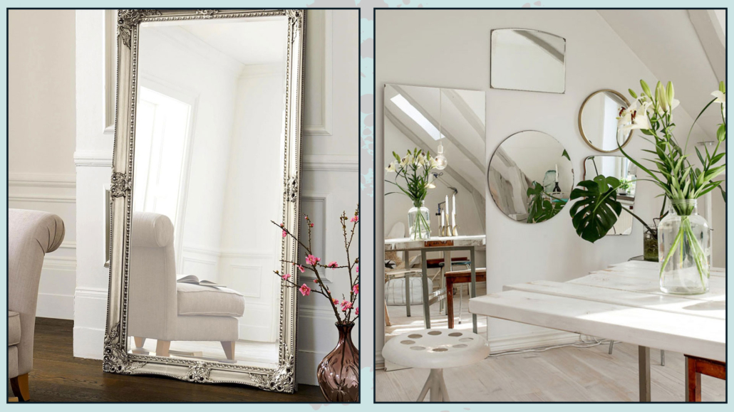
2 – DOUBLE THE LIGHT WITH MIRRORS

Strategically placing some mirrors will really make a big difference!

One of the places I recommend is in front of the window because it will double the light and give you the impression of having another window!

It could be one big mirror, but you can also decide to have more than one, perhaps of different sizes and shapes, to give some rhythm too!

(credits: shutterstock; Nodric design)

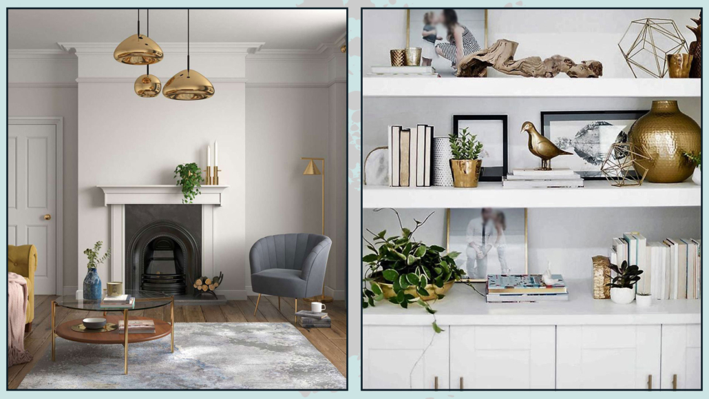
3 – ILLUMINATE WITH METALS

Another trick to make a room brighter is to use metals!

They can be the door handles, the structure of chairs, coffee tables, and lamps, or the frames of paintings and mirrors!

They are small touches that will help brighten up rooms, thanks to their ability to reflect light!

Of course, unless you have chosen a Glam style, don’t go overboard using these materials!

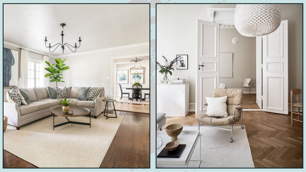
(credits: thecolourhub.ie; decoholic.org)

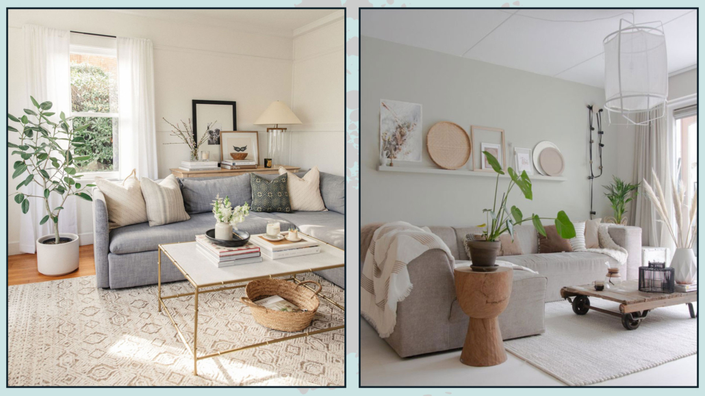
4 – USE LIGHT COLORS

Light colors reflect light very well and, therefore, will help a lot in making a room brighter.

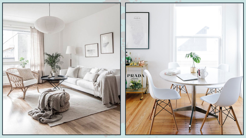
Of course, the ultimate reflective color is white, which does not have to be pure white, but can be a warm or even cool white depending on the mood you want to give the house.

However, if you want to use colors, you know that you don’t have to give them up, and you have two options for doing so:

– Use your favorite color by adding a lot of white to make it neutral (and bright)

– Use pastel colors!

(credits: stylemepretty.com; noordenzoet.nl)

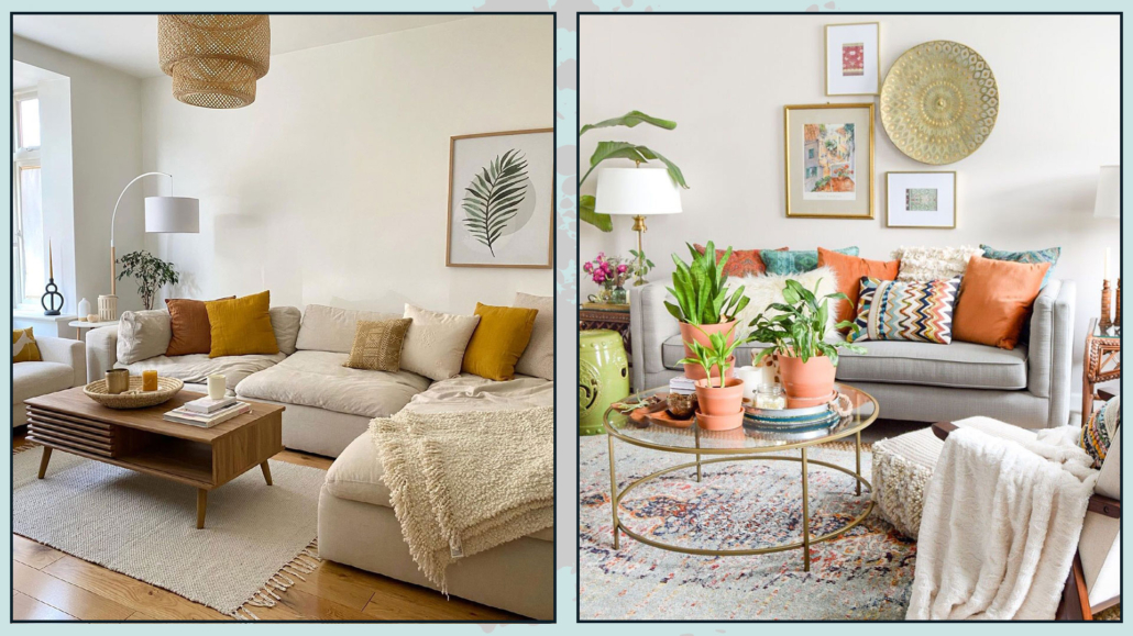
That should be done, not only for walls and ceilings but also possibly on larger pieces of furniture.

That doesn’t mean having a total white home if you don’t want it, not least because if not properly designed, having everything white, as well as for neutrals (I’ve talked about it here), could make the environment flat and boring!

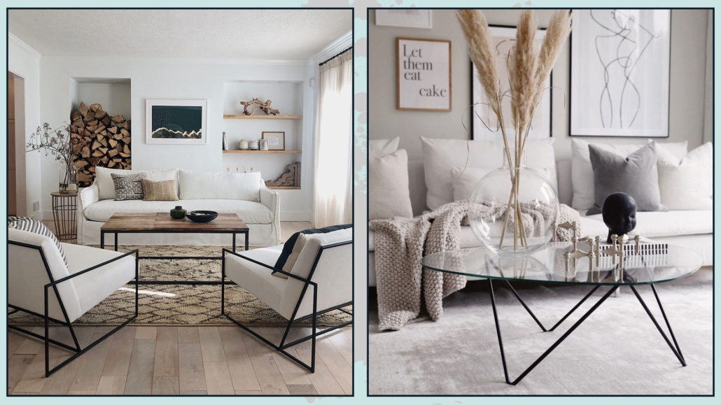
So it’s great to add a few touches of color here and there with decorative items such as pictures, pillows, and other objects!

(credits: made.com; casawatkinsliving.com)

5 – ATTENTION TO THE FLOOR

The talk of light colors also extends to floor color…

A dark floor does not reflect light and makes the room darker.

If you have a dark floor and can’t or don’t want to change it, use light-colored rugs: it will be a quick and easy way to give it more brightness!

(credits: designdirections.com; cocolapinedesign)

6 – PAY ATTENTION TO THE FINISHES

The finish you choose, whether on walls or furniture, will also make a difference!

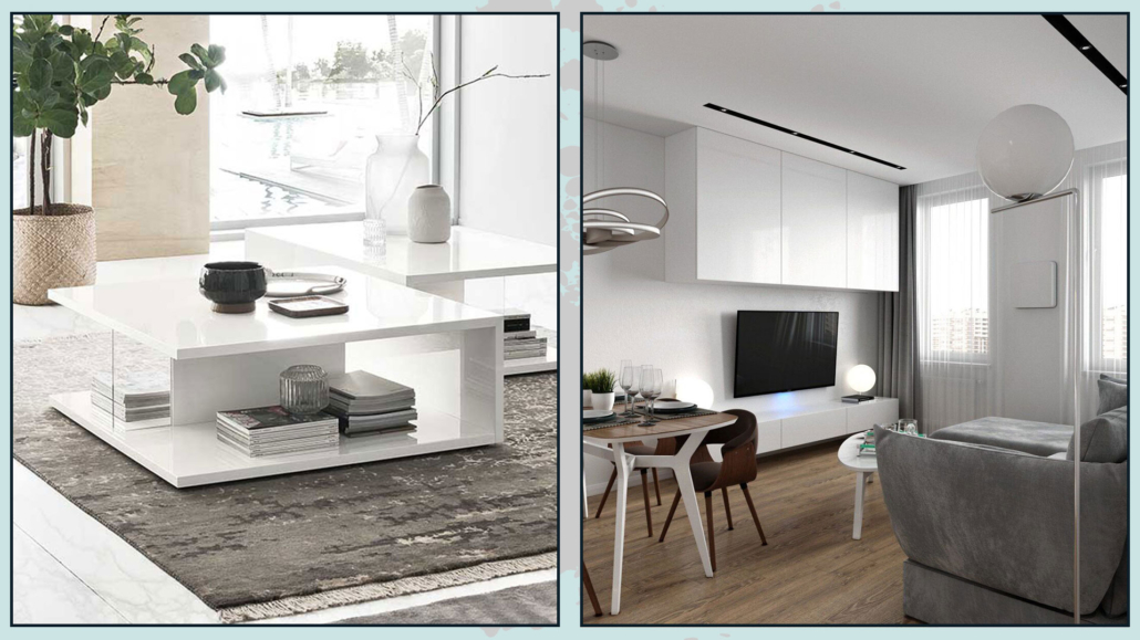
Matte finishes absorb light, while glossy ones reflect it.

Obviously, it’s not the case to have all the shiny finishes that would make the room look a little, allow me the term, tacky!

Alternate these finishes, preferring perhaps semi-gloss finishes; this will also help give some rhythm and depth!

(credits: furnitureworld.co.uk; behance.net)

7 – LAYERS LIGHTING

It’s something you’ve heard me say countless times now, but in interior design, lighting is really the most vital part!

Then if the room tends to be dark, a good artificial light design will really make a difference.

Therefore, it is essential to have different light sources; the general one is not enough because it would also make the room very flat!

(credits: etsy.com; behance.net)

It will also be paramount to calculate the bulb wattage and color temperature well!

Too powerful and too cold a light will absolutely illuminate everything, but it will make the environment really inhospitable!

Then choose the appropriate lumens for the size of the room and choose as natural a light as possible (around 4000 ), at least for the general lighting.

For the other lights, also use warmer temperatures to create as well some atmosphere!

There are bulbs to which you can change the color temperature; that could be an option!

(If you want to know more about lighting I talk about it here)

(credits: lartedinnovare.it; viverelostile.com)

8 – PREFER LIGHTWEIGHT FURNITURE

A bit like what happens with small rooms, heavy furniture will make a room darker because it blocks light and creates strong shadows!

Better to use furniture with a more slender structure, perhaps raised so that some light can pass under them as well!

Using transparent furniture, always without overdoing it so as not to make the room too cold, will also help brighten the room.

(credits: maidenhome.com; joannacolomas.com)

9 – BE CAREFUL HOW YOU PLACE THE FURNITURE

In making a room brighter or not, the placement of furniture will make a big difference too.

For example, it is a good idea to place the lightest furniture, perhaps with the shiniest surfaces, near windows and light sources: their light shape will not block too much light, and their glossy finish will reflect light rays!

(credits: livingroomideas.eu; Sera Michael)

10 – USE LIGHT CURTAINS

Thick curtains block light, so unless you have privacy issues, use very light and bright curtains!

Do you love the idea of double curtains, especially to give color?

You don’t have to give them up, but avoid blackout shades, use a fabric that is filtering anyway and colors that are not too dark, but most importantly, keep them on the side, so they don’t cover the window!

(credits: kimdeyir.com; evgezmesi.com)

These are small tricks that will help make a room brighter without drastic renovations!

I hope this article on how to make a dark room brighter was helpful and you love it; in case, let me know in the comments!

Feel free to share it with anyone you think might be interested, I will be honored, and it will help me get my name out there.

If you feel that your home, or some environment of it, does not reflect you enough, do not wait any longer and book your consultancy!

Today I would like to talk about designing the perfect bedroom so that it is a super inviting, relaxing, and beautiful room!

The bedroom is the most intimate and personal room, and it is often the one we care for the least because “only I see it anyway”!

Actually, it should be the one we pay the most attention to because it is the one where we drop all our defenses when we go to sleep, so it is the one that should make us feel the best of all!

So let’s look at some suggestions to make the perfect bedroom for you!

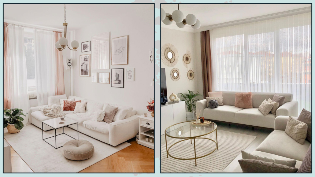
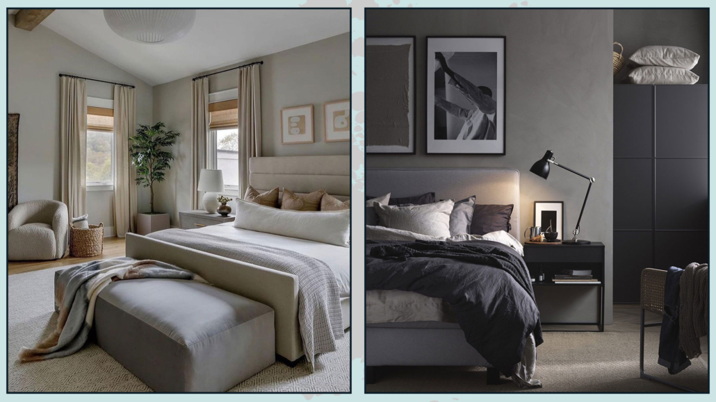
– USE THE RIGHT COLORS

Use soothing and cozy colors, colors that can make you feel good.

Recommended colors for the bedroom are shades of green, beige, and light blues, but really any color that you feel is yours will do!

The only caution will be not to use too vivid colors, except as an accent, but try to make it more neutral by adding white if you want light colors or black or gray if you want darker colors.

Doing this will allow you to have your favorite color, making it softer.

As you noticed, I mentioned not only light colors but also dark colors; this is because dark colors make the room more intimate, and therefore, it could really be a good idea for the bedroom!

(credits: lillytaylorinteriors; Pella Hedeby)

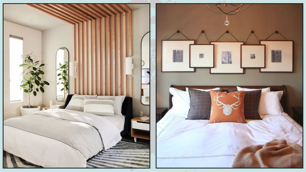
– CUSTOMIZE THE BED WALL

In most cases, the bed wall is the focal point of the room, so make it significant for you!

It could be a simple painting that has a special meaning or excites you, or a photo gallery or the display of particular objects; there is no rule: the important thing is that it draws you in and excites you!

Here are some ideas on how to decorate a bed wall.

(credits: bobbyberk.com; Bria Hammel Interiors)

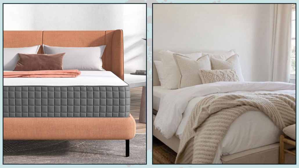
– CHOOSE THE RIGHT BED

By the right bed, I don’t mean so much the aesthetic part, which certainly has its importance, as much as the bed base and mattress so that you can have a good sleep!

These are two items, especially the mattress, that you really cannot go cheap on!

It is absolutely essential to get the right products that will allow you to get the best rest because only then will you be fresh and relaxed to face the coming day!

The bed frame is an extra, which will undoubtedly be important aesthetically but not functionally.

You might even decide to have only one particular headboard, maybe only designed on the wall on the wall!

(Here you can find some ideas for the bed headboard!)

(credits: amazingbargains.com; @CarleysWorld)

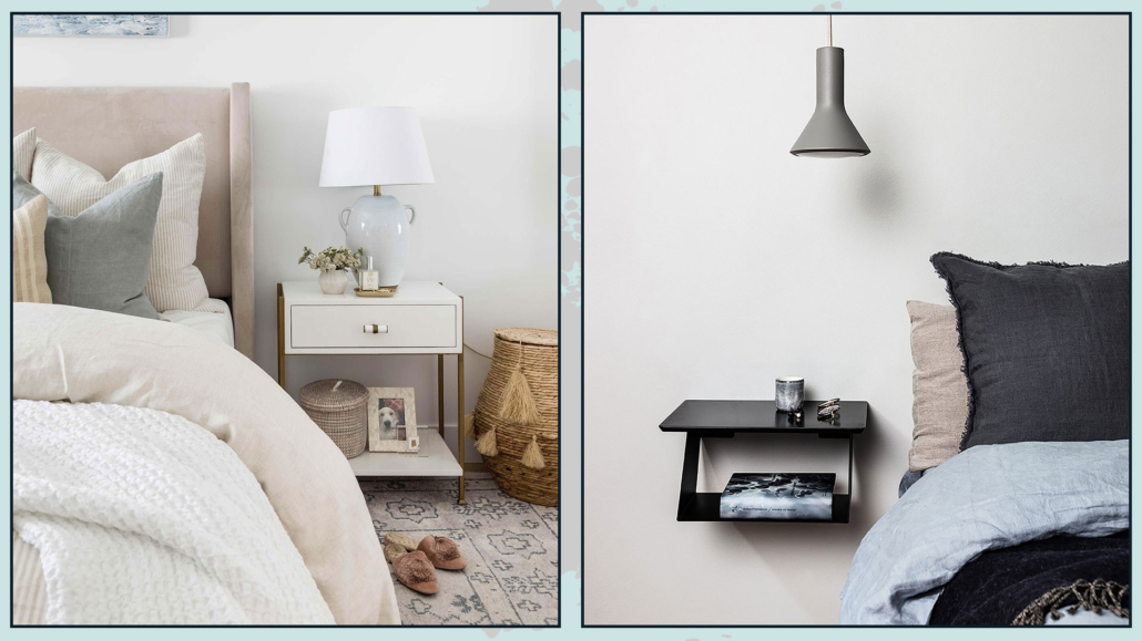
– I RECOMMEND THE NIGHTSTANDS!!!

No matter how small the bedroom is, it is really paramount to have something to serve as a countertop next to the bed!

That is for being able to rest the necessities, from an alarm clock to a book or even the phone (although that would be better not to have it near at night)!

If you don’t like classic nightstands, you can use a chair or place a super simple shelf, but it’s really mandatory to have something!

It will also be relevant to pay attention to the height of this tabletop for easy use, which should be at mattress height.

When this is not possible, it should be a little higher, but a maximum of 10cm!

(credits: shoppe.puresaltinteriors.com; royaldesign.se)

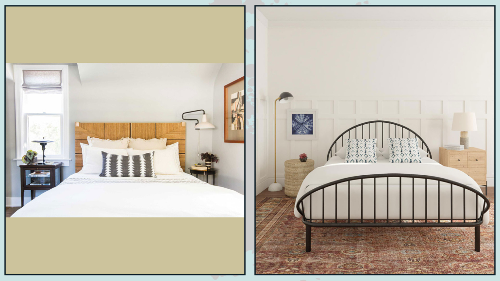
– DON’T PURSUE SYMMETRY AT ALL COSTS!

When choosing nightstands, you don’t have to feel compelled to buy them the same, perhaps coordinating with the bed and closet.

This choice is often made because symmetry is thought to be visually more beautiful in the bedroom!

Well, NO, it is not mandatory; an asymmetry, on the contrary, if well balanced, could make everything much more interesting!

Also, if there are two of you, you likely have different tastes and, above all, different needs, so one type of nightstand may suit one but not the other!

So don’t worry if there are two different nightstands in terms of shape: the important thing will be that they can perhaps have a commonality like color or material!

If then the two nightstands were also very different as visual weights, you could balance them with lamps, pictures, or, why not, a plant!

(credits: stylebyemilyhenderson.com; modsy.com)

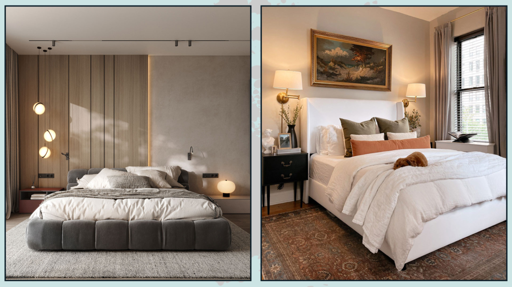
– ABATJOUR

While having multiple lighting points is always very important, in the bedroom even more so: it is essential to have a light near the bed.

It can be a table lamp to rest on the nightstand, a sconce light, or even (and we increasingly see more and more of these) pendant lights.

Some renovation work obviously needs to be done for the latter, but they have a spectacular effect that is truly amazing!

Wall lamps might be more functional where the bedside table top is cramped to avoid “stealing” practicable space for something else!

Another crucial thing in designing the perfect bedroom is the color temperature of the bulbs!

In the bedroom, it is preferable to use warm lights because they remind our brain of the color of the sunset, and this puts us in a position to relax and then sleep better.

(credits: behance.net; target.com)

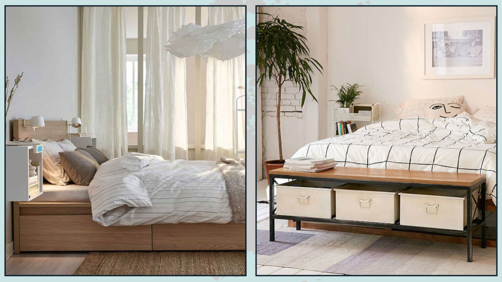
– THINK ABOUT CONTAINING

It may sound silly to you because you definitely have a closet, but it’s essential that the bedroom is really uncluttered!

That is because the disorder creates unconscious discomfort that can also disrupt sleep.

So think about having more storage elements: in addition to the possible dresser, it can be the bed with a box or drawers, but it can also be boxes to put under the bed.

It could be a bench at the foot of the bed or even a simple ottoman.

(credits: Ikea; urbanoutfitters.com)

– ADD A SITTING

The bed should only be used for sleeping, so here, to make the room functional, it is relevant to add extra seating.

That can be useful for sitting down when you need to put on socks or shoes or to lay down a dress without precisely touching the bed!

Moreover, as seen in the previous point, the seat could be a container, thus also becoming a multifunctional element!

Not only that, it brings shapes and textures, and this gives some rhythm and movement to the room.

(credits: Pretty-Honeydew;  Homepolish)

– USE THE RUG

The rug, as always, is a controversial element: if you think about it for the living room, it is much more difficult for this to happen in the bedroom!

And I’m not talking about the bedside rugs, which, let’s face it, are kind of sad!

I’m talking about a nice big rug to accommodate the bed, nightstands, and possible bench at the foot of the bed!

That will create an even more intimate sleeping area, but more importantly, it will be functional to avoid resting your feet on the cold floor!

And, again, it will contribute textures and colors, making the room more inviting!

(credits: Kristin DuFour; hartleyhomedesign.com)

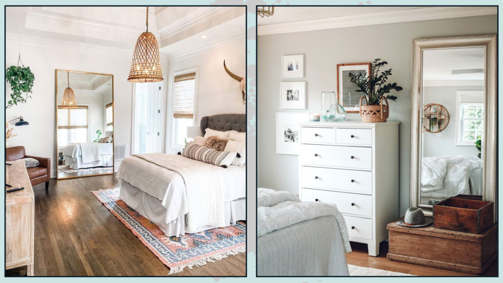
– DON’T FORGET THE MIRROR.

The bedroom is the place, 99 out of 100, where you dress and get ready for the day, so it is paramount to have a mirror where you can check that you are in order!

Personally, I really love the mirror resting on the floor, but the important thing is that it is a long mirror in which you can see yourself entirely!

The mirror also doubles the light giving more breadth to the room!

(credits: ideasdonuts.com; nestingwithgrace.com)

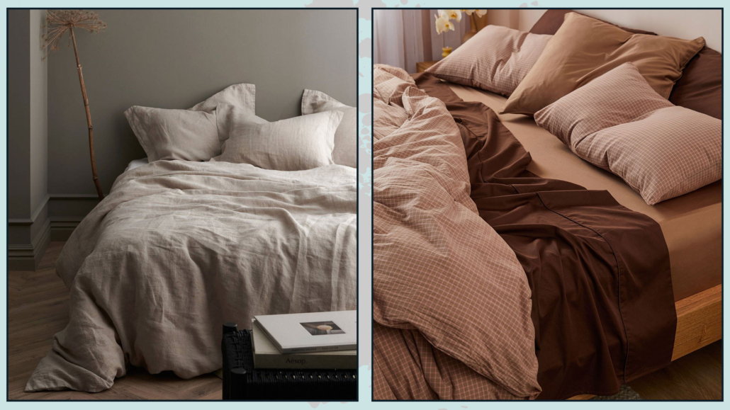
– CHOOSE THE SHEETS WELL

Like with the mattress and the bed base, it is important to feel “welcomed” by the bed sheets too!

As with room colors in general, I would advise against colors or patterns that are too strong because they excite and do not help sleep.

Choosing quality bedding that makes you feel a little snuggled and pampered will also be essential!

Therefore, choose good quality cotton or linen.

Of course, there are also satin and silk, and for them, allow me a very small digression: they are great for skin and hair care!

A satin or silk pillowcase will leave your facial skin brighter and the same for your hair by drastically avoiding knots, and for us curly-haired people, for example, it’s a boon!

Having closed this short aesthetic digression, having soft and snug sheets will surely help you sleep better!

(credits: ellos.se; sheetsociety.com)

– DRESS THE BED

Don’t settle for putting a simple, albeit beautiful, bedspread on your bed: it would look a bit “incomplete”.

Add some decorative pillows and blankets to the bottom of the bed!

You might think it’s a bother to take everything off in the evening and put it back on in the morning, but this time will be amply rewarded!

Blankets and pillows will give that extra touch to your bed and the whole bedroom, especially if you choose different materials, textures, and colors, creating some contrast.

That will give some movement and character, but most importantly, it will make the bed and room even more inviting and cozy!

(credits: zdesignathome.com; messybits.com)

I hope this article was helpful and you love it; in case, let me know in the comments!

Feel free to share it with anyone you think might be interested, I will be honored, and it will help me get my name out there.

If you feel that your home, or some environment of it, does not reflect you enough, do not wait any longer and book your consultancy!

Designing the living room seems like a piece of cake, but in reality, it hides little pitfalls that can create settings that seem to lack something!

Today I would like to talk about the big little mistakes often made when designing a living room!

– ATTENTION TO THE DISTANCES BETWEEN THE VARIOUS ELEMENTS

That is a mistake that happens especially when the room is large enough: there is a tendency to arrange the various elements against the walls, even if they are far apart, to fill the space.

The furniture seems scattered here and there, creating dispersion; the room will really look a bit sad and without personality this way!

A living room should be cozy and inviting, encouraging conversation and activities around a central point.

This central point can be the television, the coffee table, or if you are lucky, the fireplace.

However, if you are too far from this central point, or if the various elements are not arranged to emphasize it, the space will look a bit “coarse”!

So try to arrange the main elements to make them somehow linked to each other, perhaps by the rug!

If the space is really that big, you might think about creating different zones, such as a music or reading corner or an even more intimate conversation area…

(credits: @amberinteriors; thisisnick.com)

So divide the living room into several areas and remember not to be afraid to put the sofa “in the middle of the room”, leaving some passage behind; on the contrary, this is a pretty way to visually expand the space!

If you are lucky enough to have precisely that much space to go around the sofa and armchairs, I recommend decorating the backs!

There are many ways to do this: behind the sofa could be a console table or a beautiful blanket to add warmth and texture!

These small details will make your living room more complete and sophisticated!

(credits: midcentury585.com; shoppe.amberinteriordesign.com)

– PAY ATTENTION TO THE SIZE OF THE COFFEE TABLE

The coffee table is the element that somehow, along with the rug, links all the others in creating the conversation area.

It is, as well as decorative, a very functional item because it allows you to put down your things, such as your phone, or trays with food and drinks if you have guests!

The mistake that is often made is to get a coffee table that is too small; this definitely ruins the living room furniture design!

Not only does it somehow shrink the space visually as well!

The coffee table should be proportionate to the other elements and should be about two-thirds of the sofa.

A large table, however, could be expensive, but more importantly, it could be inconvenient if you wanted to, for whatever reason, move it…

So here is a simple but effective idea: buy 2 side tables!

It can be two identical coffee tables to place side by side, or you can take a set of 2 or 3 coffee tables of the same shape but different sizes and heights!

That will make it much easier for you to maneuver them, even if it’s just for cleaning, and it will give some rhythm to the conversation area!

(credits: Isabel López-Quesada; vemzu.sk)

– PAY ATTENTION TO THE POSITION OF THE RUG

If I tell you that when getting a rug for the living room, it is paramount that it be large enough to fit under at least the front feet of the various elements to create a cozy conversation area, I am not telling you anything new.

However, there is another aspect to take into consideration, namely orientation!

The rug, which is most often rectangular, should follow the space’s shape.

If you turn it in the opposite direction, you will create a kind of barrier and visually shrink the space!

The rug should really be large and cover the floor abundantly and tie together the main elements such as the sofa, armchairs, and coffee tables!

It is, therefore, paramount first to consider the layout of the room, take a rug that follows this shape and arrange the various elements to create something functional and harmonious.

(credits: justinecelina.com; @indiebohonest)

– THINK ABOUT STORAGE!

Another mistake in living room design is not thinking enough about the elements to contain!

For functional and comfortable rooms, it is really essential to have storage elements to arrange everything that is not purely decorative.

For this reason, it is better to have closed elements to make the environment more linear and clean.

If the space is small, you can think of a storage coffee table or, directly, a storage sofa.

Of course, you can add baskets, which will also, as we have seen other times, give a warm touch to the living room!

(credits: homestolove.com.au; cherishedbliss.com)

– DO YOU HAVE TWO SOFAS? BE CAREFUL HOW YOU POSITION THEM!

You may have two identical sofas, perhaps a three and a two-seater, and when you have these two items, it is actually common to see them placed angularly, perhaps with a small table or lamp in the corner.

Now, this is not a literal mistake, and sometimes you can’t really do otherwise; but it does make the living room a little monotonous and unbalanced.

When you have two identical sofas, it would be much better to put them facing each other and possibly add seating on the sides; it would make the living room look more sophisticated!

On the other hand, if you are forced to put the sofas perpendicularly, think about the possibility of taking a single corner sofa, it would make everything a bit more harmonious!

Or choose two sofas that are different because the play of different colors and shapes will break the monotony and look like a design choice!

(credits: thriftydecorchick.com;studio-mcgee.com)

– BEWARE OF VISUAL WEIGHTS!

Another thing to pay attention to, when designing a living room, that is not always done is correctly balancing the furniture’s visual weights!

What do I mean by that? I’ll tell you right now!

There are huger and visually heavier pieces of furniture than others: for example, a sideboard and a sofa versus a seat and a lamp…

That is also true when it comes to heights!

It is a mistake to put “heavy” furniture grouped together on one side and the others on the other.

Instead, it is paramount to balance and alternate weights and heights for an environment that is truly harmonious and inviting!

So, if, for example, you have a large piece of furniture on one side, it is essential to balance it on the other, perhaps with the sofa and a lamp or a beautiful tall plant.

To balance, also color theory can help: colors like red and yellow have very powerful visual weights, and small doses of that color can help balance a somewhat massive element on the other side!

(credits: lemamobili.com; sohohome.com)

– ATTENTION TO LIGHTING

By now, you’ve heard me say it many times: the light is what makes the difference in a good design project!

It is s always important to have multiple lighting points, but it becomes even more so in the living room to create the right atmosphere!

Even if it were a beautiful chandelier, general ceiling lighting is absolutely not enough!

When designing a living room, it is also good to consider floor and table lamps.

That is to provide depth and create some atmosphere making the space inviting and comfortable, as well as functional!

In fact, you can turn on the light(s) you need depending on the activity at hand!

Earlier I talked about decorating the back of a sofa when it would be away from the walls, and I talked about console tables… there it might be a great place to put a beautiful lamp.

Of course, you have to be careful about the wires: you should not see them, so if you have to renovate, you might even think about putting an outlet on the floor!

(This is one of the reasons I am so insistent that it is paramount to do a detailed project, including the furniture, when remodeling your house).

(credits: katiehodgesdesign.com; Soho Home)

I hope this article about the mistakes one can do designing a living room was helpful and you love it; in case, let me know in the comments!

Feel free to share it with anyone you think might be interested, I will be honored, and it will help me get my name out there.

If you feel that your home, or some environment of it, does not reflect you enough, do not wait any longer and book your consultancy!

We all love the idea of having beautiful and elegant “cover” houses, but we often fall into the trap you have to spend a lot of money to have them!

Actually, it is a matter of using small attentions and a few tricks to immediately elevate the perception of our environments.

I have talked about how to do for the house in general, for the living room and the bedroom, today I would like to see how to make the kitchen feel more luxurious!

1 – ORDER AND CLEANLINESS

I apologize if there are sometimes suggestions that seem obvious but allow me not to take anything for granted.

I will not dwell on cleanliness, but we know and have repeatedly said it does not go hand in hand with the idea of luxury!

We can say the same for clutter!

– FIX THE HANDOUTS

If we pay more or less attention to what we have immediately in sight, we don’t always do so with what is “hidden” in the cabinets; however, when we are forced to take them out, the chaos is immediate.

Having a thousand colored jars, tin, boxes, and packages creates visual clutter, even when they are more or less well arranged.

A good idea is to try neutralizing these shapes and colors a bit, using glass, tin, or ceramic containers; doing this would immediately elevate the perception of the kitchen.

Having the same type of container will immediately make everything much more harmonious!

These containers can be found almost everywhere and at all prices.

You can then put labels on them (especially for tin or ceramic jars) to remind you what is inside.

Of course, this can be done more with dry foods!

When you open the cabinets, everything will be tidy, and if you have to take them for cooking or put them on the table, you will be able to keep things in order!

(credits: littlelabelco.com; Laurel Bern)

– FREE THE COUNTERTOP AS MUCH AS POSSIBLE

That is one of the 2023 trends we saw a short time ago that actually gives that touch of “luxury” that we are looking for.

To do this, one of the first things is to get all small appliances out of sight by arranging the ones we use infrequently and “hiding” in a lowered cupboard the ones we use daily, such as the coffee maker might be!

Maybe you don’t have the wall unit that goes all the way to the countertop to hide these items, and it’s probably not easy to add this element, in that case consider changing these small appliances by buying new ones that are, if not designer, at least particularly beautiful, that maybe even give a splash of color!

Only items that can also be decorative should remain on the countertop.

On the countertop, as already mentioned, you can leave the small appliance, if particular or design; small jars with spice plants are perfect; you can also leave jars with flour, sugar, and/or coffee in sight if placed in glass jars!

(credits: homebunch.com; jambk.com)

Still, you could think of a beautiful vase of branches or flowers and, if you like it, classic cutting boards!

For the latter, I recommend not putting the ruined plastic ones on display; better the wooden ones that also give a touch of warmth and texture!

Speaking of texture and warmth, another way to do this is to use baskets, where, perhaps, you can store things.

This is both in the cabinets and on the top!

Another lovely idea, if you really have a lot of elements, is to group them on a tray: this will give the composition boundaries making it more studied and less chaotic!

(credits: helladesignstudio.com; alyssahaun.com)

– LEAVE THE FRIDGE CLEAR!!!

It is increasingly easy to see kitchens with free-standing fridges, and we often fill them with magnets, photographs, and papers!

For a more luxurious kitchen, this is really not the best!

This, too, creates visual chaos.

If you like to have a few keepsakes, it is not that you have to give them up completely, but leave possibly a few choice pieces, and if you have many, rather change them often!

A clean and essential fridge will really make a big difference!

(credits: designingvibes.com; lizmarieblog.com)

– WATCH OUT FOR THE SINK AREA!

Again as a matter of tidiness, avoid leaving the detergent bottle, whether it is for dishes or hands, as well as the dish sponge in sight.

That is unless you use special dispensers, as we saw when talking about decorating like a pro!

You could create a small arrangement with the dish detergent dispenser (and, if you use it, the one for your hands) placed on a small tray with, instead of the sponge, a dish brush, perhaps made of wood.

This small detail will make it more studied, elegant, and, therefore, luxurious!

(credits: public-311.com; gardentrading.co.uk)

It’s hard not to have the drainer wall unit above the sink, but if so, I would say avoid the drainer resting next to the sink, preferring a drainer rug instead (beware of colors!).

That is because they have less visual impact, and you can put them away for ease once the dishes are dried!

(credits: etsy.com; ebay)

– DON’T UNDERESTIMATE TOWELS

To have a kitchen that looks luxurious, you shouldn’t underestimate the choice of potholders, towels, and aprons.

So choose towels that don’t look like rags, but can give that extra touch!

If you can get them to match the potholders and apron if you use them!

Change potholders when they get ruined because they will immediately jump out at you!

(credits: thelovedesignedlife.com; paperplanestore.com)

2 – BRING SOME ART INTO THE KITCHEN

We have also seen this among the kitchen trends for 2023: the kitchen is a room like the others in the house, and, therefore, it is good to use the same care in decorations.

It is not mandatory to have only paintings with food or drink as their subject or a board with magnets…

Bring to the kitchen a cute photo gallery or a beautiful painting, maybe abstract… use what you would also put in the living room or bedroom!

You don’t necessarily have to spend crazy prices; we have seen it before: you can also use a little imagination and, for example, create beautiful paintings with particular fabrics!

You can hang the pictures, but you can also put them on the countertop or shelves if you have them, and maybe even create a small composition with other items!

(credits: urbanologydesigns.com; woodsandivory.com)

– CREATE A FOCAL POINT

A simple yet brilliant way to make the kitchen look more luxurious, and cover-worthy, is to have a particular, high-end element to which you can add more “normal” pieces.

You will thus create a focal point that will immediately elevate the perception of the kitchen.

It can be anything from an impressive painting to a beautiful glass vase, a souvenir from a trip… in short, anything that you think would give that extra touch!

(credits: neatlyliving.com; earthencointeriors.com)

3 – USE DIFFERENT LIGHTINGS

Lighting is really super important for good design!

Add the under-cabinet light if you don’t have it yet; there are LED strips that you can easily install without having to do any work.

You might think about adding them, as well, above the wall cabinets to add some overall light and give some depth too!

Again to give depth and create something unusual, you could also put LED strips at the foot of the cabinets to illuminate the floor!

Lighting effects help give that extra touch to the environment.

ligthting luxurious kitchen

(credits: behance.net; www.easytopltd.com)

Also, you might think about putting on the countertop, or the island if you are lucky to have it, a lovely table lamp!

That sounds like a peculiar suggestion, doesn’t it? Actually, it’s a great way to add both: an additional source of light, which never hurts, and a little atmosphere!

That will make your kitchen even cozier and more studied!

(credits: chrislovesjulia.com; cgeniae.ml)

4  – CHANGE HANDLES AND FAUCET

Details definitely make a difference: if you have a kitchen that maybe is already a few years old, changing the handles could really change its face and give it that extra touch!

All at an affordable price!

The same goes for the sink faucet: changing it could give a new look to the sink area!

All these great little touches will help you make your kitchen look more luxurious and studied!

Obviously, you don’t have to do everything immediately, but you’ll see that if you start taking your cues from a couple of these suggestions, you’ll see the difference right away!!!

more luxurious kitchen

(credits: inhonorofdesign.com; juliehowardhomedesign.com)

I hope this article about how to make a kitchen more luxurious was helpful and you love it; in case, let me know in the comments!

Feel free to share it with anyone you think might be interested, I will be honored, and it will help me get my name out there.

If you feel that your home, or some environment of it, does not reflect you enough, do not wait any longer and book your consultancy!

And, also this year, the Pantone color of the year 2023, Viva Magenta, has arrived!

(credits Pantone)

“In this age of technology, we look to draw inspiration from nature and what is real. PANTONE 18-1750 Viva Magenta descends from the red family, and is inspired by the red of cochineal, one of the most precious dyes belonging to the natural dye family as well as one of the strongest and brightest the world has known.”

These are the words of Leatrice Eiseman, executive director, of Pantone Color Institute, who also adds

“Rooted in the primordial, Viva Magenta reconnects us to original matter. Invoking the forces of nature, Viva Magenta galvanizes our spirit, helping us to build our inner strength.”

Once again, Pantone comes up with a color that can “help” us get through the tough times, including pandemic, war, and rising prices; Viva Magenta, in fact, is definitely vibrant, exuberant, and inspiring, but also sophisticated!

(credits Pantone)

Can we bring Pantone color 2023 into our homes?

Of course yes, because this color will bring vibrancy to our environments!

This color is perfect for kitchens because it is a red that is not too “aggressive” and creates an energetic atmosphere perfect for this environment.

Also, it is great when used as an accent color even with large-scale furnishings such as a sofa, but honestly, you can also venture to use it on the walls, making it the focal point of the room.

(credits Pantone)

I would avoid coloring all walls with this color because, as they point out at the Pantone Color Institute, this color “packs a lot of drama even in small doses.”

Definitely to be used with caution in the bedroom: although the hint of blue certainly tones down the exciting component, it is still part of the red family!

(credits Pantone)

It’s a color you can pair with so many shades, both cool and warm, and Pantone is helping us again this year by offering 4 beautiful palettes to make the best use of Viva Magenta (at home, but of course not only!!!)

– EQUILIBRIUM

It is composed of warm and important colors in which Ultimate Gray and Grape Shape help calm this very vibrant palette down a bit.

My advice, if you want to use this palette in your home, is to use Ultimate Gray or Grape Shape as a base, Twilight Purple or Wilde Aster as a secondary color, and the others as accents.

– RESONANCE

This color palette puts warm shades with cool ones together, but all are pretty dark.

In this elegant color combination, Viva Magenta gives a vibrant note!

Again, I recommend using these colors sparingly and calming them down with a bit of white so as not to make it too heavy!

– FAMILY TIES

As the name suggests, this palette groups together colors of similar shades.

It is a combination of mainly pinkish colors with touches of browns that blend with Viva Magenta in a striking and lively tone on tone.

The colors are relatively light but still a bit bright, so they should be used carefully so as not to overdo it: don’t risk creating a house…wedding favors!

– IGNITE

It is a very bright pastel color scheme where Viva magenta stands out and brightens up the other shades.

Compared to the other palettes, it is a color palette therefore you can use it more lightly because of these somewhat neutral tones!

What do you think about this Pantone color 2023? If you like it, will you wear it or bring it into the house as well? In case how? Let me know in the comments!!!

(credits Pantone)

I hope this article was helpful and you love it; in case, let me know in the comments!

Feel free to share it with anyone you think might be interested, I will be honored, and it will help me get my name out there.

If you feel that your home, or some environment of it, does not reflect you enough, do not wait any longer and book your consultancy!