Posts

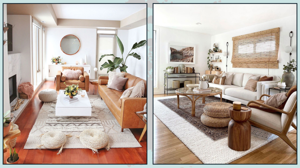
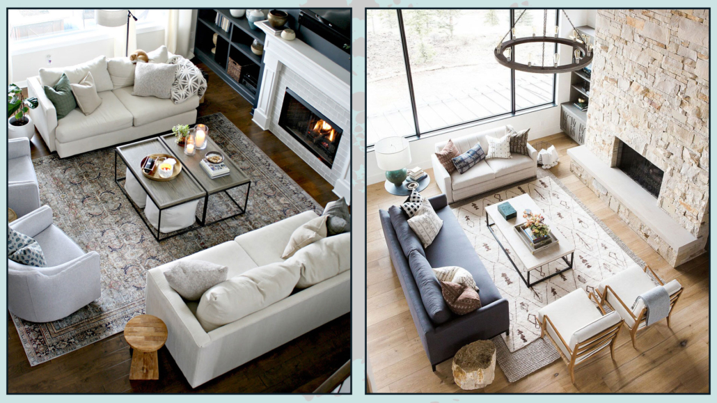
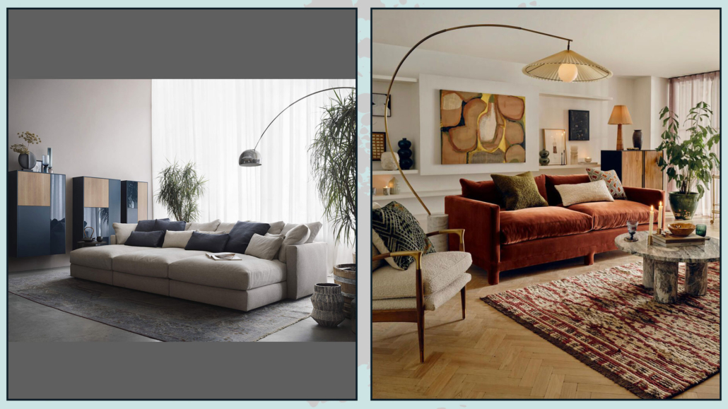
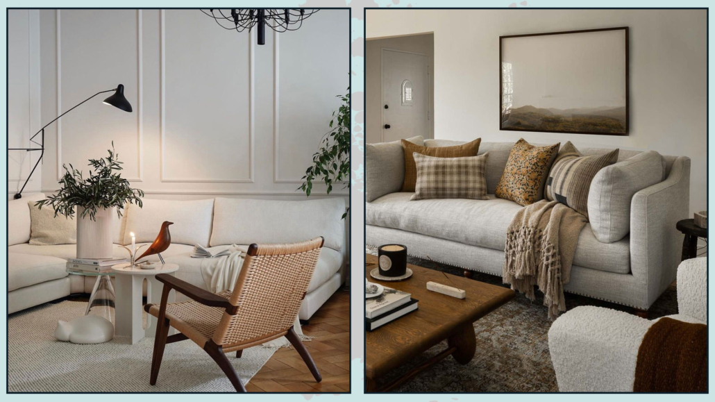
Neutral colors, mainly warm neutrals, are popular in interior design because they make rooms cozy, inviting, and relaxing.

However, one must know how to use them to avoid making them flat and boring, that will lead to somewhat impersonal rooms.

Choosing a neutral-colored palette often stems from the fear of making a mistake or overdoing the colors.

But even the misuse of neutrals may not give the desired result and, most of all, may not fully represent one’s personality!

If you want to learn more about how to choose neutrals for the home, I talk about it here!

One nice thing about neutrals is that they are the perfect base for virtually any style and are very versatile for color matching.

So let’s see how to make the use of neutrals attractive and dynamic!

– GIVE VALUE TO WALLS (AND CEILINGS)

Walls and ceilings seem to be the easy part: I choose the color, I paint, and that’s it!

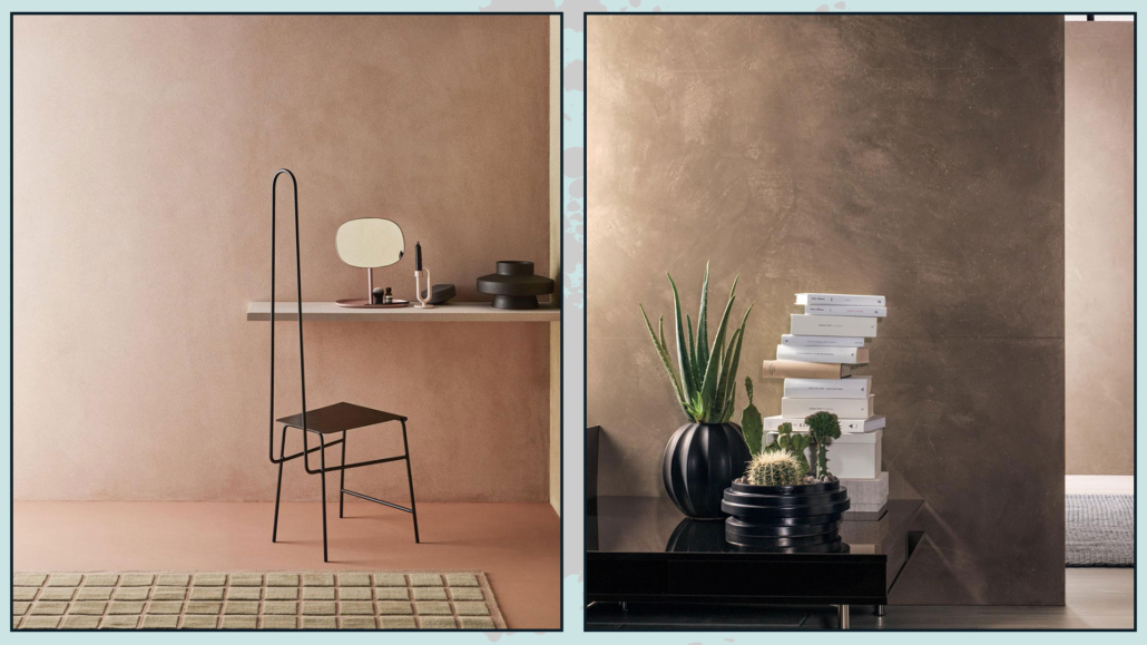
Instead, there are many ways, many finishes, and techniques regarding painting, which used with neutrals can really make a difference by making the color more vibrant.

In a simplified way, here are three techniques that enhance warm neutrals.

– there is lime wash which is made of lime and other minerals, is naturally based, and is given with a brush.

Glaze effects are created that give depth and dimension to the color.

– there is Venetian plaster formed from marble powders with lime putty.

It has a thick consistency, so it’s given with a trowel, which makes the surface perfectly smooth.

– there is roman clay, a thick paint made from chalk and other natural ingredients; it is given with a trowel.

It creates a finish similar to Venetian plaster and looks like natural stone.

(credits: cose di casa; stelianadesign.ro)

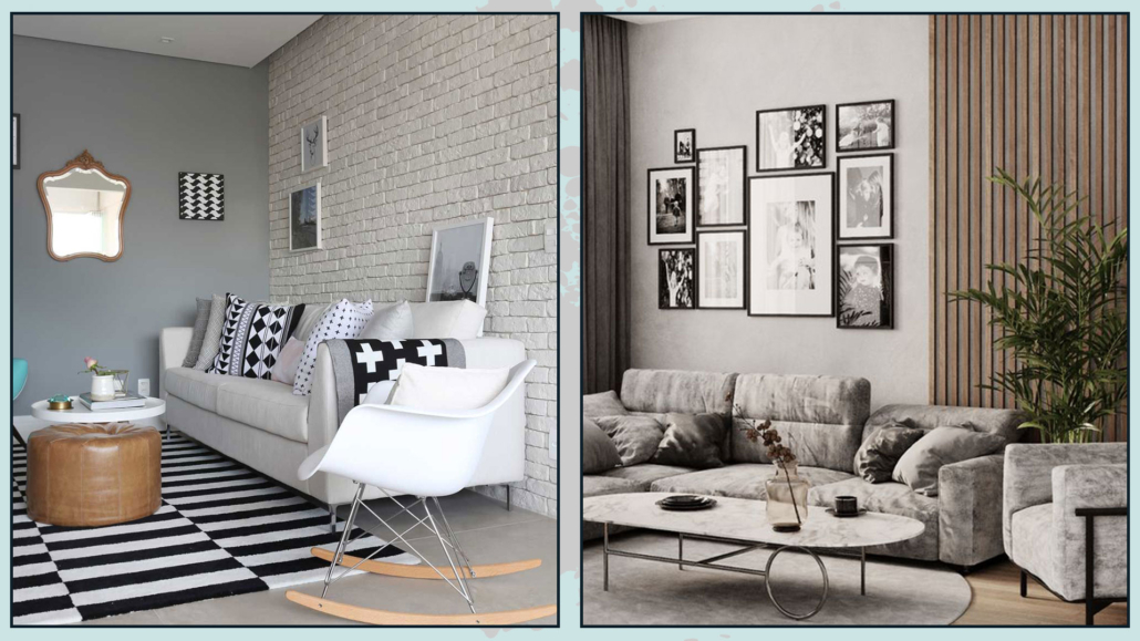
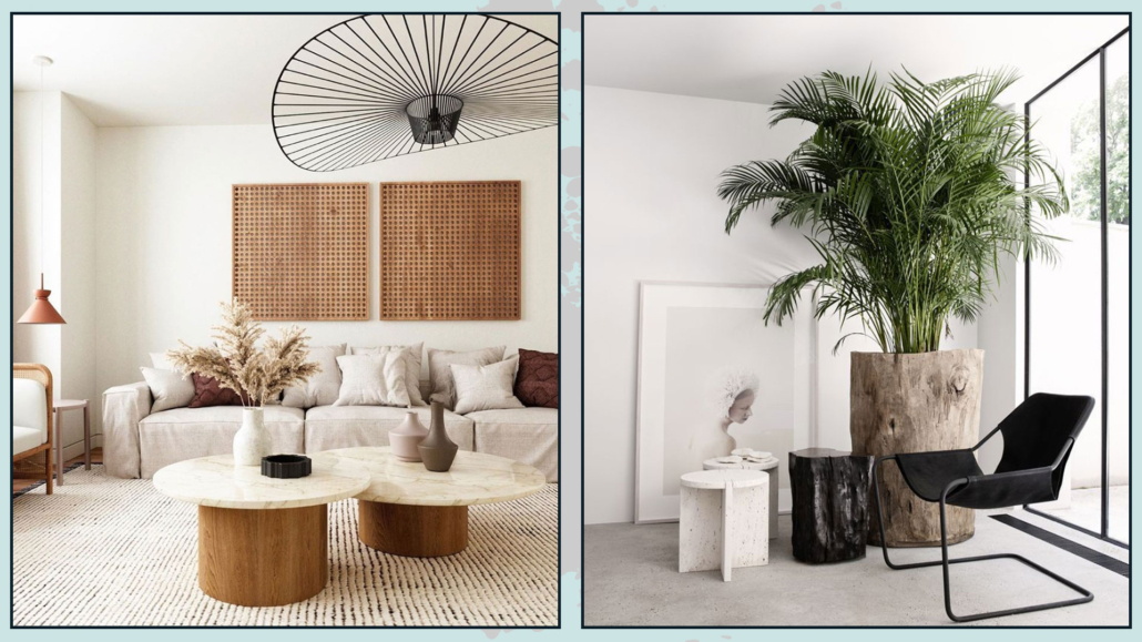
In addition to wall paintings, you can also think about using stones, bricks, or wooden laths to give the room a little more dimensionality!

It is not mandatory, as always, to use these elements on all walls; on the contrary, but they can be helpful to enhance an architectural detail or create an original focal point.

(credits: marianaorsi.com.br; behance.net)

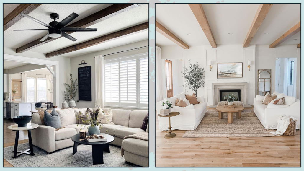
For more rustic styles, wood can also be used in the ceiling by putting beautiful beams!

This will help to give some rhythm to the environment!

(credits: greybirchdesigns; shopltk.com)

– PLAY WITH SHADES AND TEXTURES

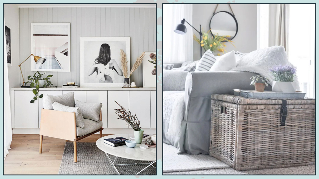
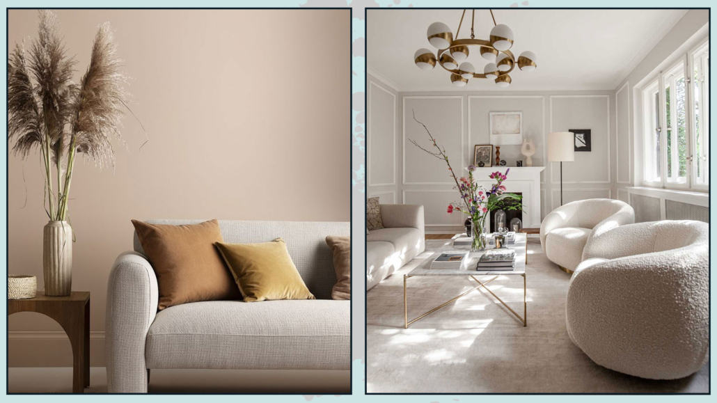
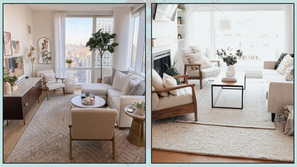
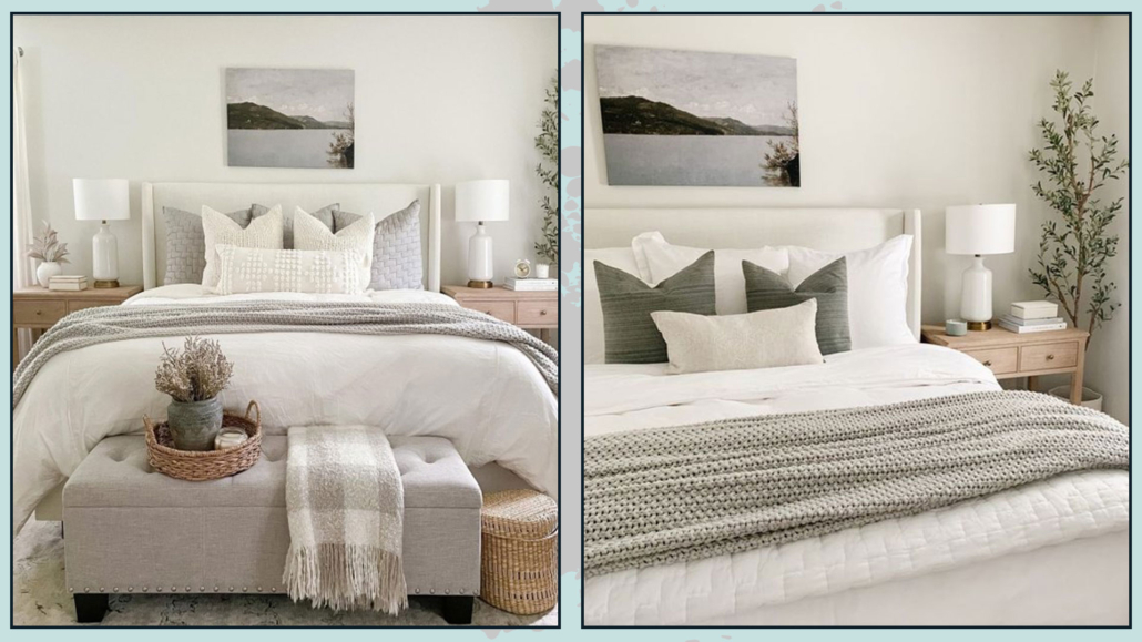
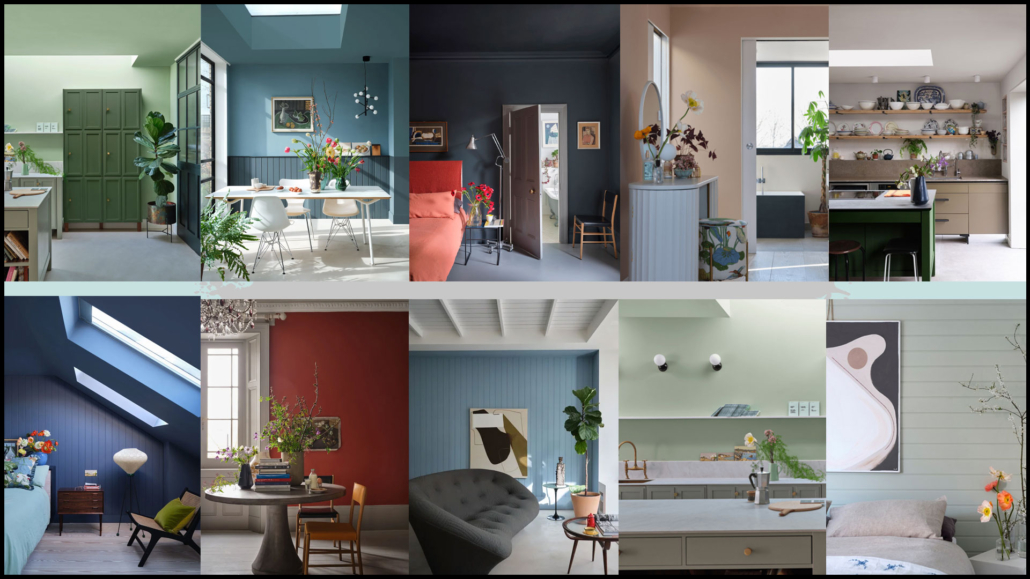
To make your rooms appealing, it’s a great idea to use different neutrals, so add some warm neutrals to a room with mainly cool neutrals and vice versa.

And especially to play with the different saturations and shades of the various neutrals.

This thing is actually always helpful to give depth and movement to rooms, but it becomes all the more so when you choose a monochromatic or precisely neutral-color palette!

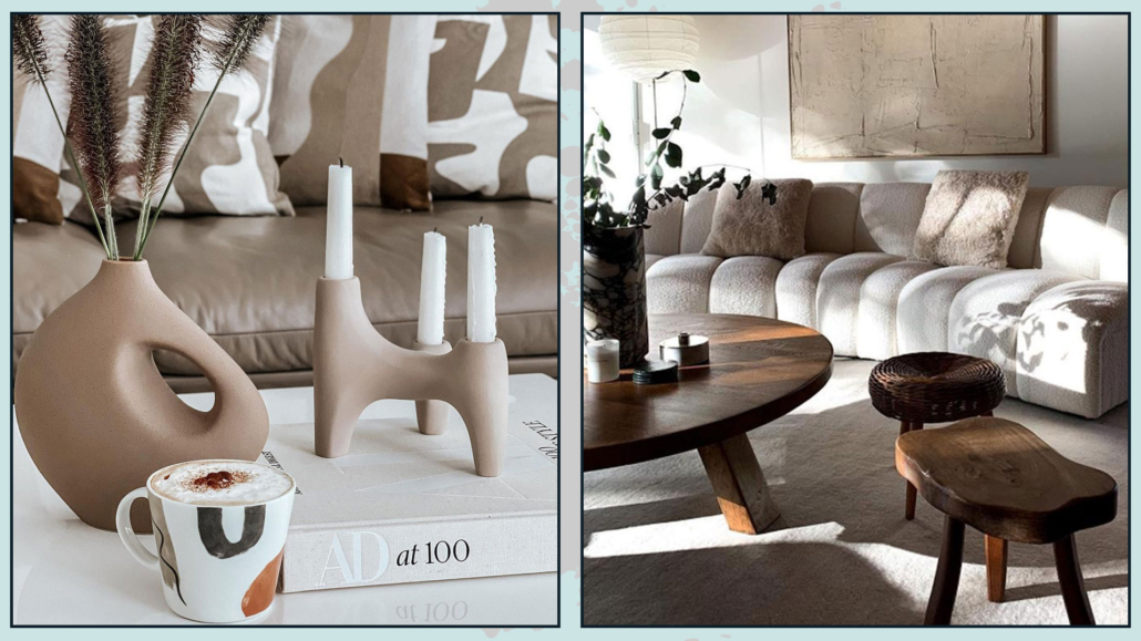
With the same principle, it is also good to play with different textures by mixing smoother finishes (both in fabrics and objects) with rougher ones.

(credits: haymespaint.com.au; editionnoire.com)

– COMBINE DIFFERENT STYLES AND PATTERNS

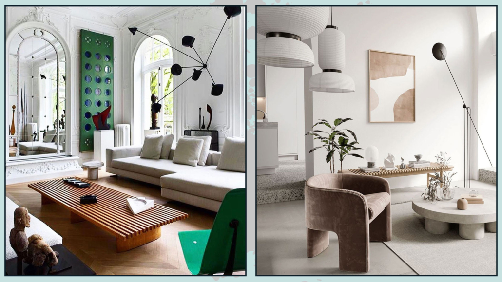
Neutral colors are a great tie-in for different furniture and accessories.

Putting different styles together is another great way to liven up the neutral color palette.

You will be able to create a play of shapes giving, over all, personality!

The same goes for patterns: mixing different ones will help make your spaces dynamic and contemporary.

In mixing patterns, I would say to avoid too strong color contrasts: better a tone on tone.

(credits: tthese_beautiful_thingss; shoppe.amberinteriordesign.com)

– USE LARGE DECORATIVE ITEMS

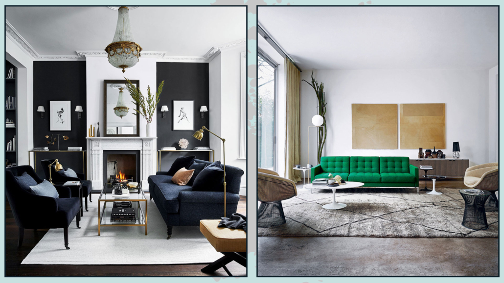
We’ve said neutral colors are calming and relaxing, so create something unexpected using large paintings or mirrors!

It will obviously be the focal point of the room.

Use particular patterns and, above all, some contrast to the wall to make it stand out.

However, this doesn’t only apply to paintings but, if you wish, also to decorative objects: think, for example, of a man-high vase with branches in it!

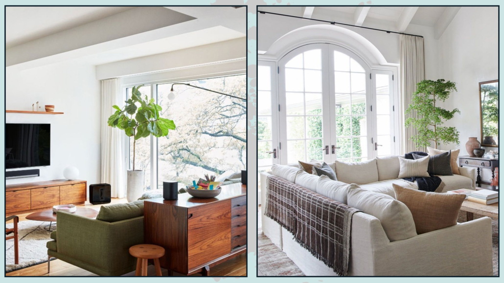
Or even a large plant that almost reaches the ceiling!

These are all things that help give rhythm and vibrancy to environments!

(credits:@anthology_creative_studio; amdesigns.com)

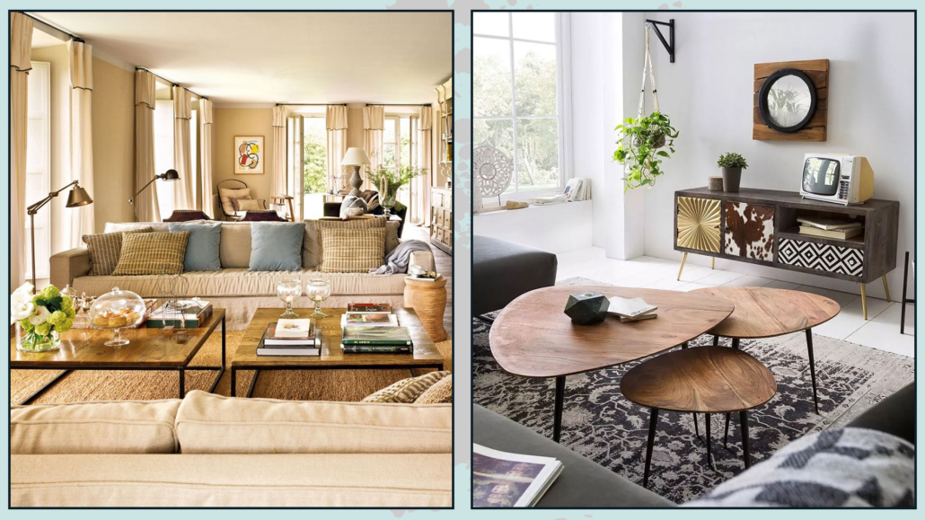
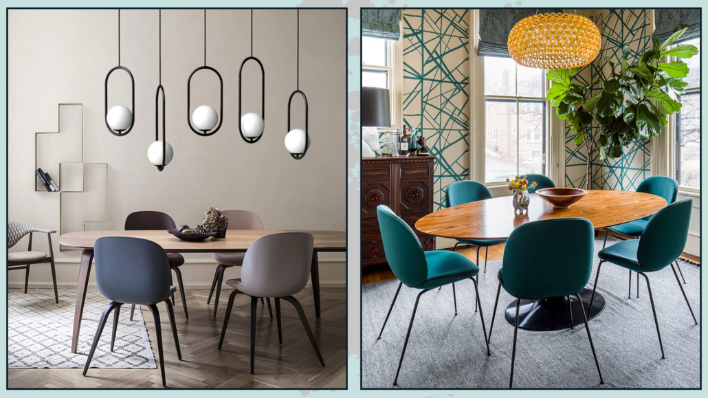
Pay also attention when choosing decorative items in general, choosing original pieces that can attract the eye by guiding it from one corner of the room to another.

Think of elements that are a bit out of the ordinary by creating distinctive and eye-catching compositions!

Sometimes, for this purpose, street markets are really a gold mine!

(credits: H&M Home; @hoskelsa)

I hope this article was helpful and you love it; in case, let me know in the comments!

Feel free to share it with anyone you think might be interested, I will be honored, and it will help me get my name out there.

If you feel that your home, or some environment of it, does not reflect you enough, do not wait any longer and book your consultancy!
Today I would like to address the kitchen topic by seeing together the trends for 2023!

The kitchen is the beating heart of the home, the room we experience most, not only for cooking and eating!

So it must be carefully chosen and studied.

Let’s see what the coming year brings!

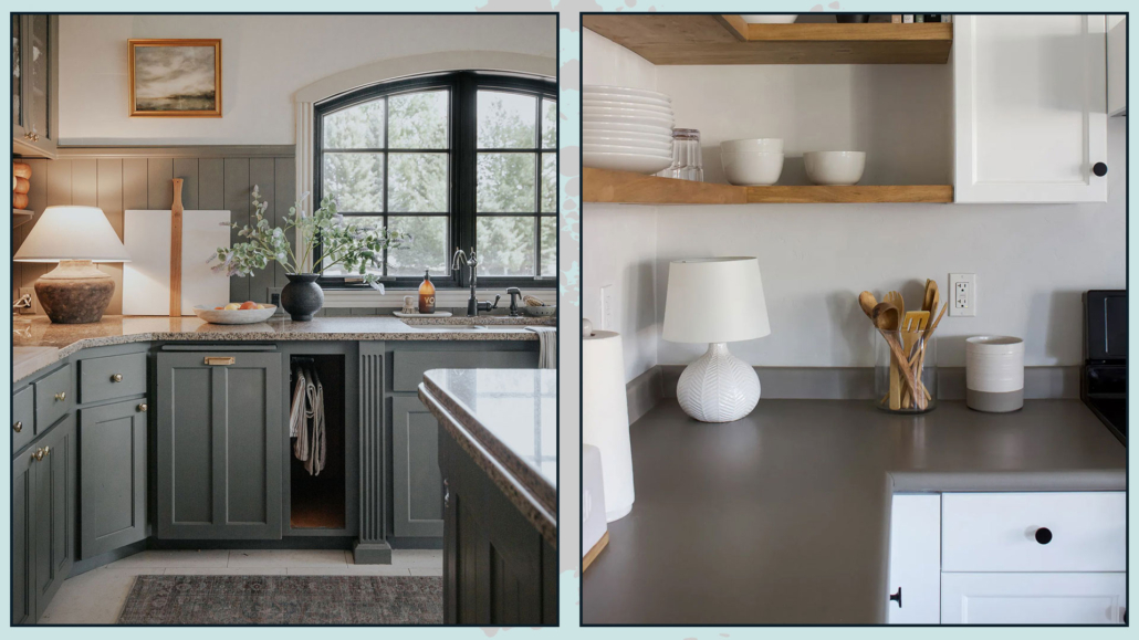
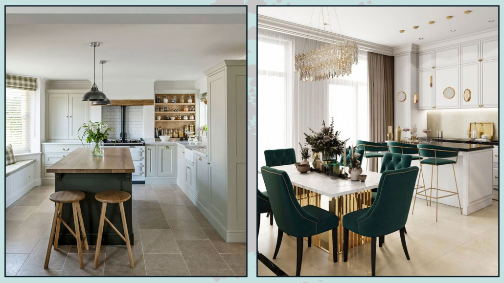
– GREEN COLOR

Let’s face it, most of our kitchens are white, black, gray, or more or less light wood color.

Although it obviously exists, the colorful kitchen is more difficult to see.

With this intense desire to reconnect with nature, which has been increasingly felt in recent years, here are changing colors in furniture too.

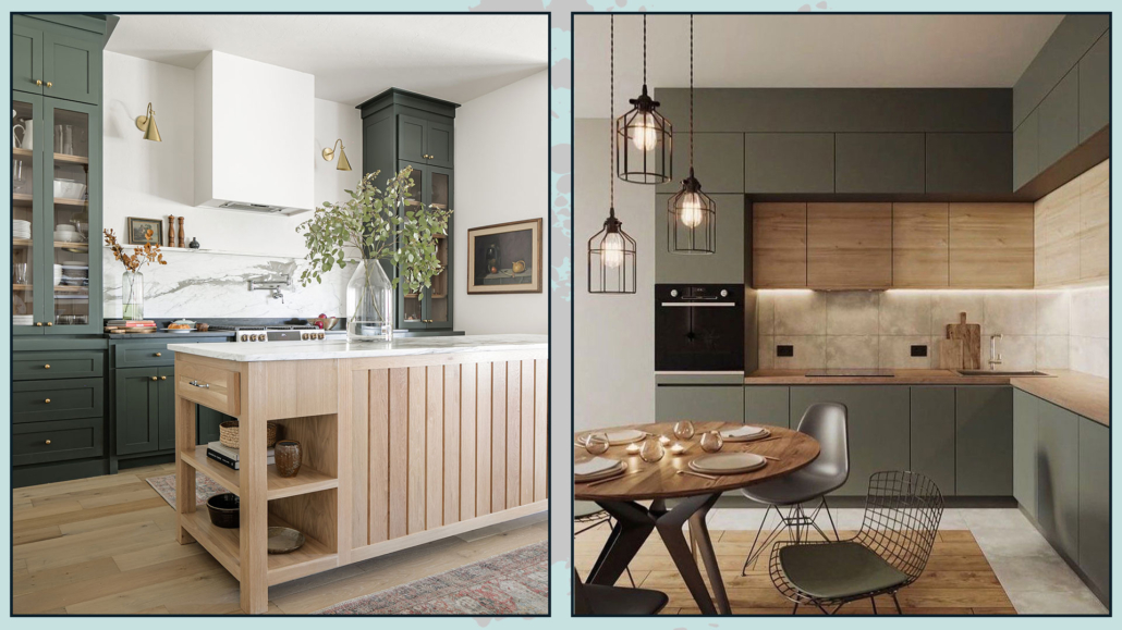
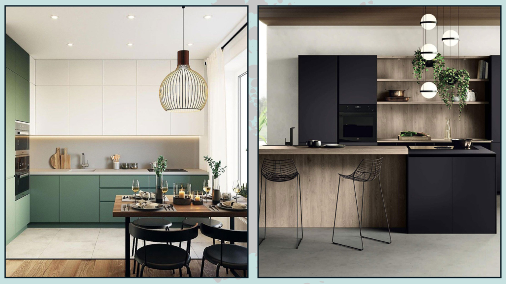
In particular, the kitchen is green painted!

Last year, green, in its various shades, was the color of the year for virtually every brand.

We can say that green is considered a neutral color; this is why it will be seen much more often, especially in kitchen cabinets, whatever the style.

Green is a welcoming and calming color that, we can say, brings some life to the kitchen.

Are you about to buy or change the kitchen, but getting it all green scares you a little? Don’t you want to get sick of it after some time? Well you can think about taking this color in small doses:

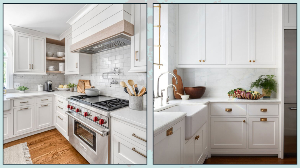
– you can get only the low cabinets in green and the wall cabinets in white or light wood color;

– if you are lucky and you have the island or the peninsula, you could consider it as the highlight and only do the one green;

– you can use it in the splash guard or by painting the walls, although here I would be careful because green is a color that does not help digestion, so don’t paint all ones!

– you can use it in some items such as chairs or stools, some small appliances that you leave exposed, or pots and plants, or simply in towels and potholders!

(credits: @homedesigner_passion; @mcgregorhomes)

(credits: middleton-bespoke.co.uk; @obsessed4interiors)

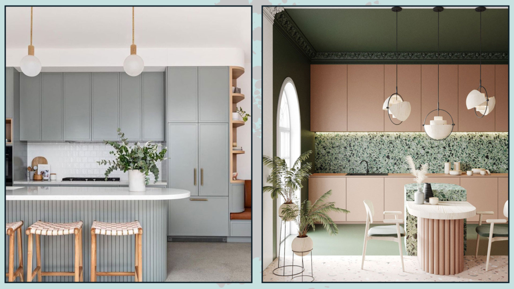
– ROUNDED ISLANDS AND PENINSULAS

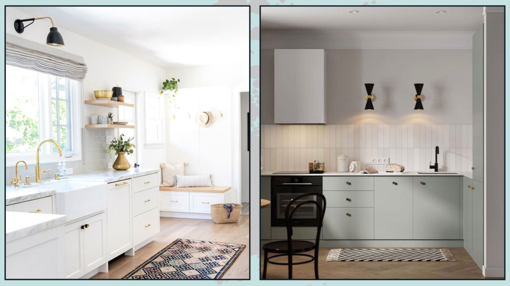
Soft, curvy shapes are a trend of recent years that will also enter the kitchen and will be seen mostly with islands and peninsulas but also in end units!

The rounder lines make the environment less rigid and impersonal, making the kitchen even more inviting and welcoming!

Curved shapes can also be introduced with chairs, which will also be more comfortable because they are enveloping, or with lighting and decorative objects!

(credits: @the_stables_; @vymir_design)

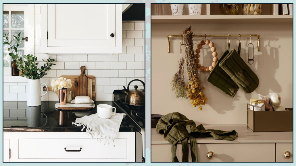
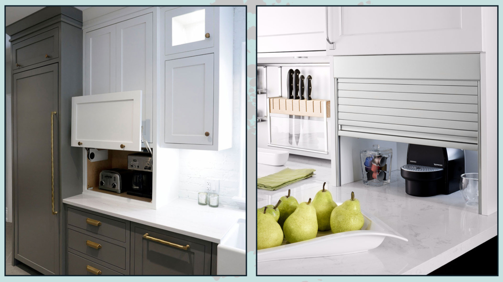
– LEAVE THE COUNTERTOP AS FREE AS POSSIBLE

The kitchen is no longer just a place to prepare meals and eat, so the important thing was to have the necessities that were functional for that purpose.

Now the kitchen is one of those rooms that are also carefully studied in terms of aesthetics.

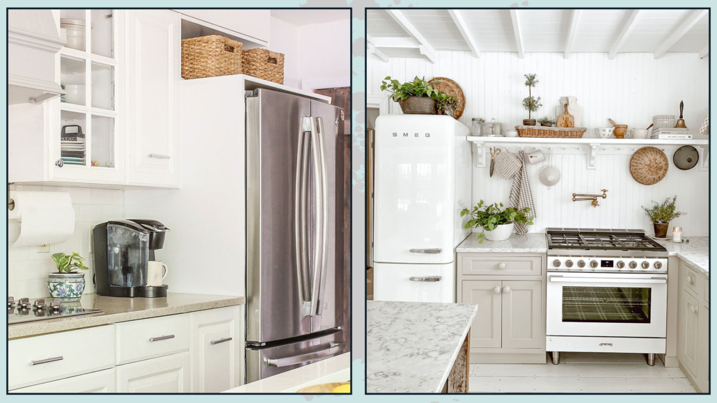
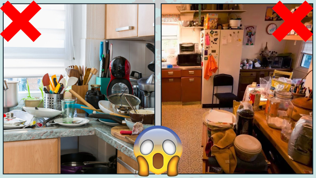
It is a shame, therefore, to have a beautiful kitchen, however on the countertop of which chaos reigns, and let’s face it, it often happens: the coffee maker, the kneading machine, the knife set, the paper roll…

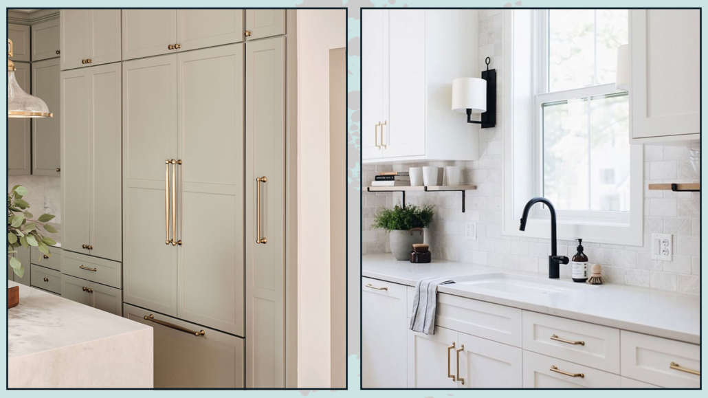
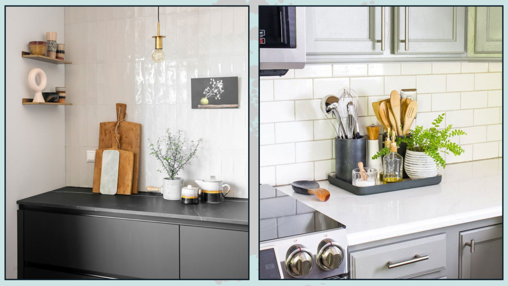
The trend for 2023 is to try to hide these small appliances, leaving out only what can also be decorative.

That is why you can bring the wall cabinets up to the countertop, inside which you can put all those things that you maybe regularly use (so it would be inconvenient to withdraw to the cabinets), but that can create chaos!

It will be enough to open the door, and voilà they are ready to use, but when they are not needed with the door closed, everything will be neater.

That will make the kitchen more elegant and sophisticated!

By the way, it is also much more hygienic because they will have less dust and also less grease if they are close to the fires.

On the countertop, you will leave only a few items that can be decorative and really give a plus!

(credits: josephkitchens.com; leacraftkitchens.com)

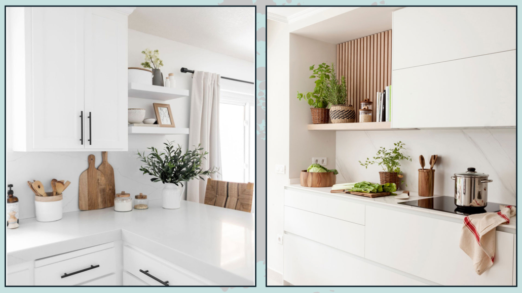
– FEWER SHELVES

For the same reason, i.e., visual chaos, but especially hygiene, the shelves will decrease a lot!

You will definitely avoid shelves instead of wall cabinets to put dishes because precisely it is not very hygienic.

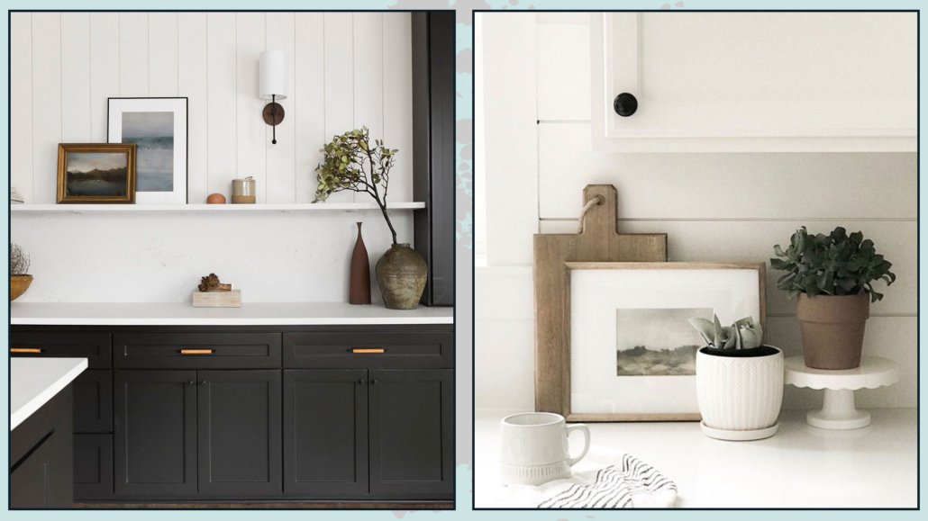
However, it is not mandatory to make the shelves disappear entirely; the important thing is to be able to decorate them simply and elegantly!

To do this, you can take a cue on how to decorate bookcases (you can find it here): the rules are always the same!

(credits: halfwaywholeistic.com; quefalamaria.com)

– LIGHTING

The lighting will also change a little bit.

We can say that we usually have a general light, often placed in the center of the room, and then perhaps the under-cabinet light.

Those with an island or peninsula could also have direct lights on the top, either as pendants or as a lowering with recessed spotlights.

Light will become a bit of a protagonist; that is also because well-designed lighting can change the face of a room, even the kitchen!

Once again, for those fortunate enough to have an island and peninsula, it will be easy to see pendant lights positioned only on one side: an asymmetry that will create visual interest.

But even for those who do not have an island and peninsula, it will be great to have multiple types of lighting, not only general lighting but also task lighting, on the table for better visual comfort when eating.

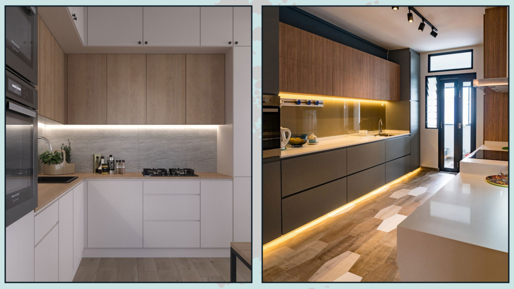
Under-cabinet lighting will also be designed even better in order to be able to see what you are doing when you are cooking, and if the cabinets are not there, you can use pretty wall lamps!

(credits: @nestmas-StudioRemi; Miton-Loto-Italian-Designer)

(credits: fireclaytile.com; @obsessed4interiors)

– PAINTINGS

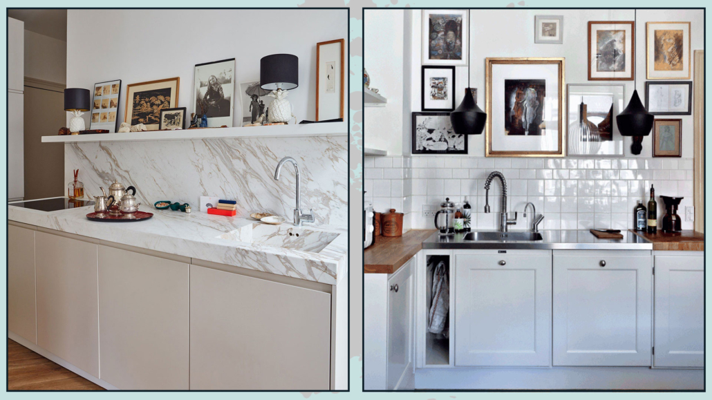
It often happens that in the kitchen, as decorations, you put pictures that take up the topic of food or drink, or (and I admit I have them too) chalkboards with magnets; it is much more unlikely to see a beautiful painting or a gallery of photos.

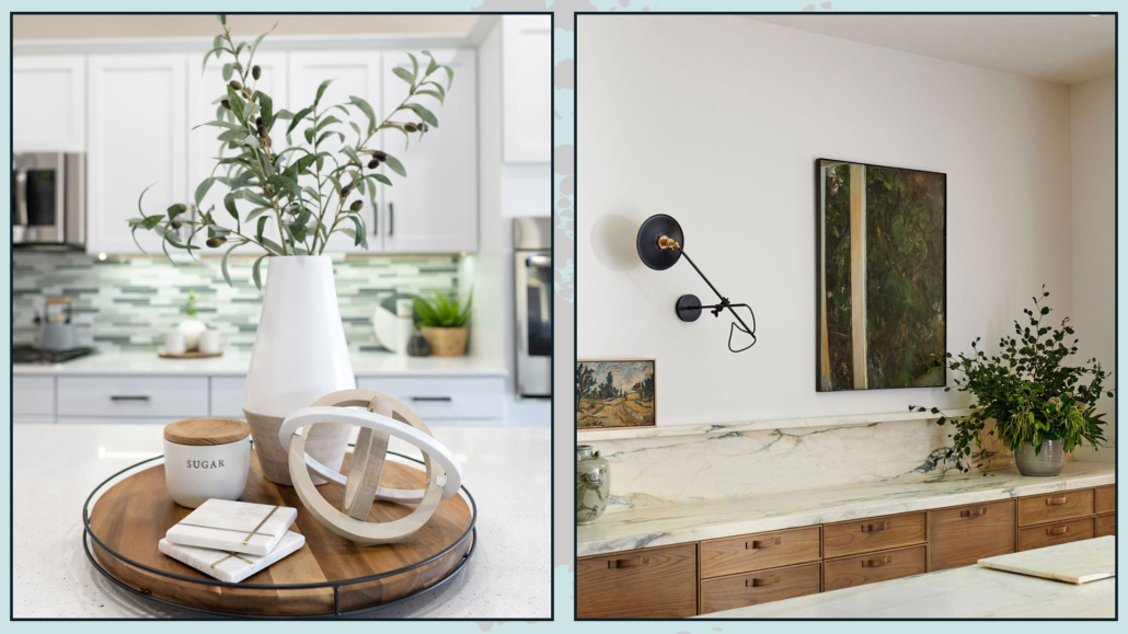
Even in the kitchen we can and should bring some art!

Decorating the kitchen as you do other rooms will give your kitchen personality!

You can do it on the walls, but also on the countertop if you have the space; if it is true that we said to hide small appliances, it is not the same for decorative items.

As always, it should not be overdone, and it should be studied, but it will make a big difference indeed!

(credits: Sara Beltran; artofit.org)

– ANIMAL CORNER

I don’t know if this will really become a trend or not, but when I saw this solution, I fell in love with it.

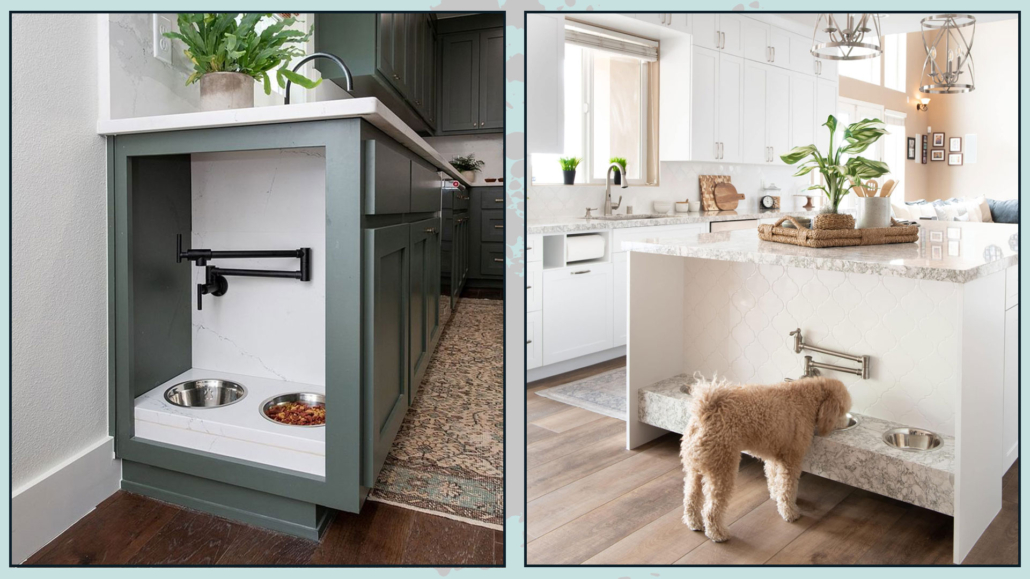
Creating a small corner with dog or cat bowls, with a faucet to fill the bowl with water, is just brilliant!

That is super functional, especially when you have a large dog; carrying the full bowl around is not the best, but size aside, there is always the risk of spilling some of the water on the floor!

(credits: daveandjennymarrs.com; kingdomhome.com)

I hope this article was helpful and you love it; in case, let me know in the comments!

Feel free to share it with anyone you think might be interested, I will be honored, and it will help me get my name out there.

If you feel that your home, or some environment of it, does not reflect you enough, do not wait any longer and book your consultancy!
Some time ago, I had talked about 10 iconic lamps to know, but as you can imagine of famous designer lamps (here you can fine the Italian video), there are many more!

So today I’d like to introduce you to 7 more.

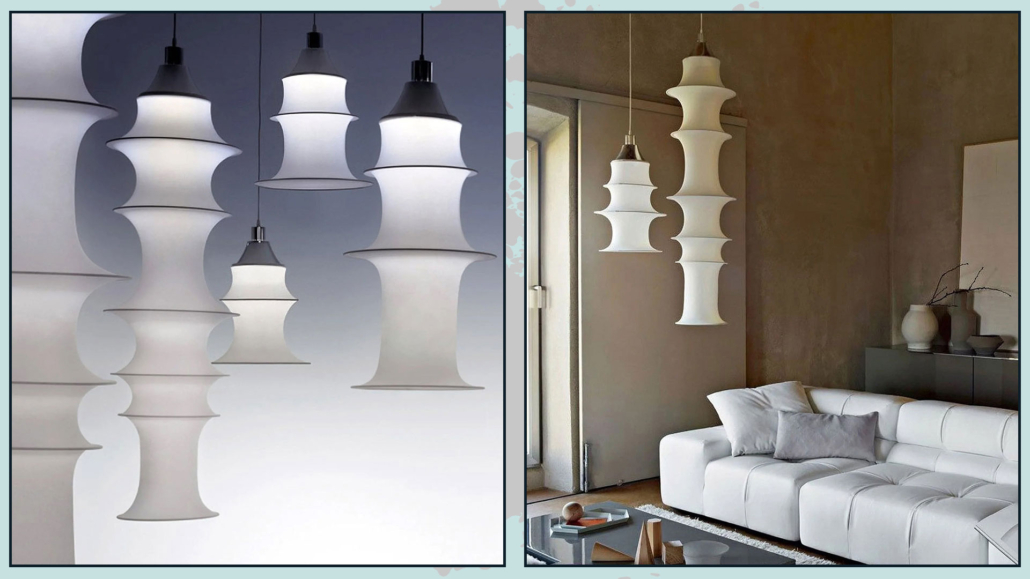
1 – FALKLAND LAMP

Designed by Bruno Munari in 1964 for the firm Danese Milano, produced by Artemide.

Also known as a stocking lamp, it was born as a hanging lamp; it takes shape from the tension of an elastic mesh tube and the weight of 7 differently shaped cylinders.

It has a single bulb with an aluminum reflector.

Munari took a cue from Japanese paper lamps to create this lamp, improving it, of course!

Unlike paper ones, the elastic mesh is less easily ruined, does not yellow, and most importantly, is washable!

Little curiosity the stretchy mesh is a real tights! In fact, Munari himself shared that one day he went to a sock factory to see if they could make him a lamp; these replied that they did not make lamps, and he said: “you will see that you will make them!”

This lamp now exists in three different sizes hanging 165, 85, and 53 cm high.

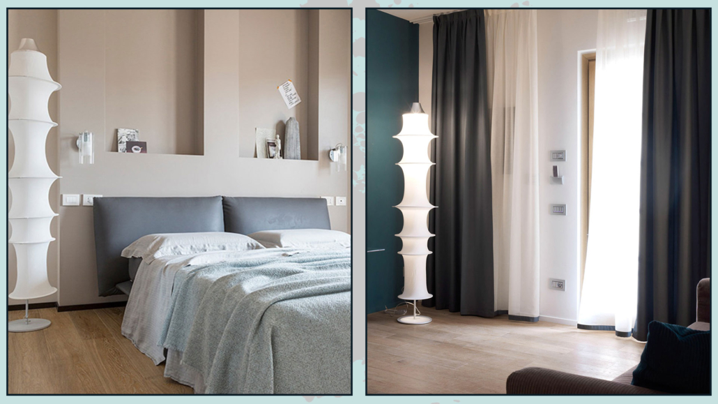
And it also exists as a floor lamp with a height of 195cm.

It is on exhibit at MoMa New York in the Architecture and Design department.

(credits: Artemide)

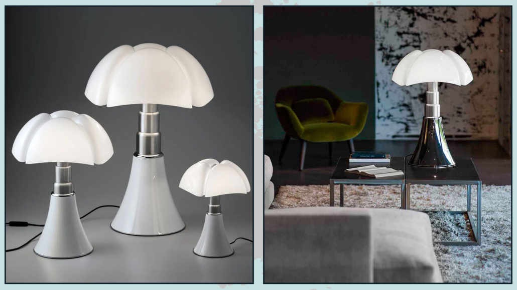
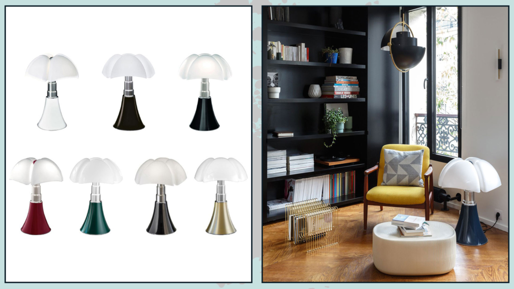
2 – BAT LAMP

Designed by Italian architect Gae Aulenti in 1965 and produced by Martinelli luce.

It is a height adjustable lamp and exists as both a table lamp and a floor lamp.

The diffuser, made of methacrylate, was obtained by molding techniques that were truly innovative at the time.

Also, the conical base spreads upward by widening into the ribs of the diffuser, just like the unfolding of bat wings.

And the telescope is in steel, and the base and knob are painted metal, now available in 7 colors.

With this lamp, Gae Aulenti returns to natural and organic shapes with a somewhat Liberty soul, moving away from the rigid and rational forms of the period.

(credits: Martinelli luce)

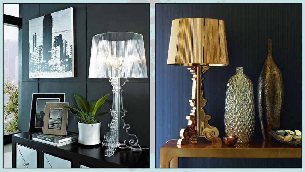
3 – BOURGIE LAMP

It is a relatively new lamp designed in 2004 by Ferruccio Laviani for Kartell.

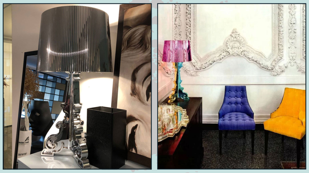
It is a lamp with baroque shapes, but made of a decidedly modern material, polycarbonate.

This classic-modern mix makes this lamp appeal to people of even distant generations!

It exists in three versions that change according to the height of the shade, making this lamp very versatile and suitable both as a floor lamp and a table lamp.

Perhaps the best known version is the clear one, but you can now find it in different colors!

Fun fact: The idea of creating this lamp came to his creator while listening to a song!

This song is “Bourgie, bourgie” (after which the lamp takes its name) by Gladys Knight & the Pips, famous in the 1970s.

The song poked fun at the bourgeoisie of the time, described as sulky, ambitious, and contemptuous!

So here, Laviani decided to ironically reinterpret classic and formal shapes which have been untouchable until then.

(credits: Kartel)

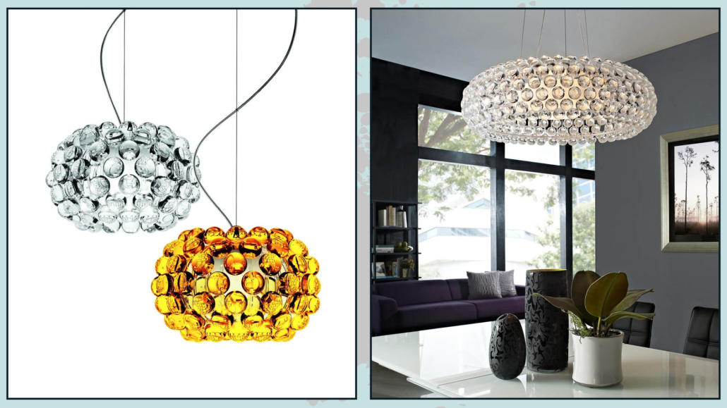
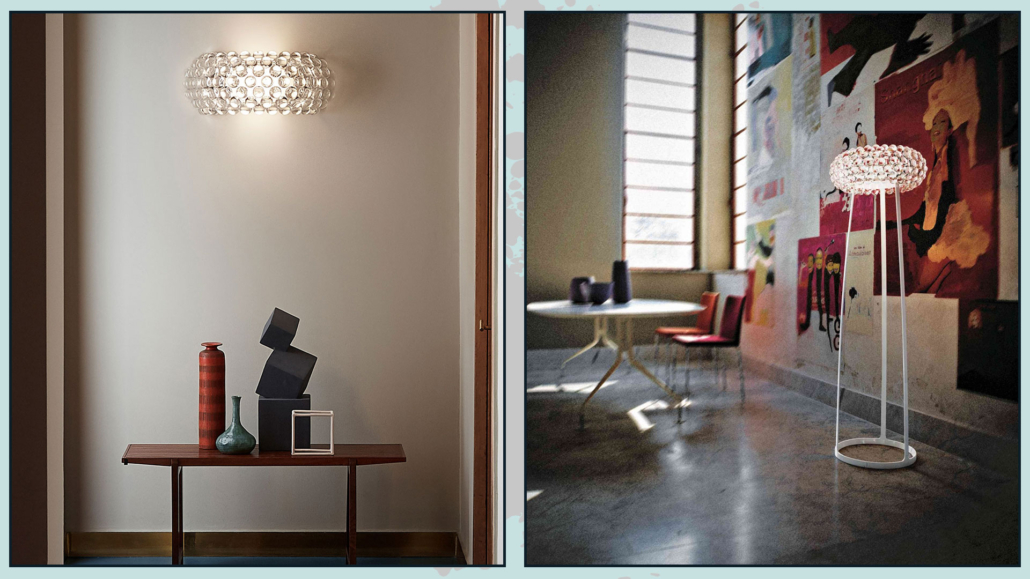
4 – CABOCHE

Designed by Patrizia Urquola and Eliana Gerotto in 2005 for the Foscarini brand.

The two designers take their inspiration from a Bakelite bracelet from the 1930s, creating a series of lamps consisting of spheres made of plastic material, the polymethylmethacrylate, blown glass, chrome-plated metal, and aluminum.

Even the name of the lamps harkens back to jewelry making; caboche, in fact, is a technical term for one of the cuts (the most well-known one) for diamonds and precious stones.

It exists in multiple models: as a pendant, table, and floor lamp, and as a wall sconce.

All these models are available in different sizes and two versions: transparent and golden yellow.

The pendant lamp is suitable as both an ambient and punctual light: in fact, it emits direct light both upward and downward, but at the same time projects it diffusely through a white frosted glass; its spheres then create a magical mosaic on the walls!

(credits: Foscarini)

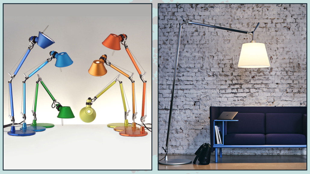
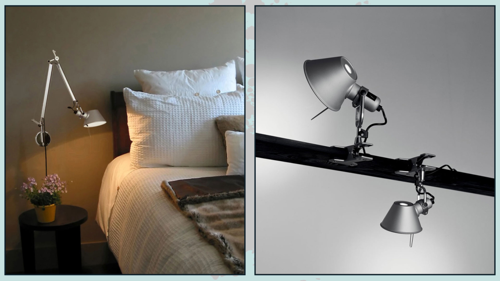
5 – TOLOMEO

Designed by Michele de Lucchi and Giancarlo Fassina in 1986 for the Artemide brand.

The two designers want to innovate the classic pantograph table lamp by comparing themselves with two other icons of the period: the Anglepoise lamp and the Nasca Loris lamp (from the latter, Pixar takes inspiration for its logo).

They changed how the lamp can be balanced and stopped in the desired position by replacing steel springs with steel cables and joints that keep them in tension; they also used aluminum for the structure.

These two fundamental changes make the lamp very light, eliminating the need for additional types of treatment, thus reducing production costs as well!

Tolomeo desk lamp won the Compasso d’oro ADI award in 1989 and is the best-selling lamp ever: an icon of simple and elegant hi-tech furniture.

Little trivia: In an interview conducted on the occasion of the 30th anniversary of the project, De Lucchi tells a curious anecdote: “Tolomeo, at that time, was not yet called that because the name was decided the night before it was presented at the Salone del Mobile. Ernesto (Gismondi, ed.) used to make a list of names every year, and Tolomeo seemed to us to be the most suitable character to represent the lamp because he was an astronomer, and a mathematician, in short, he was the one who best fits the idea of a scientific mindset.”

In its 30 years of life, Tolomeo also became a floor lamp, wall lamp, and pendant lamp, managing to adapt to new technologies, such as the switch to LED, while maintaining its essence!

(credits: Artemide)

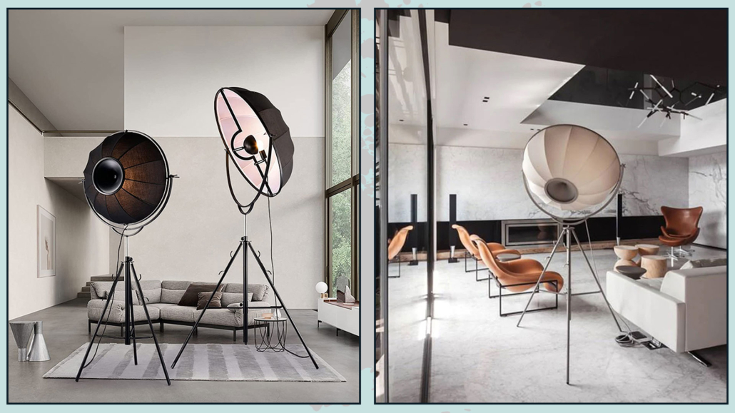
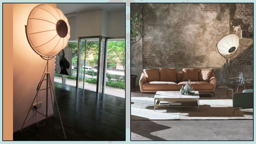
6 – FORTUNY

Designed by Mariano Fortuny y Madrazo in 1907 now produced by Pallucco.

The idea starts from the need for indirect and diffuse light in a scenic environment.

Mariano Fortuny studied lighting in depth, above all stage lighting, where he understood that the correct use of fabrics could create soft, diffuse light.

The rays of light are not projected directly onto the subject but reflect off the umbrella, returning a softer beam of light.

His knowledge then in photography led him to use the three-foot structure as a support for the umbelliform lampshade.

The lampshade is adjustable, which allows you to use the light according to your needs.

This lamp exists in three versions: Century, Moda, and Ornaments, each with different characteristics in terms of color and dimensional aspects.

(credits: Pallucco)

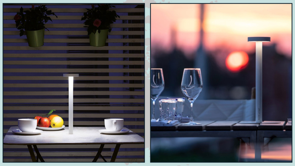
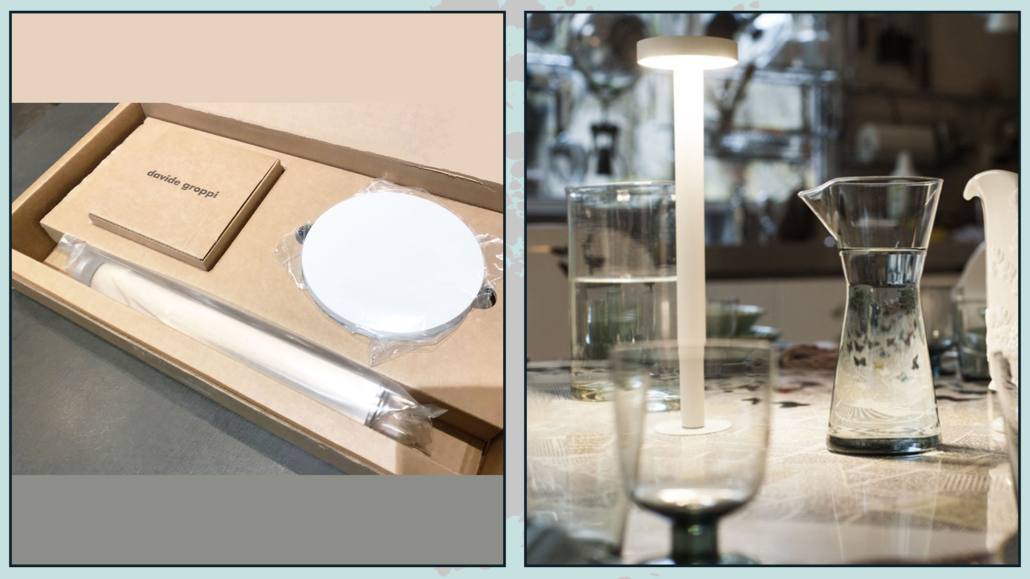
7 – TETATET

Created by Davide Groppi in 2013 for the brand of the same name.

It is a portable and rechargeable LED lamp that is small and discreet, with a magnetic base.

It comes after Groppi’s experience in the restaurant business, fulfilling the desire to see the light as one of the ingredients used in the kitchen.

Its small size allows you to put one at each table.

The designer considers it his best project, which is probably a shared thought since it received the XXIV ADI Compasso d’Oro Honorable Mention in 2016.

Little trivia: it is used for the mise en place of many starred restaurants, above all Carlo Cracco’s in Milan!

(credits: Davide Groppi)

I hope this article was helpful and you love it; in case, let me know in the comments!

Feel free to share it with anyone you think might be interested, I will be honored, and it will help me get my name out there.

If you feel that your home, or some environment of it, does not reflect you enough, do not wait any longer and book your consultancy!
I often hear the question: “How much does home staging cost?!”

Albeit it is not easy to give a precise answer because the figure depends on so many factors: the size of the house, whether it is inhabited or not, the location of the house (i.e. ease of use)… let’s at least try to give ranges.

Let’s start by saying that we can divide home staging into three types of interventions:

  • inhabited home;
  • Uninhabited but furnished apartment;
  • empty property.

In all cases, they are considered in the prices:

  • the inspection,
  • the identification of the target audience,
  • color consulting,
  • the Project
  • the photo shoot.
INHABITED PROPERTY

Having made this necessary introduction, let us start with the simplest intervention on paper, named inhabited property.

A consultation will tend to be enough here, with which we will assess: possible interventions in the colors of the house, possible moves of some furniture, what accessories to use to give it that extra appeal.

It is difficult for the home stager to have to bring materials except for the photo shoot.

for that reason, this intervention could then be around 500 euros.

UNINHABITED, BUT FURNISHED PROPERTY

For uninhabited but furnished houses, it will be necessary to assess the type of furniture present.

Of course, one will always try to keep as much as possible, but something will likely have to be eliminated.

Any work to be done, such as painting the housing, will be decided.

Finally, the materials needed to complete the set will be added (which will remain in the apartment for the agreed time, of course).

So let’s say the starting point could be as low as 1300 for a two-room apartment.

EMPTY PROPERTY

Finally, concerning the empty property, as can be imagined, there is more work to do.

In fact, it will be necessary to determine, transport, and place EVERYTHING needed to give a correct idea of the spaces.

(If you want to see an intervention on empty real estate, I’ll take you with me here!)

Of course, here again, there is the rental of materials for the agreed-upon time to consider.

We can reasonably expect the price to start at 2100 euros for a two-room apartment.

As you can see, it is not easy to say how much home staging costs! And as mentioned before, these are approximate prices, which also change depending on the house value: as you can imagine, the material brought in for staging will be quite different if it is a luxury house!

BUT THEN I FURNISH AND SELL FURNISHED…

That said, I would like to take the opportunity to consider a possible objection that might come to your mind:

“But, especially on an empty house, wouldn’t it be an idea to furnish it directly and try to sell it furnished?”

I want to talk about it because it is actually an objection made to me some time ago.

I had submitted an estimate of 2600€ for a three-room apartment and was immediately answered that with 1000/2000€ more, the apartment would be furnished and offered for sale with furniture included (of course with a higher price)!

An objection I respect, but in case you feel the same way, I would like to analyze with you whether it is a functional and cost-effective solution.

Let’s say you are in the same situation: let’s analyze this case together.

WHAT DO YOU DO WITH THE TARGET?

First, do you really only need €5000 to furnish that kind of house?

If the square footage is not a lot, it might well be.

The problem, however, might arise with the kitchen.

Even going to low-cost chains, the ones that give you kitchens “with blocked compositions,” you would have to be lucky to have the correct square footage and attachments where you need them.

Because, at the slightest change, it would become a “custom” kitchen that would raise prices!

(In the specific case, there was a corner to put the washing machine, so it definitely had to be studied).

EVEN IF YOU CAN DO IT…

Let’s be optimistic and say you manage to stay in the 5000 euros, now I’ll explain why it’s a risk to furnish to sell:

  • selling furnished will lose possible buyers because many already have their own furniture, and especially because everyone wants a home that represents them (they would find furniture not chosen by them here);
  • to furnish at that price, you have to buy basic furniture, otherwise, it’s not worth the risk, and this will reduce the potential customer’s interest more;
  • you will have to decide the style and colors, and once again, you will cut off a good chunk of people who were potential targets.
    In fact, if you choose a “strong” style or particular colors, you will lose the interest of those who do not like that style or those colors!
    If you try to stay as neutral as possible, on the contrary, you will lose those who like bolder styles!
    I know, now you’re thinking: “But home staging is very neutral, then even with this method, I lose potential customers”… that’s not the case because the house is sold empty!!!
    So the observer perceives the spaces and perhaps takes cues but knows that he will then do as he pleases!

These three points should give pause for thought: FURNISH TO SELL AT LEAST HALVES THE TARGET!!!

WHAT ABOUT THE TIME?

But there are other aspects to which I want to bring your attention.

We said that economically we could furnish with 5000€, but how much value do you give to YOUR time?

Oh yes, because if you have to furnish, you will have to go to the various stores to decide what to buy and place orders.

Not only that: you will have to wait some time before this furniture is delivered and assembled (and the house will remain stopped).

In addition, you will have to give this house a minimum of appeal: bedspreads, pillows, curtains, chandeliers, a few paintings…

These are all things you will have to bring and put in.

How long does it take? Time to find everything, buy and arrange the complements… can we say at least a day? I think I am also optimistic!

So basically, to this 5000 euro investment, you have to add the time it takes to look for furniture and accessories, the waiting time for delivery and assembly, and the time to make the house look nice!

If you don’t want to do it yourself, you will have to pay someone to do it for you.

WHAT IF THEY DON ‘T WANT THE FURNITURE?

Also, once everything is done, if you find someone who would like to buy but absolutely doesn’t want the furniture, what would you do?

If you leave the task of doing everything to the buyer, you will necessarily have to lower the price!

On the other hand, if you take care of it yourself, you will be forced to pay someone to come and disassemble and take away the furniture (increasing costs), and find a place to put it all away (which has a price)!

Indeed, you could try to sell everything, but it is not that simple, especially if you intend to sell the furniture before the delivery of the house keys.

Besides, we are always talking about low-end furniture to stay within the prices!

Assuming you have another apartment to sell, you might think about reusing them there and selling that one as furnished…

But, again, the problems will not be few.

For example, you are unlikely to readapt the kitchen (at the very least, if you are lucky, you will have to change the countertop).

Furthermore, how will you sell the house? As “furnished new”?

Remember, again, that we are talking about basic furniture, so it is easy to ruin it on the second assembly…

ALL THINGS CONSIDERED…

All this considered, taking your time into account as well, not only did you pay significantly more than 5000 euros, but:

  • you may have to pay a mover to take everything away,
  • a possible warehouse to pick up the furniture, waiting to sell it,
  • or invest more time preparing a new house, where you will have the same target reduction problems as the first one!

Is it worth it?

In the above approximate prices, as mentioned before, are included:

  • identification of the target audience,
  • study of a project for a MIRATE set-up,
  • time required for transportation, installation, and dismantling (as well as the photo shoot)!

I am convinced that it is paramount to see home staging as an investment, not a cost, an investment that will lead to selling your home sooner and at the best price.

What do you think?

I hope this article was helpful and you love it; in case, let me know in the comments!

Feel free to share it with anyone you think might be interested, I will be honored, and it will help me get my name out there.

If you have a house to sell, or if you feel that your house, or some environment of it, does not reflect you enough do not wait any longer and book your consultancy!

A couple of weeks ago, we looked together at some tips for decorating a home in style (you can find it here),

Today I would like to give more tips on decorating a home like a real pro!!!

– AVOIDING VISUAL CHAOS

Avoiding visual chaos will definitely make a big difference in the perception of your space!

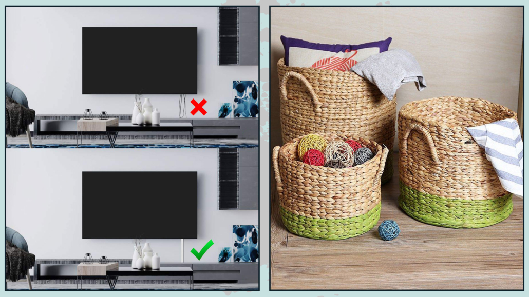
By visual chaos, I mean anything that is unnecessary or can be a disruptive element, one on all television and computer cables!

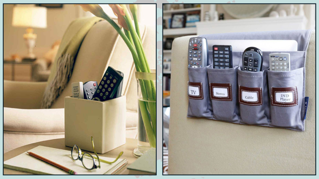
But not only that, any toys around if you have small children and all those non-purely decorative items like remote controls can be!

Try to hide, settle everything that is not “needed”!

For TV, computer, or video game cables, there are conduits that you can also paint with the color of the wall if needed.

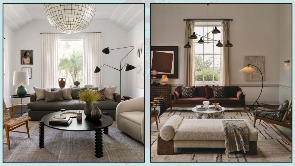
For toys, you can put them away in boxes or baskets, the latter decorate and give warmth to the room, you would have the classic “two birds with one stone”!

Avoid visual chaos - decorating like a pro

(credits: aliexpress.it; etsy.com)

Put the remotes arranged on a tray or buy those pockets that you can put on the sofa’s armrest.

Avoid visual chaos - decorating like a pro

(credits: marthastewart.com; greatusefulstuff.com)

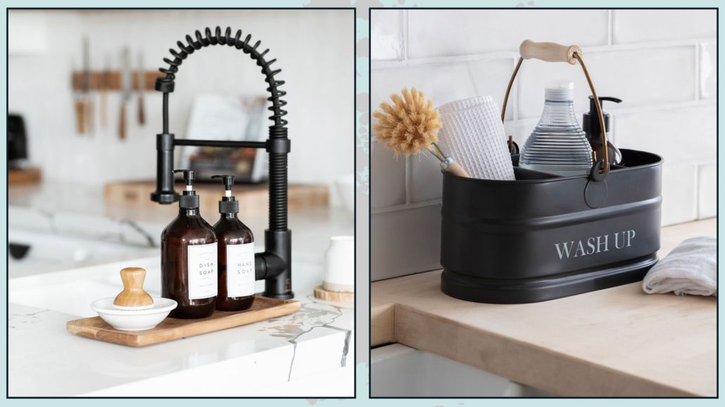
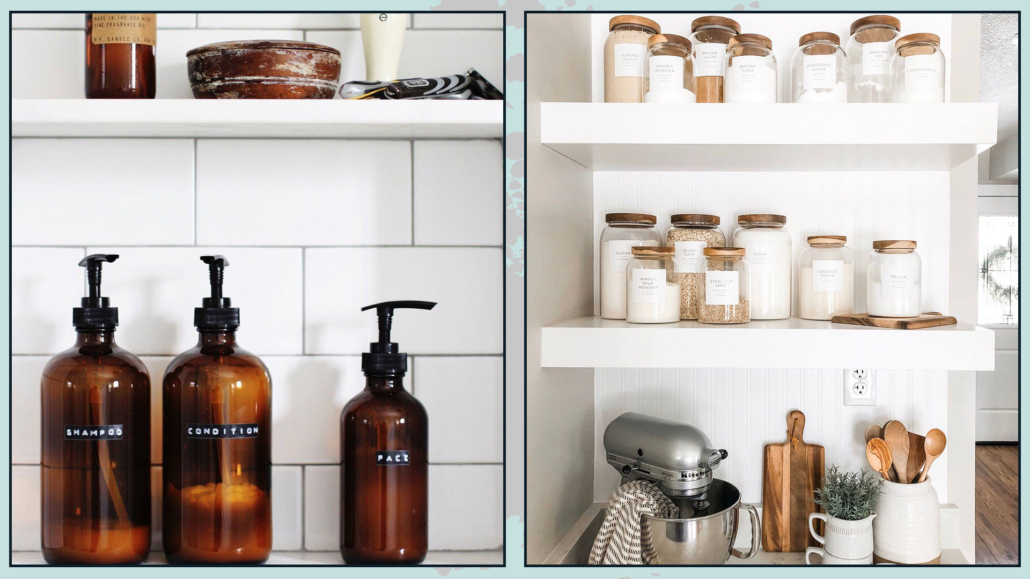
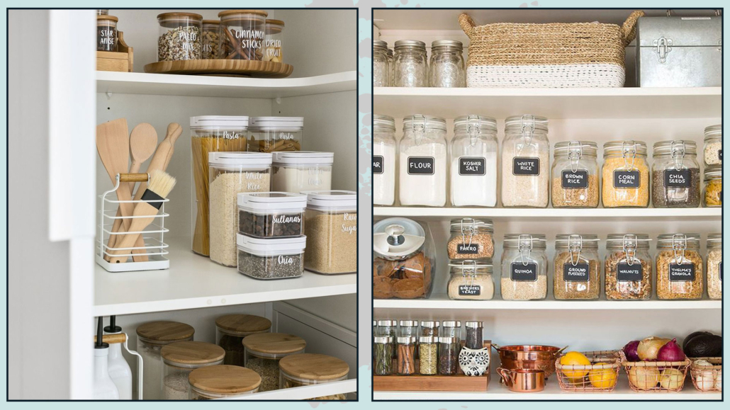
In the bathroom, you might think about getting all the same containers to fill with shampoo, conditioner, and liquid soap so that everything is coordinated and there are fewer colored bottles.

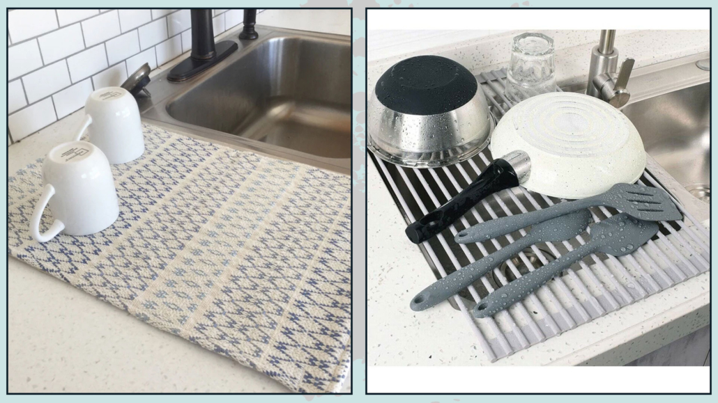
The same goes for the kitchen, for those products you may have on the countertop!

Doing this makes everything more intentional and studied like a pro!

Avoid visual chaos bathroom and kitchen - decorating like a pro

(credits: nestingwithgrace.com; etsy.com)

– USE PAINTER’S TAPE!

Does that sound like strange advice?

In fact, it may not be usual, but it could make a big difference in decorating like a real pro!

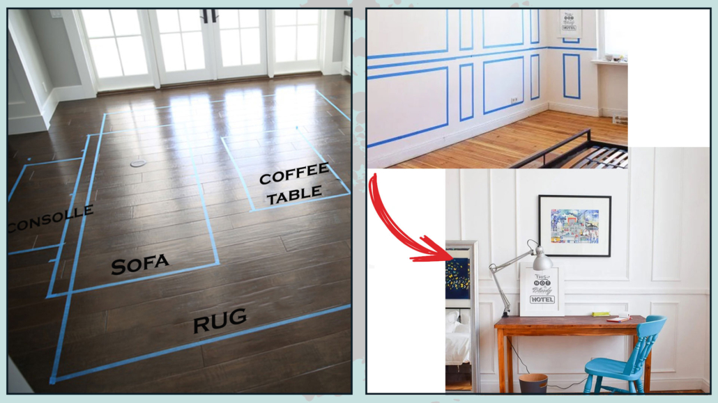
Now, if you were to do color blocking on some wall or decide to paint only a portion, you would use this tape to mark off the part to be colored, right?

Well, think about also using it to calculate the footprint of the furniture or to hang a picture or even a wall sconce.

It’s a tremendous help because it allows you to really see what a piece of furniture might look like there, whether the rug is the right size, whether the picture is proportionate and at the right height…

All with an investment that could be called zero!

We talked about moldings and paneling to add sophistication to the room… Do you want to know how it would look? Well, draw it with the tape, and you will see it immediately.

There is nothing like seeing something with our eyes to see if it is for us or not, so draw your ideas with tape to see if it really works!

By the way, regarding paintings and wall sconces, if you poke holes in the tape, you will protect the plaster from those micro flaking, which can happen by driving a nail or using a drill.

use painters tape - decorating like a pro

(credits: thesunnysideupblog.com; littlehouseonthecorner.com)

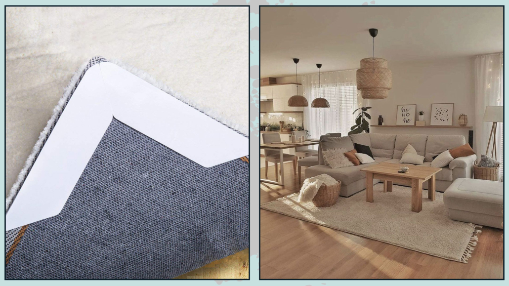
– DOUBLE-SIDED RUG TAPE

If you use rugs, this tape really becomes indispensable!

First of all, blocking the rug with tape will prevent it from shifting and thus moving from where you have placed it (this is avoided or at least greatly limited if heavy furniture or furnishings is blocking it)

The main reason is that you will prevent corners or edges from rising this way, making the rug less attractive to look at, but more importantly, risking then tripping over it!

That also applies if you put a rug on top of each other, as is very fashionable in America.

It is a double-sided tape that is really easy to remove and precisely avoids that unsightly twisting of the edge or corner!

(credits: amazon; Home interior)

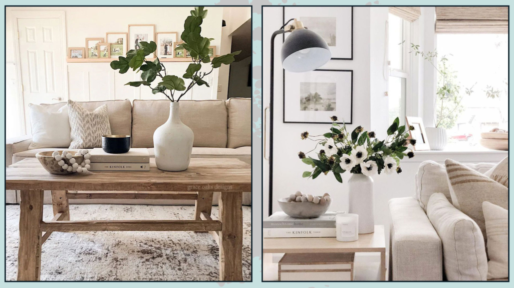
– VASES WITH FLOWERS AND BRANCHES

If you are not sure how to decorate a surface or what object to buy, the simplest and most impactful solution is to use vases with flowers or branches!

They bring color and vibrancy to the environment.

Adding something organic into the home is always a positive and stylish thing to do, and for decorating like a pro is really a must-have!

While it is true that in the case of plants these must be real, when it comes to small and potted arrangements, an exception can be made!

Let’s face it, flowers are an investment you can’t always make, not only financially but also in terms of time; going to the florist often may not always be feasible.

The same goes for looking for branches: if you don’t have a garden (and even then), you may not have time to go search for them.

Nowadays, finally, there are also really well-made fake flowers and branches that look real, so if you don’t overdo it, you can make decorations like that!

Then to give an extra touch of authenticity, if you put these flowers and/or branches in glass vases, add some water, and you’re done!

(credits: grace oaks designs; afloral.com)

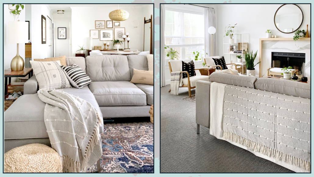
– BLANKETS

Last time we talked about throw pillows, but don’t underestimate the decorative touch of blankets!

Blankets give that touch of warmth and color to any room.

You can put it on the back of the sofa in case it isn’t pretty to look at or, otherwise, to give it that extra interest.

You can lay it on the armrest either neatly folded or a bit like it was thrown for a more casual look.

Still in the living room, you could put one or more blankets in a basket beside the sofa.

(credits: sigridandco.com)

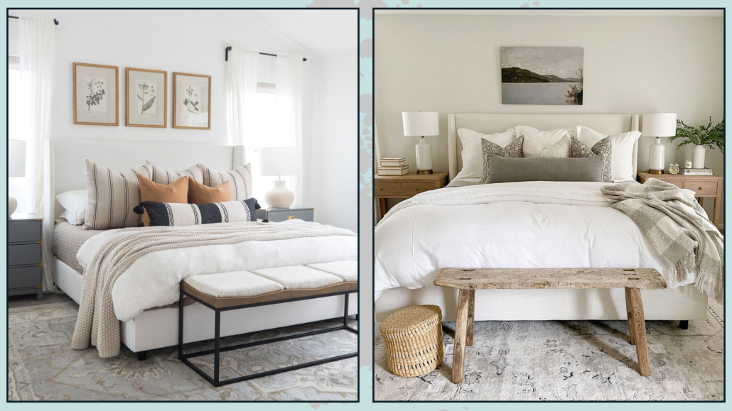
Even on the bed, putting a blanket over the bedspread, more or less width and more or less folded or ” thrown”, will give it an extra touch.

Blankets are really a classic that a pro uses to decorate the home and give it warmth and elegance!

(credits: wovennook.com; sherricalnanhome)

– ATTENTION TO THE LOCATION OF FURNITURE

It is paramount to create a comfortable, as well as a beautiful, environment, and this can only be done by functionally arranging the furniture.

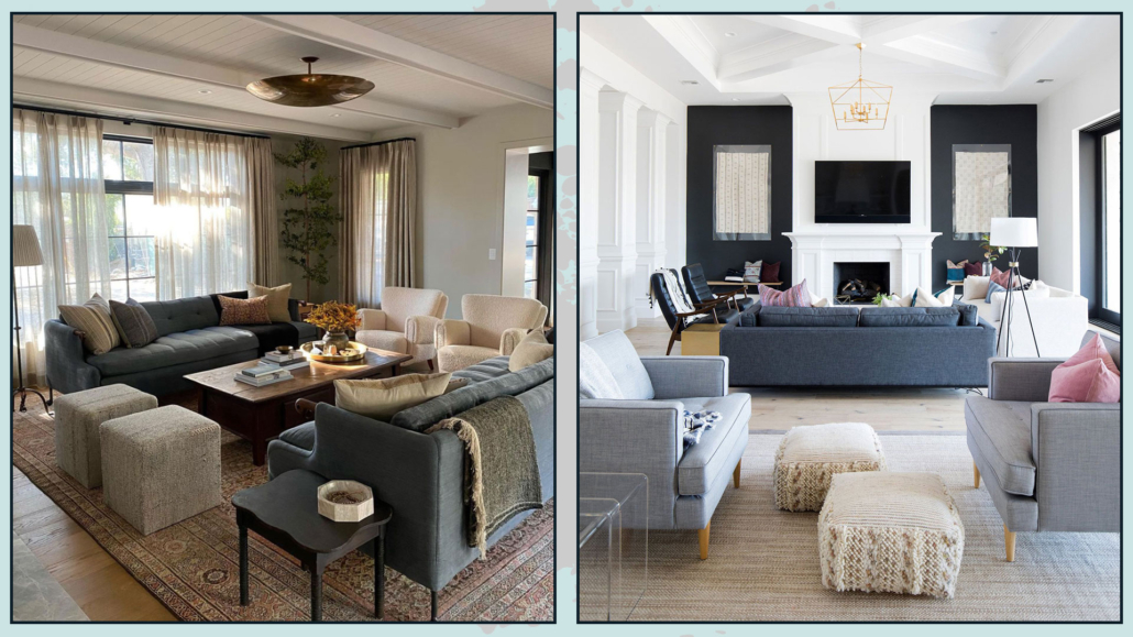
In the living room, arranging the furniture in such a way as to create a conversation area is particularly relevant.

If the seats are all facing the same side, there will be a sense that something is missing.

The excuse of the small living area is not valid, because we have seen that even there, you can still add a seat, even if it is just an ottoman!

Doing this will make the environment much more inviting!

(credits: Margaret Boatner; theblushhome.com)

– EVERY ONCE IN A WHILE, GIVE NEW LIFE TO ENVIRONMENTS!

It might also be interesting to refresh your rooms, giving them a new life!

You can do this in essentially two ways:

– occasionally, try to move some furniture to give a new layout to the room; you could also find more functional solutions!

– If you don’t want to twist everything all the time, however, you can decorate, for example, according to the season!

We’ve talked about it for fall, but it’s not like you necessarily have to fill the house with decorations, as you maybe do at least at Christmas… in fact, you’ll merely need to change colors, textures, and patterns here and there.

The simplest thing is to change the slipcovers of pillows and perhaps the blankets.

If you have double curtains, you could change the colorful ones, or have some paintings to which you could merely change the inside print!

These are all things that don’t take up too much space but will give you different environments with delivered different feelings and emotions.

(credits: sherricalnanhome)

These are little tricks a pro uses to decorate homes, always making them dynamic and never ordinary.

I hope this article on how decorating like a pro was helpful and you love it; in case, let me know in the comments!

Feel free to share it with anyone you think might be interested, I will be honored, and it will help me get my name out there.

If you feel that your home, or some environment of it, does not reflect you enough, do not wait any longer and book your consultancy!
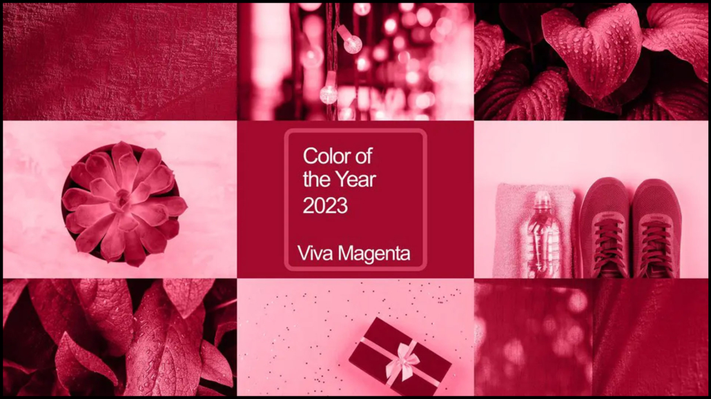
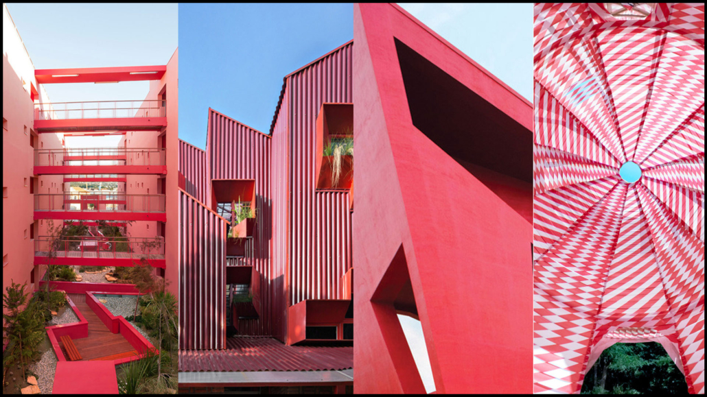
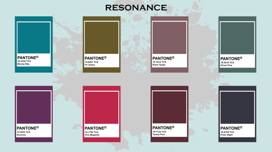
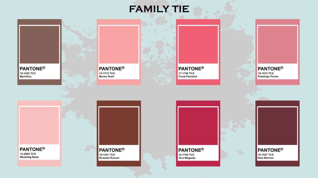
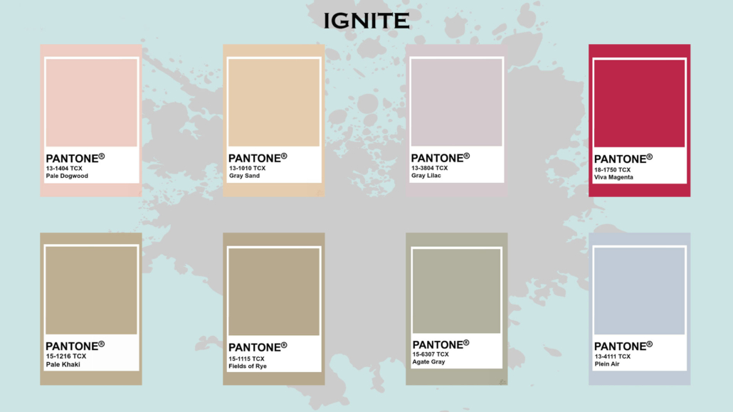
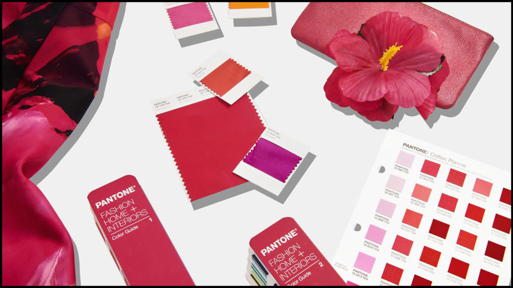
We are now in the last part of the year, and like every year, we start talking about home color trends for the coming year, each brand proposing its color of the year 2023.

While waiting for the very familiar color of the year 2023 by Pantone, let’s see what other brands in the industry are offering us!

This year too, the call is to nature, although no longer only on the green, is very strong, but some dared a little more!

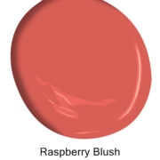
– BENJAMIN MOORE: Raspberry blush

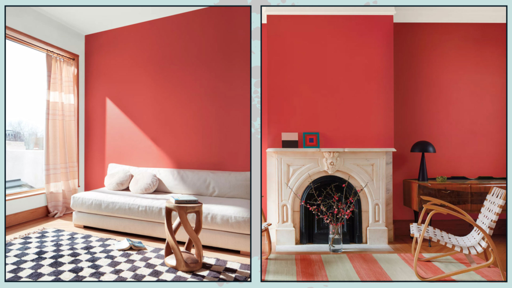
Benjamin Moore offers a vibrant and charismatic color this year, a coral mixed with red.

“Raspberry blush enlivens the senses with electrifying optimism!”

It is a powerful color, far from the neutrals proposed in 2022, which will give a touch of character to rooms.

You can use it in small doses, but you can also dare on doors or furniture up to walls!

Fun fact: To commemorate this year’s selection, Benjamin Moore collaborated with electro-funk duo Chromeo to highlight the optimistic tone of the palette and the dynamic role that color plays in personal expression, just like music (you can find the track on their website)

Benjamin Moore 2023

(credit Benjamin Moore)

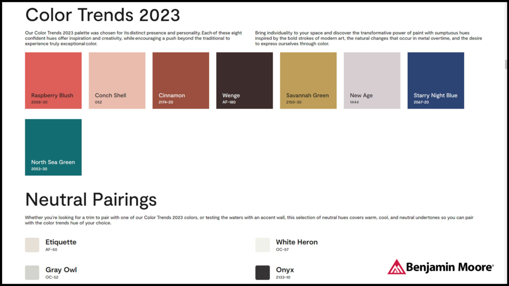
Benjamin Moore proposes a whole palette of colors, which, for them, will be the trend of 2023.

As you can see, the colors, if you exclude conch shell and new age, are all quite bold and intense.

When using these colors, I recommend calming them down with neutrals, like the four proposed by Benjamin Moore himself!

Benjamin Moore 2023

(credit Benjamin Moore)

– SHERWIN WILLIAMS: Rendend point

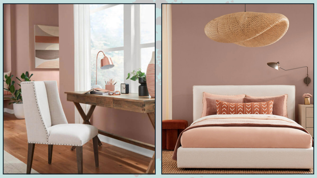
Sherwin-Williams offers a warm and intriguing color that goes well with all styles.

Basically, it is a neutral color, an earthy color with a hint of pink, a color that helps you feel rooted!

It is a soothing color, so it is also suitable for the bedroom, giving a touch of personality.

It is versatile, so in addition to fitting all styles, it also goes well with most colors, although it gives its best with white and other warm colors!

Sherrwin Williams 2023

(credit Sherwin Williams)

Fun fact: Sherwin-Williams worked with Etsy to find a selection of items that would go well with this color.

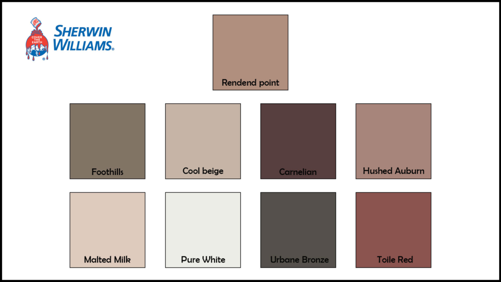
Sherwin-Williams also offers a whole palette of colors that you can safely pair together!

Sherrwin Williams 2023

(credit Sherwin Williams)

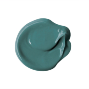
– PPG: Vining ivy

PPG stays in shades of green, although this year’s is a bolder green!

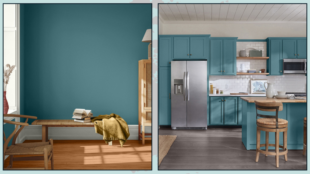
“It’s a deep, shaded Caribbean aqua with turquoise undertones” that goes with any style!

It is an elegant color that becomes truly gorgeous when paired with warm wood tones.

Relaxing, refreshing, and revitalizing, you can use it in all rooms, either as furniture or on walls!

PPG 2023

(credit PPG)

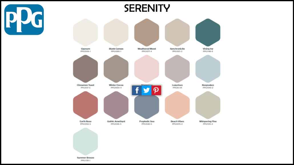
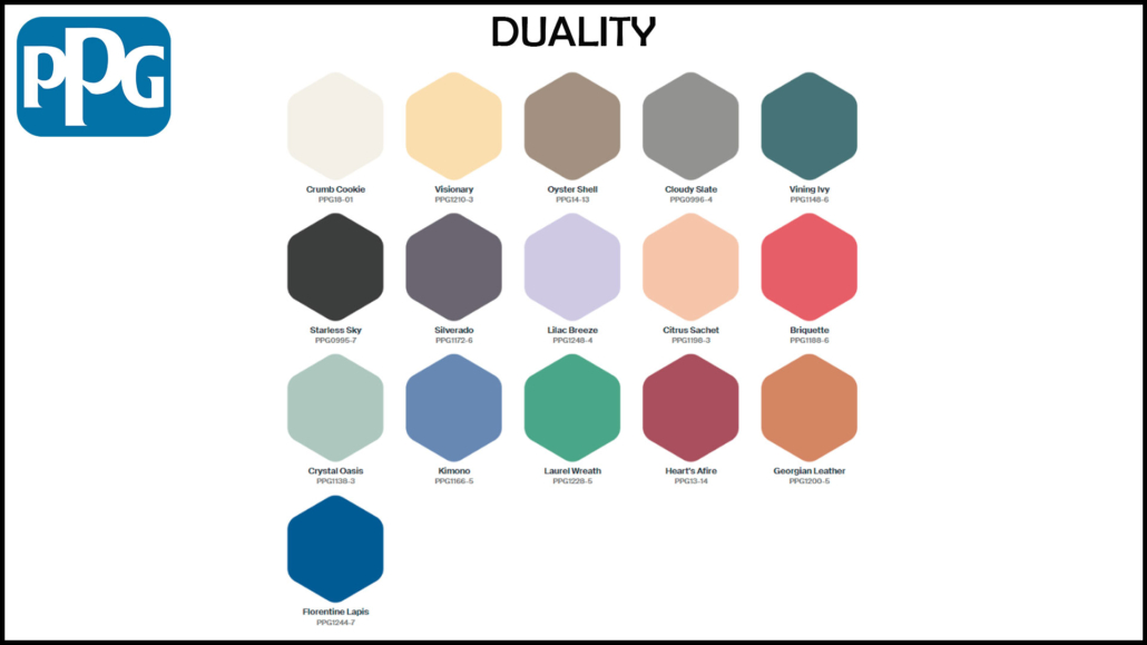
This year too, PPG offers three color palettes that include Vining ivy:

– Serenity

It is a color palette that combines pastels, watery tones, and warm neutrals, all calming and soothing colors that bring serenity precisely!
PPG 2023

(credit PPG)

– Duality

It is a palette that plays with contrasts: there are, in fact, pastel colors and very bright colors; it is for those who like to dare and give a touch of powerful character!
PPG 2023

(credit PPG)

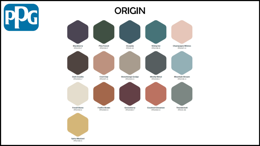
– Origin

It is a palette that takes inspiration from the natural world, picking up the colors of nature, forests, earth, and sea…

PPG 2023

(credit PPG)

We can also find this color in one of the three color palettes proposed last year:

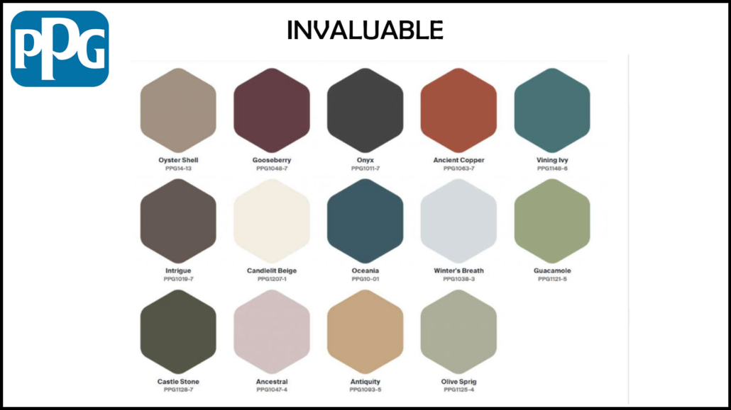
– Invaluable

Dark, refined hues, in short, an elegant color palette that winks at traditions!

PPG 2022

(credit PPG)

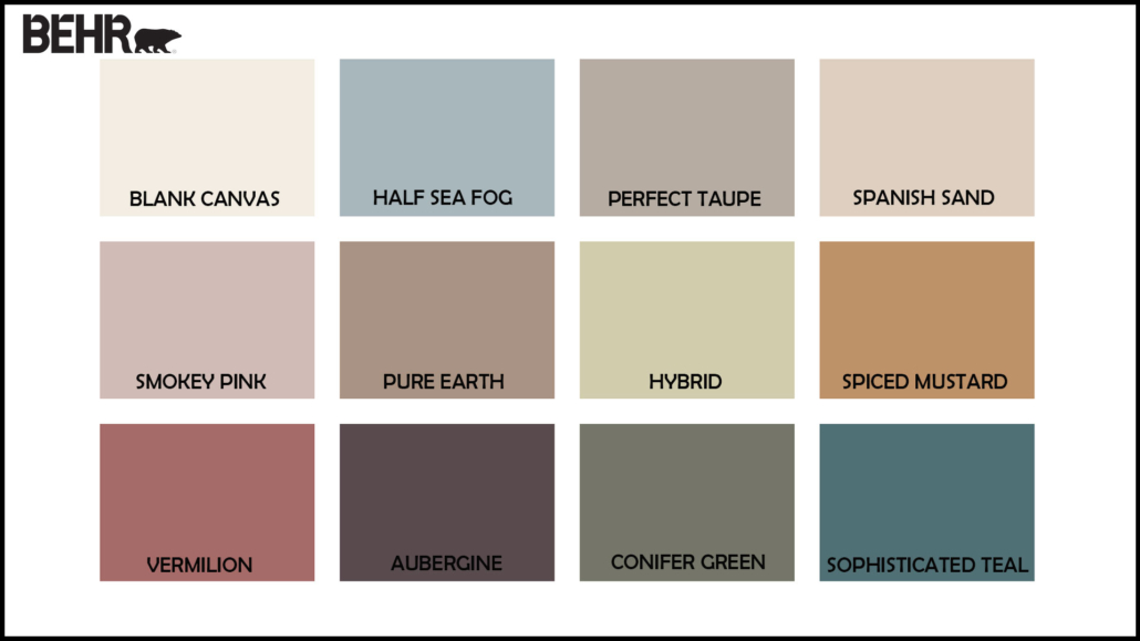
– BEHR: Blank canvas

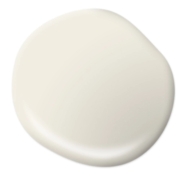
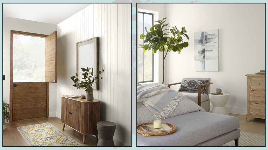
The Behr brand chooses, as the color of the year 2023 Blank canvas, a warm, buttery, and enveloping white.

It is a calming and soothing color that you can use with all styles and in all rooms; you can use it alone, but it will be an excellent glue for many other colors.

It is less rigid and austere than pure white, it nevertheless retains its brightness, so it’s excellent on walls.

In an exclusive interview with AD, Erika Woelfel, vice president of color and creative services at Behr, described the shade as “that perfect artistic color to allow people to start expressing their creativity.”

Behr 2023

(credit Behr)

Behr, too, offers a color palette that can be used in conjunction with the blank canvas.

They are all dusty colors, many of them echoing the colors of nature and the earth.

Behr 2023

(credit Behr)

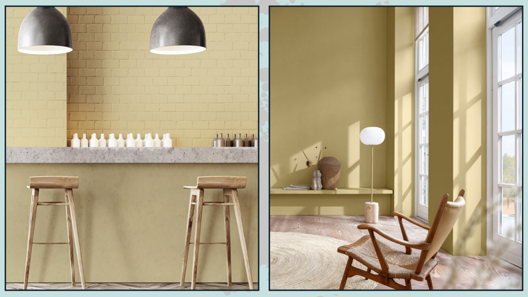
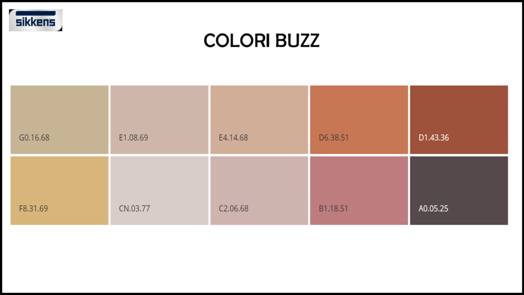
– SIKKENS: Wild wonder

Sikkens, too, draws on nature with its Wild wonder, a color that echoes that of wheat.

A warm, positive color that reconnects us precisely with nature, bringing calm and serenity.

That, too, is a color that goes with all styles and can be used in all rooms, from the furniture to the walls, for a definitely relaxing and bright environment.

Sikkens 2023

(credit Sikkens)

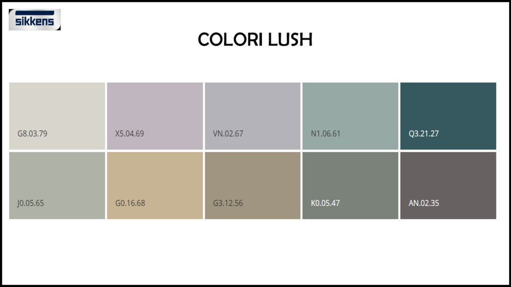
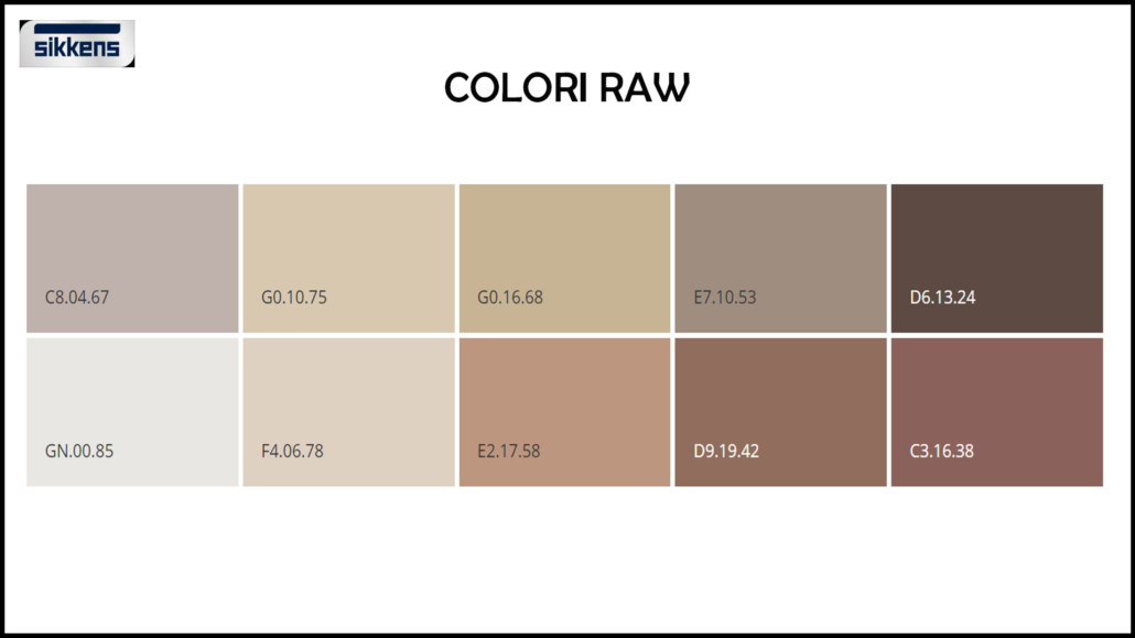
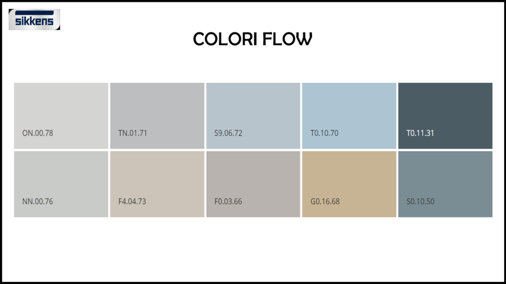
This brand is no exception and creates no less than 4 palettes around its color of the year, all inspired by nature:

– Lush colors:

Resumes forest shades “help us make our homes feel part of the world”.

Sikkens 2023

(credit Sikkens)

– Buzz colors:

echoes the bright colors of the meadow and flowering fields; they are shades that “give energy, harmony, and joy”

Sikkens 2023

(credit Sikkens)

– Raw colors:

echoes the hues of the harvest, conveys “the wonder of nature’s products, and can give a sense of richness and creativity to the environment.”

Sikkens 2023

(credit Sikkens)

– Flow colors:

echoes the hues of the sea; they are delicate shades “capable of conveying a sense of balance in our hectic lives.”

Sikkens 2023

(credit Sikkens)

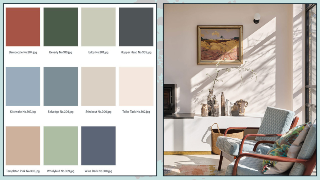
– FARROW & BALL:

As always, this brand offers more than one color each year: this year, as many as 11, all inspired by moments of joy, comfort, and refreshment.

Bamboozle is the somewhat bolder and more vibrant of these colors; the others are a bit more neutral.

All of them, however, including bamboozle, fit well with any style and can be used together to create an original palette that will give your home some character!

Farrow & ball 2023

(credit  Farrow & Ball)

Farrow & ball 2023

(credit  Farrow & Ball)

I hope this article was helpful and you love it; in case, let me know in the comments!

Feel free to share it with anyone you think might be interested, I will be honored, and it will help me get my name out there.

If you feel that your home, or some environment of it, does not reflect you enough, do not wait any longer and book your advice: just contact me!

Today, I would like to share with you some tips and tricks used by interior designers to decorate home with style!

A few suggestions are really very simple and usable right away in your home!

– SCALE AND PROPORTIONS

It is paramount that furniture and accessories are correctly scaled to the size of the room and in proportion to each other.

Furniture or elements that are too large will give a feeling of an overstuffed and confusing environment.

Conversely, too small will be lost, giving the feeling that something is missing.

So to furnish and decorate in style, it is really essential to measure the space and buy items with the correct size for that specific place and in relation to the rest!

(credits: artheco.it; Bronxes Studio)

– BALANCE AND SYMMETRY

Our eyes really like symmetry: it is something that subconsciously calms us!

Decorating your home in style using symmetry is undoubtedly a great thing to do…

BUT, as always, without overdoing it, because then it can get boring!

Perfect symmetry, if repeated over and over again, loses its appeal then, making the environment flat.

The key word is always BALANCE, so don’t be afraid to use asymmetry you only need to balance it visually!
Now let me explain:

If, for example, you decide to put a picture above the couch but not centered, you can balance on the other side with a beautiful floor or wall lamp.

Balancing visual weights will maintain a balance even without perfect symmetry!
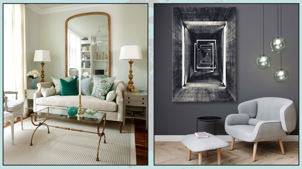
The important thing is not to decorate only one side of the wall or place all the furniture in one area of the room without balancing it with something: otherwise, it will look like something is wrong.

(credits: neptune.com; Knoll)

– ATTENTION TO THE USE OF COLORS

The right or wrong use of color will make a big difference in decorating your home in style.

Color has deep psychological significance and is a fantastic ally for our homes.

You can use it on walls, furniture, and decorations, such as pictures, pillows, and vases…

Unless you want a total white or total black or total grey home, you certainly use some colors: in fact, neutrals are colors because they will have a definite undertone (actually, unless you use pure colors white, black, and gray, do too).

You can have a monochromatic home, that is, using the same color everywhere, changing the saturation and intensity: this creates rhythm and does not make everything flat.

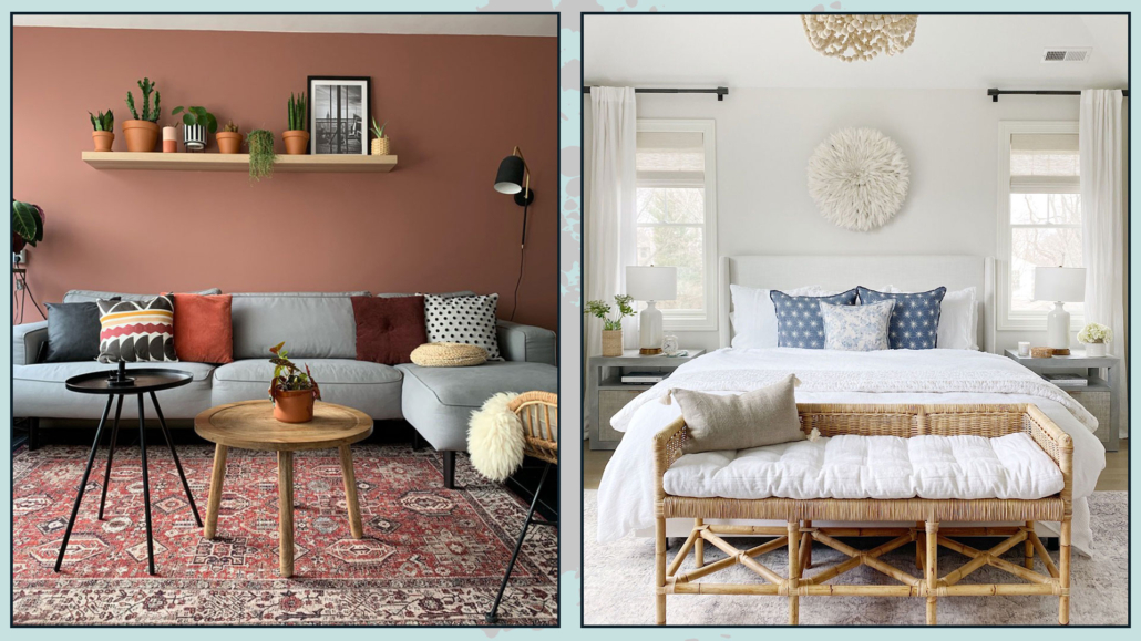
You can also use color just in small touches, so in a room, which tends to be neutral, add a few colorful elements here and there (a pillow, an ottoman, an armchair… for example!).

Then, again, you can use different shades of this color to give that sophisticated and stylish touch.

Of course, you can also use more than one color by creating a well-thought-out color palette that allows you to have a balanced and harmonious environment.

If you are afraid to use color, proceed in small steps, with small elements first!

(credits: mooielight.com; Sean Litchfield)

– ALWAYS MAKE COMPOSITIONS IN ODD GROUPS

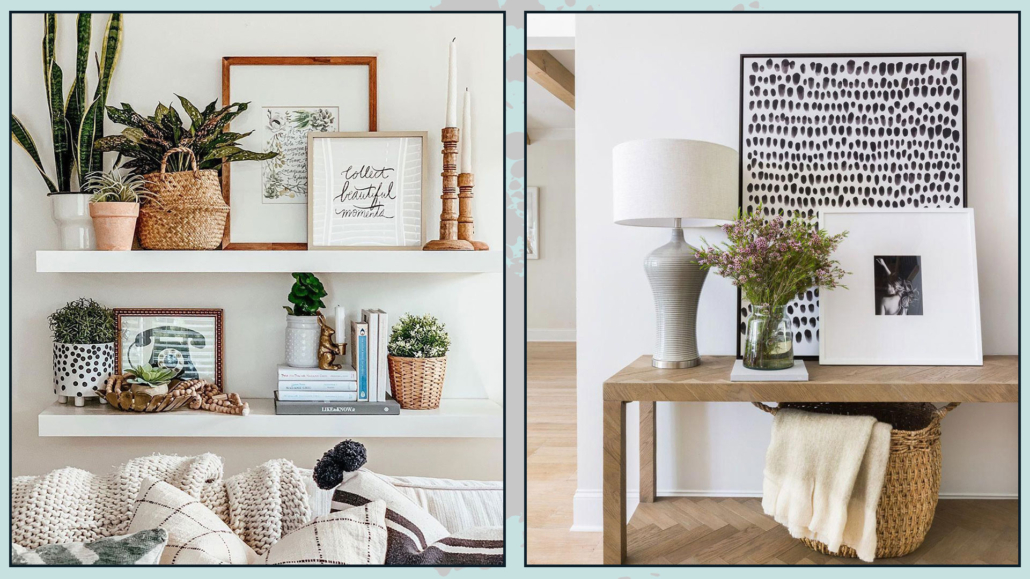
When making your decorations on a coffee table, a console table, the shelves, or a bookcase, always make compositions with an odd number of elements.

If you put only two elements next to each other, there will be a bit of a feeling of something incomplete; something put there somewhat randomly.

One is an odd number, so, especially on the dining or coffee table putting only one object, perhaps a vase with flowers, may be an option; the only caution will be that it be proportionate to the surface on which it is placed.

The fact remains that three is always the perfect number, although nothing prohibits making five-element compositions as well.

Small clarification, if you put books on top of each other and place an object on there, the whole thing will be considered as one element of the composition!

When making these groups, to make them attractive and sophisticated, always remember to play with different sizes, materials, colors, and finishes.

The elements should create a triangle or diagonal, as always, to give rhythm and dynamism.

Also for compositions, pay attention to the things mentioned in the previous point, namely, the proportions between the elements that make up the composition itself and this in relation to the place where it is placed!

(credits: boho-farmhouse-decor-home-tour-2020; Scout & Nimble)

– THROW PILLOWS

Throw pillows are a quick, easy, and inexpensive way to decorate your home in style.

It will also allow you to change the face of your environments whenever you want!

In fact, once you have bought different-sized and shaped interiors, you can purchase different slip-coverings that you can replace at every change of season, for example, or whenever you see fit.

The slipcovers do not take up too much space and, as just seen, allow you to renovate your home with ease.

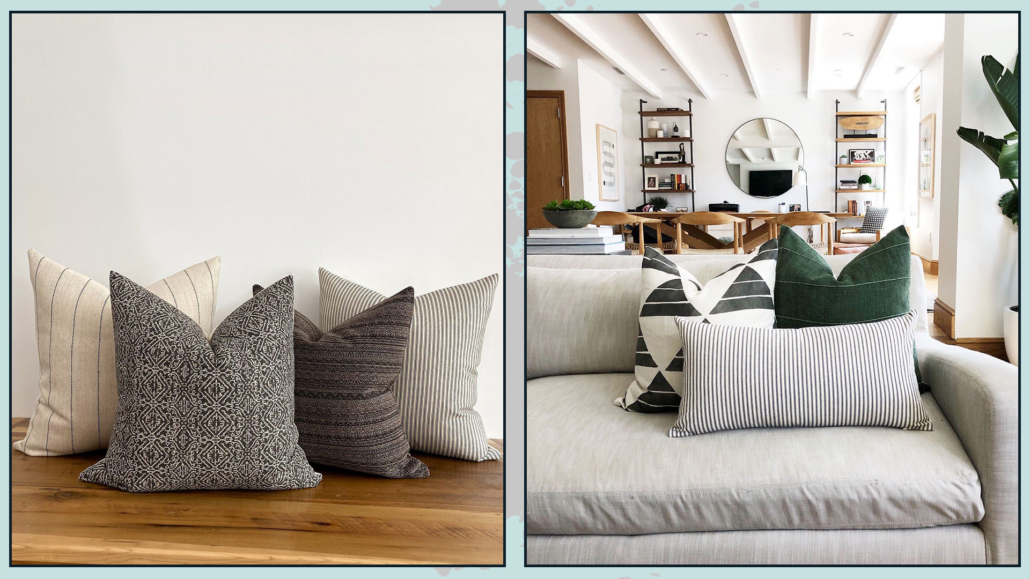
I recommend considering throw pillows as any decorative object and so, also with them, as mentioned in the previous point, make compositions in groups of three, or at any rate, always in odd numbers on the couch or bed.

Therefore, even with throw pillows, it is good to use different sizes, colors, patterns, and textures in the composition to give some rhythm and dynamism.

Be careful how you mix patterns, keep in mind the colors, but also the scale of the designs so that each piece blends well with the other (I talk in detail about how to mix patterns here).

Avoid, unless you are in an armchair, leaving a pillow alone, it would seem to be put there a bit haphazardly!

A well-designed composition will immediately give a sophisticated and elegant effect.

(credits: Enorm d’Acheteromme; lifeoncedarlane.com)

Little Tips:

– to get pretty filled pillows, get interiors a little bigger than the covers.

– if you like to give a magazine look to your pillows, get interiors that you can shape well (not too dense, to be honest), and then once it’s pretty filled, you can karate chop it with your hand in the middle!

It is very trendy, but, actually, it gives that feeling of something more studied.

(credits: Etsy.com)

– WALL DECORATIONS

Decorating walls with style is not as easy as it looks, and mistake is really just around the corner!

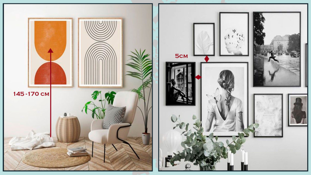
On the wall, you can put mirrors, pictures, or photographs; you can put one or two pieces or a whole gallery, and, in all cases, the first thing, the most important, is to hang at the right height!

Mirror or pictures, or, better, the center of them, should be hung at eye level, being around 145 and 170 cm from the floor; it will depend on your height, of course!

If you hang the picture or mirror too high, it looks like its own thing, separate from everything else.

In the case of a composition, this measure should be taken for the center of it.

The distance between the various elements on the gallery wall is also significant, which must always be the same and is around 5 cm, both in height and sideways.

If the paintings are too close together, it will create confusion, while if they are too separate, they will look like stand-alone pieces and will not form a cohesive and harmonious composition.

(credits: etsy.com; posterstore.it)

Small cautions:

Regarding mirrors, as seen on other occasions, you can also dare to use huge mirrors, perhaps resting on the floor; they will double the light and give an incredible touch of elegance and style.

For paintings, on the other hand, I recommend avoiding buying elements mass-produced because they will not bring originality.

Of course, I understand that one cannot always afford an auteur painting, but if you look well, you might find a large number of emerging artists who have really cool and distinctive works.

Another way to have original paintings is to create them yourself: if not painting, you can use fabrics, for example… don’t limit your creativity.

The important thing, however, is to look for elements that represent you and tell who you are so that you can decorate in style, your style, your home!

(credits: Sarah Richardson Design; hepsiburada.com – Voovart)

I hope this article was helpful and you love it; in case, let me know in the comments!

Feel free to share it with anyone you think might be interested, I will be honored, and it will help me get my name out there.

If you feel that your home, or some environment of it, does not reflect you enough, do not wait any longer and book your advice: just contact me!

It’s been some time now that wallpaper has been back on trend, but, as you know by now, it’s nothing like what our grandparents used!

With modern technologies, there are wallpapers of different materials which can now be adapted to any environment, even unthinkable ones such as kitchen and bathroom, even in the shower interior!

Even in terms of colors and patterns, there really is such a varied and wide choice that getting lost is a snap!

How to choose the best wallpaper?

EVALUATE THE MATERIAL

The first thing to figure out is WHERE we want to put the wallpaper; this is important to understand the most suitable material!

As I mentioned earlier, today, wallpapers are made of different materials, not only pure paper; in fact, there are also fabric wallpapers, vinyl wallpapers, fiberglass wallpapers, etc.

Depending on where the wall to be decorated is, there will be the best material:

– for example, to use wallpaper as a kitchen backsplash, the ideal is to use fiberglass one, in the bathroom, and even in the shower vinyl or PVC paper will be suitable.

– in all other rooms that do not have as much humidity and thermal stress, all kinds of paper will do, although perhaps the best is a nonwoven paper composed of fabric and vinyl, making this paper durable, washable, and also very pleasant to the touch.

(credits: wallsauce.com; Lime Lace)

(credits: london-art-naiadi-wallpaper; Jenn Feldman)

ATTENTION TO THE CONFIGURATION OF THE ROOMS

For the correct choice of paper, it will be essential to consider the condition of the room where you want to put the wallpaper.

Patterns, especially, should also be chosen according to the size and lighting conditions of the room.

For example, if the room is small, better to use wallpapers with light contrasts and designs that are not too small to avoid over-saturating.

You could even dare with decidedly oversize patterns because that also tricks the eye and makes you perceive larger spaces.

In small spaces also better not to put the paper on all four walls.

The thing that actually, I personally advise against regardless, is to avoid “trivializing” the choice of wallpaper, but mainly because the eye also needs solid colors to rest!

However, it is clear that, in huge environments, you can dare a little more!

(credits: archiproducts; cartadaparatiartistica.com)

For the other walls, you can use colors similar to the paper ones to harmonize it better or neutral and simple colors to enhance it more.

Wallpaper is a great way to emphasize a wall, and create a focal point, so choose the most important wall in the room, the one where you want to draw the eye!

N.B. the focal point doesn’t have to be the wall…it could also be the ceiling!!!

That would undoubtedly give a strong personality to the environment!

(credits: wdesigncollective.com; Magnolia Network)

FOLLOW THE STYLE

Having figured out the best material, the room configuration, and on which wall (or ceiling) to put the paper, you can choose colors and patterns!

Wallpaper is a piece of furniture in its own right; it must coexist with the rest harmoniously.

Then it will be necessary to look for papers with colors included in the palette selected for the house and from the patterns that can enhance the chosen style.

For colors, the “rules” for choosing solid colors apply, so in addition to referring to the palette, it will be based on the feelings you want to experience.

Light-colored papers will visually enlarge spaces, while dark ones will create more intimate environments.

You can also combine it with the other elements using the color wheel and its various combinations (I’m talking in detail about this here).

(credits: wallpaperdirect.com; cutewallpaper.org)

As mentioned earlier, for these reasons, it will be paramount to look for something that enhances the style you choose and can perfectly complement your type of decor.

In general:

– Black and white papers fit well or poorly with all styles and match any floor easily

(credits: estahome.it; uwall.it)

– Geometric wallpapers combine well with modern and contemporary style

(credits: ebay.com)

– jungle-style cards go well or poorly with all styles, even maybe it may sound strange to you!

(credits: artofit.org; tecnografica.net)

– Damask and floral cards give a retro and romantic touch.

(credits: nattyandpolly.com.au; leroymerlin)

I recommend you to think carefully about your choice so that you don’t have to get bored soon, and by the same token, get something you love madly!

(credits: mobilipolizzidesign.it; sancarwallcoverings.com)

WARNING…

If you decide to use wallpaper in your home, as always, I recommend not to overdo it; not only is it better not to paper all four walls, but it is also good to avoid putting it in every room of the house.

That is because otherwise, this choice will become less distinctive and original!

Also, if you choose striking patterns, don’t repeat them too often because instead of characterizing the environment, they can annoy the eye.

(credits: stan-concept.com; bricoflor.it)

Many brands study custom designs so that the pattern is proportionate and in scale to the size of not only the wall but also the rest of the room.

Finally, I recommend not skimping on choosing suitable wallpaper; if you choose low-quality materials, it will be ruined soon!

If you want to make the investment, do it well by choosing the most suitable material!

(credits: tecnografica.net; edilcomes.com)

I hope this article was helpful and you loved it; in case, let me know in the comments!

Feel free to share it with anyone you think might be interested, I will be honored, and it will help me get my name out there.

If you feel that your home, or some environment of it, does not reflect you enough, do not wait any longer and book your advice: just contact me!

A defining element in the bedroom is the headboard because it somehow determines the style and mood of the whole room.

I have already covered the topic of the bedroom with tips on how to decorate it in general and how to decorate the bed wall in particular; today, I would like to focus on this detail, which can actually make a real difference!

Of course, there are bed frames that already feature a headboard, and honestly, you can really find all kinds and tastes of them.

But, if you are an imaginative person and want to customize the headboard to your liking, you can do so, just buy a sommier bed, that is, a bed that has only the base!

Let’s now see some types of headboards to choose from!

1 – WOODEN

Wood is a versatile and, if desired, low-cost material for a headboard.

The easiest solution is to use wooden planks vertically or horizontally!

(credit: shop8.onlinestoresoutlet.ru; colorsandcraft.com)

You can use bamboo rods or thin logs, or even, you can use pellet pallets.

With pallets, you could also create side niches using their thickness.

(credit: booking residence-capraggia.de; shop04004.shadrychant.com)

In all cases, you can leave the wood raw, pickle it for a shabby style, or stain it with the colors you have chosen as a palette.

You could also make a low boiserie that takes the length of the wall, or even, for an original idea, you could think of using one or two old doors!

(credit: mondadori editore; var-dags-rum)

2 – PADDED

You can find pre-made ones on the market, you can have it made by an upholsterer, but if you want to, you could make it yourself by creating something really unique!

All you need to do on your own is a wooden panel, some foam, and the fabric you like.

You can make it smooth for a more modern room, but if you have craftsmanship, you can also do some work like the quilted effect for a classic bed!

(credit: Holms Homes; overstock)

It must be well-padded for a more elegant and refined effect.

You can choose a headboard in fabric, velvet, as well as leather, or faux leather for a more impactful effect!

There are also modular panels and modules on the market for a unique and original bed headboard!

If you like, you could even cover the whole wall with these modular modules!

(credit: archiproduct.com; Alessandra Fedorova)

3 – WITH CUSHIONS

If a fully padded headboard seems too much, but you like the idea of something soft, you might want to think about hanging pillows!

They will be cushions (two separate ones or a single one doesn’t matter) with large loops to be stuffed into a rod and hung on the wall!

The rod can be a simple curtain pole and can be of wood or metal: the important thing is that it is at least as long as the bed.

(credit: @sarahmontgomerydesign; drom living)

4 – WROUGHT IRON

It is not mandatory to have the entire wrought iron structure: you can only have the headboard!

Here too, there is plenty of choices, from simple and linear headboards to very elaborate ones.

You can also have a padded wrought iron headboard or attach cushions to it, to maintain the charm of the iron as well as the comfort of the padding!

(credit: cosatto; aliexpress)

5 – MASONRY

It is possible to create a small counter-wall, in masonry or plasterboard, which can be as long as the wall, or just a little wider than the bed, at the desired height.

In this counter wall, you can make niches that can act as bedside tables.

If this wall is high enough, you could think of a long niche at the top.

(credit: Jover Construcciones; @vevamall)

Finally, the thickness of this wall will serve as a shelf to rest what you prefer, from decorative objects to lamps!

Of course, these niches can also be illuminated, thus creating a bit of play and atmosphere.

(credit: estudiomatmata.es; Ons Haarlemse Huisje)

6 – WITH FURNITURE

Do you like the idea I gave you before but don’t want to do the masonry work? You can use a piece of furniture!

It can be a low, perhaps modular bookcase: you would always have the top shelf and space to use as a nightstand, actually freeing up space near the bed.

(credit: iStock; uoifa.com)

7 – DRAWN

Why not draw it? Nowhere is it written that the headboard must be something physical!

If you are an original person, you can draw a headboard of the shape and size you want: using stickers or washi tape.

(credit: clemaroundthecorner.com; audreysjl)

This solution would allow you to change the headboard whenever you want, just detach the tape and create a new one.

You can use the stencil and, again, give your headboard the shape you want or just use color blocking!

(credit: Sarah Cooper; historiasdecasa.com.br)

8 – WITH TILES

That is not a solution you often see, but you can also make the headboard of your bed with ceramic tiles or porcelain stoneware, the same used for the coatings of bathrooms and kitchens.

Like the masonry option, this is a more “invasive” and, I dare say, definitive solution, but also of considerable scenographic impact.

The modularity and various tile sizes allow you to create a wide variety of wall designs.

Here you can really give space to your imagination!

A not insignificant advantage of this solution is that it is really easy to clean, thus being very hygienic!

(credit: beriestain.com; Patchwork Harmony)

Which of these ideas did you like the most? Let me know in the comments!!!

Whichever type of headboard you choose, remember that for a regal and distinctive look of the bed and the room in general, the headboard will have to be huge!

I hope this article was helpful and you enjoyed it; in case, let me know in the comments!

Feel free to share the article with anyone you think might be interested, I will be honored and it will help me get my name out there.

And if you need advice for your home, do not hesitate to contact me!

Who doesn’t love the idea of having a luxurious and sophisticated living room?

But is it necessary to spend crazy amounts of money to have such a living room?

No! It is not mandatory: some tips and tricks will help to achieve great results without having to “splurge”!

Let’s see them together

1 – COLORS: START FROM A NEUTRAL BASE

Luxurious environments, regardless of style, have in common that they use neutral colors, at least as a base.

Neutrals make spaces relaxing, elegant, and sophisticated, and because of their versatility, they match any style!

Use neutrals for walls, floors, and larger furnishings, then give them a pop of color with smaller furnishings and decorations!

I remember that when I talk about neutrals, I am not just talking about white, gray, and beige, but any color to which a lot of white (to get a light neutral) or a lot of black (for a dark neutral) is added.

Adding white or black to the color will allow color lovers to not give it up!

The neutrals thus obtained will lose their exciting component but will maintain the mood of that color that will still remain in the background.

If you want to learn more about neutral colors, I describe them in detail here!

(credits: rh.com; interiorbutikker.no)

2 – BOISERIE AND MOLDINGS

Moldings on the walls help give some movement and depth to the room, especially when you have neutral-colored walls.

They also provide textures and warmth, make the room more “rich”, and create visual interest.

Simple and linear moldings go very well with modern or contemporary styles but also with the minimalist one.

The slightly more elaborate ones will go better with the classic style!

You can use low paneling, about a meter high, this has a high visual impact giving importance to the room, especially if colored differently from the wall.

If you make this paneling a little overhanging, you can use this shelf to put decorative objects or frames on it!

Alternatively, but also in addition, you can use full-wall moldings to create frames that will give a very stylish and sophisticated effect.

It is better, in this case, to keep the same color between the wall and the boiserie.

(credits: Sergey Krasyuk; leroymerlin.fr)

– CREATE A FOCAL POINT

The focal point is an essential element in interior design: it catches the eye by creating visual interest!

It is always relevant, but it becomes even more so when you want to make your environments sophisticated and luxurious!

In the living room, the focal point can be the sofa wall or, if well-designed, the TV wall!

For the lucky ones, of course, it could be a beautiful fireplace or a window with a stunning view.

It must be something that “dominates” the rest of the room and around which everything else revolves.

You can use a different wall color to make what is placed next to it stand out.

You could also use a particular wallpaper, a large mirror, or an important painting.

The focal point doesn’t need to be the wall; it could be the sofa itself or a piece of furniture perhaps of particular value (not necessarily economic value!)

(credits: Shiri Ganesh Home Solutions; Etsy- ArttideArt)

4 – CONTRASTING SEAT

Buying coordinated furniture, we have seen it before, is a “mistake” that people often make, for fear of making a wrong…

So people often buy the sofa-armchair set and, in fact, miss out on great opportunities.

For a more luxurious, sophisticated, and studied living room, it is a good thing to have one or two seats contrasting with the sofa.

Different shapes, textures, and colors will break the monotony and make the environment even more interesting, giving it character.

If the seat is totally different from the sofa, “justify” it by picking up the color in the covers of the decorative pillows: this will harmonize the whole thing!

(credits: article.com; textureliving.com)

5 – MIRRORS (AND PICTURES)

Mirrors amplify space and natural light, making the environment more refined, elegant, and luxurious.

Ideally, put them near a window to amplify the light as much as possible; however, be careful what it reflects, that it is a tidy area, or you will duplicate the clutter!

Dare with even oversized mirrors resting on the floor: you’ll give an extra touch of character; by doing so, the mirror could become the focal point of the living room!

That also applies to paintings: compositions of several small-medium-sized paintings are all right, but if you want something to make the living room look more luxurious and sophisticated, then dare with large ones!

They have a higher visual impact and make the environment less stuffy, more linear, and clean!

(credits: living-corriere; Meridiani living)

6 – CURTAINS

Curtains, in general, dress a home by bringing warmth, texture, and color.

They become significant when you want to add a touch of elegance and luxury to your living room.

They don’t have to be super expensive because it’s their scenic effect that changes the perception of the environment!

The best choice, in this case, is drapery curtains, perhaps a double curtain, with a filter curtain and a blackout curtain always open at the sides.

The double curtain brings a bit of contrast and color, making the living room even more elegant and luxurious.

For a perfect result, the rod should be as close to the ceiling as possible to enhance the heights and give more breathing space to the window.

When ceilings are really very high, the rod should still be placed at least 15-20 cm above the window.

It is also important that the stick is wider than the window by at least 10 cm on each side so that the curtain, when open, does not block the passage of light.

The curtain then can rest lightly on the ground or barely touch it; short curtains shrink the room and look “unfinished”!

(credits: pinimg.com; Tom Stringer)

7 – RUGS

I know this point is controversial because many people do not like rugs, yet, in the living room, it is an essential element to make it elegant and sophisticated.

The rug brings warmth and texture, but most importantly, it ties the elements together!

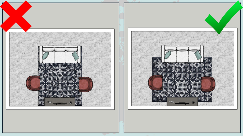
A large rug that encloses the sofa, seats, and coffee and side tables will create a conversation area, a more intimate and welcoming environment.

I’m talking about rugs here!

(credits: theblushhome.com; @homepolish)

8 – PILLOWS

Dressing the sofa with some decorative pillow (and maybe a blanket) is extraordinary for a luxurious living room!

The pillows, such as the curtains and the rug, bring texture and color, and this creates rhythm and contrast.

It is important to alternate between large patterns, solid colors, smaller patterns, and even geometric designs (I’m talking about how to mix patterns here).

Also, use different textures by alternating smoother fabrics with rougher and more worked ones; this tip will make the sofa look more sophisticated and elegant.

A little trick for pretty puffy pillows: get the inside of a material that can be easily “molded” like down and then always take it a little larger than the lining (example: 45×45 pillow with 40×40 lining).

(credits: studio mcgee; french.alibaba.com)

9 – LIGHTS

Artificial lighting will play a significant role in the final result!

First of all, there must be good general light for visual comfort, but ambient and task lights (perhaps near the sofa for reading) should still be added to the general one.

Having multiple types of light helps create contrast and depth.

Where possible, use dimmable lights to manage the intensity of the light as needed!

Then, in choosing lights, be daring, as with mirrors and pictures: get large, distinctive chandeliers or floor lamps that immediately grab attention!

(credits: nomadbubbles.com; Bronxes Studio)

10 – SEARCH FOR PARTICULAR ITEMS

When looking for decorative accessories, avoid ordinary objects; instead, search for unique and out-of-the-ordinary items.

For example, look for vases and candle holders with unusual shapes and finishes.

Buy also trays and create inside your compositions: giving it a sort of border, you will set it more importance.

Remember to create compositions with an odd number of objects, which have different heights and sizes, and distinct colors and finishes.

Another trick that gives a touch of sophistication and luxury is to use, here and there, the principle of symmetry; for example, on the sideboard, you could put two equal lamps on the sides and a beautiful central painting.

It is not to be done constantly and at all costs: on the contrary, it would become boring, but the principle of symmetry immediately gives the impression of something sophisticated!

(credits: etsy.com; east.co.uk)

(credits:pinimg.com;sarahshermansamuel.com)

11 – PLANTS, FLOWERS, BRANCHES, AND ESSENCES

Plants bring a touch of nature into the house, and this is really very important; they also purify the air and elevate the perception of the environment!

They immediately give that touch of elegance and sophistication!

Fresh flowers are also great, but for a more low-cost elegant effect, you can also decorate with branches!

Even these bring movement and freshness with simplicity!

The perception of spaces is not only visual but also concerns what we feel with touch and smell.

The scents of fresh flowers immediately elevate the perception of the environment, but of course, you can also help yourself with candles and diffusers.

Perfumes do not have to be aggressive, it goes without saying, but adding them in the living room will immediately make it more refined and luxurious.

(credits: @homepolish; tileclub.com)

12 – ORDER!

It seems obvious, but clutter is the exact opposite of luxury, even the visual one: a living room too full of things is not good.

We need to embrace a little more of the rules of minimalism, including “less is more”!

Then use storage furnishing to store things that are too much!

Poufs, coffee tables, benches, or baskets are excellent allies for this purpose.

(credits: coffeetableonline.com; wallmart.ca)

I hope this article was helpful and you loved it; in case, let me know in the comments!

Feel free to share it with anyone you think might be interested, I will be honored, and it will help me get my name out there.

If you feel that your bedroom, or some other room in the house, does not reflect you enough, don’t wait any longer and book your consultation, all you need to do is contact me!