Posts

How correctly to furnish the entryway? It’s a question I’m often asked!

The entryway is your home calling card, the first impression a guest will have of the rest of the house.

The entryway is a transition from the outside world to the heart of your home, so it should be welcoming and give a sense of the style and atmosphere that awaits inside!

First, you should interpret your available space: a small space does not necessarily have to be less welcoming than a large one!

Sometimes, the opposite is true because a generous space can feel empty and impersonal!

You can create a welcoming entryway even if you don’t have one walking straight into the living room!

Let’s go over 6 rules for furnishing your entryway perfectly, no matter the available space!

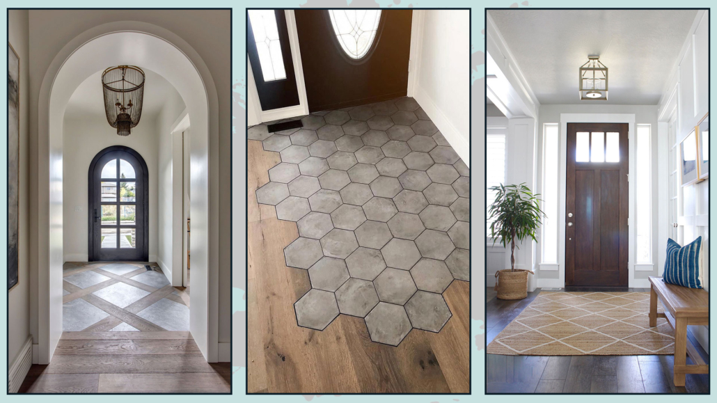
1 – FLOORING OR RUG

As we mentioned earlier, the entryway is a transition from the outside to the inside, so ideally, the flooring should highlight this transition.

You could choose different flooring from the rest of the house, which is ideal if your entry leads directly into the living room to divide the two areas visually.

You’d want to avoid having two floors with strong contrasts in a tiny space, but different flooring helps define specific areas.

Alternatively, you could use a rug: only remember to choose one simple to clean.

That can help prevent guests from bringing dirt into the rest of the house!

Naturally, having a doormat outside the door is also helpful to get rid of most of the dirt.

(credits: karstinteriors.com; Stefania Damaggio; Pinterest.com)

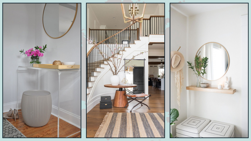
2 – ALWAYS HAVE A SURFACE TO SET THINGS ON

It’s paramount to furnish the entryway with a surface whose dimension will depend on the available space.

It could be a beautiful round table in the middle of the room, a console table against the wall, or even a simple shelf!

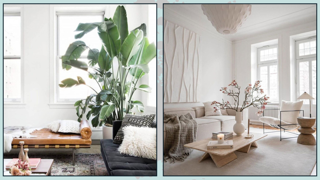
First and foremost, it’s functional because it’s where you’ll “empty your pockets” when you come home, but it will also serve as the focal point of the entryway.

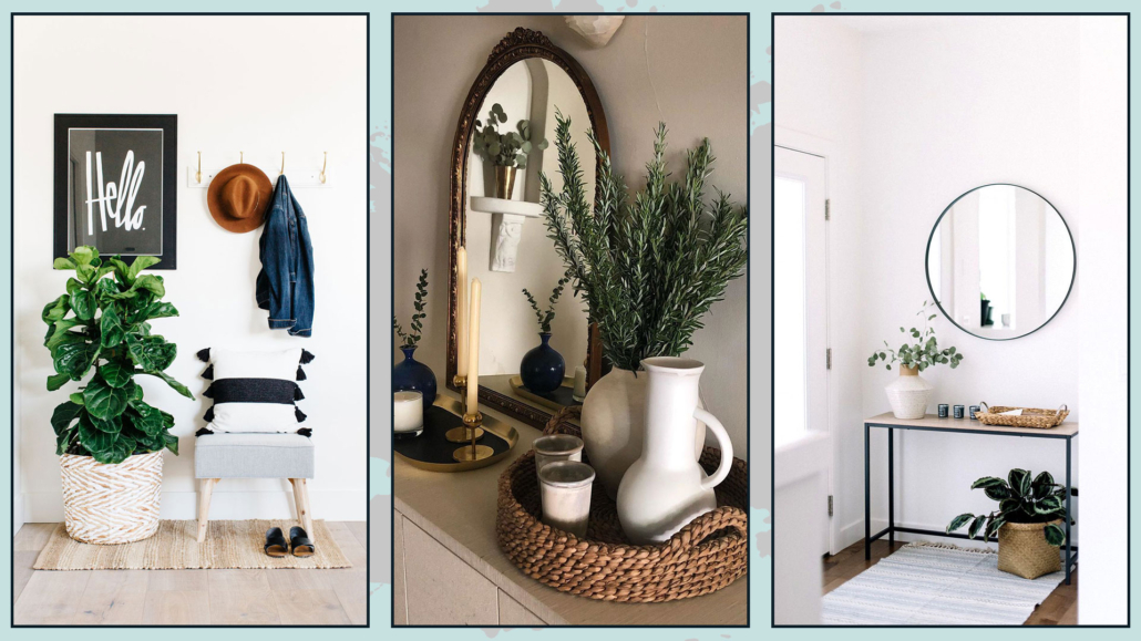
You can place a lovely plant, a vase of flowers on it, or a tray with candles or diffusers. In short, you can decorate it as you see fit!

That is where you give a preview of your home’s style!

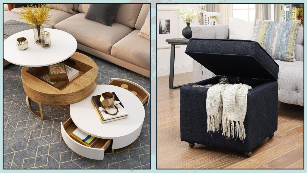
If space allows, you could add a small seat, like a simple pouf!

It can be handy if you change your shoes right at the entrance.

(credits: amazon.com; studio-mcgee.com; ohmeohmyblog.com)

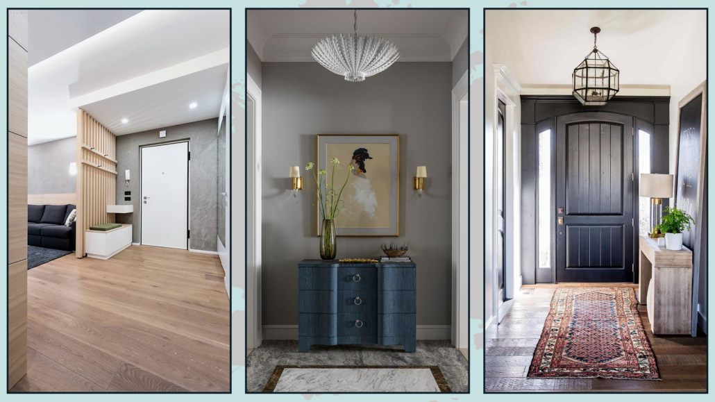
3 – LIGHTING

To welcome your guests, lighting in the entryway is vital; you should study it, recalling that there is a transition from the outside, where lighting is totally different.

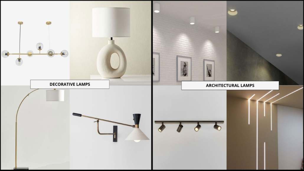
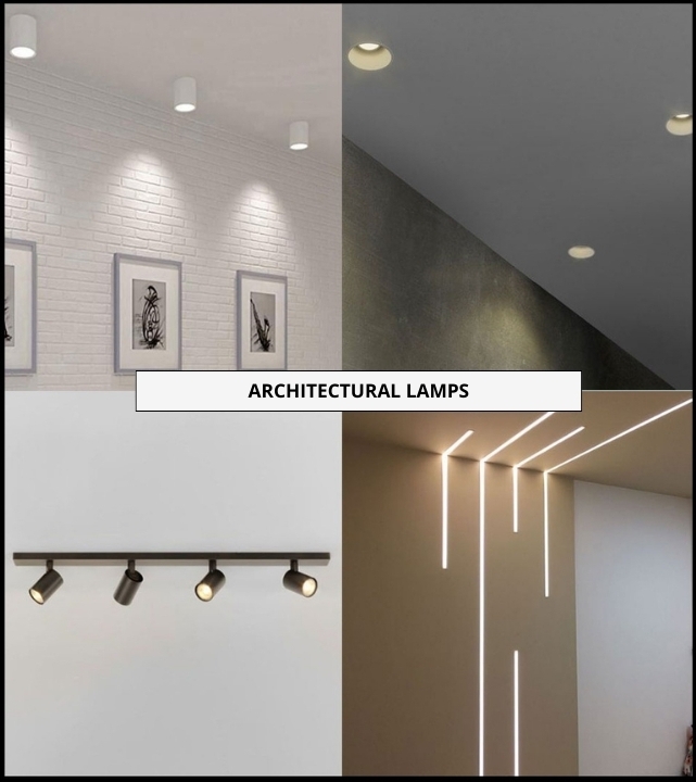
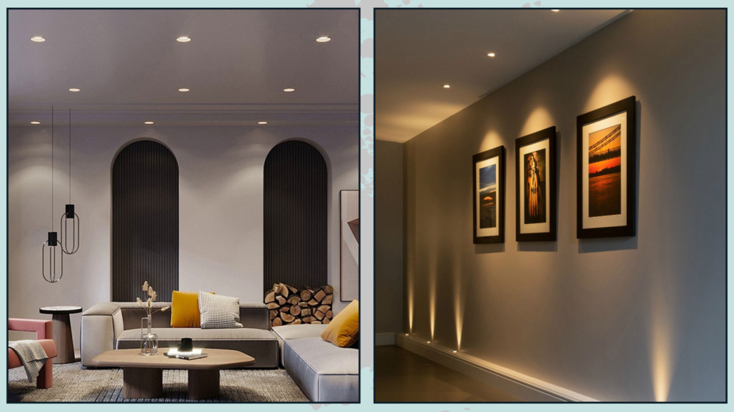
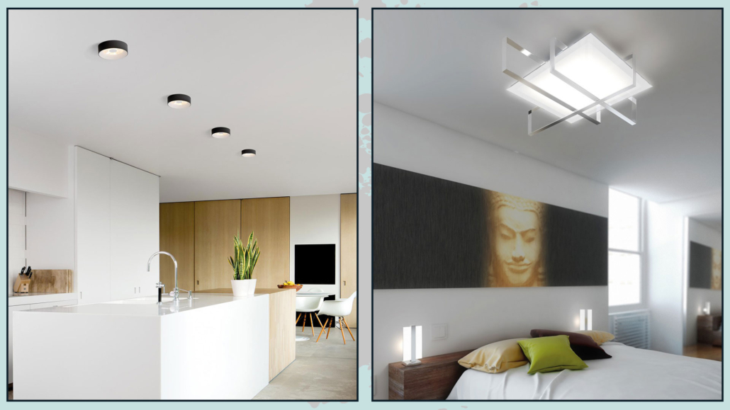
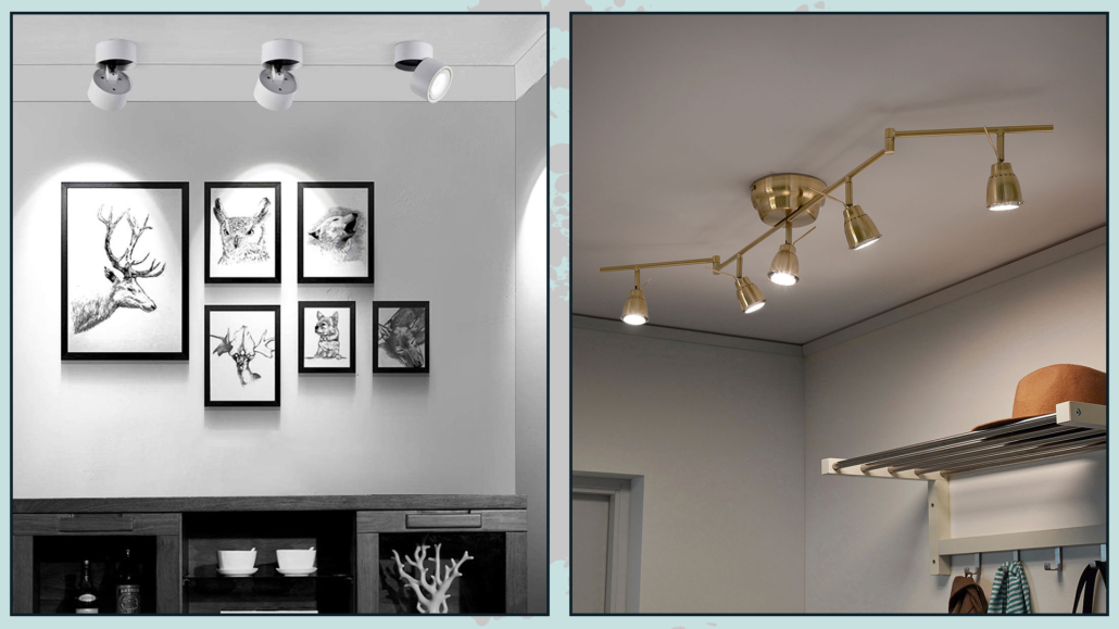
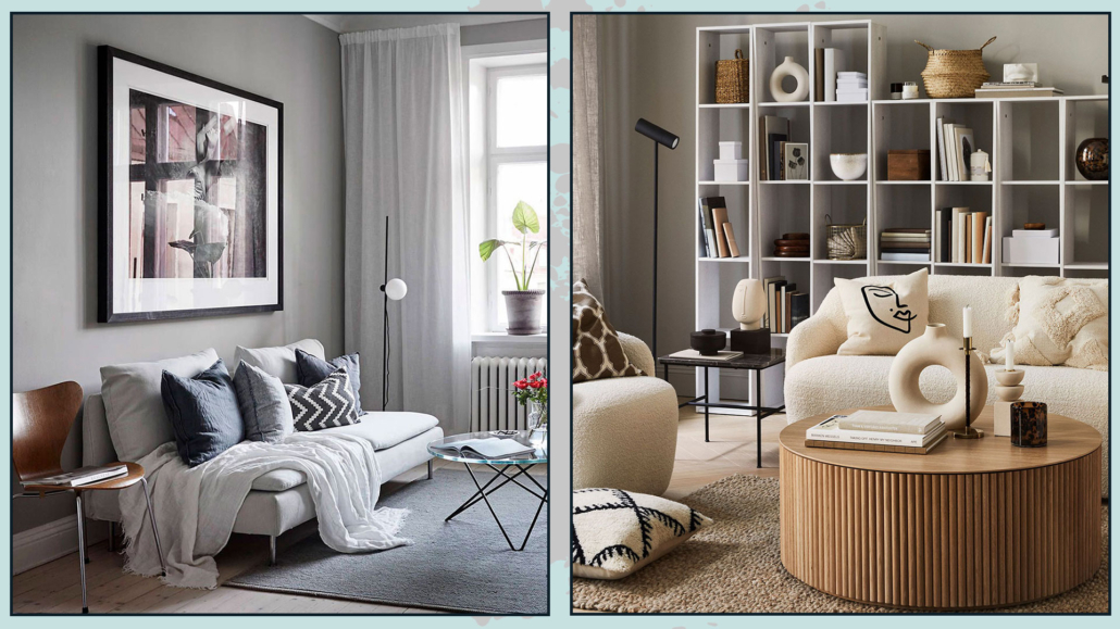
Get creative, for instance, using recessed ceiling lights: as for the flooring, if your entryway opens into the living room, lowering the ceiling can visually separate the two areas.

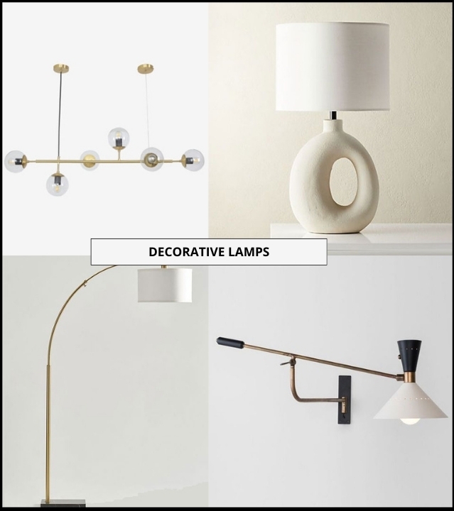
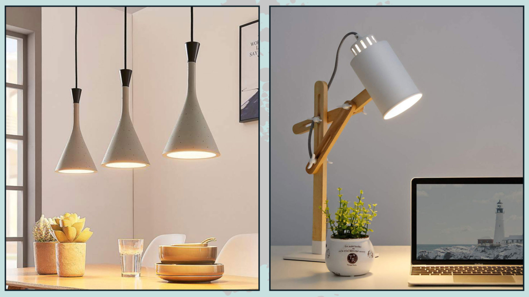
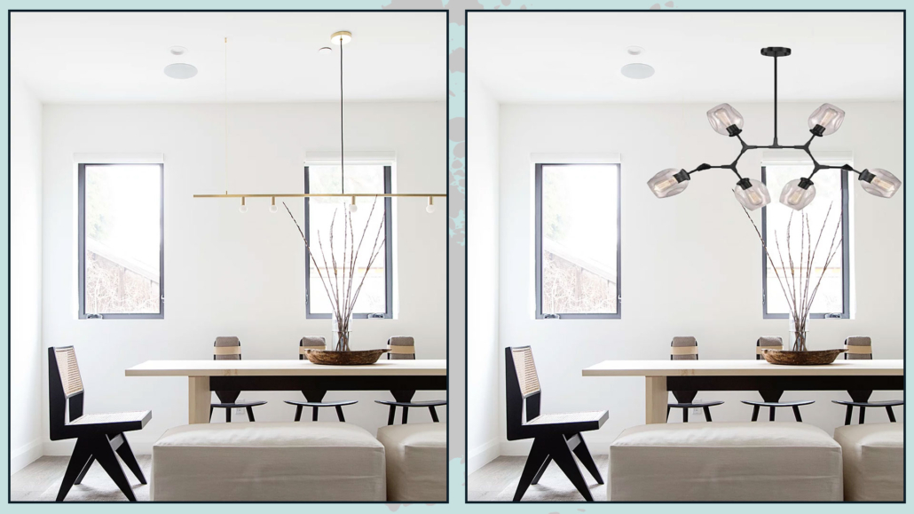
You can furnish the entryway with unique and original chandeliers or wall sconces, anything that not only lights the space effectively but, like the surface area, gives a sense of your home’s style and atmosphere!

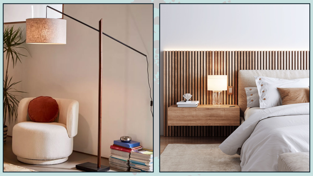
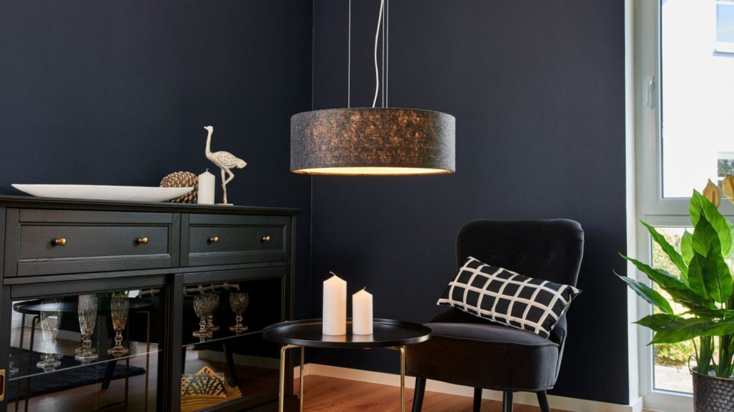
Play with different types of lighting: use recessed lights or chandeliers for general lighting, but where possible, add a floor lamp or a beautiful table lamp to create a cozy ambiance!

(If you want to know a little more about how to correctly light I talk about it here)

(credits: vogliadiristrutturare.it; amazon.it; houseofjadeinteriors.com)

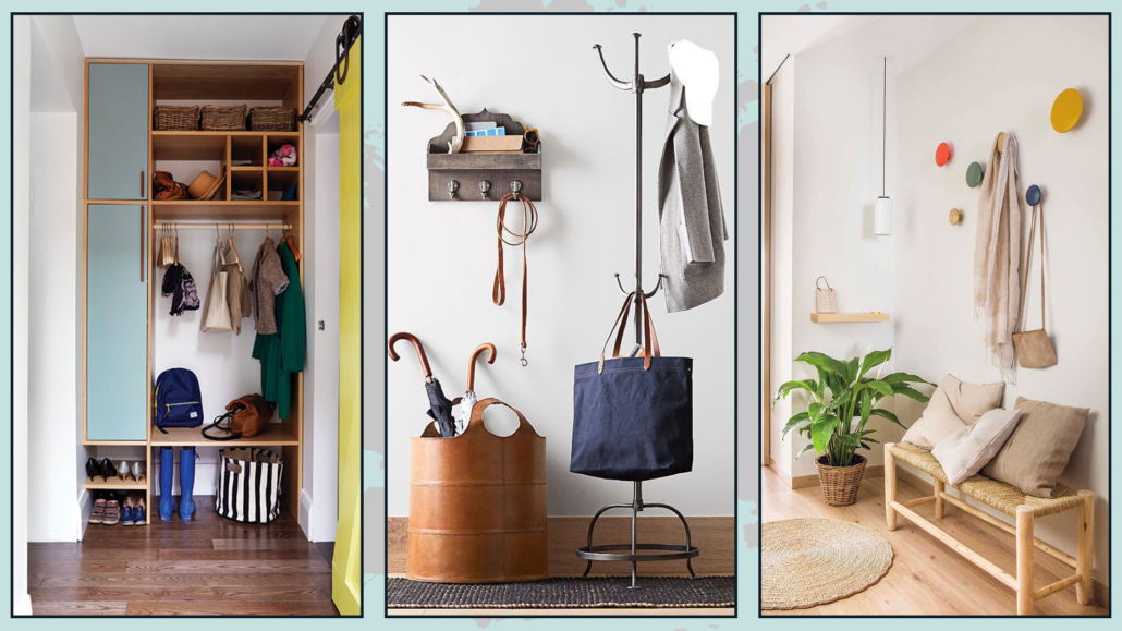
4 – STORAGE ELEMENTS

When someone visits you, especially in winter, they’ll likely have something to take off and set down, and the same goes for you when you come home!
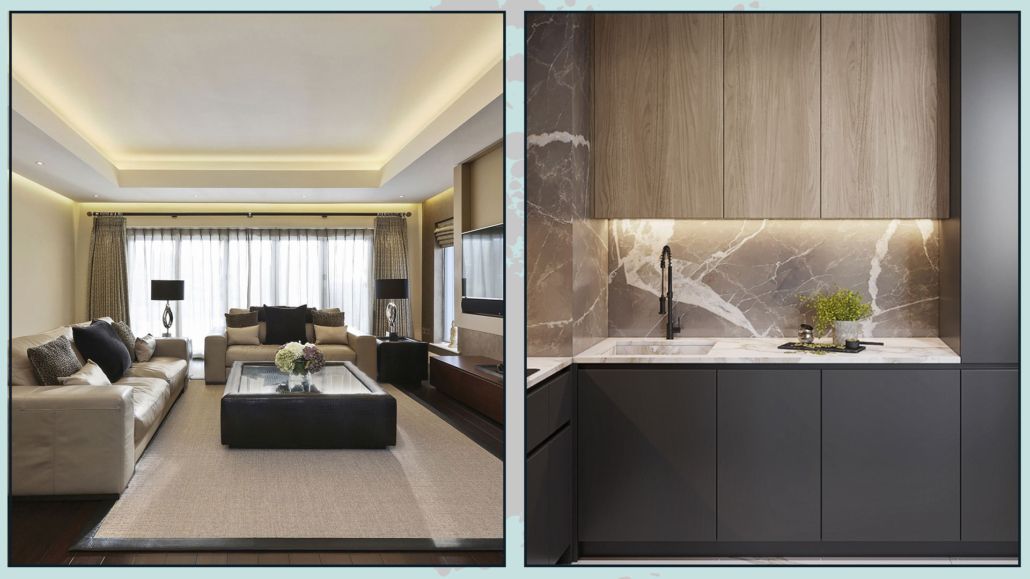
Of course, a built-in closet isn’t always possible, but many different solutions on the market can adapt to any space.

There are open shelving units that function as coat racks, classic coat racks, or even wall-mounted hooks—some are incredibly original and, when placed correctly, can be very artistic!

You can add a few baskets for smaller items; this will also give a stylish touch to the entryway!

And don’t forget an umbrella stand—if it rains, at least you won’t have wet umbrellas dripping all over the place!
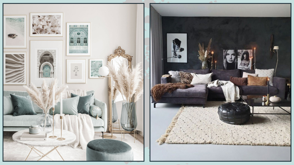
(credits: cutlerkitchenandbath.com; dienlanhsapa.com; elmueble.com)

5 – MIRROR

Having a mirror at eye level in the entryway is very important because:

– You can take a final look at yourself before heading out;

– Your guests can check they look presentable before fully entering the house!
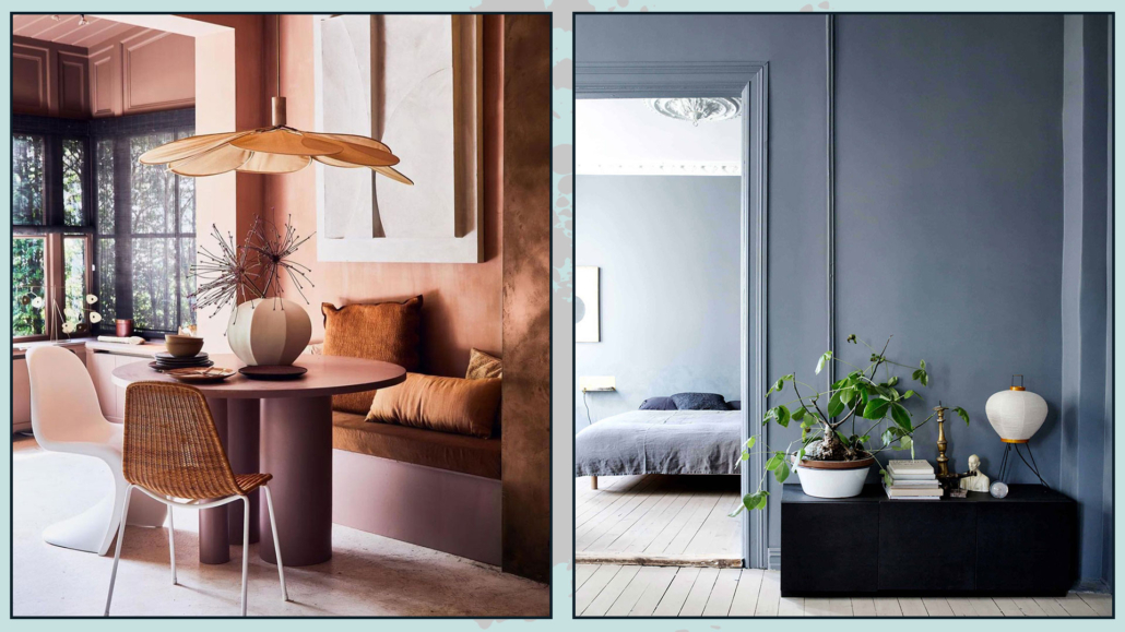
That is a detail not to overlook! Just as you prepare your home when expecting guests, they also want to look their best when visiting you. Coming in from outside, they might need a quick touch-up, so give them that chance!

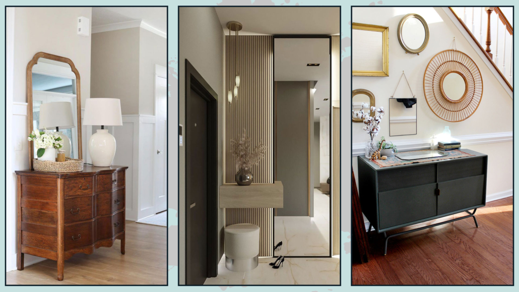
Depending on the space, you can place a beautiful mirror above the console table or create a composition of mirrors—feel free to get creative according to your style!

Plus, the mirror will help enlarge the space by reflecting light!

(credits: twotwentyone.net; Marina Karpilovsky; lagnappe.com)

6 – PLANTS AND FRESH FLOWERS

By now, you know that plants are vital in any room of the house; in the entryway, they also have a psychological significance: as earlier mentioned, the entryway is the transition space from outside to inside, and plants help to create a smoother connection (even if you live in the city!).

Plants, vases with branches, leaves, or fresh flowers, it doesn’t matter; what is paramount is to have something, even tiny, that brings a touch of nature!

Plants also add fragrance, texture, and color, making them ideal for decorating an entryway!

(credits: brainstudy.info; Muebles Home Direct; amazon.es)

I hope you enjoyed this article and found it helpful.

If so, don’t hesitate to share it with someone you think might be interested; I would be honored, and it will help me get known.

If you feel that your home, or any part of it, doesn’t reflect you enough, don’t wait any longer: fall in love with your place again and book your consultancy!

Often, I receive questions about how to make one’s home cozier, warm, and inviting, so I’ve decided to answer with this article.

When designing a house, commonly, we focus on the aesthetic aspect, neglecting the emotional one: that is what we want to feel in that particular environment!

But to truly feel comfortable and relaxed 100%, the house, besides being beautiful, must also be welcoming and inviting.

So today, I want to share five essential elements to make your home cozier and inviting, regardless of your style!

– WARM LIGHT

Light is a fantastic ally for changing the mood of a room.

The same room, colors, and textures visually change depending on the type of light or, more precisely, the light color temperature chosen (I discuss lighting in detail here).

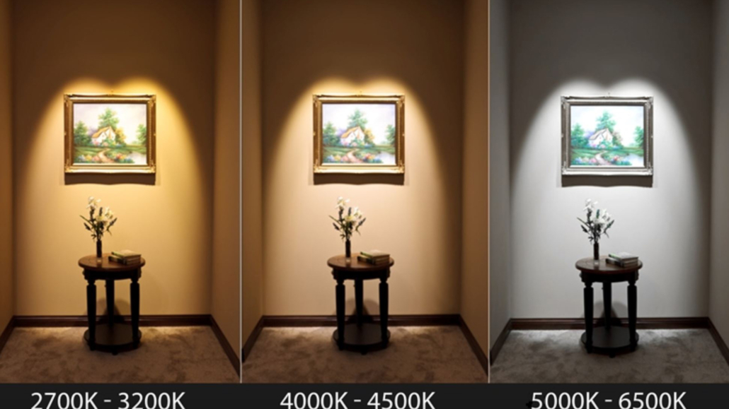
Lighting with a cool color temperature (above 5000 Kelvin) will give environments tending toward blue, and the perception will be of cold and unwelcoming rooms.

Using instead lighting with a warm color temperature (between 2700 and 3000 Kelvin) will change everything radically, without having to change anything in the room.

This color temperature produces a light that slightly veers towards yellow, creating inviting and warm atmospheres.

(credit: housmag.it)

(credit: morabitoimmobiliare.it)

But there’s a “problem”; this type of lighting changes our perception of colors and spaces, which could ruin some of your design choices.

I’ve said it often: you can design the most beautiful spaces in the world, but if you get the lighting wrong, you ruin everything.

So, what to do?

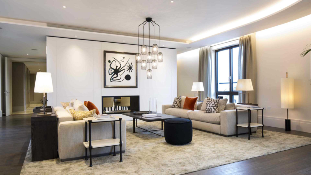
Well, since there are various types of lighting, the ideal is to use a neutral color temperature (around 4000 Kelvin) for general lighting and warm lighting for secondary lighting, such as table lamps or floor lamps.

(credit: jowebster.com)

Playing with different lights and different color temperatures will allow you to easily change the atmosphere of a room, all with just the use of different bulbs!

Today, there are even some special bulbs on the market that you can not only dim (meaning you can decide the light intensity) but also change the color temperature.

With these bulbs, you can modify the mood of your spaces whenever you want!

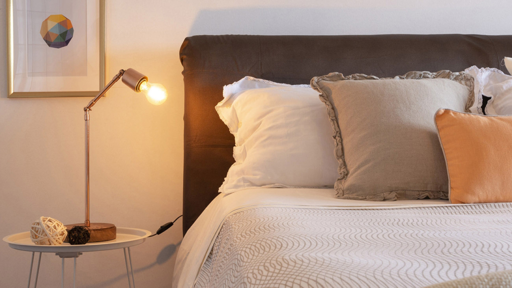
Another relevant element to consider is using lampshades that can soften the light.

That also helps to make the spaces warmer and more comfortable.

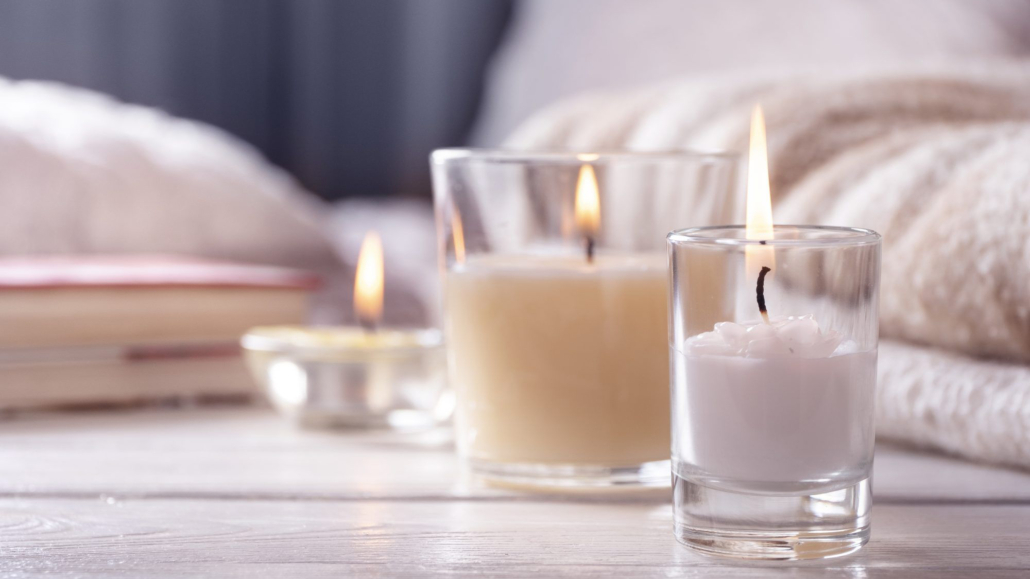
Additionally, to add a bit more warmth and romance, I suggest adding some candles

(credit: firstforwomen.com)

Candles not only illuminate but also immediately create the atmosphere.

And if you get scented ones, you can give that extra touch that makes a difference!

– SCENTS

As I’ve mentioned before, good design goes beyond aesthetics, and how we perceive spaces through all our senses can also improve our quality of life.

So, we should use everything at our disposal to stimulate the senses and create the atmosphere we want to live in.

(credit: istock.com)

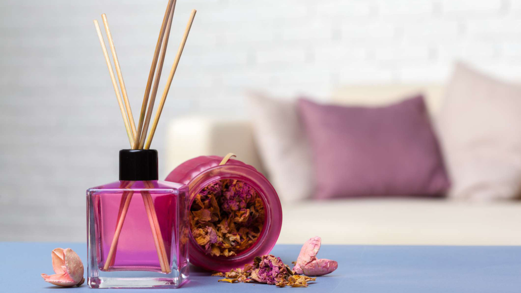
Stimulating the sense of smell is a simple way to make instantly a home more welcoming and inviting.

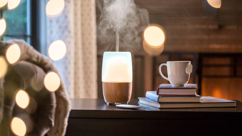
In addition to scented candles, as mentioned earlier, you can use small aroma diffusers.

Of course, you can use fresh flowers, adding a little color and freshness.

(credit: shutterstock.com)

Some inviting and enveloping essences that help with relaxation and feeling good are cinnamon, orange, cedar, lavender, chamomile, jasmine, rose, and vanilla.

These essences help slow down the nervous system and thus bring many benefits to the mind and body.

(credit: homedics.it)

Of course, be careful not to overdo it with essences, especially with chemical ones; too much could have the opposite effect.

– WARM COLORS

It’s well known that colors have a strong psychological impact and are an excellent ally in creating elegant and attractive environments (I’m talking about color psychology here).

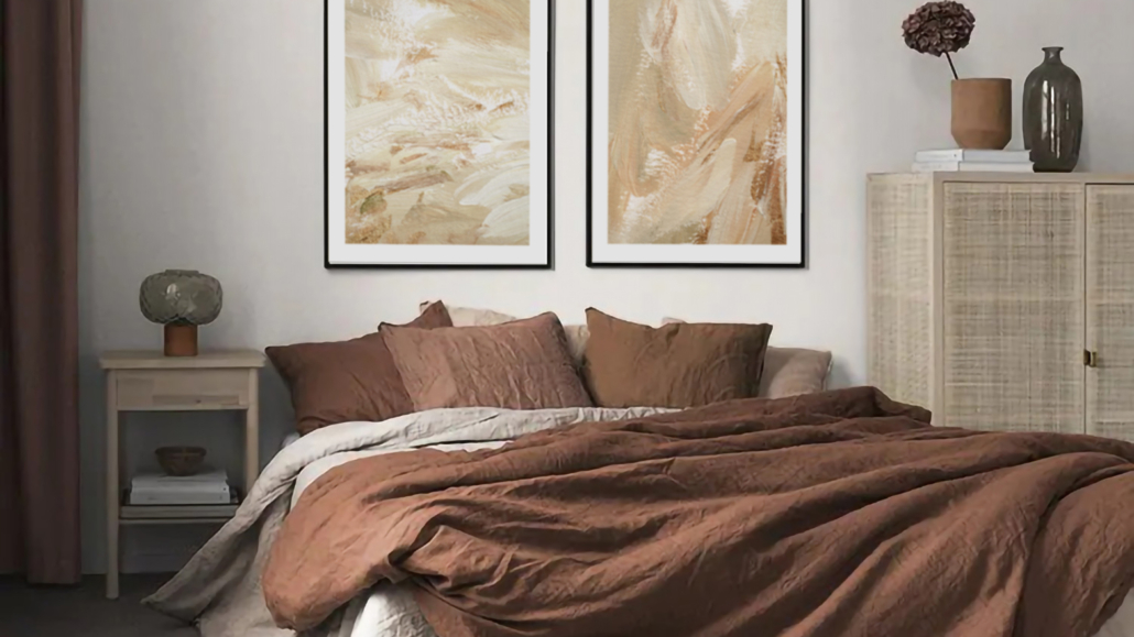
Warm colors, needless to say, are highly recommended for spaces where you want to feel immediately welcomed, almost like being in an embrace.

(credit: desenio.it)

Using warm colors is even more vital in large rooms or open spaces, which otherwise could feel empty, somewhat impersonal, and especially cold.

(credit: larizzadesign.com)

In smaller spaces, the key is to use light shades to maintain that sense of warmth without overwhelming the space.

(cretid: living corriere)

– NATURAL ELEMENTS

Plants, in particular, are an incredible way to make a home comfortable and inviting!

(credit: istock.com)

Regardless of your style, a plant will liven it up and add that extra touch of elegance.

Not only that, plants help purify the air, making it healthier!

Additionally, as mentioned other times, they bring shapes, textures, and a touch of color that never hurts!

Other natural elements like wood, terracotta, rattan, or fibers such as linen help us feel closer to nature, which relaxes us and makes us feel good!

(credit: H&M)

(credit: Sebastian Erras)

If you like, you can also add nature sounds in the background at home: for instance, classical music accompanied by the sound of the sea, rain, or crackling fire.

That could also be a great way to feel even more relaxed!

– TEXTURES

Soft textures are essential to create a warm and enveloping home feel and stimulate the sense of touch.

Look for materials that are pleasant to the touch and can make spaces more comfortable and inviting.

(credit: entrancemakleri.se)

A soft rug will immediately help warm up the environment, and walking barefoot on it will help you relax!

(credit: soopush.com)

Blankets, casually draped over the sofa or bed, immediately give a sense of warmth, also adding a touch of color!

Likewise, cushions are indeed the best way to add comfort and decorate a sofa or bed.

(credit: favim.com)

As you can see, making a home more welcoming and inviting is not difficult.

Use what you have, make changes if necessary, such as changing a few light bulbs, and add some details, and you’re all set.

Your home should represent you and, most importantly, make you feel good and comfortable.

Choose things based on your style and personality!

I hope this article on how to make your home cozier and inviting has been helpful and enjoyable for you. If so, let me know in the comments!

Feel free to share it with anyone you think might be interested, I would be honored, and it will help me gain more exposure.

If you feel that your home, or any specific area of it, doesn’t reflect your personality enough, don’t wait any longer and book your consultancy!

Did you know that the most important element in interior design is the focal point?

It’s actually a fundamental element to consider when designing the furnishings of a home!

What is the focal point, such an important element in interior design? 

It’s the area of the room that captures the gaze because of its greater visual interest.

It’s an element that should stand out from the other elements in the same room due to color, size, style, or material!

The focal point is a valuable element in interior design because it somehow defines the space: the other elements and furniture and their position, and consequently the use of the room, will be decided concerning this.

Study each room, looking for those that can already be major architectural elements to enhance.

If there aren’t any, try to understand which area could be most suitable for creating an attractive viewing area.

You can do this by looking at how you wish to move and live in that space.

Can you have multiple focal points in a house? 

Absolutely yes! Each room can (indeed must) have its focal point.

The care to take is not to make these focal points “compete” with each other because otherwise, you will lose the very meaning of a focal point!

Therefore, one should aim to create focal points that are visually different!

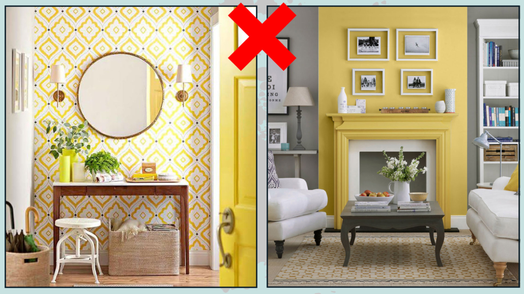
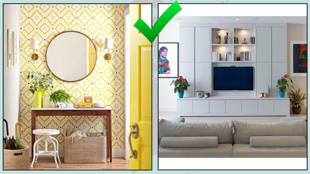
If, for example, you’ve used a wall color as a focal point at the entrance in the living room, it should be something else, like a fireplace, a mirror, or even the TV wall!

(credits: vivadecora.com; Rugh Design)

These two focal points will not compete: they will attract attention, stimulating the desire to enjoy each space!

(credits: vivadecora.com; alibaba.com)

Now, let’s see how to create a focal point, room by room!

– ENTRANCE

If you’re fortunate enough to have an entrance, even a small one, remember that it’s the first thing people will see and the first impression they’ll get of the house.

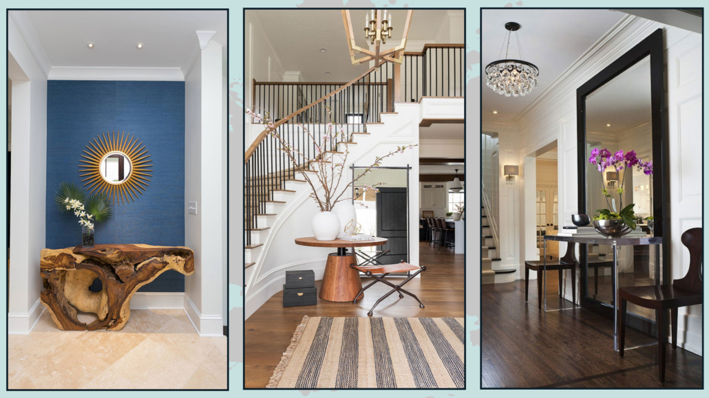
The focal point could be a large mirror above a console, a vibrant painting, or an extraordinary vase of flowers!

The important thing is to choose ONE main element that catches the eye, then use other items, like lighting or decorative objects, to emphasize the main one!

This element should grab attention and “invite” people in!

(credits: albertolamaphotography.com; studio-mcgee.com; pianetadesign.it)

– LIVING ROOM

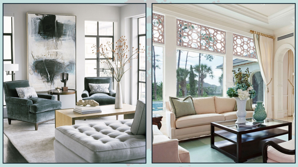
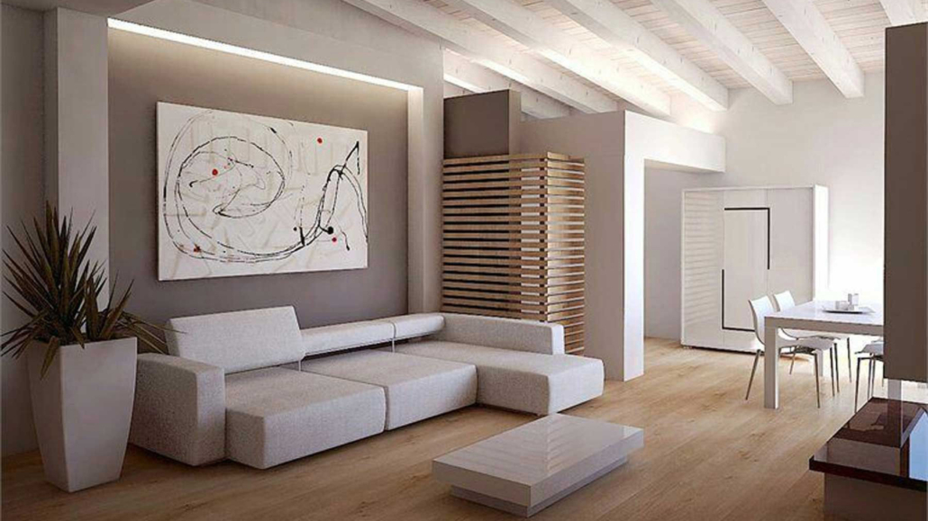
As mentioned earlier, in the living room, the focal point could be a beautiful fireplace, for those fortunate enough to have one, or the TV wall.

But you could also decide to have a wall filled with photos and paintings or a beautiful and particular wallpaper.

If you’re lucky, even a large window with a superb view can be the focal point!

Once you’ve figured out where and how to create this focal point, which must somehow “dominate” over the rest of the room, you’ll arrange your furnishings accordingly!

(credits: edilnet.it; vault-light.com)

– DINING ROOM

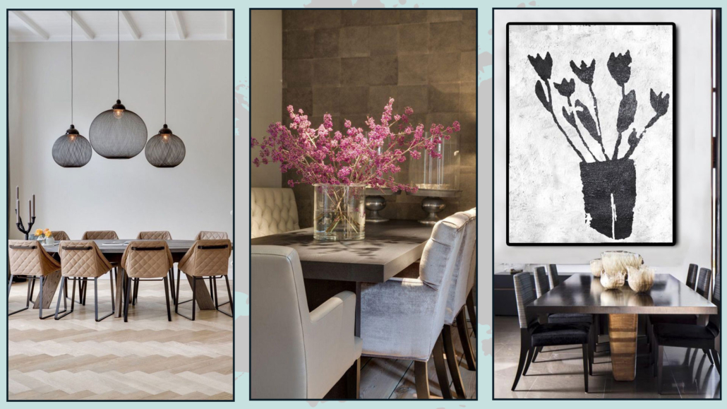
Usually, the table takes center stage in the dining room. Thus, the focal point could be a large and unique centerpiece! 

Alternatively, you could have a beautiful and stylish chandelier above the table, immediately drawing the eye.

Whether you choose the centerpiece or the chandelier, remember that the walls should remain simple and linear to not “steal the show.”

Of course, you can decide the opposite and choose a wall as the focal point with a beautiful mirror, painting, or even a particular wallpaper.

In this case, the chandelier and centerpiece will be more “modest” to avoid competing with the wall!

(credits: dearkitchen.it; casatuaitalia.it; beiboerfineart.com)

– KITCHEN

Even in the kitchen, it’s possible to have a focal point!

Study the space to evaluate potential areas to transform into focal points.

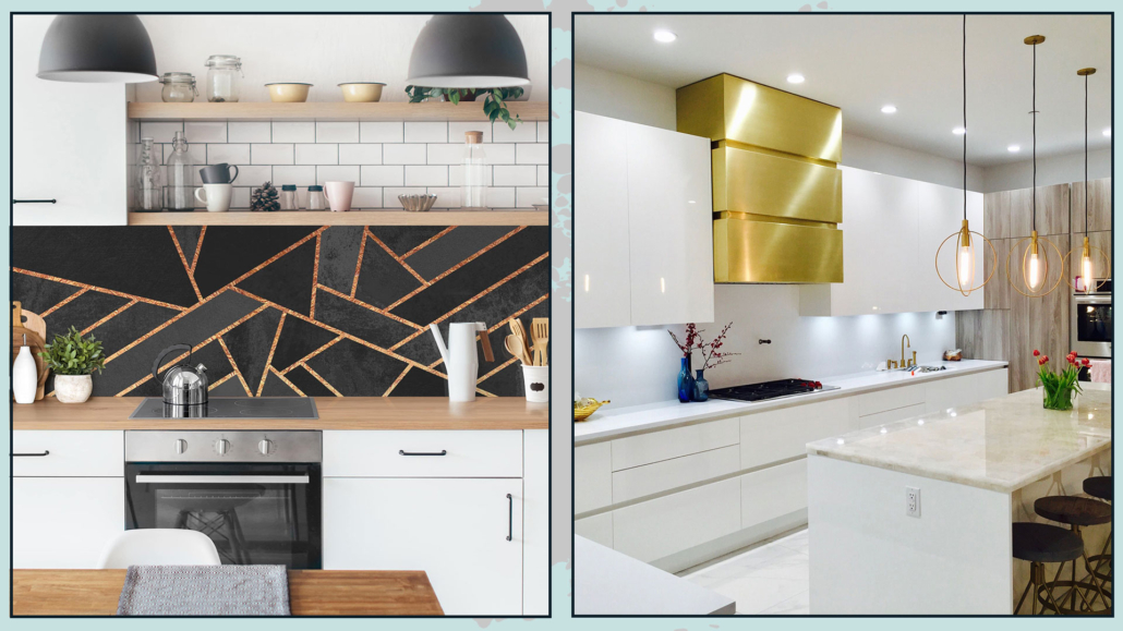
You could choose a colorful or textured backsplash, a unique hood (perhaps a design piece), or a splendid credenza.

As always, the important thing is using the other elements, like lighting or color, to emphasize this focal point. 

(credits: bilderwelten.it; homedesignlover.com)

In the case of an open space with a living room or dining room, consider how these two areas are connected and look for the most significant and attractive point.

Since it’s a unified space, having a single focal point is better!

(credits: pinterest.co.uk)

– BEDROOM

Just as in the dining room, the table takes center stage; in the bedroom, the bed is the main element.

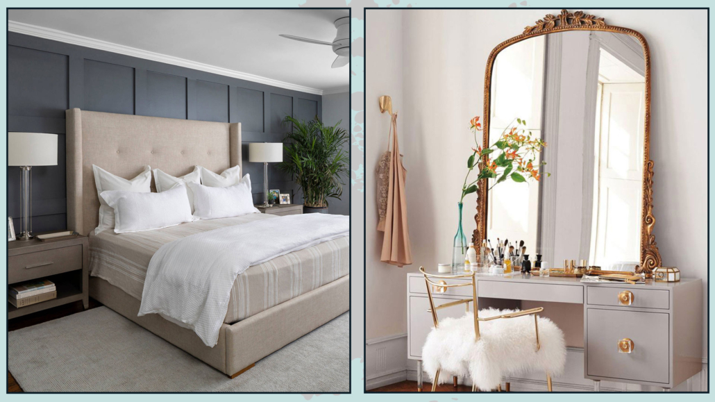
Thus, the focal point of the room could be the bed wall!

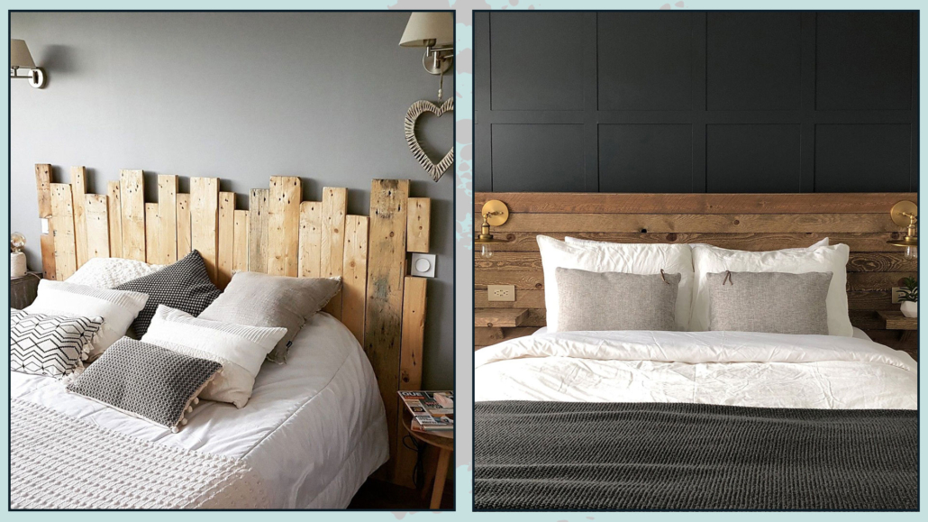
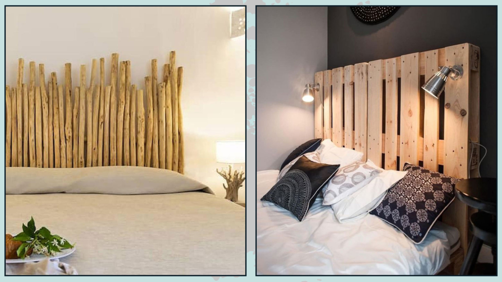
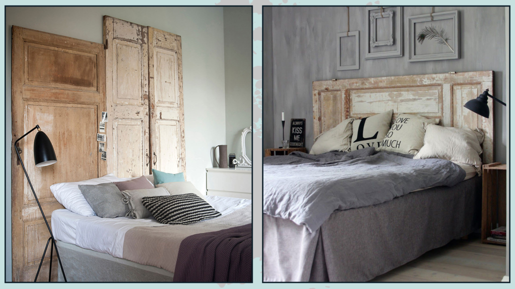
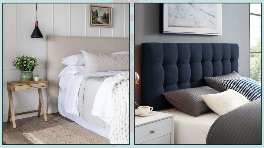
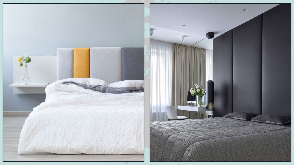
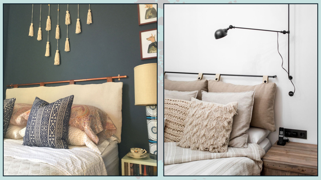
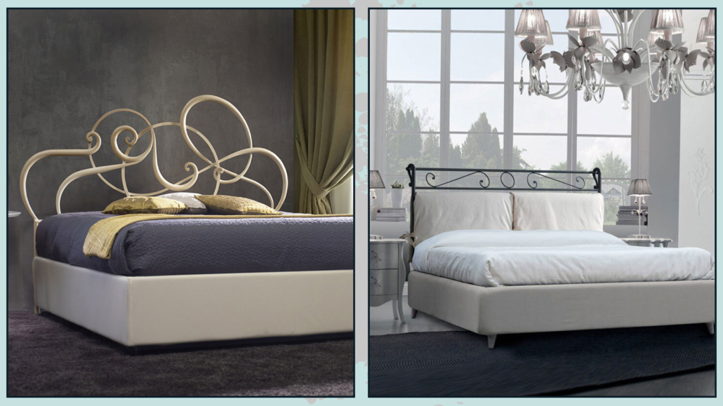
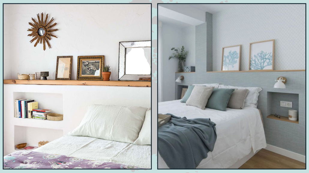
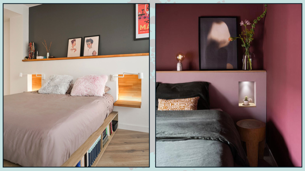
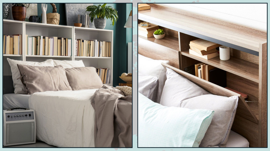
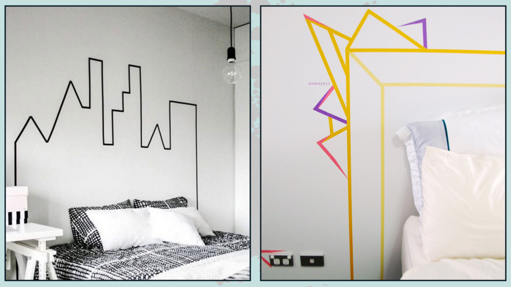
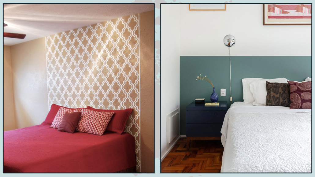
You can decide to have a particular headboard or decorate the wall with a contrasting color with the bed, a wallpaper, a picture gallery, or use the boiserie!

There are many ways to decorate the bed wall; I discuss them here!

However, if entering your room, there is something else you want to “draw attention” to, such as a vanity with a lovely mirror, why not make that the focal point?

(credits: thespruce.com; casamagazine.it)

– BATHROOM

Even in the bathroom, it is paramount to have a focal point to give that extra touch!

Typically, the focal point is the mirror area. 

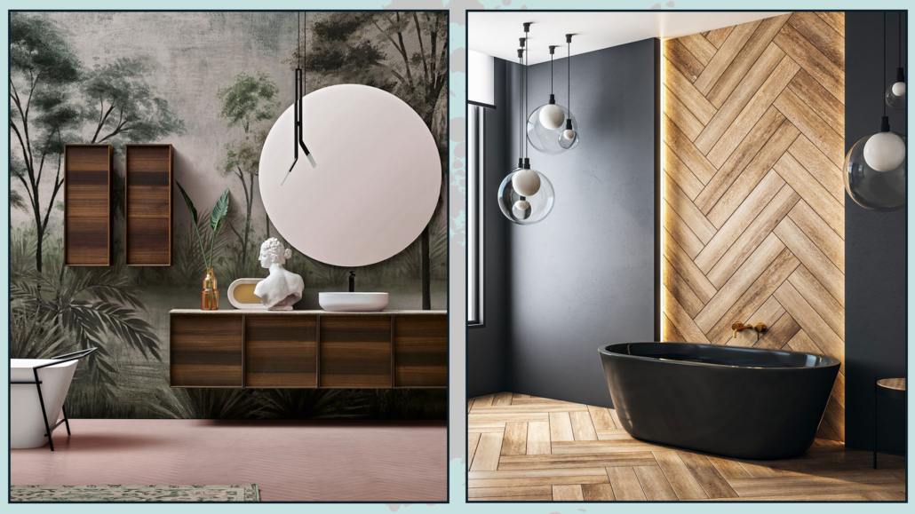
You can choose to use a distinctive mirror, perhaps backlit, colored tiles with particular textures, but here, too, you could use wallpaper (there are special ones, highly resistant to moisture!)

If entering, the first thing you see is the shower or bathtub area, you could decide to make that area your focal point, always with a particular wall covering that contrasts with the rest of the room in terms of colors, shapes, or materials. 

(credits: il-bagno.it; arredobagno.shop)

The toilet shouldn’t be the first thing you see in a bathroom, but this isn’t always possible!

However, properly studying the focal point can help draw attention to captivating elements while making the rest less prominent!

(credits: pinterest; pianetadesign.it)

As you can see, the focal point is actually crucial in interior design for every room in the house! 

To achieve this, in each room, try to find the best area to create it; remember first to see if there are already architectural elements worth emphasizing.

Then, consider how you want to experience that space and what you want to be noticed first in that room.

Use focal points to draw attention where you want it!

Utilizing contrast, whether it’s in color, shape, or material, is the best way to create effective and impactful focal points.

(I discuss the contrast of the six basic concepts in interior design here.)

Creating a focal point is essential to make that room unique and special!

I hope this article about the most important element in interior design has been helpful and enjoyable for you. If so, let me know in the comments!

Feel free to share it with anyone you think might be interested, I would be honored, and it will help me gain more exposure.

If you feel that your home, or any specific area of it, doesn’t reflect your personality enough, don’t wait any longer and book your consultancy!

Do you have all the measures that really matter in furnishing for harmonious and proportionate spaces?

When it’s time to furnish, we usually take measurements of the room to see which furniture pieces we can place in that space.

We measure width, depth, height, and, of course, the encumbrances such as windows and doors, radiators, and other architectural details like niches and corners if they exist.

All perfect!

That is necessary to buy furniture proportionate to the surrounding environment: furniture that is too large will overwhelm the room, while items that are too small may get lost.

However, there are other really specific measures to consider in furnishing for harmonious, proportionate, and functional spaces!

Let’s explore them together.

DISTANCE BETWEEN SOFA AND COFFEE TABLE

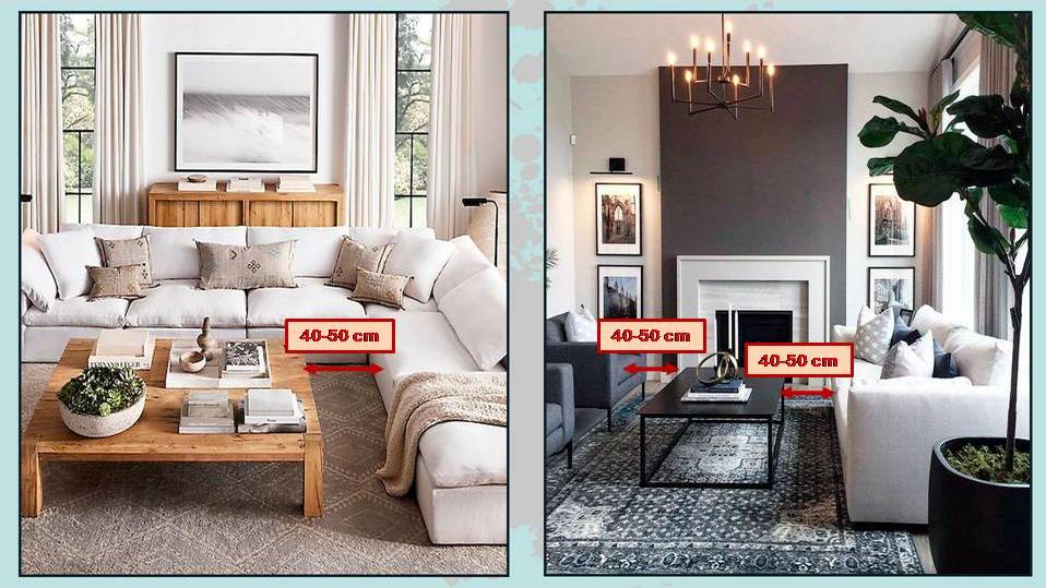
That is a measurement you do not often hear about, but the coffee table should be positioned at a distance ranging from 40 to 50 cm from the seating of your sofa.

distanza tra tavolino e divano

(pinterest)

The reason for such a precise measurement is that the table should be far enough away to allow for a comfortable and easy passage, leaving adequate space for your legs when sitting.

At the same time, it should be close enough that you can comfortably place a glass or anything else on it!

After all, that’s its purpose!

SEATING HEIGHT OF THE SOFA AND COFFEE TABLE

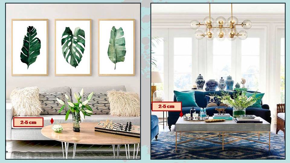
This measure is not often discussed in furnishing, but it’s paramount that the coffee table has the same height as the sofa or is even 2 to 5 cm lower.

altezza tavolino seduta divano

(pinterest)

If it must be higher, it should not exceed 2 cm.

The reason it should be at the same height or slightly lower is to facilitate the action of placing things on top.

DISTANCE BETWEEN TABLE AND CHANDELIER

That measurement is discussed more often in furnishing, but probably not enough, as the tendency is to hang chandeliers too high!

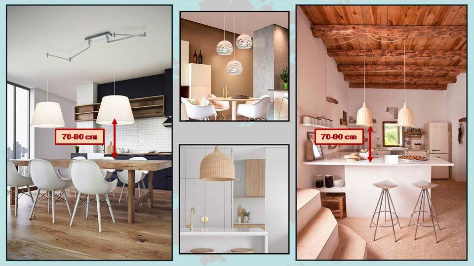
The measurement that the bottom of the chandelier should have from the table is between 70 and 90 cm.

distanza lampadario da tavolo o isola

(Credits: clippings.com; Amazon; zephyrandstone.com.au; trendland.com)

That allows for punctual light on the table without diners being dazzled, and at the same time, they can see each other’s faces.

This distance is also applicable to any chandeliers hanging above a kitchen island.

THE HEIGHT OF THE ARTWORK

Correctly hanging artwork is crucial, but here, as with chandeliers, there’s a tendency to put them too high!

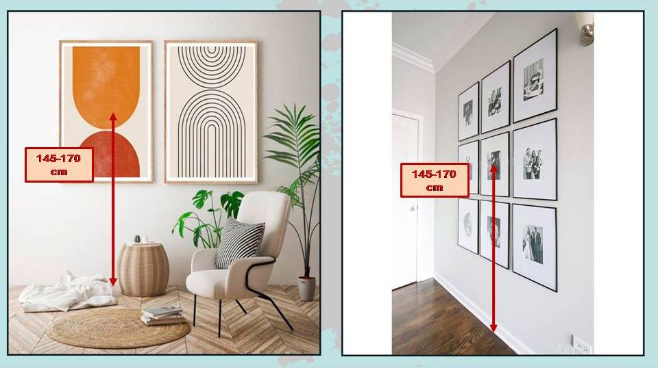
The correct height to hang a painting should be 145 to 170 cm from the floor for optimal viewing.

That is the average eye level for people.

A clarification: this measurement is to take from the floor to the CENTER of the artwork.

What if, instead of a single painting, you have a composition?

The rule remains the same: only that, instead of taking the center of a single painting, you’ll take the center of the entire composition (imagine enclosing all the pieces in a large rectangle, and you’re good to go!).

(credits: etsy.com; The DIY Playbook)

THE HEIGHT OF ARTWORK RELATIVE TO THE SOFA OR BED HEADBOARD

That is another measurement to consider for a pleasant and harmonious environment.

Here, too, there’s a tendency to hang artwork too high.

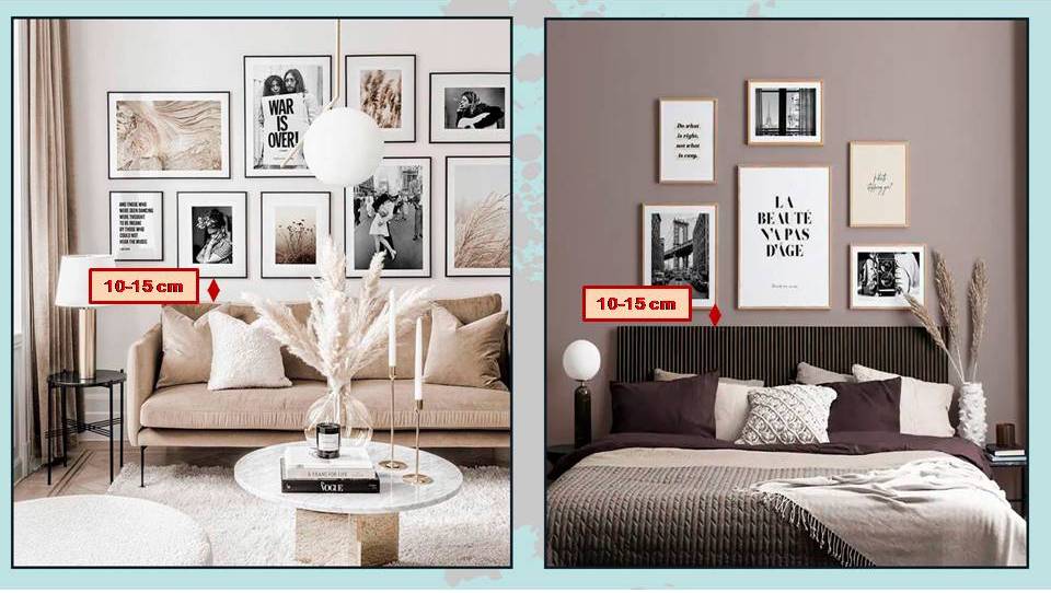
The correct distance of the frame should be 10-15 cm from the back of the sofa or the bed headboard.

(credits: posterstore.it; desenio.it)

A closer distance would be too intrusive and create confusion, while a greater distance would make it seem out of place.

Also, ensure that the overall height from the center of the artwork remains in the range of 145-170 cm, but if you choose artwork proportional to the sofa, there should be no issues.

DISTANCE BETWEEN ARTWORK IN A GALLERY ARRANGEMENT

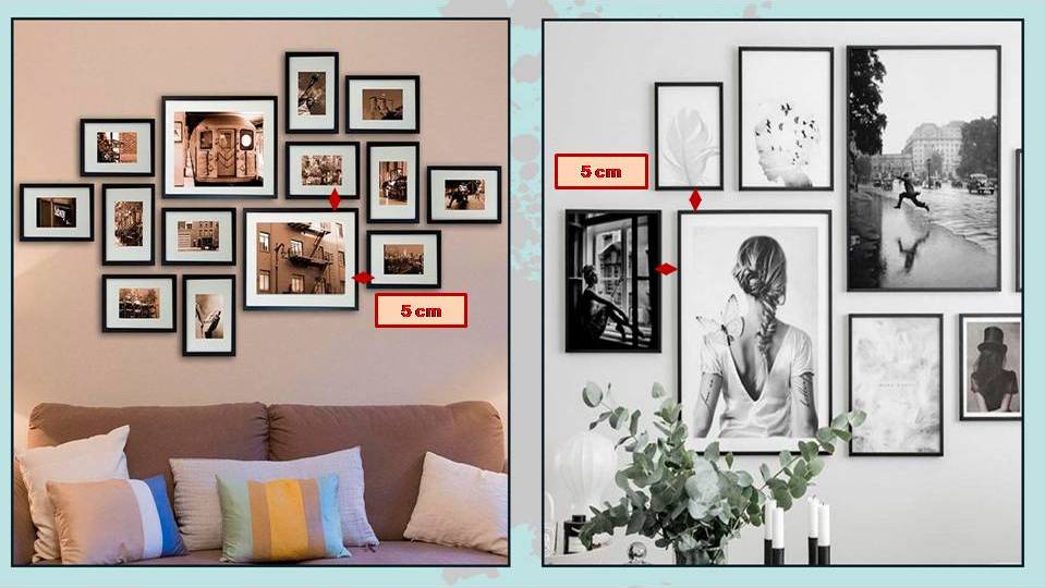
In addition to positioning the entire composition at the right height, you’ll also need to pay attention to the distance between the various pieces if you create a beautiful gallery with your paintings or photographs.

This distance should be approximately 5 cm.

That allows a little breathing space between the various pieces while ensuring they don’t appear randomly placed but instead form a cohesive group.


(credits: etsy.com; posterstore.it)

DISTANCE OF THE TABLE FROM THE WALL

Again, attention is required because this measurement can help you choose the right table!

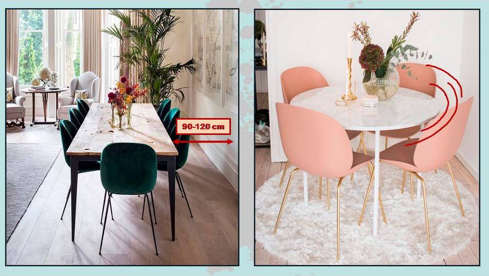
The table should be positioned at a distance of 90 to 120 cm.

In this case, the minimum measurement is crucial, and you should absolutely not go below it.

That allows people to get to their seats and settle in comfortably.

The comfort of accessing the seats is essential, so it’s better to have a slightly smaller table, but do not go below 90 cm.

If 90 cm is really tight, and perhaps you’re forced to have only 75/80 cm, it’s better to opt for a round table; its shape will simplify passage!

(credits: kitesgrove.com; pinterest)

If there’s a piece of furniture, you should increase this distance to allow easy access for everyone without too much inconvenience.

THE CURTAINS

I’ve mentioned this here, but as the Latins used to say, “repetita iuvant” (repeated things help), so I’ll remind you.

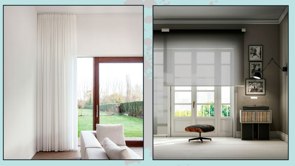
Unless they are glass panels, curtains should be hung just below the ceiling and touch the floor (where there isn’t much traffic, you can also let them rest slightly).

Moreover, they should cover not only the window but also a portion of the wall, at least 15/20 cm on each side!

(credits: PianetaDesign.it; tau.com)

JUXTAPOSING TWO ELEMENTS TOGETHER AND THE RULE OF 2/3

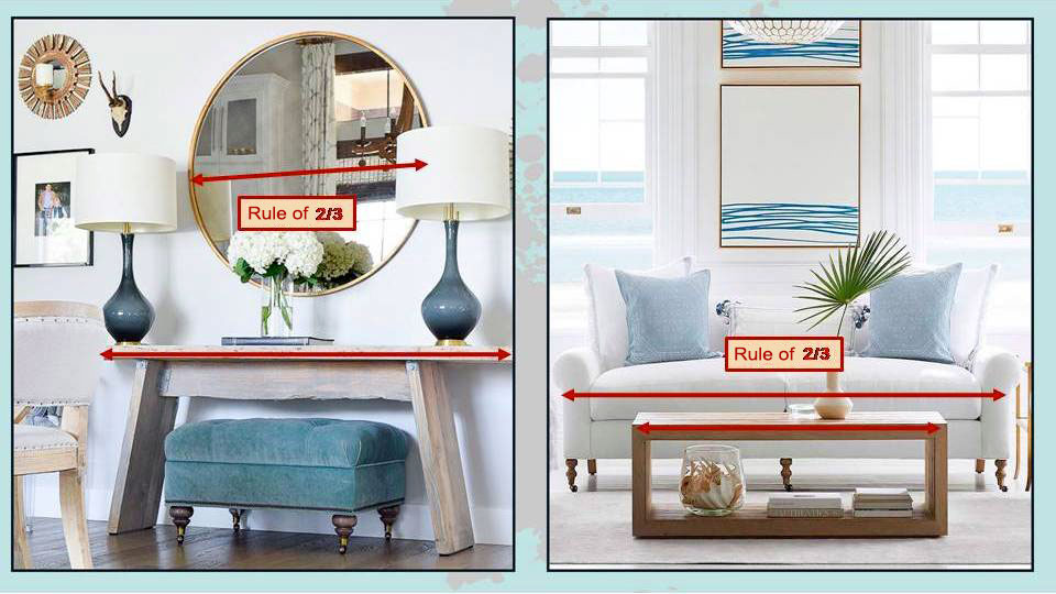
That isn’t a specific measurement but a suggestion to achieve a balanced and proportionate decor: the rule of 2/3!

Let me explain how it works:

If you have a console or a sofa and want to hang a painting above it, its width should be 2/3 of the sofa or console.

The same goes for the coffee table concerning the sofa (in this case, there’s also the functional factor – the couch remains easily accessible!).

(credits: zdesignathome.com; serenaandlily.com)

With this rule, the elements become proportionate and balanced with each other.

Proportion between elements is crucial in furnishing because, otherwise, one item might seem out of place!

It’s one of the six basic concepts of interior design, which I discuss here!

So, these are the measures that matter in furnishing to achieve truly harmonious environments!


I hope this article has been helpful and enjoyable for you. If so, let me know in the comments!

Feel free to share it with anyone you think might be interested, I would be honored, and it will help me gain more exposure.

If you feel that your home, or any specific area of it, doesn’t reflect your personality enough, don’t wait any longer and book your consultancy!

Do you have the luxury of having a basement? If you have doubts about how to furnish this space, this article might be just for you!

The basement is an absolutely fascinating space.

Not everyone is lucky enough to have one, but for those who own this room, there are numerous ways to utilize and furnish it.

Let’s explore them together!

– DINING AREA

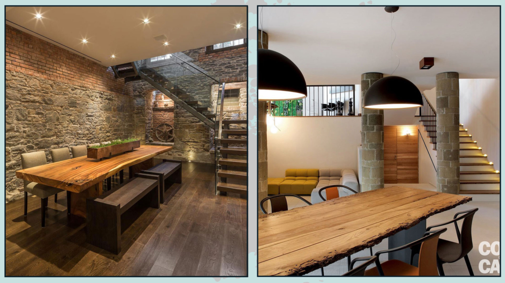
That is perhaps one of the most common ways to furnish a basement. The basement is often transformed into a dining area to avoid making a mess in the main living space and to enjoy mealtime more informally.

If you want to set up your basement as a dining area, it’s essential to have a kitchenette.

That is much more practical as it saves you the hassle of going up and down to carry dishes.

It doesn’t need to be as extensive as the kitchen in your main living area, but it should have all the essential elements for heating and serving food, in addition to a refrigerator.

Naturally, you’ll need a reasonably large table to accommodate everyone, and you can use benches or chairs as seating.

(credits: freshpalace.com; cose di casa)

Try to avoid stools if possible, as they can be quite uncomfortable.

It’s okay to keep things informal, but stools are not the most comfortable choice.

If you have enough space, you might also consider creating a conversation area with some armchairs for post-meal relaxation.

That is even more appealing if you’re fortunate enough to have a fireplace!

PAY ATTENTION TO THE LIGHTING

When it comes to lighting, you’re likely to have limited natural light, so remember to illuminate the space effectively:

– use ambient, soft lighting to ensure the entire area is well-lit;

– install dedicated task lighting for the kitchen, to properly illuminate the workspace;

– place lighting over the dining table so that the food and setting are always well-illuminated.

(I talk about lighting here)

As for the style that works best in a basement, it depends on the architecture and your personal preferences.

The beauty of a basement is that it’s a distinct space from the rest of the house, so you’re not constrained to match the style of the main living areas.

Exposed brick can give a more rustic or industrial vibe, while plastered walls and ceilings offer a blank canvas for you to choose the style you prefer!

– WINE CELLAR WITH A BAR AREA

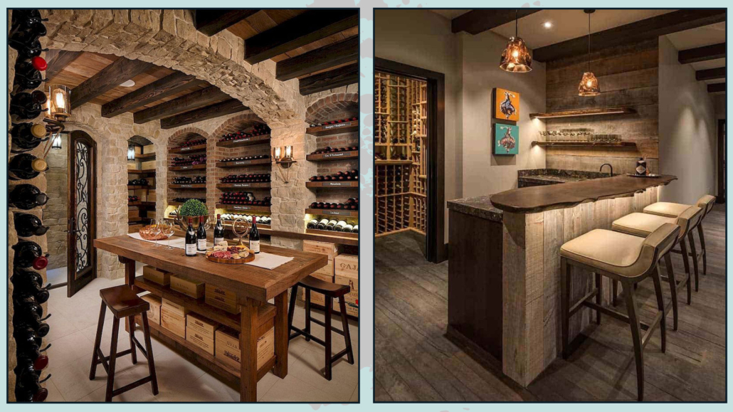
If you’re a wine enthusiast, you can transform your basement into a marvelous wine cellar.

Displaying your wine collection can be a work of art, and if you also enjoy making cocktails, it’s a great idea to pair the wine cellar with a bar area!

You can set up a lovely bar counter with a selection of glasses and other liquor bottles.

This way, you can treat your friends and family to your fantastic aperitifs or host wine tastings.

(credits: kwdesigns.com; weheartit.com)

If space allows, consider creating a conversation area for a more relaxed wine-tasting experience.

Just like in the dining area, it’s essential to have both general ambient and specific task lighting for the bar.

As for the wine cellar area, it might require specialized lighting, but if you’re a wine connoisseur, you probably know more about that than I do!

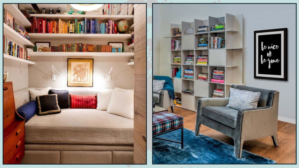
– READING AREA

If you are fond of books, I’m sure you never seem to have enough space for them, and you particularly enjoy alienating yourself a bit when you want to read.

Your basement could actually become your sanctuary!

You can fill it with bookshelves and create a cozy sitting area where you can immerse yourself in your reading.

(credits: studiovert.com; overstock.com)

There are plenty of solutions available in the market for creating your library, with various materials to choose from.

Just find the most functional for the space and your needs.

A couple of armchairs or a small sofa will complete the reading nook.

You can also consider enhancing the space with a pretty stereo system for some background music to enjoy even more the reading experience!

That all depends on your preferences and the type of reader you are.

Once again, pay attention to lighting.

In addition to ambient lighting, make sure to have specific task lighting for reading near your seating area to avoid straining your eyes.

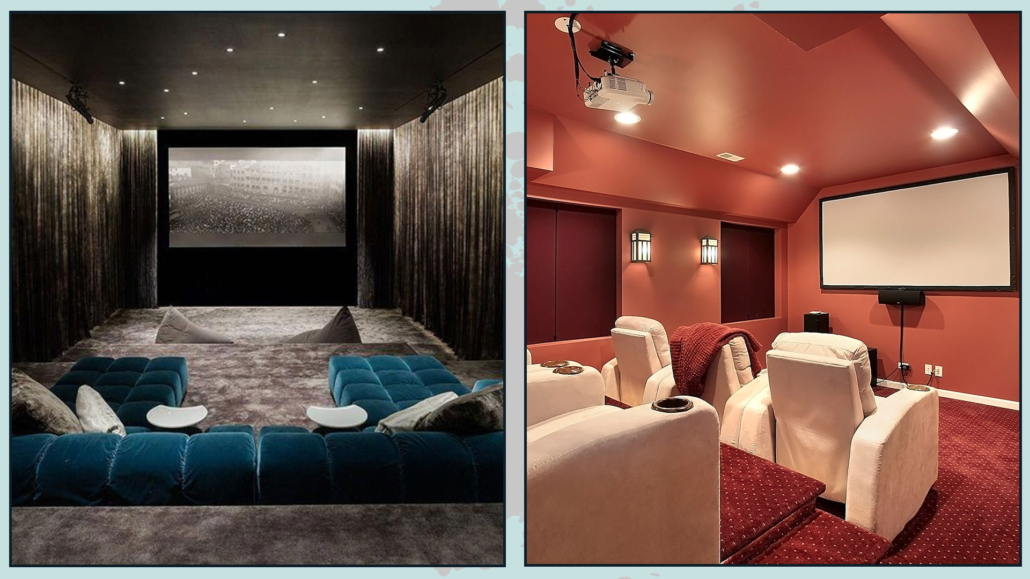
– HOME THEATER

You might have a deep passion for movies, documentaries, and TV series, so why not transform your basement into a home theater?

You’ll have the luxury of enjoying it without having to share the space with anyone but the people you love.

With proper soundproofing, you can install top-notch home theater equipment without disturbing anyone nearby.

(credits: ecstasymodels.tumblr.com; pinterest)

You can create a super modern home theater with a large TV screen mounted on the wall, or you can opt for a slightly more vintage setup with a high-quality projector and leave the wall smooth and white as a screen.

Find some comfortable reclining chairs, and then… enjoy the show!

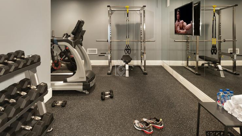
– HOME GYM

If you’re someone who loves staying in shape but doesn’t enjoy spending hours at the gym, you can always consider bringing the gym to your basement!

You can select the right exercise equipment and arrange the room to suit your workout routine.

(credits: pinterest)

It’s a practical option because you can use it whenever you want for as long as you like, eliminating the time wasted on commuting to a gym. Plus, when you’re done, you’re already at home!

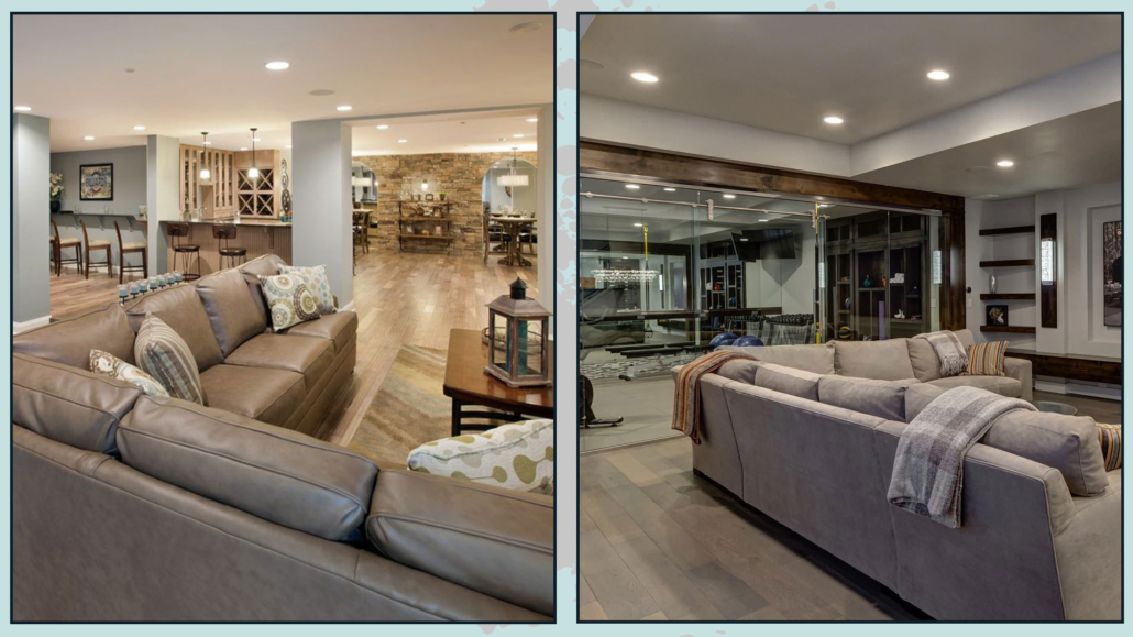
– PLUS ONE

“What does ‘plus one’ mean?”

It means that you could also decide to combine multiple functions, such as having a dining area with a wine cellar and a bar or a gym and a reading nook…

That, of course, depends on the size of your basement.

In general, you could leave it as one huge open space for most combinations, perhaps visually dividing the various zones with colors, rugs, or furniture acting as “room dividers.”

If you’re combining two distinct functions, like a dining area and a gym, it’s a good idea to create separate, different zones to maintain a sense of order.

(credits: fbcremodel.com)

When you have two different functions in one space, the same design principles you use in your house apply:

– use a consistent color palette (as mentioned earlier, visually divide with different colors that are part of the same palette);

– maintain a cohesive style or a mix of styles that creates a harmonious feel across the different zones.

I hope you found this article helpful and enjoyable. If you did, please let me know in the comments!

Feel free to share it with anyone you think might be interested; I would be honored, and it will help me get noticed.

If you feel that your home or any part of it doesn’t reflect you enough, don’t wait any longer and book your consultancy!

Do you need to renovate or plan a bathroom? In today’s article, I would like to share with you 5 ideas and trends to do it in the best possible way.

It’s incredible how the perception and experience of the bathroom have changed over time.

Initially, the bathroom was located outside the house because it was considered a dirty and unhygienic place.

Then, it became incorporated into the house for convenience but remained a secondary space.

Over the years, the bathroom has acquired increasing importance, evolving into a mini spa.

Today, the bathroom is actually one of the most crucial elements people consider when buying or building a home, and even the smallest ones are designed for maximum functionality.

Let’s look at the trends for contemporary bathrooms, which are highly functional and absolutely on-trend!

1 – WALL-MOUNTED FURNITURE

For a few years now, countertops or built-in sinks have been trending.

And this trend continues this year!

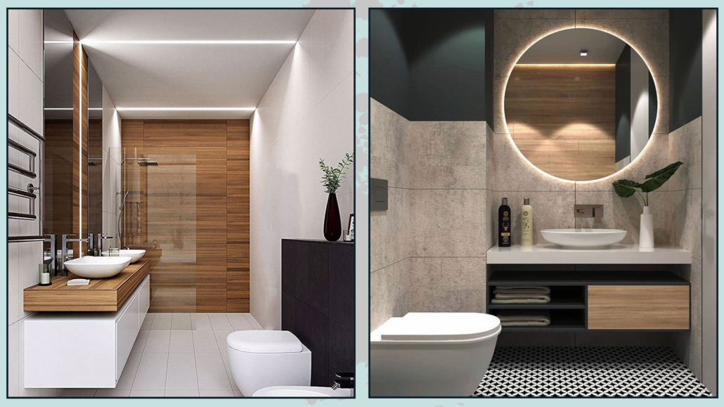
Wall-mounted furniture is an excellent way to make a bathroom appear larger than it actually is: the space underneath visually expands the area.

Moreover, they serve a practical purpose because they make floor cleaning easier!

(credits: Sonia Meneghin; rénovert)

You can find wall-mounted furniture in various shapes and sizes on the market, so you can definitely find something that suits your needs and style.

You can place or embed the sink on a support shelf in small bathrooms where a full-sized cabinet might be too bulky.

That will be a minimalistic yet highly impactful decor!

With boards made of wood or any material you prefer, you can definitely get creative and design something that fits perfectly into the available space.

(credits: leroymerlin.it; vogliadiristrutturare.it)

One original idea is to incorporate LED strips UNDER the furniture or the boards.

That creates unique and captivating atmospheres: it emphasizes the elevation of the furniture, defines the volumes, and enhances diffused lighting.

(credits: deghishop.it; screwfix.com)

Be CAUTIOUS of the floor surface when adding lighting under the furniture: if they are glossy, they reflect the light, which can be actually annoying!

In this case, make sure the light is not directed towards the floor; instead, you can aim it at the wall, or at the very least, use an LED strip with a diffuser!

2 – INTEGRATED LIGHTING

We already know lighting is essential everywhere, and the bathroom is no exception!

The trend for bathroom lighting is to incorporate it into the architecture, illuminating the geometry and volumes of the space instead of relying on the traditional central light fixture and mirror lights.

This type of lighting makes the environment more sophisticated, clean, and modern; it produces a soft light that creates a beautiful atmosphere!

(credits: pinterest; screwfix.com)

This kind of lighting is becoming increasingly popular because technology and LED lighting are becoming more accessible and versatile.

It’s great to use this type of lighting, not only under the wall-mounted furniture we discussed earlier but also behind the mirror, in potential niches, recessed in the ceiling, or along his perimeter.

(credits: ernesto.it; artheco.it)

Of course, you can add, as well, decorative wall or ceiling lights according to your style!

(credits: screwfix.com; medium.com)

A good lighting design combines various types of lighting (I explain it here), and playing with different lights in the bathroom can create truly enchanting spaces!

3 – MIXING TEXTURES AND MATERIALS

Mixing different materials and textures is crucial in interior design in general, as it creates contrast and movement, and contrast is a fundamental aspect of interior design (I discuss it here).

That holds true for bathrooms as well!

You could use different materials or colors to distinguish two distinct areas within the bathroom.

(credits: anword.com; leroymerlin.it)

For instance, the shower area could have a floor made of the same material but with different colors than the rest of the bathroom.

Alternatively, you could use entirely distinct materials that still complement the colors of the overall flooring.

You might decide to make the sink area and mirror the focal point of your bathroom by using tiles that contrast with the rest or even opting for wallpaper!

(credits: il-bagno.it; milanuncios.com)

As for the floors, of course, be careful that it is not a slippery material to avoid possible accidents!

A timeless combination is marble, either in white or black, with wood, combining the elegance of marble with the warmth of wood.

(credits: screwfix.com)

For an ultra-modern bathroom, you can combine concrete with wood and satin-finish elements.

Don’t be afraid to use wood; specially treated woods exist, which endure the moisture present in bathrooms.

You can mix highly patterned tiles with neutral colors and uniquely shaped elements for a more relaxing atmosphere.

(credits: obi.de)

There’s a wide array of choices available in the market when it comes to materials, and making decisions can get quite complex.

You can find a lot of examples for tile combinations, but remember, a bathroom isn’t just about tiles!

You have to consider lighting, furniture, sanitaryware, faucets, and various elements, and the risk of picking things you like individually but don’t work well together is quite significant.

HELP YOURSELF WITH A MOOD BOARD

So, how do you go about it?

As discussed in the 4 steps to furnish, creating a mood board can be immensely helpful for the bathroom as well.

A mood board is a sheet where you assemble all the pieces together.

(credits: saniweb.com)

You can easily find images of what you like online, perhaps on the retailer’s website.

Take these images and place them close together to see if the overall look is balanced and harmonious.

If not, you may need to change the mismatched piece.

Mood boards are an indispensable tool for interior designers, and I highly recommend using one when renovating or planning a bathroom!

4 – LARGE TILES

Contemporary spaces favor clean and minimalist lines, so using large-sized tiles in the bathroom is a winning choice!

The fewer interruptions in the lines, the more spacious the room will appear.

It’s also important to try to place the tiles as close to each other as possible and use grout material that matches the tile color as closely as possible.

(credits: kylandkara.com; lightslightslights.com)

That will make everything look more linear, uniform, and elegant, and, most importantly, it will reduce dirt buildup in the grout lines!

5 – TOUCHES OF BLACK

We’ve seen it in the 2021 trends: in recent years, touches of black are a beloved trend that continues to be popular!

Black details, typically matte, are widely used.

It could be the faucet, the cabinet handles, the mirror frame or shower enclosure, or even the sink itself!

Black details add a certain visual weight to the space, helping to bring strength and movement to the environment, especially when light colors dominate.

(credits: Rubinet Faucet Company’s; verticalclimb.it)

The contrast created is truly unique and captivating.

Black complements just about any material, but before incorporating this touch of black, consider how it harmonizes with the rest of the space so you can use it in the right proportions!

I hope this article has been helpful and enjoyable for you. If so, let me know in the comments!

Feel free to share it with anyone you think might be interested, I would be honored, and it will help me gain more exposure.

If you feel that your home, or any specific area of it, doesn’t reflect your personality enough, don’t wait any longer and book your consultancy!


Spring is just around the corner: are you already thinking about how to decorate your balcony?

We saw it in the 2021 trends (find the video here!): decorating your balcony becomes vital, especially after all that happened last year and even more so since, as of today, unfortunately, we still haven’t gotten out of it.

So today, let’s see how you can furnish your balcony, even if it is small, to make it a small oasis!

– USE MAINLY LIGHT AND NEUTRAL COLORS

I’m not saying to give up colors, do not worry, however especially if the balcony, as it easily is, is small, use light and neutral colors as a base.

colori neutri e pop di colori

(credit: @shahindesign; pinterest)

That will optically expand the space!

Then you can give your touch of color and personality in some decorations!

– CREATE DIFFERENT AREAS

Dividing the balcony into small, well-defined areas will help make it seem more spacious, even if it’s just 2: relaxation and plant area!

If the balcony is long and narrow, the areas can be more: you can add a zone with a small table, perhaps foldable, with chairs, to use for eating or smart-working!

aree diverse

(credit:drawhome.com;grazia.it)

Of course, be careful not to overfill so as not to suffocate and impede passage.

Better a few elements, but well designed according to your needs!

– USE FOLDABLE AND MULTIFUNCTIONAL FURNITURE

Precisely to avoid overfilling and blocking the passage, I recommend using folding furniture; they will help you efficiently move and store the various items, thus not taking up space permanently.

Another very clever thing to do is to use multifunctional furniture such as a storage bench, which will help you keep the space tidy, or an ottoman that doubles as a side table as needed.

arredi pieghevoli e multifunzionali

(credit: Ikea; pinterest)

– TAKE ADVANTAGE OF THE DEPTH AND HEIGHT

Exploit most of the short side of the balcony by putting relaxing seating there: it can be a small sofa, two seats, or even large cushions on the ground!

If you have a wall on the short side, you can decorate it with lights or a small vertical greenhouse taking advantage of the heights too; doing this, among other things, will allow you to remove plants from the ground freeing up valuable space!

profondità

(credit: decostore; mimartofis.com)

Again, all this is a great way to expand the space, at least optically!!!

– LEANING ON THE RAILING

There are so many solutions on the market that you can hang on the railing: not only in terms of vases but also for side tables or mini barbecues!

As with the vertical greenhouse, this will allow free space on the ground for stools, for example!

Without having to hang necessarily, you can also place a long, narrow counter as high as the railing to store whatever you prefer under which!

banconi

(credits: mujerde10.com; pinterest)

If you access the balcony from a large window or the view is not the best, you might decide to lean seating against the railing so that you can look inside.

(credit: @pernillevinge; pinterest)

That will make your balcony an extension of the room, another way to make it appear larger!

In this case, having a common thread between inside and outside is essential: it can be done with colors or by having same elements both inside and in the exterior.

– ILLUMINATE CORRECTLY

Proper lighting will help you create the right atmosphere to enjoy your balcony, even in the evening!

Try to put softer lights where you have assigned the relaxing area and more direct where you have the eating or smart-working area (if you can not work in the evening, better, but if you have to, good lighting is essential!).

(credit: @marzena.marideko; bonprix)

The cables with several bulbs are also very lovely and evocative, creating a joyful and relaxing atmosphere.

– PLANTS AND FLOWERS

It seems almost silly to say, but on a balcony, you can’t do without greenery!

I have often said plants help you feel closer to nature: that is even more true when you are outside!

As said before, choose a specific area for the green corner and, if there is not too much space, hang the vases either on the railing or on the wall!

(credit: juditu.hu; maisoncreative.com)

I hope you found these little tips on how to decorate your balcony helpful!

If you still have any doubts, let me know in the comments, and don’t hesitate to contact me if you need any help!

A couple of weeks ago, we saw how to combine different woods in the home (you can find it here); today, I’d like to share with you how matching various metals too!

Metals have the ability to bring light, depth, and character to rooms while also bringing that touch of luxury!

In the home, metal parts are often in the details:

– cabinet and closet handles;

– door and window handles;

– faucets;

– legs of chairs/tables and coffee tables;

– chandeliers;

– household items

it often happens, for this reason, that we are not careful in matching them and end up perhaps with many different metals in the same room.

Fortunately, let’s face it, most of the time, since they are small details, it does not immediately fall to the eye if there is some “confusion” in these elements and if they do not always go well together.

Yet details, we have said a thousand times, can make a difference and, if well thought out, can elevate the perception of environments.

If the “clutter” doesn’t immediately fall to the eye, the correct pairing will!

There are really many different metals: gold, silver, bronze, brass, copper, corten, steel, etc.

varietà di metalli

They can also have different finishes: they can, for example, be shiny, matte, satin, or brushed.

Each of these metals has its own specific color, and steel can also be colored; you can find it mainly in white and black.

In short, you can understand that the combinations can be really many and that putting them all in the same room can become a bit “too much”!

At the same time introducing only one metal in the house could be “boring”!!!

So let’s see the best ways to combine different metals to give character to your rooms!

1) CHOOSE THE STYLE YOU WANT TO GIVE TO YOUR ENVIRONMENTS.

As seen before, metals are many and also have many different finishes.

Each of them goes better with a particular style: steel, for example, is not the best in the rustic style; it’s better in a modern or contemporary style.

2) COMBINE A MAXIMUM OF 3 DIFFERENT METALS!

If a room is small, perhaps it is better to combine a maximum of 2 different metals, while you can go up to 3 in larger rooms.

In the case of mixing 2 metals, you can do it in two ways:

– balance the two metals by giving them equal importance, so put the same amount.

– choose one primary metal and put the second one only as an accent metal.

(Credit: Studio Mcgee; beckiowens.com)

In the case of matching three, you cannot give equal importance to everything, so you have to choose the metal you want to be “dominant.”

Then choose a second metal that complements the dominant metal in a less overbearing way and, finally, a third metal that is the extra “touch,” the accent color that draws the eye!

mix a tre metalli: uno principale e gli altri in dosi minori

(Credit Studio Mcgee)

The choice of the dominant metal should be made in accordance or contrasting color with the rest of the environment.

3) USE CONTRASTING METALS

putting different metals that, however, have the same color, such as aluminum and steel, will not create contrast and will not make a real mix of metals be perceived.

mettere metalli in contrasto per interesse visivo

(Credit @lindyegalloway; simplenaturedecorblog.com)

Choose metals with contrasting colors to create movement and visual interest.

Possibly use the same metal for all elements that have the same function.

For example, in one bathroom, use the same metal for all the faucets and another for all the towel and roll holders, and a third for the handles.

That creates harmony!

4) BALANCE THE DIFFERENT METALS

As with woods, avoid creating groups of the same metal separated by other metals; instead, try not to put elements of the same metal too close together.

For example, still in the bathroom, if you have a steel faucet, avoid putting the mirror of the same finish: put it instead in brass!

non mettere gli stessi metalli tutti vicini, evita assembramenti

(credit Lindye Galloway Interiors; maisondepax.com)

Also, repeat this choice several times, for example, in cabinet handles or lights.

5) CHOOSE THE RIGHT FINISH

We have seen it before, the same metal can have different finishes, and each metal will have a different impact depending on the finish you choose.

Choose the finish that best matches your style and personality!


I hope this article was helpful and you love it; in case, let me know in the comments!

Feel free to share it with anyone you think might be interested, I will be honored, and it will help me get my name out there.

If you feel that your home, or some environment of it, does not reflect you enough, do not wait any longer and book your consultancy!

I often get this question, “Is it possible to mix different woods in the home?”

When it comes to wood, many people love it but are afraid to use it because they fear unattractive results!

And indeed, they are right: if you are not careful, the risk of chaotic environments is around the corner, but at the same time, using only one type of wood could make the environment definitely monotonous!

We’ve seen it on other occasions (here I talk about it): one of the ways to make a room intriguing is to use contrast because it creates movement, and mixing woods could be one way, and in order not to make a mistake, it’s enough to follow some small “rules.”

First of all, talking about wood, you have to keep in mind that there are two characteristics that you need to consider:

– color or tone

– texture

COLOR OR TONE

Woods can be Warm, Neutral, or Cold.

Warm woods tend to yellow, orange, and red colors; neutral woods tend to beige and cream colors; while cold woods will tend to grays.

Natural oak, hickory, cherry, beech, teak, acacia, and mahogany, are some woods that are part of Warm woods.

Maple, wenge, ash, birch, taupe oak, and dark brown are examples of Neutral woods.

Bleached oak, gray oak, gray elm, white maple, silver oak, and heather are part of the Cold woods.

Each tone, whether warm, neutral, or cool, also has different undertones or brightnesses; that is, it can be more or less intense and saturated!

TEXTURE

Different woods have varied grains, more or less pronounced, and these grains or textures will characterize rooms differently.

Marked grains will make the room more rustic and informal, while finer grains will make the environment more formal and refined.


Having made this necessary introduction, let’s see how to combine different woods and achieve harmonious and characteristic settings!

– CHOOSE THE MAIN TONE

The first thing to do is to choose a principal tone for the house, warm, neutral, or cool.

If you already have a parquet floor or a significant piece of furniture, that will be the tone to start with.

Once this is done, you can include other types of wood by following two rules:

1) SAME TONE, DIFFERENT SUBTONES (BRIGHTNESS)

It is the easiest combination: match lighter or darker woods with the same tone.

(credit Studio Mc Gee; Kindred Homestead)

Merely put, combine neutral woods with neutrals, cool ones with cools, and warm with warm.

In the case of warm tones, however, I advise you to avoid mixing woods tending toward red with ones leaning toward yellow because they don’t tie together too well!

Light, medium and dark essences create movement and contrast while maintaining uniformity thanks to the shared tone.

2) TOUCH OF DIFFERENT TONE

This one is a slightly more daring combination, but that can yield beautiful results!

When you decide to mix different tones, remember to dose them well; first of all, don’t mix more than 2, and one of them only as an accent, in small touches.

Compared to the previous combination, the contrast, will be stronger and more visible, so don’t overdo it!

(credit Bandd design-neutral and red warm)

To make the environment more cohesive, repeat this combination at least a couple of times.

– BALANCE

Be careful how you distribute the wood elements in the room; if you group them all only in one place, that area will be relatively heavy.

(credit Milk Magazine; Unisonhome)

That also applies to essences, light and dark, or different tones: distribute them so that there are no unwarranted “assemblages.”

– WATCH OUT FOR THE GRAIN

I said it just before, large grains give the feeling of rustic environments, while finer ones of more formal spaces.

You can mix these too: depending on the atmosphere you want to create, putting different grains together will definitely give the room character!

(credit Zara home; arscity.com)

Again, be sure not to overdo it: choose the primary grain that will give the room style and add a few touches of wood with different grain.

– INTERRUPT

To better match the different woods and harmonize it all, use various elements of disruption.

Rugs, for example, are good allies to soften the different wood tones.

(credit etsy.com: 123design)

If the woods you used are dark, remember to use light tones in the fabrics and other elements, such as the sofa or on the walls. That will help keep the room from being heavy and make it “breathe”!


Try to have, if it’s possible, “physical” samples and take them to the rooms where you would like to use them.

That’s because figuring out matches from catalogs is not always easy; it’s better to “touch them with your hands.”

Taking them to the rooms where you would like to use them serves to understand their rendering based on the light present there! The same materials may perform differently depending on the room orientation and the natural and artificial light present!!!

I hope this article was helpful and you love it; in case, let me know in the comments!

Feel free to share it with anyone you think might be interested, I will be honored, and it will help me get my name out there.

If you feel that your home, or some environment of it, does not reflect you enough, do not wait any longer and book your consultancy!

The idea of having a luxurious home appeals to everyone, no doubt, but it is also a fact that you cannot always afford to spend large prices on furnishing.

However, some little tricks will allow you to have a home that looks more luxurious and perhaps designed by an expert!

Let’s look at them together:

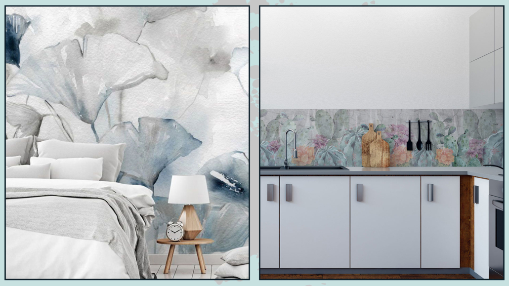
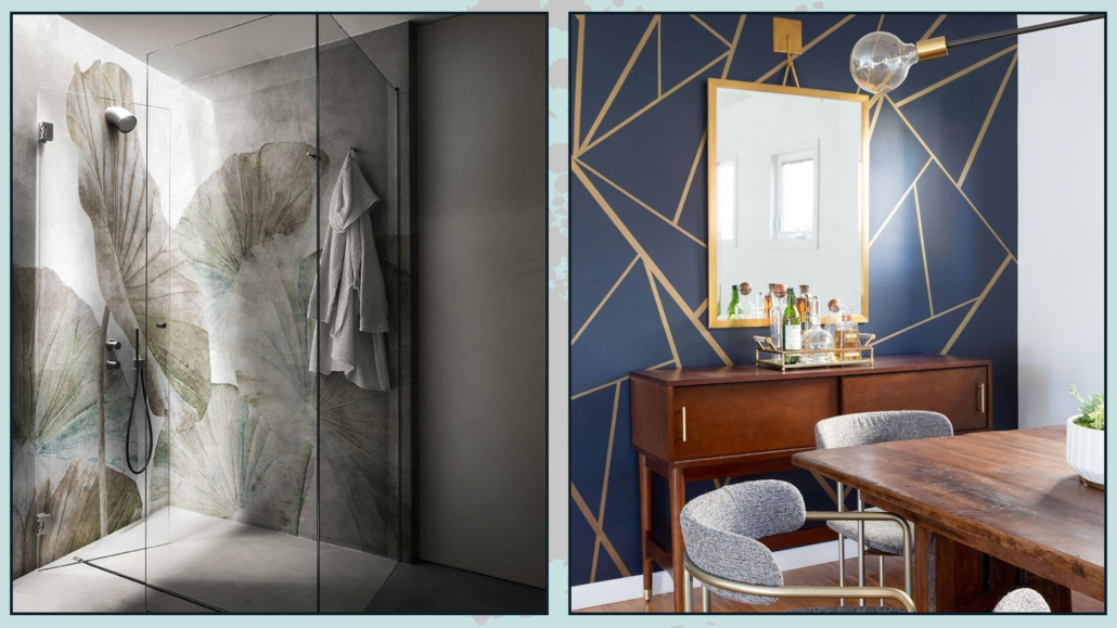
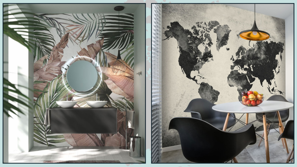
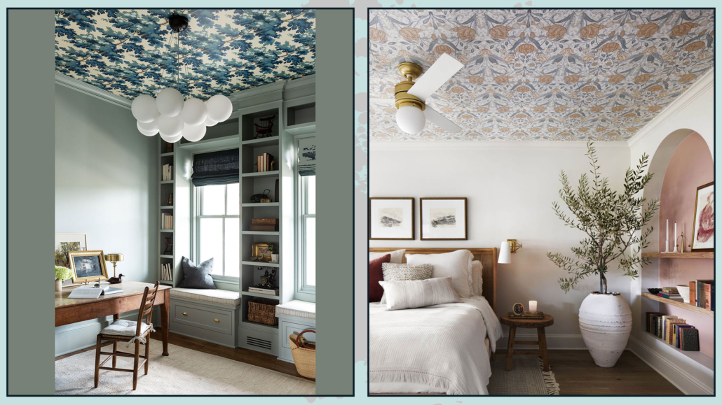
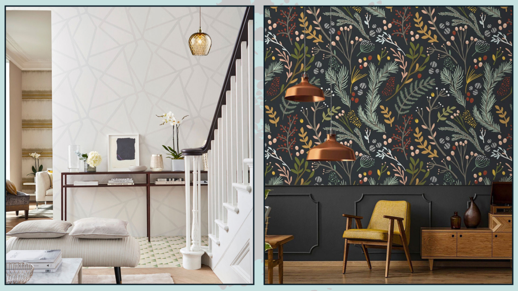
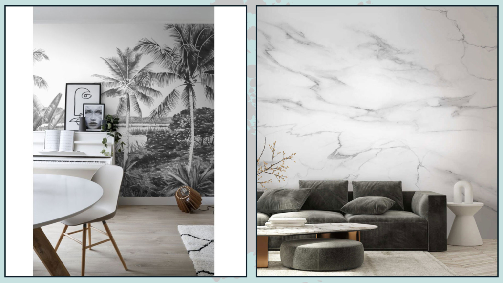
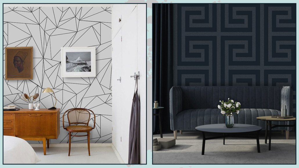
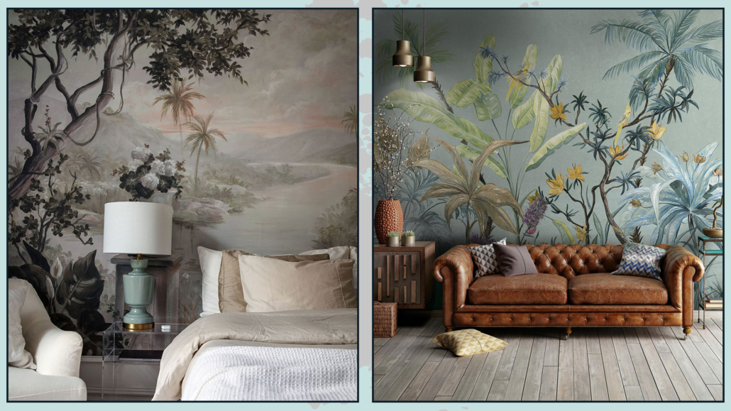
1 – WALLPAPER

No, don’t think about the wallpapers our grandparents had! There are all kinds and for all tastes on the market today!

(credit coverdesign.it)

Without necessarily opting for the super-colored ones (which should not be banned, we’d miss it), think of a neutral color, but one that carries different textures.

(credit demart.it)

It is not mandatory to cover all four walls: you can also do just an accent wall or a bookcase background.

The visual impact of the wallpaper is powerful and immediately gives the idea of something sophisticated and elegant.

2 – BOISERIE and MOLDING

We saw it in the 2021 trends, and again, it has nothing to do with what our grandparents had.

However, adding details like these means bringing in textures, but most importantly, that touch of elegance!

These elements create visual interest and immediately make the room look “richer.”

(credit it.decorexpro.com)

Again it is not mandatory to use it, as with wallpaper, on all four walls, but you could use it in only one that will become the room’s focal point!

Beware that this kind of decoration is suitable for classic style but also a modern and contemporary style!

3 – CHANDELIERS

Chandeliers are items that can enhance the aesthetics of a room if properly chosen and placed.

The chandelier usually makes the ambient light, but if properly placed above the table or on the island, it will indeed help create a focal point by emphasizing that specific area.

(credit Nicole Franzen; zephyrandstone.com.au; roeserhomes.com)

Depending on the chandelier you choose, you will undoubtedly add a touch of personality and style.

Always consider, when choosing, the colors, style, and materials you have chosen for the walls, furniture, and accessories!

Try to create cohesion with the other elements in the house!

When the chandelier falls on a rectangular table, remember to get it lengthwise or put more than one so that you can suitably illuminate everything!

(credit Pinterest; Poliform; Pinterest)

4 – ACCENT SEATING

We often have the habit of buying sofas and armchairs in agreement; however, putting an armchair or seats with contrasting shapes, materials, and colors with the couch will give the room a different, more luxurious perception.

Doing this is also a great way to bring a touch of color and different textures to that room and, thus, effectively break the monotony and make it more interesting!

The room will look more elegant, sophisticated, and studied!

(credit villa Bellaria umbria Ph Kristian Septimius Krogh)

If the seating is totally different from the sofa, remember to “justify” it, perhaps by picking the color in the pillows, pictures, or other decorative objects.

That will make the environment harmonious!

You can find many different seats on the market and at all prices; what they have in common, as mentioned before, is that they will give emphasis and character to any room!

(credit Ikea)

5 – PILLOWS

Pillows are another beautiful way to bring in textures and colors.

Putting a couple of pillows on the sofa that, as written a few lines ago, recall the different seat, or some color present in the decorations, will give a sense of harmony and keep everything well balanced.

(credit Pinterest; halfwaywholeistic.com; Pinterest)

Putting pillows on the bed is also a good idea; you can place them in various ways, creating beautiful compositions.

That will give importance and elegance to the bed.

(credit Vivere lo stile; Brittany Niemer; Etsy)

Taking off and putting on pillows every day takes a little time, of course, but it is an investment that the final result will amply repay!

6 – CURTAINS

Curtains dress the home, bringing, too, textures and colors.

They bring warmth and elegance.

A pretty rod anchored high up, just below the ceiling, and soft, well-draped curtains that come to lean on the floor will make any room look decidedly more sumptuous.

(credit interiordesignexplained.com)

It is not mandatory to have highly pricey curtains: even at Ikea, you can find beautiful low-cost ones, but the dramatic effect they give is really unique.

(credit alexanderpollock.com.au)

If space allows, you can put drapery curtains also in the bathroom and kitchen, giving elegance and that extra touch to those two rooms as well!

7 – MIRRORS

The mirror is functional for reflecting oneself, but it is also an object that stands out in any room.

Properly placed, it amplifies light and can even give the illusion of a larger space than it actually is!

(credit Tomasella.it)

Spaces seem to flow better because its ability to reflect creates a kind of continuity, but most importantly, it provides a focal point that draws attention and enhances the room.

Mirrors resting on the floor, uniquely shaped mirrors will be able to give that extra touch of character and style!

(credit Living-corriere)

8) USE SYMMETRY

The human mind needs balance, and symmetry is a form of it.

When you furnish and decorate, try to create symmetries; you don’t have to do it all the time: it might even be boring after a while, but for example, putting two equal table lamps at the ends of the console could be one way.

(credit sarahshermansamuel.com)

Using symmetry with objects or some furniture will immediately give the impression of something definitely researched.

(credit callastudio.com)

9 – ATTENTION TO DETAILS

Details can change the face of rooms: so pay attention to finishes such as handles or faucets!

(credit Franke; Frattini; gaiainterni.com)

I have already spoken about this in a previous video, but the same kitchen, sink, or cabinet with different faucets and handles will give different impressions!

On the market, you find endless variations of materials and shapes, both as faucets and handles and at all prices, but these are details that can actually make a difference and make your home feel more luxurious!

(credit Ikea; Gucki; Ikea)

They are easily changeable elements that, correctly chosen, can give your home a touch of elegance and style.

10 – PLANTS AND FRESH FLOWERS

Plants bring color and textures into the home, and fresh flowers bring fragrance; all of these things elevate our perception of the ambiance.

Plants, as mentioned other times, bring us back to nature, allowing us to feel better; in particular, the scent of fresh flowers helps lower anxiety.

(credit @homepolish)

So plants and flowers have a dual function: they bring beauty, elegance, and well-being too!

Orchids, lavender, eucalyptus, and gardenia add a touch of elegance and a pleasant scent to any room!

If you don’t like cut flowers, you can also bring fragrance with candles and diffusers; those will also be very effective in enhancing environments.

Avoid fake plants and flowers except for the occasional small arrangement here and there!

Then if, like me, you’re not exactly a green thumb, know that there are very easy-to-care-for plants that are “big talkers,” as Simona Borgia, the urban gardener, says in this video!

One more note, it seems almost silly to say, but clutter is really the opposite of luxury!

So everything must be suitably stored and nothing out of place!

The clutter otherwise could ruin all the study and work done!


I hope this article was helpful and you love it; in case, let me know in the comments!

Feel free to share it with anyone you think might be interested, I will be honored, and it will help me get my name out there.

If you feel that your home, or some environment of it, does not reflect you enough, do not wait any longer and book your consultancy!