Posts

Making your home inviting and welcoming is paramount, just as is making it personal and unique!

Two weeks ago, we discussed the 5 essential elements to make your home cozy. Today, I’d like to share some of my favorite items that can help make it more personal and intimate.

Things are quickly available at any price and will have a substantial impact on making your home truly special!

Furnishing and decorating your home doesn’t necessarily have to be expensive; you can find unique items for any budget!

But details can indeed make a difference, no matter what style or mix of styles you choose for your home.

Let’s take a look at these items together:

– WICKER BASKETS

As I mentioned in the video about Ikea products (you can find it here), baskets add warmth, bring texture, and even give a sophisticated touch to the room.

You can use them as a magazine holder, near the sofa, or as plant pot covers.

Baskets are a super easy and inexpensive way to add that extra touch to any room in the house!
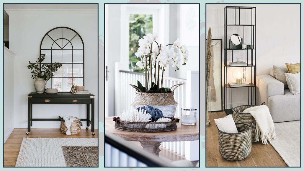
Ceste in nvimini

(credits: Botteh Tapetes; coastalvintage.blogspot.com; mypie.site)

– CANDLES AND CANDLEHOLDERS

Candles create an atmosphere even when they’re unlit.

When they burn, they add fragrances and warm light.

The right candle holder can help create a beautiful composition.

They come in all shapes and materials, so choose the one that best matches your home’s style.

You might even combine different materials and shapes for a unique effect!

Candles are another inexpensive way to enhance the ambiance and make your home welcoming, inviting, and personal!
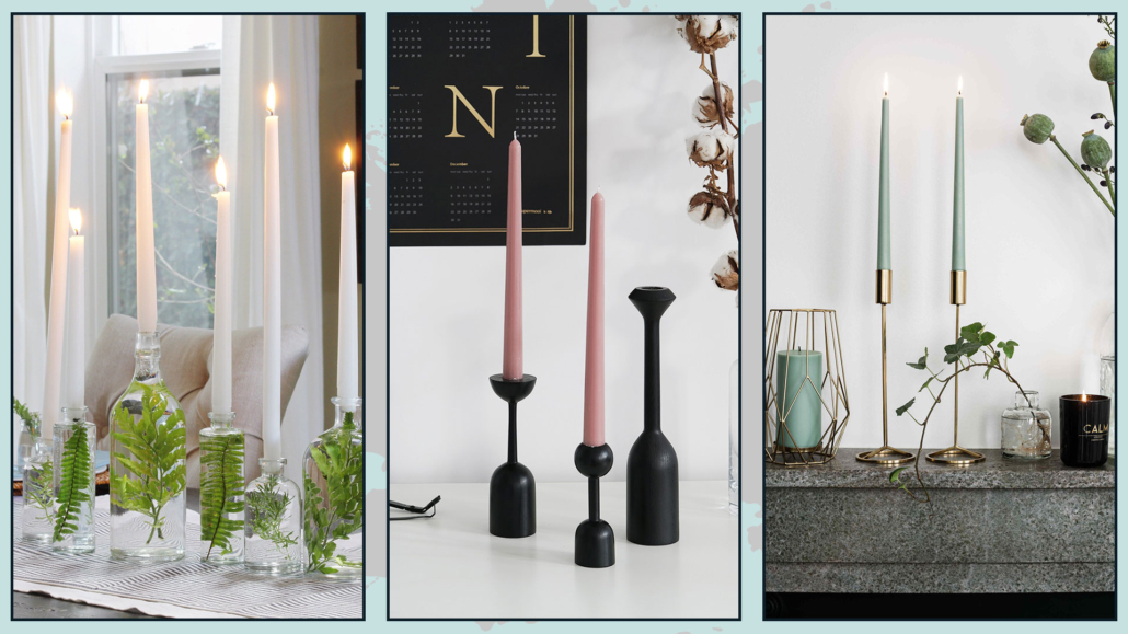
(credits: olagiatingunaika.gr; aliexspress.com; ilpampanodesignbimbi.com)

– WALLPAPER

Wallpaper has a powerful visual impact and comes in an infinite variety of colors and designs.

You don’t need to cover all the walls; but use it strategically to create a focal point, which will help emphasize that particular area.

You can place it on the wall behind the bed, sofa, or, why not, even in the bathroom!

In this case, there are wallpapers specifically designed to withstand humidity.

Wallpaper is a great way to add movement, color, and dimension to a room.

When choosing wallpaper, remember to consider the colors and furnishings you already have in your home to maintain harmony!
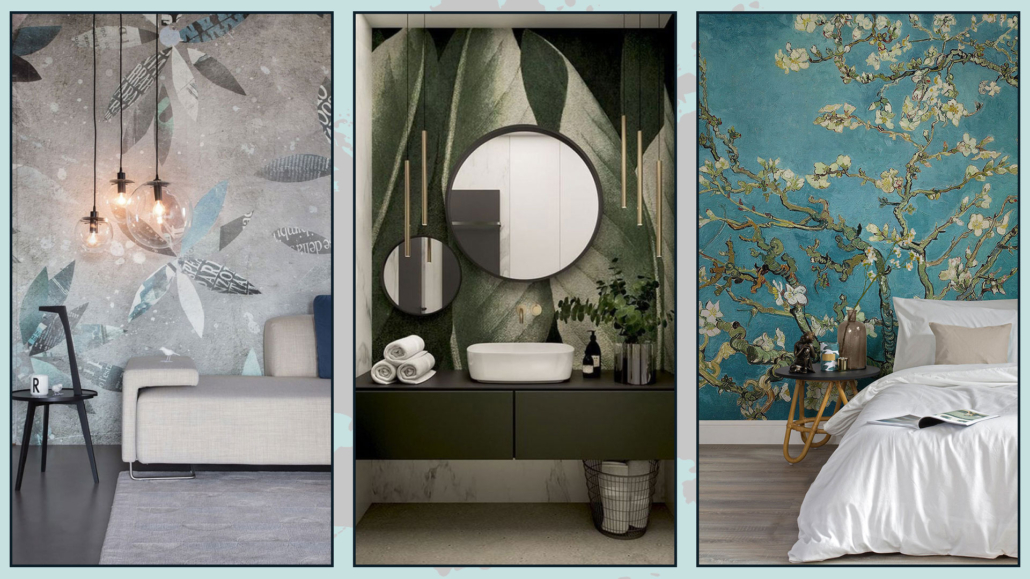
(credits: wallanddeco.com; artheco.it; lionshome.it)

– COLOR

How many times have you heard me say it?

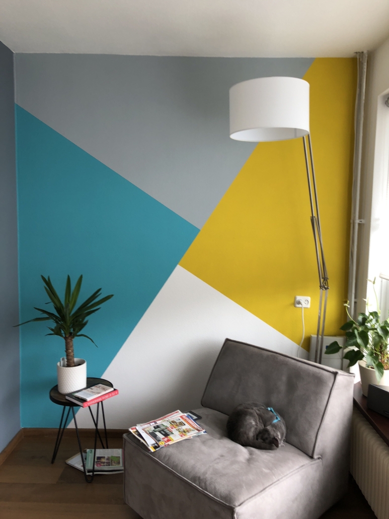
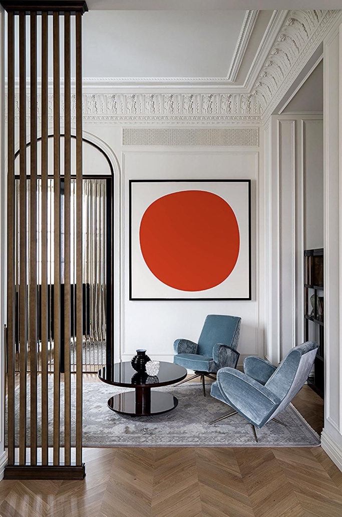
Color is indeed a powerful ally for decorating and personalizing your home.

Like wallpaper, you don’t have to use it on all the walls; you can paint just one wall or a portion of it.

You can use color only for furniture or accessories, although that might miss that special touch.

One way to make a room inviting and welcoming is to use a color on a wall and then pick up that color in some objects, such as cushions, an armchair, or a rug.

That creates cohesion, harmony, and rhythm!
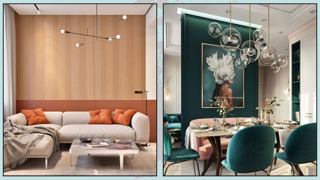
(credits: wayfair.com; @interiors_dd)

– MIRRORS

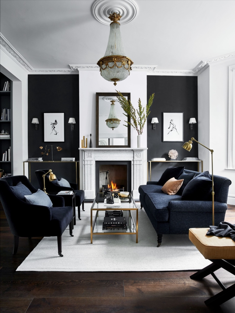
A mirror is essential in the case of a small room because it reflects light and amplifies the space.

But regardless, a mirror is an element that immediately adds a touch of elegance and style!

You can place mirrors anywhere: in the entryway, above the fireplace for those lucky enough to have one, in a hallway, above the sofa, or even leaning against the wall on the floor.

Mirrors come in all shapes and sizes, and again, for all budgets!

It’s a decorative element with a strong impact that can make a big difference!
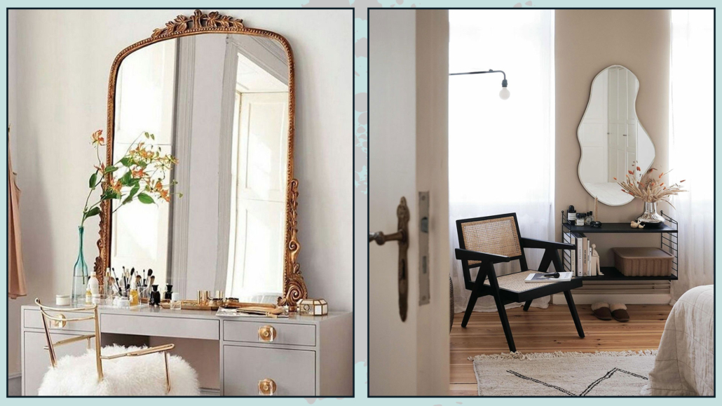
(credits: theurbnite.com; ferm living)

– LAMPS

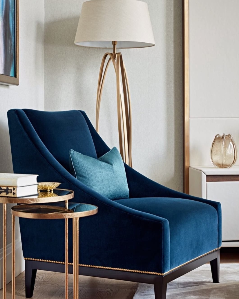
Lamps are functional because they provide light but can be very decorative, too.

When adding a lamp, consider what you do in that room so you can use it most profitably for you while adding that extra touch of charm.

For example, if you like to read in your favorite armchair, a beautiful floor lamp would be convenient, or if you have a nearby surface, a lovely table lamp!

Like candle holders, lamps come in different materials and various shapes!
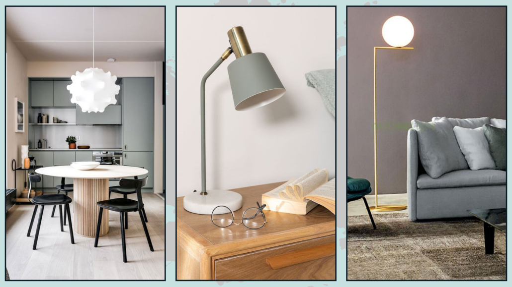
(credits: Noted Design Studio; sklum.com; diffusioneshop.com)

– PLANTS AND FRESH FLOWERS

Plants and flowers transform a space, making it instantly more elegant while adding a touch of freshness, color, and even fragrance!

Their organic shapes and air-purifying abilities also help with relaxation.

Look around your space and see where you need life and color; that’s the right spot to place a plant or a vase of flowers!

You might also consider placing a vase with leaves like a monstera, which lasts for weeks and makes a significant impact!

There are easy-to-care-for plants that can definitely enhance the style of your home!

Remember to beautify your plants with pretty pot covers!
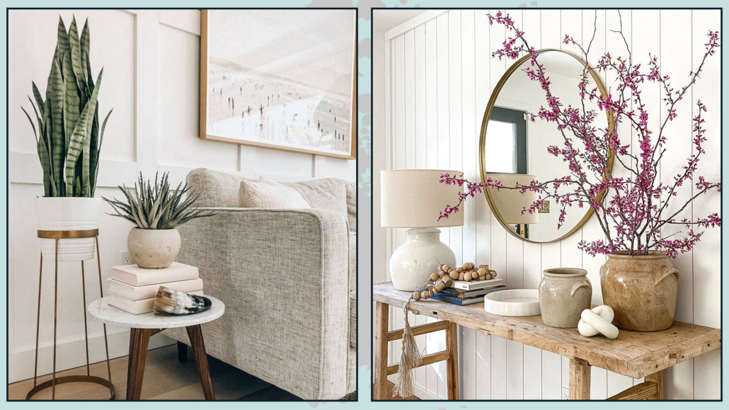
(credits: Brianne Penney; thevintagerugshop.com)

– USE SOMETHING YOU LOVE

There is nothing more personal than decorating with your passions!

Do you love photography? Create a beautiful gallery of images!

Do you love books? Place them on a coffee table to add a touch of sophistication.

Using what you have and what represents you is a creative way to decorate and make your home truly unique!

Your home should represent you, so show who you are and use what you love to make your home personal!
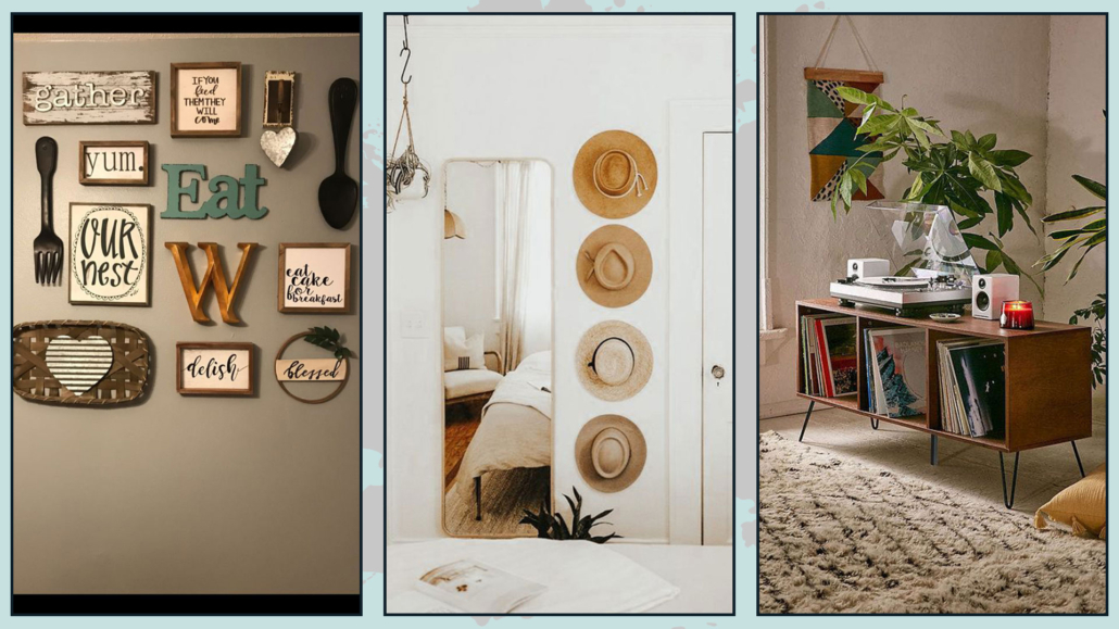
(credits: @Brittney Edwards; etsy.com; urbanoutfitters.com)

Are there other elements you think are essential to make a home inviting, welcoming, and personal? Let me know in the comments!

I hope this article has been helpful and enjoyable for you. If so, let me know in the comments!

Feel free to share it with anyone you think might be interested, I would be honored, and it will help me gain more exposure.

If you feel that your home, or any specific area of it, doesn’t reflect your personality enough, don’t wait any longer and book your consultancy!
A couple of weeks ago, we saw how to combine different woods in the home (you can find it here); today, I’d like to share with you how matching various metals too!

Metals have the ability to bring light, depth, and character to rooms while also bringing that touch of luxury!

In the home, metal parts are often in the details:

– cabinet and closet handles;

– door and window handles;

– faucets;

– legs of chairs/tables and coffee tables;

– chandeliers;

– household items

it often happens, for this reason, that we are not careful in matching them and end up perhaps with many different metals in the same room.

Fortunately, let’s face it, most of the time, since they are small details, it does not immediately fall to the eye if there is some “confusion” in these elements and if they do not always go well together.

Yet details, we have said a thousand times, can make a difference and, if well thought out, can elevate the perception of environments.

If the “clutter” doesn’t immediately fall to the eye, the correct pairing will!

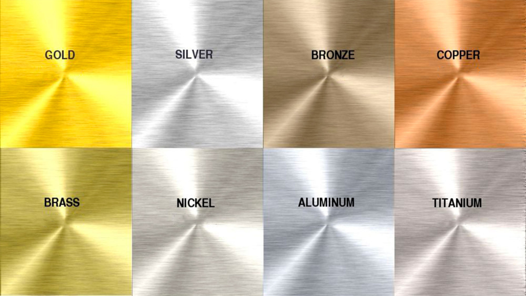
There are really many different metals: gold, silver, bronze, brass, copper, corten, steel, etc.

varietà di metalli

They can also have different finishes: they can, for example, be shiny, matte, satin, or brushed.

Each of these metals has its own specific color, and steel can also be colored; you can find it mainly in white and black.

In short, you can understand that the combinations can be really many and that putting them all in the same room can become a bit “too much”!

At the same time introducing only one metal in the house could be “boring”!!!

So let’s see the best ways to combine different metals to give character to your rooms!

1) CHOOSE THE STYLE YOU WANT TO GIVE TO YOUR ENVIRONMENTS.

As seen before, metals are many and also have many different finishes.

Each of them goes better with a particular style: steel, for example, is not the best in the rustic style; it’s better in a modern or contemporary style.

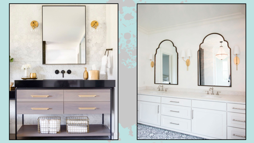
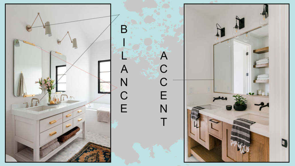
2) COMBINE A MAXIMUM OF 3 DIFFERENT METALS!

If a room is small, perhaps it is better to combine a maximum of 2 different metals, while you can go up to 3 in larger rooms.

In the case of mixing 2 metals, you can do it in two ways:

– balance the two metals by giving them equal importance, so put the same amount.

– choose one primary metal and put the second one only as an accent metal.

(Credit: Studio Mcgee; beckiowens.com)

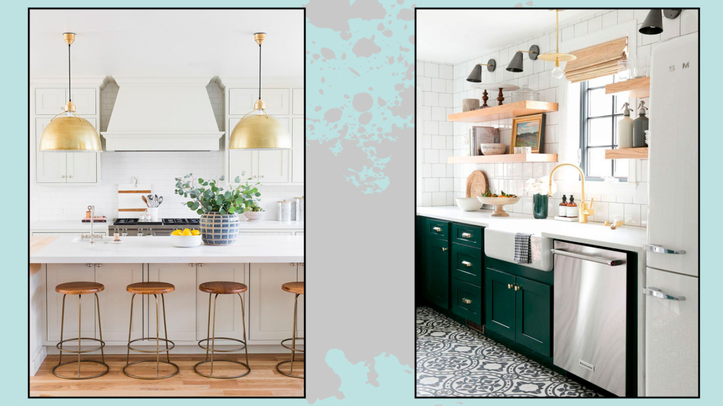
In the case of matching three, you cannot give equal importance to everything, so you have to choose the metal you want to be “dominant.”

Then choose a second metal that complements the dominant metal in a less overbearing way and, finally, a third metal that is the extra “touch,” the accent color that draws the eye!

mix a tre metalli: uno principale e gli altri in dosi minori

(Credit Studio Mcgee)

The choice of the dominant metal should be made in accordance or contrasting color with the rest of the environment.

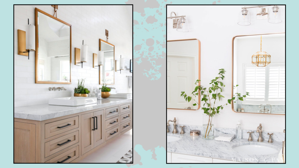
3) USE CONTRASTING METALS

putting different metals that, however, have the same color, such as aluminum and steel, will not create contrast and will not make a real mix of metals be perceived.

mettere metalli in contrasto per interesse visivo

(Credit @lindyegalloway; simplenaturedecorblog.com)

Choose metals with contrasting colors to create movement and visual interest.

Possibly use the same metal for all elements that have the same function.

For example, in one bathroom, use the same metal for all the faucets and another for all the towel and roll holders, and a third for the handles.

That creates harmony!

4) BALANCE THE DIFFERENT METALS

As with woods, avoid creating groups of the same metal separated by other metals; instead, try not to put elements of the same metal too close together.

For example, still in the bathroom, if you have a steel faucet, avoid putting the mirror of the same finish: put it instead in brass!

non mettere gli stessi metalli tutti vicini, evita assembramenti

(credit Lindye Galloway Interiors; maisondepax.com)

Also, repeat this choice several times, for example, in cabinet handles or lights.

5) CHOOSE THE RIGHT FINISH

We have seen it before, the same metal can have different finishes, and each metal will have a different impact depending on the finish you choose.

Choose the finish that best matches your style and personality!


I hope this article was helpful and you love it; in case, let me know in the comments!

Feel free to share it with anyone you think might be interested, I will be honored, and it will help me get my name out there.

If you feel that your home, or some environment of it, does not reflect you enough, do not wait any longer and book your consultancy!
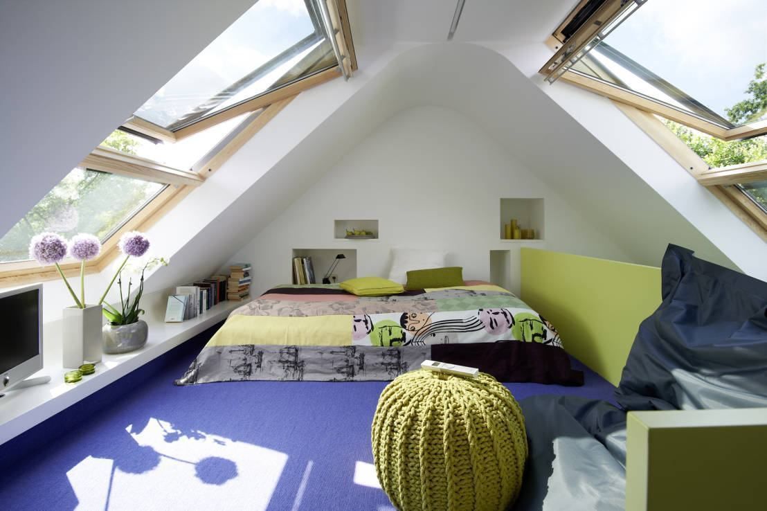
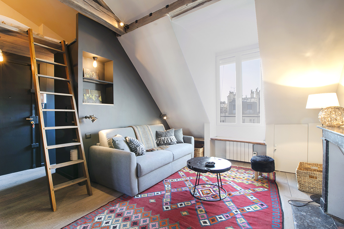
How to furnish a mansard?

Living in a mansard has a certain charm because of its unusual shape, but for the same reason, decorating it is not so easy!

Today let’s see together some tips and tricks to make attic rooms comfortable!

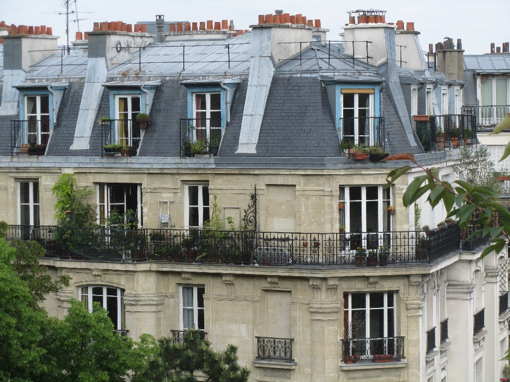
Before we get into today’s topic, let’s make a little history: the mansard and this term come from the French word “mansarde,” which in turn comes from the name of the architect François Mansart (1598-1666) who first designed this type of housing.

There are pros and cons to having a mansard room or apartment

Pros:

– it is an original and striking environment because of the sloping ceilings, often with exposed beams;

– thanks to the skylights, it tends to be a bright environment;

– with a bit of imagination, you will be able to find unusual settings not found in “normal” apartments.

Cons:

– it is not easy to find suitable furniture in stores;

– you have to be more careful about the climate and relative temperatures.

The roof is definitely exposed, and the risk is to have a room or house very hot in summer and very cold in winter;

– despite having a large floor plan, it might look small, having areas perhaps not walkable!

With good design, however, these cons can be, if not eliminated, at least curbed!

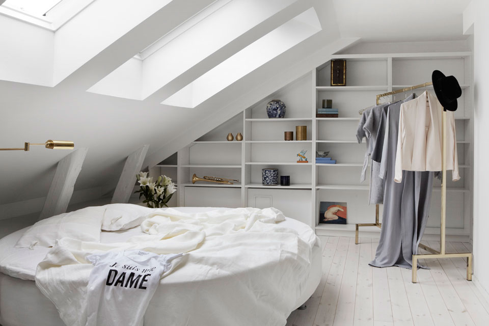
What makes particular a mansard is the difference in heights within it, which can be very different, making a furnishing project more or less difficult!


come arredare una mansarda

(credit fantasticfrank.se)

There are mansards that at their lowest point reach 2 meters and definitely make the task of furnishing it easier.

But there are also mansards that perhaps barely reach a meter in height and complicate things a little.

In this case, figuring out how to furnish the attic flat becomes more complicated but not impossible!

Speaking of heights, I make a very small digression: if you have an attic and would like to make it an apartment, you should know that there are very strict regulations to make that space habitable.

These regulations mainly concern heights (but not only), more precisely, the average height between the highest and the lowest point.

They vary from region to region, so I recommend contacting a technician who can give you the correct guidance!

Back to us, let’s look at some ideas that can help you better understand how to furnish a mansard!

1) CORRECTLY MATCH ROOMS TO HEIGHTS.

That is, put the rooms in the right place!

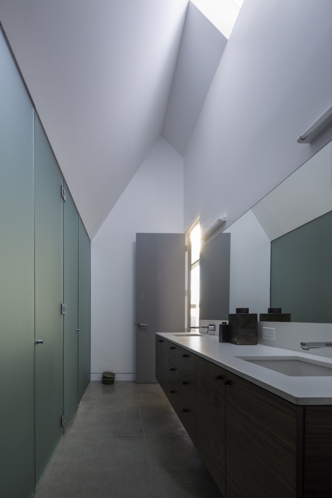
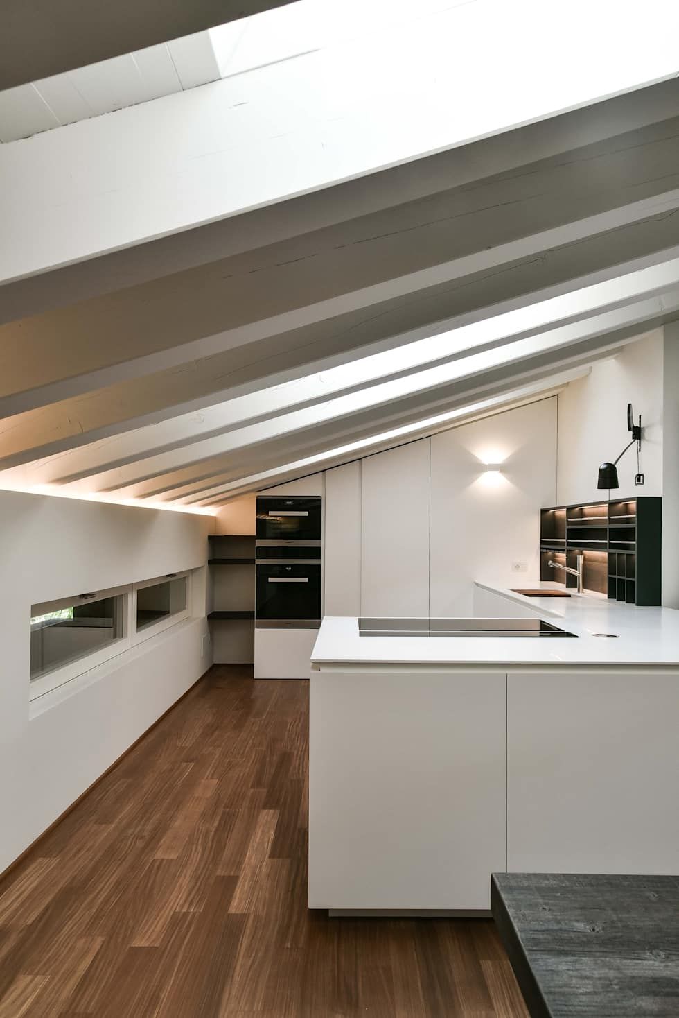
By this, I mean placing in the highest areas those rooms where you are often standing, like the kitchen or the bathroom.


(credit. architecturebeast.com)                                          (credit arch.Claude Petarlin)

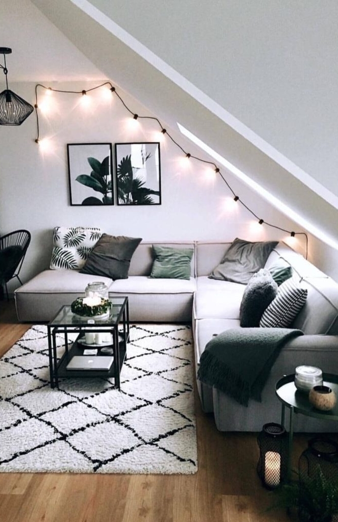
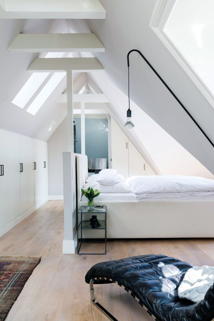
In the lower areas, on the other hand, you can put, for example, the living room (especially the sofa area) or the bedroom…


(credit Westwing)                                                                  (Christian Schaulin tramite Elle.com)

That may create an irregular floor plan, but, after all, this is another thing that gives charm to this type of housing!

2) USE CUSTOM-MADE FURNITURE

Here more than ever, making the best use of space is vital!

As we have seen among the cons of this type of housing, it will not be easy to find suitable furniture in traditional stores.

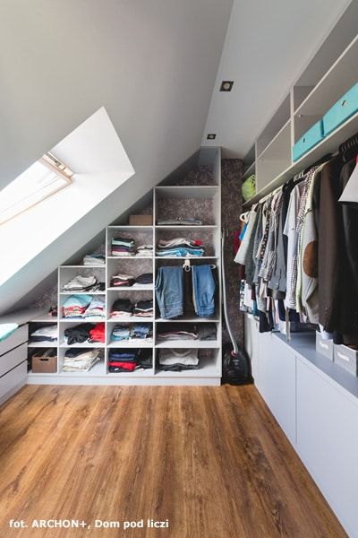
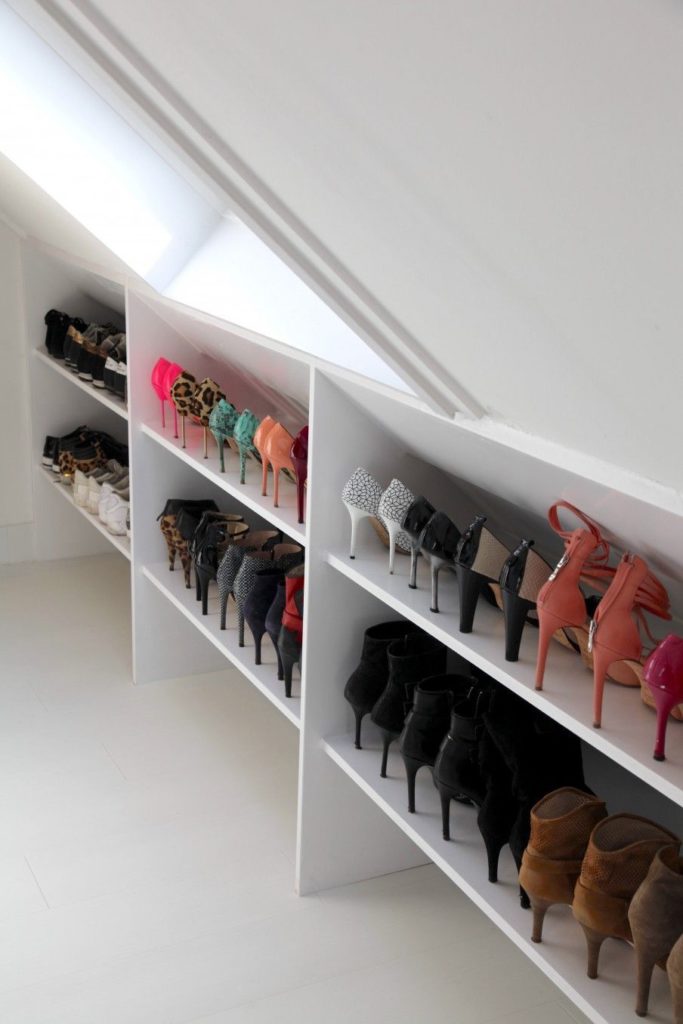
Therefore, it will be necessary to create custom-made furniture and carve out cabinets and storage in the lower areas that you could not otherwise exploit!


(credit Archon)                                                                          (credit vtwonen)

The cons turn into pros because you will have unique and original furniture designed not only for the conformity of the room but precisely for your needs!

3) ATTENTION TO LIGHT

These rooms should be very bright, as always natural light is preferred.

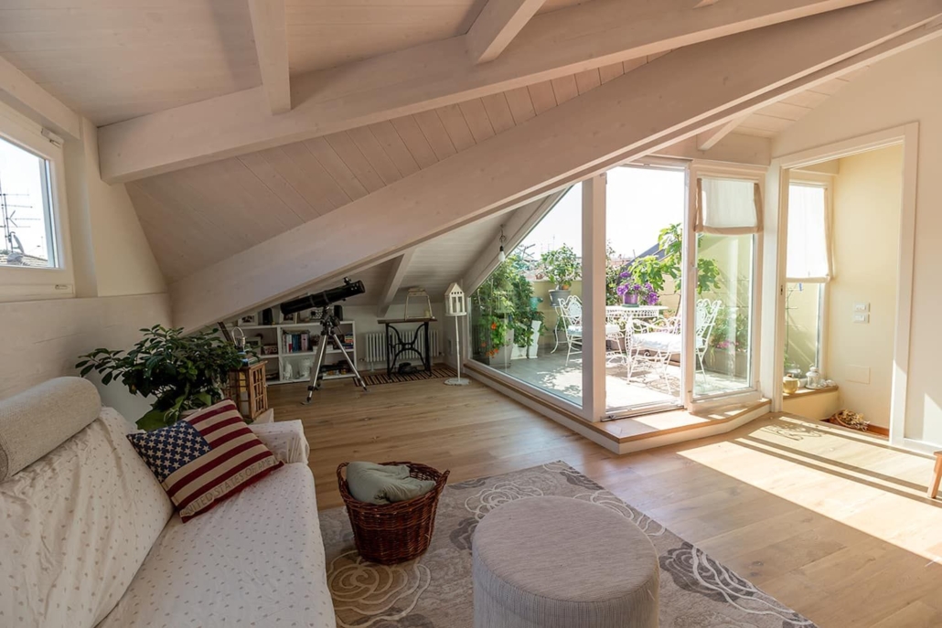
If it is a room, skylights will be okay, but if it is an entire apartment, it is good to have vertical windows and maybe, at least, a small veranda!


(credit Arch. Bartolucci)

That will allow a glimpse of the outside the risk, otherwise is to feel a bit stuffy!

As for artificial lighting, however, some tricks will improve living comfort:

– light from below and above, especially if you have a wooden roof!

– be careful with chandeliers except in the highest areas!

While passing under them without problems, the chandelier is still a bulky element that creates a visual “barrier” that will optically shrink spaces.

Electrified rails, adjustable spotlights, sconces, and LED strips will allow you to bring light where you want it with little clutter.

(credit menzoarchitetto.it)

(if you are interested I talk about lighting in general here)

4) ATTENTION TO COLORS!

If the mansard is very low-lying, the ideal is to use light and bright colors, at least as a base.

That will optically expand the spaces giving more breathing room.

If you want to use it, the color will be good in the furniture, accessories, and textiles.


(credit dodk.net)

On the other hand, if the mansard is high, you can dare a little more by coloring some walls too.

In this case, do it in the brightest parts of the house and avoid too dark colors.


(credit cristinavelani.com)

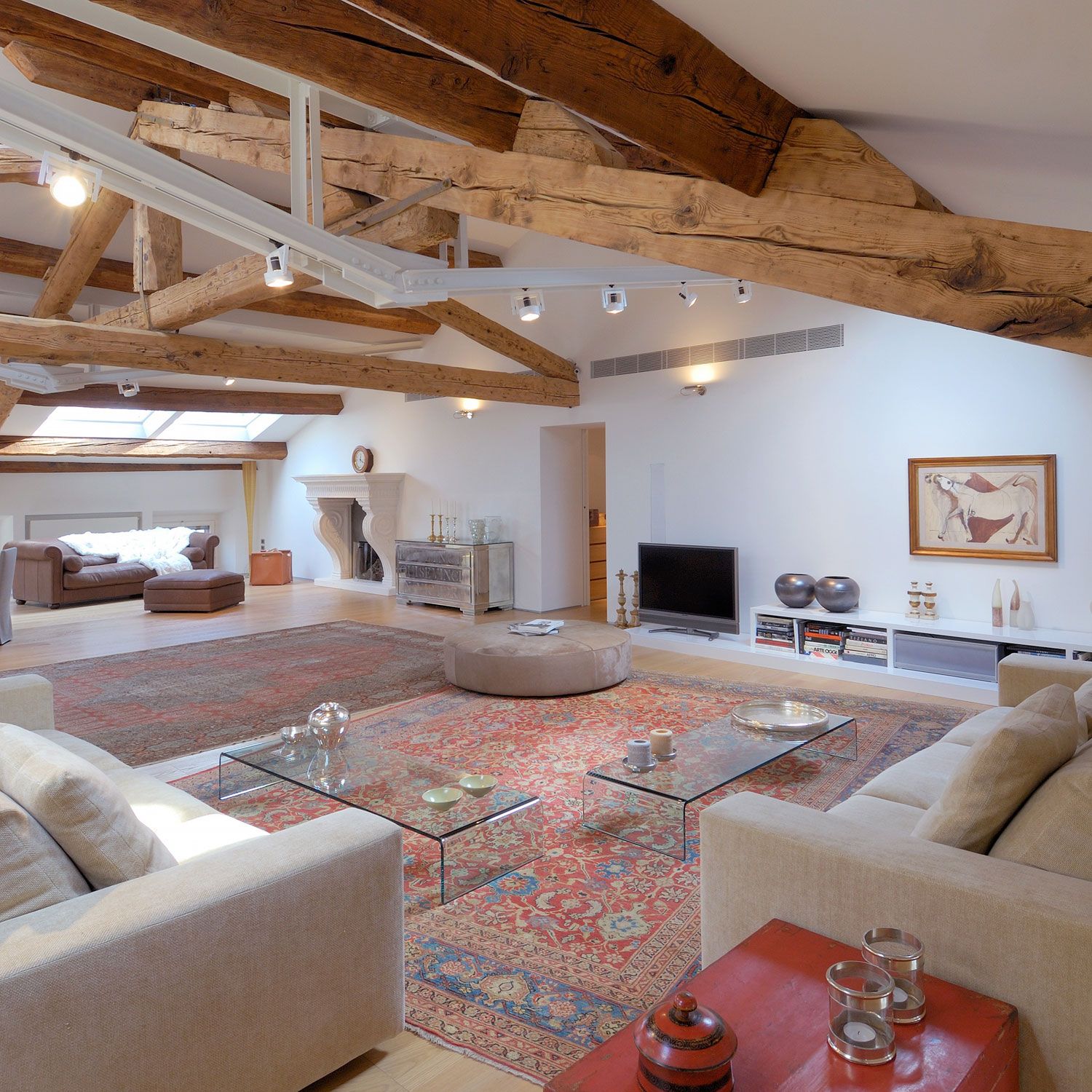
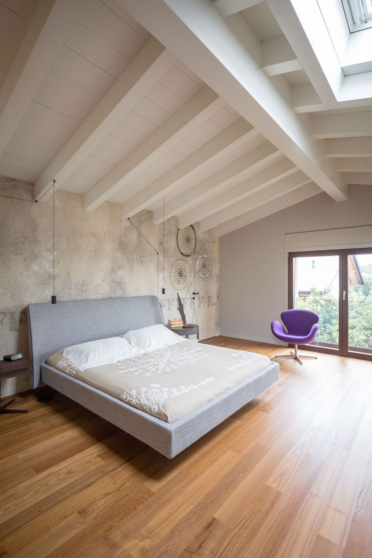
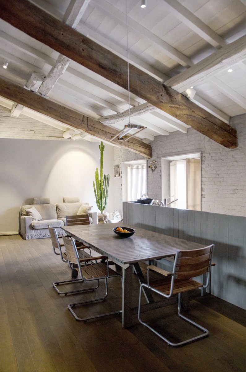
If you have a wooden ceiling and want to keep it that way, keep more neutral colors for the walls; so you don’t risk weighing the environment down.

You can think of whitewashing the wooden ceiling to give it more breathing room, all or part of it; for example, if you have beams, you can decide to whitewash the battens between the beams while keeping them unchanged.


(credit Architettura & Urbanistica Sigurtà)                        (credit Living corriere)

These 4 tips are the basics that will help you better understand how to decorate your mansard, but if you have any doubts, don’t hesitate to write in the comments so I can better help you!

I hope the article on how to furnish a mansard was helpful and you loved it; in case, let me know in the comments!

If you need any help just contact me!

Home decor and furnishing are exciting, and today I’d like to give you some tips that can help you do it to the best for a home that represents you deeply!

Good design is not only about aesthetics; it is not enough to put beautiful things in a room for it to be lovely and comfortable.

More importantly, it is about how each element can communicate with the other.

So it is not just a matter of “beauty,” but it is a proper interaction between the elements of the same environment.

Some basic concepts are crucial to designing or transforming any environment, making it unique and wonderful.

Each thing must be connected to the other and give a sense of unity.

These concepts that will help you best decorate your home are 6: let’s see them together!

1) The first home decor basic concept is to create EMPHASIS.

Said like this may sound tricky, but it is not: it is about creating a focal point!

So it is having something outstanding that grabs attention.

If everything in the room has the same importance, everything will seem somewhat unconnected, monotonous, or boring.

There is a need for something that attracts, that somehow breaks the patterns.

That can be a wall with a bold color, a painting or a particular object, etc.


(credit archimadestudio.com)                                                                        (credit etsy.com)

2) another concept is creating CONTRAST

In order to create movement, it is relevant to put elements close together that contrast with each other through color, shape, materials, or sizes.

It can be done in many ways, for example, by combining light and dark colors, huge elements with small ones, shiny and matte surfaces, and so on…

These contrasting plays enliven the environment by giving it character!

(credit ludexo.com)                                                                                (credit neptune.com)

3) RHYTHM is another essential concept.

In furniture, rhythm is achieved by creating repetitions and contrasts: it is like in the combination of musical notes, only this one is visual!

The repetitions create a flow that guides the eye through the surrounding space.

You can do it in various ways:
– a repeated architectural detail, object, or complement
– use the color of a painting in the patterning of a pillow and in some objects.

The latter will create rhythm precisely, but it will also help create balance and tie all the various elements together.


(credit shootfactory.co.uk)                                                                       (credit elledecor.com)

4) speaking of BALANCE, this is the fourth concept for a perfect interior project

Balance is the proper distribution of different visual weights.

Some colors, shapes, or sizes attract more than others and are said to have a greater visual weight.

To achieve a harmonious environment, it is paramount that these do not overpower what has less visual weight but that there is indeed a balance.

On paper, the perfect balance is symmetry, which is when dividing a room in half, the two parts are furnished in the same way; it is as if there is a mirror!


(credit Flanagan Lawrence source yellowtrace.com)

Why did I write “on paper”?

Because it is not mandatory that everything is symmetrical to achieve balance: on the contrary, asymmetry could make everything more dynamic!

A color with a high visual weight will balance well with a neutral colored element, but perhaps very large…


(credit Abramson architects)

Or, again, when elements are duplicated.


(credit Knoll)

5) SCALE and PROPORTIONS are basic home decor concepts when designing furniture!

SCALE takes into consideration the size of an object relative to the room in which it is placed:

Small rooms with furniture that is way too bulky will suffocate the space (and therefore you!); conversely small furniture and objects in large rooms will get lost!


(credit Meridiani living)                                                                                       (credit Bronxes Studio)

PROPORTION takes into consideration the size of one item in relation to another.

A rug that is too small next to a large sofa will look out of place!

You cannot think only about the size of the room and the main furniture, but you will have to think about the size of each element and the correlation between them.


(credit artheco.it)                                                                                              (credit artheco.it)

6) Finally, the last concept is HARMONY.

You can achieve harmony when all the elements in the environment communicate with each other, creating a unique and balanced whole.

One must have the impression that each piece nicely matches the other.

As always, this does not mean using only one style or color, but it is paramount that each piece seems to belong to the other in some way!

To do this, you need, as mentioned before, for the pieces to communicate with each other, picking up the material or color, for example!


(credit casavogue.globo.com)                                                                         (credit jessicabrigham.com)


These six home decor concepts go hand in hand, and if followed carefully, they will help you decorate your home by creating unique and spectacular environments where you will always feel at ease!

I hope this article was helpful and you love it; in case, let me know in the comments!

Feel free to share it with anyone you think might be interested, I will be honored, and it will help me get my name out there.

If you feel that your home, or some environment of it, does not reflect you enough, do not wait any longer and book your consultancy!
Knowing how to face at the best a renovation, small or large, is really important to prevent the dream from becoming a nightmare!

We have said it several times, restructuring is not a picnic, and it can be very stressful, but some tricks can “facilitate” this path!

THREE TRICKS TO FACILITATE THE PATH

Let’s see them together, in order:

– CHOOSE AN ARCHITECT OR SURVEYOR:

If you need to renovate, unless you just have to redo the floors and/or whitewash, you MUST turn to a professional for the project, for the bureaucratic part, for safety on-site and, indeed, follow the work!

Be careful that not all professionals do everything I have just mentioned, so I recommend making sure that it can follow every part, not to risk any kind of sanctions!

– MAKE A DETAILED PROJECT:

I know, it’s not the first time you’ve heard me say it, but that’s because it’s really the cornerstone of the whole process!

Where to start?

If you don’t build from scratch you must surely start from the current state map!

From there, if you rule out any load-bearing walls, you can really go wild!

But I suggest you start with the furniture!

I know it sounds counterintuitive, but if you study the rooms from the furniture you’ll be able to create really functional settings!

Once you have identified the furniture, you can decide on the appropriate size for each room.

Once this is done, or at the same time, you can choose the materials and finishes, so that they will match the chosen furniture!

Then you can study the various systems, the electrical one, in particular, will be studied ad hoc for the position of the various elements present, making the environment even more comfortable!

– CHOOSE THE CONSTRUCTORS OR THE VARIOUS CRAFTSMEN:

having clear the work to be done and the materials you want to use will make it easier for you to search and find the right professionals!

I know that often we start from the choice of the constructor, but it is unthinkable that everyone can do everything!

Laying a resin, for example, is certainly not the same as laying tiles and requires different skills!

If you have a clear idea of what you want to do you can choose a constructor or craftsmen SPECIALISED who will surely know how to do a good job!

Better a single constructor or individual craftsmen?

It always depends on the works you want to do, there are the pros and cons in both cases:

– with a single constructor, you have only one contact person and the professionals working inside already know each other, this could save time,

– if turn on individual craftsmen you may get lower prices, because, easily the company will add a more or less large percentage on the quote of the individual professional!

In any case, if you choose a constructor, make sure that it does the work directly and not subcontract to another company, in this case, you can be sure that the prices will be much higher!

OTHER ADVANTAGES OF FOLLOWING THESE THREE TRICKS

Doing this will allow you to have a clear understanding of the costs you are about to face, and the picture is total!

So, not having yet “lifted a finger” you can always fix things!

Once you’ve done these three things, you can start work!

Will everything go smoothly?!

Well, it’s really hard because a few hitches and a few unexpected are easy to happen, it’s part of it!

If you invest some time in the research for the right professionals, but especially in the project, you will surely reduce the problems!

And the stress that follows and you will surely be able to face your renovation in the best way!
Even at an economic level, the possible cost increases are reduced, because the quotes for the works are based on a well-detailed project, and therefore, unless there is a change in the race on your part or something unexpected, the prices will remain the same!
TO DEAL AT THE BEST A RENOVATION IT’S POSSIBLE!

To face at the best a renovation is possible, the important thing is not to be in a hurry to start the work without having clear ideas!

Among other things, when everything is well planned, it allows you to speed up the whole process and not just a little bit because everyone will have clear what to do and so there will be no waste of time!

The investment made in the project and research will pay off!

If you’re going through a renovation and you’re feeling a little lost, don’t hesitate to contact me!!

Often, the entryway and passages, being passage areas, are somewhat put in the background.

Today I would like to focus on these two environments to make them always pleasant and harmonious (and maybe take the most advantage of them!).

The entryway is the very first room we come in contact with, and it’s the house’s calling card!

CORRECT THE DEFECTS

How to do it when long and narrow entryway or open on the long side of a hallway?

Irregular entryways or where a lot of doors open are definitely unpleasant to look at!

If we have this type of entryways (and it often happens), we have to regularize volumes and paths, let’s see how:

– Too long paths, such as hallways, can be “slowed down” and “modulated” with color, prints, consoles, mirrors, or architectural elements.

– It is an excellent thing to draw attention to one or two key points, such as a particular wall or a significant painting.

– Irregular spaces can also be harmonized by using a piece of furniture to fill an empty area or closing off an area to create a small closet.

– Uniform style, color, and finishes with the rest of the home.

PAY ATTENTION TO THESE DETAILS

– Of course, the more natural light there is, the better it is, but if it is not possible, check that the lighting is good, not just the central light point.
A false ceiling with recessed spotlights might be a good idea!
This even if the entryway gave directly into the living room: it would help visually delimit the space.

– Warm and light colors are always good, but since these areas are transit zones and the stay is short, you can even venture stronger colors to have an impact effect!

– Try to use low furniture, because tall ones, especially if there is little space, are too dominant.
If it is necessary to have a wardrobe, it is better to have a wall one; if it isn’t possible, the ideal is to mask it with the colors of the walls so that it is concealed and does not overlap too much.

– In the entryway, an “emptying pocket” is essential!

– If large furniture can be too pressing, remember to avoid too small accessories, they would be lost!

– If you want to draw attention to something, whatever it is, it needs to be big and very well lit, even better if it is effectively lit with a spotlight pointed at it.

– Never show the bathroom from the entrance, try to mask it as much as possible!
The connection to emphasize is always the one with the living room.

– Entryways and hallways can also provide other functions, such as a small study or a library area…

With small tricks, even the “strangest” entryway and hallway can become welcoming and very pleasant.

Do you need a hand with your entryway and passages? don’t hesitate to contact me for a consultation!

Changing the perception of environments with colors is it possible?

Visual perception has a strong impact on our brains: a room will seem smaller if it is empty, compared to a furnished one!

This is because the furnishings delimit spaces but, above all, they are for us a “measuring meter”.

For example, if we see that on a wall there is a double bed with 2 nightstands and still advances free wall we know with certainty that that wall will be longer than 2 meters.

The bed is, in fact, 1mt 60 wide, the two nightstands will be at least 40 cm so, making the calculations, we are definitely over 2,5 meters.

LET’S SEE SOME TRICKS

Today I want to give you some little tricks on how to create different visual effects by simply using color on walls and ceilings:

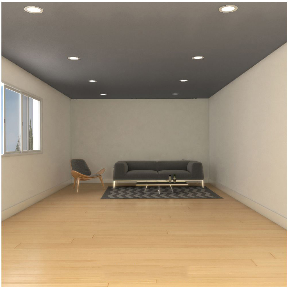
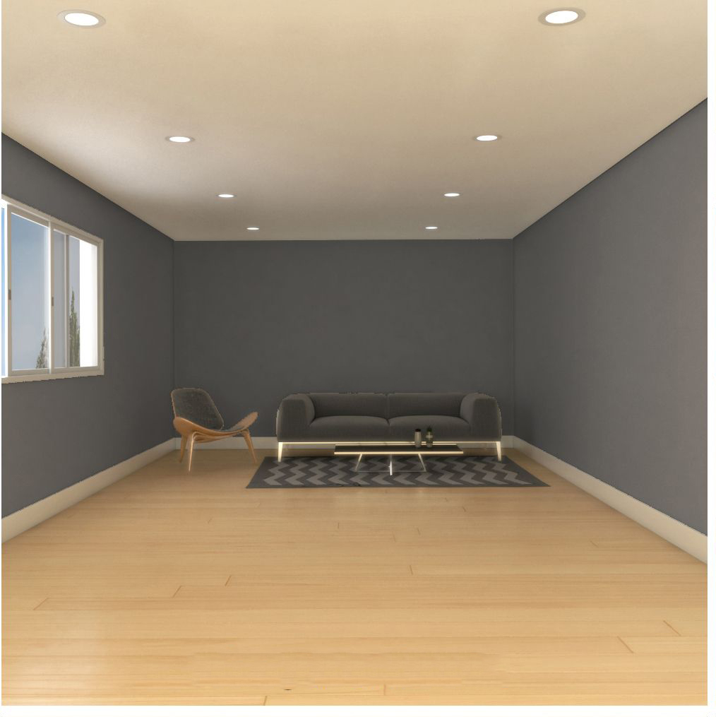
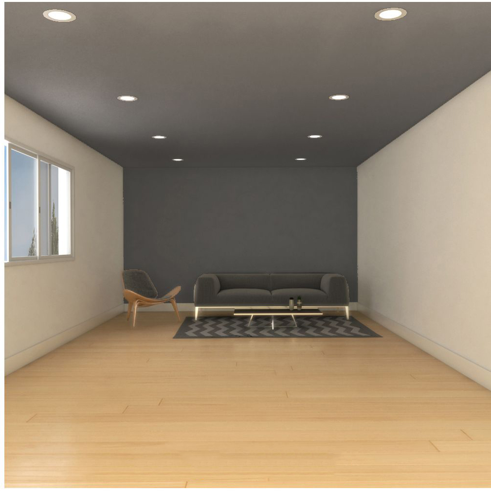
  •  To “lower” a room, it will be enough to paint the ceiling a darker color because this will optically lower and, therefore, give the impression of a lower room.

  •  In corridors, which are often long and narrow, it will be useful to color the ceiling and the back wall with a darker color to give the impression of greater breathing space.
    This will give the impression of a wider corridor.

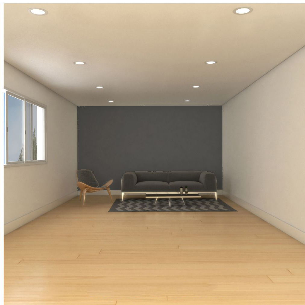
  • If you need to shrink a very long room, you only need to color the back wall a darker color, because visually it will bring the wall closest to you.

  • On the contrary, to lengthen a room, you should keep the ceiling light and paint the walls a darker color.

  •  Furthermore, to “compress” a room it will be enough to paint both, walls and ceiling, with dark color.
    On the contrary, to enlarge, everything will have to be clear.

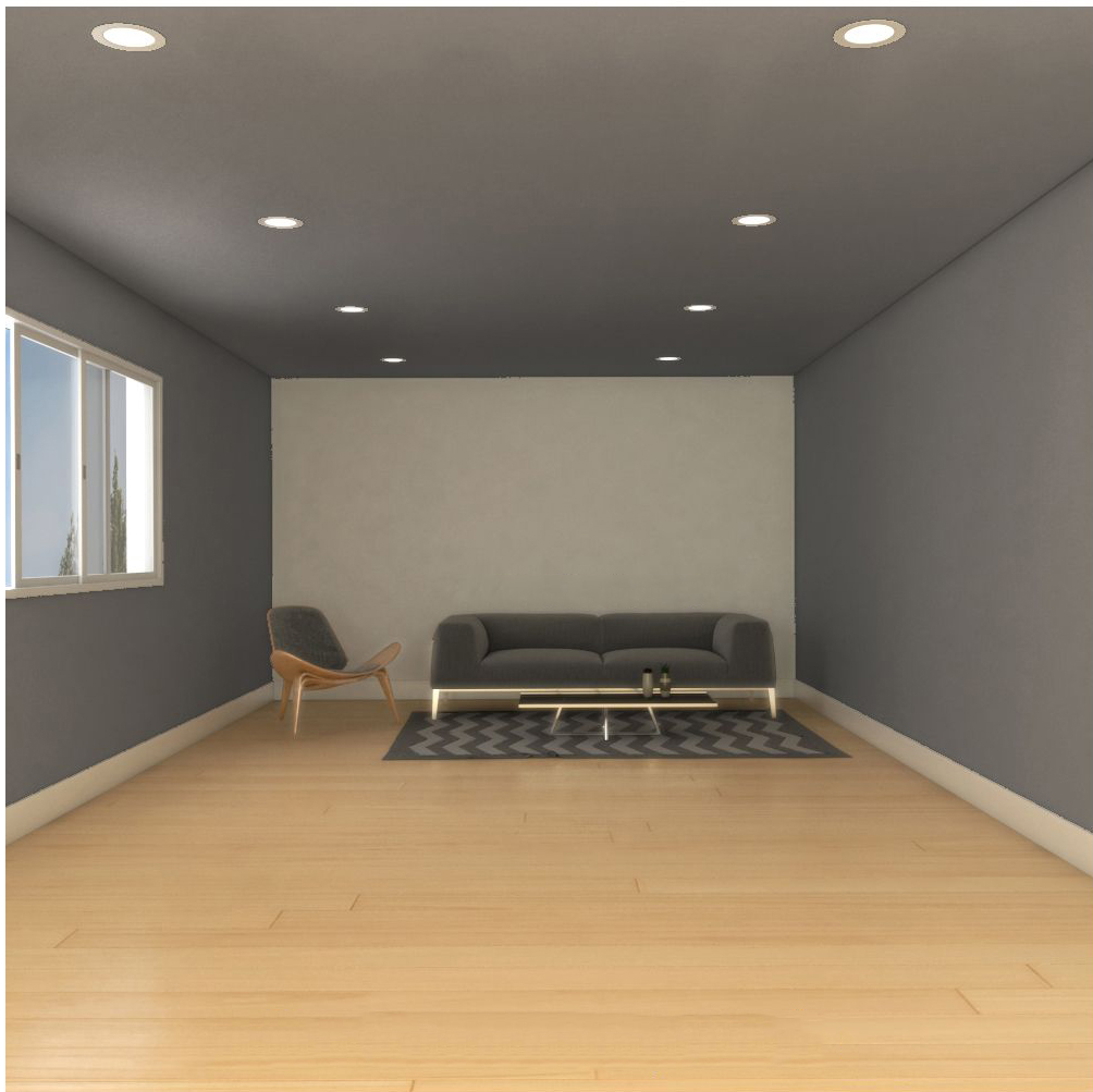
  • Finally, you can paint everything dark and leave only the back wall light, in contrast to the rest.
    In this case, the wall will give a lot of prominence to whatever element you put in front of it.

USE WISELY COLORS!

Depending on how the walls are colored, the perception of these environments will change and appear more or less deep, wide, high, or low.

Knowing how to play with visual effects can be useful to “improve” an environment.

And it will do without masonry works that perhaps, because of a load-bearing wall, cannot even be done!

If you want to transform home environments, the correct use of color is a fast, and above all, changeable solution !!!

If you still have doubts about how to do it, you can contact me!