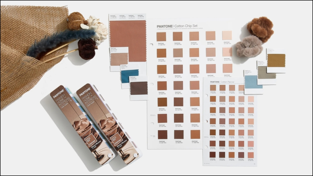
Just a few days ago, Pantone revealed his Color of the Year 2025: Mocha Mousse,
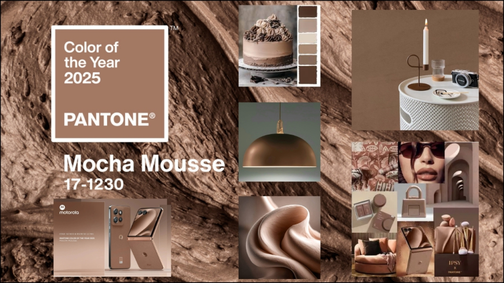
“A soft brown imbued with a sensory and enveloping warmth. Driven by our need for small daily pleasures, it expresses a form of indulgent reflection,”
according to Leatrice Eiseman, the Executive Director of the Pantone Color Institute.
It is a return to darker shades, in contrast to 2024’s Peach Fuzz.
This color takes us back to nature and the earth, reestablishing our connection and contact with it.
“The constant quest for harmony is reflected in every aspect of our lives, from the relationships we nurture to our work, from social connections to the natural environment around us. Harmony generates a sense of fulfillment, inspiring positivity and inner peace, calm and balance, while fostering a sense of alignment with the world around us.
Harmony embraces a culture of connection and unity, as well as the synthesis between our mental, spiritual, and physical well-being,”
explains Laurie Pressman, Vice President of the Pantone Color Institute.
“With this in mind, for the Pantone Color of the Year 2025, we are inspired by a color that responds to our desire for comfort and well-being while celebrating the joy of simple pleasures to give and share with others.”
How to use the color at home?
It is an elegant, classic, and refined color that suits any style, as it remains a neutral tone.
You can use it in every room and, if desired, on all walls to create a cozy and enveloping atmosphere.
Beyond walls, you can also incorporate it into furniture, decor items, and textiles such as blankets, curtains, and rugs!
You can pair it with other shades of brown for a monochromatic, tone-on-tone palette or combine it with orange-leaning hues like terracotta.
You can also dare to use contrasting colors like deep blues or greens, such as navy blue or olive green.
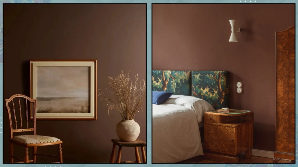
(credit: houseandgarden.co.uk; Giulia Maretti Studio)
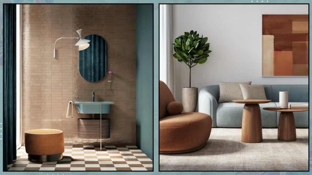
(credit: Ceramica Faetano; CreativaStudio-Getty images)
It becomes very delicate and refined when paired with blush pink.
This color is enhanced by using natural materials such as wood, wicker, wool, linen, and cotton, all of which help maintain its connection to nature.
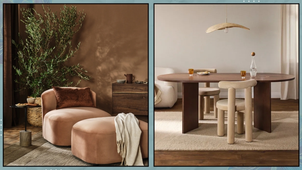
(credit: Joybird; Westwing)
This year, Pantone is also introducing five color palettes that pair beautifully with Mocha Mousse:
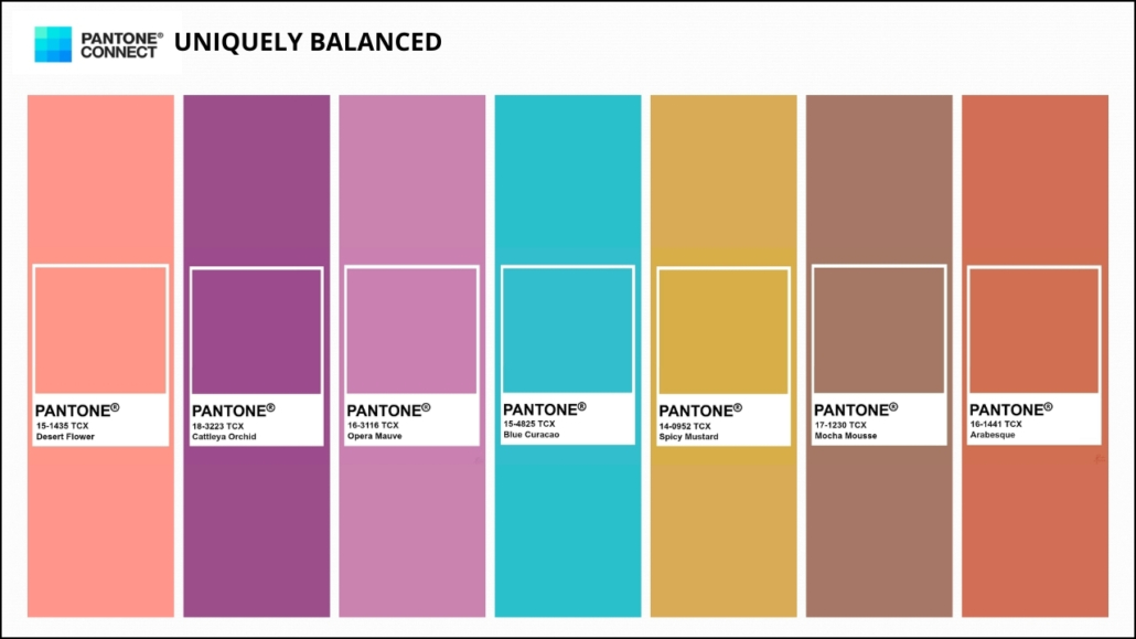
– Uniquely Balanced
This vibrant and exotic palette combines warm and cool tones.
Mocha Mousse seamlessly ties these colors together, balancing and softening them with its gentle presence.
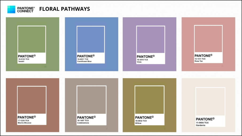
– Floral Pathways
This palette takes us back to spring gardens, with floral tones that almost evoke their fragrances!
It is delicate and enveloping, with Mocha Mousse blending perfectly into it.
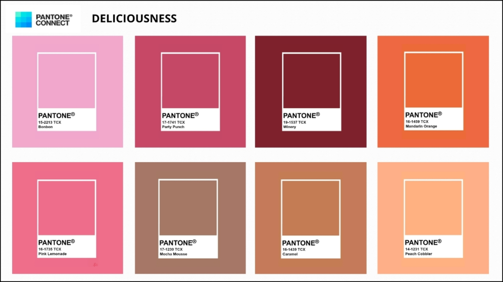
– Deliciousness
The color Mocha Mousse, both in hue and name, evokes a dessert—like chocolate or coffee mousse, making it easy to pair with other colors reminiscent of a pastry shop!
This palette is truly indulgent and vibrant but should be used sparingly at home to avoid an overly “sugary” effect
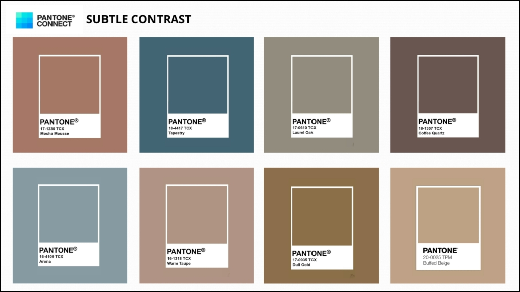
– Subtle Contrast
This palette plays with contrasts, where the brown of Mocha Mousse pairs beautifully with blues, grays, and other shades of brown!
It is surely an elegant and refined palette that can enhance any style.
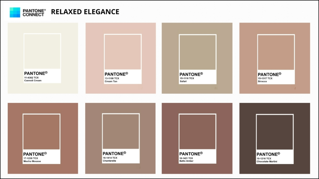
– Relaxed Elegance
This palette focuses on neutrals, ranging from light to dark, creating an almost tone-on-tone effect.
As the name suggests, it is elegant and relaxing, making it a perfect match for any style!
Do you like this Pantone Color of the Year 2025? Will you use it? Tell me in the comments!
I hope you enjoyed this article and found it helpful.
If so, don’t hesitate to share it with someone you think might be interested; I would be honored, and it will help me get known.
If you feel that your home, or any part of it, doesn’t reflect you enough, don’t wait any longer: fall in love with your place again and book your consultancy!
