Open space is a concept that you often see in modern homes.
Some time ago, I talked about how to divide an open space kitchen and living room.
Today, I want to give you some tips to make your open space beautiful and functional.
1 – PLAN HOW YOU WANT TO USE THE SPACE
It’s essential to understand how you want to use the available space to figure out how to furnish it.
Generally, in an open space, there are three areas:
– Kitchen
– Dining area
– Living room
To make the open space functional, you need to determine how you use these three spaces:
Do you have many guests for lunch or dinner? In this case, you’ll need an appropriate dining table and prioritize that area.
How do you use the living area?
Do you want to have a kitchen island?
The answers to these questions will determine the layout of the various elements.
The same room can be furnished in different ways.
For instance, if you often have guests and enjoy conversations with them, it might be ideal to position the elements so that the three areas communicate with each other, making it easy to move from one place to another.
On the other hand, you might want to keep the zones well-separated by using the back of the sofa as a divider if you enjoy using the living area for watching television!
It will also be vital to keep in mind the size and shape of the room to buy furniture and elements that are proportionate and scale-appropriate for the available space.
In small spaces, you’ll need to give greater importance to the area you use the most to ensure that the rooms are truly functional.
When you have ample space, it’s still important to consider the space as a whole, even when divided into areas.
In this case, it’s also paramount to avoid placing furniture against the walls but create central areas to make the transitions flow smoothly.
Studying the shape, dimensions, and how you use the room will help you understand how much furniture to buy and how to position it so that the space represents you and is functional for your needs!
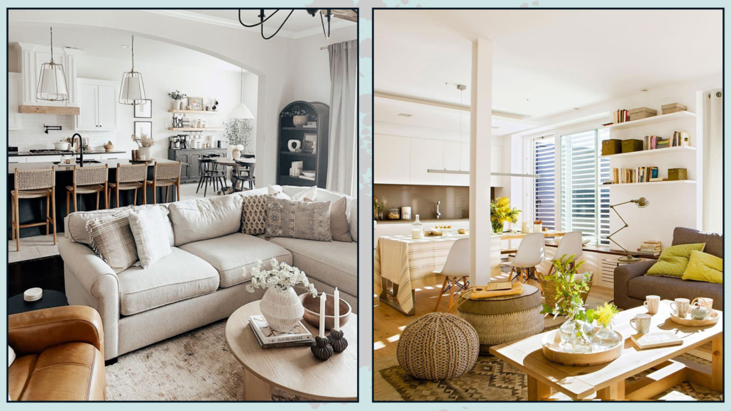
(credits: missjessicanicoleblog; dizain-krasivo)
2 – MAINTAIN A CONSISTENT STYLE IN EACH AREA
In an open space, it’s important for each area to “communicate” with one another!
Style, colors, and shapes should be visually similar to create harmony.
If you have a very modern and minimalist kitchen but a rustic-style living room, the contrast will be strong and visually divide the two areas!
Of course, this doesn’t mean that you can’t mix styles; rather, the mix should be present in all areas!
If you want to create some division between the different areas, you can use furniture or other elements, as explained here, but it’s better to maintain a consistency of style!
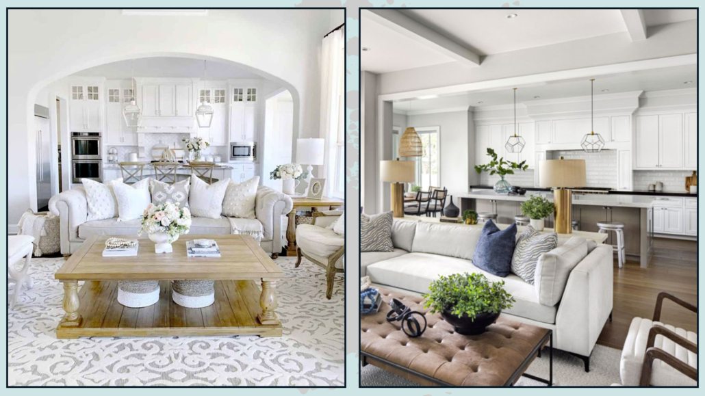
(credits: Erin Vogelpohl; Kennedy Cole Interior Design)
3 – PAY ATTENTION TO COLORS
It’s paramount to have a cohesive color palette and, as with style, use it in all three areas of the open space.
To create a sense of unity, use a neutral color on all the walls and incorporate colors into furniture and accessories (two or three, but not more, I recommend) to add some movement and character to the open space.
On the other hand, if you want to divide the different areas optically, you can change the wall colors, but the important thing is to keep the color palette the same throughout all the open space.
That way, you’ll create a virtual division while maintaining harmony!
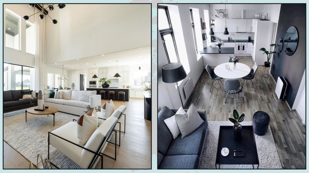
(credits: urbanologydesigns.com; @egilfarstad)
4 – USE CONNECTING ELEMENTS
Ensure that the different zones communicate with each other by seeking connecting elements.
As mentioned before, definitely utilize the same style or a mix of styles and distribute the color palette skillfully throughout all the spaces.
You can also use shapes and materials!
For instance, you could use the same metal for the legs of the coffee table in the living room, a candle holder on the dining table, and as handles for the kitchen cabinets!
Doing this creates a certain rhythm, which is one of the fundamentals of interior design (discover the others here!).
Repetitions of colors, materials, patterns, and textures tie the spaces together, providing harmony and unity that are never boring!
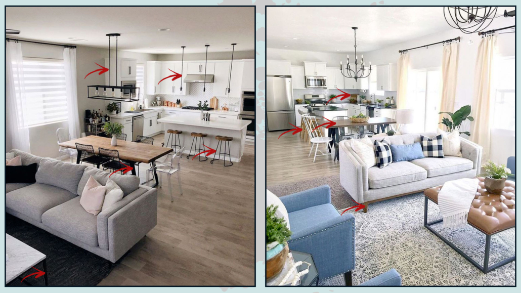
(credits: @ed__interiordesign; article.com)
5 – FLOORING
The discussion about flooring is somewhat similar to that of colors:
– if you want to maintain space homogeneity, it’s good to use the same flooring throughout;
– if you want to create a sense of division, especially for the kitchen, you can change the flooring, of course, but try to incorporate the same color or pattern in the other areas!
However, if the space is small, the advice is to keep the same flooring, or at least the same color, to avoid a sharp interruption.
In small spaces, sharp interruptions can visually shrink the rooms even further!
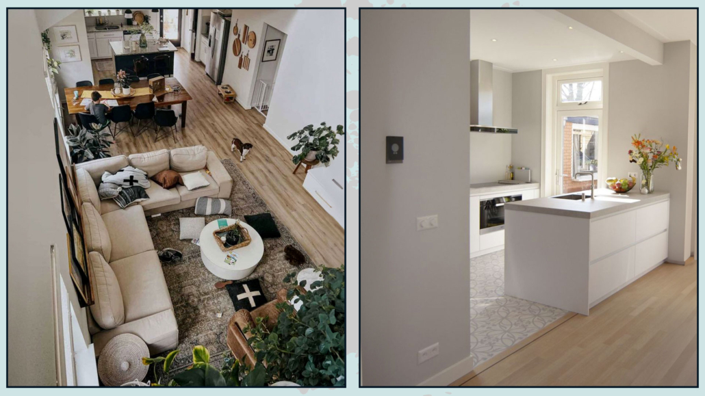
(credits: loveandrenovations.com; Habitat Sintoni)
6 – DEFINE THE AREAS
It’s paramount to define the various areas very clearly!
Saying this may seem contradictory to what I mentioned earlier, but even while maintaining style and color consistency, it’s good to define the different zones.
You can divide the areas by positioning the furniture in a certain way, such as placing the sofa with its back to the kitchen/dining area. Alternatively, you could use rugs!
Rugs are fantastic because they not only help define spaces but also add warmth and texture!
If you use more than one rug, for example, one in the living area and another under the dining table, make sure they have something in common.
It could be the same pattern but with different tones (in line with the color palette), or vice versa, the same shades but different patterns!
They can also share the same colors and patterns but differ in shape, such as having a round rug under the table!
When it comes to rugs, pay attention to the dimensions!
As you know by now, it should accommodate all the elements or at least the front feet for the living area, while, for the dining area, you should also consider the space needed to move the chair when sitting down!
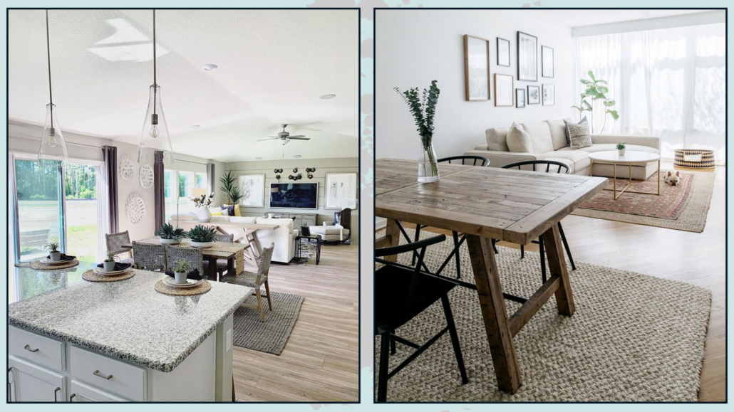
(credits: i.pinimg.com; theeverygirl.com)
Another way to define the areas could be to use dropped ceilings to lower one of the zones!
That is a great idea and can be actually effective in visually separating different areas of an open space.
By creating a lower ceiling in one specific area, you can clearly demarcate the boundaries between the spaces while maintaining a cohesive overall design.
It’s an architectural approach that adds an interesting dimension to the interior design of the open space.
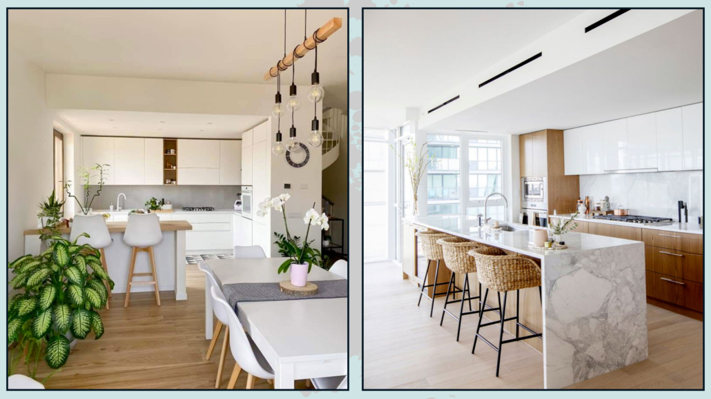
(credits: @penny.rogers.home; kathleenlindesign.com)
7 – LIGHTING
Maintain a certain uniformity for the general lighting using the same color temperature, preferably a natural one (around 4000 kelvin).
Then, add table lamps or floor lamps in the living area with a warmer color temperature, which will also promote relaxation.
Place a light above the dining table and, if present, over the kitchen island.
Having various points of light will not only provide adequate illumination but also highlight each area correctly!
The lamps should ideally have some common elements, either in terms of shape or color, to maintain consistency in the overall design!
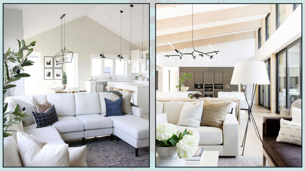
(credits: orangetreeinteriors.com; Studio McGee)
8 – CURTAINS
In an open space, it’s essential to have the same window treatments!
That doesn’t necessarily mean having the same curtains on all windows because, for example, draped curtains might be impractical in the kitchen but perfect for the living room!
In using different types of curtains, however, make sure that they are perhaps of the same material and color so that here, as well, there is a common thread!
It’s also essential to hang the curtain rod at the same height, even if you have windows of different sizes.
That helps maintain some visual order and makes everything look more cohesive.
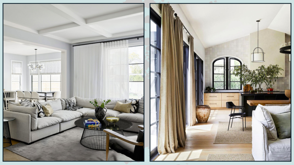
(credits: devongraceinteriors.com; katewalkerdesign.com)
I hope this article has been helpful and enjoyable for you. If so, let me know in the comments!
Feel free to share it with anyone you think might be interested, I would be honored, and it will help me gain more exposure.
If you feel that your home, or any specific area of it, doesn’t reflect your personality enough, don’t wait any longer and book your consultancy!
This post is also available in: Italian



Leave a Reply
Want to join the discussion?Feel free to contribute!