Having a small bathroom is really a problem, and in homes where there are two, generally at least one is indeed tiny, maybe even without a window.
The small bathroom is a very challenging space to design, but with a few small tricks, you can make it look bigger, functional, and even definitely trendy!
Let’s look at them together.
– MEASURE THE SPACE
Measure the available space is the first step to understanding how to proceed and buy proportionate elements!
Specific standards exist for the minimum distances between fixed elements like the toilet and bidet. Once you have identified and positioned them correctly, you can decide on the sink (with or without a cabinet), shower or bathtub, and everything else.
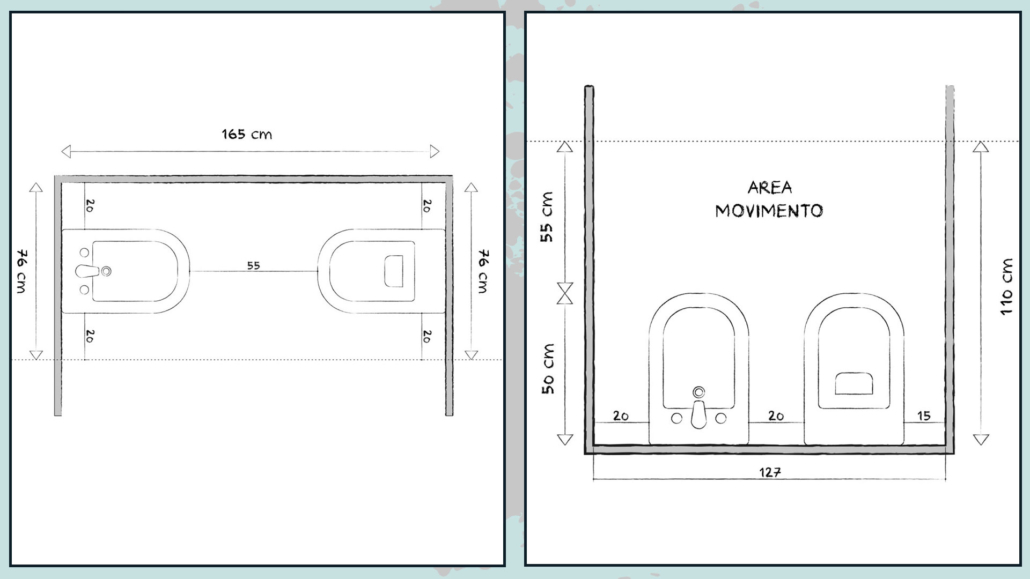
(credits: besidebathrooms.com)
Regarding the sink, avoid placing or wedging it in large cabinets that rest on the floor: it’s better to use wall-mounted cabinets, simple shelves, or light, open structures.
Being able to see beyond or having floor space amplifies the space visually.
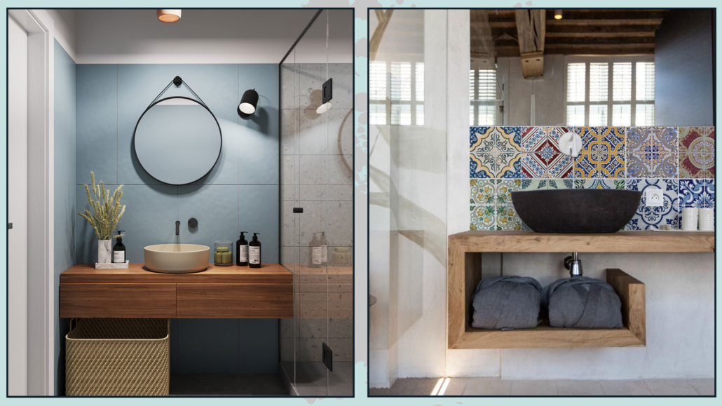
(credits: Sonia Meneghin; xlab.design)
Remember, for the sink, there is no minimum size; it depends on how you use it and your needs.
For a secondary bathroom, a smaller sink could make a difference!
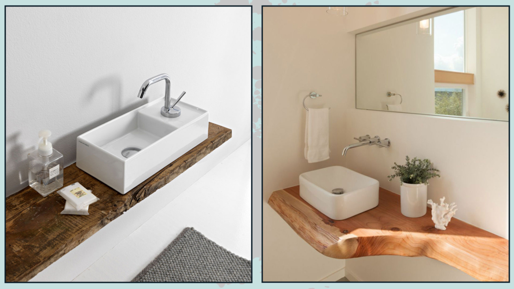
(credits: scarabeosrl.com; homedesignlover.com)
If you opt for a hugger sink, beware of its proportions relative to the available space!
Sometimes, it’s just a matter of paying attention to the shape: a rounded sink might be more functional than a square one!
Once you have identified the positions of the fixed elements, you can choose the rest, such as materials and colors, that can help visually enlarge the bathroom.
– WALL-MOUNTED FAUCETS
It may seem trivial, but having wall-mounted faucets allows you to save space by reclaiming those extra centimeters where the faucet is anchored.
A wall-mounted faucet adds a touch of style to the bathroom and is also super functional for cleaning: there won’t be that annoying ring that forms on the sink around the faucet!
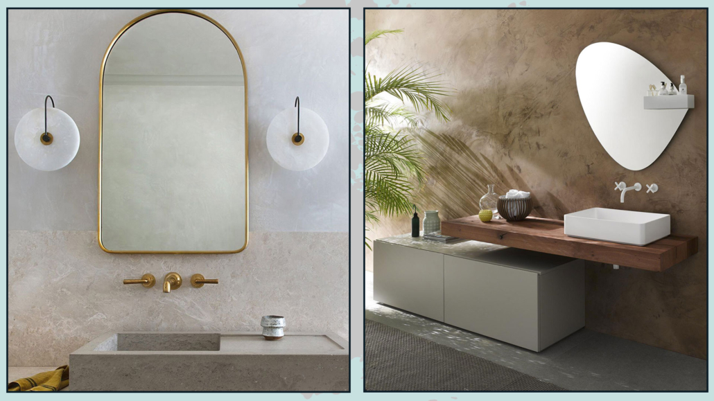
(credits: alliedmaker.com; espace-aubade.fr)
With a bowl-type sink placed on a cabinet or shelf, you can also position the faucet on the side.
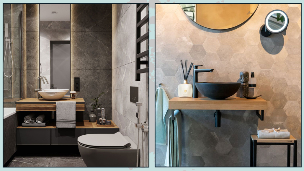
(credits: group-hadara.com; looox.nl)
– COLORS (light and… dark!)
The trick to make a bathroom appear hugger is to use very little contrast with the colors!
Light colors will illuminate and give a lot of space to the bathroom.
Everything should be light: walls, fixtures, furniture, and details like handles; the latter will illuminate even more if they have a glossy finish!
By light, I don’t necessarily mean white, but any color used in a light, desaturated version.
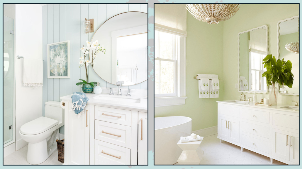
(credits: thehappyhousie.porch.com; Meg Graf Designs)
Even the curtains should be light and airy, perhaps Roman shades partially pulled up… it’s a small detail that will instantly make the space look larger.
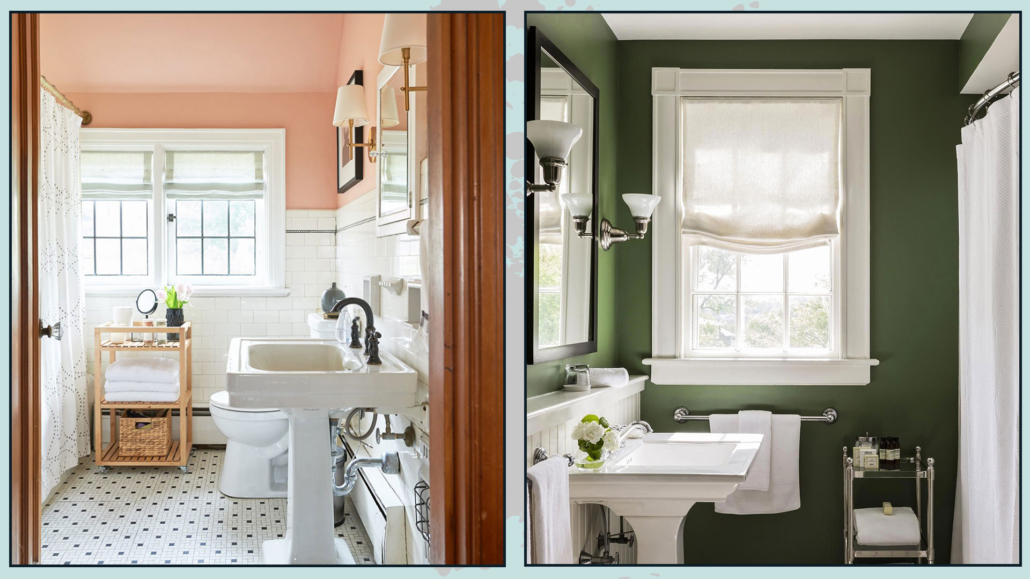
(credits: helloalva.com; ph Michael J. Lee)
However, you should know that you are NOT forced to use only light tones.
It may seem strange, but very dark colors, especially in windowless bathrooms, create a sense of depth and give the illusion of a larger space!
The trick, with dark colors too, is to use very little contrast: everything should be dark (except for the fixtures; if you prefer!).
Another clever strategy is to use glossy colors to reflect light everywhere!
Just as light colors don’t necessarily mean white, dark colors don’t automatically mean black.
Instead, use intense colors and low lighting to make everything appear more dramatic!
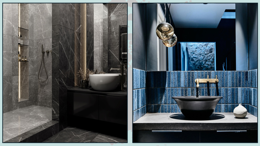
(credits: dezignark.com; homedit.com)
– SHOWER ENCLOSURES AND BATHTUBS
It is ideal, whenever possible, to have shower enclosures and bathtubs without frames, as frames create a barrier.
Where a frame is necessary, it should be as minimal as possible and light (if you choose dark colors, it should be dark but still minimal).
Where possible, you can also use a simple fixed panel!
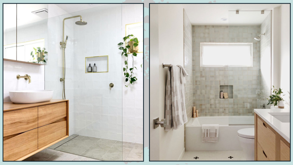
(credits: Jacqui Turk; casework.it)
Of course, in the case of a shower without a door, you will need to pay particular attention to the drain, ensuring it is hugger than usual to avoid water spilling all over the bathroom!
If you have a bathtub, you can opt for a curtain.
When opened, it will create no visual barrier and add a touch of color to the bathroom.
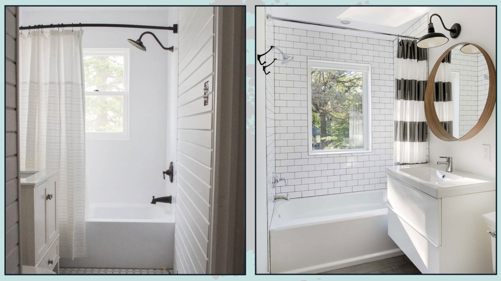
(credits: lovegrowswild.com; stranddesign.com)
– LARGE PATTERNED WALL COVERINGS
Wallpaper or tiles with large patterns help give the impression of a larger space.
The larger the pattern, the more spacious the room will seem!
Going “out of scale, out of proportion,” in this case, is absolutely recommended, so feel free to unleash your creativity!!
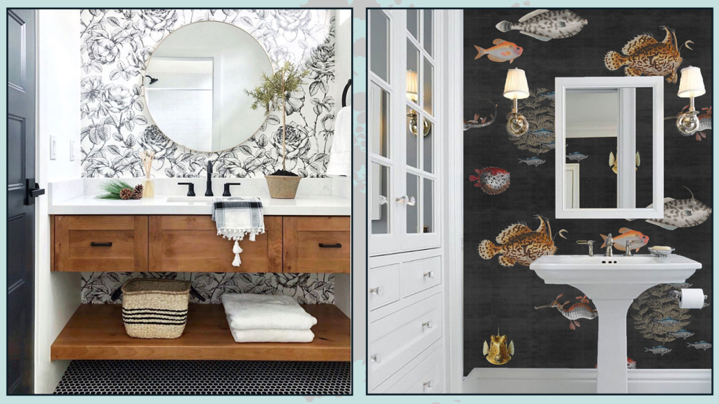
(credits: anewall.com; etsy.com)
If you don’t like large patterns, you can choose small patterns ONLY as long as they are tone-on-tone with very little contrast.
That will give the impression of a color rather than a pattern.
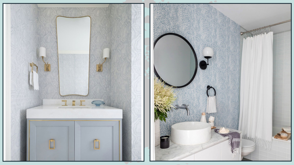
(credits: jenkinsinteriors.com; rebeccaatwood.com)
If the pattern you like is particularly bold and busy, consider using it only on the upper half of the wall and tiling the lower half to lighten things up a bit!
– TILES
If you prefer not to use wallpaper but tiles, a trick to make your bathroom appear larger is to tile all the walls up to the ceiling.
That will give a nice effect to your small bathroom!
As with patterns, the ideal is to use huge tiles and minimize the visibility of grout lines as much as possible!
It’s not necessary to have all the walls with the same tile; you can change it in the shower/bathtub area, always being careful to use little contrast!
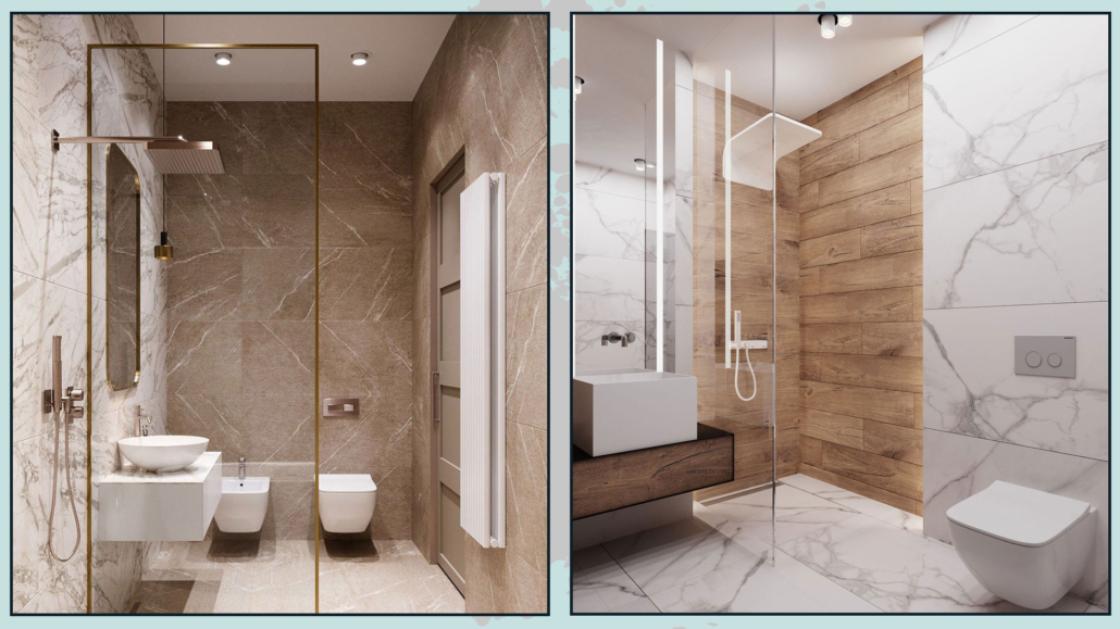
(credits: redefineinterior.com; lashopagranite.com)
As for the floor, in addition to large tiles, it’s a great idea to use the same tile for the shower floor.
A material change creates a boundary, which makes the space look smaller.
If you don’t have a shower but a built-in bathtub, you can consider tiling the surround with the same tile as the floor.
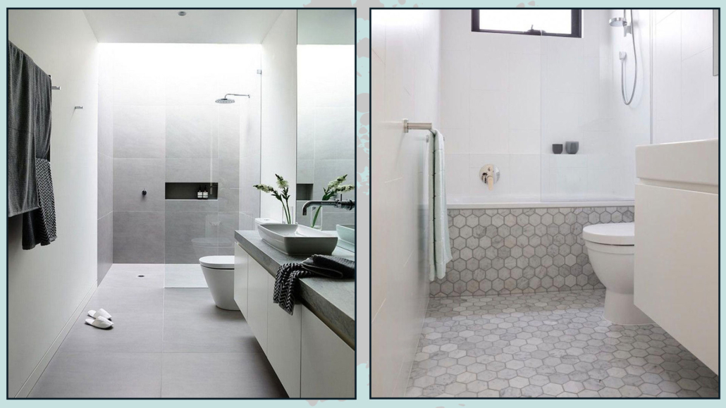
(credits: hupehome.com; i1.wp.com)
– MIRROR THE ENTIRE WALL
A mirror reflects light, which will instantly make the space feel larger.
So, consider a large mirror that covers an entire wall, perhaps even up to the ceiling, for a dramatic effect.
That is especially useful in windowless bathrooms, where the mirror will act as a sort of window by reflecting and multiplying the light in the room.
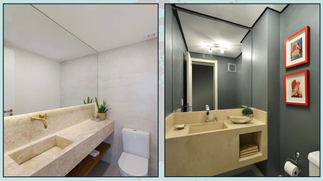
(credits: eixoz.arq.br; Ph Alessandra Bonotto Hoffmann Paim)
Of course, mirror only ONE wall; avoid the infinite repetition effect by mirroring all the walls or even just the opposite walls. Doing so will only result in a major headache!
– LEDGES AND STORAGE UNITS
Another effective way to visually enlarge the space is by creating a small ledge along the entire wall to place objects on
I know it may seem counterintuitive because it technically reduces the space by a few centimeters, but having a spot to place, perhaps a picture or a few well-chosen decorative items, will really give the illusion of a larger room.
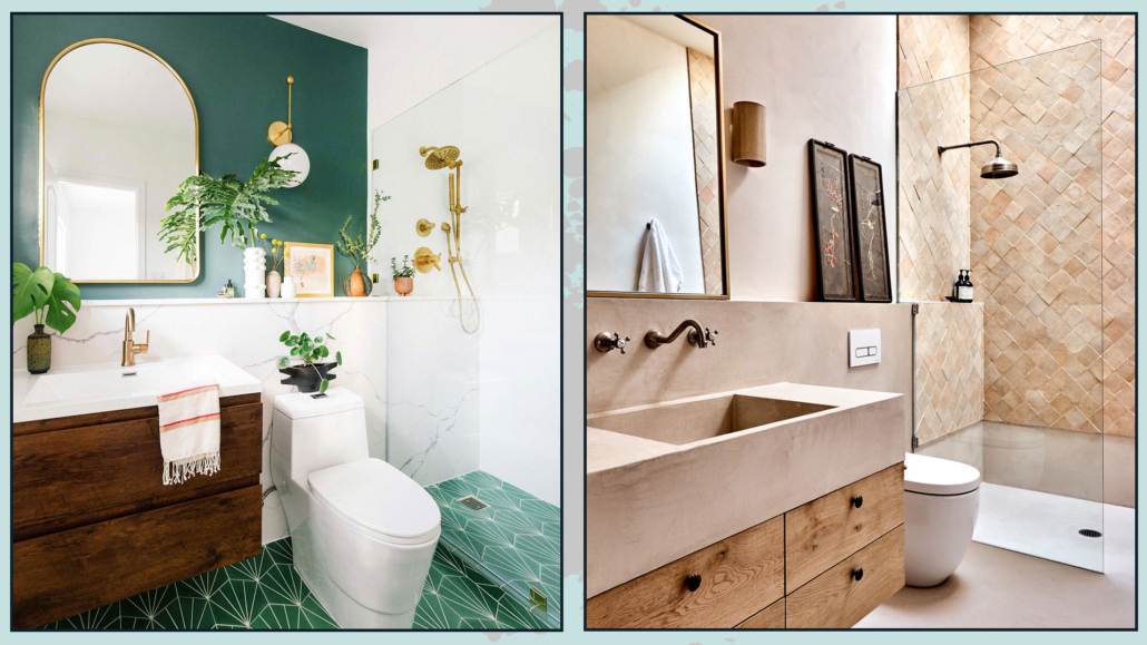
(credits: oldbrandnew.com; studioezra.com)
As for storage units, they should be well-closed!
In a small bathroom, visible items like towels and containers, even if neatly arranged, create clutter and make the space feel smaller!
With these small precautions, even a small bathroom can become functional and trendy, almost like a little gem of the house!
I hope this article has been helpful and enjoyable for you. If so, let me know in the comments!
Feel free to share it with anyone you think might be interested, I would be honored, and it will help me gain more exposure.
If you feel that your home, or any specific area of it, doesn’t reflect your personality enough, don’t wait any longer and book your consultancy!
This post is also available in: Italian




Leave a Reply
Want to join the discussion?Feel free to contribute!